In the ever-evolving world of product design, various design styles have emerged over time to enhance user experiences and bridge the gap between the physical and digital realms. Design approach that we will discuss in this article has garnered a lot of attention in the early 90s and late 2000s, and it's called skeuomorphism. In this article, we will delve into the concept of skeuomorphism, exploring its key characteristics, and the role it plays in product design.
What is skeuomorphism?
The term "skeuomorphism" originated from the Greek words "skeuos," meaning vessel or tool, and "morphē," meaning form or shape. Skeuomorphism is a visual style that aims to bridge the gap between the physical and digital worlds by incorporating visual characteristics of familiar objects. When we create a skeuomorphic design, we incorporate visual cues in an interface that imitate the appearance of physical objects, even when those elements are not necessary for the interface's functionality.
As a visual approach, skeuomorphism existed before the first digital interfaces were created. Designers often rely on familiar elements when creating innovative products. For example, early automobiles looked like horse-driven carriages without horses.
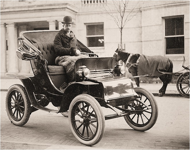
Horseless carriage. Image by hackastory
In digital design, skeuomorphism began to take shape in the 1980s. One of its strongest proponents was Steve Jobs. Apple relied on skeuomorphism both in the era of first desktop computers and the era of first smartphones. After Apple, skeuomorphism was quickly popularized by other tech companies.
Examples of skeuomorphism
In user interface design, skeuomorphism often manifests as the use of realistic textures, such as wood grain or leather, to simulate physical objects on digital screens. Below are a few notable examples of skeuomorphism design:
Apple Books (iOS 6). The app is designed to resemble physical bookshelves, complete with wooden textures, book spines, and even simulated lighting and shadows that help create a sense of depth. The app also mimics the appearance of physical books, featuring virtual pages that flip when a reader navigates through them.
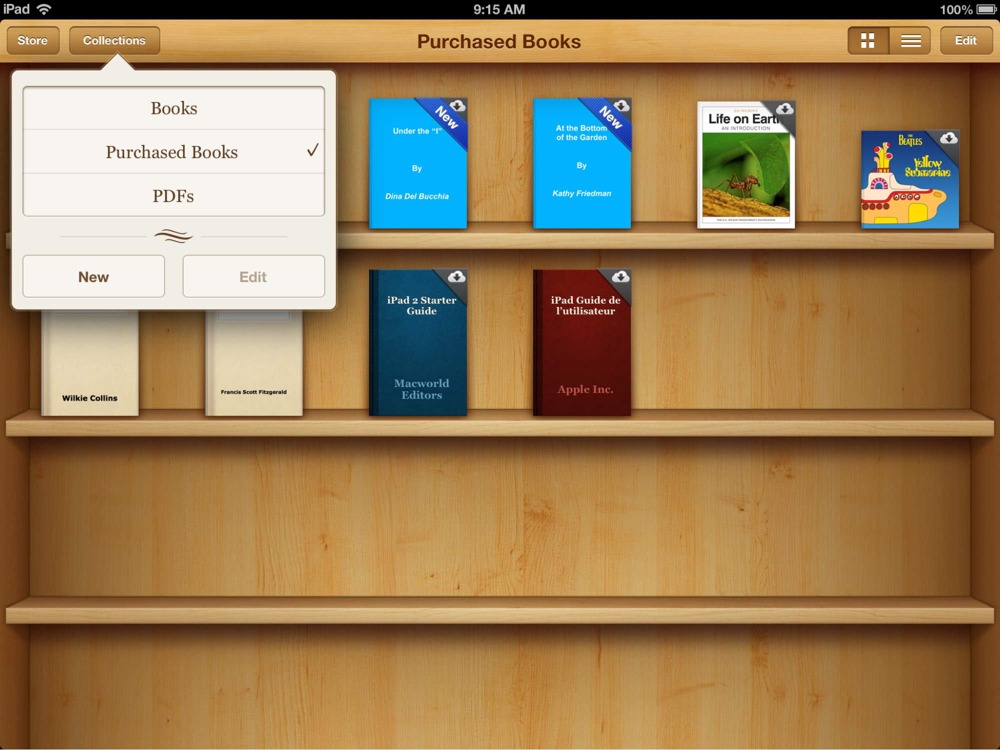
Apple Books (iOS 6).
Apple Calendar (iOS 6). Apple Calendar in iOS 6 utilizes subtle skeuomorphic elements such as raised buttons with shadows and gradients that imitate the appearance of physical keys. The redesign of the Apple Calendar app was one of the most notable changes in iOS 7, and it helped make the interface more clear.

Apple Calendar in iOS 6 (left) vs iOS 7 (right). Image by Business Insider.
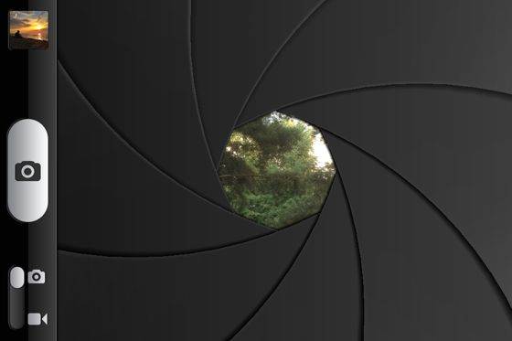
Camera shutter (iOS 6). Camera app features the visual appearance of a shutter and imitates its functional behavior by showing a quick animated effect when the user takes a photo.

Camera shutter in iOS 6. Image by iPhone photography school.
Voice recorder (iOS 6). Voice recorder app includes not only subtle skeuomorphic elements such as metal polish for the record button but also major elements such as imagery of a physical microphone.

Voice recorder in Apple iOS 6. Image by osxdaily
Apart from specific apps that utilized skeuomorphic design back in the day, skeuomorphic elements can be found in many modern apps. Mobile apps often have skeuomorphic icons to represent real-world objects. For example, a note-taking app might feature an icon that looks like a notepad or a camera app with an icon resembling a physical camera.
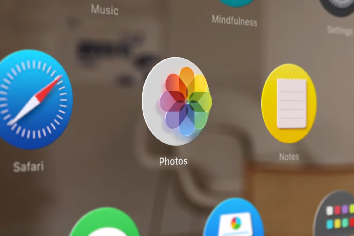
An icon of Apple Notes, a note-taking app for iOS and Mac.
What are the benefits of using skeuomorphism?
The skeuomorphic design aims to make digital experiences more intuitive and familiar for users by leveraging users' existing knowledge and mental models of physical objects. It gained popularity in digital design with the rise of graphical user interfaces for desktop computers in the late 80s and smartphones in the late 2000s. In the earlier days of personal computers and smartphones, these categories of devices were new to the majority of people, and many apps often featured realistic representations of physical objects. It allowed for simplifying the interaction with a new category of devices for various groups of users, including non-tech-savvy users.
Apple Macintosh (circa 1984). Graphical user interface features skeuomorphic elements such as heavy shadows and skeuomorphic elements like folders that look the same as paper folders.
Here are more specific benefits of using skeuomorphism in design:
Sense of familiarity: Skeuomorphic design draws on familiar visual cues from the physical world, making it easier for users to understand and interact with digital interfaces. By mimicking real-world objects, skeuomorphism can reduce the learning curve associated with new technology.
Cognitive mapping: Skeuomorphism helps users create mental connections between the objects they see in a digital interface and the corresponding real-world objects. This cognitive mapping enables users to transfer their existing knowledge and understanding of the physical world to the digital realm, enhancing their ability to navigate and use the interface.
Emotional connection: Skeuomorphic design can evoke a sense of comfort, by tapping into users' memories and experiences with physical objects. When people see something familiar, they much easier establish an emotional bond with the product. And when users form a strong bond with a product, they are more willing to use it on a long-term basis.
Affordance: Affordance is what a user can do with an object based on the user's capabilities. Skeuomorphic design can provide visual cues that imply the functionality and purpose of certain elements of the interface. For example, a digital button that resembles a physical button with a raised appearance suggests that it can be pressed. These visual affordances can help users quickly understand how to interact with the interface.
Accessibility: Skeuomorphism can benefit users with disabilities by leveraging their familiarity with physical objects. For individuals with cognitive impairments or older adults, the use of familiar visual cues can reduce confusion.
What are the main problems with skeuomorphism?
While skeuomorphism has its advantages, it also has some potential problems and limitations:
Visual clutter: Skeuomorphic design often involves the use of intricate details, textures, and ornamentation to mimic physical objects. It can result in visual clutter and make interfaces appear busy, especially when decorative details are applied excessively. Cluttered interfaces can hinder usability and distract users from essential tasks: users might have to switch focus from the task they want to complete to decorative details they have to comprehend.
Limited creativity: Skeuomorphism may restrict designers' creativity and limit innovation. By adhering too closely to the visual elements of physical objects, designers may overlook opportunities for fresh, original design approaches that better suit digital platforms.
Inconsistency across platforms: Modern digital products are typically created for various platforms. However, skeuomorphic design can lead to inconsistencies across different platforms and devices. The physical world lacks a standardized design language, which means that transferring skeuomorphic elements from one context to another can result in a lack of coherence or visual harmony. In contrast, more minimalist design approaches like flat design make it easier to provide consistent visual language across different platforms and devices.
Increased cognitive load: While skeuomorphic design aims to leverage users' familiarity with physical objects, it can also introduce additional cognitive load (the amount of brain power users have to invest in order to interact with a product). Users need to decipher which design elements are purely ornamental and which ones are functional. This cognitive overhead can slow down interactions and hinder efficiency.
Accessibility challenges: Excessive ornamentation or small visual details used in design can pose challenges for visually impaired individuals.
What is the difference between flat design and skeuomorphic design?
Flat design and skeuomorphic design are two distinct design styles that have been prominent in the digital design landscape. The peak of skeuomorphism was around 2010, but shortly after, there was a shift towards a more minimalist style, "flat design." The era of skeuomorphism ended in 2013 when Apple released iOS 7, which utilized flat design. At that time, most users were already familiar with mobile devices, and ornamental decorative details were no longer necessary.

Visual comparison of iOS 6 (left) followed a skeuomorphic approach, and iOS 7 (right) followed a flat design.
Let’s compare two design styles:
Visual attributes of UI elements
Skeuomorphic design mimics real-world objects, textures, and visual elements. It often incorporates depth, shadows, gradients, and realistic details to create a three-dimensional and tactile appearance. Flat design, on the other hand, embraces simplicity, minimalism, and a two-dimensional aesthetic. It utilizes clean lines, simple shapes, and vibrant colors without excessive gradients or shadows.
When it comes to visual attributes, it's important to mention that it's always better to avoid radical versions of skeuomorphism (ultra-skeuomorphic design) or flat design (ultra-flat design). Some visual styles, like Material Design by Google, tried to find a balance between skeuomorphism and flat design. Google attempted to eliminate all unnecessary decorative elements leaving only essential visual properties that aid usability.

Material design button. Image by Vadim Gromov
Level of realism
Choosing the level of realism is one of the fundamental steps in the product design process. The level of realism should be selected for all user interface elements, including small elements like icons.

Abstract-o-meter. Image by Christoph Niemann
The skeuomorphic design aims to replicate the realism of physical objects. It resembles real-world counterparts and creates a very rich visual appearance. Flat design strips away unnecessary visual ornamentation and focuses on simplicity. It often employs simple iconography and bold colors to create a clear visual language.
User experience
Skeuomorphic design can provide a more immersive user experience by leveraging users' familiarity with physical objects. It can create a sense of depth, tangibility, and realism.
Skeuomorphic audio player. Image by audiob
The flat design emphasizes clarity by removing unnecessary visual details. It focuses on quick comprehension.
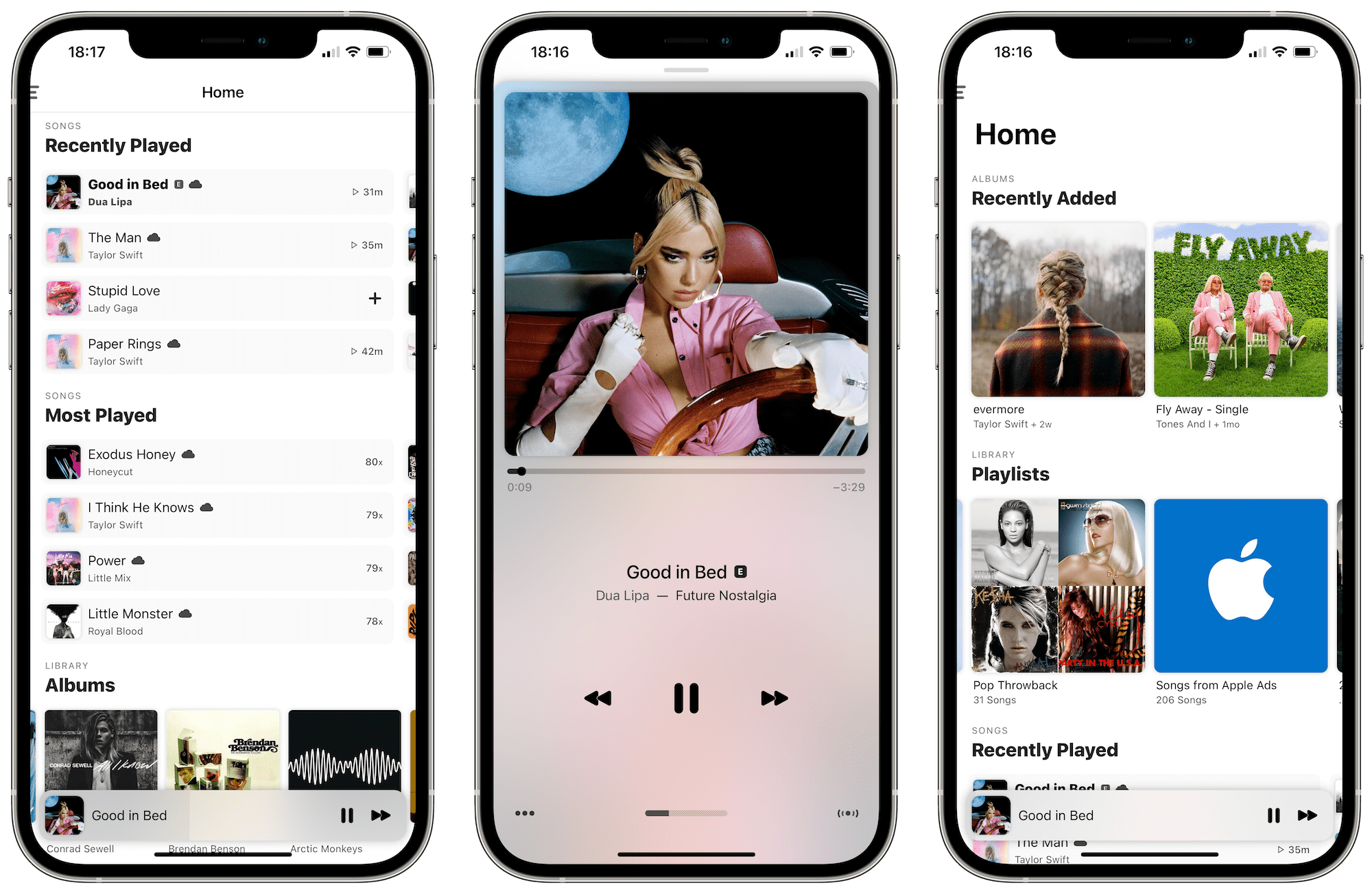
Apple Music features an almost-flat design.
Adaptability
Skeuomorphic design can be challenging to adapt to different platforms and devices, as it relies on replicating physical objects. Transferring skeuomorphic elements across platforms can lead to inconsistencies and visual disharmony. Flat design lends itself well to responsive design practices. Its simplicity and minimalism make it easier to scale and maintain consistency across various platforms and screen sizes.
How to create skeuomorphic designs?
Creating skeuomorphic designs involves careful consideration of various design elements and techniques. The ultimate goal when creating a skeuomorphic design is to create a usable, aesthetically-pleasing, and adaptable digital interface. Here are some steps to help you create skeuomorphic designs:
Understand the purpose and context of your design
Skeuomorphic design is just one design approach among many. The approach you choose to use should be selected according to the goals of your project. That's why the first thing you need to do when starting a new project is to determine if the skeuomorphic design is appropriate and aligns with the needs of the project. Start by understanding the purpose of your design, learning about the target audience and their preferences, and the context in which they will interact with your project.
Define the scope
Identify the specific UI elements within your design that will adopt skeuomorphic attributes. It could be buttons, icons, backgrounds, or other interface objects. Determine how far you want to take the skeuomorphic approach—whether it will be a subtle touch or an all-encompassing design.
Gather reference material
Once you know at what scale you want to implement skeuomorphism in your design, you must collect visual references of the physical objects you want to mimic. And the best way to achieve this goal is to take inspiration from the physical environment. Study various textures, materials, and physical shapes to understand their visual characteristics. Take pictures of physical objects, create a moodboard with various types of visual assets you've collected, and compare them side by side before utilizing certain assets in your design.
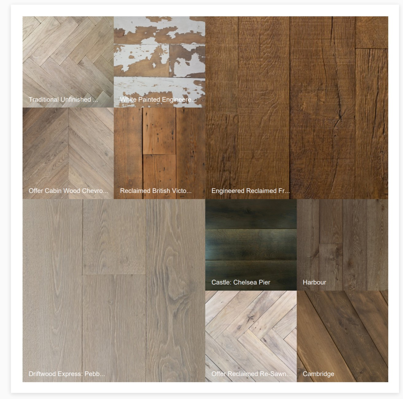
Different types of wood collected in a single moodboard. Image by reclaimedflooringco
Focus on small detail
Design is in the details. How well individual details are implemented can have a significant impact on how people perceive your design. Here are a few things you can do to make the most of skeuomorphic style:
Pay attention to the small details that make an object unique. Consider elements like embossing, bevels, and shapes that define the object you're referencing. These details contribute to the overall realism and can enhance the user's perception and interaction with your design.
Consider depth and lighting. Skeuomorphic designs often incorporate lighting effects to create a three-dimensional appearance. Experiment with shadows, highlights, and gradients to give UI elements depth and make them appear raised or recessed.
Ensure that you apply skeuomorphism consistently in your design. The skeuomorphic elements should align with the overall design and user interaction.
Maintain usability
Usability is one of the fundamental properties of good design. No matter how beautiful your design is, it's impossible to achieve a good user experience if a product has poor usability. While skeuomorphic designs aim for realism, it's essential to ensure that the design remains functional and usable. For example, when it comes to designing functional elements, it's vital to make the design intuitive. Users should understand how to interact with a particular UI object just by looking at it. Balance the visual aesthetics with functional considerations, such as providing clear affordances for interactive elements and maintaining consistency across the interface.

Using lights and shadows to create raised or sunken objects. Image by OTAKOYI
Look for inspiration
Inspiration is a significant driver of a designer's creativity. It's nearly impossible to create something new by working in an information vacuum. But the great thing about skeuomorphism is that it's relatively easy to find inspiration; all you need to do is literally look around and find physical objects that you find beautiful. Conduct research on the physical objects or materials that you want to mimic in your design. Study object characteristics, textures, colors, and visual properties. Alternatively, you can look for examples of skeuomorphic design in a digital context by visiting places like Dribbble and Behance —it will help you understand how other designers have approached this style in a similar context. But it's recommended to do that only after you finish collecting inspiration from physical objects.
Practice iterative design
Design is not something that is set in stone. It constantly evolves and changes. That's why once you have a preliminary skeuomorphic design, you need to validate it with your users and refine it based on the feedback you receive. Evaluate the usability, accessibility, and overall user experience to identify areas for improvement. Iterative design cycles will help you fine-tune your skeuomorphic elements and optimize the user interface.
Design trends are another thing that you need to consider when evaluating your design decisions. It's vital to ensure your design works well with current trends. Otherwise, your design might look dated.
What is the difference between neumorphic and skeuomorphic?
Design is an ever-evolving field, and new trends emerge regularly. Neumorphism is a design trend that emerged in the design community. It has gained popularity on platforms like Dribbble and Behance. Many designers like the visually appealing and engaging design style of the neumorphism. Neumorphism combines elements of skeuomorphism and flat design to create a new, visually distinct style. It aims to create a fresh, futuristic appearance by using the following visual elements:
Soft shadows. Neumorphic design relies on soft shadows to create depth and give the impression of elements being pressed or raised from the background. The shadows are often subtle and use lighter shades of the element's color.
Subtle gradients: Neumorphic design incorporates gradients that blend harmoniously with the background and element colors. These gradients add depth and contribute to the soft, embossed effect.
Essential contrast: Neumorphism often features a contrast between the background and elements to create a seamless integration. The subtle color differentiations between layers contribute to the overall soft and gentle appearance.
Minimalistic aesthetics: Neumorphism embraces simplicity by using clean lines, simple shapes, and monochromatic color schemes. It aims to create a visually pleasing appearance using basic objects and visual design decisions.

Headphone controller app created in a neuromorphic visual style. Image by Ariuka
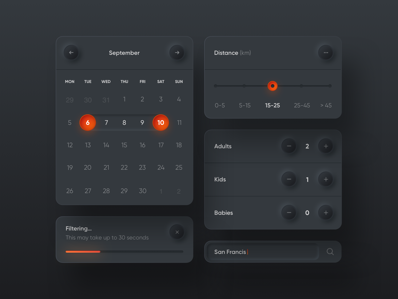
Neumorphic UI Elements (calendar, distance, filtering). Image by Filip Legierski
The process of creatine neumorphic design is similar to the process of creating a skeuomorphic design, but there are a few important differences:
It's vital to select a color palette that will complement the neumorphic style. Neumorphic designs often use muted or pastel colors to create a soft and subtle look.
Experiment with light and shadow angles to create soft shadows. You might want to adjust the intensity and opacity of the shadows to achieve the desired effect.
Balance light and dark tones. Neumorphic design requires finding the right balance between light and dark areas. Elements that protrude should have lighter shades, while elements that are recessed should have darker shades. This balance contributes to the overall depth and tactile feel of the design.
Is skeuomorphic design dead?
The skeuomorphic design had its heyday in the early days of desktop and mobile interfaces but has become less prominent in recent years. Flat design has gained popularity, influenced by the rise of minimalism and the need to optimize the design for various screens and resolutions. However, elements of skeuomorphism can still be found in many interfaces, including the latest interfaces created by industry leaders like Apple.
Apple Vision Pro interface features icons with skeuomorphic elements (such as subtle shadows).
The truth is—both flat design and skeuomorphic design have their merits and can be effective in different contexts. The choice between the two depends on the project requirements, target audience, and brand identity. Most of the time, designers can draw inspiration from various design styles and may incorporate subtle skeuomorphic touches or combine different design approaches to create unique and engaging experiences.
Will designers completely abandon skeuomorphism in the foreseeable future? The answer is no. Skeuomorphic elements will likely be used in design on some scale, but it's unlikely that this style will be dominant in the era of 2D digital design. The situation might change with the rise of augmented and virtual reality (AR and VR) devices. To make AR and VR accessible to all groups of users, designers might need to create familiar experiences, and skeuomorphism can help them with that.
Conclusion
Skeuomorphism offers a unique opportunity for designers to bridge the gap between physical and digital experiences, providing users with a sense of familiarity and ease of use. While it may not be as prominent as it once was, understanding the principles and applications of skeuomorphism can inform decision-making processes and inspire designers to create memorable and intuitive products. It's possible to achieve amazing results by blending skeuomorphic elements with modern design approaches to create a balanced and contemporary design.
Free prototyping tool for web and mobile app design
Get Started for Free
Free prototyping tool for web and mobile app design
Get Started for Free
Free prototyping tool for web and mobile app design
Get Started for Free


