The differences between responsive and adaptive design have always been a hot topic of debate in the design industry. The development of information technology and the overwhelming popularity of mobile devices have heightened the debate among web and app designers about these differences.
Being a designer, you will need a thorough understanding of these two design methods and what each can do to improve the way products serve your customers’needs. In this article, we will give you a detailed explanation of both responsive and adaptive design.
What are adaptive and responsive design?
There is no doubt that both adaptive and responsive design methods can play a part in improving user experiences of apps and websites. But there are some basic differences between them.
Responsive Design (RWD) was introduced by Ethan Marcotte who first applied it when designing a webpage and changing the size of the page in order to adapt to different screen resolutions via the CSS Media Query, Content (Based Breakpoint), and other technologies.
There are several reasons that might lead you to choosing responsive design:
- · it has become a popular trend among new sites;
- · it is easy to use and maintain, even for less experienced designers and developers;
- · there are a great number of themes accessible through CMS systems;
- · it has responsive layouts that are fluid and better suited to new projects.
Adaptive design (AWD) is about creating different pages according to the specific size and screen resolution of a device.
The following are reasons for using adaptive design:
- · it is better suited to the job of retrofitting an existing site to make it more mobile friendly;
- · it allows you to design screens with six common widths: 320, 480, 760, 960, 1200, and 1600;
- · it is possible to design an adaptive site from scratch by designing for the lowest resolution and working your way up.
What are the differences between adaptive and responsive design?
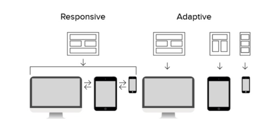
The most obvious difference between adaptive and responsive design lies in their respective layouts.
Responsive design is liquid and will automatically adapt to the user's device regardless of the screen size. With the adoption of CSS media queries, this kind of design method can auto-change the display style depending on the target device. This is an easy way to solve display problems created by different screen sizes.
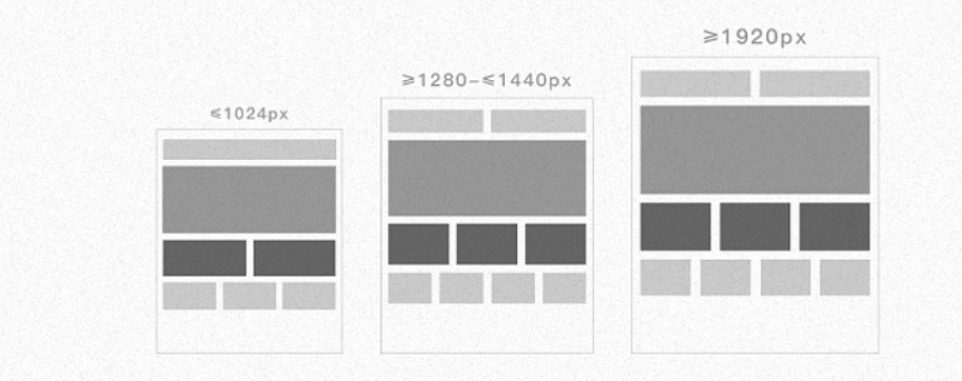
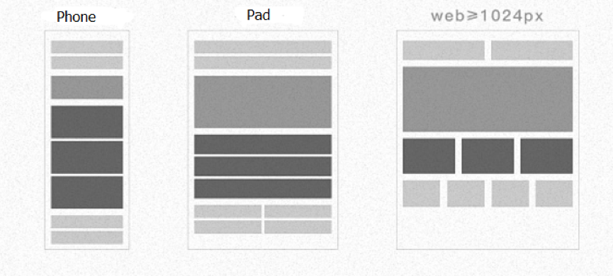
Adaptive design is built on the use of a static breakpoint, with a page not open to adaption once it has loaded. Here a work layout is loaded that is appropriate to the screen size of the device. To achieve this, the designer needs to take all mainstream display sizes into account and design corresponding layouts. Thus, the correct screen layout will load and display when a user visits a website. This is a great way to make your website user-friendly.
When you design an adaptive site, there are generally six common screen widths: 320, 480, 760, 960, 1200, and 1600.
Secondly, these two forms of design each have different strengths and advantages.
The advantages of Responsive Design:
- · User-friendly and flexible on different screen resolutions.
- · Unified visual and operational experience on multi-terminal, with low maintenance costs.
- · SEO friendly with no page version distinction, keeping the SEO strategy consistent.
- · Able to connect between mobile and desktop sites can be completed without redirection.
In fact, responsive design incorporates many aspects of adaptive design. Any website using responsive design will adapt to both web and mobile browsers, and the site frame will automatically make appropriate adjustments after recognizing the screen width. It's easy to detect when an application was created by professionals, and if you want to get user-friendly website mockups, you can hire dedicated Vue js developers. Of course, the layout and display of the content may be subject to change.
The advantages of Adaptive Design:
- · Compatible even with some complicated sites.
- · Can be implemented at a lower price.
- · Time-efficient coding.
- · Easier testing and more accurate operation.
In theory, there is no huge difference between responsive and adaptive web design. But a responsive layout is better than an adaptive layout in most cases. Another feature is that adaptive design can make your design more manageable as you only need to consider a few states. But in practice, many responsive design problems can crop up in the implementation phase, and adaptive design can be easier to implement and test.
Which is better, responsive or adaptive web design?
So, how do you decide which is the right approach for you? Let us share some insights that will help you make up your mind.
First, think of your users and the type of device they tend to use to access your site. If you know what would best suit your users, it will be easier to pick the design method for your layout.
Second, are you working on an existing site or are you creating a new one. Responsive design is usually better for new websites starting from scratch, while adaptive is better suited to the task of retrofitting an existing site.
Check out the 20 Best Responsive Web Design Tutorial to Get You Started.
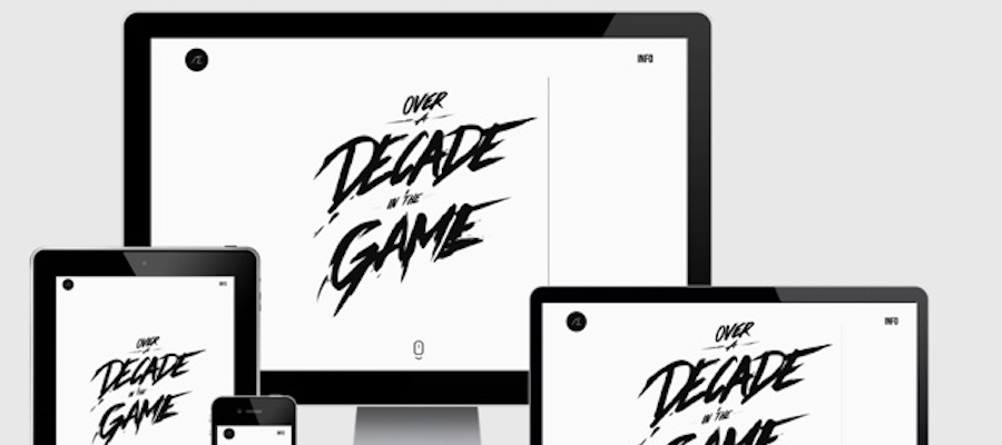
Examples of adaptive and responsive design
Both responsive and adaptive methods are used in web design, but what do they actually look like? We have ten web design examples both, five adaptive and five responsive, that we hope will give you some inspiration.
Five examples of adaptive web design:
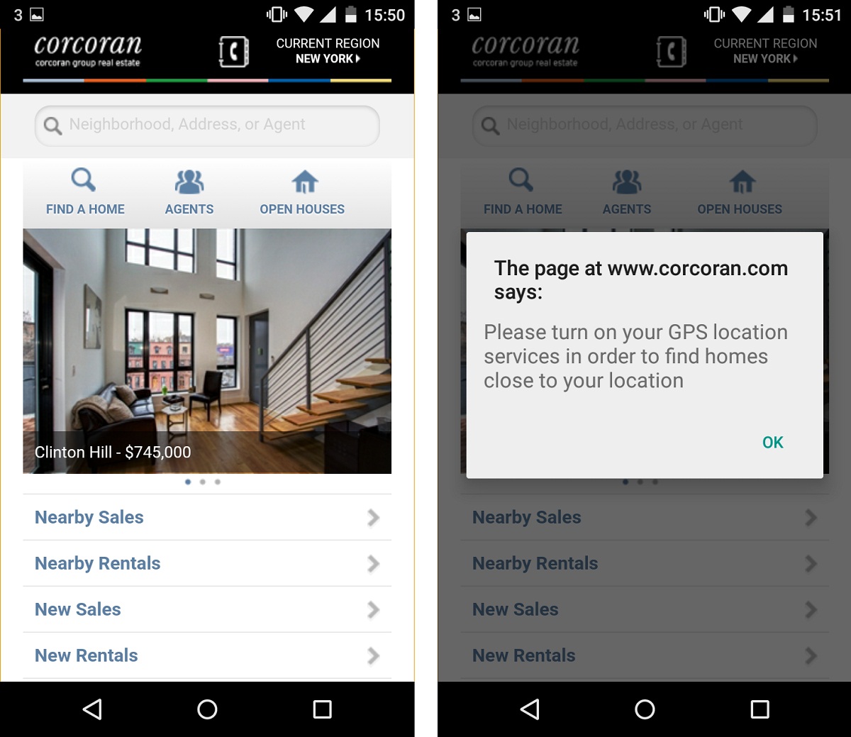
1. Corcoran
Corcoran is a famous New York real estate firm. It uses adaptive design to help improve performance and enhance its users’experience. It has a great number of features to provide potential home-buyers and renters with a list of amenities.
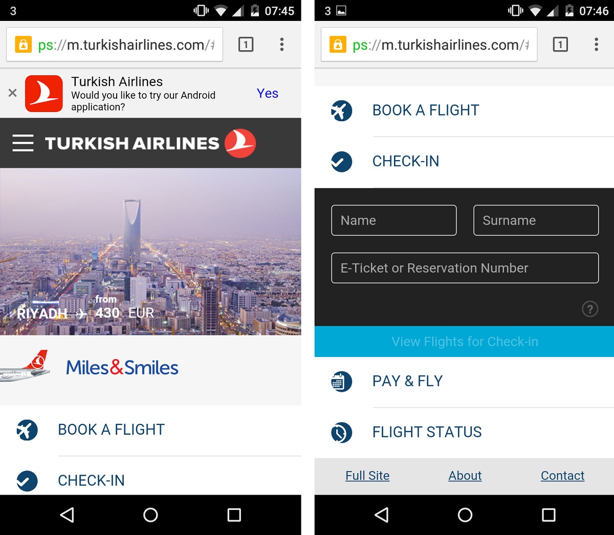
2. Turkish Airlines
Turkish Airlines uses adaptive design to give its users a better choice of experiences. Users can choose between desktop website, mobile website, and mobile app.
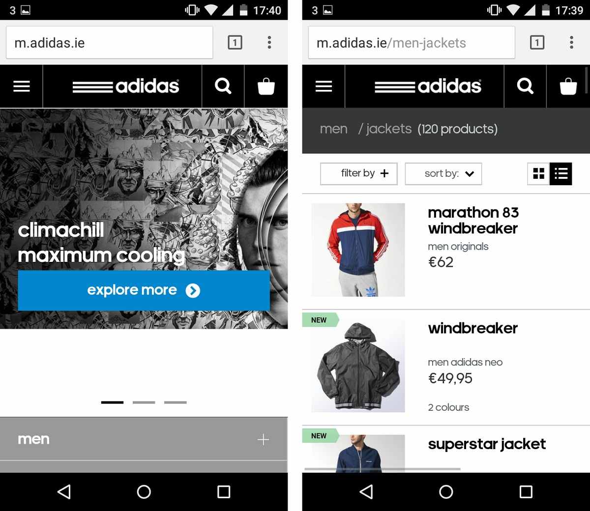
3. Adidas
Adidas is a world famous brand. Its use of adaptive design gives users and mobile visitors a better shopping experience.
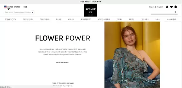
4. Avenue 32
Avenue 32 is an online luxury shopping site using adaptive web design.
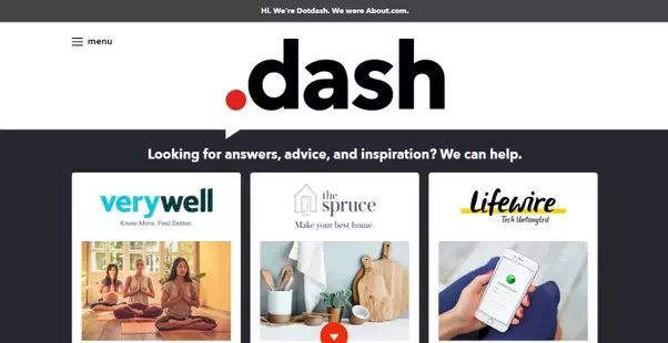
5. About.com
About.com has adopted adaptive web design to ensure that its web pages load quickly and work on all different devices.
Five responsive web design examples:
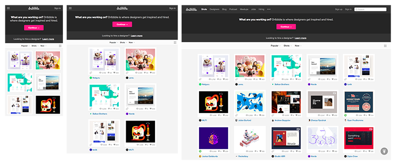
1. Dribbble
Dribbble is a website using CSS to ensure its columns automatically rearrange themselves to fit the size of the screen or browser window.
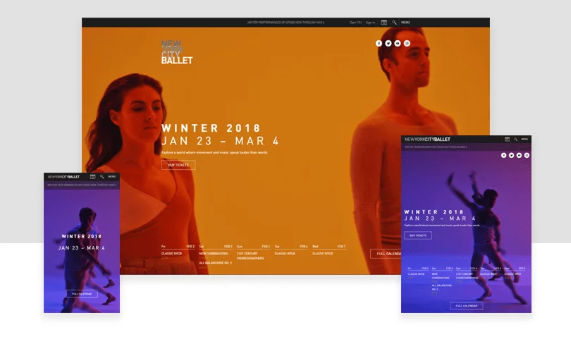
2. New York City Ballet
New York City Ballet is a typical responsive website that is able showcase its best performances on all kinds of devices.
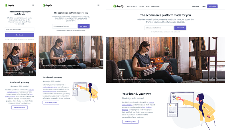
3. Shopify
Shopify has amazing user experience that is consistent across all devices. The responsive design makes all the button and illustrations change smoothly between desktop and mobile devices.
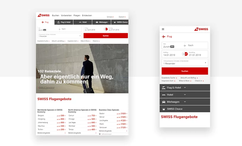
4. Swiss Air
Swiss Air is a very responsive website that most web designers have studied carefully. It maintains its bold call to action on all platforms.
5. Alexander Engzell Portfolio
Alexander Engzell is a responsive Swedish design studio website.
You can find even more responsive web designs from the 20 Inspiring Examples of the Best Responsive Web Design.
What’s next?
If you prefer wireframe or prototype responsive design, you can get moving faster and easier with Mockplus, a powerful product design platform where you can do prototyping and hand-off, collaborating with your whole team.
In conclusion
Having explained the differences between responsive and adaptive design, we hope you will now appreciate how almost any kind of design idea will have both advantages and disadvantages. As a designer, you will need to keep up to date with all the mobile or web design trends to enable you to choose the best solution that will suit the demands of each individual project.
Free prototyping tool for web and mobile app design
Get Started for Free
Free prototyping tool for web and mobile app design
Get Started for Free
Free prototyping tool for web and mobile app design
Get Started for Free


 Join our Discord community
 support@mockplusapp.com