Interaction Design, also known as Interactive Design (IxD), is the field to design the behavior of human-computer systems. As an interaction designer, we have to create the content and functions of products that are useful, easy to use, user-friendly, technically feasible, and of commercial interest. All of these are meant to improve the user experience. This article is going to talk about 10 basic principles of interaction design. Whether it is for the traditional graphical user interface or for any smart electronic devices, you can’t find it more useful.
1. Follow the user's mental model
Most of users are operating the interface just based on their instinct. In short, when they encounter a button, they will think this button will be triggered to meet their needs. But if this button get triggered in some other operation ratner than user's expectation, it must be a bad design.
2. Meet the user's needs
The most basic principle of interaction design is to meet the user's needs. To determine the user’s requirements is a product manager's basic work, there are many ways and UX tools to help us identify the user's needs. For examples, observing user behavior, analyzing data, building user scenarios, and more.
3. Consistency
Consistency is a fundamental principle in the product design process. It requires that within the same or familiar functions and scenes, to use the consistent performance, operation, and feeling in a (or a category) product. The purpose of consistency is to reduce the user's learning costs, the user's cognitive costs, and the probability of misuse. Let me show you an example:

If I told you this is a part of the poster from a famous company, do you know which one? Ok, a little hint for you, a beverage company. That’s right, it’s Coca Cola, here is the original poster.
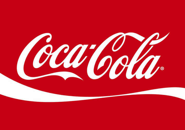
Why the first picture does not appear Coca-Cola's logo, product images, product introduction and any other information, and you still can assure it is Coca-Cola? Because behind Coca-Cola, there is a system called VI (Visual Identity System) that guides all of its external image design. The essence of VI is the visual consistency through a high degree, to guide users to be forcibly associated with some kind of visual information and a business, or products.
The white streamers in the picture are actually the auxiliary graphics commonly used in the Coca-Cola VI system. The graphics appear on almost all Coca-Cola promotional materials. The colors (including the red background), the shapes, and the twisted angles are exactly the same, so when we saw the similar graphics and color, our brain will generate reactions "This is Coca-Cola,"immediately. This action drastically reduces a lot of cognitive costs.
In a certain type of product or an industry that can form a wider range of "consistent" and get everyone's recognition. At this time, consistency will become "standard."
4. Less is More
Originally proposed by architect Ludwig Mies van der Rohe, it is a design philosophy that promotes simplicity and opposes over decoration. This principle has a long history and led to many different interpretations in many industries. I think "less" is not to pursue so-called "simple", but is that we should do our best to reduce the user's cognitive and operational costs, this is the essence of “less” in the internet industry.
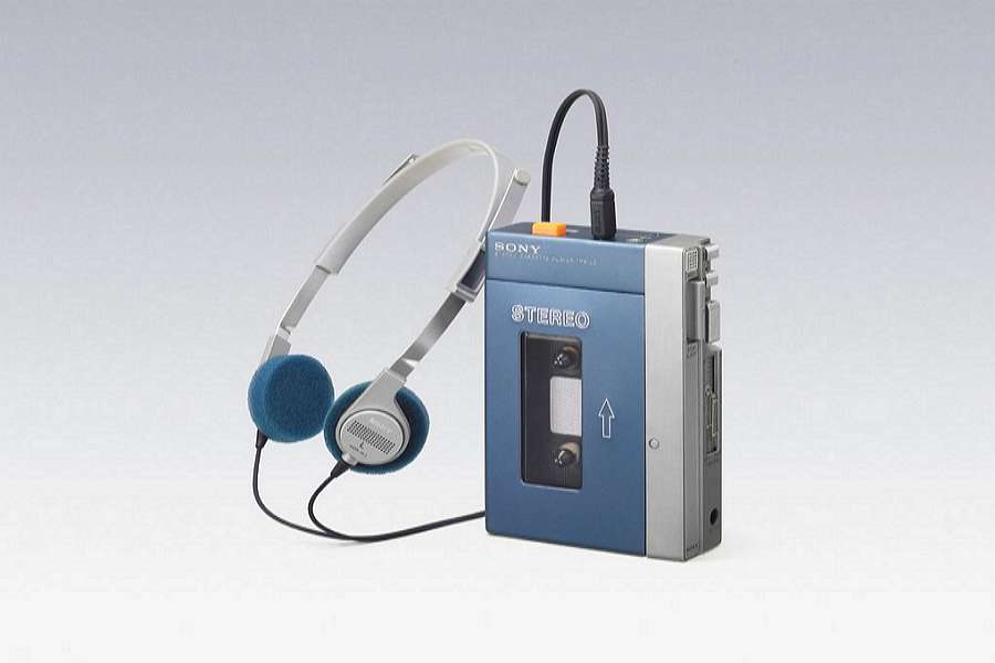
In 1979, Sony found that most users had far greater demand for playing than recording, so they removed the traditional recording function of the recorder, and even removed the essential external speakers. Moreover, they put the remaining part in a small box with a stereo headset. This is the Walkman.
In 2007, Apple streamlined the phone's keyboard, and even cut off the traditional physical keyboard. Then, they launched the iPhone. Well, you all know the following story.
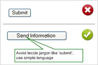
5. Use simple language instead of technical terms
Users are not a designer or a developer, most of them do not understand the design concept and development process, the language and text of the product must be easy to understand and very close to general user's thoughts. However, we need to think users are busy people instead of not smart people. So we have to optimize some functions for middle-class users.
6. Design for functional than the aesthetic
Good-looking interface will not only please the user but also reflect the upgrade iterations of the product. However, it should be noted that the functionary of product design is more important than the aesthetics. We can’t lose the basic operation to achieve unnecessary beauty. In most cases, we should obey standard normal operation principles.
When it comes to art, many people are put the "design" and "art" together. In my opinion, design is completely different from the art. To put it simply, art gives people a sense of "feeling", while the designed products are helping people to solve problems and needs.
But we have to admit that sometimes a little "emotional feeling" is needed beyond function. So in many cases, if a small "design" can make the user smile, even if it is useless, it is also a “good design”. Look at New York subway poem below:
Overslept.
So tired.
If late,
Get fired.
Why bother?
Why the pain?
Just go home.
Do it again.
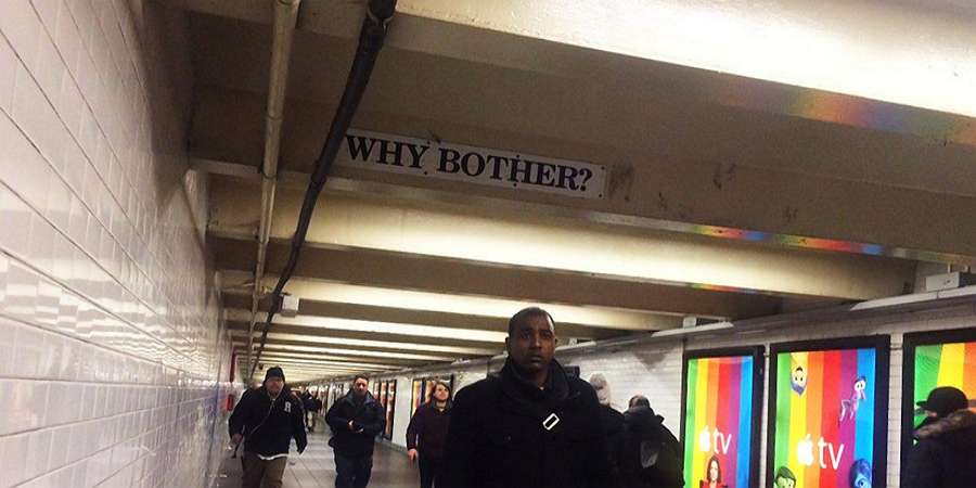
The poem, by Norman B. Colp, is aptly titled "The Commuter's Lament. “As swarms of city-dwellers make their morning and evening trek between the high-traffic subway stations, they need only to glance up to see a sympathetic message.” Who can say that is a bad design?
7. Don’t make me think
This principle is throughout the user experience design. My understanding is to use the most simple way to help users achieve their goals in the shortest time. That is a good user experience product.
8. Intuitive
Correct operating parts must stand out obviously and can convey the correct information to users. Also, the user can operate the interface based on his/her life experience and instinct, no extra learning.
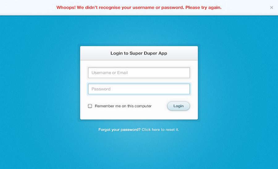
9. Allow user making mistakes
When the user operates the interface, the mistakes that they made must be allowed. Because this may not user's fault but a design problem. And when the user is making a mistake, it should provide effective information to guide him to the right operation path. We need to avoid the error-prone situation, or check and confirm the options before the actual action prompts to the user.
10. Provide feedback
The "communication" between people and machines is essentially the process of information transmission. The process of Information send out and get back will form an effective interaction and mutual understanding. So the timely effective feedback and explanation are particularly important.
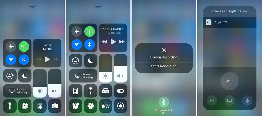
When the user performs certain operations in the human-computer interaction interface, the system must give the feedback to the user in the form of discoloration, shape change, vibration, light emission, etc. immediately. The purpose is to inform the user that their operation is known by the device. For example, the design of the control center of iOS 11 design will highlight the clicked icon by the user and use a different color to let the user know his operations is completed, and the un-clicked icon will be grayed out so that the user can see the feedback at a glance of his operation.
Takeaway
In order to convey the user's needs in the prototyping design, Interaction designers need to clear out the interaction process and information architecture when drawing the wireframe. Whether it's a high-fidelity prototype or a low-fidelity prototype, interaction design is the key to the entire product design. You need to follow the above 10 basic principles, but also need a simple and practical interaction prototype design tools to improve your design efficiency. Mockplus, is an interaction prototyping tool that can achieve a fast interaction with simple drag-and-drop. It has 200 built-in components, allowing you to quickly design the menu, navigation, list and so on.
Conclusion
Interaction design is "user-centered design", user experience plays the most important role in it. To grasp some interaction design foundation knowledge is important, but the greatest part is to let user can operate and master the product easily, also, interact with it, establish the basic cognitive ability of the product, so that the product's operating mode can meet the design intent. In this case, we should pay more attention to Service design, not just UX design.
Free prototyping tool for web and mobile app design
Get Started for Free
Free prototyping tool for web and mobile app design
Get Started for Free
Free prototyping tool for web and mobile app design
Get Started for Free