The UI design landscape is changing tremendously fast. And, to stay competitive, you need to keep pace with these trends and implement them as soon as possible. To understand the importance of tracking industry innovations, let’s take a brief chronological overview.
2016 was the year of the Pokémon Go craze, blurring the lines between the real life and the digital world. In 2017, iPhone X was launched, taking mobile user experience to a whole new level. Consequently, these innovations brought some significant changes to the overall UI design world, in terms of the colors, fonts, imagery, videos, and animations used. Moreover, the way we interact with the websites through our devices has changed a lot.
This is exactly why, in 2018, UI designers are expected to make the most of the above mentioned trends, delivering web designs that are highly personalized, user-friendly, and time-saving.
So, what are the innovations we could possibly expect to see? Most importantly, how and why should we use them?
1. The Rise of Immersive Interactivity
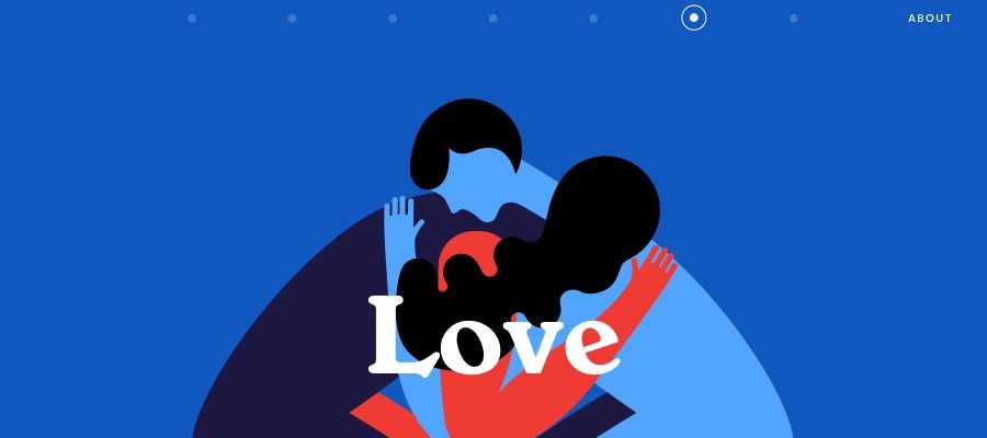
An old saying claims that a picture is worth a thousand words, and UI designers couldn’t agree more. This is exactly how the idea for a large, full-screen website background was first created. Given users’ preferences and tendency to engage more with enriched digital content, it’s not surprising at all that this immersive website experience is estimated to replace image carousels and gain ground in 2018.
Immersive Images Stay Relevant
Full-screen website images boost user engagement in numerous ways. Apart from making your website look awesome on all screens, their greatest strength is their interaction with a user. Namely, a single, large image stands for your brand quality and tells your story in a brief, clear, and engaging way. This is why you need to choose it smart. Here are some things you need to keep in mind:
Choose a photo that makes sense for your niche and brand. It needs to tell your target audience what your site is about.
It needs to be authentic. You could either hire someone to design an image for you or turn to a photo stock site, as a much affordable and yet effective option. If you decide on the latter solution, you need to be careful. Make sure that you choose a photo stock website that features the photographs you can use commercially and edit them additionally.
Go with high-resolution images only. An image needs to be large enough to display well on all screens and, at the same time, it shouldn’t burden the loading time.
Full-Screen Videos will Gain Ground
If a picture says a thousand words, what could we say about videos? Images have long been the backbone of UI design and their success has gradually paved the way for their obvious successors- rich, full-screen videos. Numerous websites have already integrated them into their home pages and we must say that they look awesome! The reason why full-screen videos have become that popular lies in a fact that they are extremely dynamic and engaging. Most importantly, they work really well on single-page websites, as well as with flat and minimalist design. Accompanied with the right typography, immersive videos make a memorable impact on users, convey your brand message effectively, and serve as a brilliant method of visual storytelling.
2. Borderless Display Redefines the Rigid Grid
If the right image is all it takes to deliver an amazing brand experience, then Apple has already got the most of this practice. Namely, when they announced the launch of their iPhone X with a borderless display, a lot of buzz was created around its influence on UI design, in general. Namely, they started a new trend of redefining strict grid concepts in web design, encouraging fluent storytelling.
In web design, a grid offers consistency, balance, and order. It gives a sense of familiarity to users, allowing them to click through a site smoothly. On the other hand, grids can be highly restrictive, limiting designers’ creative possibilities. Attempting to build digital experiences that break these traditional standards, many UI designers are experimenting with the layout by breaking the grid. This allows them to create interfaces and apps that are altogether unique, by adding a pinch of layering, motion, and depth.
3. Bold Typography Replaces Traditional Fonts
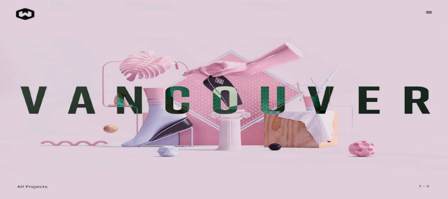
Typography is yet another great feature for UI designers to experiment with when developing highly personalized web design. As you could have probably noticed, the majority of these trends go hand-in-hand, complementing each other, and creative typography is a great example of this. When combined with imagery, video, animations, colors and unconventional layouts, it brings an outstanding user experience. Precisely because of this, it will become a crucial aspect of UI design in 2018 and beyond, transitioning from the traditional graphic design practices to a more creative and experimental landscape. What you can expect to see is bold and fancy fonts instead of done to death system fonts that have been used so far.
4. Personalization Boosted with Vivid Colors
In 2013, flat design was born, spreading like wildfire among UI designers. Based on muting colors and removing unnecessary details, it aimed to simplify UIs to their core. However, it became extremely popular and widely used, which resulted in websites that were too similar, lacking personality.
In 2016, UI designers redefined flat design, focusing on website personalization. Instagram was one of the first platforms to change their logo and switch from flat, dull-muted nuances to multi-colored gradients, and was followed by a wide range of famous brands. Moving in this direction, 2018 will be the year of vivid colors, injecting energy, warmth, and dynamics to your homepage. So, be brave and experiment with your colors, but choose and implement them wisely, ensuring that you create powerful, unique, and above all, eye-friendly whole.
5. Cards for Mobile Web and Apps Boost User Experience

In 2015, mobile devices officially overtook desktops as the most popular tools for browsing the web. Precisely because of this, UI designers are balancing between mobile and desktop to create a seamless user experience is on a steady rise. One of the most effective ways to do so is cards. Even though they are not some innovative addition to the 2018 UI trends, they still play a fundamental role in creating effective UI design. Containing text, photo, and link about a particular subject, cards are a brilliant way to organize and display a large amount of content on the screen. Most importantly, they are visually appealing, easily digestible, and well-optimized for thumbs. That’s why they are used by popular sites and platforms like Netflix, Pinterest, and Newsfeed.
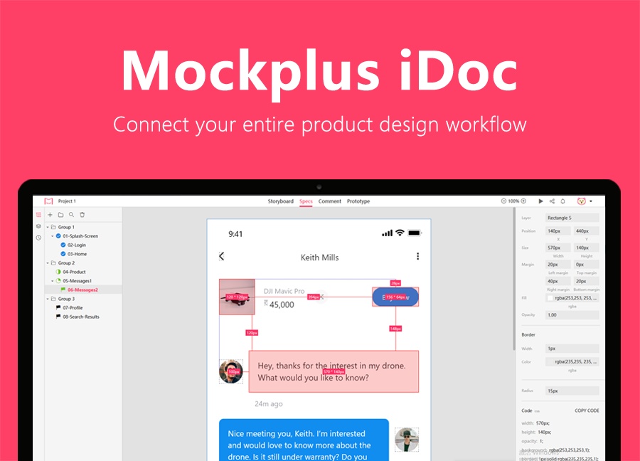
6. Best Product Design Collaboration Tool in 2018
If you are still worried about manually handoffing designs with asstes and spec. Mockplus Cloud is a powerful product design collaboration tool for designers and engineers. It goes beyond the design workflow and helps teams with the design hand-off. It greatly facilitates the handoff by taking designs from Sketch, PS, Adobe XD and exporting them into a format thatcan easily generate code snippets, specs, assets, style guides, interactive prototypes, etc.
To Wrap it Up
So, these are some of the most popular UI design trends that will gain momentum in 2018. As you could see, most of them will continue to follow the major 2017 UI design trends, from experimental typography to vivid colors. To perfect your website design and stay competitive, you should constantly keep an eye out for these changes.
Emma Miller is a digital marketer from Sydney. Works as a blogger, Senior Editor for Bizzmark blog and a guest lecturer at Melbourne University. Interested in digital marketing, social media, start-ups and latest trends.
Free prototyping tool for web and mobile app design
Get Started for Free
Free prototyping tool for web and mobile app design
Get Started for Free
Free prototyping tool for web and mobile app design
Get Started for Free


 Join our Discord community
 support@mockplusapp.com