Color is a fundamental way we perceive the world. In design, one of the first tools we are introduced to while learning color theory is the color wheel. The basic color wheel contains 12 colors: Three primary colors, three secondary colors, and six tertiary colors. Mastering colors is one of the most powerful tools in a designer's arsenal.
After all, how do you know where to start when it comes to using analogous colors in your design? How can you choose the right color scheme to keep your design looking as good as possible? This article will give you the answers. We'll explain what analogous colors are, why they work so well, how to implement them in your own design and more. Let's dive right in.
What are analogous colors?
Generally speaking, analogous colors are a group of three colors next to each other on the color wheel, composed of one dominant color (usually a primary or secondary color), then a supporting color (a secondary or tertiary color), and a third color that is either a mix of the first two colors, or an accent color that pops. When these three colors are grouped, they are called an analogous color scheme.
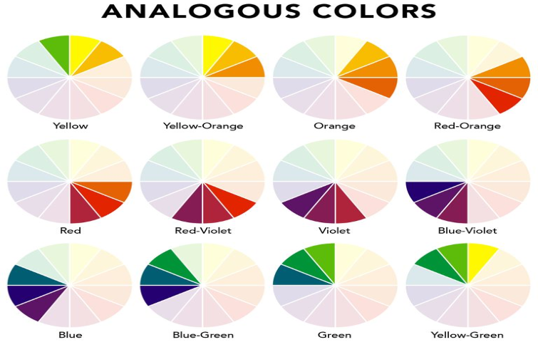
As we can see from the color wheel, the three analogous colors provide a low-contrast experience, as all colors fall in line with one another. These colors usually match well and create serene and comfortable to look at designs.
Why use analogous colors?
The term analogous refers to having analogy, or corresponding to something in particular. The following are the reasons why designers use analogous colors:
They create a visually pleasing and calming display;
They can help express the type of expression they wish to emphasize in their designs;
They can help to create a rich, monochromatic look;
They are best used with either warm or cool colors, creating a look that has a certain temperature as well as proper color harmony.
As for website and app designs, the application of analogous colors is a viable option. It can provide a seamless flow to the design that creates a soothing effect on the eyes.
How to create an analogous color scheme for your design?
When you start thinking about how to include analogous colors in your next design, it's important to make sure you define your analogous colors early on in your design system tools. That way, no matter which designer is working on the project, the color set you choose from will be easy to source from start to finish keeping your colors consistent throughout.
Now, let's take a look at how to create an analogous color scheme:
Step 1. Set the tone of your business
Each color carries a specific human emotion, and the psychology behind the color is what you need to tap into when making your choice of color. If your brand stands for happy, cheerful, and bright, your base color can be yellow. Similarly, if you are creating a brand that is more inclined towards nature, organic, and biodiversity then your base color can be green.
Step 2. Choose a primary color (red, blue & yellow)
As we mentioned above, an analogous colors scheme has three colors in the most conventional sense. You can pick any color at any point of the wheel and note its direct neighbors, to either the right or left. A great way to have an analogous color selection is to start with a primary color (i.e. red, yellow, or blue) and use the secondary and tertiary colors as accents.
Step 3. Add more contrasting colors and avoid being boring
Once you have your primary, secondary and tertiary colors, the next step is to use these analogous colors for your designs - you need to be creative about it. What we mean by this is, you need to be cautious about confusing simple with boring.
Step 4. Apply the 60-30-10 rule
Many designers embrace the 60-30-10 rule, which is used to ensure a peaceful, visually appealing balance. Under this rule, 60% of your space will be the base color, 30% will be your accent color, and 10% will be your accent or color that ‘pops’.
Step 5. Be more inclusive
Having an inclusive design means that your product is designed to reach as many people as possible. For example, certain color palettes can’t be viewed by certain groups of people, such as those with color blindness or color vision defects. Blue, on the other hand, can be seen by more than 99% of color blind people, so it's a more inclusive color.
Examples of analogous color schemes
To better understand how you can start using analogous color schemes in your designs, let's take a look at some of the possible color combinations available:
- Yellow – Yellow-green, yellow, yellow-orange
- Red – Red-orange, red, red-violet
- Violet – Red-violet, violet, blue-violet
- Blue – Blue-violet, blue, blue-green
- Green – Blue-green, green, yellow-green
From what we have learned from the above information, it can be easier than you think to find a color combination that works within your website's design principles.
Now let's have a look at some analogous color scheme examples with the help of which you can get some idea regarding how to use these colors for your website design:
Cool and Fresh
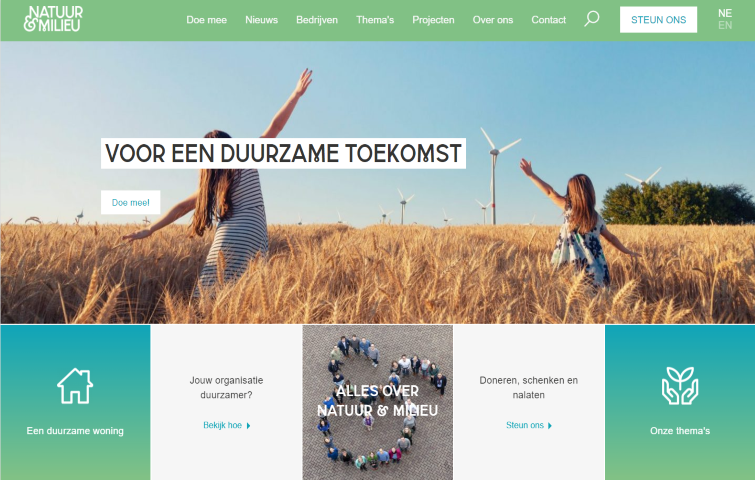
This page uses an analogous colors scheme to give a clean and refreshing feel. The combination of emerald green and dark imperial blue makes people feel as if they’re in a natural environment, this type of color scheme is ideal for websites or apps intended to convey a calm and reliable image.
Stylish and Sophisticated

This elegant and analogous color scheme brings together dark muted tones to create a clean and sophisticated look. Its shades of gray and blue are ideal for more conservative designs.
Clean and Energetic
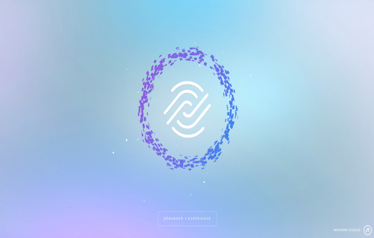
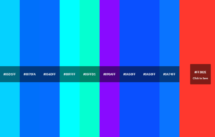
This site uses shades of blue and violet, making it pleasing to the eye. At the same time, it evokes peace and energy. The combination of blueberry, sky blue and amethyst gives life to a refreshing and pleasing color combination suitable for any design intended to inspire positive emotions.
Pink and energetic
The developers of this site have used pink, black and blue color combinations. They have used all these colors in a smart way by making the whole background use pink, which is considered as one of the lightest from the Red color section, and complementing it with a light purple and blue.
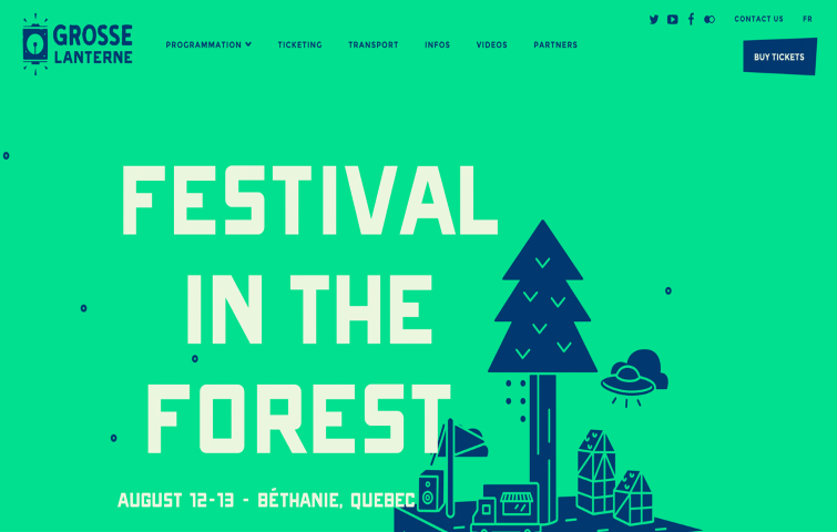
Dark and cool
This site uses two main analogous colors that are brown and green. With the help of the design, it would be easy to notice they have made the whole website a dark themed one. The combination of various design elements and the overall website design make it a great and impressive website with a nice color scheme.
Close to Nature
This site uses an earthy combination of green with a range of blues, from pale cerulean to teal blue, which would be perfect for a conservative design intended to create an image of stability, reliability and richness.
Unique combination
This site uses a range of dark pinks as an analogous color scheme with blue and white to make it a unique and engaging combination that can be used for a range of projects in different fields.
Blue and green
For this page, the developers have used blue and green combinations of analogous colors, which gives an impressive look that depicts calmness and wholesomeness. They also used different shades of green and blue, which made the whole site revolve around similar colors without creating too many color variations.
Rose Red and Blueberry
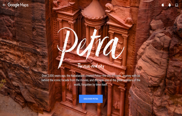
This page uses a range of pinks and reds for an analogous color scheme with a bright blue call-to-action button to create plenty of visual interest that draws attention to itself immediately.
Blue and Refreshing
A range of blues, from bright lapis lazuli to aqua blue, make this a reserved but beautiful and analogous color scheme. It can be used for a variety of different visual effects, from soft corporate projects to design-related projects, as in this example.
Best color picker tools for designers 2023
We have discussed a lot about analogous colors and have shown you many examples. I bet you now have a comprehensive understanding of analogous color. But are there some tools to help you choose the right color or use the right combination of colors for your logo, brand, or website? We are here to help. The following are some of the best color tools you can not afford to miss out on.
Coolors

Coolors can help you create, save, and share perfect palettes in seconds. You can also get inspired by thousands of beautiful color schemes. Coolors is a great way to find color scheme inspiration since it allows you to explore new color combinations and sort through the best ones voted by the community.
Color Hunt
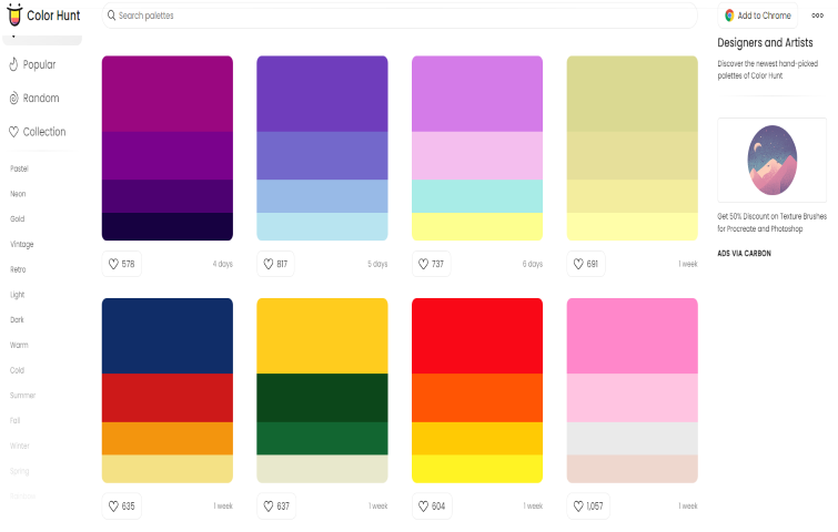
Color Hunt is a carefully curated collection of beautiful color schemes, updated daily. Designers can also sort colors by new, random, and popularity (voted by the community). The reason why designers like it is that these are of high quality and the color generator is simple to use.
Adobe Color CC

Adobe Color CC is a simple tool that’s great for designing color themes and palettes. Not only can you create your own color schemes, but you can also explore ones others have created.
Khroma

Khroma is an AI color tool that learns to generate colors you like and block the ones you don't. You need to select 50 colors that you like first and then click the palette icon to view your results.
Colordot
Colordot is an excellent free online tool for creating color palettes. You can select and save colors by using simple mouse gestures. You can click on the TOG icon to see the RGB and HSL values for each color.
Colormind
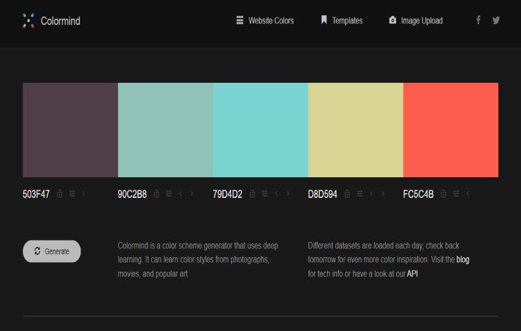
Colormind is a color scheme generator that uses deep learning. It can whizz through different palettes at the click of a button. All colors are shown with their hex codes, and if you want to slightly tweak the color then you can also do that easily.
HueSnap
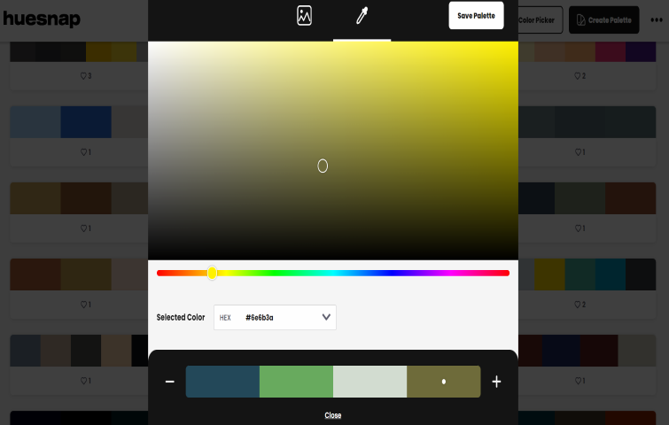
HueSnap can help you create beautiful color palettes to share and inspire others. You can create customized palettes by extracting the colors from an existing image or by using the color picker tool.
Wrap up
To figure out what looks best for your design, you need to incorporate your brand's color scheme with your goals. Feel free to use different shades until you find an excellent aesthetic combination.
As a designer, using an analogous color scheme is an effective way to connect with your audience on a visual and emotional level, while helping to maintain the principles of design unity. Additionally, with the above comprehensive guide about analogous colors, you can effortlessly level up the aesthetics of your design.
Free prototyping tool for web and mobile app design
Get Started for Free
Free prototyping tool for web and mobile app design
Get Started for Free
Free prototyping tool for web and mobile app design
Get Started for Free