When it comes to user interface design, there are a lot of things should be done well so that an interface meet the needs of the target audience. One of the vital parts in UI creation is color choice. Without any doubts, color is a core building block of any UI.
Creating a color scheme for a product might seem like a hard task (especially if you do not consider yourself a graphic designer). But in reality, it’s not as complicated as many people think. And there are quite a few tricks we can employ to create great color scheme in no time.
In this article, I’ll describe what UI color scheme is, share a few tips on color scheme creation, and provide a few useful tools that will help you with that.
UI color scheme is a combination of colors used in your user interface. Almost every scheme contains the following groups of colors:
Primary and secondary colors are base colors of your UI. Primary colors are the colors used most frequently in your UI. Designers usually choose brand colors as primary colors. As a rule of thumb, it’s recommended to have no more than three primary colors.
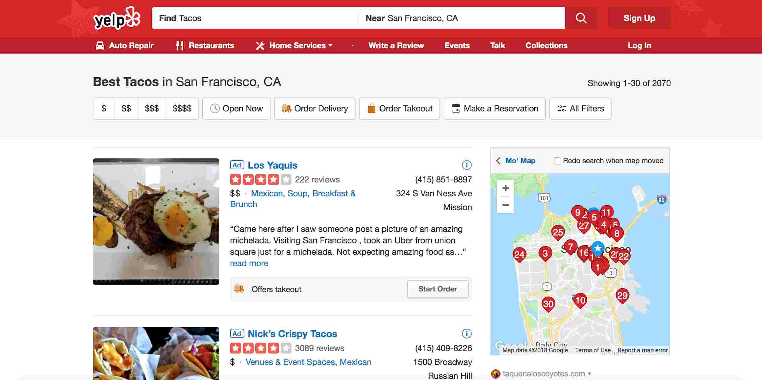
Yelp uses its brand red color in multiple parts of a website.
Besides primary color, designers can make up secondary color set. Secondary colors are optional, but they provide more opportunities to distinguish your product. For example, by adding in a secondary color, you can make your UI more interesting.
Accent colors are colors used to emphasize some UI elements such as buttons or progress bars, or to highlight some information. Accent colors usually have more brightness and saturation — such visual properties make UI elements pop off the screen and encourage user interactions.

Notice how accent color of floating action button is used to prioritize it visually. Image: Material Design
Neutrals have a supportive role in UI design — these colors are usually made for text and background. Most often neutrals are represented by greys.
Semantic colors are signaling colors — they used to deliver information about success, error, warning. UI designers often reserve a specific tone of red for errors, green for success, yellow for warning, and blue for informational messages.
Now when you have a basic understanding of what UI color scheme is, we can discuss the ways we can create our scheme.
Some colors go well with each other, while others will clash. If you don't consider this fact, you’ll end up designing UI that make users feel uncomfortable.
Hopefully, there’s a simple way to create a harmonious color combination. Traditional color scheme patterns such as monochromatic, analogous, complementary will help you to create a scheme that will work fine for your product:
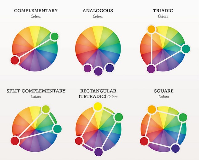
Different color schemes. Image: oss.adm.ntu.edu.sg
The best color combinations come from nature. Why? Because real-world color variations always look natural for a human eye. Look to the real world for reference cues — go for a walk and take a few shots, or search for beautiful nature photos online. You will definitely find the inspiration.
Usually, designers choose primary colors and secondary colors for UI based on the brand’s colors. It helps to achieve consistency — app or website design will look familiar for people who have previous experience with a brand.

McDonald’s uses familiar colors on it’s website. It helps distinguish a brand and allows visitors to create consistent experiences.
Humans are visual beings and colors we see can influence the way we feel about the design. When we perceive a particular color, our brain process this information and gives signals to the body to release hormones responsible for the mood and emotions. That’s why psychology should plays a vital part in the process of color selection. Each color symbolizes different emotions.
Additionally, designers need to remember that the way different people perceive colors can vary. The factors like age, gender, can have a significant impact on color preferences. That’s why to create a perfect color scheme you need to get to know your target audience first.
Applying color to design has a lot to do with balance. Generally, the more colors you use, the harder is to achieve a balance. That’s why it’s recommended to use a limited number of colors in a scheme. For some products like mobile apps, you can do amazing things with just one single primary color. The trick is to use dark and light variants of primary color. You can create darker color variations by lowering brightness and increasing saturation while brighter color variations can be produced by increasing brightness and lowering saturation.
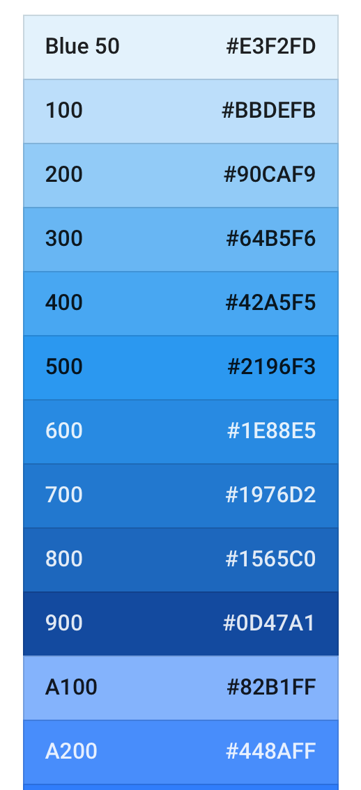
Variations of blue color
Take a look at the Facebook app for iOS. The primary color of this app is blue, and it’s a dominant color on this page. Facebook uses dark and light variations of a blue color.

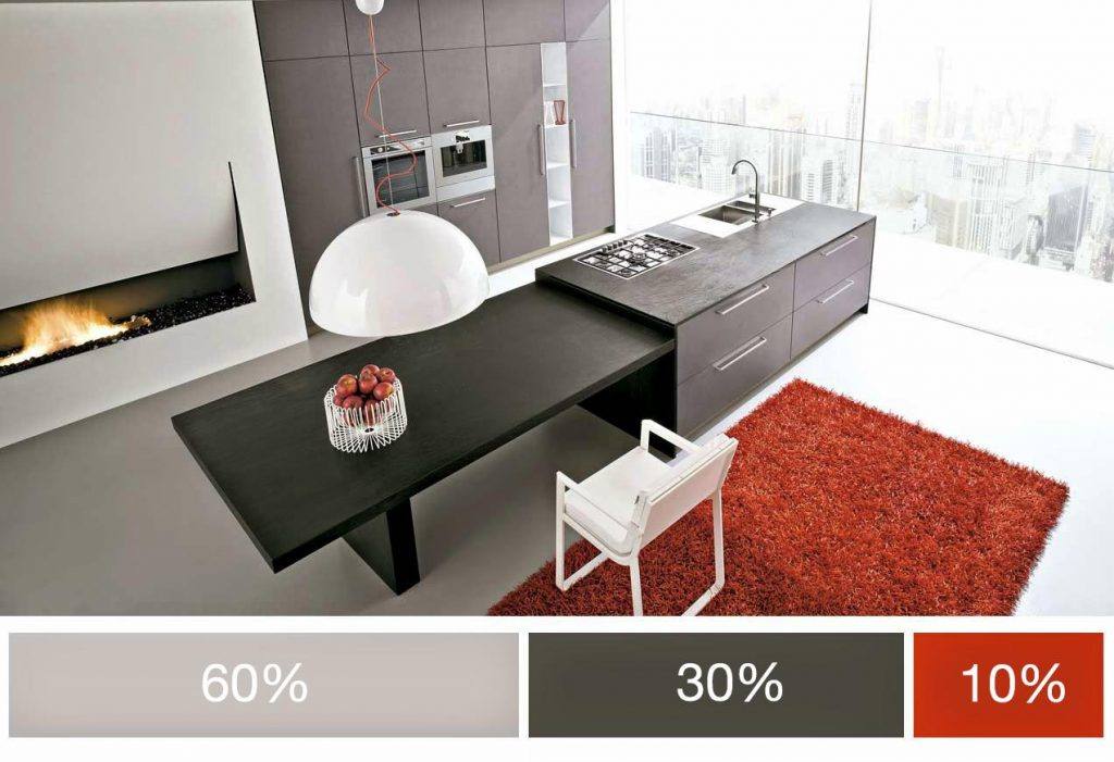
Even with a limited color palette, it might be hard to create a harmonious color scheme. Many designers face a problem of color proportions — it might be tough to understand what percentage of color in UI should be in comparison with the other colors.
Hopefully, a simple rule known as ‘60–30–10’ can help you to create a proper balance. This technique came from the interior design — it’s often applied for house decorating. The rule is straightforward — to bring the balance into the composition, the colors should be combined in the proportion of 60%-30%-10%. By following this rule, you’ll have 60% of your dominant color, 30% for your secondary color and 10% for accent color.
When creating a UI, designer’s primary goal should be ensuring that everyone has a great experience when they use a product. It happens when a design is accessible for all groups of users, including people with visual impairment. The designer responsible for color must be familiar with WCAG 2.1 rules and incorporate the practice into a color selection.
Two foundational rules of accessibility should be applied to every UI design:
To complement our quick guide for creating a color scheme, we also include a variety of tools which will simplify the task of creating a unique UI color scheme.
Coolors.co is a great tool for picking colors. All you need to do is to lock a selected color and press space to generate a palette. Alternatively, you can upload an image and make a color palette from it. The tool allows exporting color combinations to different formats such as SVG.
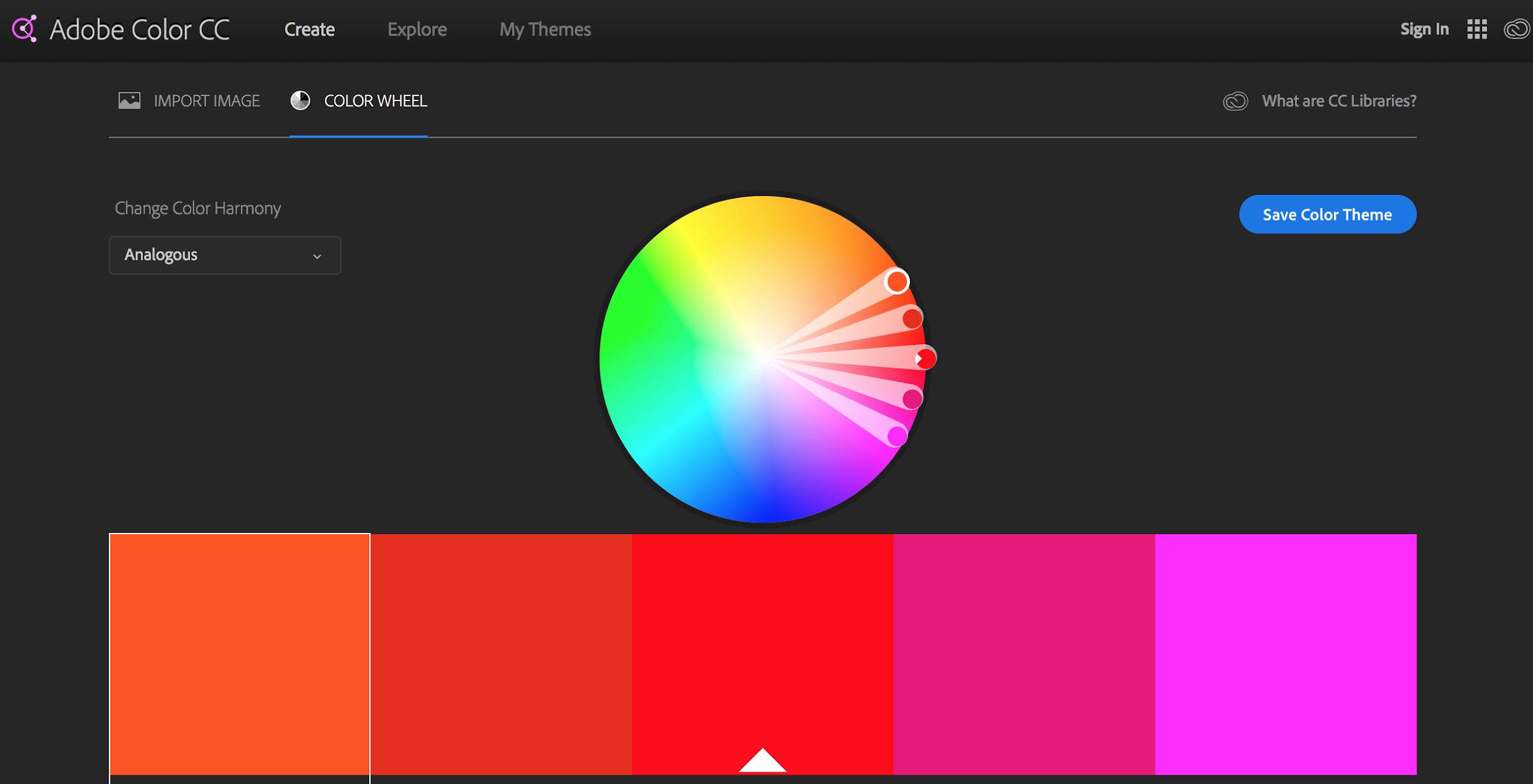
Adobe Color CC allows you to use a color wheel to create a color scheme. Created scheme can be exported into Adobe Photoshop. Color CC also provides an excellent collection of thousands of color combinations from the creative community.
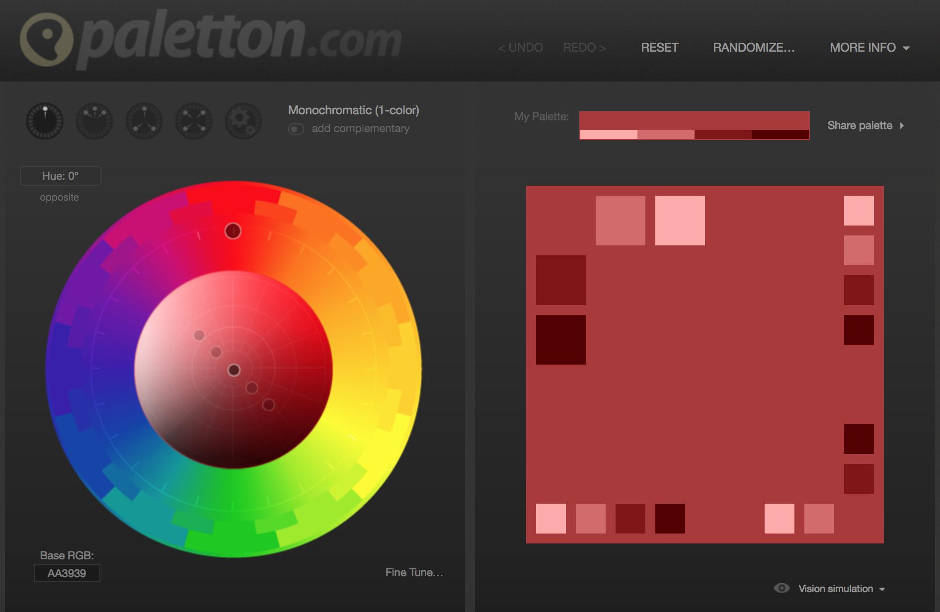
Paletton is similar to Adobe Color CC. The key difference is that you aren’t limited only to 5 tones. This feature comes handy when you have primary colors and want to play with additional tones.
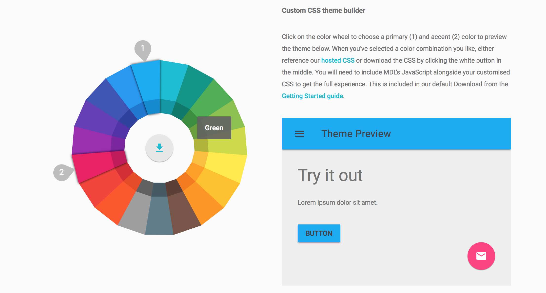
Google’s MDL Color Customizer is an excellent tool for Android developers. It enables users to combine primary and secondary UI colors for Android app.
Mockplus is a great prototyping tool which allows you to build an ideal UI design. Mockplus provides a color picker tool which can be used to get specific color properties of elements.
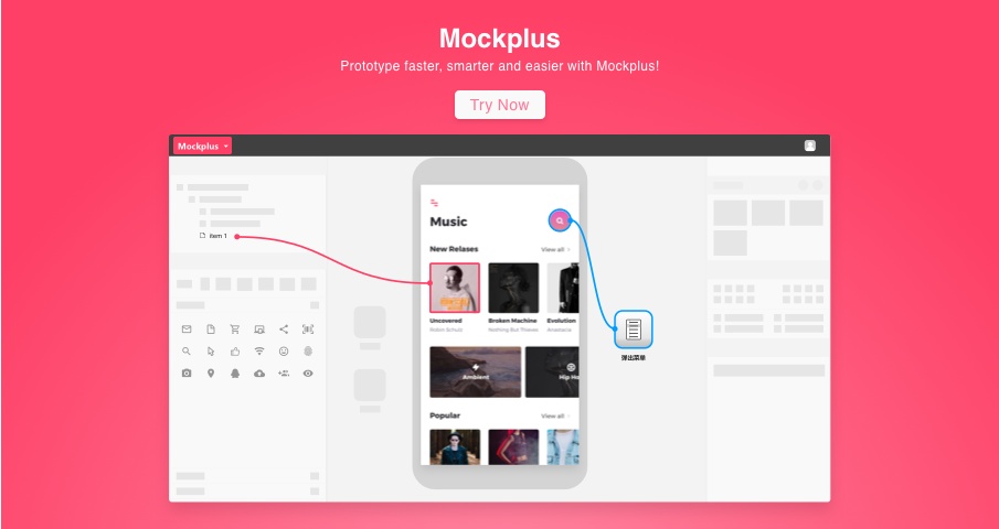
Mockplus provides color picker function
Color is the cornerstone of UI design. When choosing colors for your UI, keep in mind that there are no wrong colors. What matters most is how you use them. Take your time to create a palette that works the best for your product and apply it harmoniously across a UI.
 Mockplus RP
A free prototyping tool to create wireframes or interactive prototypes in minutes.
 Mockplus DT
A free UI design tool to design, animate, collaborate and handoff right in the browser.


 Sign up with Google
 Join our Discord community
 support@mockplusapp.com