In our daily lives, we are heavily reliant on a plethora of applications, and the app marketplace is becoming increasingly saturated with a myriad of choices. How can your app stand out and attract users in the crowded landscape in their first glimpse?The significance of a well-crafted app icon can not be overstated. In this article, we will explore the multifaceted realm of app icon design and give your a comprehensive understanding of it. Let's dive into the details and unlock the secrets to creating captivating icons.
What is an app icon?
An app is small graphical representation of an application displayed on a user's devices such as mobile phone, pad or PC. The app icon serves as the virtual face of your application, acting as the initial point of contact with potential users. As users scroll through app stores flooded with a myriad of choices, your app icon must not only capture attention but also convey the essence and purpose of your application in just a second. It's the first impression that can determine whether a user decides to explore further or move on to another option.
What should be included in app icon design?
Although the app icon is of a tiny size, there are plenty of elements that should be included to clearly convey brand and stand out among other apps. Here are some essential elements that should be included in an app icon:
Distinctive brand elements: Infuse the icon with distinctive brand elements that serve as visual anchors, fostering brand recognition. Align the icon's aesthetic with the broader brand identity, utilizing consistent colors, typography, and design motifs to strengthen the app's association with its overarching brand.
Color and contrast: Color, and contrast are essential elements that can greatly impact the icon’s visibility and appeal. While contrast helps ensure that the icon is easily recognizable and distinguishable, even in its tiny sizes.
Shape and composition: The shape and composition of your app icons can singnificantly influence how users perceive your app. You can use simple geometric shapes such as circles, squares or triangles, which are visually appealing and easy to recognize. Or create custom shapes that are unique to your brand or app to set your icon apart from competitors and enhance brand recognition. Moreover, speaking with composition, a clear hierarchy of visual elements within the icon is also needed. The most important elements should be prominent and easily distinguishable, guiding the viewer's attention.
10 best practices to create your own app icons
As we mentioned, app icons should convey the essence of your applications and also be visually appealing to attract potential users. So, with this purpose in mind, here are 10 best practices to get your there.
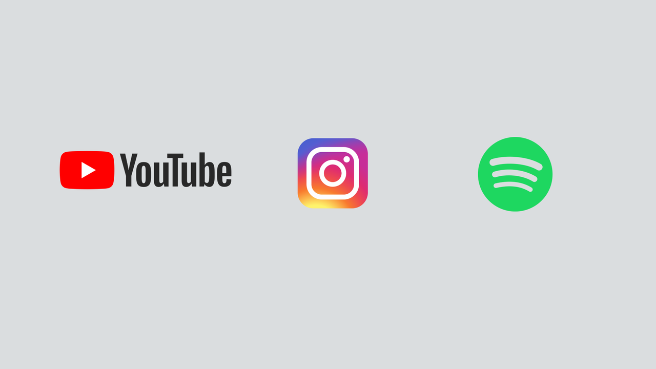
Simplicity: simplicity is a foundation principle in app icon design. As we know, an app icon is a pretty small image. A simple and uncluttered icon is more likely to be visually conprehensible, especially on this small image. By examing major brands’ icons such as Youtube, Instagram, Spotify, you can find out that their icons only contain just a couple of vibrant colors and simple shapes, while remains appealing and memorable.
Relevance: Your icon should reflect the core features or purpose of the app through symbols, imagery, or shapes. Make sure the icon communicates what the app does, giving users a clear idea of its functionality and branding. Let me also use Youtube's icon as an example, as a popular video-sharing platform, its icon design has traditionally been characterized by simplicity, recognizability, and alignment with its overall brand identity. It consists of a red play button symbol positioned within a white square background, which immediately communicates the platform's primary function: video playback.
Strategic Color Scheme: A carefully curated selection of color palette should not only adheres to the app's overall design language but also exploits color psychology such as complementary, analogous, or triadic color schemes, informs. The selected colors should evoke specific emotions or associations while harmonizing with the broader visual theme of the application to enhance brand coherence.
Scalability: Design the icon to be scalable across different devices and screen sizes. Ensure it remains clear and recognizable whether displayed on a smartphone, tablet, or other devices.

Be Cautious with the Use of Text: You should minimize the use of text, especially if it might be difficult to read at smaller sizes. If text is necessary, keep it short, legible, so that it can be easy to read and doesn't crowd the app icon.
Stick to Platform Guidelines: Different operating system and app marketplace, such as iOS, Android, Windows and MacOS, have different desgning principles to guide app icon's size, shape, visual specification and all user interactions. Before you create a app icon, you should carefully read the platform guidelines and design with it in mind to compatibility and a seamlyess intergration into the user interface.
Stay Consistent Across Platforms: Although your app icon have to stick to different platform guidlines, you should use the same design elements like symbol, color and composition on your app icons to drive consistency across platforms and enhance brand recognition.
Differentiate Your Icon from Competitors': You should always check what your competitors are doing before you get your hands dirty. We can analyze their design intentions and gain inspiration from them. But our purpose is to stand out from them, so we have to learn from them and try to blend their nice tricks into our design, meanwhile try to differentiate from them.
Do Enough Testing: An app icon is actually part of your product. Then it's important to do some necessary tests to solicit user feedback and analyze performance among real users. The common-used method is A/B testing methodologies. It allows you to compare different app icon designs and choose the one that performs the best in terms of driving downloads and user engagement.
Keep Updating: Keep in mind that design elements, including icons, are subject to change, and it's advisable to check the most recent design iterations on official platforms or design guidelines and continually refine your design to align with evolving visual trends and user expectations.
5 App icon design resources for inspiration
Seeking inspiration from various design resources before embarking on your own app icon design can be pretty valuable. In this way, you can explore different styles, get inspired and stay informed on design trends. Here we handpicked 5 app icon design resources and websites where you can spark creative ideas from.
Dribble: Dribble is a design community where talented designers all over the world showcase their work, including app icons. You can browse through a wide array of design styles, color schemes, and creative concepts. Designers often share not only their final creations but also their design processes, offering valuable insights into the reasoning behind each meticulously crafted app icon.
Behance: Behance is another popular design platform for designers globally to showcase their portfolios. It features a diverse range of design projects, including app icons. Behance allows you to explore case studies and see how designers approach different aspects of icon design.
Pinterest: Pinterest is a visual discovery platform where users can curate boards and pin designs that ignite inspiration. You can uncover meticulously curated collections of app icons by searching for terms like " app icon design" or " mobile app icon inspiration". It provides a dynamic space for designers to gather, share, organize and resonate with diverse visual inspirations and collect visual ideas.
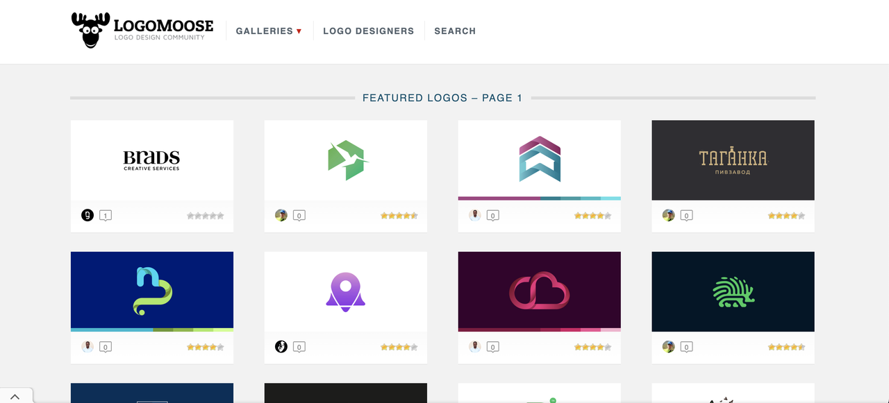
Logomoose: Logomoose is a logo and design community where designers share their work. While focused on logos, it includes a variety of design styles that can inspire app icon creation.
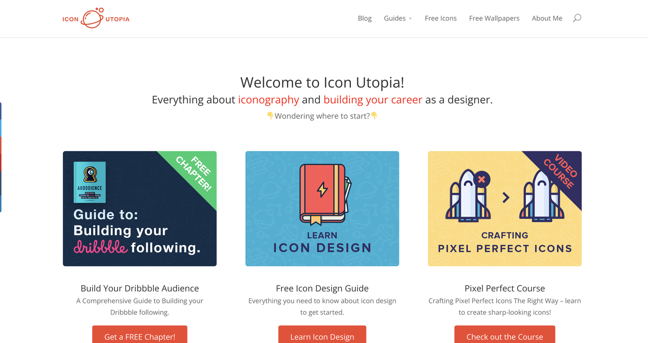
Icon Utopia: Icon Utopia is a blog and resource hub dedicated to icon design. It provides articles, tutorials, and showcases of well-designed icons, offering valuable insights and inspiration.
FAQ:
How do I make a picture of my app icon?
Here are general steps you need to go through to create a picture of your app icon.
Choose the right tool
Choosing the right tool for designing an app icon depends on various factors, including your design preferences, skill level, and the specific requirements of the platform where your app will be published. Here I recommend some nice choices for you.
Mockplus RP: A powerful web-based prototyping & design tool with super intuitive interface.
Adobe Illustrator: A software application for creating drawings, illustrations, and artwork using a Windows or MacOS computer.
Figma: A web-based design tool to create websites, applications, logos, and much more.
Refer to platform guidelines
Different platforms (iOS, Android, HarmonyOS, etc) have specific guidelines for app icons. Familiarize yourself with these guidelines to ensure your icon meets the platform's requirements.
Design your icon
Think about the visual identity of your app, the color scheme, and any branding element. Then create your icon with the right tool.
Export the icon
Different platform might have different formant requirements for app icon. Choose the file format you need and export the image.
What are some common mistakes to avoid when designing an app icon?
Designing an app icon requires careful consideration to ensure it effectively represents your app and stands out in the crowded app marketplace.Here are some common mistakes you should avoid to ensure effectiveness.
Overly complex design: Including too many details or intricate elements that make the icon look cluttered and difficult to understand.
Too Many Colors: Using a color palette with too many colors can make the icon visually overwhelming and less cohesive.
Inconsistent With Branding: Creating an icon that does not align with your overall brand identity, leading to confusion among users.
Using too much or Tiny Text: Including small or intricate text that is difficult to read on smaller screens.
By avoiding these common mistakes, you can increase the chances of creating an app icon that is visually appealing, memorable, and aligned with your app's identity and purpose.
What size should my app icon be?
Ensuring that an app icon adheres to size specifications can be a challenging endeavor due to the diverse standards set by various operating systems, such as iOS, android, windows, harmony OS. Make sure to check the design guidelines of the platforms your app is designed for before you get started. Usually, at a minimum, designers must comply with size recommendations for famous manufacturers such as Apple and Google.
Standard App Icon: 180 x 180 pixels
iPad Pro (3rd generation) App Icon: 167 x 167 pixels (with rounded corners)
- App Store Icon (Marketing):
1024 x 1024 pixels
- Spotlight and Settings Icon:
80 x 80 pixels (with rounded corners)
60 x 60 pixels (with rounded corners)
Android App Icon Sizes:
- Launcher Icons:
Standard: 48 x 48 pixels, 72 x 72 pixels, 96 x 96 pixels, 144 x 144 pixels, 192 x 192 pixels (all at 48dp)
Google Play Store Icon: 512 x 512 pixels
Status Bar Icons: 24 x 24 pixels, 32 x 32 pixels
Small Notification Icons: 16 x 16 pixels
Large Notification Icons: 64 x 64 pixels
- Action Bar, Tab, and Dialog Icons:
Action Bar and Tab Icons: 32 x 32 pixels, 48 x 48 pixels
Dialog Icons: 24 x 24 pixels
- Feature Graphic (Google Play):
1024 x 500 pixels
Please note:
These size requirements are only for reference. The size standard is evolving all the time. You should always refer to the latest official guideline files.
Should I include text in my app icon?
As we mentioned in this article. You should avoid unnecessary texts in the app icon. App icons are often viewed in smaller sizes, especially on mobile devices. Including too much text may cause the icon cluttered and reduce the readability. Also, a text-free design may allow for more creative and versatile iconography, contributing to a modern and aesthetic look. If text is deemed necessary for your app icon, do limit the text to a short and concise representation of your app's name or a key feature. Such as the logo of photoshop, only use the abbreviation of its app's name.
What format is an app icon?
The format of an app icon can indeed vary depending on the platform and operating system for which the app is developed. Different platforms may have specific requirements for the file format, size, and resolution of app icons. It's always crucial for developers to refer to the official documentation and guidelines provided by each platform to ensure that the app icons meet the specific criteria for that platform. Here are format requirements for some popular platforms:
Windows: Its common formats include ICO (Windows icon) and PNG.
macOS: Its preferred format for app icons is ICNS (Apple Icon Image format).
iOS: The primary format for iOS app icons is PNG. And also iOS supports vector-based PDFs for app icons.
Android: Android app icons are commonly in PNG format.
Web Apps: Web app icons are often specified in the HTML code using the "apple-touch-icon" for iOS devices and "manifest.json" for Android devices.
How can I ensure my app icon stands out in the app store?
Ensuring that your app icon stands out in the app store is crucial for attracting potential users among a sea of competing apps. But how? In general, you should use vibrant colors, a distinctive shape, and a design that is unique but also aligned with your brand. Also conduct research on competitor icons to ensure yours stands out. Follow the app store's guidelines for design and consider how your icon will appear in search results. By carefully considering these factors and incorporating them into your app icon design, you increase the likelihood of capturing users' attention in the app store and encouraging them to explore and download your app.
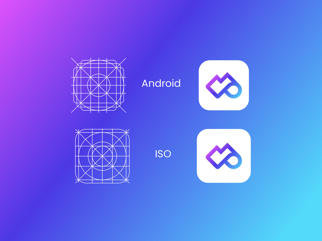
Can I use the same app icon for both iOS and Android?
No. As we mentioned, every platform possesses distinct design guidelines and aesthetic preferences for app icons. Although it's technically feasible to employ the same app icon for both iOS and Android, to ensure that your app maintains a cohesive and refined visual presence on each operating system, it's typically recommended to conform to these platform guidelines.
Conclusion
In conclusion, a well-designed app icon play a pretty important role in the highly competitive landscape of mobile applications. It acts as a visual anchor. In interfaces with limited space, small icons have the ability to convey meanings in a simple and efficient manner, providing users with accurate and friendly guidance.
So, there is no doubt that it's worth investing sufficient time and creativity into your app icon design, by which you can ensure a positive user experience and increase the likelihood of your app standing out in a crowded and competitive marketplace.
Ok, that’s all for today’s article. Designing an app icon can be a tricky process, but we hope that this article help you move forward with confidence. We can’t wait to see the icons you create!
Free prototyping tool for web and mobile app design
Get Started for Free
Free prototyping tool for web and mobile app design
Get Started for Free
Free prototyping tool for web and mobile app design
Get Started for Free