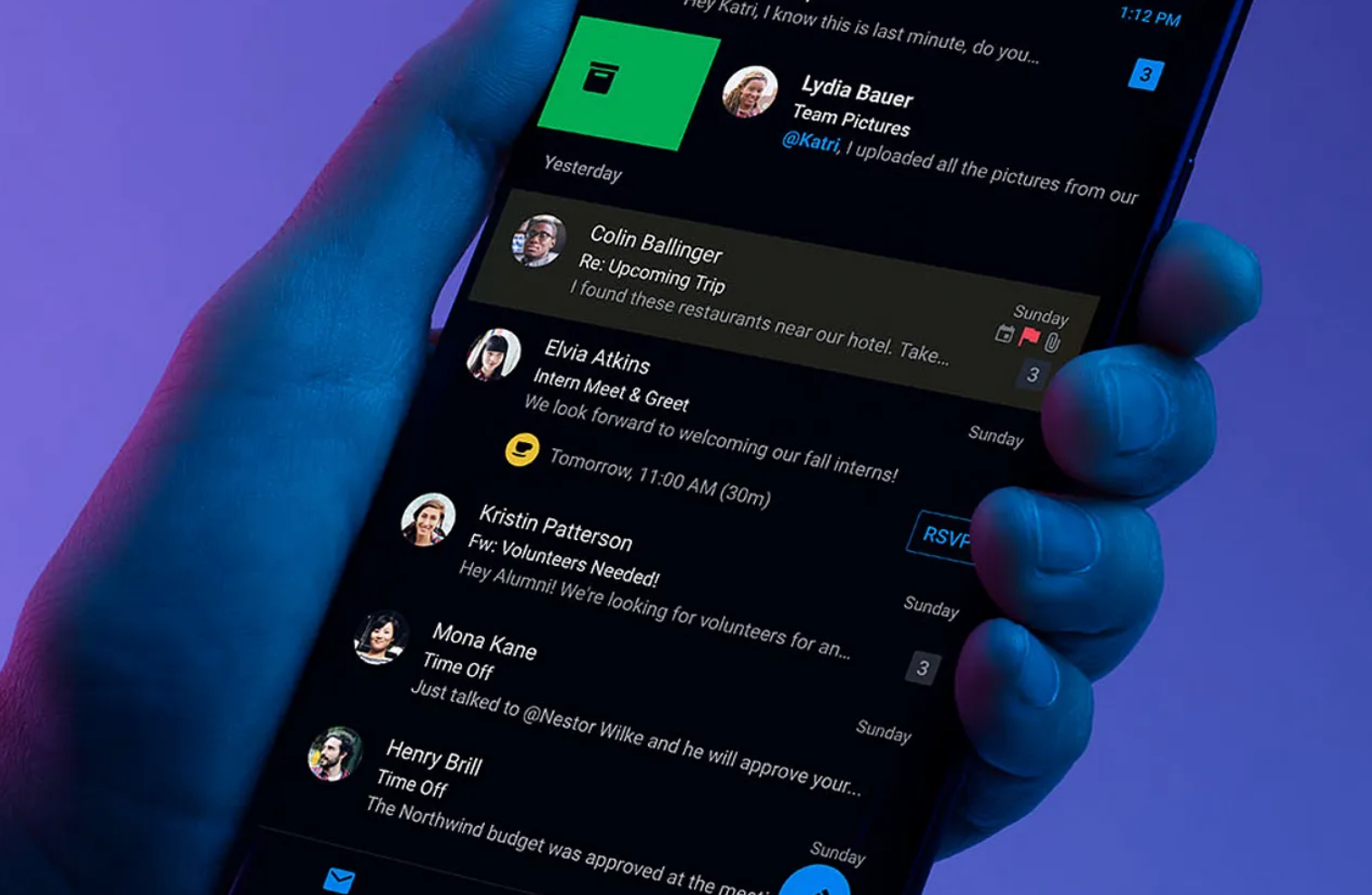
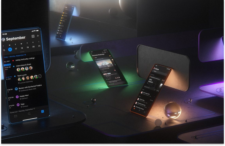
Dark mode has been rapidly getting popular over the past few years. We can see that more and more apps and websites are offering a dark mode option. It is now even considered as a standard feature in many digital interfaces. This trend is primarily driven by its ability to strike a delicate balance between enhancing readability and reducing screen brightness. It provides a more visually comfortable experience for users.
Today let's explore the magic of Dark mode together.
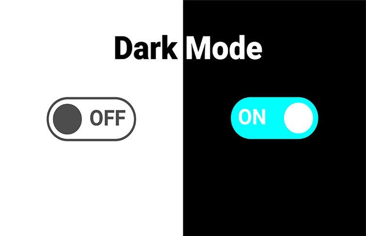
What is Dark Mode?
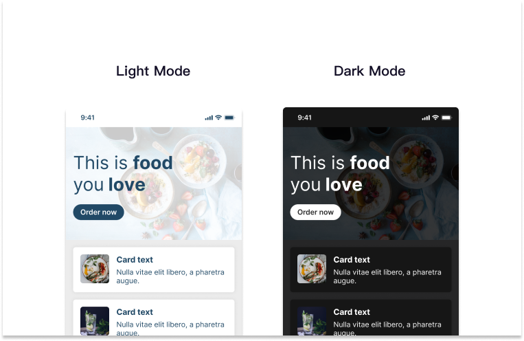
Dark mode, also known as night mode or dark theme, is a UI interface option that display content with a dark background, light-colored text and graphical elements, whether it's a website, mobile app, or operating system. It can reduce the amount of light emitted by device screens. Comparing to light mode, dark Mode can offer a more comfortable viewing experience and significantly minimize eye strain in low-light environments .
How to Create a Dark Mode UI Design?
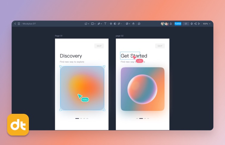
To create a dark-mode UI design effectively, the journey begins with a crucial decision – choosing the right design tool. In a market teeming with various UI design tools, each offering a unique set of features and capabilities, choosing a right tool for you and your teams lays the groundwork for a effective design process.
As you navigate through an array of options, considerations such as functionality, integration capabilities, and user-friendliness come to the forefront. Among the most popular UI design tools, Figma has gained widespread acclaim for its versatility, collaborative features, and user-friendly interface.
Although Figma is a great design tool, it can be quite expensive, especially for teams. I personally recommend a powerful design tool - Mockplus DT. It includes almost all the key features of Figma, but it costs only $8 per user per month, while Figma charges $12-$45 per user per month.
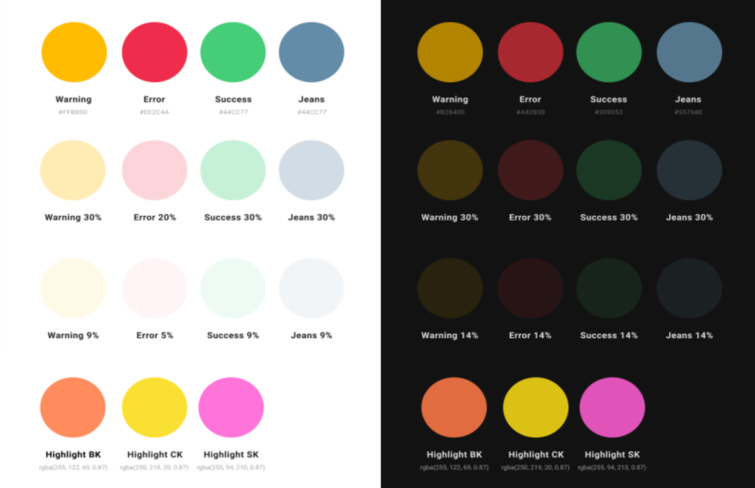
Once armed with the appropriate tool, attention turns to defining a captivating color scheme and achieving optimal contrast.
Color Palette: Choose darker and muted tones for dark mode color schemes and stay away from excessively bright or saturated colors, as they may strain the eyes and cause discomfort in dark settings.
Contrast Ratio: Make sure there's enough contrast between text and background colors for easy reading. You can use tools like the Web Content Accessibility Guidelines (WCAG) contrast ratio calculator to confirm that your chosen color combinations meet accessibility standards.
Typography: The choice of typography is also important. You should choose fonts that are not only aesthetically pleasing but also clear and legible against a dark background.
Then you can start creating the design and once it's done, you should also do some user testing. This includes comprehensive testing in different lighting conditions to assess the visibility and performance of the dark mode interface. In the way, you can get real user feedback during beta testing and uncover any usability issues, preferences, or areas for improvement.
8 Design Tips for Dark Mode UI
Implementing dark themes in application design demands thoughtful consideration. Here are some key tips to enhance the overall aesthetic and usability of dark mode UI.
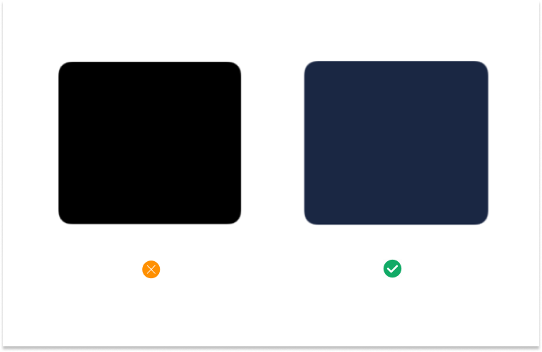
1.Avoid Pure Black
Pure black can be harsh on the eyes in low-light conditions. Instead, you should dark shades of gray or other muted tones to create a more visually comfortable experience. A dark color with a slight tint to reduce the starkness of the background while maintaining a dark theme.
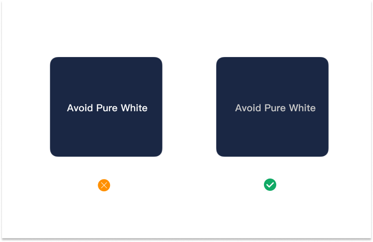
2.Avoid Pure White Fonts
Pure white fonts on a dark background may cause excessive contrast, leading to eye strain. Off-white or slightly grayish fonts can improve readability and reduce visual discomfort.
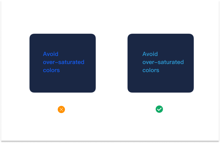
3.Avoid Over-saturated Colors
Overly vibrant or saturated colors can be jarring in a dark mode interface. You should choose muted or desaturated colors to maintain a harmonious and soothing visual experience.
4.Avoided Shadows
In dark mode, excessive or unrealistic shadows can disrupt the overall aesthetic and create visual inconsistencies. Minimize or eliminate the use of shadows to maintain a clean and modern design.
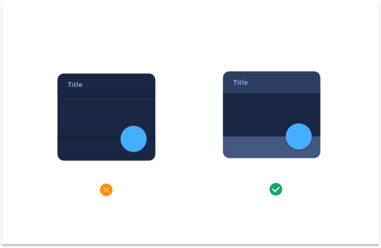
5.Communicate Depth
Similar to light theme design, when it comes to creating dark theme UI it’s essential to create hierarchy and emphasize important elements in your layout. In light mode, designers usually use shadows to express elevation. The higher surface gets, the wider a shadow it casts. But in dark mode, as we mentioned above, we should avoid shadows. It’s hard to see a shadow against a dark background. In dark theme, elevation is a tool designers often use to communicate the hierarchy of elements. Elevated surfaces and components are colored using overlays. The higher a surface’s elevation, the lighter that surface becomes.
6.Update Your Images
Images optimized for light mode may not display as effectively in dark mode. Ensure that your imagery database is reviewed and adjusted to maintain visibility and clarity in a dark-themed environment.
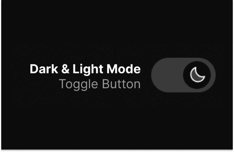
7.Give User Choices
You should always provide options for users to switch between dark and light mode. It empowers users to align the interface with their preferences based on factors like ambient lighting, time of day, or personal taste.
8.Test Across Devices
Dark mode may appear differently on various devices and screens. You should always conduct thorough testing across different devices, ensuring that your dark mode UI maintains its intended appearance and functionality universally.
In aditition to those 8 points mentioned above, there are absolutely many other points that need to be taken into consideration. Designers should be aware to consider all the aspects before using it for any of the projects.
30 Best Dark Mode UI Design Examples & Templates in 2024
Here are 30 Dark Mode UI Design examples & templates for some inspiration:
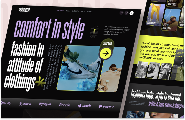
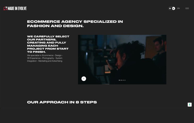
This is a dark mode website design for fashion brands with bold style and user centered user interface. It comes with stunning visual and color. It has almost all of the features of a business website. It’s suitable for any startup business, companies, agencies, and freelancers which need a aesthetical and professional way to showcase their product.
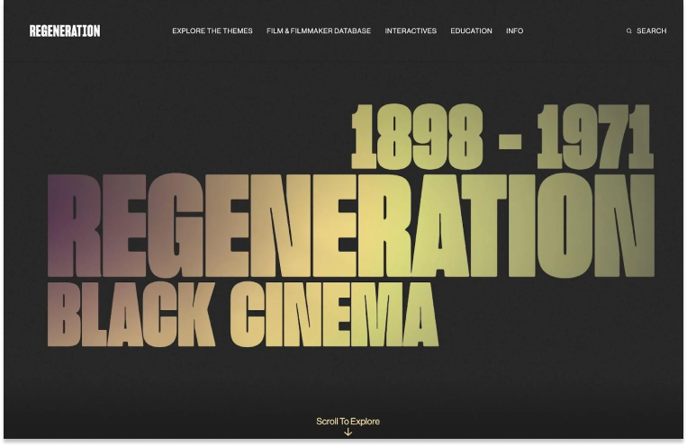
This website uses a classic black-and-white color theme in the hero section, but adds bright yellow text as users scroll down the page. The yellow text adds energy and creativity to the page. The website changes some colors on hover to differentiate different sections and engage visitors, which is a nice way to build on the classic black-and-white foundation.
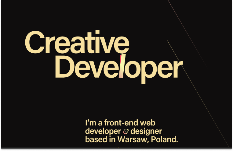
This is a front-end web developer and designer based in Warsaw, Poland. By using soft yellow instead of pure white, Peter's portfolio stands out against true black-and-white dark website themes. It also adds tiny color accents, such as the red on the "L" in "Developer." The small color accents add interest, especially because 99% of the design is just two colors.
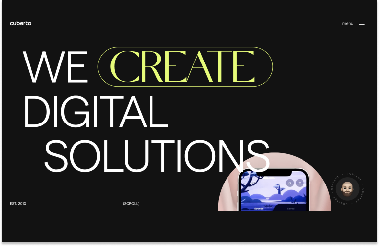
This is a digital agency located in Alexandria, Virginia. The Cuberto website uses a classic black-and-white color scheme, which is a classic dark website theme, and adds some interest with bright yellow accents. The yellow accent still adds some interest and energy to the design.
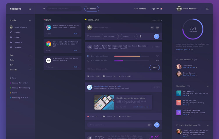
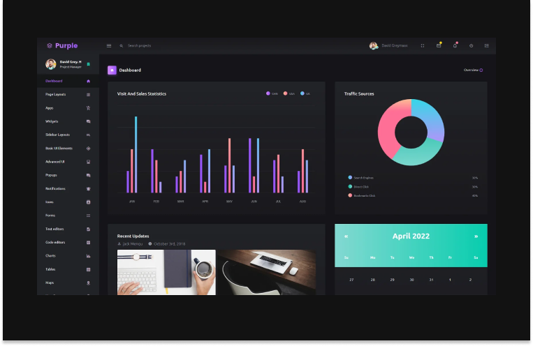
The Purple Admin template is intended to be simple, one-of-a-kind, and elegant. It has a well-designed and meticulously crafted dashboard with a plethora of neatly arranged components. The template also includes a number of charts and tables for data representation and visualization. Moreover , it also includes horizontal and vertical layouts.
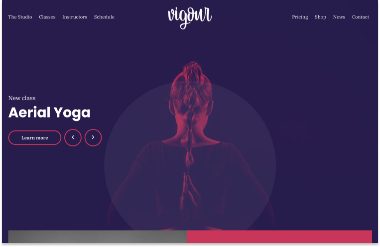
Vigour is an interactive WordPress dark theme template. It comes with parallax scrolling, stylish homepage elements, great typography, and a single-page layout to create any type of website. The theme features include unlimited color choices, custom backgrounds, mega menus and more.
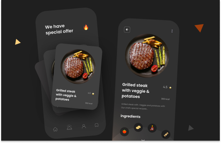
This is a dark theme design for food Apps. The shading inside the circle gives the impression of a physical plate that has space for each meal. The components are arranged in a round shape, making the entire appearance truly remarkable.
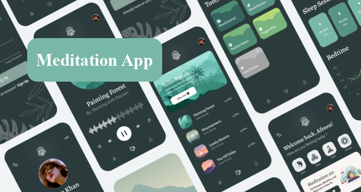
This free dark-themed app UI template is perfect for a meditation iOS app where you can meditate properly in a very comfortable way. It comes with a minimal and clean design and contains 11+ screens. It also simulates real user experience with prebuilt icons and components. Each screen is fully customizable and well organized.
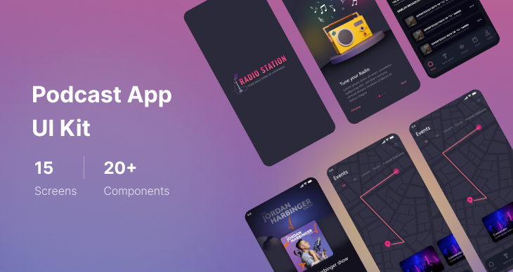
The Podcast is a free app UI template that you can use to create your own podcast, radio, and music player app within just minutes. It comes with a dark color theme and super clean interfaces, packing a total of 15 pages.
This app UI kit is also modern and minimal, and also easy to customize with fully organized layers that allow you to replace the colors, background, texts, and images, giving you the flexibility to create your own unique app. Best of all, it's free to download and use, so don't hesitate to give it a try and bring your ideas to life in the quickest way.
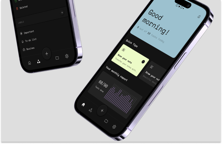
This is a personal notes app for users to create and edit their work or personal notes and upload any necessary corresponding files. It can help users plan and allocate their time effectively and not forget any upcoming events. The designer added bright and strong hues over a black background. The high contrast is amazing and the font brings a personal note to it.
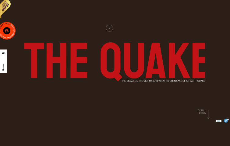
The Quake, an informative website dedicated to educating people on earthquake safety, employs a striking dark red background paired with bright red heading text. The intentional use of an all-red color scheme effectively conveys a sense of "danger" and heightened alertness, aligning with the website's mission. Furthermore, the choice of white paragraph text ensures optimal contrast against the dark red backdrop, promoting readability.
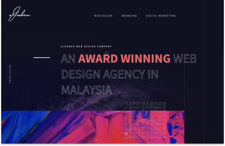
This is a web design agency based in Malaysia. It uses a dark blue-magenta background and light gray text. It then adds some energy and creativity with a pink-red accent. The pairing of the dark blue-magenta background and light gray text is a little softer than a classic black-and-white design. The sparingly used pink-red accent is very well done and adds creativity and energy.
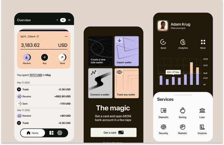
This is a dark-themed design for banking apps where you can view your expenses and income, pay for services and make transfers. The accent color — purple, contributes to the more trusting relationship of the user to the bank, and it has different shades to add most pleasant perception both among young and more experienced audiences

This is website of an Italian digital agency specializing in fashion and lifestyle, showcases its expertise through a classic black-and-white website theme complemented by distinctive purple accents. The website provides users with the flexibility to switch between light and dark modes. In the dark mode, the black-and-white composition is inverted, presenting a white background with black text. The use of purple accents adds a touch of visual interest to the design, contributing to a dynamic and engaging user experience.
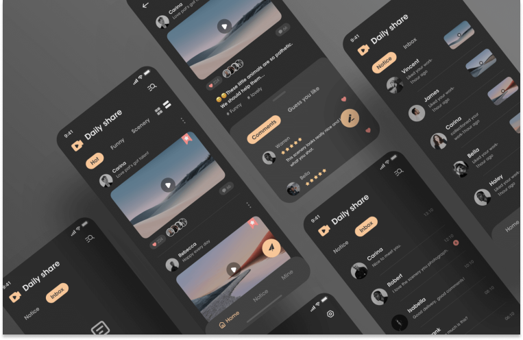
This app is mainly aimed at users who like to share good things. The overall style of the product adopts dark color mode, which can better alleviate the visual fatigue caused by long-time browsing and bring more comfortable experience to users. At the same time, the color of the theme is orange, which brings users a more lively and cheerful atmosphere.
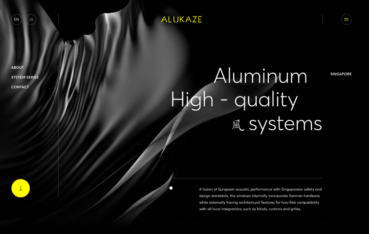
Alukaze, a Singaporean company specializing in high-quality aluminum window systems, showcases its offerings through a sleek website design. The site embraces a timeless black-and-white dark color theme, punctuated by vibrant yellow accents that inject energy and captivate visitors. Notably, the strategic use of yellow extends to an intuitive arrow button, facilitating effortless scrolling for a seamless user experience. The combination of classic elements with vibrant highlights makes Alukaze's website not only visually appealing but also user-friendly and engaging.
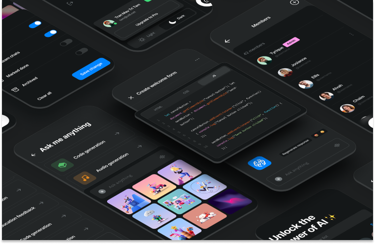
This is a game-changing UI kit designed to enhance your ChatGPT experience. With voice commands, image editing, video generation, education assistance, code generation, and other advanced features, Brainwave unleashes the full potential of AI-powered applications. Moreover, Brainwave adapts seamlessly to native iOS app designs and supports both light and dark modes.
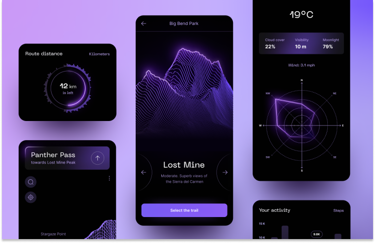
This is a dark mobile application that guides users through a route and measures their steps, altitude, and the weather. Furthermore, it even locates ideal spots for star gazing. Truly, this is a remarkable user interface design.
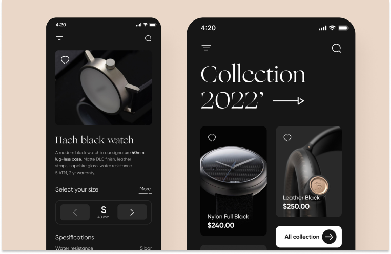
This is a modern watch collection app of a dark shopify theme – the interface is sophisticated, featuring the Gilroy typeface, and all the shapes have rounded edges. Plus, the photography of the watches is simply amazing!
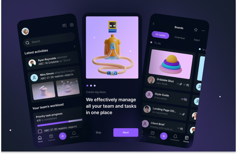
This is proof that you can create something usable and attractive simultaneously. Its interface should be not only convenient and clear (that goes without saying), but also incredibly attractive. These custom-made illustrations are also very suggestive and bring a lot of fun to this.
This a dark UI design made by Andrew Jr. This modern approach is what every designer should strive for in 2024. Simple and clever user experience with thin lines, round corners, and unique icons.
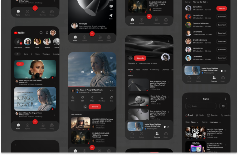
This concept is way more subtle and sophisticated than the original design. The designer Soroush made an exceptional dark design, with subtle navigation, where the subscribe button is more emphasized.
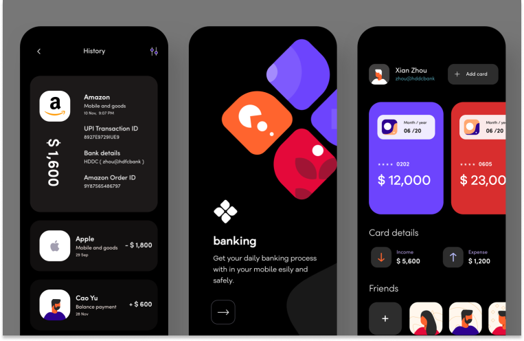
Sudhan Gowtham’s Dribbble shot is amazingly creative. The intense hues stand out effectively without being too intrusive. The use of white on the transaction history over the black background makes it very effortless to follow.
This design features a dark mode, primarily using black as the background color with bright colors for text and other elements to ensure legibility. The overall design aesthetic is clean and uncluttered. Font sizes and colors have been carefully chosen to ensure users can read and understand the information easily. Additionally, graphic elements have been used to enhance visual impact.
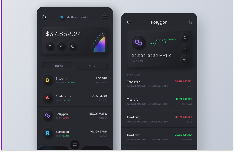
This is a dark themed design for crypto wallet apps. The design style used is called neumorphism, which represents a soft interface with embossed shadows, in-depth effects, and strong accent hues.
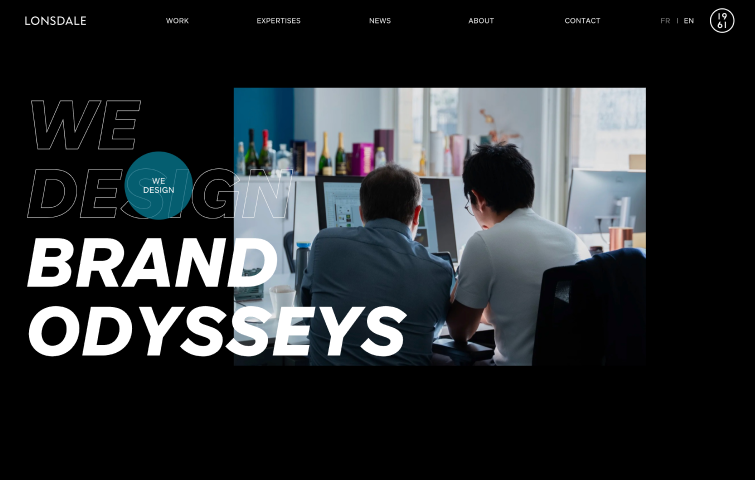
This is a design and branding agency with offices in Paris and Singapore. The Lonsdale website uses a classic black-and-white color theme which, when combined with excellent typography, creates a striking effect. It still adds some color by showing different colors on hover, including blue, purple, red, orange, and more."
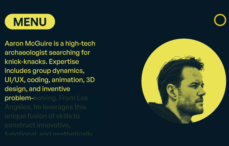
Aaron McGuire, a versatile designer specializing in UI, motion, and video, presents his portfolio through a clean and classic website design. The site adopts a simple yet impactful dark theme, combining black with soft white and yellow tones. The deliberate choice of a two-color palette, featuring soft yellow/white instead of pure white, distinguishes Aaron's portfolio amidst the prevalent black-and-white dark website themes. This subtle variation adds a unique touch to the design, enhancing the overall visual appeal of the website.
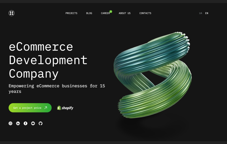
This is the website of a development agency specializing in Shopify and WordPress. It adopts a classic black-and-white website theme. The use of black and white as the primary color scheme provides a timeless and sophisticated dark website theme. Moreover, the site incorporates strategic green accents, aligning seamlessly with its emphasis on Shopify development. The introduction of green accents serves a dual purpose by not only enhancing the visual appeal but also reinforcing the website's core focus and its association with Shopify.
Le Studio Culotté, a French design agency specializing in the wine and alcohol industry, adopts a captivating dark purple/magenta background on its website. Accentuated by brighter purple calls-to-action (CTAs) and eye-catching color gradients, the design introduces brightness and vitality to the overall dark theme.
Overall, the strategic use of gradients enhances visual interest, while the prominent bright purple CTAs ensure sufficient contrast, effectively capturing visitors' attention.
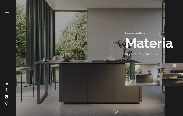
Opera, known for its stylish kitchen solutions like vented hobs and hoods, presents a chic website with a dark theme. The dark green background adds a touch of sophistication, and the dark gray and soft white text create a clear contrast, making the content easily readable. This choice not only aligns with the kitchen-focused business but also adds a sense of luxury to the overall design.
Conclusion
In conclusion, the widespread adoption of dark mode in UI design reflects its transformative impact on the digital market. It's evident that this design trend is not merely a stylistic choice but a strategic enhancement for user experience. Creating a captivating dark mode UI involves thoughtful considerations, from color schemes to user preferences, ensuring a seamless transition between light and dark themes. Go and create your dark mode design in Mockplus DT now!
Free prototyping tool for web and mobile app design
Get Started for Free
Free prototyping tool for web and mobile app design
Get Started for Free
Free prototyping tool for web and mobile app design
Get Started for Free