Typography is more than just choosing the right words or fonts for your web or mobile UI, the text hierarchy, font scales, white space, color contrasts and other visuals in your typography also help deliver specific messages about your brand.
It is of the utmost importance to any design and that's why designers invest much time and energy in creating a better typography to improve the readability and legibility of their UI, driving their businesses to a new level.
In this guide, we’ll go over typography design in UI to give you a strong foundational understanding. Typography and fonts can change how your messages come across and so we have included typography basics, examples, tools and resources to help enhance your UI designs.
Tables of Contents
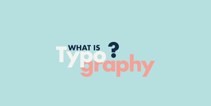
What is typography in web or mobile UI design?
What role does typography play in UI design?
Why do you need good typography?
Best practices you should follow for better typography
More typography design tools and resources
Let's dive into the details:
In web and mobile UI design, typography is the art of organizing typefaces on the interface to make all copy readable, legible and scalable to the audience. Visually appealing typography sometimes even catches the users' attention and increases the interface conversation rate effectively.
Designing good typography is not just choosing a beautiful font for your app. The decision depends on many visual aspects of your UI.
Before diving into the actual aspects that you should involve to create better typography, let's first see what basic elements you should pay attention to:
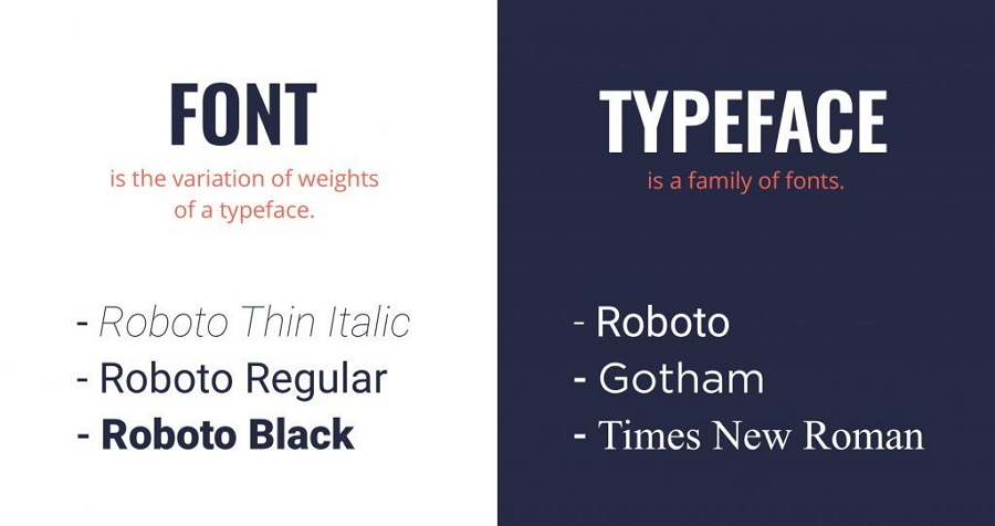
Fonts - As we all know, a font is a collection of letters and words with the same weights, widths and styles, such as the well-known Times New Roman, Helvetica and Garamond. There are 7 common types of fonts that are widely-used in mobile or website UI design.
Typefaces - However, a typeface is a family of related fonts, like the commonly-used Serif and Sans Serif. So, a typeface often consists of several fonts.
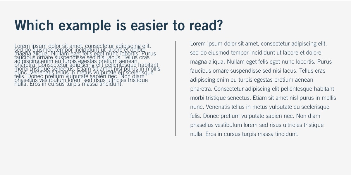
Letter and line spacing - Letter and line spacing focuses on the distance between the letters and lines. Both of them directly affect the readability of your interface copy.
Font weight, height and size - The different weight, height and size values define a font, helping designers create interfaces with different styles and emotional tones.
In one sentence, all these elements should always be considered when designing typography for your project.
Typography in UI design works just like a visual communication tool to engage users and convince them to stay longer or buy something.
When users visit a website or mobile app, instead of reading texts line by line, they often first scan the entire page to see whether there is data they need. At this moment, a scannable and well-organized typography will impress and engage potential customers or users.
Typography works just like a visual communication tool to convey interface content in a clear hierarchy and encourage users to stay longer or buy something there.
Once users stay on a page, a clear or informative typography design is also required to deliver product or service information precisely and encourage them to place an order.
Never ignore the role of typography when designing UI.
When designing a website or mobile app, typography does not only work as a visual communication tool. It also brings many benefits:
Good typography delivers page content in an immersive visual form and makes it easy for users to read, scan and navigate around. It simplifies the process users need to go through to find the desired information and learn how the product or service helps them out.
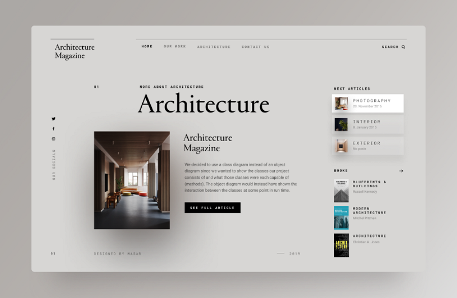
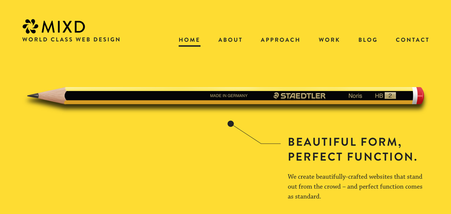
The style of typography sometimes also sets an overall tone or mood for all interfaces. For example, when you are using a cartoon font with warm colors, soft lines and bold strokes to present the page banners or titles, you add fun and personalization to your page. However, when you choose a plain, simple and serious typography, you also seem to set a serious tone for your entire app.
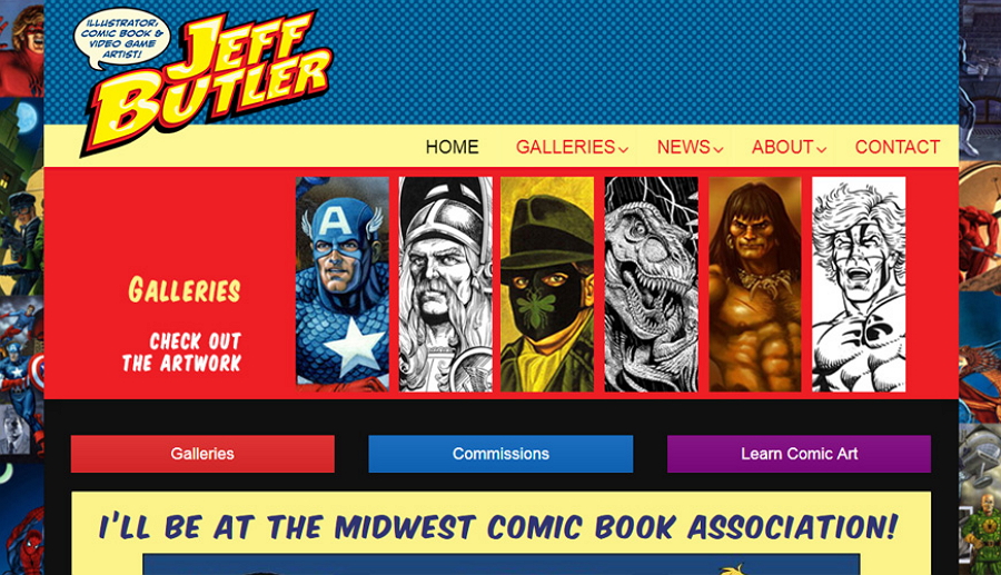
A colorful cartoon font creates a visual feast and also sets a fun tone for the game app.
Like other elements in UI design, high-quality typography often has a professional look, and combines the brand vision, color and concept together. All these features make it easy to stand out from others. Nevertheless, unique and effective typography also impresses users and lets them remember the website or mobile app brand.
Successful typography design encourages users to spend more time on your app and makes it easy for them to find whatever information they need quickly. This increases the product or service sales by reducing any distractions to the customer.
So, no matter what happens, you and your team should always work together to create better typography.
However, do you know how you can design good typography for your app project? Here are 10 of the core principles that you should follow:
Different typefaces and fonts have their own features, giving users completely different feels. The visual experiences they offer can vary as well. So, you should always choose the right typeface and font that best suits your design theme and style, delivering the page content in the right mood and tone.
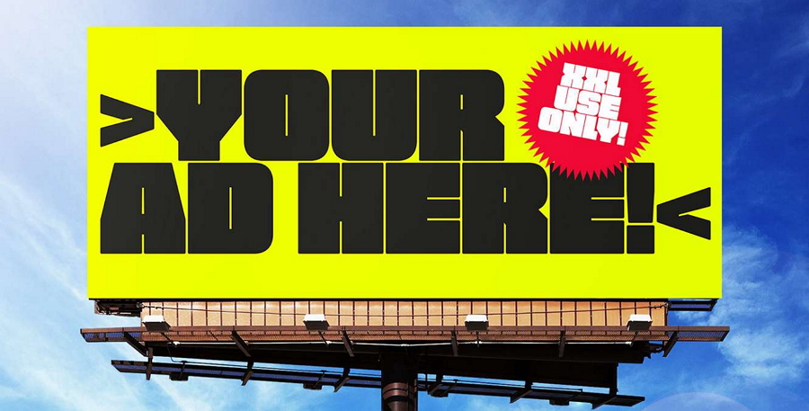
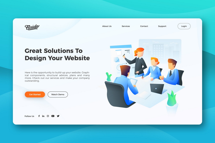
For example, if you want an eye-catching font for an illustrated or cartoon style website, you may want the following bold, fat, and rounded font to catch attention for a split second.
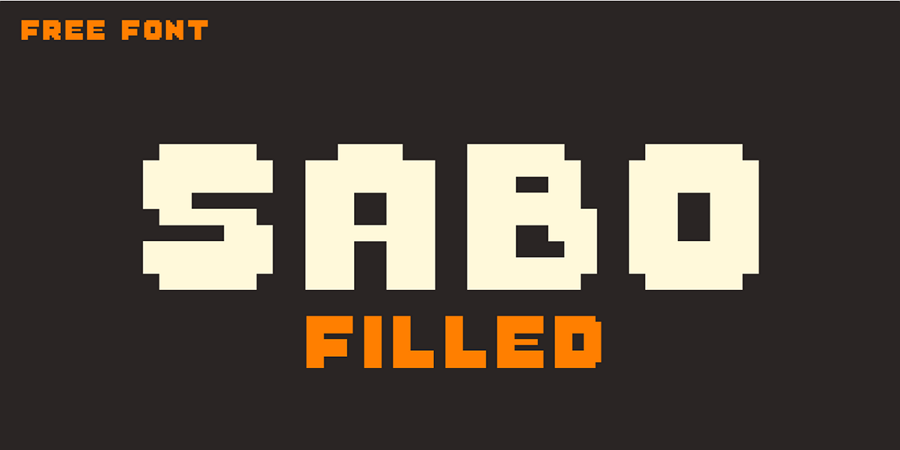
However, here, this pixelated font inspires a retro feel, making it perfect to create a 80's and 90's style game app.
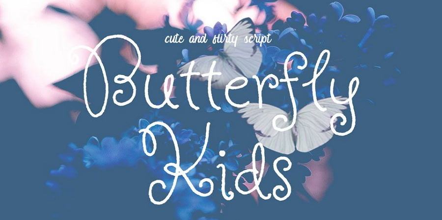
Below, this more curly font with a more unique design style that might not fit into a business-orientated website, but better for a personal or portfolio website.
To create a comfortable reading experience without distractions, you should use a maximum of two typefaces in an app or website. Too many typefaces will conflict with the user's vision and won’t allow a natural reading experience due to too much noise on the screen.
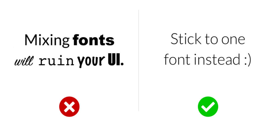
Too many fonts may emphasize too many elements, creating unnecessary noises to distract users.
The next principle you should follow is to balance the space and element on the interface. About the space, here we are talking about two types of spaces:
White space, also referred to as negative space, is the empty space between different elements and graphics. A website with proper white space creates a clear layout and makes the webpage content easy to read.
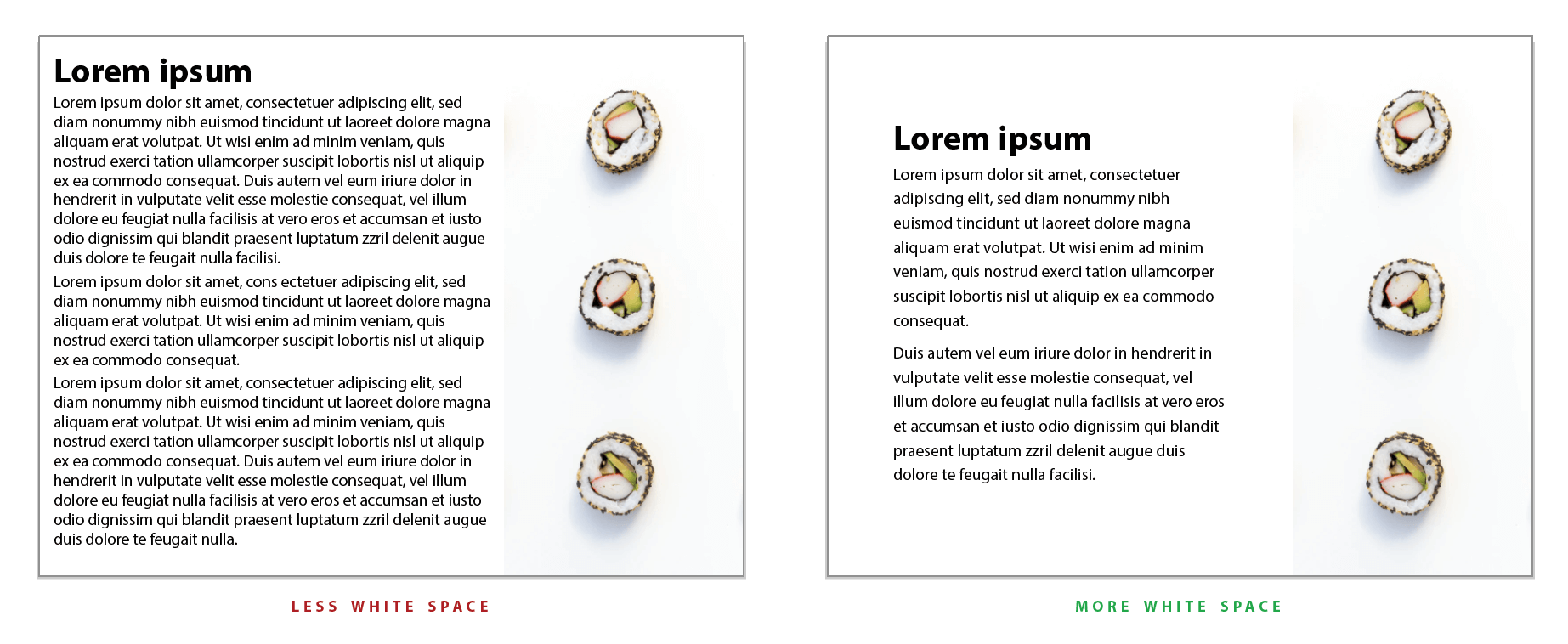
However, too much white space may create an "empty" webpage, making it boring for users to use and navigate around. Not enough white space may also create a cluttered and crowded interface, making it hard for users to find the information they need.
So, never forget to keep an eye on the white space when designing the typography, it is all about striking the right balance of enough white space with enough information on the page.
You can also read another 5 tips to use white space for a better UX.
Apart from the space around the elements or block of texts, you should also pay attention to space around the individual text itself, including the letter and line spacings so you can create a more readable copy to deliver messages effectively.
Here are two tips that may help you:
Use tighten letter spacing when designing for larger fonts or typefaces, like headlines, banners and titles
Use looser letter spacing when designing smaller fonts or typefaces, like body texts, error messages or notifications for easier legibility.
A website with a great visual hierarchy will also help users find their information fast. So, for better typography design, you should also try to create a clear visual hierarchy.
In general, apart from the common elements like grid layouts, tables and card designs, you can use the following elements to create a better visual hierarchy:
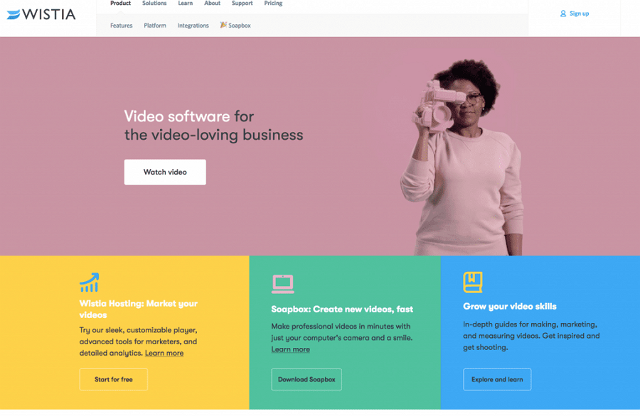
Headings, sub-headings, titles and subtitles are useful elements you can use to create a great text hierarchy.
As you can see, hierarchical headings and titles stand out the important information visually, making it easy for users to read and scan. A different color enhances the visual effect.
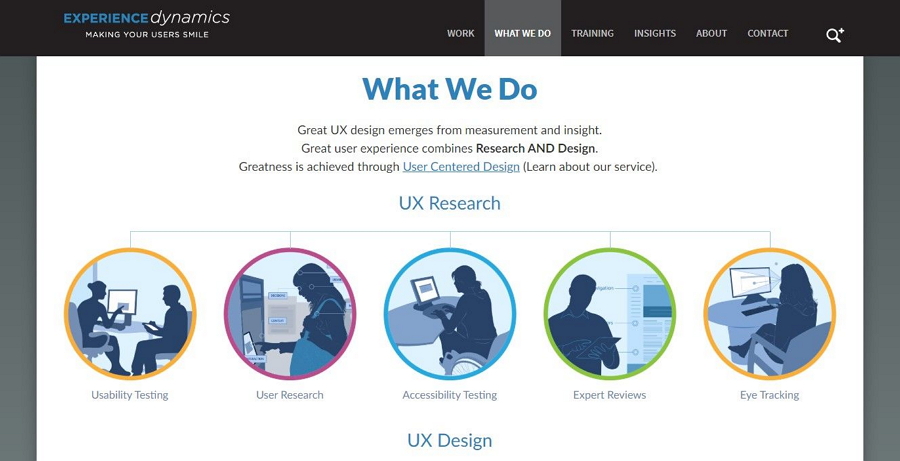
Using different font sizes together with proper space will also help create a clearer visual hierarchy, making the interface more readable and easy to scan.
In this image, the big, bold title illustrates the services in short words, catching the eyes of users quickly, and the following small body text explains the title in detail. Both of them play a role in engaging users and work together to create a clear visual layout.
Colors, including the color contrast, color gradients and color blocks, also help you create a clear visual hierarchy.
Color block helps stand out the visual hierarchy of the webpage.
Want more details? Read on gold tips and examples to create visual hierarchy in web design.
To create the best user experience, designers are always asked to create a website app that works well both on desktop and mobile devices. This requires designers to design typography that scales well on different screen sizes.
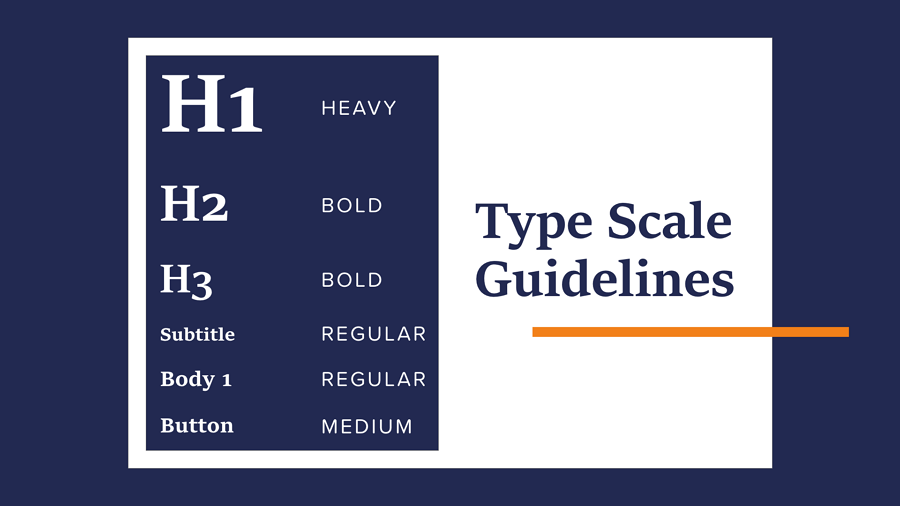
It is vital when designing a website to define a scale from the outset for all fonts and typefaces.. Also do not forget to share the scale guidelines for all platforms, like Android, iOS and Web platforms, with your team members, so they can know which platform or situation a font or typeface scale should be used.
Applying visual contrast wisely will also make your UI more legible and friendly to everyone. When designing the typography for your project, you can try to create strong visual contrast by trying the following:
Color is the top factor that most designers use to create contrasts in UI design.
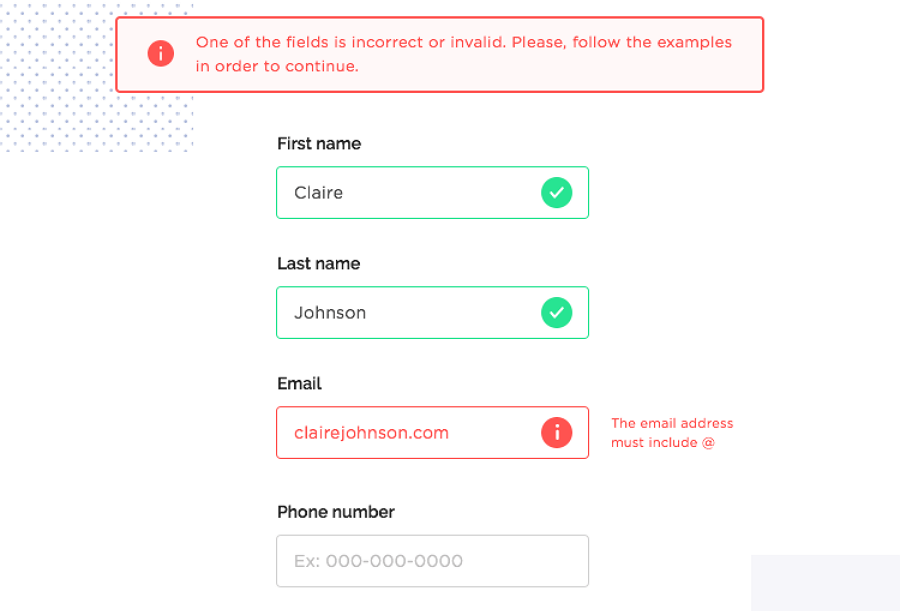
As you can see, the red and green colors stand out from the white background, and emphasize the error message in an effective visual way. It is not so easy for any users or visitors to miss out on such error messages, right?
Using the uppercase and lowercase words together will help you create contrasts to effectively convey desired interface messages.
A different text style, such as italic, bold, or underlined text, helps the messaging stand out and make users unconsciously focus on the text .

An italic or bold copy is much easier to stand out from other body context.
No matter whether you are designing a minimalist website or not, you should always try to make your UI text as simple and short as possible. "Never make your users think" is always the final goal that you should keep in mind.
Text that is too short or simple can sometimes confuse users and create a bad result. You should always try to create short and simple, but informative text on your website or app.
When trying to design the best possible user experience, visual consistency should always be at the top of the list. Striving for consistency in typography is one of the basic principles of using typography in design, use consistent colors, font sizes and font types, so the user is not distracted by the font or text or feel confused when visiting the website.
To engage users as soon as they visit your website, try to add lightweight animations and interactions to your banners and subtitles that grasp their attention right away. Interactive text engages the user and gives you more time to make your pitch.
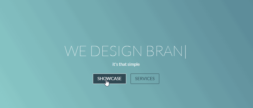
The vivid micro-interaction brings life to your copy and makes it easy to deliver the product information.
No matter what type of website or mobile apps you are trying to design, to save time and money, amazing typography or UI design should always be fully tested before being moved to the development process. That's why a prototyping tool like Mockplus is essential for product teams and designers to visualize their design ideas and test all details in advance.
Prototyping and Testing Apps in Mockplus
No matter which prototyping tool you choose, you should always remember to:
test the type scales to see whether your typography works on all types of devices;
test the animations and interactions to see whether they work as you think;
test the colors, white spaces and sizes to see whether they get the desired results;
If possible, you may also invite some real users to test the details and collect their feedback to improve the app functions and user experience.
Here are some typography design tools and resources that you can use to simplify your design process:
A curated collection of the best free Google website fonts are available for you to create an excellent website design. Most of them are free for personal and commercial use.
This post shares 30 of the best bold fonts to level up your UI design. OTF, TTF, and Web formats are supported.
20 of the best free and paid fonts are collected for mobile app projects. A detailed guideline about how to choose the right font for your apps is also included.
This website compiles a collection of the best typography design examples. Some useful tutorials are also included to help you create a more striking website.
 Mockplus RP
A free prototyping tool to create wireframes or interactive prototypes in minutes.
 Mockplus DT
A free UI design tool to design, animate, collaborate and handoff right in the browser.


 Sign up with Google