In these days, besides rich functions, the words/texts (also professionally called “Microcopy”) of a web/app contribute a lot to improving user experience. Any word, label or sentence on an app/web interface always matters. That’s why a growing number of companies start to hire UX writers and let them specialize in text/microcopy design/research to enhance UX.
As a UX designer or UX writer, you’ve already realized the importance of words or witnessed the magic of microcopy, but, don't know how to make your microcopy outstanding and successful? Or really want to know some practical principles/guidelines to write short, clear, informative and enticing microcopy for better user experience, higher conversation rates and product sales?
To help you out, we’d love to share 7 secrets of writing successful microcopy for you to improve UX:
Before we start to learn the tips of making an outstanding microcopy, you should firstly know what microcopy really is. Generally speaking, the microcopy of a web/mobile app often indicates a cluster of words/texts/copies on a page to instruct and alleviate the concerns of users. It often includes the labels of a button or option, privacy and security notes, terms and conditions, warning notifications and more instructions shown on your apps. So, in this aspect, it is indispensable for users to understand, learn and master a web/mobile app.
Cannot help asking how come a small bit of words could be so important for a web/mobile app? OK! The answer is simple. A short, clear, informative and enticing microcopy helps designers improve user experience, increase conversion rates, sometimes even impresses users and let them remember the apps/products/brands clearly.
To be more specific, microcopy often plays various roles in a web/app:
In daily use, people can easily check some instruction texts, such as the product/app instructions, privacy and security notes, terms and conditions, feature introductions, etc., to remove their usage problems and doubts. So, in this aspect, the app/web microcopy works as a consulter and help people use the app/web easier and faster.
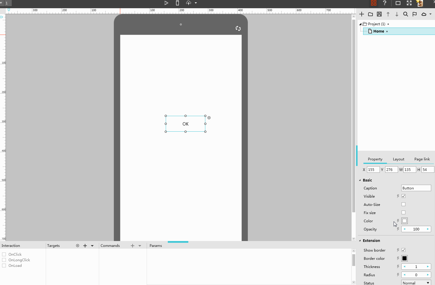
Many app texts, such as the labels of a button, the words showing how to sign in/up or other guidelines, often deliver useful information and lead users to complete a task/operation with ease. So, in this aspect, microcopy is also used as a useful guider.
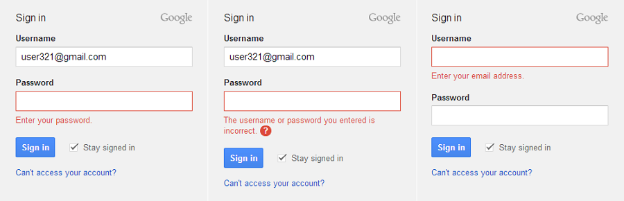
Microcopy can guide you to sign in successfully.
As we know, warning, prompt or error messages are indispensable for a web/mobile app. And an error message with well-crafted microcopy not only comforts users, removes their worries/doubts and also reduces frustration/negative emotions of them effectively. So, microcopy is also the very front comforter when users have some worries, doubts or problems while using an app/web.
And some labels of CTA buttons, product instructions or feature descriptions, also introduce a product clearly, impress user and entice them to purchase. So, in this aspect, microcopy is also an excellent product promoter.
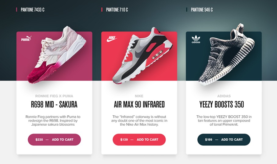
Microcopy can also introduce product/app features and stimulate users to purchase.
In a word, an outstanding and enticing microcopy always contributes a lot to enhancing UX, increasing product sales and standing out an app.
Microcopy is so important to enhance UX and competitiveness of a web/mobile app. How can you make your microcopy outstanding and appealing for better UX as a UX designer/writer? Here are 7 secrets and best microcopy examples (some of them are made by an easier, faster and smarter prototyping tool, Mockplus ) for you to learn:
Nowadays, texts in an app/web are increasingly important to guide users and achieve interaction with users. However, that does not mean the longer your microcopy is, the greater it will impact on users. Honestly, most users do not really read all shown words literally as you wish. Hence, in order to increase the chances that users will read them or understand the meanings behind quickly even at a glance, it is always better to keep your microcopy simple and short.
For example, you can try to simplify your microcopy with the following methods:
*Make your microcopy short and light
To improve the user experience with excellent microcopy, the first thing you are supposed to do is to shorten and lighten your interface texts. Moreover, the best way is to write all contents down, and then, appropriately integrate, delete and replace some words based on different needs and scenarios. And at last, shorten your microcopy to the best state.
Shorten and lighten your words to make them simple and intuitive.
*Use lists or subtitles
When the interface words cannot be shortened any longer, it is better to use lists or subtitles to simplify your microcopy.
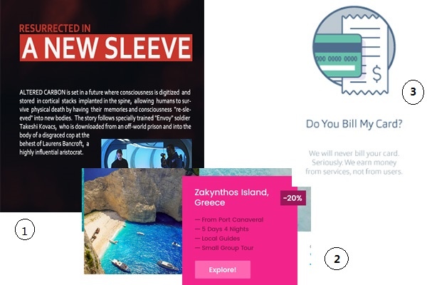
In comparison with the whole paragraph in Picture 1, the microcopy with lists in picture 2 and the text with subtitles in picture 3 are far more intuitive and easier for users to understand the actual meanings of them quickly.
*Add links to simplify your microcopy
The microcopy of a web/mobile app does not have to include all contents. In actual designs, you can easily add links (this is also called “Progressive Disclosure” design technique that is widely used by UX/UI designers) to simplify your texts. The users can easily click the linked words to jump to other pages and read more details.
Add links to make your microcopy short and light.
Please Note: Never make your text too light
Simplifying your microcopy does not mean to blindly reduce the text words. Oppositely, your microcopy is supposed to deliver the most informative and complete contents with the least numbers of words. So, shorten your microcopy and also make it clear to avoid any ambiguous or incomprehensible situations.
While designing your microcopy, you are also supposed to combine the product/app/brand features to make it unique. Moreover, this will also be an effective way to increase the popularity of the product/app/brand.
For example, in your design, you can try to add some words/sentences to introduce the special services/features of your products/apps, use special terms/phrases or choose special styles, color schemes or interactions based on product/app/brand features, etc. These ways always work to impress users and make them remember the product/app/brand well.
Design your microcopy in combination with product/app/brand features.
Microcopy works a lot to enhance UX of a web/mobile app. And you do not have to design every interface text with the same standards. Actually, it is often better for you to customize your microcopy based on different scenarios.
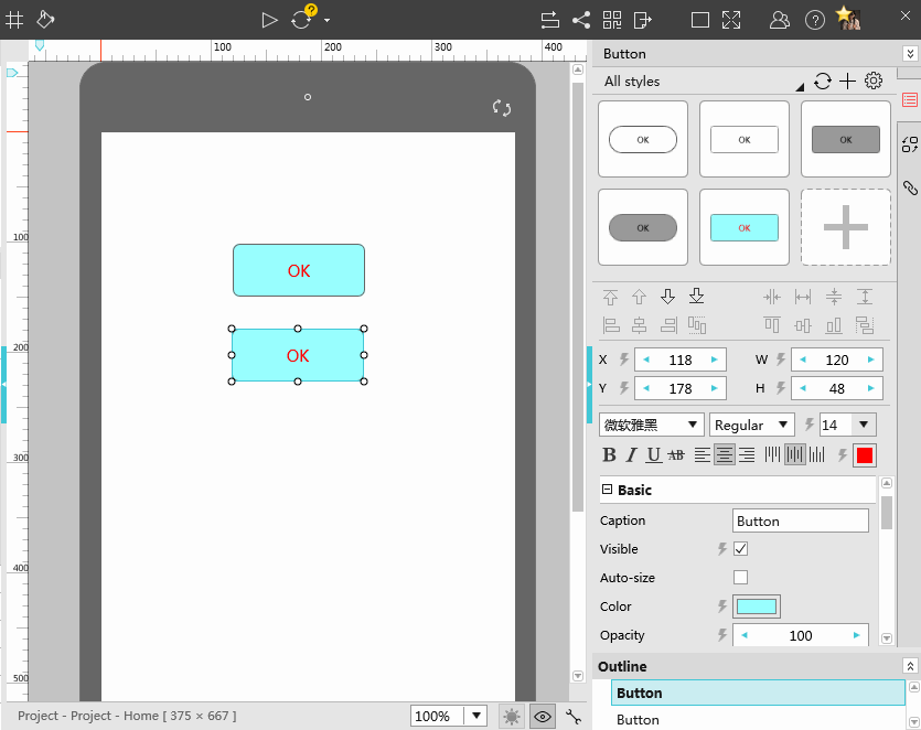
For example, if you want to design excellent labels for CTA buttons, except making them simple and light, in order to get higher click rate, it is better to make them distinctive and enticing by adding smart and eye-catching interactions.(Click to check 10 common mistakes when designers create website buttons )
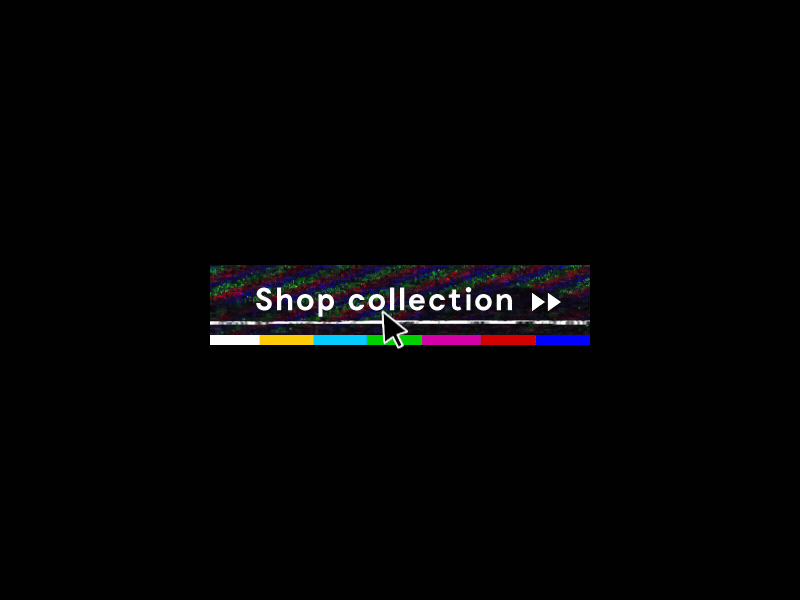
Add proper interactions to make your buttons eye-catching and entice more users to click.
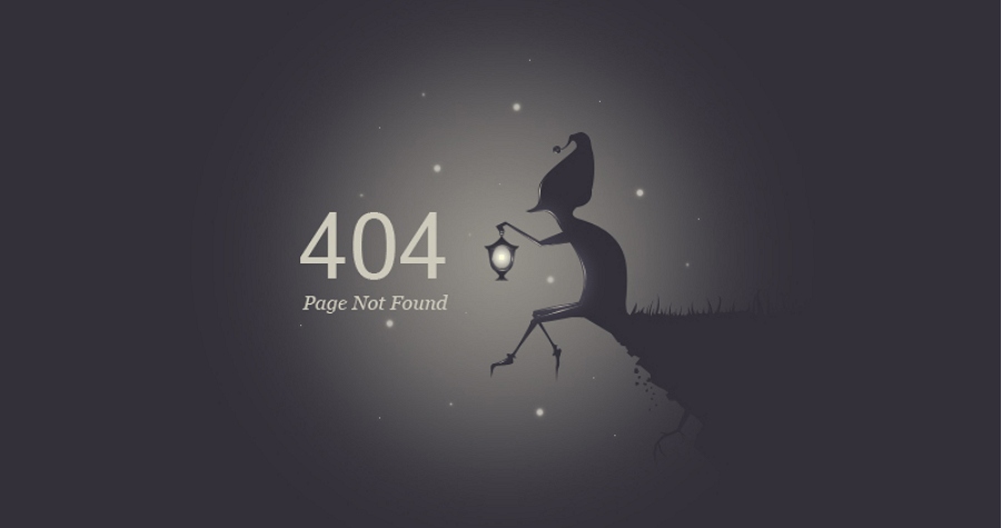
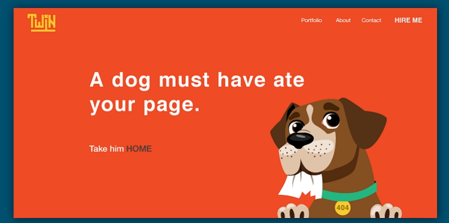
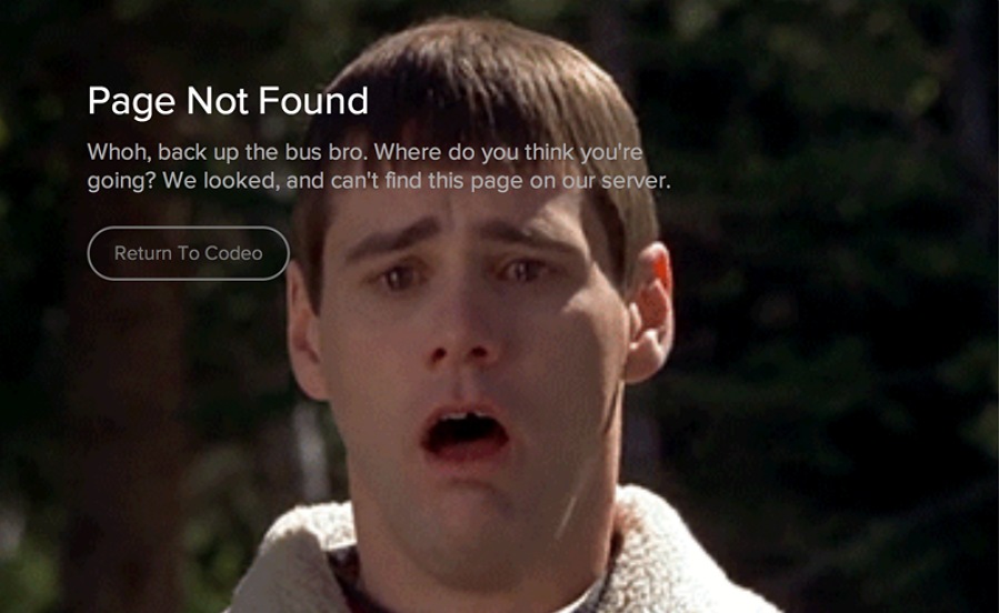
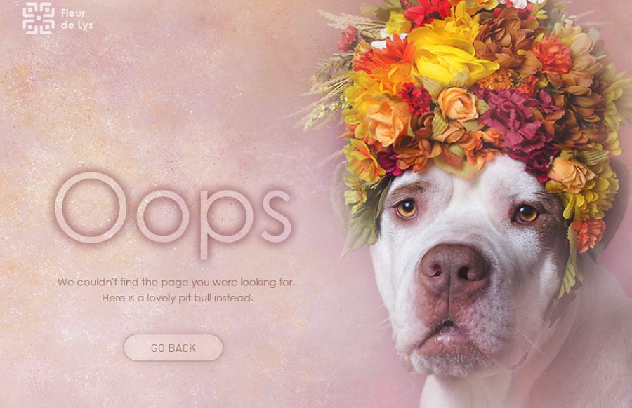
When it comes to some error or warning messages, it is also highly recommended for you to use some humanistic expressions to reduce frustration of users and improve user experience. (Click to check 14 most creative 404 error page designs )
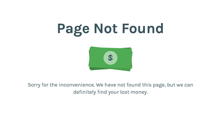
Add humanistic expressions to achieve emotional interactions with users.
And as with some information interfaces that need users to fill some personal information, including “Sign In”, “Sign Up”, “Contact” or “User Profile” pages of a web/app, you’d better add some words/sentences to remove doubts/worries of users.
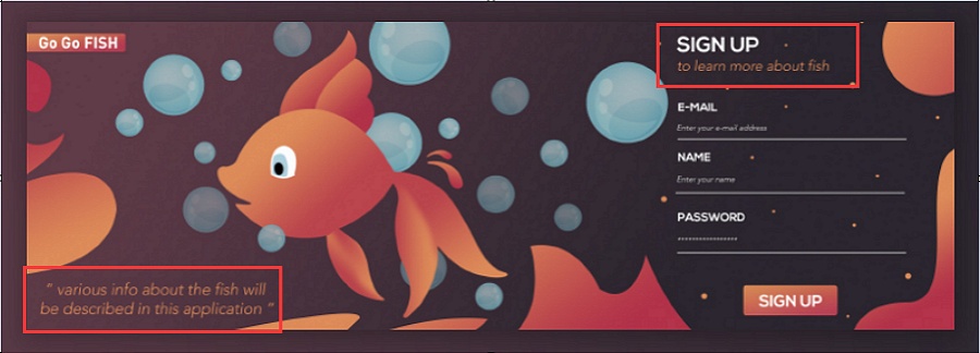
Microcopy helps remove doubts/worries of users and encourage them to sign up safely.
Microcopy is not supposed to be designed in the same way. Instead, it should be regarded as an important platform to show your personality and creativity.
Hence, you can try to make your microcopy different in the following aspects:
*Improve your microcopy with imagination
You can also improve your microcopy with imaginations. For example, It is usually a good try to use your microcopy to tell a story, illustrate the culture of a product/enterprise or present a special local/ethnic feature, etc. This can make your microcopy far more attractive.
Use microcopy to tell an interesting story.
*Make your microcopy different with humor
Humorous or funny words/expressions/jokes not only attract users effectively, but also enable users to know/learn something more naturally and enjoyably.
Use humor to improve your microcopy.
Please Note: Be careful with funny jokes/humorous texts
Humor is not suitable for all cases. Why? A humorous microcopy can make it easier for users to accept the sudden error or warning messages. While, it will also make a privacy and security note less convincing. Hence, you are supposed to be careful with funny jokes or humorous texts.
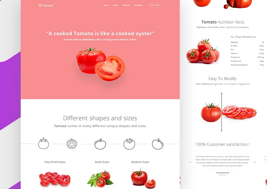
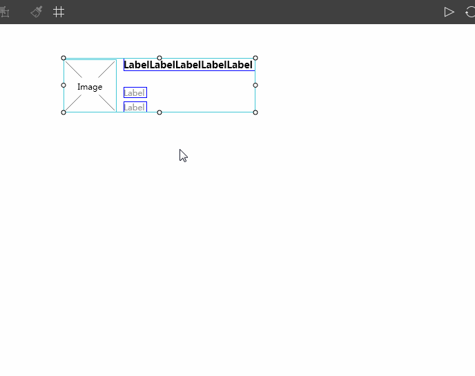
*Pair your microcopy with photos
As the old saying goes, “a picture speaks a thousand words”. In order to make your microcopy outstanding and convincing, you can also try to use words and photos together.
Use photos to illustrate your microcopy more intuitively.
And in such situations, to add some texts with photos, you can try to download and use Mockplus, which allows users to easily pair their texts with photos by using “Image” and “Label”/“Text Area” components together. Moreover, it also offers easier and faster solutions for designers to add dynamic photos, import Sketch or static photos in batches. Of course, if necessary, you can also use its “Repeater” feature to add such “text + photo” pairs in batches with simple clicks.
*Show your unique style in microcopy designs
Each designer has his own design style/tone to make a microcopy for a web/mobile app. In your design, you’d better show your unique design style/tone to make your microcopy unique and distinctive. This is a really useful way to attract and impress users.
In a word, the microcopy designs created with creativity and sincerity of designers is doomed to be different and appealing to users.
Except making your microcopy simple and different, you are also supposed to improve it with some visual elements. The visual elements, such as colors, fonts, sizes and interactions of the interface texts, are always attractive for users.
Here are several clues for you to improve your microcopy in visualized ways:
*Adjust the properties of texts to present its hierarchy/importance relations
Many properties of the interface microcopy can be used to present its hierarchy/importance relations, such as the colors, fonts, sizes, background photos/colors and more. Moreover, strong contrasts of these mentioned properties could also work much better.
In short, set, adjust or contrast the properties of your microcopy to show its hierarchy/importance relations. This is also helpful to make it easier for users to get the useful information quickly.
In addition, while using Mockplus, a powerful prototyping tool, you can freely adjust or contrast the properties of an interface text easily by using its “Label” or “Text Area” components.
*Add proper interactions or animations for your microcopy
Smart interactions or animations can make your microcopy interesting and enticing. So, add proper interactions/animations to your microcopy for more pleasant user experience.
Take Mockplus as an example. You can easily add loading, clicking, long clicking and more interaction effects (especially the hovering effects ) with simple drag-and-drop.
It also offers many powerful interaction commands to enrich your microcopy designs, such as “Show/Hide”, “Move”, “Zoom”, “Rotate”, “Resize”, “Set Color”, “Set Text”, “Set Text Color” and more.
In short, proper interactions are also effective for you to make your microcopy different in a visualized way.
To help users understand and master your web/mobile apps easily, it is better to keep all interface texts consistent. And the consistency of your microcopy can be reflected in following aspects:
*Use consistent appellations
Muddled appellations in an interface text often make the entire microcopy complicated and confuse the readers. Hence, you’d better use consistent appellations in your microcopy designs.
Please Note: Use “You” instead of “He”, “She”, “It” or “They”
Moreover, in comparison with using “He”, “She”, “It” or “They” in your designs, “You” is often more acceptable for readers and helps you communicate with them more naturally.
*Use consistent tenses
In your text designs, it is highly recommended to use consistent tenses. Moreover, the active voice is much better to arouse users’ resonance than the passive voice. It is just like having a direct talk with them. Overall, keep your microcopy consistent in tenses.
*Keep your words consistent
In comparison with using completely new, ambiguous or obscure words/terms, directly reusing the words that you’ve used before in your microcopy designs is more acceptable and understandable for users. So, keep your words consistent.
*Use consistent themes and color schemes
The themes and color schemes of your microcopy also should be in accordance with the themes and colors of your entire web/mobile apps.
*Use consistent design style/tone
Each UX writer/designer writes their microcopy with a unique style/tone. That’s normal. However, in case of any messy situations, it is better to keep your design style/tone consistent in your actual designs. No matter which design style/tone you choose, such as simple, humorous, formal or informal design style or tone, always keep it consistent in the entire web/app design.

Keep your microcopy consistent in color schemes, theme and design style.
In addition, in this aspect, in order to keep your microcopy consistent easily, Mockplus with powerful Component Style, component and icon libraries is really worth trying.
Take its Component Style library as an example, you can freely save, reuse and share the styles (such as colors, text fonts, sizes, alignment, etc) of your used components to keep your microcopy consistent in colors, theme, style or more.
Like other elements of a web/mobile app, microcopy is also supposed to be tested and edited in a real app prototype over and over again. To be more specific, you’d better test and adjust the length, color, alignment, size, font, style and interaction of your microcopy in a real app prototype to see whether it works as you wish.
And in this aspect, we have to mention Mockplus again for its 8 ways to test and share prototypes. With these 8 ways, you can easily test the feasibility of your microcopy designs, and also collect feedback from users and designers to iterate your designs quickly. So, Mockplus is really an excellent prototyping tool for you to optimize your microcopy with ease and efficiency.
In a word, a creative and appealing microcopy not only improves user experience, but also enhance the competitiveness of your web/mobile apps easily. So, you’d better always pay much attention to the microcopy designs of your apps.
The microcopy designs of an app/web play a really important role in improving user experience. However, they can work well as you wish only when you put it back to a real web/app or prototype. Therefore, in order to improve UX and enhance the competitiveness of your app/web, you’d better also pay more attention to strengthening and enriching the features and functions of your app/web. Of course, a right prototyping tool, like Mockplus, is also your best choice to make, test and iterate your app/web designs.
Overall, it is always good for you to take every detail seriously in your app/web designs.
Hope this article with 7 secrets of writing successful microcopy will be helpful for you to work out an outstanding microcopy.
 Mockplus RP
A free prototyping tool to create wireframes or interactive prototypes in minutes.
 Mockplus DT
A free UI design tool to design, animate, collaborate and handoff right in the browser.


 Sign up with Google