In the 3.3 release of Mockplus, there is a new feature of Component Style that allows for saving and reusing the styles of components quickly and effortlessly.
As is shown, you can select a certain component to set its properties and then click the + icon to save the styles in your library. To apply the style, just select certain components which you’ve set its style and there will load the corresponding styles of that type of components. Choose the needed style to make it applied.
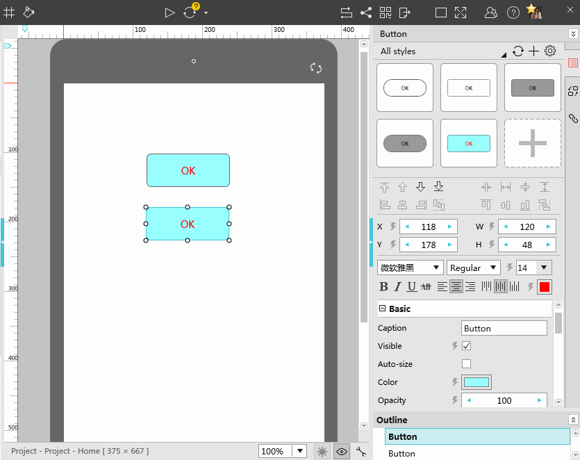
It’s possible to set styles to multiple components of the same type at the same time. For more details, please take a reference to this tutorial.
 Mockplus RP
A free prototyping tool to create wireframes or interactive prototypes in minutes.
 Mockplus DT
A free UI design tool to design, animate, collaborate and handoff right in the browser.


 Sign up with Google
 Join our Discord community
 support@mockplusapp.com