Buttons, as one of the essential elements in UI design, can not only lead users through a website/mobile app effectively, and can also entice them to click for better sales. That’s why to make their buttons stand out, UX/UI designers should pay much attention to button designs and read numerous articles, which analyzes and shares principles, secrets and ways to set the size, position, shape, color and more factors.
However, for seasoned professionals, such articles/guidelines are no longer enough to create an excellent and useful button. Do you really need new clues, ideas or inspiration to make a unique and distinctive button for your web/mobile apps?
OK! Here are 13 latest and best button practices that you cannot miss out in 2018. And hope they can inspire you somehow:
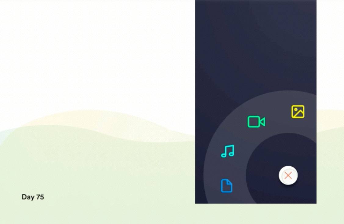
*Designer: Mayur Kshirsagar
*Highlights: Very cool floating navigation button and well-crafted Circle navigation design
FAB uses a very cool floating button which attracts users’ attention and extends the functions of the web/mobile app. A well-crafted Circle navigation is also really eye-catching and useful for your users, it allows them to easily choose and switch to other parts of this web/mobile app. Overall, this entire button design is really creative, interesting and can create very pleasant user experience.
*What can you learn:
Add floating navigation buttons to attract users’ attention and improve user experience
In your website/mobile app designs, you can create similar multifunctional navigation buttons floating in an interface to extend the functions of a website/mobile app and customize a special way to expand the menus, options or functions based on users interaction with these floating buttons. And in this way, such floating buttons can be really interesting, attractive and impressive for users.
Moreover, you can also learn more secrets on how to design an excellent floating buttons with ease.
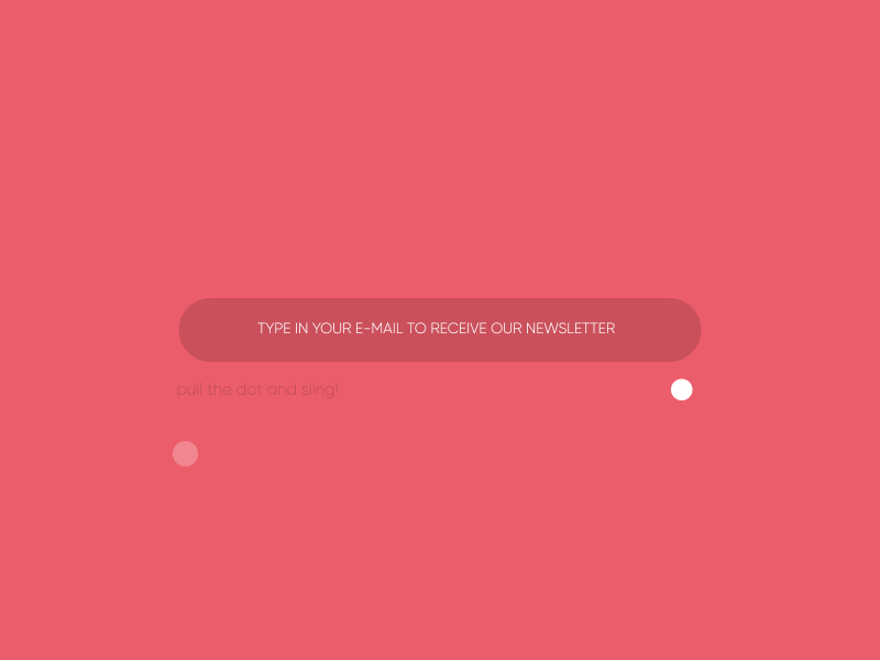
*Designer:Knarik & Robert
*Highlights: Excellent button interaction, elements of gamification and neat sliding effects
This input button is designed in a way that users cannot resist interacting with. After users type email, they need to slide a white button to launch a small paper plane. The further the small white button is slid, the higher the white paper will fly. Such design strategies are really interesting and attractive.
*What can you learn:
Add smart interactions, games and dynamic effects to make your button excellent
When you try to create an excellent button design, you can add such smart interactions, games and dynamic effects to make your button interesting and irresistible. The more interesting and appealing your button is, the higher chances users will click it and you will increase your conversation.
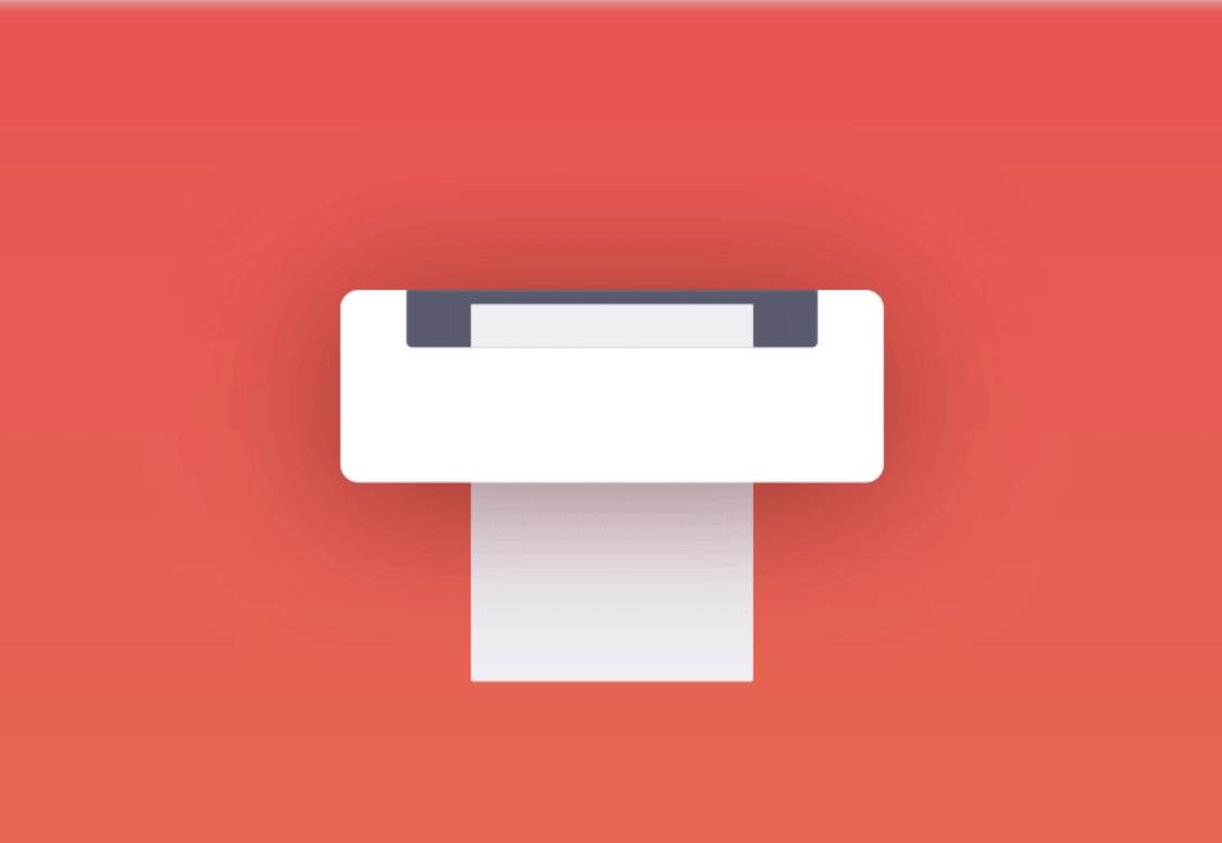
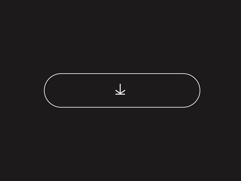
*Designer: Quovantis
*Highlights: Use “button + animation ” to show the functions of buttons more vividly
Once users click the button to print files, a small animation gets started and shows how a file is printed. Microinteraction for print button is a really vivid way to show how the function of this “print button” works and effective way to help users kill the time while they have to wait for printing a large number of files. Overall, this is excellent to improve user experience.
*What can you learn:
Add vivid animations to your buttons based on different button labels, features and scenarios
In your button design, you can incorporate some funny or glamorous animations to make your buttons appealing and outstanding based on different button scenarios.
*Designer:Alvaro Secilla
*Highlights: Eye-catching hover effects for buttons
Microinteraction uses very appealing hover effects. When users move over or across the CTA button, the borders of this button start to shake rhythmically. Once users move the mouse cursor away, the hover effect will be stopped immediately as if it had never happened before. Such designs are really interesting and eye-catching. They could be very useful to entice users to click and go to the next stage, such as buying a product, reading more details or filling contact information, etc.
*What can you learn:
Optimize your button designs with rich hover or interactions effects
In your web or app design, you can add various hover or interaction effects to optimize your button designs. For example, you can add some changes of colors, shadows, shapes, texts, opacity, frames and animations of a button to make it more attractive for users. You can also learn how to make hover effects easily and quickly with ease.
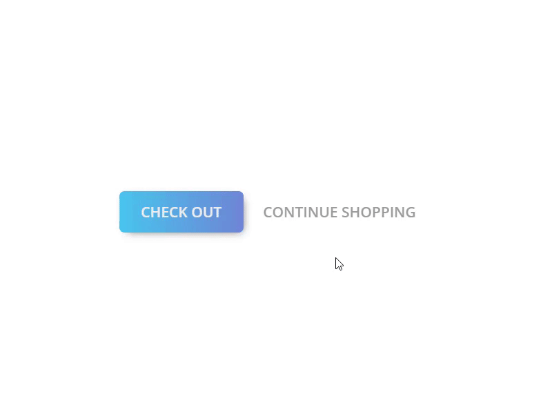
*Designer: ali said
*Highlights: A perfect combination of download buttons and progress bars
When users click the download button, a progress bar of file downloading will be automatically shown. Dynamic helps to reduce the frustration of users while they are waiting for content to download. And this is really sweet and impressive.
*What can you learn:
Improve your download button designs with proper loading animations
Downloading buttons are common part of a web or mobile app. Loading animations, such as dynamic progress bars, are effective to ease users’ negative emotions while they are waiting. So, the perfect combination of download buttons and loading animations will surely achieve far more splendid effects.
*Designer: Serhad iletir
*Highlights: Smart sliding button and color gradient
In this sliding button design, where the mouse clicks, the button will automatically slide there. This is creative and vivid. And the color gradients also make the entire button design more beautiful and fashionable. All of these design techniques are really effective to grasp user’s attention and guide them to click.
*What can you learn:
Improve sliding buttons with the change of colors, opacity, shapes and many other visual properties
The toggle button is one of the most popular types of buttons among designers. And you can try to improve your sliding buttons with the changes of colors, opacity, shapes, rounded corners and other factors. These changes will be very effective to increase the click rate of a website or app.
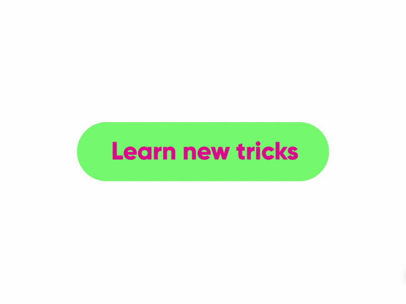
*Designer: Alvaro Secilla
*Highlights: Materialize a CTA button in the combination of button features and functions
Microinteraction 04 gives the CTA button a materialized look, a dynamic skateboard together with a label whichsaying “learn new tricks” , which let users understand the functions and features of this button more intuitively and clearly. And, such design strategies are really inspiring and worth imitating in your design.
*What can you learn:
Design a materialized look for your buttons to make them easier to understand
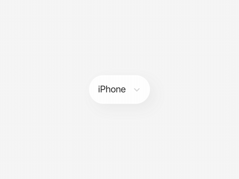
*Designer: Khalil Hanna
*Highlights: Simplify button design with changes of colors, icons and background photos
At the first sight, this series of button designs looks pretty simple and straightforward. However, when these buttons are designed in combination with the change of icons, colors and background photos, they can also prove to be intuitive and changeable. And such designs will be very useful for users to easily recognize and use these buttons.
Moreover, the simplified design style is also effective to reduce interference from unnecessary disctractions and make users focus on the functions of these buttons/website/apps. If necessary, you can also learn how to simplify your prototype or design easily.
*What can you learn:
Optimize your web/app with simplified, but not boring button designs
In your web/app designs, you can use such simple design style and try to work out some minimalistic, but never boring button designs to attract more users.
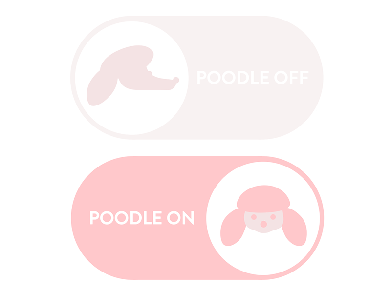
*Designer: Vanessa Brown
*Highlight: Cute sliding button and creative transitions between 2D and 3D effects
Poodle Switch shows cute sliding buttons with great visual effects. The button with a cute poodle icon is transformed between 2D and 3D in the process of sliding from one end to another. And together with the change of buttons' text label, the entire design becomes really intuitive for users to know the functions of this button clearly.
Moreover, the white and pink color scheme is effective to attract some users who love adorable dogs, cats and pets.
*What can you learn:
Improve your web/mobile app button designs with 3D/2D and sliding effects
The real-life sliding button, as one of the basic buttons designers use in their app/website projects, can also be cool, clean, simple and attractive if you add proper 2D/3D/sliding effects and texts. The visual effects of such buttons will also be great.
*Designer: Oleg Frolov
*Highlights: Unique menu switcher/buttons
Unlike some conventional navigation/menu buttons which show options with a drop-down or accordion menu,Menu uses a menu switcher that allows users to switch different options. And this effect will surely impress users and give them pretty interesting experience.
*What can you learn:
Make your menu/navigation buttons eye-catching using unique ways to expand/switch options.
Similar to the Circular navigation mentioned above, this menu switcher in this design is also really great and worth trying in your design. Of course, it is better to create your own unique way to provide menu options todemonstrate your creativity. That really works for users.
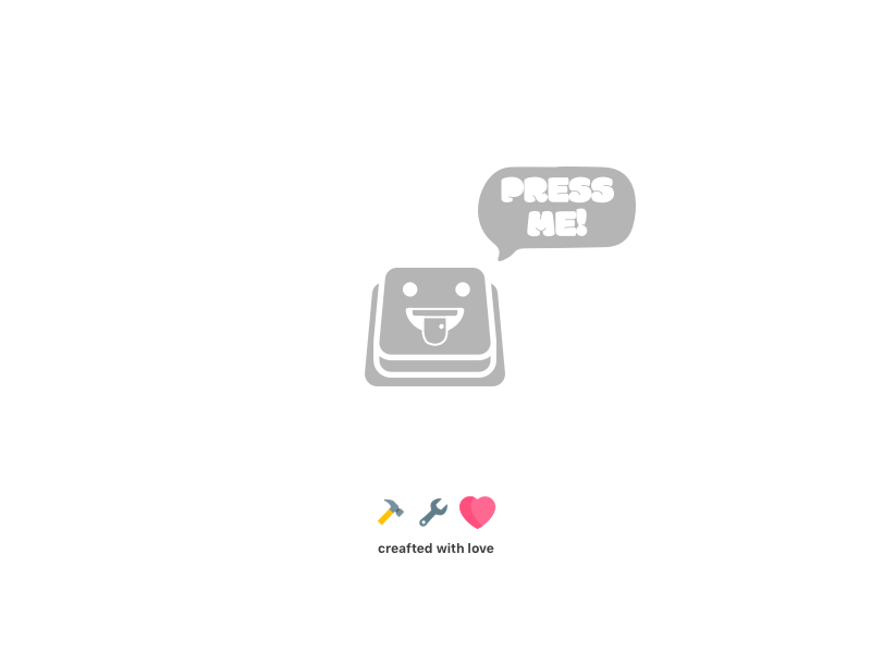
*Designer: Mehdi Mahdloo
*Highlights: Very enticing microcopy
Can someone press it is an emotional button design. The button microcopy says “Can someone press it? Please...” This is very witty and enticing design technique. After reading this copy, I just cannot help clicking it even though I do not know what this button is used for. How about you?
*What can you learn:
Add an enticing microcopy to your website/mobile app buttons
When you are trying to design a creative button, do not forget to choose and add an enticing microcopy for your button according to its features and functions. This is really effective to achieve emotional connection with users and encourage them to click.
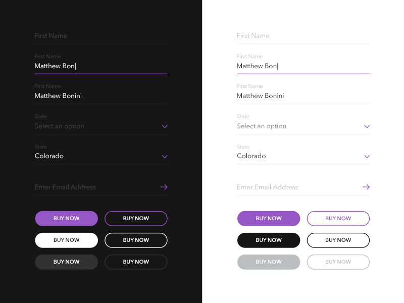
*Designer: Matt Bonini
*highlights: An excellent combination of ghost buttons and flat buttons
UI Elements clearly shows the different visual effects of ghost buttons and flat buttons. When a flat button is used together with a ghost button, the flat button will be more eye-catching. And the layout of the entire website/mobile app will be affected when there are many contrasting buttons used.
Therefore, try to use both of flat and ghost buttons in your design to define the importance and hierarchy relations of these buttons.
*What can you learn:
Improve your website/app designs with ghost buttons and flat buttons
Creating contrast with the changes of colors, shadows, sizes and other visual properties will make your button designs completely different.
*Designer: Tobi Santaso
*Highlights: Realistic buttons and cool glowing effect
Realistic Buttons uses a realistic design style by adding three real-life buttons with cool glowing effect. And these buttons are so similar to the real-life buttons of diverse electronic appliances that people surely cannot help clicking them. So, creating such realistic buttons is a very good idea to get higher website/mobile app click rate.
*What can you learn:
Add realistic buttons to reinforce the sense of familiarity
These are 13 examples of button design best practices that are perfectly combined with interactions, animations, icons, progress bars, background photos, small games and more attractive elements. Hope they will inspire you to create your own buttons.
No matter which type of buttons you are trying to design, whether it will be CTA buttons, navigation/menu buttons, input buttons or something different, it needs to be a natural part of web/mobile app and should be tested there. And you will surely need a prototyping tool that will help you create and test your button designs as well as the entire web/mobile app prototype effectively.
However, the problem is that you just do not know which prototyping tool will work best for you? Don't worry! Mockplus, an easier and faster prototyping tool with powerful features, will be your best choice to test and improve your website/mobile app button designs:
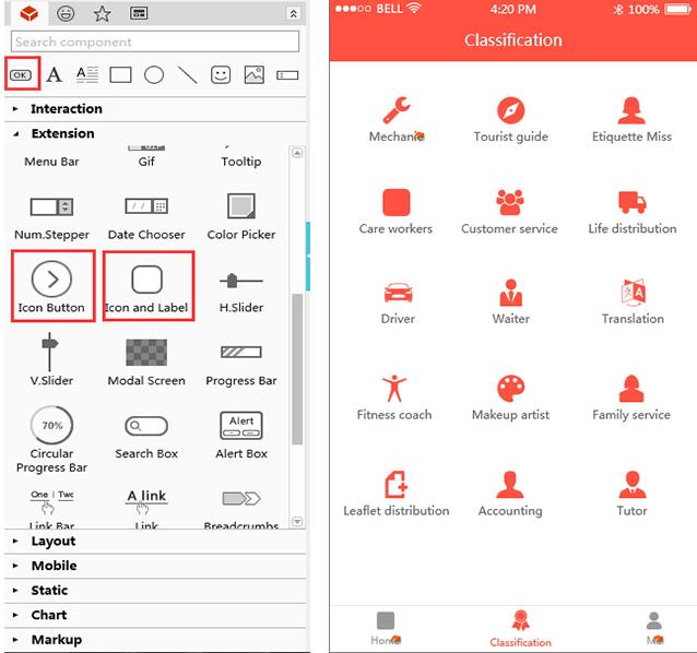
Every website/mobile app needs many buttons with different looks, shapes and styles. That will certainly require the used prototyping tool is able to offer more options or features for users to create all needed types of buttons to optimize their interface designs. Mockplus offers a variety of button components for designers:
*Use “Button” components to create essential buttons, such as CTA buttons
*Use “Icon Button” components to create buttons with icons
*Use “Icon and Label” components to create buttons with icons and labels
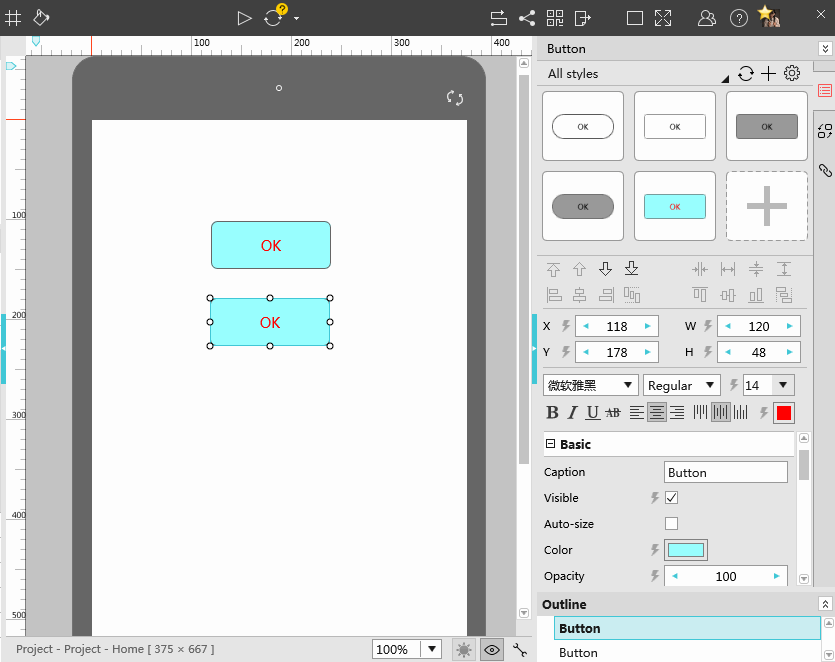
Moreover, you can also easily set the colors, borders, comments and background of these button components to make them changeable and attractive.
In addition, Mockplus offers a powerful icon library with over 3000 vector icons that will allow you to play with far more design options.
Need to add some well-crafted background photos to create a unique design for your buttons? In Mockplus, you can easily use both of “Button” and “Image” components together to achieve that.
Moreover, if you need to create buttons with special background photos in batches, you can use Repeater to design such buttons quickly and easily.
Enticing microcopy plays an important role in grasping users’ attention and enticing them to click. With Mockplus, you can easily add “Label” and “Text Area” components to customize perfect texts for your button designs.
In website/mobile app design, it is common for designers to reuse the styles of different buttons.This not only saves valuable time of designers, but also allows them to create better outlook. In Mockplus, you can use “Component Style” to save, reuse and share your button styles freely with one click.
Mockplus offers many rich and smart interaction options for you to create truly responsive and attractive buttons. For example, you can try to add hovering, loading and clicking effects with simple drag-and-drop.
Moreover, Mockplus provides Interaction State feature that can help designers add hovering effects for their buttons. This is also worth trying.
Mockplus offers 8 ways to test and share your button designs. They are extremely useful for designers who want to collect feedback from other designers/users and improve their designs.
Mockplus also offers other powerful features for designers to easily translate their ideas into visualized interactive prototypes, iterate and test their designs timely and effectively, such as team collaboration, team management of newly released Team and Enterprise Edition, etc.
Overall, no matter whether you are trying to find a perfect prototyping tool to make excellent app prototypes or want to find an ideal tool to test your button designs, Mockplus meets all your needs easily.
So, as an essential element of a web/mobile app, buttons can also be complicated even though they might look very simple and plain. That's why a seasoned UX/UI designer should always try to design different buttons indiverse ways based on different features, scenarios and more.
For example, if you want to design CTA buttons, in order to attract users’ attention and entice them to click, you should try to change the colors, shapes, labels and positions of your buttons to make them obvious and enticing.
However, when it comes to menu/navigation button designs, it is better to use progressive disclosure techniquesor floating effects to make them simple and useful. Last but not least, when you design input buttons, for better interaction with users, it might be good to combine buttons with some loading animations or the related elements to offer more pleasant user experience.
In short, hope these 13 best and most creative button design practices will inspire you to create your own great button designs.
 Mockplus RP
A free prototyping tool to create wireframes or interactive prototypes in minutes.
 Mockplus DT
A free UI design tool to design, animate, collaborate and handoff right in the browser.


 Sign up with Google