Buttons are one of those always used yet overlooked components of a design. Most of the time, we resort to some sort of compromise over button design elements as it is one of the hardest to come up with.
So as a designer, what you need is a checklist to refer back to, when you are faced with these design woes. And that’s what we present here - what you need to know about android button design that ensures smooth user experience while maintaining your professional design standards.
Your user needs to understand what design element it is. If your button looks just like the other elements in your assembly of components, they will miss it. They need to know it’s clickable and you, the designer should ensure that your user receives the visual cues to use it properly. If your user can’t distinguish a clickable button from other elements, how do you think they are going to interact?
Another factor to take into consideration is the size of your button. Don’t think of itsy-bitsy fingers when you design. We users, hate it when we miss our button presses. Make it accessible or risk irking your users. I am an adult and so is 70% of the population who’s going to use your apps. So, do make it easy for us to use it. Keep these clickable buttons at the right size for interaction.
If you are placing multiple buttons side by side, maintain adequate spacing between them so as to reduce the rate of faulty clicks. This padding helps to differentiate the different action items and this white space will give your design a breathing space. Align the padding space in line with the rest of your design theme while still maintaining balance.
Use colours in your design to point out clickability and help your users to identify the elements you want them to focus on. Having a contrast in your call to action buttons to the rest will help your conversion rates to boost up.
While the colour palette you use for your design depends on your branding and colours, it is still possible to create enough contrast in your design so that your action buttons pop up.
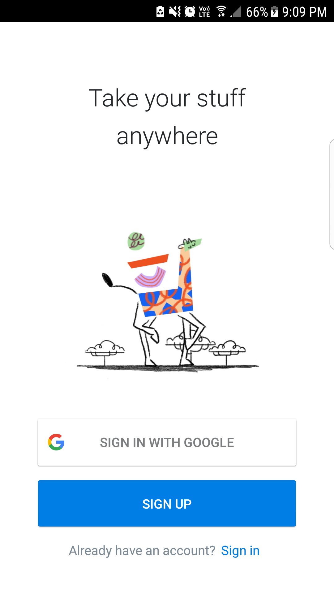
If you are using Sign up and Login buttons on the same page, giving them entirely different colours will improve usability. The colour also depends on the actions intended for that page. If you want to improve your sign-ups, make the signup button colour more prominent. But if you want to cater to existing users as your priority, apply the prominent colour scheme to your login buttons. It is as simple as that.
For the most important CTA buttons, remember to have a high contrast with the rest of your design elements. It should pop up and attract, but at the same time, it should not jump out.
Your primary action buttons should be designed to appear as prominent. Your secondary action buttons should go with a muted design themes so as to reduce potential errors. We are not attempting to be subtle with our primary buttons, so go all out. At the same time, go subtle with your secondary buttons.
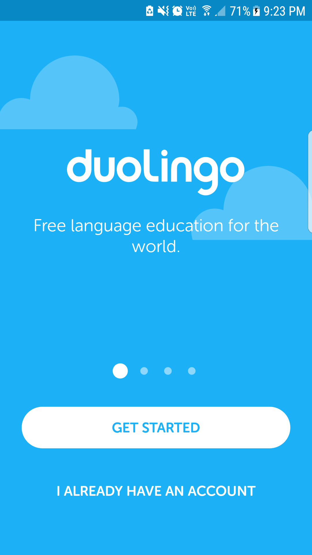
As a user, I don’t want to guess what a button is supposed to do. Make it easy for me and label it clearly. Show me what it does or where my click will take me. Your user should never be taken on a journey without being informed of the destination first.
Your labels should be clear, concise and to the point. You don’t have a lot of space to explain what it’s going to do for the user. That comes before or after the user interacts with the button. What should appear in the label part is an action verb.
What action should the user do? How will you reward your user if they click that button? Take sign up for example. It says you are signing up for a feature explicitly without doing into information overload. What the app does comes before encountering the signup button. How the app performs it comes after interacting with the button. But still, the user understands the need and goal from the button label.
Understand this principle. Live it and design accordingly. Labelling your buttons as “Let’s be friends” or “Get on” should be avoided at all costs. For usability and improved user experience, clearly defined labels are a must. And usability is what your app should strive for.
Keep your buttons accessible and in a position, that’s aligned with your user’s path. If they can’t find your action buttons where they expect it, you are not going to get your intended user actions or interactions. Don’t make your user hunt for the action buttons.
Position it where they expect it. Go with the norm on this one. The norms to follow not only includes the consistency with your own apps, but with your competitors and the Android design principles.
We, the users are subconsciously wired to expect the buttons in certain positions. When we can’t find it where we expect it to be, we get irritated and it destroys that smooth user experience you wanted to create. What do you think will happen if you try switching the “Pay Now” and “Cancel Order” buttons in your shopping carts?
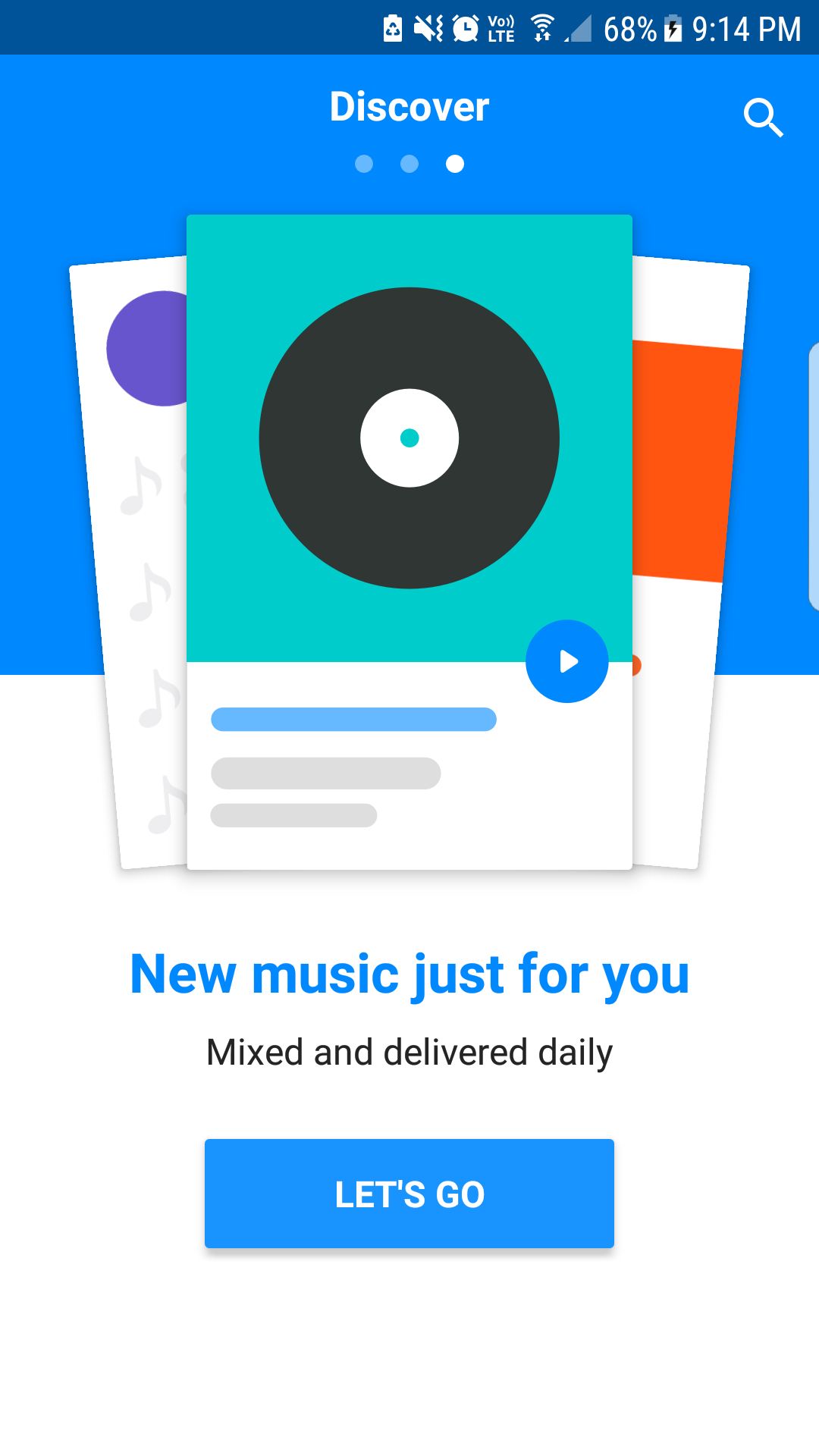
If you use a floating action button(FAB) in your design, limit its use to be the only action item on the screen. This will limit the choice overload for users. This limiting of decision options will help them to be on track with the best action choice to make on each screen.
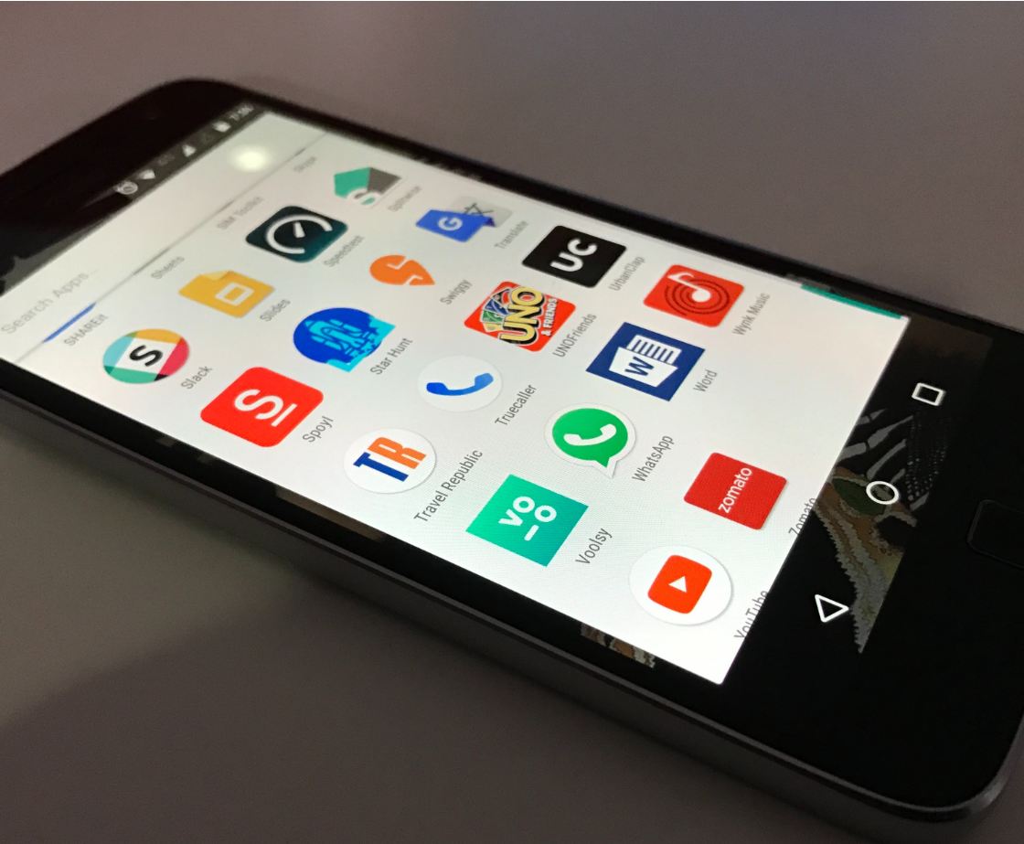
Pause for a second and think about a button. What shape comes to your mind first? I’m guessing that it’s either a rectangle or square and never a weird shape that looks like a clipart.
It's because we are accustomed to these rectangle shaped buttons and it sort of acts like the norm. Your users are familiar with them too and keeping these shape patterns will improve your usability.
That’s not to say, that you need to be restrained in your design choices. You definitely can implement unique ideas in your design, but if you go that route, ensure that your user can easily identify these as a button/action item.
You need to be consistent in your shapes and button design throughout your app so that the user doesn’t get bombarded with a multitude of elements they are unfamiliar with. Remember, consistency breeds familiarity.
The consistency of design improves your user’s interactions with the application. Your users attribute particular design choices you make to you and will expect the same throughout your app. This consistency is another factor that will reduce the decision fatigue and is extremely important for usability.
Keep in mind, if you decide a weird shape for button design, use it throughout your design or else go with a normal one users can easily identify with.
Use prototypes to test it out. Tools like Mockplus give you ample opportunity to try out your designs and get user feedback before releasing your app into the global stage of play store. These user feedbacks can single out the flaws you may never notice or point out which button is inaccessible, all of which you may miss in haste. So, incorporate the prototype - test- feedback - refine loop in your design process.
So designers, you now know the checklist of items you need to keep track of while creating your button design for android applications. While this may look a bit constricting, these tips are meant to help you improve the application’s usability. If you already do all these, keep up the good work. However, if you missed on some of these in your design process before, you now know how to improve it.
To quickly recap, your buttons should look like buttons and your user should be able to identify one as such. The primary and secondary action items should be as visually differentiated as possible with primary action appearing prominently. Consistency should be maintained throughout your design elements and this applies to your buttons too.
If you find it hard to put the unique design you come up with consistently across all your design frames, chuck it for now and use a norm your users are familiar with. Make it accessible to users and keep the treasure hunt part away from app design.
And last but not the least, remember your labels. Don’t input your artistic flair here. Plain speaking will do and we, your users will appreciate it. Finally, don’t forget to prototype and test it before release so that you can ensure a high level of user experience.
Do you think we missed out on any awesome tips you follow in your android design practices? If so, do let us know in the comments.
 Mockplus RP
A free prototyping tool to create wireframes or interactive prototypes in minutes.
 Mockplus DT
A free UI design tool to design, animate, collaborate and handoff right in the browser.


 Sign up with Google
 Join our Discord community
 support@mockplusapp.com