As one of the most crucial elements in Android UI, floating action button plays an important role. It’s always the most charming and visual elements and presents the high efficiency of action. What are the basic guidelines for the FAB? Where can it be used? Let's take a look at this article.
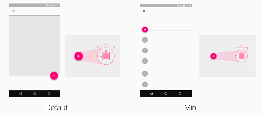
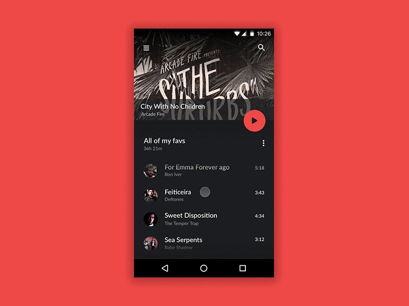
Floating action buttons are distinguished by a circled icon floating above the UI and have motion behaviors that include morphing, launching, and a transferring anchor point. There are generally two kinds of size, the default version and the mini version (only used to create visual continuity with other interface elements).
The default size is generally 56 * 56 dp, and the mini version of the size is 40 * 40dp. When the interface width is less than 460dp, it needs to be adjusted from the default size (56dp) to the mini size (40dp).
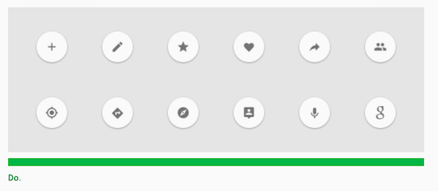
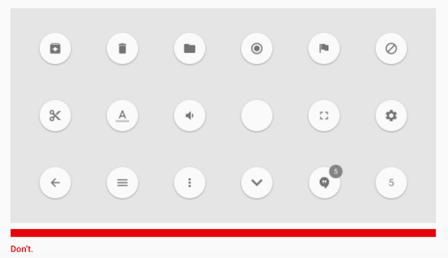
The floating button usually carries the main, representative action. Usually, it should be a positive interaction, such as creating, sharing, exploring and so on. The only android button design should not perform destructive operations, such as delete, archive. It should not be non-specific or incomplete. Cut and paste, for example, is a set of composite interactions that should exist in the menu bar instead of the floating button.
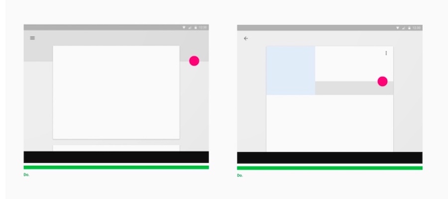
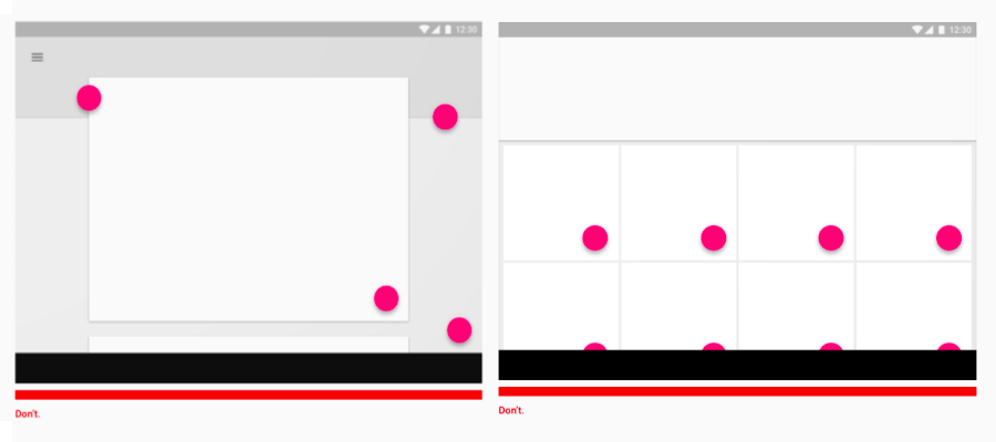
Floating buttons can be placed on extended APP bars, toolbars, or structural elements (without hindering other elements) and on the edges of the form on large screens. You should pay attention that each page can only appear one floating button, nor associate the floating button with all the elements on a page. The floating button itself is very eye-catching, the abuse of the button will distract the user's attention.
Floating buttons can easily trigger an action or navigate somewhere. It often used to trigger functions, menus, or navigation.
Floating buttons can be converted into toolbars when clicking or scrolling. Toolbars contain related actions, text, search fields, and more. When users scroll to signal that they are interested to read more, the toolbar that disappears on scroll will greatly save screen space and brings users a more fluent experience.
The fab button can be converted into a part of the APP structure. With the help of the dynamic effect, it extends to the entire screen, or even become a separate interface, to be a dynamic hub for switching interface. Google material design guideline requires:
“ When morphing the floating action button, a transition between starting and ending positions in a logical way. For example, do not pass through other sheets of material.
The morph animation should be reversible and transform the new sheet of material back into the floating action button.”
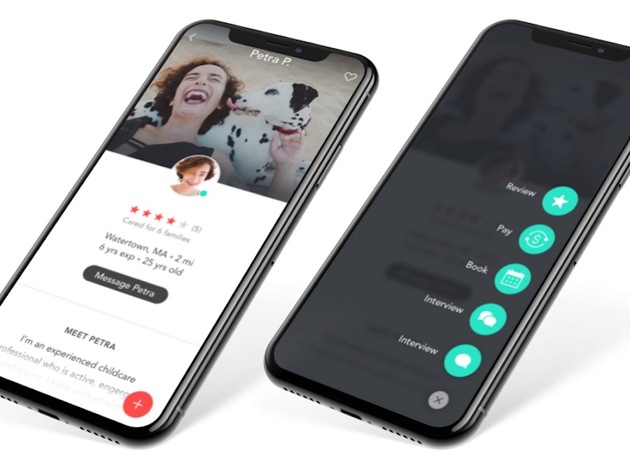
In addition to the single function trigger, the FAB is more commonly used to trigger a series of actions to replace the original single interaction with a group of related, commonly used, floating buttons.

As a general rule, this group of extended buttons should be more than 3 but less than 6. Otherwise, it violates the principle of fast, and efficient.
After figure out the basic guidelines and use of floating button, you can try to start making your own design practice. There are two methods for entry.
Prototype design
If you have an initial idea about how to use the floating button on the product, you can quickly prototype it with the Mockplus.
Mockplus is an all-in-one Web UI mockup tools for free that allow you to create mockups for mobile (Android & iOS), Desktop (PC & Mac) and web app, which helps ensure the particular mockup matches all design best practices.
Not yet inspired? It doesn’t matter. These 3 well-selected classic floating button design cases, I believe they will bring you inspirations.
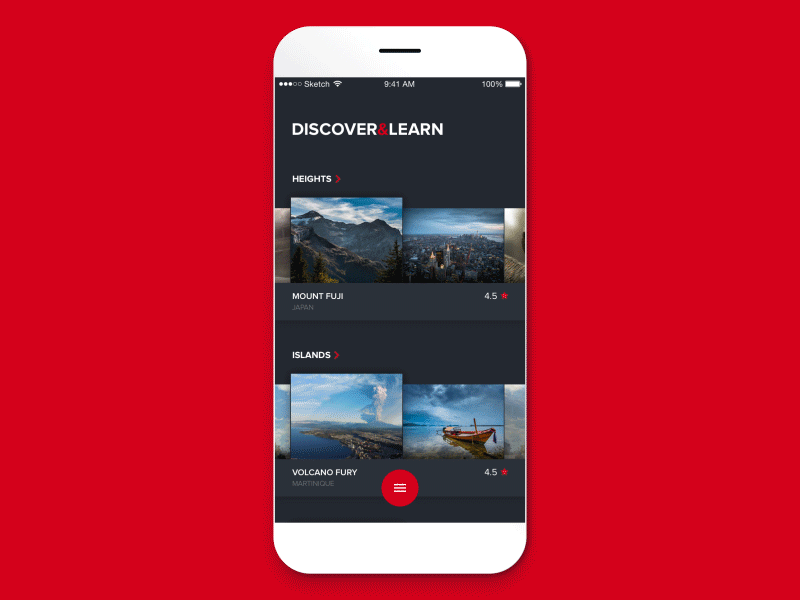
The designer sharply focused on usability, but also remembered to take into the consideration of account design and dynamic constituent.
Here, the drop-down menu occupies the half of the screen, slightly blurring the elements on the background to reinforce its importance. The detailed fluid accompanying animation contributes to the general impression.
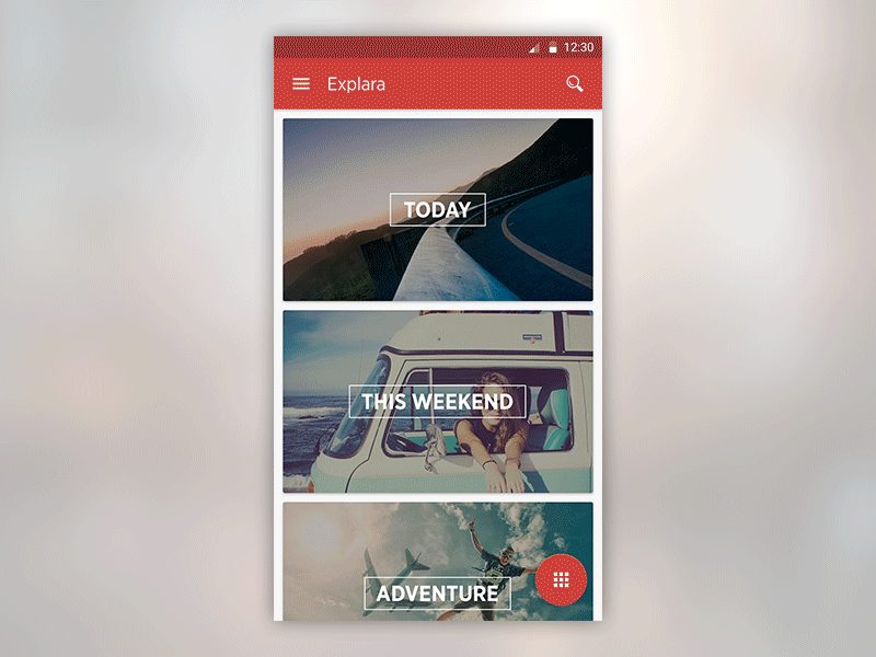
This FAB looks very aggressive. The form occupies the entire screen without any hesitation after activation. Because of the abundant space, the design succeeded in including all the important elements. The icons are beautiful and intuitive providing a strong and spacious user experience. The author skillfully set the focus, bringing a pleasant visual perception in UI design.
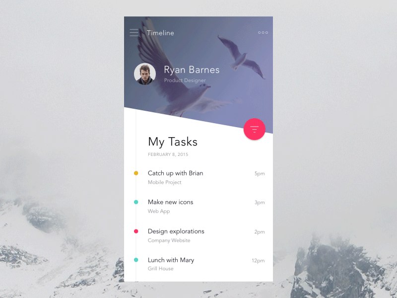
The designer uses FAB as a hub to make the search process more efficient and enjoyable, providing users with a more flexible user experience. The necessary filter options are arranged in an arc. Each of them has a well-designed circular icon. The menu panel in a circular shape that resembles the button itself. All these factors make the components look harmonious.
Floating action button seems like a simple animation in App design, but there are lots of details you should pay attention to, such as the basic guidelines, scenarios and user experience. Proper use of the floating button will give your product experience with a multiplier effect.
 Mockplus RP
A free prototyping tool to create wireframes or interactive prototypes in minutes.
 Mockplus DT
A free UI design tool to design, animate, collaborate and handoff right in the browser.


 Sign up with Google
 Join our Discord community
 support@mockplusapp.com