After a year of Facebook’s “like” button updates, the "like" button design of Facebook attracts people’s attention again due to the Ted speech of Margaret Gould Steward. Is it really this difficult to redesign a button as small as the “like” button on Facebook? Yes, Steward says. And according to the news, the leader of the project spent about 280 hours on coming up with a feasible solution.
Now that 280 hours are not squandered, I find it more interesting to look inside. It is certain that the 280 hours was not wasted and spent on more than just replacing the thumb icon on a light-blue round corner square and the standard font “like” with the “f” icon and the bold-font “like” on a deep-blue round corner square.
First things first, Facebook need the guts to give up the “thumb” icon, though it is so prevailing that it has already become a part of our lives. Actually, the “thumb” icon is also brought to us by Facebook, in other words, the “thumb” represents the Facebook brand in a way.
However, Facebook’ s “thumb” soon turns into the standard “like” button as the brand influence of Facebook gets stronger and stronger. As a result, we begin seeing thumbs of all kinds everywhere in our social apps. It’s the time when Facebook detects that its brand relation to the “like” button design is lowered by being copied by others. Different from Twitter, Facebook decides to strengthen the brand name and weaken the “thumb”. It’s not hard to infer how much time the whole process will take.
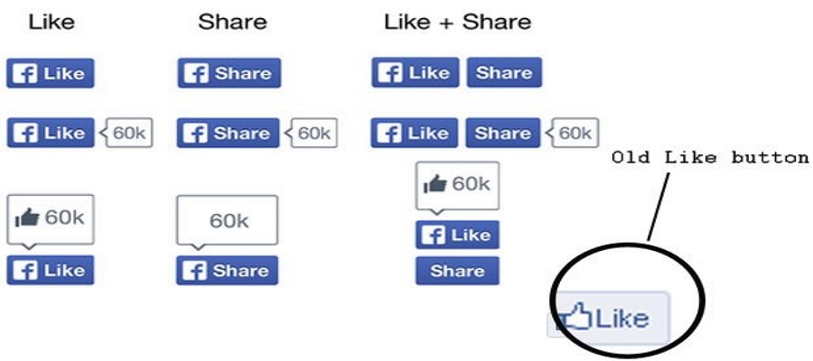
In fact, it is not, as it says, a trivial detail as small as the “like” button. Every satisfactory user experience project like the small “like” button in Facebook cannot be separated with a great number of corresponding and complementary designs. The screen shot released in the official blog which contains lots of models is only for one single button. Moreover, an array of other plug-in models needs to be modified correspondingly. In addition, like in the example in Steward’s speech, countless details of interactive design will be redesigned due to the change of the button design. And the final design still needs to be tested over and over again during iterations.
What’s amazing is that Facebook creatively bundles the “like ” button with the “share” button. 22 billion people are seeing the “like” button design of Facebook and over a half of them click it. While “like“ and ”share” come together, not only the content but the homepage of users will be exposed more wide-spreadingly. In Facebook’s test, the click rate of the wider new “like”button is twice of the former one.
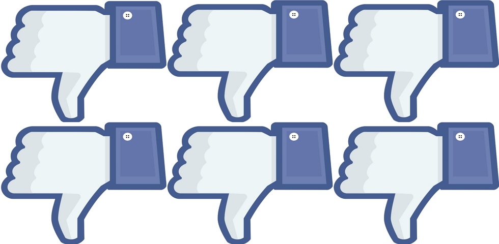
By the way, it is said that Facebook has received some feedback that suggest Facebook introduce a “dislike” button. But Facebook turns down the “dislike” button design project along with the “confused” reaction button. “I might feel frustrated if my posts are disliked all the time.”
So, what is the major factors that is deciding the outcome of button design? Here are 3 principles for you to do the perfect button design:
How to tell users it is a button on the first sight? In most cases, visual model tells users which element is clickable. You can also design the button in different shapes,though sometimes grotesques in shape are risky of recognition failure. It’s very important to apply visualized model in a correct form.
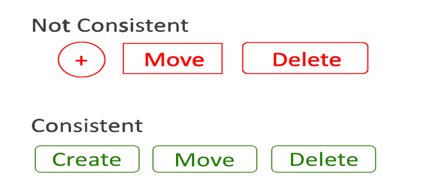
We don’t really have to make every button fantastically stylish and elegant, but at least we can get a better first impression to enhance the uer experience by being consistent. Users tend to unconsciously recognize buttons in specific shapes as “buttons”. Consistence not only help designers build a beautiful interface, but also provide users a more familiar experience. The example above shows how users are confused by inconsistent button design.
It does not refer to the visualized experience mentioned before, but the experience between users and UI interaction elements. Generally, button design have multiple status. Users need to know which is the current status by the form of the button.
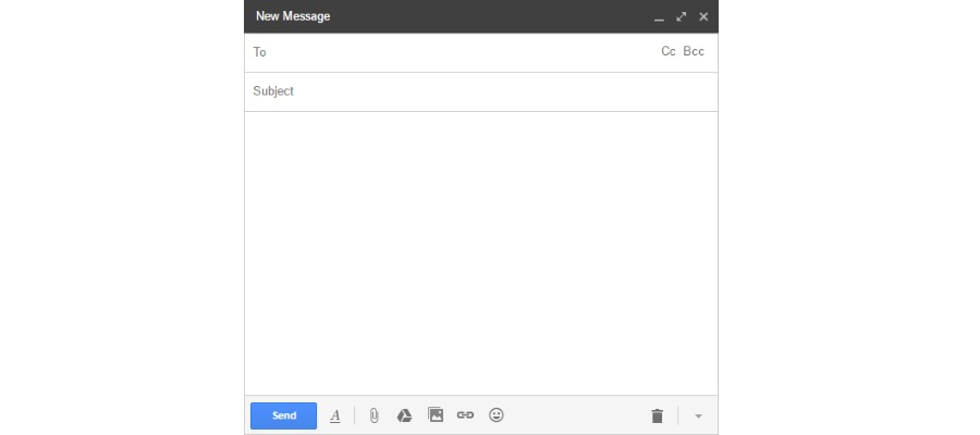
Important buttons, for example, the CTA (Call To Action) button, often lead users to conduct the operation you want them to do. The ultimate UX design of the perfect CTA button should catch users’ attention and induce them to click. Let’s take Gmail as an example. We can see the color of the writing interface is mostly gray. Once users complete an email, they will immediately notice the“send” button covered by blue at the left corner. If you are designing the “register” button, the using of potion and color is more decisive.
Go and check these principles in Facebook, you may notice more spots about button design that you have ignored before.
read more:
 Mockplus RP
A free prototyping tool to create wireframes or interactive prototypes in minutes.
 Mockplus DT
A free UI design tool to design, animate, collaborate and handoff right in the browser.


 Sign up with Google
 Join our Discord community
 support@mockplusapp.com