As we all know, websites with a good visual hierarchy organize UI contents more effectively and are also more compelling for users. That’s why UI/UX designers always pay much attention to add visual elements to stand out their websites.
However, what on earth makes a powerful visual hierarchy in website design? How do you visualize your website UI contents for better visual hierarchy? Is there any effective design tips or examples for your inspiration?
This article will analyze 9 effective tips and examples of creating visual hierarchy in website design for your inspiration. Moreover, to help you test and implement your design ideas quickly, some useful website prototyping tips (with the aid of an easier, faster and smarter prototyping tool, Mockplus) will also be introduced to you:
The visual hierarchy in website design refers to the arrangement and presentation of website UI elements in order of their importance so that users can easily scan page information needed quickly, click and purchase a website product smoothly. Moreover, websites with better visual hierarchy will often have better UX as well as higher product sales.
Hence, in your design, you can also utilize visually hierarchical elements to create a beautiful and compelling website.
After knowing the visual hierarchy web design definition, let’s learn 9 golden tips and examples to organize website UI contents for better visual hierarchy and UX:
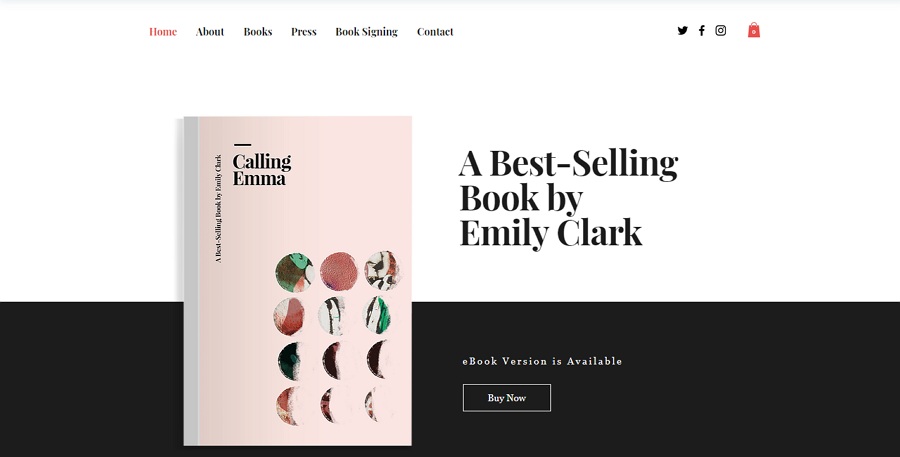
Size, as one of the most powerful tools for better visual hierarchy, has placed a great impact for designers on visualizing their web page elements.
The larger the element (such as photos, texts and shapes) is, the more attention it will grasp. So, you can try to adjust the size of your website elements to show their importance.
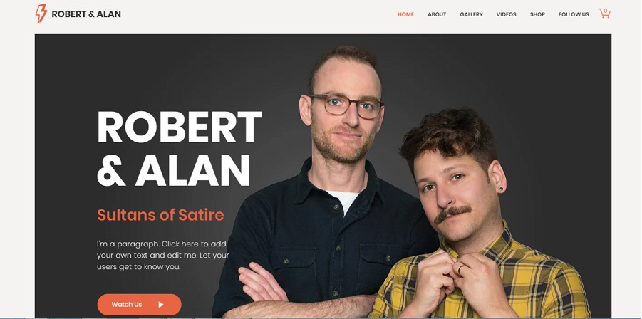
Adjust the size of texts to show visual hierarchy.
Please Note: The size of web elements should be controlled in an acceptable range.
Take the website texts as an example. Too big words will surely decrease the contents of a page. And too small words will be extremely difficult for users to read and find out needed information.
Prototyping design tips:
To visualize the website elements by adjusting their size in Mockplus (a useful prototyping tool with powerful component and icon library), you can easily drag the borders or edit the width and height numbers of the selected website components.
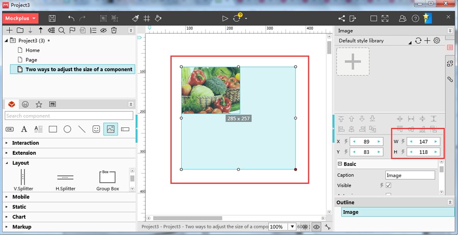
Mockplus provides two ways for you to adjust the size of web elements freely.
Like the black words in white background, similar web elements with diverse shadows and opacity can easily present simple hierarchical relations among them. And in some cases, without many colors involved, different web elements with diverse shadows and opacity can also create visual hierarchy for better UX.
Moreover, creating web page visual hierarchy with shadow and opacity will also extremely simplify your website and help you make an amazing minimalist website.
Create simple visual hierarchy with opacity and size of text elements.
Prototyping design tips:
In this aspect, Mockplus provides a special “Opacity” property for every user to easily adjust the opacity of website element. What you are supposed to do is only to edit the number of this property based on your needs.
And, if you want to create hierarchical elements with shadows, you can easily overlap components of Mockplus to achieve that.
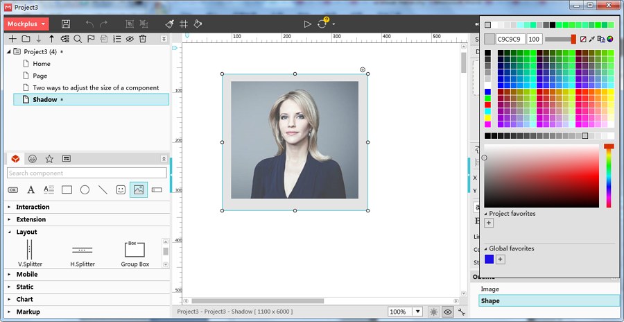
Create shadows by overlapping “Image” and “Shape” components together in Mockplus.
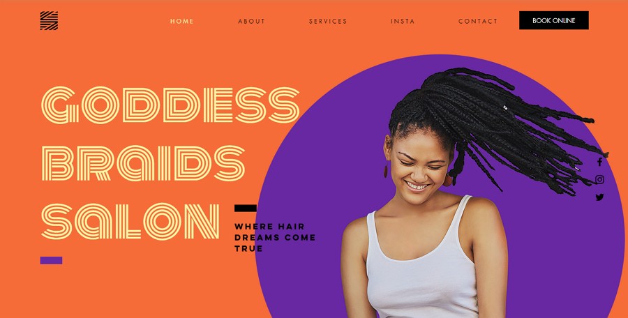
Color is another widely-used visual tool for designers to create an appealing website with a strong sense of hierarchy. And in your design, you can make full use of colors for better visual hierarchy in the following aspects:
1). Use bright colors to emphasize important web information
Bright colors always draw the attention of users more effectively and quickly than muted colors. So, use bright colors to emphasize important web contents.
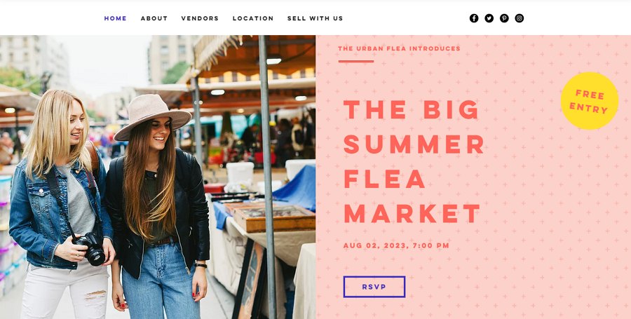
The brighter red and yellow texts in the softer pink background are much easier to be noticed.
Moreover, some colors with special meanings will also help determine the basic tone of a website and attract the attention of users.
For example, the blue color often indicates trust, security, calm and peace. So, it is better to be used in the pages of some management or security websites. And the red color often has meanings, such as confidence, youth, enthusiasm and happiness. It is better to be used to emphasize some promotional advertisements.
You can use read color to stand out promotional information of your websites.
2). Use color gradients to implement website visual hierarchy
Color gradients can also help create a clear visual hierarchy for your website.
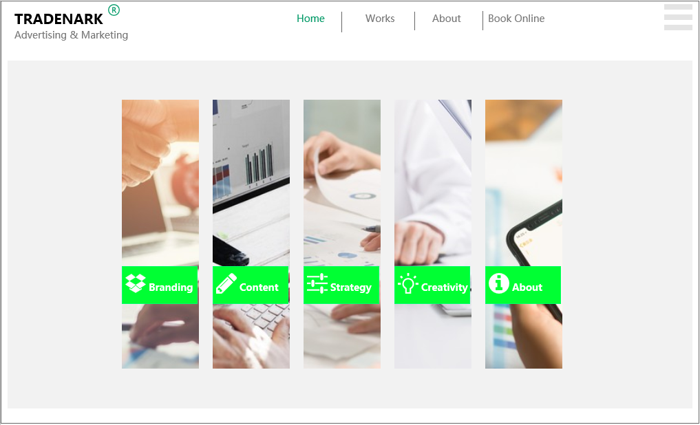
3). Use color blocks to closely place elements logically related
Logically related elements that are closely placed in the same color blocks will be easier for users to scan and use them freely. Of course, the color blocks also help create website hierarchy.
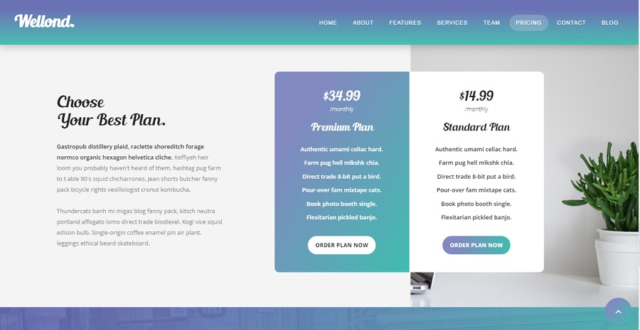
Use color blocks to more intuitively show elements logically related.
Prototyping design tips:
To help you create a clear visual hierarchy, Mockplus provides a very powerful color selector for every component, which enables designers to easily choose wanted colors with simple clicks. It also allows you to save favorite component colors for later or future use.
And to add color blocks, you can easily use “Shape” components in combination with other components, such as “Image”, “Label”, “Text Area” and so on.
Moreover, if possible, you can also make a simple color interaction with more than one trigger, such as “MouseHover” and “ClickOn” by using its “State Interaction” function.
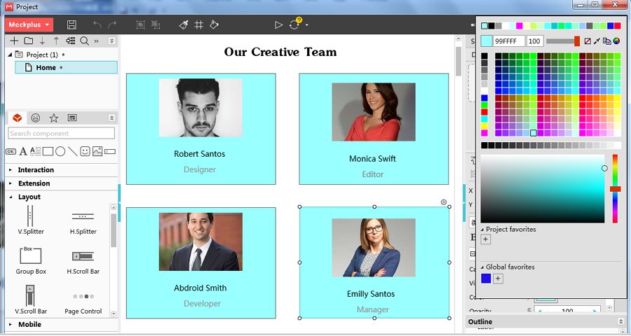
You can create functional color blocks with “Shape”, “Label” and “Image” components in Mockplus.
Page layout is also another powerful visual element. On the one hand, one website can be assigned with a variety of page layouts based on web/product features for better readability and richer contents.
On the other hand, one website can also be designed with repeated page layouts so that user can become familiar with this website and find the information needed quickly.
In short, page layout also helps create compelling websites in an effective visual way.
And below are some common layout patterns that you can try in your web UI design:
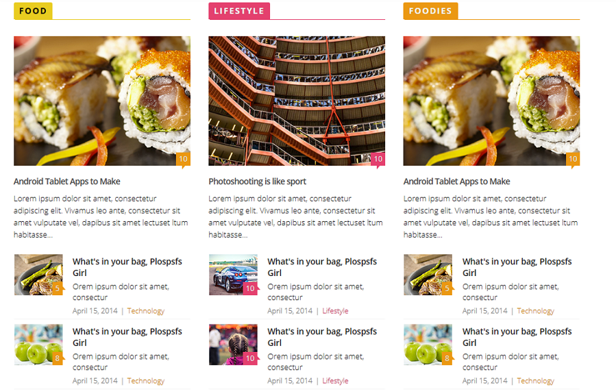
1). Grid helps create a clear layout visually
Grid, as an essential element to divide page functions, is an important tool to help designers organize visual contents in website design. Moreover, in combination with the change of colors, page grid can also make your entire website design very beautiful and cool.
Grid can help you create an intuitive layout and make your entire website design more beautiful.
2). Placement & Proximity
Since people naturally tend to perceive the proximity of UI components as groups, designers often use proximity as a tool to divide the website page contents. Hence, in your design, you are also suggested to closely place logically related UI components in the same place for better readability and clearer layouts.
3). Create clear page layouts with dots and lines
Without any grid involved, you can also use dots and lines to divide page blocks and create clear page layouts freely.
You can create clear page layouts with proximities and lines.
4). Alignment
The alignment of website photos, texts and other elements will also present the website visual hierarchy perfectly.
Overall, page layouts also help designers make a fashionable, beautiful, attractive and hierarchical website effectively.
Prototyping design tips:
In Mockplus, you can easily use “Repeater” and “Auto Data Fill” features together to make grids easily. Moreover, while prototyping your websites, many features of Mockplus, such as its Ruler, Guidelines and Alignment options, etc., can also be extremely helpful.
You can freely use “Repeater” and “Auto Data Fill” features to make grids for your website design.
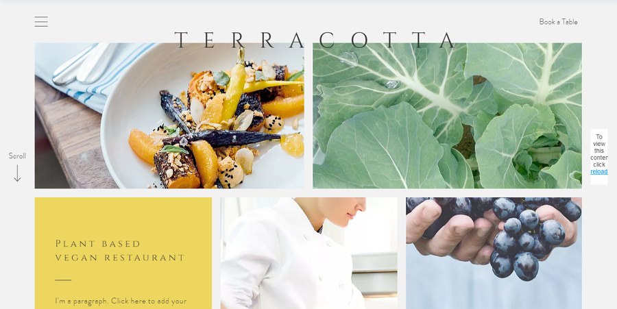
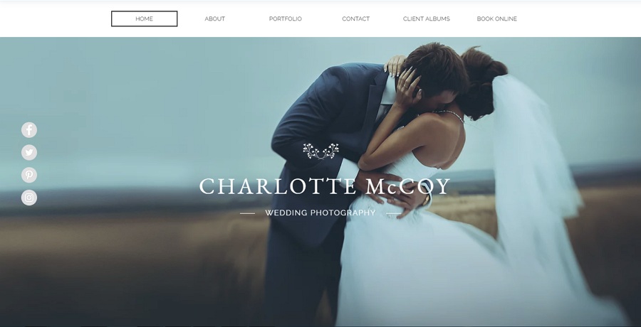
Space, especially white space (also called negative space), between website UI elements can also help highlight the UI contents and create visual hierarchy intuitively. Below is one of the typical examples that wisely use space to show web hierarchy:
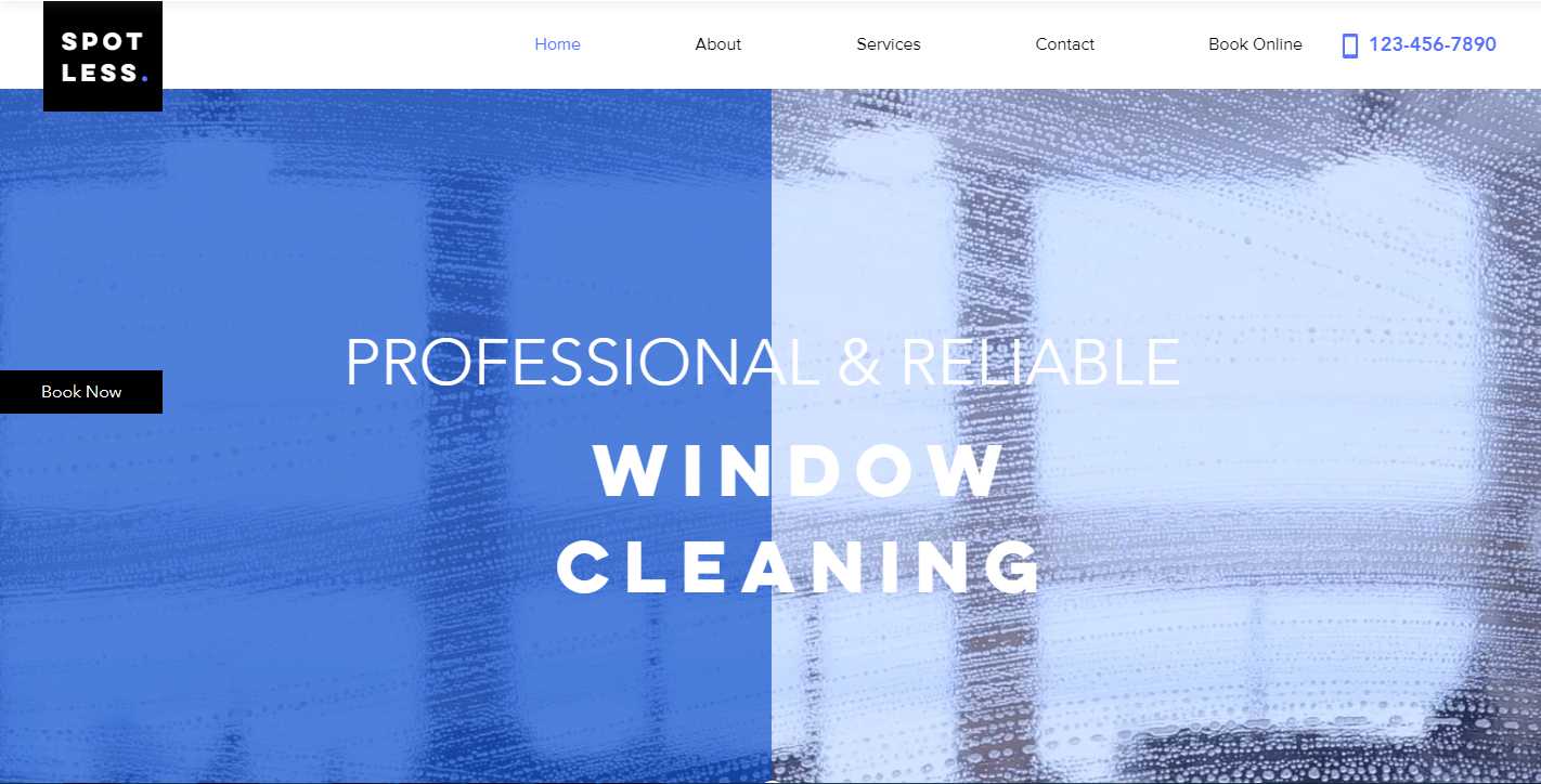
All the visual elements/tools mentioned above, such as colors, shadows, sizes and space, can contrast with each other to show the differences between them and help designers stand out the website visual hierarchy.
Strong color contrasts make the website visual hierarchy clearer for users.
In addition, when overlapping two or more UI elements together, you can also use contrasts to emphasize the top layer elements. Moreover, in case of causing any chaos, you’d better keep the contrasts in balance.
To be more specific, the top layer is supposed to be placed with the most important and clearest elements with the richest details. However, the background or backward layers are supposed to hold some more obscure web contents with fewer details. Otherwise, the users may not be able to distinguish the important data from the surroundings quickly.
The top layer is supposed to be placed with the most important and clearest elements with the richest details.
The unique design style can not only make your website interesting, but also affect the visual hierarchy of your web. And in your design, it is always a good attempt to use very unique texture, graphics, images and more visual elements for a greater visual hierarchy.
Personal design style can not make your website interesting and outstanding, but also help you create a greater visual hierarchy.
Overall, your unique design ideas can make your website different and compelling.
Prototyping design tips:
To help you make a successful website prototype with a good visual hierarchy, Mockplus provides various powerful features for you to translate, test and iterate your design ideas with ease and efficiency.
For instance, its team collaboration and management feature facilitates designers to complete their design projects more efficiently. After you’ve completed your prototypes, you also get 8 ways to test and share prototypes in Mockplus.
In addition, with its Component Style library, it is also a piece of cake for you to save, reuse and share the component styles freely.
In your design, you are also supposed to add or highlight the important content that users real need in the website visual hierarchy. Otherwise, the users may directly leave when they find no information needed.
Moreover, you’d better also assign the visual elements based on the page scanning patterns of users.
In fact, according to report by Nielsen Norman Group, there are several common scanning patterns, such as “F” or “Z” pattern, while people are browsing web pages.
To be more specific, no matter whether people will use a “F” or “Z” scanning patterns, they often read both of the head and bottom of the page carefully for searching for the core information from the left to the right. And as with the body contents, they will often scan the hierarchy (which consists of web tiles and subtitles) and choose useful parts only to read.
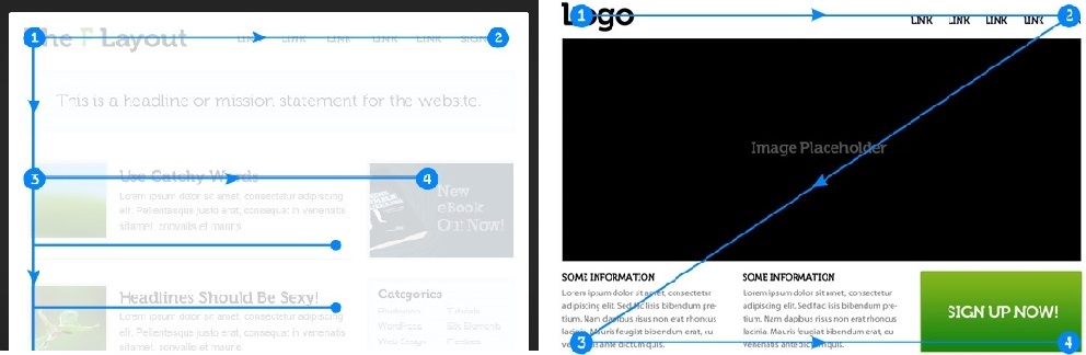
And these scanning patterns require designers to place important or interesting contents with a good hierarchy in the head or bottom of the web page. And as with the body contents, you are also supposed to add attractive tiles and subtitle to create compelling hierarchy.
In short, you are supposed to optimize the website contents based on real user needs.
There are also many other tips that can help you visualize website page contents.
For example, in your website design, you can also use font, typography, alignment and more to create text hierarchy.
Prototyping design tips:
If you plan to create visual hierarchy with the fonts, sizes, colors, alignments and typography of website texts, you can use “Label” and “Text Area” to achieve that easily in Mockplus. Moreover, if necessary, you can also add appropriate interactions to them freely.
Visual hierarchy not only makes a website UI beautiful and attractive. It is also effective for UX/UI designers to perfectly organize the contents of an Android or Mac app. So, if you coincidentally need to use visual hierarchy to stand out your mobile apps, all the website design tips and examples will also be helpful for you.
In short, no matter whether you are trying to create visual hierarchy on website/app design, it is necessary for you to choose a powerful prototyping tool (such as Mockplus) to test the feasibility and effectiveness of your design ideas.
Overall, hope all the mentioned best website visual hierarchy design tips and examples will be inspiring to you.
 Mockplus RP
A free prototyping tool to create wireframes or interactive prototypes in minutes.
 Mockplus DT
A free UI design tool to design, animate, collaborate and handoff right in the browser.


 Sign up with Google