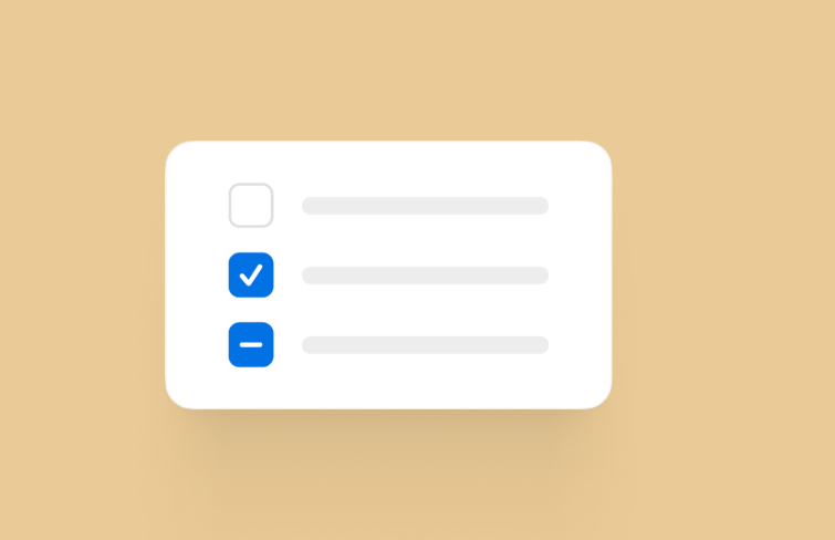
Checkboxes, commonly used componets in UI design, play a important role in digital interfaces. It intricately intertwines with the subtleties of interface logic and significantly influences user experience.
Despite their seemingly uncomplicated nature, their design and practical implementation demand a nuanced approach. In this article, let's explore it together and understand the essence of checkboxes. Moreover, we also handpicked the best designs of checkboxes for you to draw inspiration from. Let's dive into details.
If you search for "Checkbox" in Google, you can see Google defines it as a graphical widget that allows the user to make a binary choice. Actually we can defines it more accurately as a UI component that allows users to indicate a binary choice, typically represented by a small box that can be checked or unchecked. When checked, the small box will be filled with a check mark.
Originating in the the early days of computing, checkboxes have undergone a remarkable evolution from a mere functional element to a versatile and visually appealing component in contemporary user interfaces. Checkboxes are now frequently used in forms, dialog boxes, and settings panels. Their prevalence is owed to their intuitive nature, marked by simplicity and visual clarity, which make it easy for users to understand and interact with, reducing cognitive load and enhancing the efficiency of user interactions.
In addition to exploring the definition of checkboxes, we have curated a collection of the best checkbox designs for you to draw inspiration from.
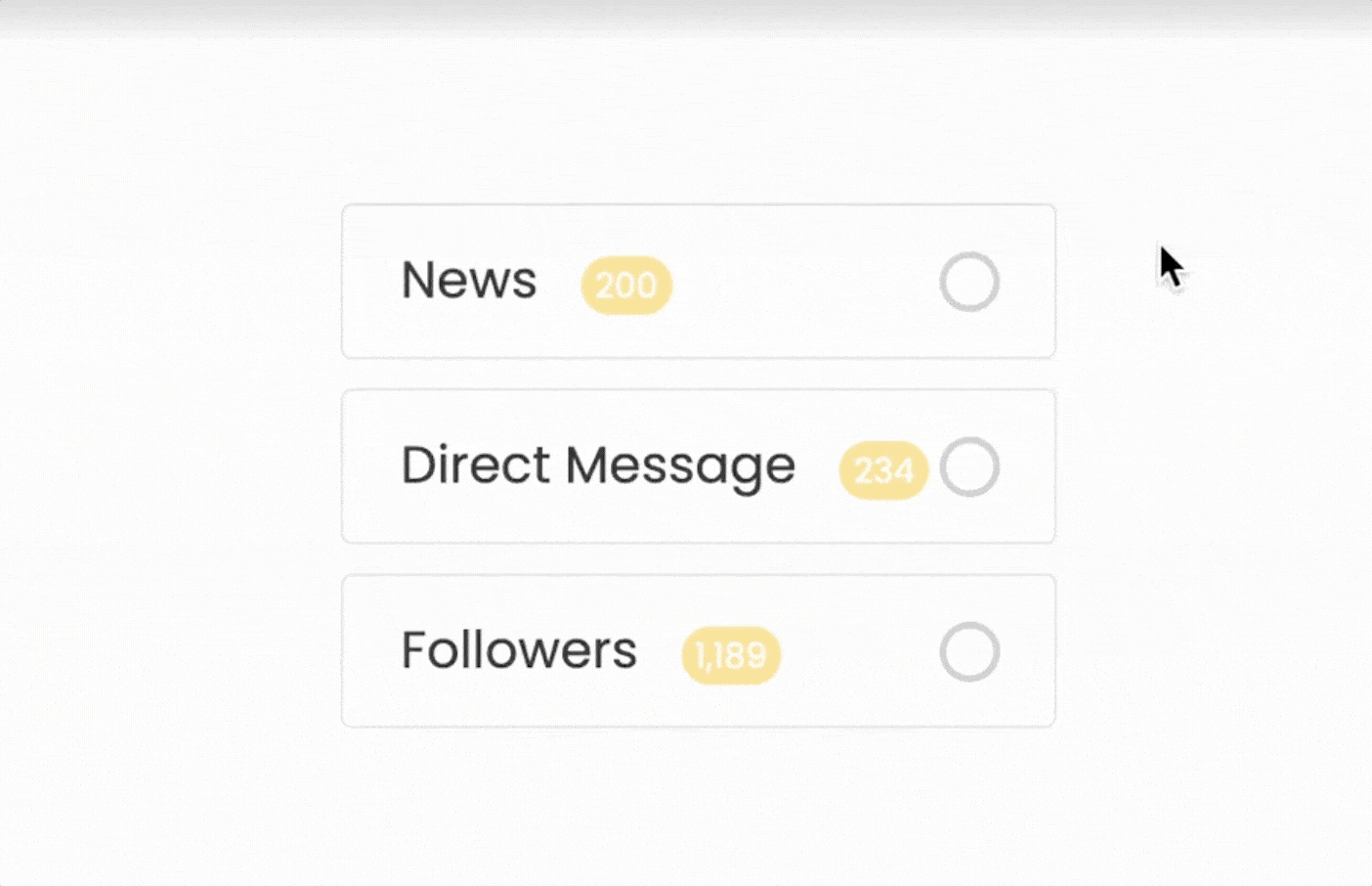
As the design landscape continues to evolve, chekboxes come in various visual designs. In recent years, you can observe various metaphors to correspond to the active checkbox state, such as rounded checkbox, squared, outlined, and others, and various styles such as styled background and colored themes. Let's draw insights and ideas from these exemplary designs which showcases the creativity and innovation that designers bring to this seemingly simple UI element.
If you would like to spice things up when it comes to selecting different functions, this free checkmark checkboxes template will come ideal. Upon selection, the checkbox undergoes a transformation – the background color gracefully transitions, infusing a subtle visual flair. Meanwhile, the checkmark icon completes the spectacle by performing a graceful spin, reinforcing the confirmation. Its dynamic animation and checkmark design not only ensure clarity but also add a touch of excitement to the interaction.
Mix and match vanilla look with creativity by utilizing this free unique checkbox snippet. The unique part of this checkbox is its animation. Upon selection, it changes the square checkbox into a beautiful tick mark with a smooth animation.
The neuromorphic checkbox concept uses a modern age 3D button design concept. It has incorporated modern-age visual elements to elevate user engagement and deliver an authentic experience to the users.
This checkbox uses a sensible hover effect to show the users that it is clickable. If you are planning to use a checkbox as one of the key elements on a web page, checkbox designs like this will be a good choice to deliver a better user experience.
If you are bored by the same old checkbox designs, fresh designs like this might ignite your creativity. Instead of selecting the checkbox alone, the entire option is highlighted when you select one, which will help the user clearly see the options they choose. Because of the compact nature of this animated checkbox design, you can also use it on the mobile application designs.
This checkbox has a simple and elegant animation effects that give you a realistic feel. Upon choosing an option, a subtle yet captivating scribbling animation unfolds, providing a touch of sophistication to the interaction.
The bubble effect of this checkbox is pretty smooth. And also bright colors are used effectively with the animation effect to clearly show that the user has selected the checkbox. As more users are using smartphones nowadays, an animation effect like this will give a reassuring feel to the user
Another area where the checkboxes are still used is in the checklist. There are a lot of apps to help you organize your work and if you are planning to make a handwritten style checklist, this design will give you an idea.
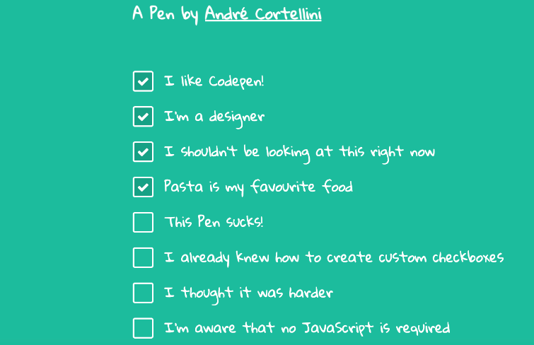
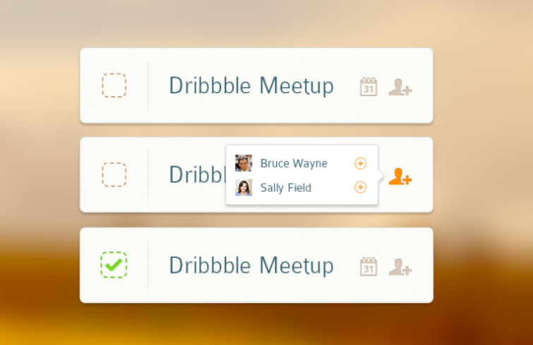
This design exemplifies an intuitive user experience with an old-fashioned style. Its unchecked state is depicted as a hollow square, while the checked state is represented by a green-colored box. It incorporates social elements within its modules, displaying profiles of participants clearly yet unobtrusively, fostering a sense of community and connection. The additional icon on the right invites users to join effortlessly. Every element serves a purpose and its visual cues are clear and inviting.
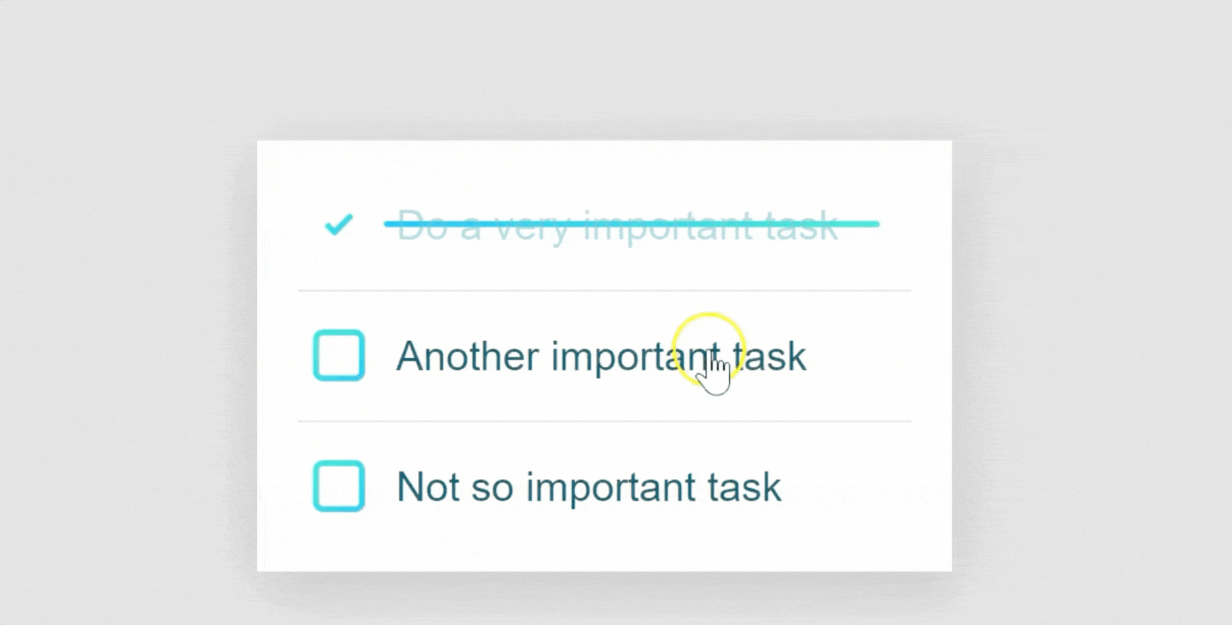
This is a beautiful to-do list strike off animation designed by Gal Shir and Shaw. When you click on the list item, the square checkbox slides away and strikes off the text.
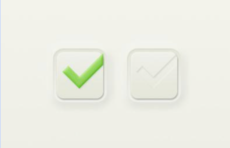
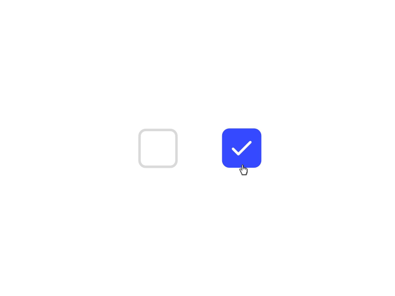
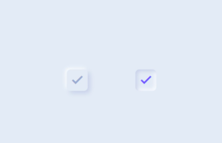
This checkbox in checked state encapsulates a minimalist aesthetic, featuring a white square border enveloping a vibrant green check mark. This design choice not only accentuates visibility but also intuitively conveys selection to users, eliminating ambiguity. As for the checkbox in unchecked state, it adopts an equally minimalist approach yet distinguishes itself through its outlined check mark. This subtle variation signifies non-selection while maintaining consistency in design language. The use of rounded corners softens the overall appearance, making it more approachable and user-friendly. Furthermore, the color green is not arbitrarily chosen; it aligns with universal signals for affirmation or ‘go’, thereby intuitively resonating with users across diverse backgrounds.
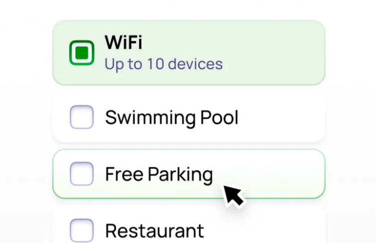
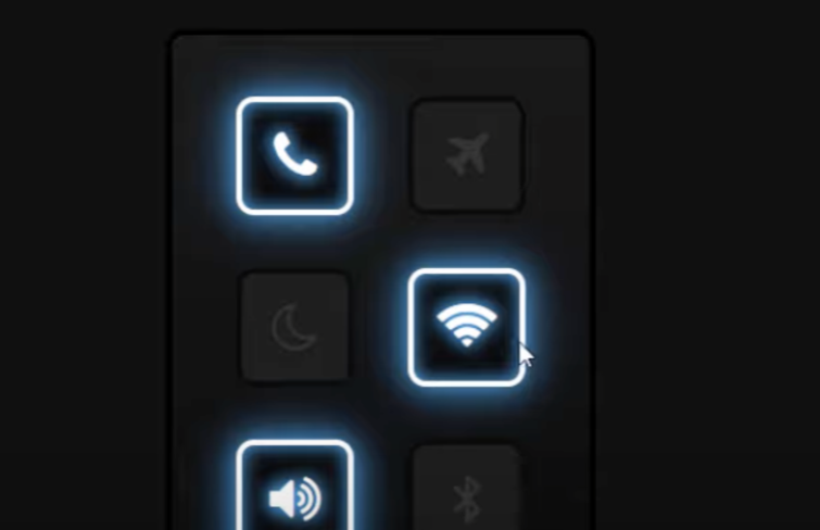
This checkbox comes with a rectangular with rounded corners, which gives them a soft and user-friendly aesthetic. And also it's outlined, which ensures that they don’t overpower the content but rather complement it.
When an option is hovered, the rectangular is outlined and turns linear in subtle green. When an option is selected, the rectangular fills with a vibrant green hue, instantly signaling activation to the user. Another notable feature when an option is selected is the inclusion of supplementary information. For instance, ‘Up to 10 devices’ under ‘WiFi’. This additional context aids users in making informed decisions without cluttering the interface.
Jelly Checkbox is a simplified, posh-looking checkbox with a bouncing animation, which makes it noticeable and also interesting when an option is selected.
Incorporating an element of simplicity and playfulness, this animated checkbox introduces a delightful interaction. When clicking on the checkbox, the initial purple outline undergoes a vibrant metamorphosis, transitioning into a cheerful yellow hue, and then quickly moves to the center and transfers into the check mark. This dynamic animation not only brings an element of fun to the checkbox but also provides users with instant visual feedback, enhancing their overall interaction.
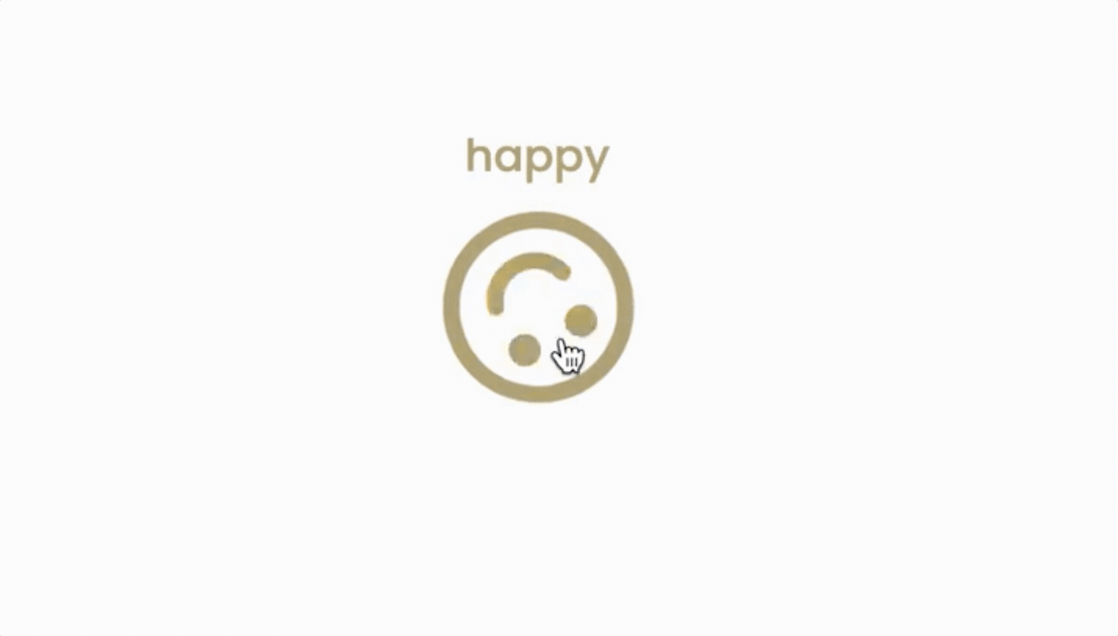
This is a delightful user interface enhancement that brings a touch of celebration to the digital experience. Once selected, this checkbox will give a dazzling sparking display, creating a visually captivating and enjoyable moment for users.
With this free emoji checkbox template, you can lift up the overall behavior of your website and user experience. The fluent transferring animation accompanying the checkbox selection captures attention and injects a touch of liveliness into the interface.
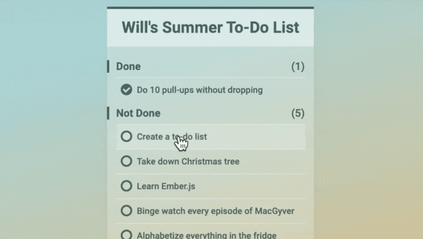
The whole checkbox looks neat and works according to its purpose. When the user marks the action as completed, the label will move to the completed list section. By adding this nuanced trick, the checkbox interaction transcends its utilitarian purpose, becoming a conduit for a more profound connection between the user and their completed tasks. The deliberate movement of the label to the dedicated completed list section not only imparts a sense of closure but also amplifies the user's satisfaction, fostering a positive and rewarding association with task completion.
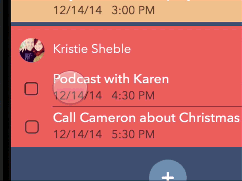
This checkbox not only facilitates the conventional tapping method for checking off items but also introduces an interactive twist. Users can engage with it by employing a drag-and-release gesture, adding an extra layer of dynamism to the interaction. The flexibility in interaction methods elevates the overall usability of the checkbox, catering to a diverse range of user preferences and contributing to a more engaging interface.
When you are going to design checkboxes, an excellent design tool guarantees efficiency and perfect results. I personally recommend Mockplus RP - a super powerful and easy-to-use prototyping tool. It has a super intuitive interface, thousands of built-in UI icons, component libraries and templates, and powerful interactions & animation features. What's next when you got a right tool? You have to consider both the aesthetics and functionalities of checkboxes - how they look and how they work, which means that it's not just about making them pretty, they've got to play nice with the overall design to give users a seamless and enjoyable experience. It's like finding the sweet spot where good looks meet practicality to make those checkboxes not just cool but also user-friendly. Here are some basic steps to guide you through the process:
Understanding the purpose of checkboxes is a crucial and initial step in the design process. You should identify the context in which the checkboxes will be used and the purpose they serve within the user interface. Whether it's for form submissions, settings, or preferences, a clear understanding of their role is essential. Designing checkboxes with a clear understanding of their intended use ensures that they are appopriately designed to fulfill their specific role and aligns with user expectations.
The visual style of checkboxes plays a pivotal role in creating a cohesive user interface. The visual style should not only be visually appealing but also align with the overall design language, creating a unified and polished look. Ensure the chosen style maintains consistency across the application, considering factors such as color, shape, and size.
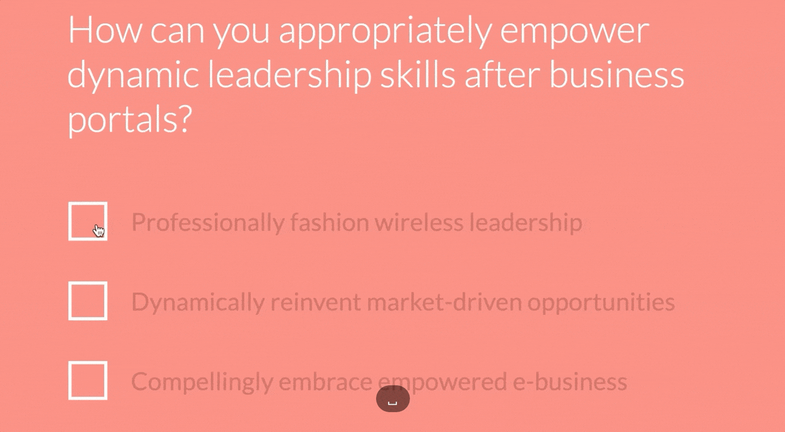
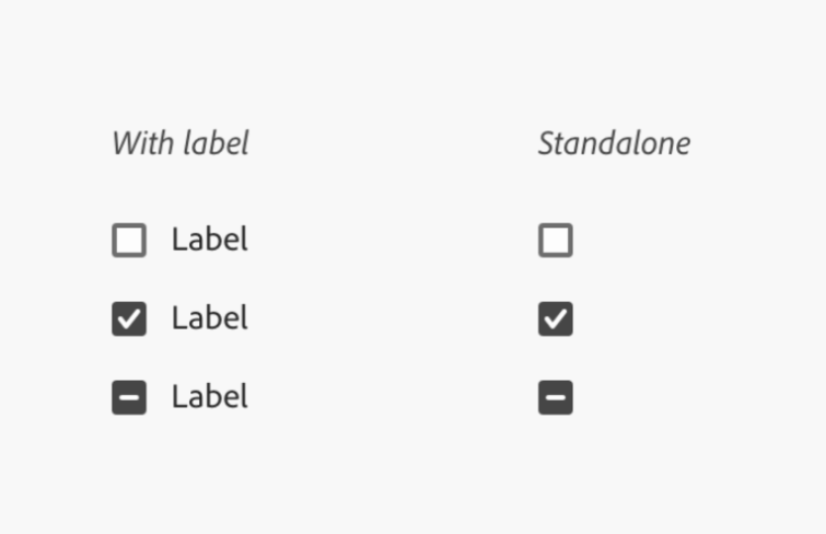
Accompanying checkboxes with clear and concise labels is a best practice in checkbox design. A checkbox without a defined label may operate as a standalone element, which is acceptable only when its connection to other components is evident. However, for enhanced clarity, especially when the context might not be immediately apparent, incorporating meaningful text is advisable. This ensures users can easily comprehend the purpose of each checkbox without confusion, contributing to a more user-friendly experience.
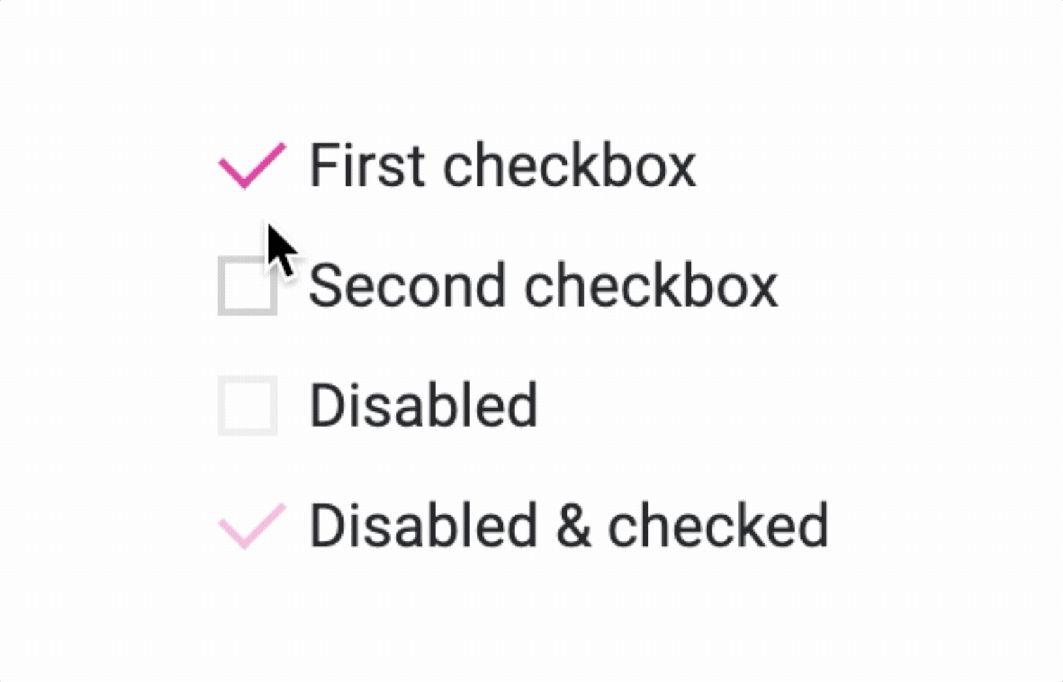
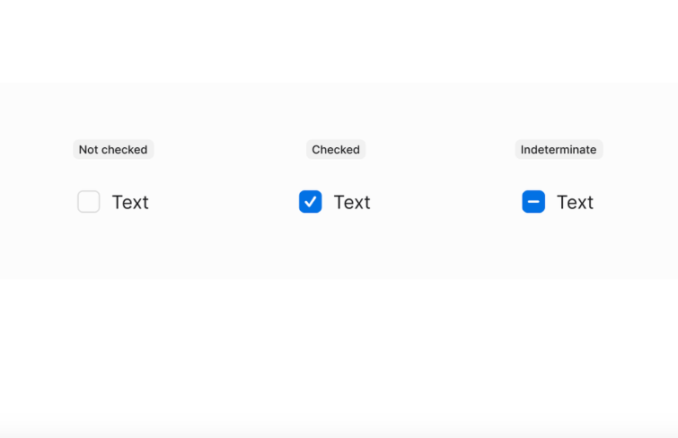
Another key aspect of checkbox design is considering various interactive states. Design for default, hover, focus, and selected states to provide users with clear visual feedback as they interact with checkboxes. This feedback can manifest through color or shape changes, subtle animations, or highlighting effects that confirm their selection. Crafting visually distinct states enhances the user's understanding of their interaction with checkboxes, creating a more engaging and responsive experience.
To ensure the effectiveness and user-friendliness of your checkbox design, thorough testing across different devices and screen sizes is essential. Preview the design to verify that it functions as intended, considering factors such as color accuracy, radius, and the appearance of different states. This rigorous testing process guarantees a consistent and seamless user experience across various devices, enhancing accessibility and usability.
Generally speaking, the meticulous design of checkboxes involves a thoughtful process that goes beyond mere aesthetics. By understanding their purpose, determining a cohesive visual style, adding clear labels, designing interactive states, conducting comprehensive testing and even more, you can create checkboxes that not only look visually appealing but also contribute to a user-friendly and enjoyable interface. Moreover, some tricks can also be helpful in the process for designing a better checkbox.
Ensure the visual relationship between the checkbox and its associated label is clear.
Keep labels short so users can check quickly and confidently.
Provide visual feedback when users interact with the checkbox. Users should be able to easily identify which element they are interacting with. This can include changes in color, animation, or the addition of a checkmark to confirm the selection.
Ensure your checkbox design is accessible to all users, including those with disabilities.
Ensure sufficient contrast between the checkbox and its background for clear visibility.
Provide enough spacing around checkboxes to prevent accidental clicks or taps.
Video tutorials for your reference:
These tutorials cover a range of topics, from the fundamental principles of checkbox design to creating interactive and animated checkboxes. Designers, whether beginners or seasoned professionals, can find valuable insights to enhance their skills.
A checkbox serves as a fundamental component or graphical widget in GUI design, providing users with a clear and intuitive way to interact with.
You can think of it as a decision-maker in the binary realm, offering users a straightforward choice between two options that are often mutually exclusive. It's like a digital coin flip, where you can pick heads or tails with a simple click.
The magic happens when you interact with the checkbox. Traditionally, a click on the box itself triggers a transformation in its state. However, the versatility extends further. Now it usually allows users to alter its state not just by clicking directly on the box but also by interacting with its label. It's like having multiple entry points to the same decision-making process, offering flexibility in how users engage with the interface.
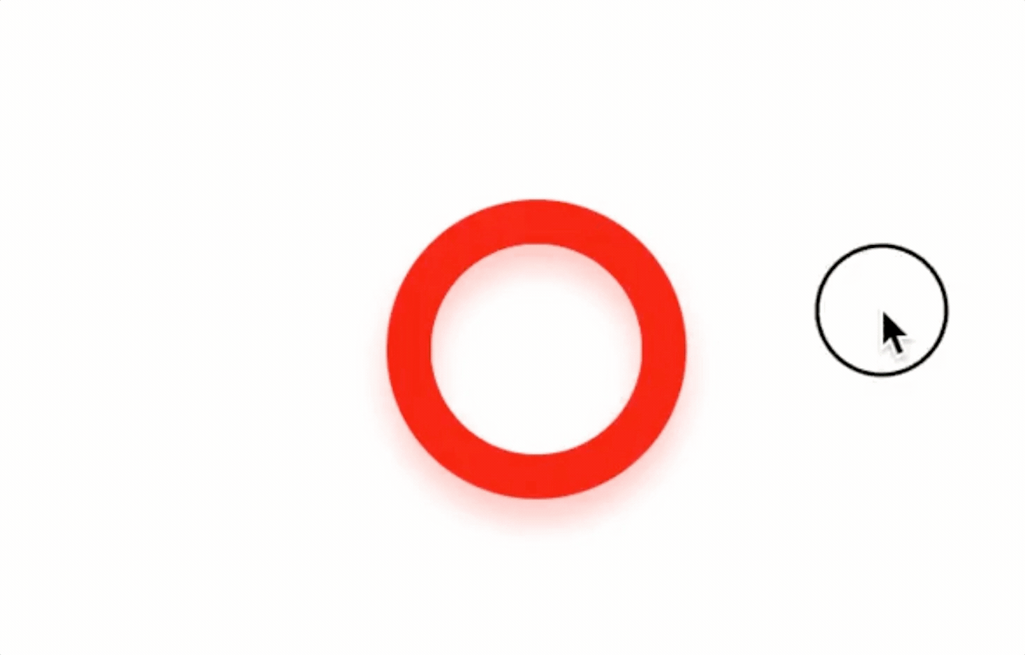
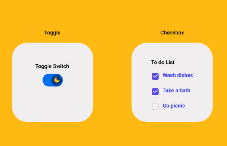
Although checkboxes and toggle switches are both interactive elements used to represent binary states. But they are actually different in terms of functionality. Toggle switches are suitable for binary, mutually exclusive choices. Think of toggle switches like switches in your house. When you flick it, the lights are either on or off—just one choice. It's also like deciding between 'Dark Mode' (lights off) or 'Light Mode' (lights on) for your phone.
While checkboxes allow for the selection of multiple options. Imagine checkboxes as those little boxes you tick when you're ordering food. You can choose pizza, pasta, and salad all at once if you want.
They both help you make decisions in the digital world, but checkboxes are the friendly buffet, and toggle switches are the straightforward light switch, each with its own unique way of helping you choose.
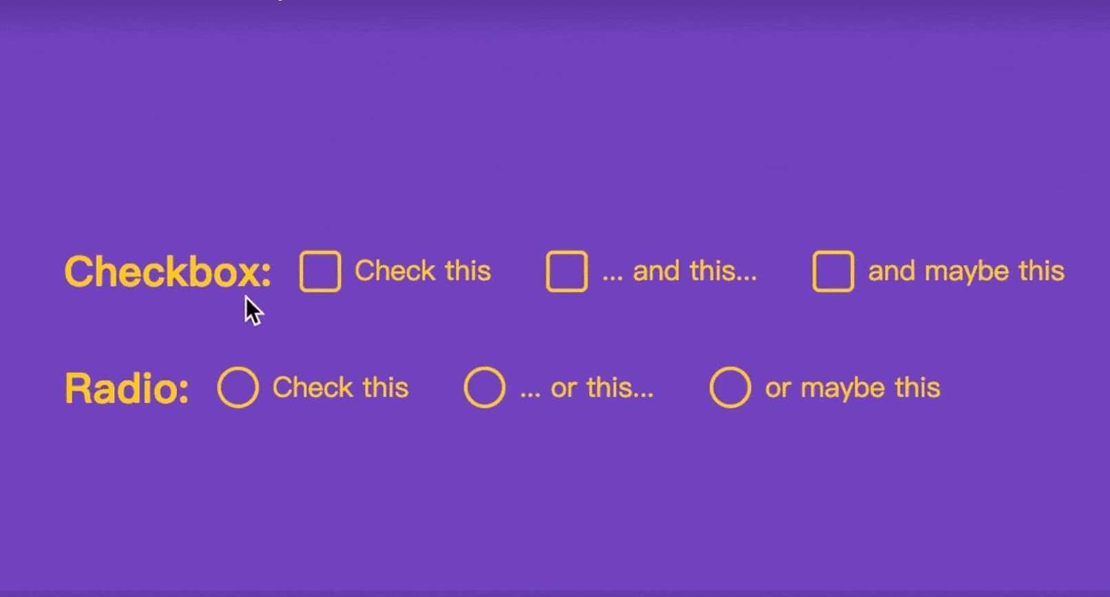
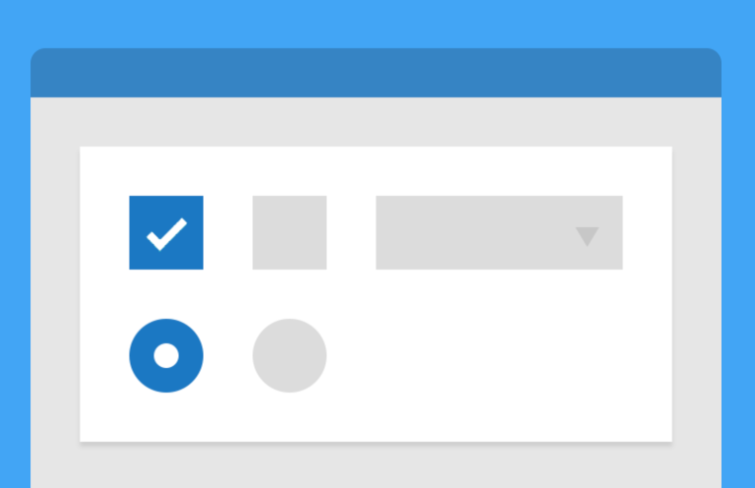
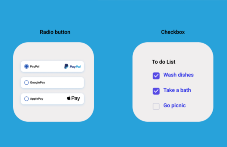
Checkboxes and radio buttons are both UI elements used for making selections. But checkboxes allow for multiple selections, while radio buttons only allow for exclusive selection within a group.
Think of checkboxes as the versatile multitaskers—they allow users to make multiple selections simultaneously, making them perfect for scenarios like curating a to-do list, like picking various items for your to-do day.
On the flip side, radio buttons take on a more exclusive role. For example, when selecting the payment method (credit card, PayPal, etc.) , users can only choose one, creating an environment of mutual exclusivity. When you select one payment method, it graciously and automatically deselects any others.
As the design landscape keeps evolving, checkboxes emerge in diverse types and distinctive visual styles. The selection of a particular checkbox type becomes a nuanced decision, influenced by specific design requirements, the overarching aesthetic of the application, and the desired user experience. Different types carry unique visual language, contributing to the overall look and feel of the interface. Here are several common-used types of checkboxes.
1.Traditional checkbox
A checkbox that comes with a square shape and a check mark is widely used for years.
2.Round checkbox
This is a variation of the traditional checkbox. The only difference is that it has a round shape rather than a square shape.
3.Neumorephism checkbox
Neuomorphic checkboxes design effectively utilizes the depth and shadow effects to give an authentic button-clicking experience.
4.Icon-based checkbox
There exists a fascinating checkbox variant that embraces a purely visual language, utilizing icons or symbols to denote the selected state. This innovative approach not only imparts a streamlined aesthetic but also transcends linguistic boundaries. By employing universally recognizable symbols, this checkbox type communicates efficiently, contributing to a seamless and inclusive user experience, where the language of icons becomes a powerful means of interaction.
5.Custom-styled checkbox
Numerous designers opt for checkboxes that diverge from standard designs. This inclination towards customization ensures that checkboxes not only fulfill functional roles but also seamlessly integrate into the visual narrative, contributing to a cohesive and branded user experience.
As we conclude our exploration through checkbox UI design, we unveil the multifaceted nature of these common-used UI elements. Beyond their functional purpose, checkboxes have evolved into a canvas for artistic expression and innovative interaction. Designers, who stay close to the knowledge of trends, principles, and practical steps, can push the boundaries of checkbox design, creating interfaces that captivate users and elevate the overall user experience.
Hopefully, this article helps you get a better understanding of checkbox, these humble but important UI elements, and create more engaging and user-friendly interfaces in 2024 and beyond.
 Mockplus RP
A free prototyping tool to create wireframes or interactive prototypes in minutes.
 Mockplus DT
A free UI design tool to design, animate, collaborate and handoff right in the browser.


 Sign up with Google
 Join our Discord community
 support@mockplusapp.com