The toggle switch is one of the most commonly used elements in UI and UX design. Like any other common design element, it requires an overview of the general flow and navigation of the application you're designing. As a UX and UI designer, you need to pay more attention to what question needs to be answered. Depending on the type of answers a user is required to provide, the toggle switch UI component can be your UI element of choice.
In this article, we'll explore what a toggle switch is, when to use it, and we will also share with you the best practices and examples to get you inspired for your next design.
Table of contents:
What is a toggle switch?
When to use a toggle switch?
Best practices for a toggle switch
Best examples of toggle switch design
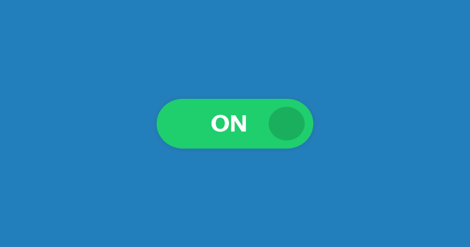
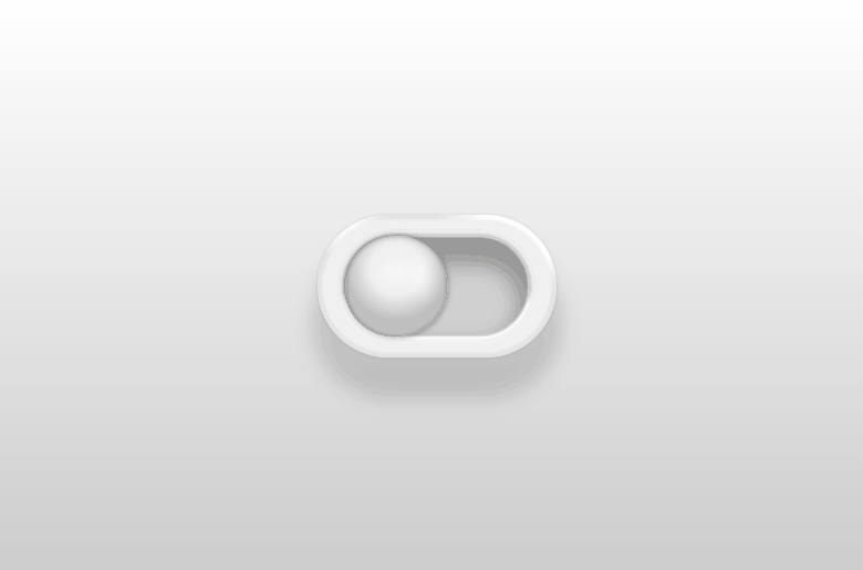
By definition, a toggle switch in UI/UX design implies that the user must choose between two mutually exclusive options. When the user presses the switch, a brief interaction appears with the chosen option, then takes immediate effect. The design of the toggle switch originates from real life. Just look around your daily activities, you will see that you use a number of physical toggle switches such as light switches and kettles. As a UI and UX designer, how can you implement these toggle switches in your design? Let's read on to check it out.
Toggle switches are best used for changing the state of system functionalities and preferences. If you want to meet the user's needs to change or update preferences and settings, you should have a toggle switch in your design. However, a toggle design can be a bit confusing because they have very specific uses, much like checkboxes or radio buttons. If you are not sure which option will fit your use case, you can check the below table that summarizes questions and answers about these frequently used UI elements, which can help you to decide when to use which element.
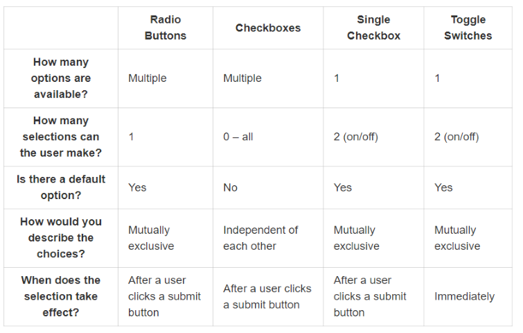
Checking all these questions and answers in the above table can help you avoid user frustration and ensure comprehension.
When you come to the question of when to use a toggle switch in your design, just bear these two rules in mind: a toggle switch is one where an instant response is required without review or confirmation; and when a setting requires an on/off or show/hide function. But how can you design a toggle switch that fits your case? Take a look at the following best practices.
As we previously stated, the design of a toggle switch originates from real life. Take the light switch as an example, and think about how it works. You press the button to turn the lights on and press it again to toggle it off.
In UI/UX design, the toggle switch simply mimics a real-life switch, making it easy for users to understand and use. In other words, when a user interacts with toggles, they shouldn't need to click Save or Confirm to apply a new state. Instead, when a user presses the switch, the chosen option takes immediate effect to get the state of system functionalities and preferences changed. When immediate results can not be achieved due to system delays, you can consider adding a processing status loop animation to help let the user know their toggle is being implemented. But remember that the operation should take no more than a few seconds.
When we meet a toggle switch with good labels, it will be easier for us to understand what option the toggle controls and what state the toggle is in right now. When writing your labels, you need to make sure your labels are short and clear. The number of words should be no more than two but also clearly describe the functionality of the toggle controls. Moreover, you had better use a left-aligned inline label, because these labels work best as they fit the way users scan the layout. Just keep in mind that toggles are either OFF or ON and that you should not add extra text labels which will make your interface cluttered.
It is commonly known that the visual appearance of the UI element helps users predict what will happen when they interact with an element. If your design is not consistent with what users already know, they would be forced to stop and think about how to interact with the UI. When creating your design, you need to make sure that the visual language that you choose to use for toggles is used consistently and all toggles should be implemented in this style across your app.
What's more, remember to follow the platform's default visual design. That's because when the style of your toggles corresponds with platform design standards, people who are familiar with a platform can easily decode the UI.
It is easier than you think to design toggle switches because many design tools offer toggles in their basic components. But most of them are missing something crucial: built-in interaction. That's why Mockplus makes sure to bridge that gap and offer designers toggle switches that are fully functional from the get-go. Designers do not need to upload an image and then add interaction, all they need to do is simply drag the toggle out onto the artboard that's that! This may seem like a small detail at first, but it makes a huge difference in the time and effort needed for prototyping the product as a whole -- especially large products that hold many small components in the UI design.
As a UI/UX designer, the way you make sure your mobile toggles is usable across various products. To do this, you need to make sure that the layout generally permits these two things: allow users to touch the toggle without problems and to allow enough free space between components for the interface to breathe. If you use a design tool like Mockplus, you can choose from Android and iOS toggles to meet your design needs, which will be of great help for improving the user experience of your mobile design.
Last but not least, you need to conduct user testing before publishing your design to ensure that a system failure will not happen. Just keep in mind to test out the usability standards, with both the general UI design and the specific toggle components. The most practical and efficient method for testing your toggle design is a good old A/B test. When it comes to toggle design, you need to test the visual hierarchy in the entire page and also on the specific component. Also, do not be afraid to modify the labels until you find one that users can understand immediately.
This is a great example of a toggle switch design. Users can enjoy smooth animation and visual details at the same time. We love that with the animation, users can see clouds or reflections of light that make the switch dynamic, fun, and obvious in its meaning.
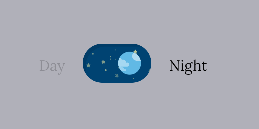
This nice toggle switch has a day and night mode. During the day, the background of the toggle has clouds moving right to left and a starry night sky as the switch and on click, the starry night expands and switches over to the other side swapping the toggle and background animation. This is dynamic and full-featured, giving users an easy-to-understand toggle switch.
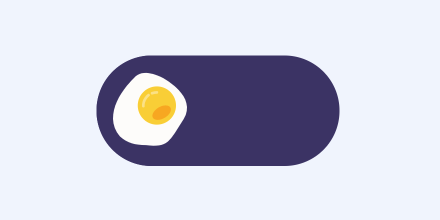
This toggle switch example is for food-related snippets and it's using GSAP and SVG. It offers you a toggle switch that goes from fried egg to boiled egg on click. It can work well on food-related apps or websites.
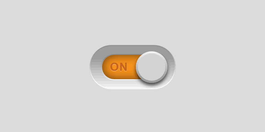
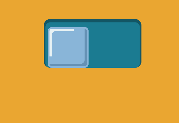
This is a button that toggles between on and off state on click. It delivers a simple switch that enjoys labels inside the switch itself. The toggle switch works well due to the straightforward illustration and great interaction design, making for an intuitive user experience.
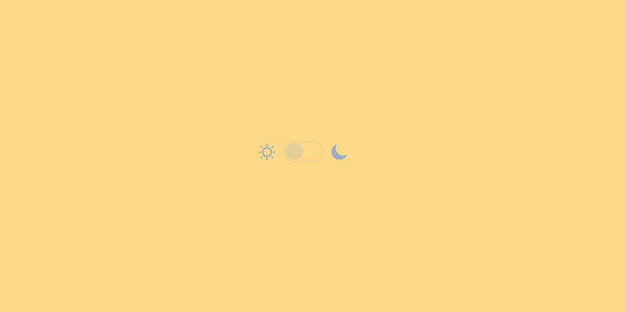
This is another wonderful light/dark mode toggle switch example. Users can switch between day and night with the background color changing to yellow or black depending on the state of the button.
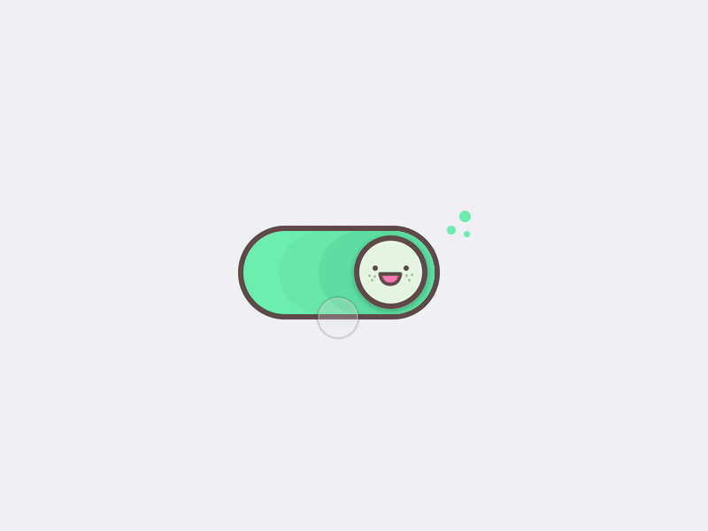
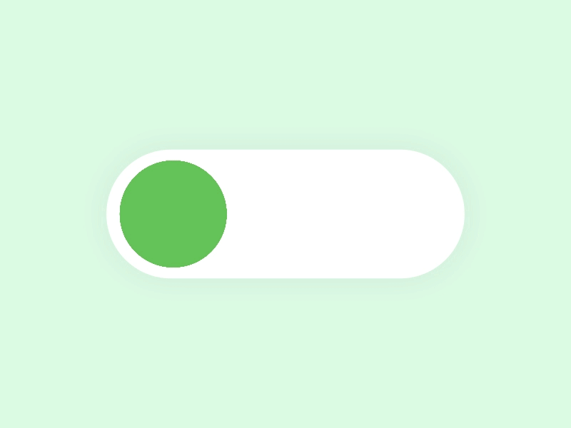
The toggle is created for the fun of it. The design is all about soft lines, wholesome artwork, and dynamic animations. We love that the states differ not just in the illustration but also in colors, with the deactivated switch being green. The design is sweet, young, and refreshing.
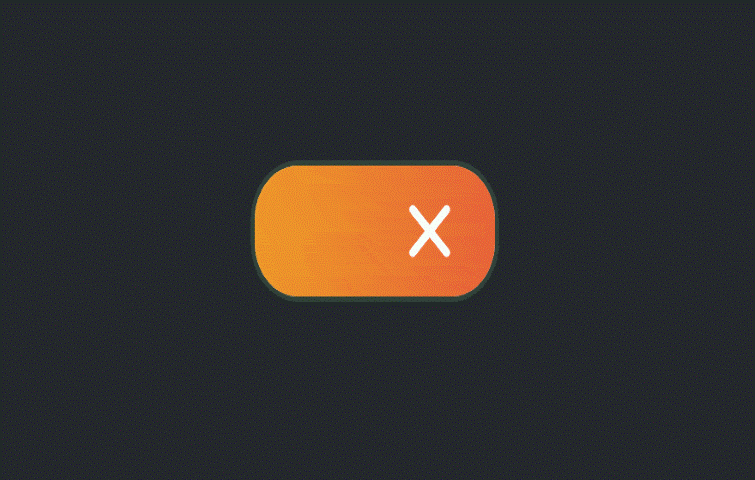
This toggle switch draws on the simplicity of a check and an X as visual signs. It is a beautiful toggle switch animation that morphs into a cross or tick with a smooth animation. This is a quick symbol for showing enabled and disabled.
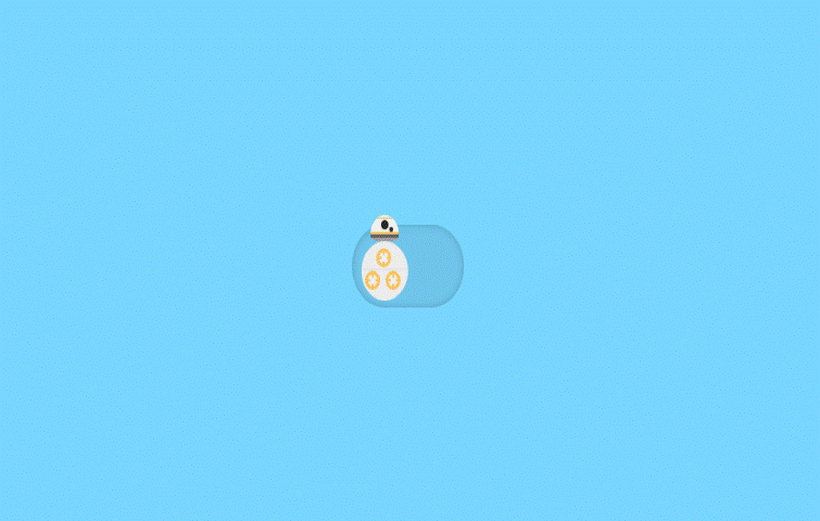
If you love movie-inspired web design, you will love this simple Star Wars BB-8 toggle switch. This is a rolling toggle switch. When a user clicks on it, it rolls from off to on and vice versa.
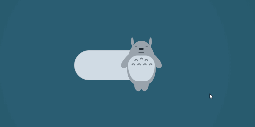
This is a movie-inspired toggle switch. The Totoro will switch from an awake to a sleeping state on a click. The design is sweet and fun, making for a memorable user experience.
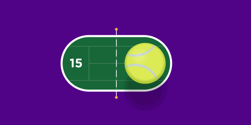
This is an awesome little Wimbledon-inspired toggle design using GSAP. When you click on the toggle, the tennis ball bounces and moves into the opposite court. If you are running a sports-related website, this design can get you inspired and help you get more ideas for your own apps or websites.
This toggle switch example has a simple switch with a twist. In this design, there are no other visual cues as to the state of the switch aside from the color change between states. The twist here is the smooth animation that elongates the switch between states, making it dynamic and fun.
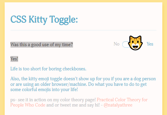
This switch replaces the traditional toggle circle for a cat emoji. It adds a little extra excitement to a website, making the design cute and fun.
This toy toggle switch is simple and clean. Have you ever thought about what a toggle switch may look like if on a Little Tikes product? Just use the plastic look shown here. The handle is to resemble a dual-colored ball, making the design dynamic and fun.
This toggle switch concept is unique and hasn’t been tried before. The designer wants to portray the handle as an ice cube for cold and a flame for hot. When the user clicks for hot, the cube moves right and melts at the same time, and a rising flame moves along with it. When clicking for cold, the water forms back into a cube while moving left, and the flame dies while moving with it.
As we stated previously, toggles can be a solid UI component that greatly helps to improve user experience. It is straightforward and familiar to everyone and works to an important end in giving the user control to customize a system. All in all, designers need to attach importance to toggles to search for more edge-cutting UI design. Hopefully, though, with this post, you'll be feeling inspired to make a great toggle switch for your next design.
 Mockplus RP
A free prototyping tool to create wireframes or interactive prototypes in minutes.
 Mockplus DT
A free UI design tool to design, animate, collaborate and handoff right in the browser.


 Sign up with Google
 Join our Discord community
 support@mockplusapp.com