A radio button is an interactive graphical control element that allows users to select one from a list of many choices. Have you ever looked at the lid of your cup of soda and seen the little round bumpy circles? If you are like me the first thing you do when you get that soda is to smash all of those little buttons down.
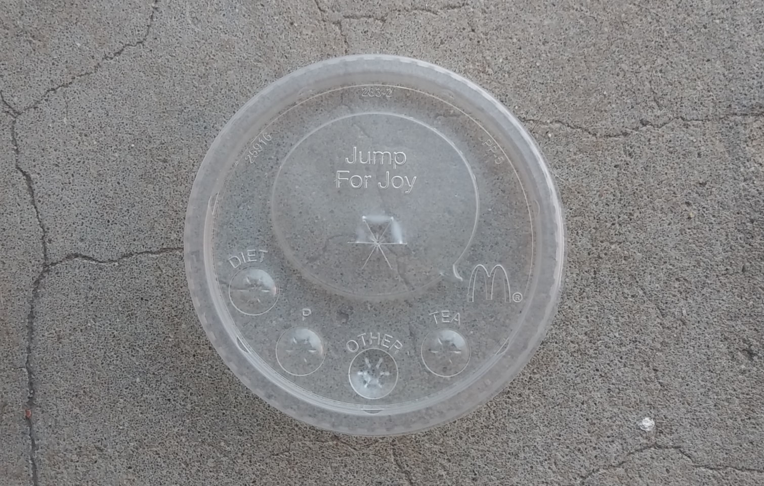
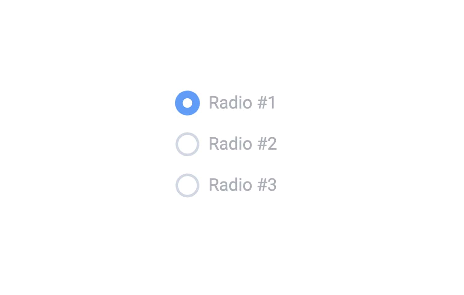
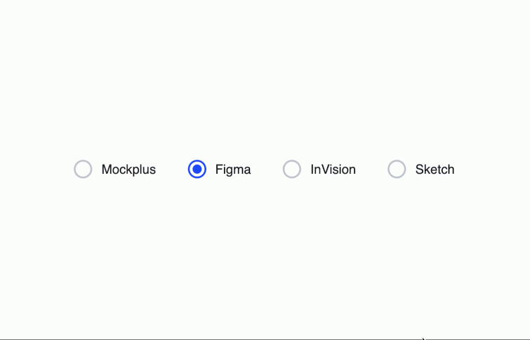
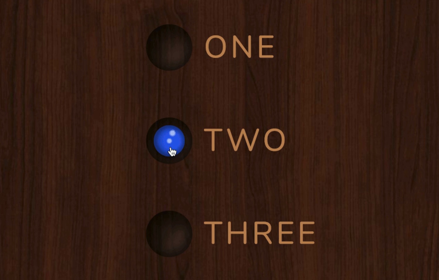
A radio button looks like those little round buttons on your soda cup lid. There can be a lot of variation in how radio buttons look, but most often they take the form of a circle that either looks empty or filled in depending on whether or not the user has selected it.
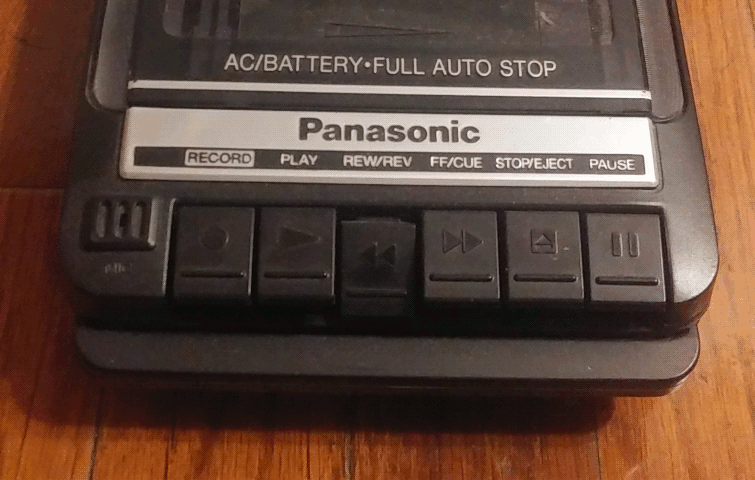
Radio buttons get their name from the buttons on old radios. To select a station, you would push in the button for that station on the radio. Any other button that was pushed in before that would pop back out as soon as you pressed the button!
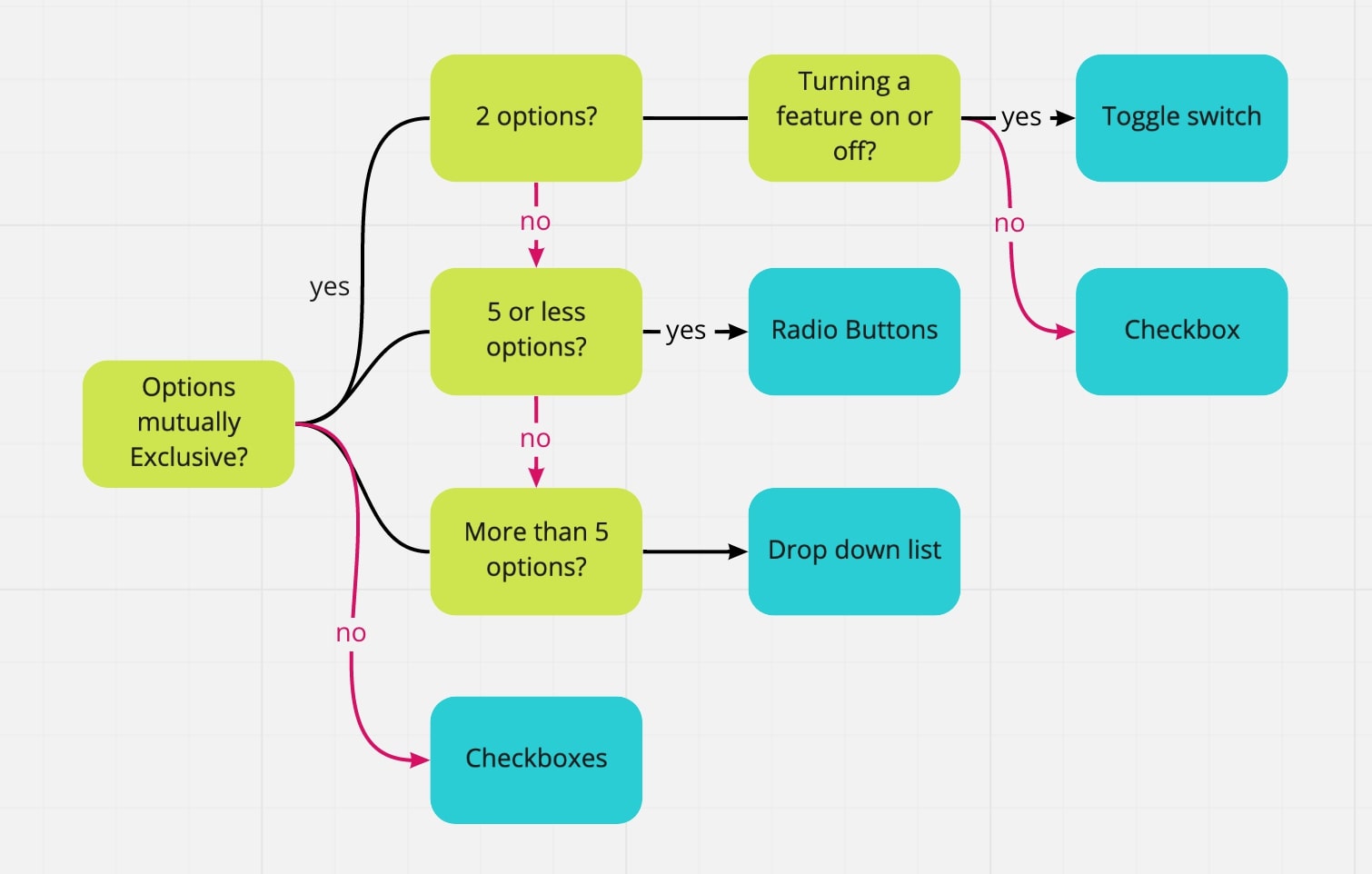
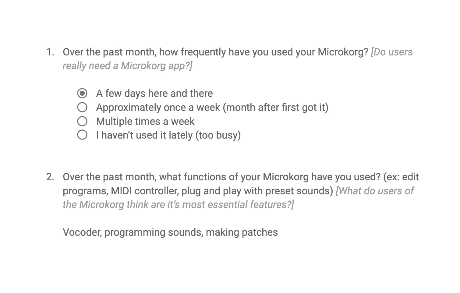
Using a radio button group allows a user to make a selection. Radio buttons can be found on forms and surveys that require a user to make choices. When I want a user to make a single selection from a short list of mutually exclusive options, I use a radio button.
As a long time user interface designer, I know that a good radio button can make or break a user’s experience with my design. If the buttons don’t communicate what I want them to communicate, users will not have a positive experience, and less of them will return to using my product. As a professional UI designer I want as many people as possible to use the sites and apps that I design!
Radio buttons are important to UI design because they allow users to make a choice that does not immediately cause the whole interface to change. The user is allowed to switch between options without any immediate consequences. Radio buttons are also great for settings panels where the user can only select one option from a list of two or more.
Groups of radio buttons are usually paired with a call to action button that allows the user to submit the form they have completed or apply their selected settings. They are especially helpful because they allow for a user to change their mind before the changes that the user has selected take effect.
Radio buttons should only be used when you need a user to select one option, and only one option from a shortlist of options, in other words, when you want a user to make a mutually exclusive choice. Given options A, B, C, and D your user is allowed to select A, B, C, or D, no more and no less.
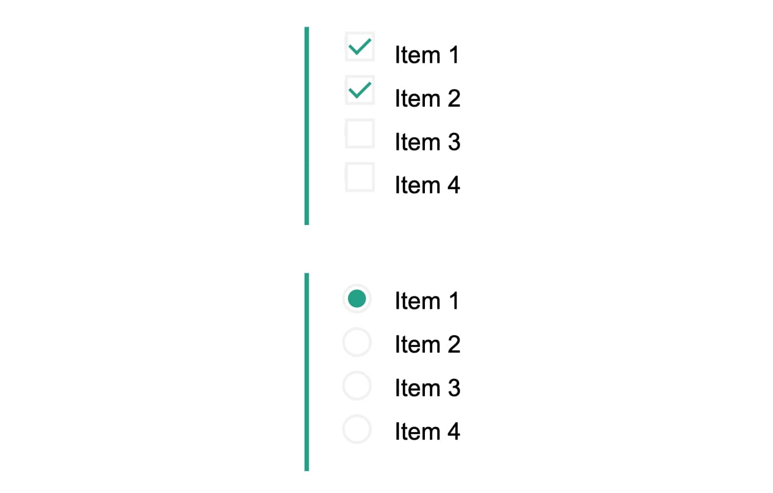
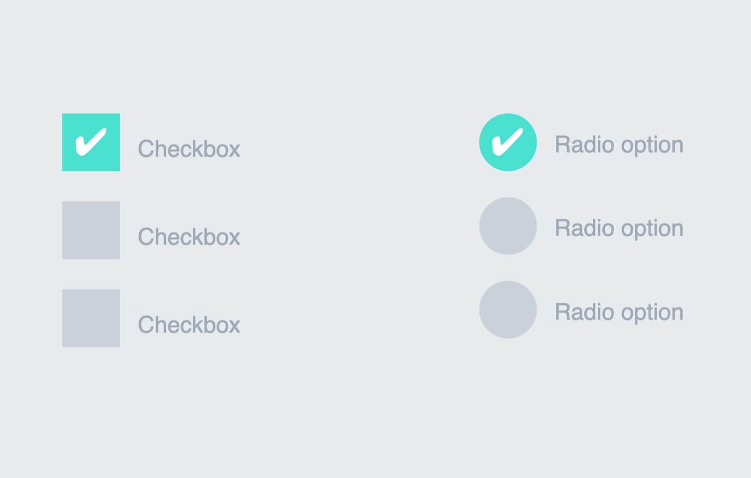
Checkboxes are for when a user can select more than one option from a list of options. Given options A, B, C, and D, your user can select A and/or B, C, or D. Basically, the user can select all options, or pick and choose what options to select.
A checkbox is usually represented by a square that is either empty or has a little check mark in the box depending on its selection state. De-selected it is empty, selected it has a check mark. Like radio buttons, checkboxes in a good UI design are used with a call to action button so that users are allowed to change their selection before any change in the UI occurs.
Drop-down lists are similar to radio buttons in that they require a user to make a mutually exclusive choice. Drop-down lists are a way of condensing information for the user. If there are 10 different choices shown that a user can select, that user might very easily become overwhelmed and leave the page.
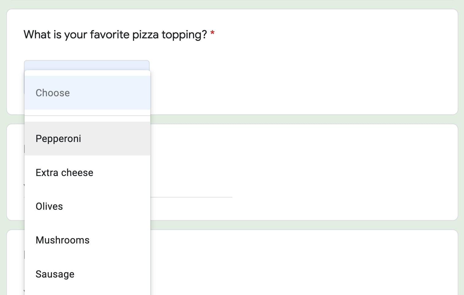
Using a drop-down-list allows you to de-clutter the UI for your user. Good practice in UI design recommends that drop-down lists should be used when there are more than 5 options for a user to pick from and they are only allowed to choose 1.
As a professional user interface designer, I know that being able to use radio buttons, checkboxes and drop-down lists properly when collecting information from users is one of the most important skills you can have. Not only does it make the experience better for your user, but it allows you to collect very valuable feedback so that you continue to improve.
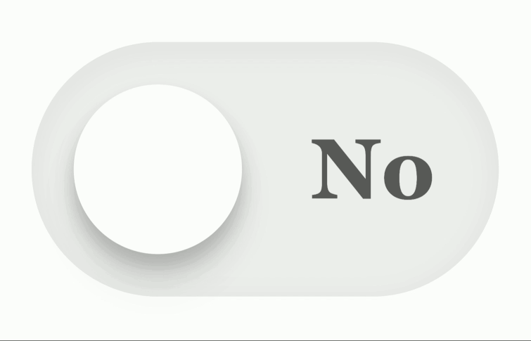
There is one more selection tool that is becoming more and more popular in UI design, that is the toggle button or toggle switch. The toggle button is like a light switch, it exists in either an ‘on’ or an ‘off’ state. More frequently seen in mobile UI design, the toggle switch allows a user to toggle a feature on or off depending on their preference.
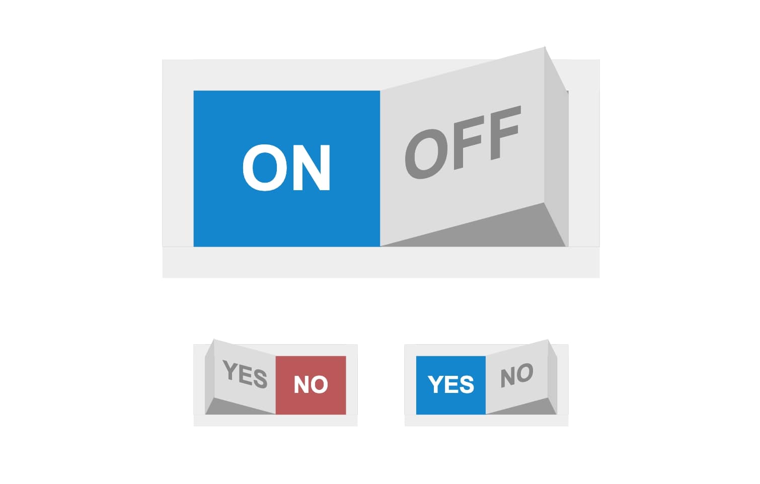
Toggle switches can only be used in instances where a user has two options and two options only. A toggle button or switch differs from a checkbox in that when interacted with it results in immediate change to the user interface. For instance, if you want users to be able to select between a light mode and a dark mode you could use a toggle switch. As soon as the user clicks or presses the switch, the interface immediately converts to dark or light mode.
Toggle buttons should be used sparingly. While there are instances in which a UI designer could use either a checkbox or a toggle switch, it is important to know when to use one over the other.
If you want a user to experience a change right away, like the lights coming on when they flip a switch, use a toggle button. If your user needs to be able to change their mind, or pick more than one option like when picking toppings for their pizza, use checkboxes.
Also, keep in mind that user-friendly toggle buttons are much larger than checkboxes. To use a toggle switch effectively requires more space in your UI than using a checkbox. Because toggle buttons take up more space in an interface, they should be used sparingly. A user interface with lots of toggle switches can be difficult to navigate.
While it may seem like an easy way to spice up the look of a UI, changing or reversing the shapes of buttons on an interface design could cause your users to become confused.
Users expect certain buttons on a user interface to behave a certain way. There are better ways of bringing a sense of delight to your user that don’t involve trying to reinvent the wheel or throw off your users. Animation for instance, when simple and unobtrusive is a great way to make your surveys more lively!
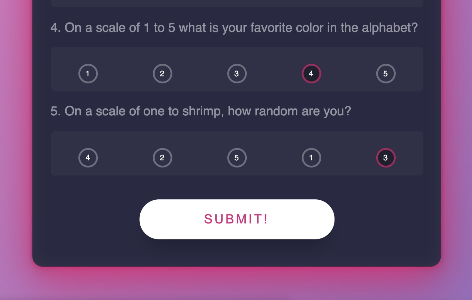
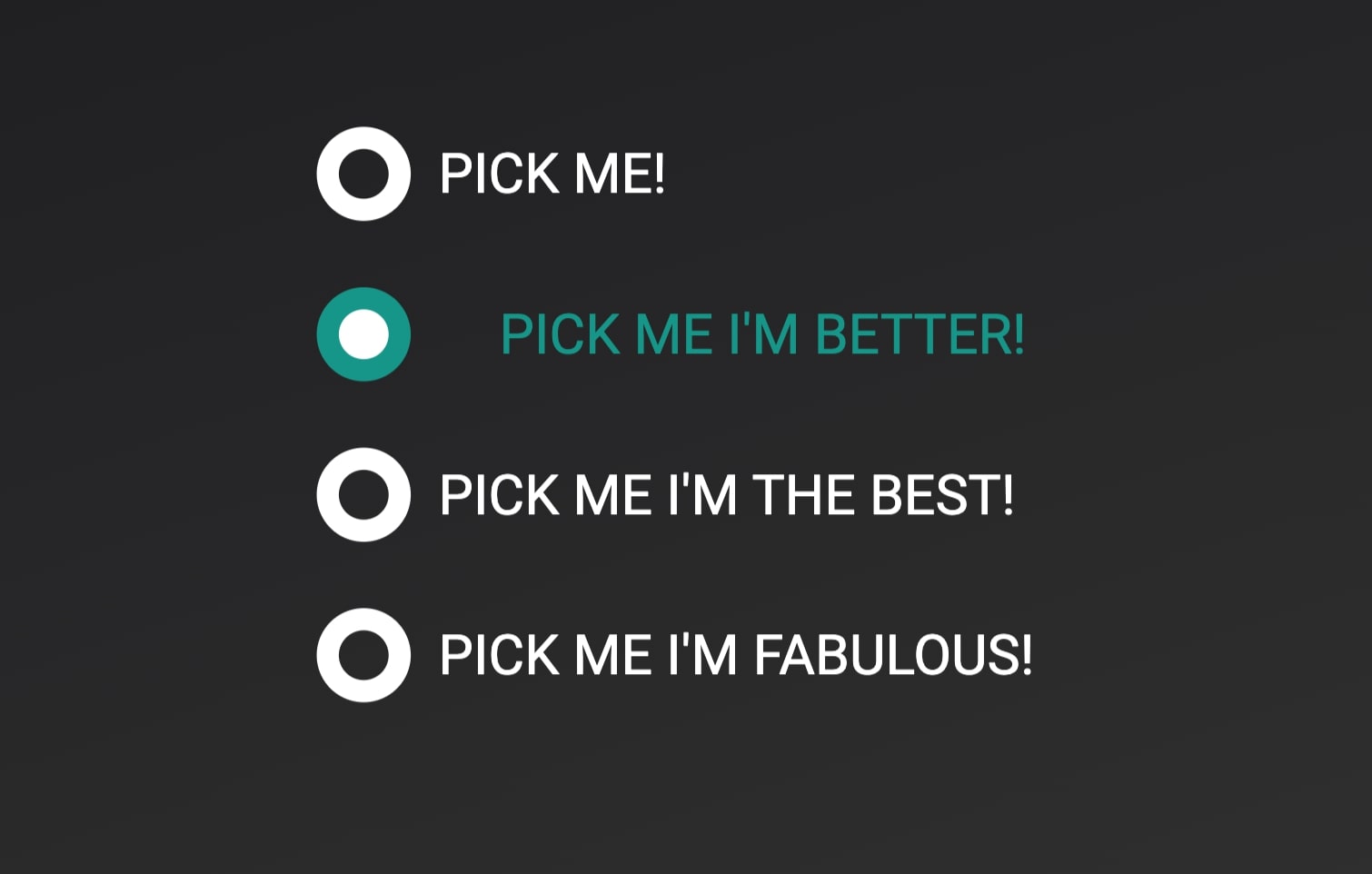
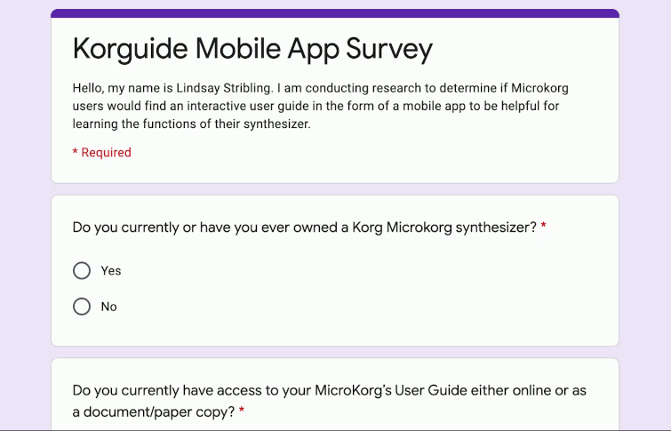
There should be no questions about which selection belongs to which button! When radio buttons appear side by side it can be difficult to know which button goes with which selection.
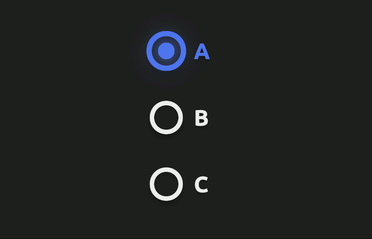
Avoid the hassle of a confused user by listing selections vertically with the radio button to the left of the word or phrase the user is supposed to choose.
Remember that your user is only allowed to make one choice from the options listed. Phrase your question clearly and deliberately so that there is no confusion.
Radio buttons are used for questions that are mutually exclusive, therefore make sure all possible answers to your question are represented in the options. I have come across many multiple-choice radio button surveys where I did not know what selection to make because none of the given options applied!
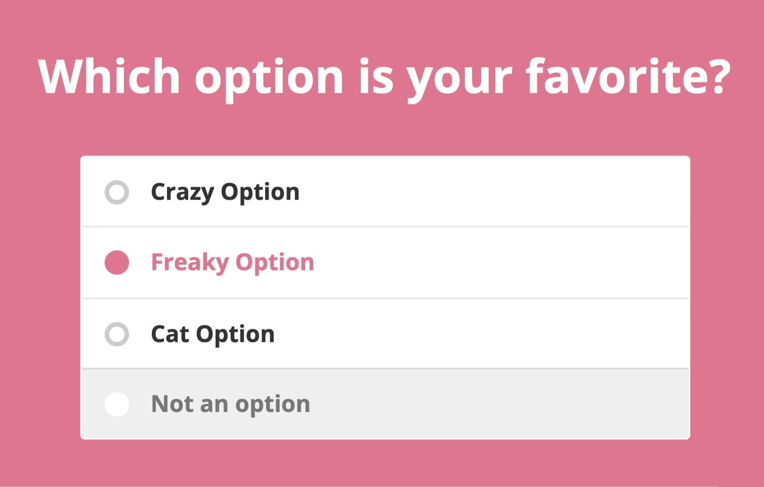
Make sure that there is space between the question and the selection options so that your UI does not appear crowded. My rule of thumb is that space between questions > space between question and answer > space between radio buttons.
If I have two survey questions on a vertically scrolling survey, I will leave two lines of space between survey question 1 and survey question 2. I will leave one line of space between survey question 1 and options A, B, C, and D. I will leave half a line of space vertically between A, B, C, and D.
 5. Know when to use alternative selection tools.
 If there are more than 5 options to select from, consider using a drop-down list instead. Radio buttons are best when a user needs to see each and every option in order to make a decision.
Drop-down lists are great when you don’t need to see every single option you have to choose from. They also help you keep your UI clear and easy to navigate.
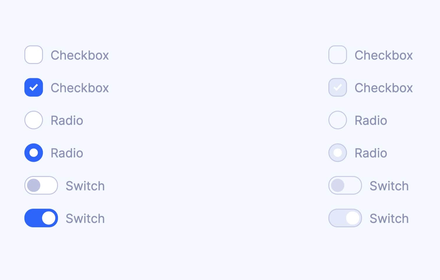
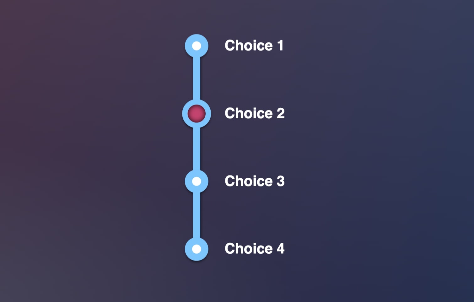
A selected radio button is usually represented by a filled circle or one with a dot in it. An unselected radio button will usually be the same circle, but empty.
A selected checkbox will typically be filled with a check mark while a not selected checkbox just looks like an empty box.
Be sure the animation is short and draws attention to the selection made! Long animations for every question on a page or survey become more of a hassle than they're worth.
Opt for simpler animations that are quick! In my experience, giving a user a delightful, fun experience using radio buttons does not have to be complicated. The most important part of the experience of using a radio button is making sure you know that you selected the correct button. If your animation makes selecting an option unclear, it just defeats the purpose!
Be sure that any animation affects only the area where a user is making a selection. If the whole UI lights up or confetti falls all over the screen every time you select a radio button, that gets distracting very quickly.
You want to make sure your user is able to complete their task successfully. To do that they need to remain focused on the question they are answering and the radio button that they intend to select.
If I’m conducting a survey where 10 questions use radio buttons, 2 have drop-down lists and 2 involve checkboxes, I like to start with five radio button questions then ask either the two checkboxes or drop-down list questions and then ask my last five radio button ones.
I’ve noticed that my users tend to stay more engaged during longer surveys when I change up the pattern of questions asked. It’s a simple way to mix things up without distracting your users!
 10. Always check for accessibility
 Make sure the color scheme and overall design of your radio buttons stands out and that the buttons themselves are large enough to be clearly visible.
I love to use pastel color palettes because they are bright and clean. When I first started, the color I chose for my radio buttons didn’t contrast enough with the background for a website I designed.
When I did some user testing I found that quite a few users were unable to complete my survey or took an extra long time because they could not figure out where to click to answer the question!
 Mockplus RP
A free prototyping tool to create wireframes or interactive prototypes in minutes.
 Mockplus DT
A free UI design tool to design, animate, collaborate and handoff right in the browser.


 Sign up with Google
 Join our Discord community
 support@mockplusapp.com