UI elements are the visual elements that people can see on a website or app interface ( including the buttons, menus, text fields, progress bars, and so on). They enable users to interact smoothly with the website or mobile app and get what they want from it. They are also essential tools for designers looking to create a unique visual language and to ensure consistency across different products.
As a UI designer, it’s also important to repeatedly test your designs - and this is where prototyping comes in. Prototypes enable you to showcase your visual designs in action, helping you to quickly identify flaws and smooth over any rough edges. Mockplus is a great product for prototyping, as it allows designers to build an interactive prototype quickly and rearrange the IA(Information architecture).
Here we have put together the list of the basic UI elements -in particular, the best resources available for free - to help you quickly get to grips with UI elements so that you can start making the most of them in your own designs.
To help you understand these UI elements better, we have grouped them into four categories:
Input controls are a series of UI elements that enable users to input information so that your website/app can react correctly and quickly to meet their needs. Many basic UI components come under this category, such as buttons, text fields, images, checkboxes, radius buttons, and drop-down lists. Here are the main input controls that you should be familiar with:
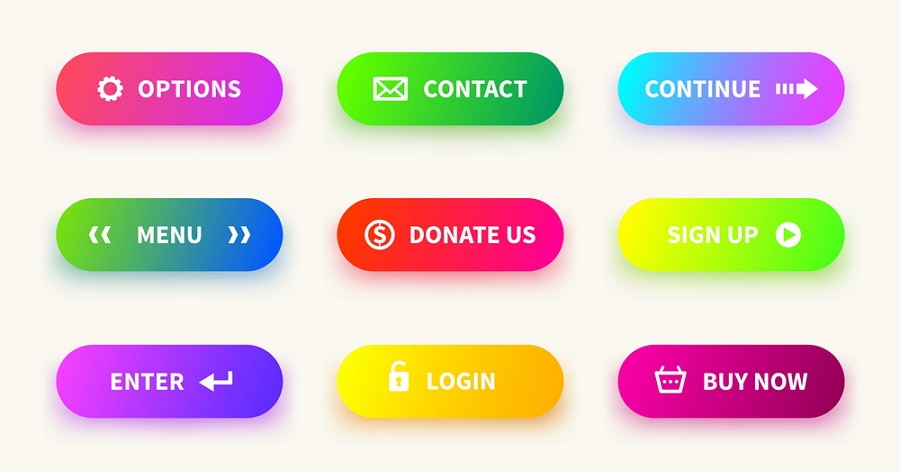
A Button traditionally appears as a rectangular shape labeled with an icon, text or both, and is typically used to handle user actions, like submitting, sending, uploading, downloading, and so on.
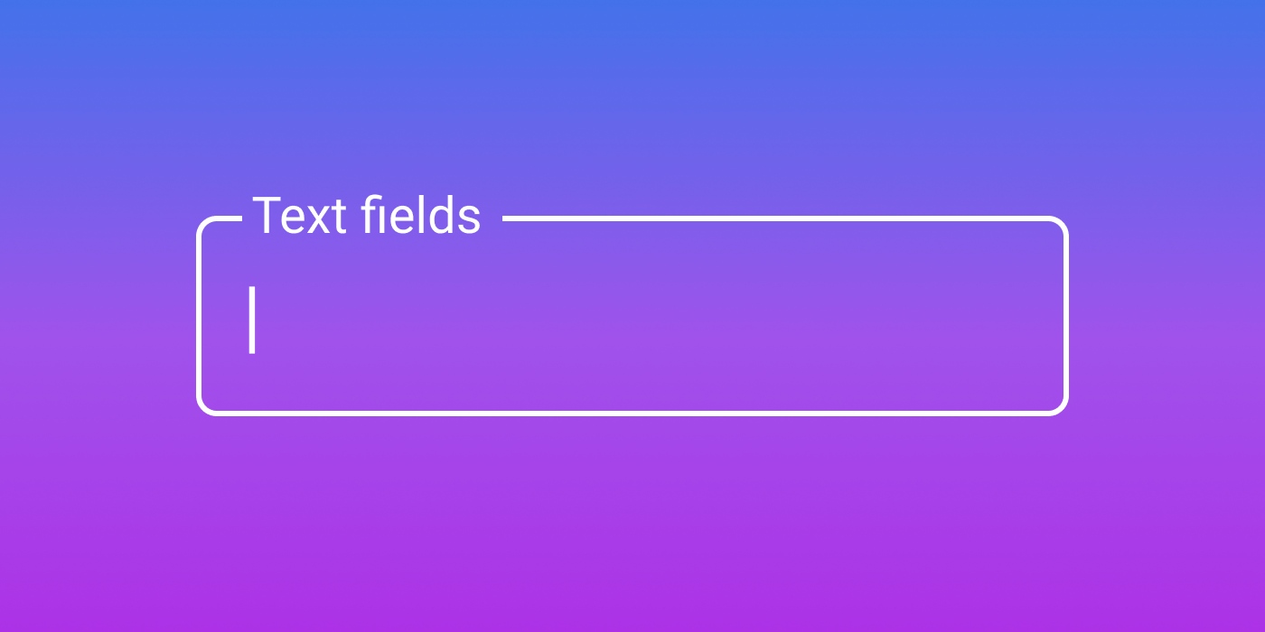
Text fields, also known as Input fields, are where users can enter text. This can be a single or multiple lines. These are not limited to forms; any field that enables people to input text or information comes under this heading, such as the commonly-used "Search" field.
Images or icons are intuitive image components that can be used to enhance explanations or demonstrations and make the site easier to use. As well has helping users to understand and navigate the website/app better, they are a great way to improve the entire visual appeal.
In some cases, they can be hyperlinked and used as action buttons.
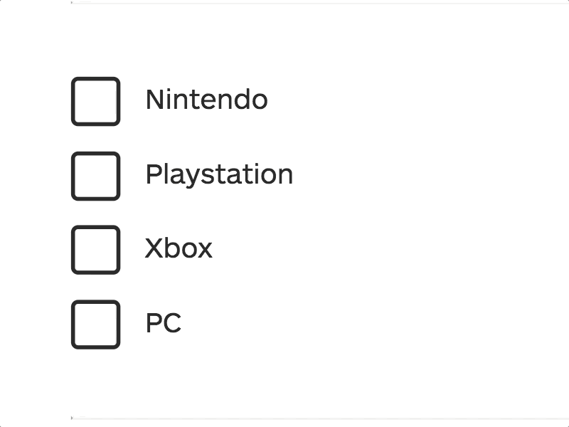
A checkbox is a basic UI component that allows users to make a binary choice simply by checking or unchecking an option. Designers usually use a group of checkboxes, grouped vertically or horizontally, to provide users with more options. They are often a key feature of form or database design where they can improve the user experience.
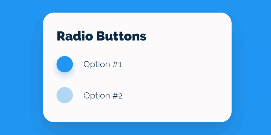
Radio buttons are simple circular elements that provide users with multiple options, a bit like checkboxes. However, radio buttons only allow users to select one option at a time, while with checkboxes they can often select multiple options at once.
Like radio buttons, lists offer users different options and enable them to choose one item at a time. Lists differ in that they do not have the circular buttons by the options available; users simply click on the option itself. But it is still possible to add icons or numbers to make the process clearer.
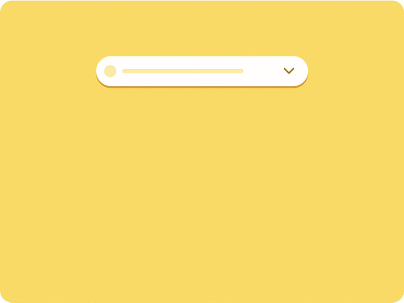
Like a list box, a dropdown list is a common way of presenting a list. It is often hidden, occupying only a single line of UI space before it is activated.
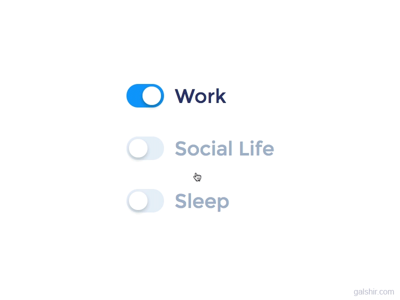
Toggles are basic button components that enable users to turn something on or off. They work just like an on-off switch. So they are often used to change website or app settings where there are just two options, such as notifications, auto system updates, and so on.
Navigation components are a range of UI components that can make it easy to navigate through a website or mobile app. There are many navigational components, such as:
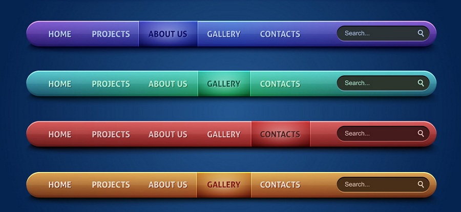
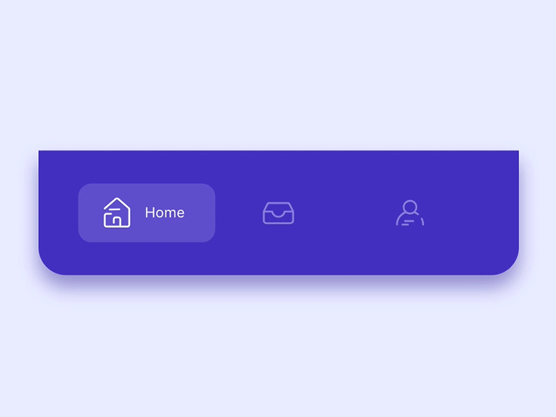
A navigation bar, generally located at the top of the screen, is a section of the website or app interface that helps users navigate and get to the information they are looking for. It contains many navigational buttons, such as Home, Contacts us, About, Profile, and so on.
Website menus are a series of linked items that help users navigate between different pages and page sections. They are often placed at the top and can be divided into different types, such as Hamburger Menu, Meatball Menu, Mega Menu, and Kebab Menu, and so on.
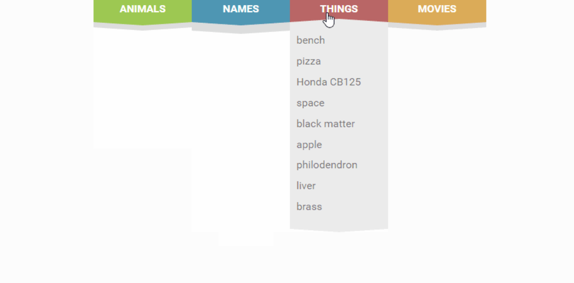
To save screen space and improve UX, designers also use dropdown menus to present different menu options. Users can click on or hover over a button or option to open up the full menu and see all its items. Dropdown menus are best for websites with a lot of menu options.
Want to read more about dropdown menus, check top 40 dropdown menu design examples and best practices.
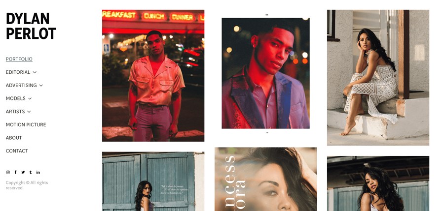
Sidebars present a list of navigational actions or options located on the left or right side of a websiteor app page. They often allow users to show or hide items or even hide the entire sidebar if they wish. So, they are perfect to make a minimalistic website or mobile app.
Tab bars are common on Android or iOS mobile apps. They often locate at the bottom of a mobile app interface, allowing users to move back and forth quickly between different sections of the app.
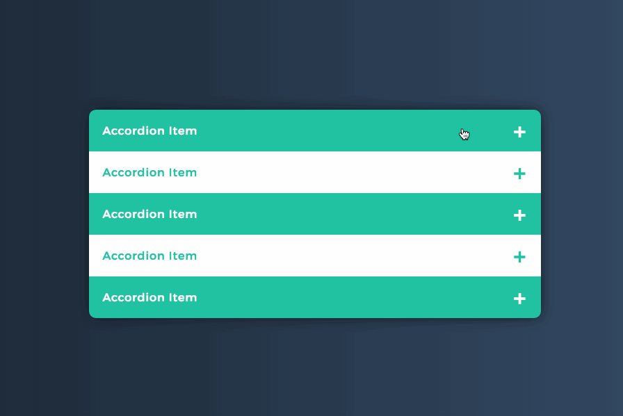
The accordion is a navigational element that presents a list of navigational items stacked vertically. This allows users to expand or collapse each item to check its contents. It is an excellent way to present a large amount of navigational information in a limited space.
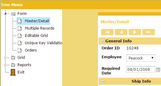
The Tree Menus are an advanced navigational component that displays all navigational options in a tree structure. It is an intuitive way of presenting all related options hierarchically. It is also another good option if you want to display large amounts of information in a limited space.
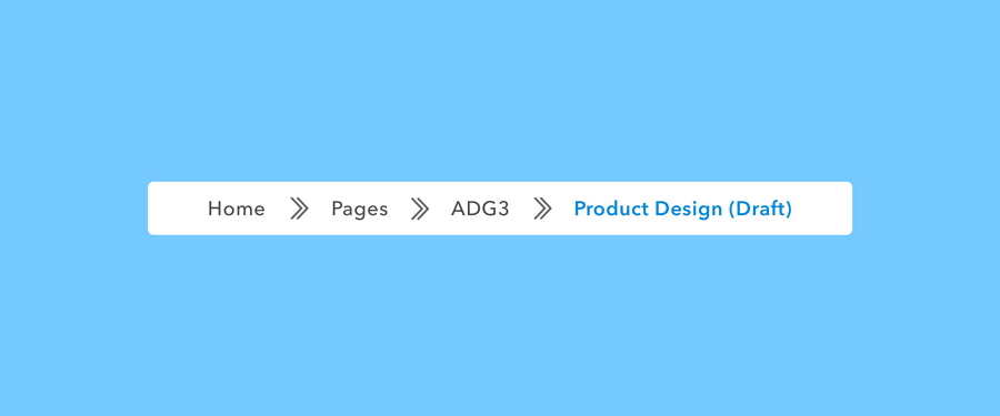
A Breadcrumb provides users with a clickable trail of links to let them know where they are within a website. Typically placed at the top of the page, it does a great job of helping users see their current location and move between different parts of the website.
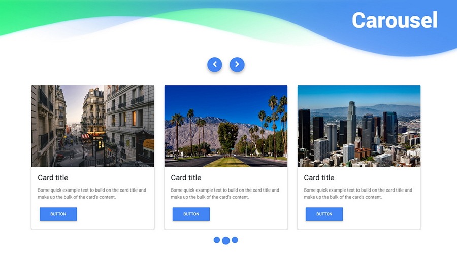
Carousels allow users to browse through a set of images, cards, or content in limited webpage space. It is easy to click one of the images or cards to receive more details from elsewhere. They can operate automatically or manually according to individual requirements.
Search bars or fields allow users to search for pages, sections, or content by entering key words or tags. These are used widely in UI design to create a more pleasant browsing experience for users.
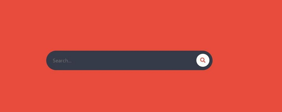
You can also check out 20 creative Search Bar Design examples to get inspiration.
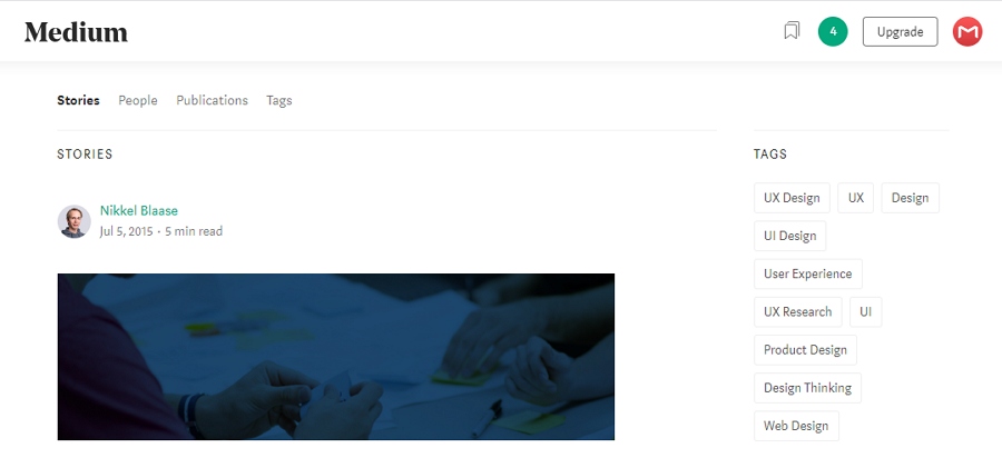
Tags are often used in Blogs or Social websites to help users find content in the same category quickly. While being used with Search bars, they serve more like keywords that can help users find the content they are looking for with a few simple clicks.
Informational components are components that help share information with users, including tooltips, progress bars, notifications, modal windows and alters, and many more.
Tooltips provide users with hints to explain the name, use, or function of an element. They appear when a user hovers the mouse over the element. Designers find tooltips very useful for creating a more user-friendly product.
Progress bars are UI components used to show users how far along they are in a process: for example, submitting, shipping, purchasing, or uploading, and so on. They can also encourage users to carry on and complete all the steps to get to the end.
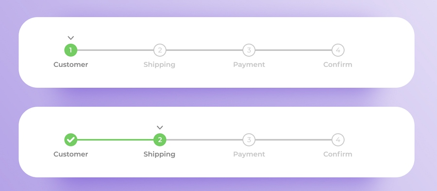
Want to create a user-friendly yet effective progress bar for your website or app? Check 24 Best Progress Bar Examples and Free PSD Templates.
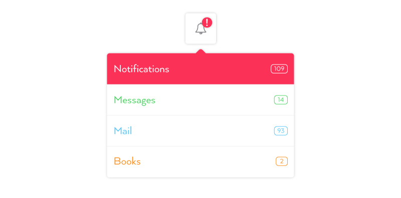
A notification is a message that indicates a change, update, or error in a task, project, or team. It is intended to encourage the user to check out what's new as soon as possible. It is often automatically sent to participants when a change occurs.
A loader is often an animated component that tells users that the website/mobile app is processing action in the background and asks them to wait patiently. To make them wait enjoyable, loaders can have creative designs in different forms and colors. For example:
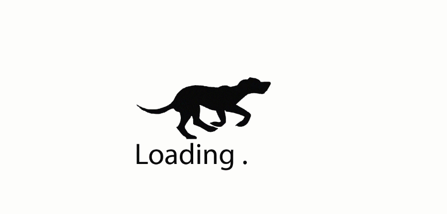
If you are interested in creating a brilliant loader for your website/app, check top 15 creative loader examples first.
Containers are UI components that can hold together a full set of components and content that are related to each other so that you can use them as a whole. (Implementing robust container security measures is critical to protecting the application architecture that containers are a part of.)
Cards are typically rectangular or square module that contains different page information, like buttons, texts, images and more, so that you can use them all as a whole. These days, to create an intuitive yet clear layout and enhance UX successfully, cards have become very popular and can be found nearly everywhere on the web or app page.
If you plan to create card designs for your websites or apps, just check 15 best card UI design examples for your inspiration.
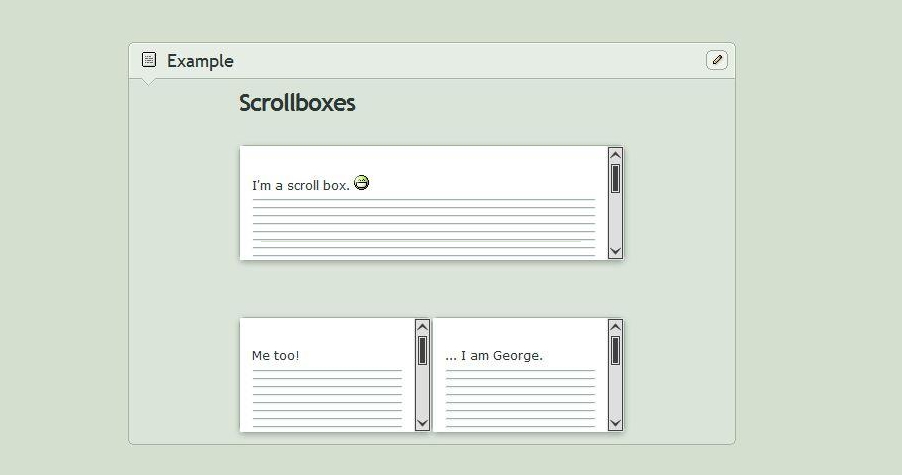
Scroll boxes are UI elements used to create a scrollable content, enabling users to view a large number of images, cards, or content in limited page space.
Forms are advanced components that can help collect user information, such as shipping information, account information, registration information, contact information, etc.
In order to help you create your own designs quickly, we've collected the best free UI element resources for you:
Top 25 best free Android UI kits for Sketch are gathered to help you create an amazing mobile app with ease. Most UI kits are free and downloadable.
41 of the best UI kits and templates for website projects are collected. All of them are in Sketch/Photoshop/Adobe XD formats. You can freely download based on your own needs.
If you need Adobe XD UI kits to improve your app or website projects, these 35 downloadable free resources are helpful.
Looking for Material Design UI kits? We are confident that this small collection of UI kits will have what you are looking for.
30 of the best UI design examples and UI kits for iPhone X can help you create a gorgeous mobile app.
You will get 11 of the best free Android mockup templates in different styles - clay style, realistic mockups, and flat design. They all are in PSD format.
Feel free to check 25 of the most professional and beautiful MacBook mockups and templates in different angles and scenarios.
42 high-quality iPhone X, iPhone XS, and iPhone XS Max mockups and resources are introduced to help you create iPhone apps with ease.
UI elements, along with interactions and animations, play a very important role in giving your products the best UI and UX.
We hope all this information - the basic UI elements and the free resources -will give you a head start in creating your own websites and apps.
 Mockplus RP
A free prototyping tool to create wireframes or interactive prototypes in minutes.
 Mockplus DT
A free UI design tool to design, animate, collaborate and handoff right in the browser.


 Sign up with Google
 Join our Discord community
 support@mockplusapp.com