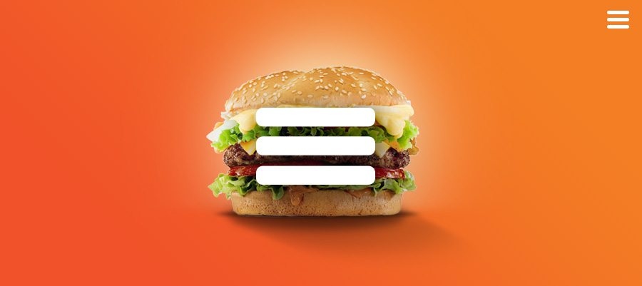
Whether browsing a web or mobile page, we can easily find the triple bar icon usually located at the top left corner of the UI. It’s known as a “hamburger menu” as it takes after the form of the sandwich, with super-simple design and appearance.
However, it has gotten wide popularity and controversies for different reasons and scenarios. To make that clear, we will lay out the pros and cons of the hamburger menu, with mostly-recommended hamburger menu examples and alternatives to give you the evaluation criteria to find the most appropriate design solution.
On the web, a hamburger menu is an icon that opens to reveal a navigation menu when it’s clicked. This kind of menu is a stack of three horizontal lines resembling a hamburger – top bun, patty and bottom bun. In this way, it’s called many things, like “Hotdog”, “Side Menu”, “Pancake” and so on. It wasn’t widely used until 2009, and has gotten a lot of flake over the years.
• It is generally well-recognizable. This is actually a universally understood sign, which doesn’t require translation into other languages.
• It provides direct navigation access. Users can go to the needed section without clicking on the screens or scrolling through all the content.
• It makes the navigation and UI more clear. That keeps users focused on the core functions and you’d like them to see, by displaying the primary navigation and shifting secondary options to a hidden side menu.
• It’s not one-click and thus makes the click rates relatively low.
• It’s somewhat difficult to discover and makes the features inside it seem to be less important.
As a matter of fact, it’s hard to give a definite answer to this question, as it should be adjusted accordingly as your requirements and design purposes. To name a few, it’s suggested to place it on the right side to make it easier to click given that the majority of people are right handed and the top right corner is slightly more accessible than the left one.
Also, it’s recommended to shift it to the left as it’s fully compliant with the Google Material Design Guidelines (where the icons on the right side are app-related actions, and the menu icon opens the overflow menu and contains menu items like settings, feedback, etc.).
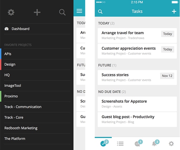
In Android, the hamburger menu is that sliding menu that comes out onto the screen when you swipe a finder from the right or left edge of the screen. Meanwhile, it shows up when you tap on the 3 bar button in the Action bar; In iPhone, it’s exact same as the default for the back button, and you can squeeze both of them in next to each other.
• It can help get everything tucked away neatly.
• It’s self-explanatory and doesn’t require users to learn all over again.
• It delivers better usability and helps users arrive the desired destination more rapidly and easily.
• It may clash with navigational buttons on iOS.
• It’s hard to reach especially when located at the top of the screen.
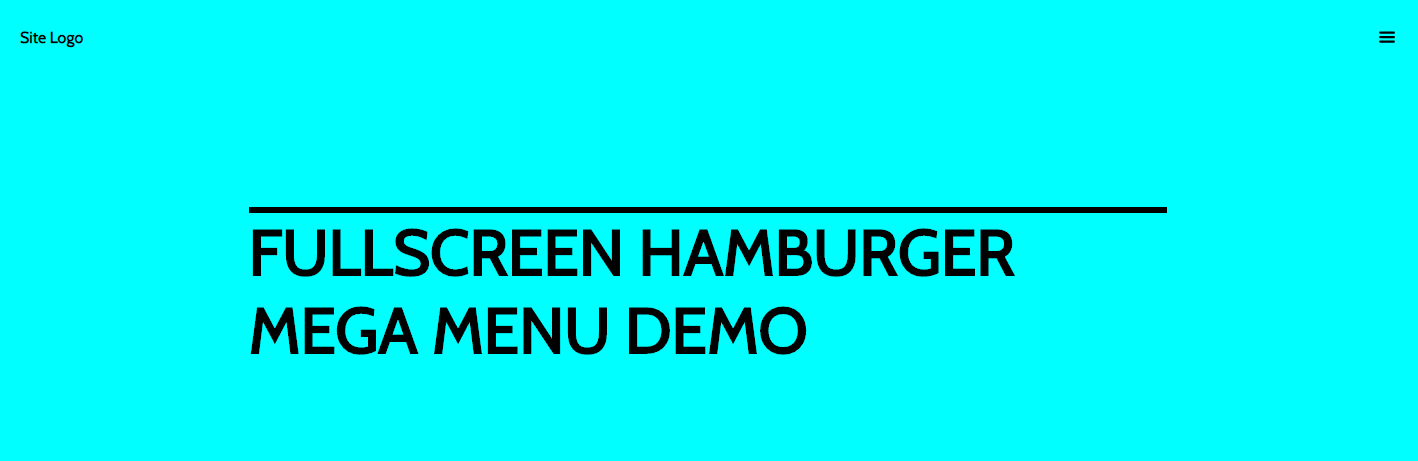
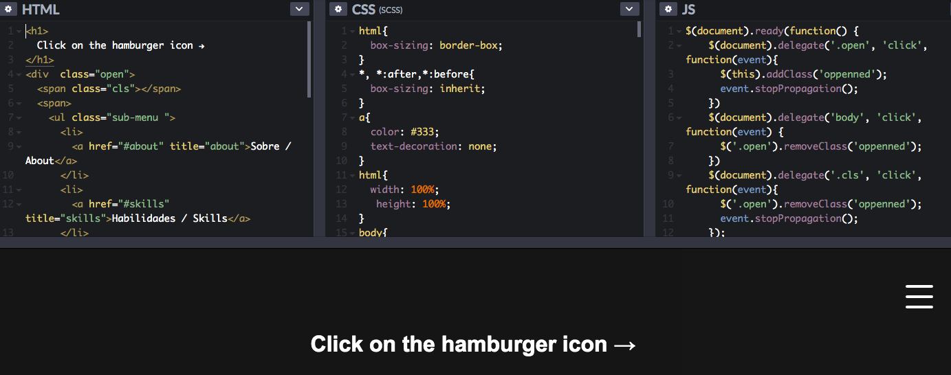
For a web or App, it's without a doubt to create a simple but useful and functional menu to navigate upcoming visitors. Don't worry, we've prepared simple hamburger menu examples with usability and animations to provide you all required services.
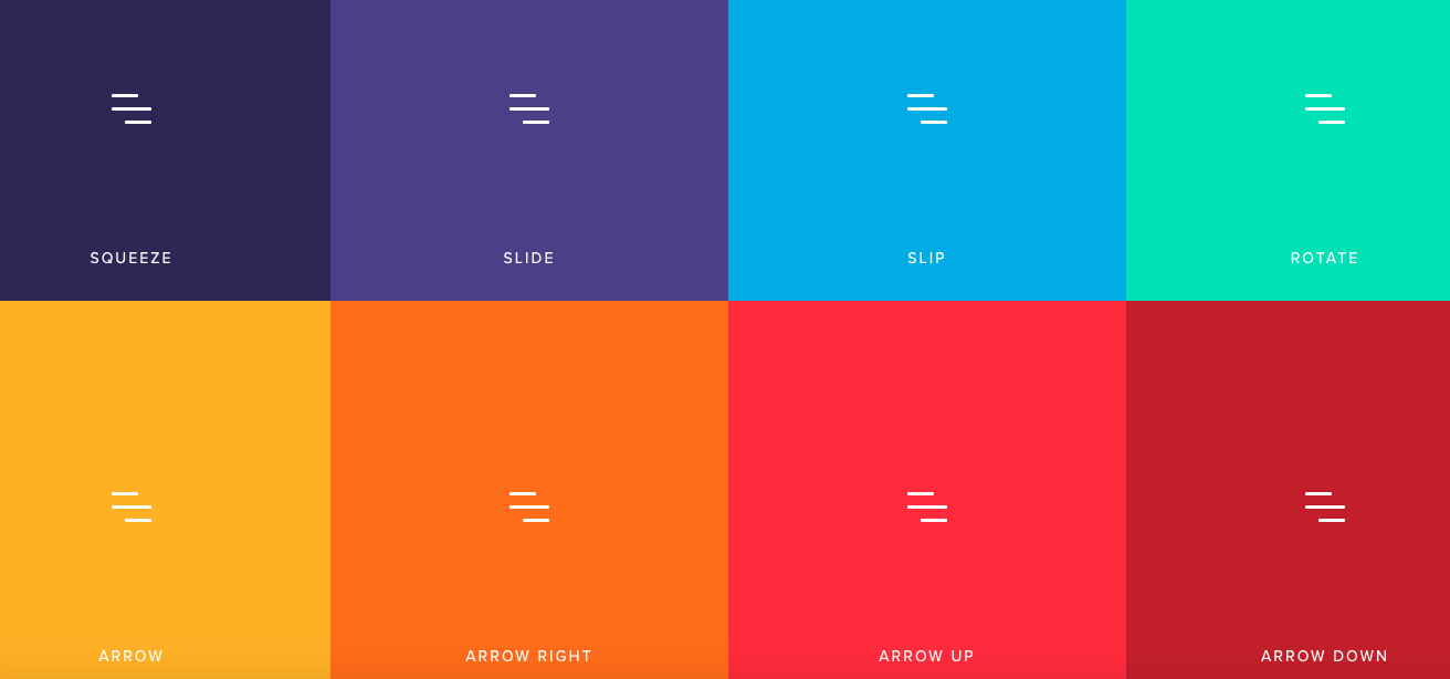
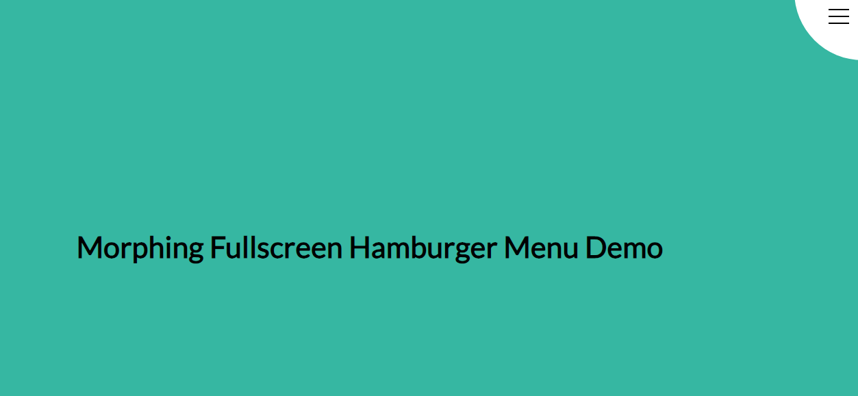
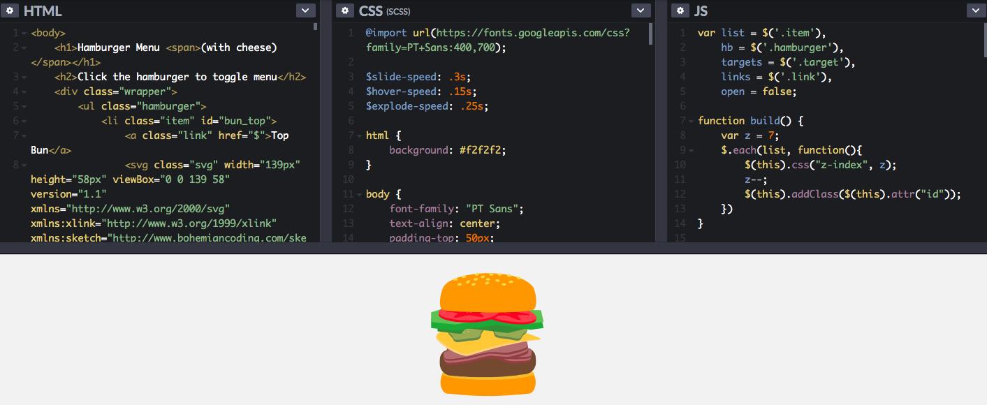
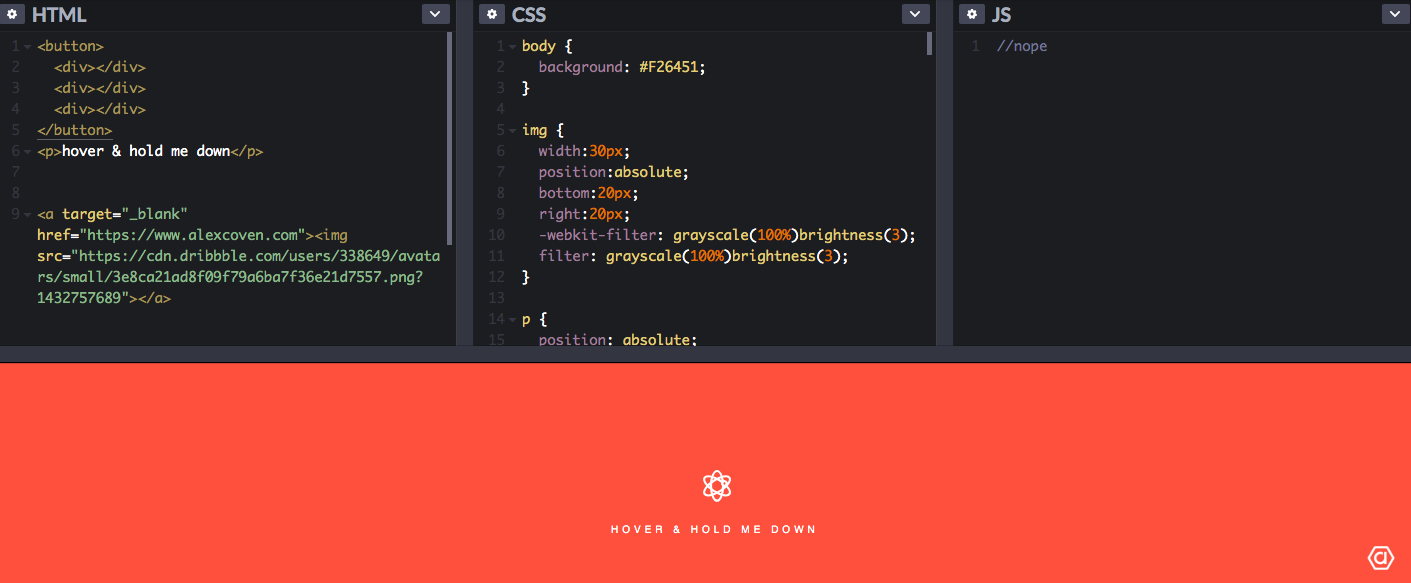
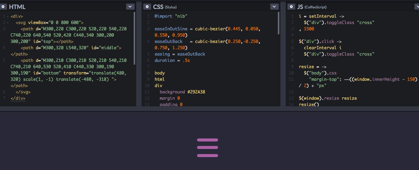
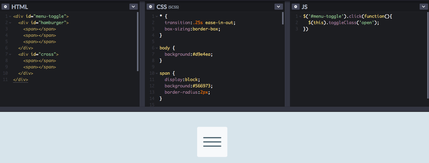
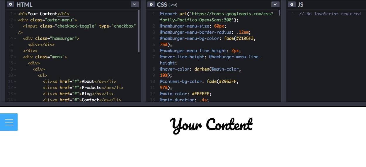
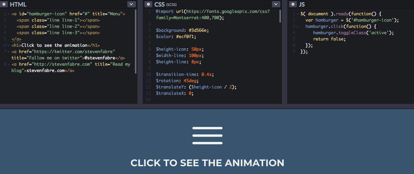
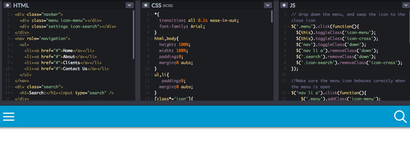
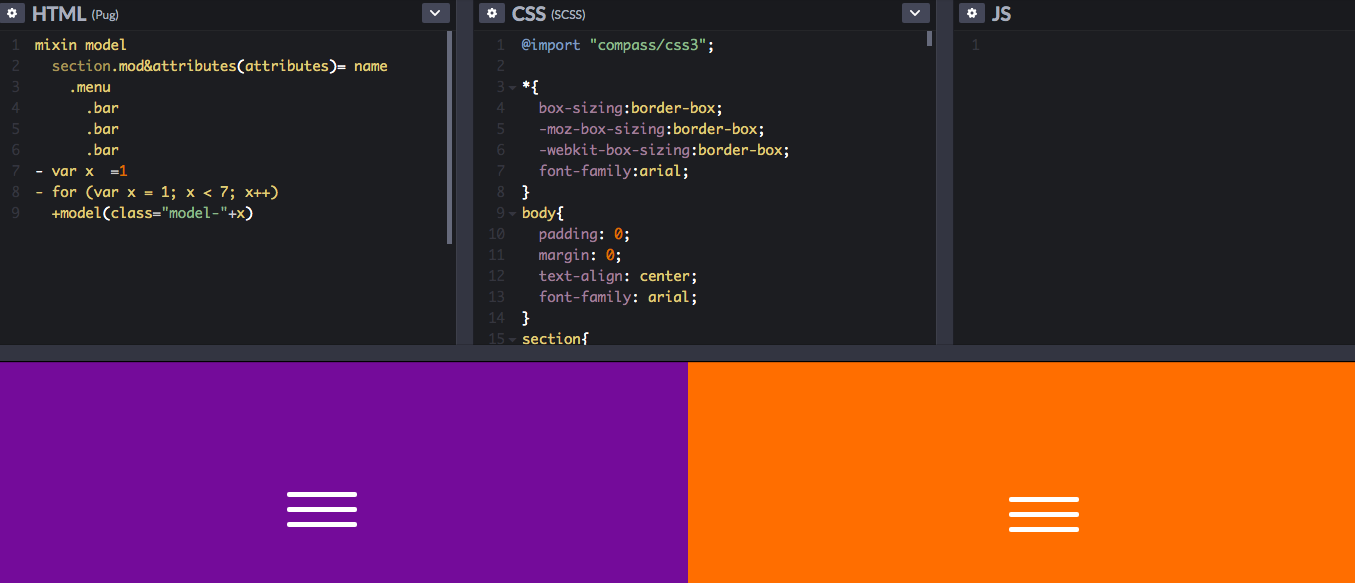
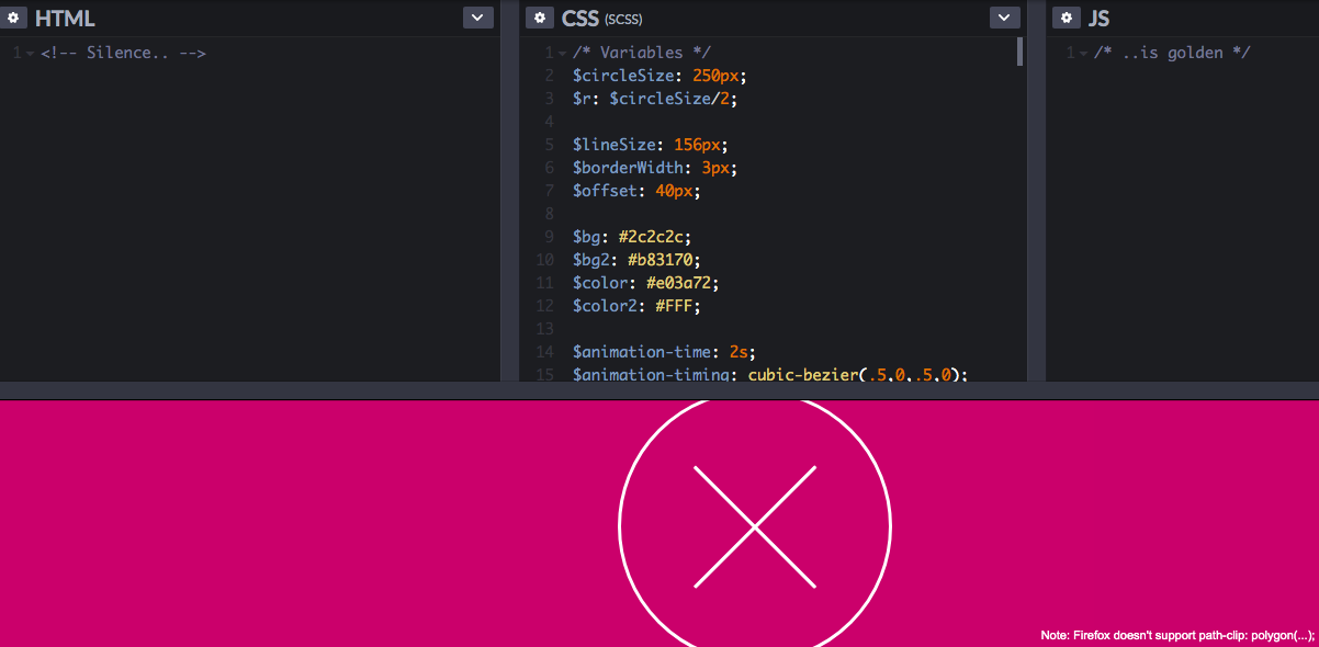
As we all know, the hamburger menu can trigger a sliding drawer navigation which is great for responsive design. If you want to find new ways to animate those three lines into a neat X, refer to the following CSS hamburger menu.

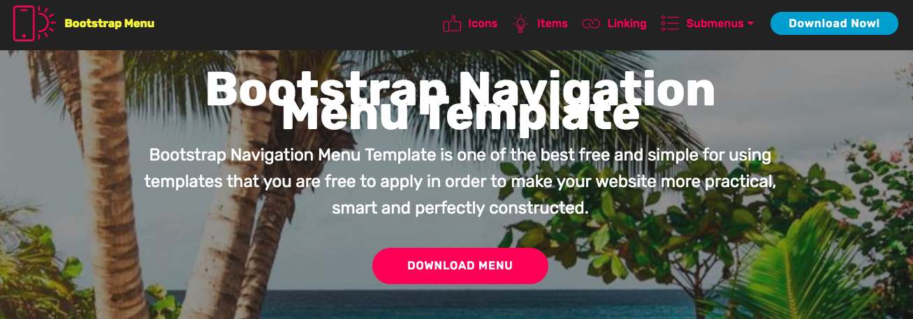
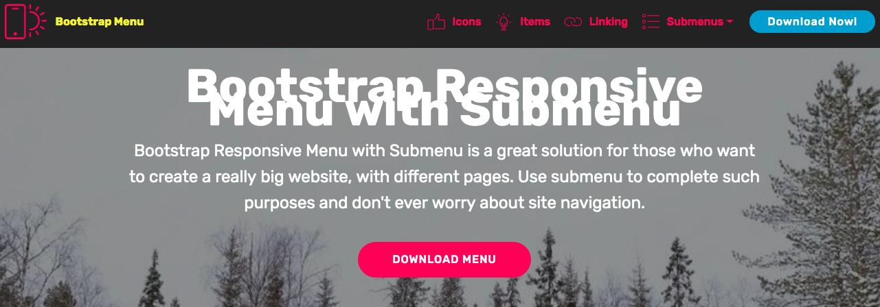
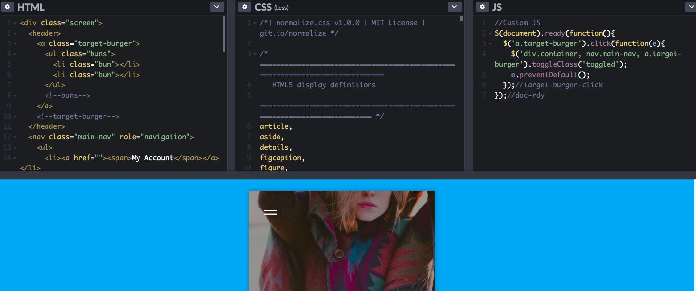
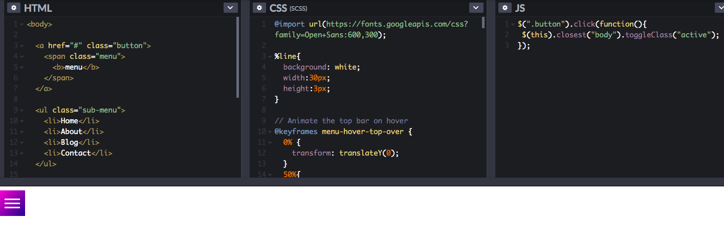
Following are the highly-recommended Bootstrap hamburger menu, and you can find the widely-used left Bootstrap hamburger menu below.
There is no doubt that the hamburger menu is a one-sided bashing of the popular UI element, which has been incorporated into our websites or Apps. And there are many top Apps use it in one form or another to make full use of its advantages and try the best to avoid the disadvantages in order to achieve their ultimate goals:
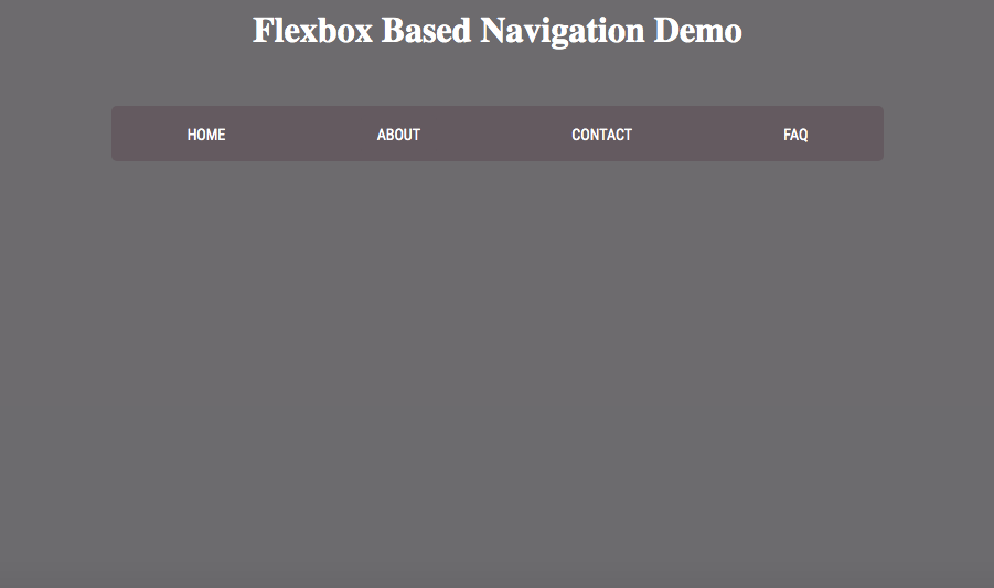
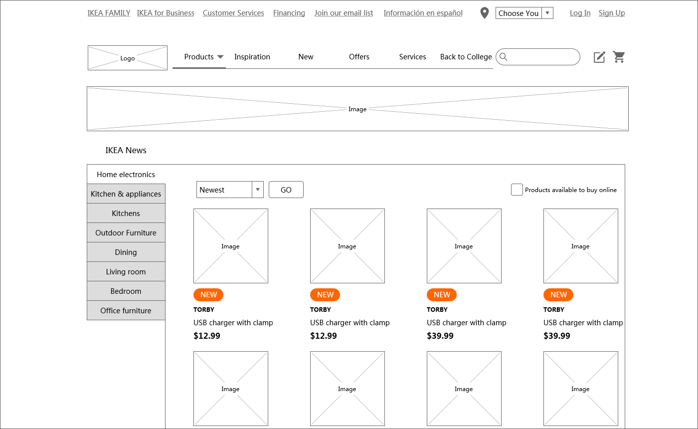
As follows, if you have a small number of separated parts in your webpage or App and want to ensure that users can quickly switch between different parts, then the tabbed menu will be your best solution. Here is an example made with Mockplus for you to refer to:
When there are over 5 tags in the menu, it's possible to place other tags more than 4 tags into the "More" option as a drop-down menu. Here is an example of Mockplus for your reference:
Floating hamburger menu, and the menus that can fit the width of the screen.
All in all, the hamburger menu is neither good nor bad, and you need to make sure it's the right decision for your design. Also, you can run A/B or user testing to predict user behavior and consider/adopt alternatives to help visitors get efficiency and speed. Hope the above hamburger menu examples get you inspired!
 Mockplus RP
A free prototyping tool to create wireframes or interactive prototypes in minutes.
 Mockplus DT
A free UI design tool to design, animate, collaborate and handoff right in the browser.


 Sign up with Google
 Join our Discord community
 support@mockplusapp.com