Android is extremely popular mobile platform. Currently, Android devices are used by more people than any other type of mobile device. This gives you as a designer an opportunity to create an app that can be used by millions of people. At the same time, getting started with Android design might seem overwhelming, especially if you don’t have any previous experience in mobile design. But don’t worry! The tips mentioned in this article will help you design great mobile experience for Android users.
As with other disciplines, when it comes to learning new things you need to learn some ground rules for making things right. These rules will establish a solid foundation for your design.
It’s a well-known fact that the best apps presented on the market are created according to the rules stated in platform guidelines. When it comes to designing an app for Android, learning Material Design should be a first natural step for you as a designer. Material Design is a lot more than just platform guidelines; it’s a document that describes visual language. As Google describes it: “We challenged ourselves to create a visual language for our users that synthesizes the classic principles of good design with the innovation and possibility of technology and science.”
You can’t create great user experience without having a proper visual hierarchy in your UI. That’s why when it comes to Android apps, the foundational elements of Material Design are grids & whitespace. You need to focus on removing all purely decorative elements and focus on what’s really important — content.
Many designers believe that when it comes to creating a new product, they need to design every interaction pattern of their app from scratch. I strongly recommend you avoid following this path. Each custom component which will be different from Material Design language can increase cognitive load on users (simply because it’ll be unfamiliar for them and they’ll need to learn how to use it). But even if you succeed in creating a custom component, your solution will cost a lot more money. You’ll spend a lot of time not only designing them but also implementing them during the development phase.
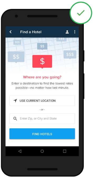
Standard components (standard layouts, navigation, color schemes, etc.) will reduce designing and engineering overhead both regarding initial investment and long-term support. Both Android and iOS have a lot of patterns that are considered industry standards.
When it comes to flat design, it might be hard to establish strong relationships between different pages or UI elements. Without a clear, logical connection, users might wonder how different pages are connected to each other. The tool which helps to create this connection is called animation. Material metaphor puts strong attention on motion design because it not only helps to convey the meaning of UI, it also makes the interface more dynamic.
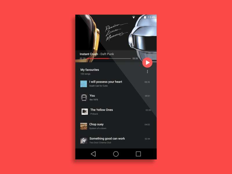
In this example, motion is used to create a logical connection between two different states - browsing music tracks and listening to a favorite track. Image: Anish Chandran
In the attempt to craft beautiful app many designers ignore one essential rule of good design - accessibility. Accessible is what allows users of all abilities to use UI successfully. As Material Design puts it: “A well-designed product is accessible to users of all abilities, including those with low vision, blindness, hearing impairments, cognitive impairments, or motor impairments.”
Accessibility starts with small things such as selecting right contrast for UI elements and text copy. The W3C recommends the following contrast ratios for body text and image text:
Even great designers can fall into the trap of low-contrast problem. Some parts of this page are barely readable for people with normal vision. Image: Anton Aheichanka
When you have the right contrast for your UI elements, you can switch to more complicated things such as animations and audio. Be sure to make motion and audio effects optional so users who have visual or hearing disorder can switch them off if needed. The app should have captions, a transcript, or another alternative to critical motion effects or audio alerts.
When it comes to designing an app for iOS, you have a precisely determined number of devices and displays you need to design your product (in most cases, the list of devices starts from old iPhone such as 5s and goes up to the latest models such as iPhone X). But when it comes to designing an app for Android, you won't have determined models of screens/devices. Android runs on a variety of devices that have different screen sizes and pixel densities.
Companies that specialize in mobile app development will always run different tests to see if their product works well on all types of devices. This testing is usually done by the Quality Assurance (QA) team. They also create detailed reports of bugs found in the process.
Be ready to optimize the app for the vast majority of screen sizes. The screen sizes and densities can vary drastically — from $100 smartphone with a tiny screen and low screen resolutions to high-end tablets with Retina-like displays.
To achieve this goal you have to switch from px to density-independent pixels (dp or dip) as a unit of measurement. Maintaining density independence is important because, without it, a UI element (such as an icon) might appear larger on a low-density screen and smaller on a high-density screen.
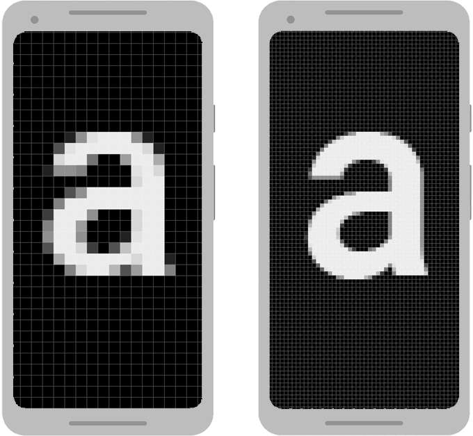
Example of two devices that are the same size but have different pixel densities. The Android system uses dp to helps you achieve density independence. Image: Google
Be sure to check how to support different screen sizes. As can be seen in the example below, the screen sizes vary from xsmall to xlarge.
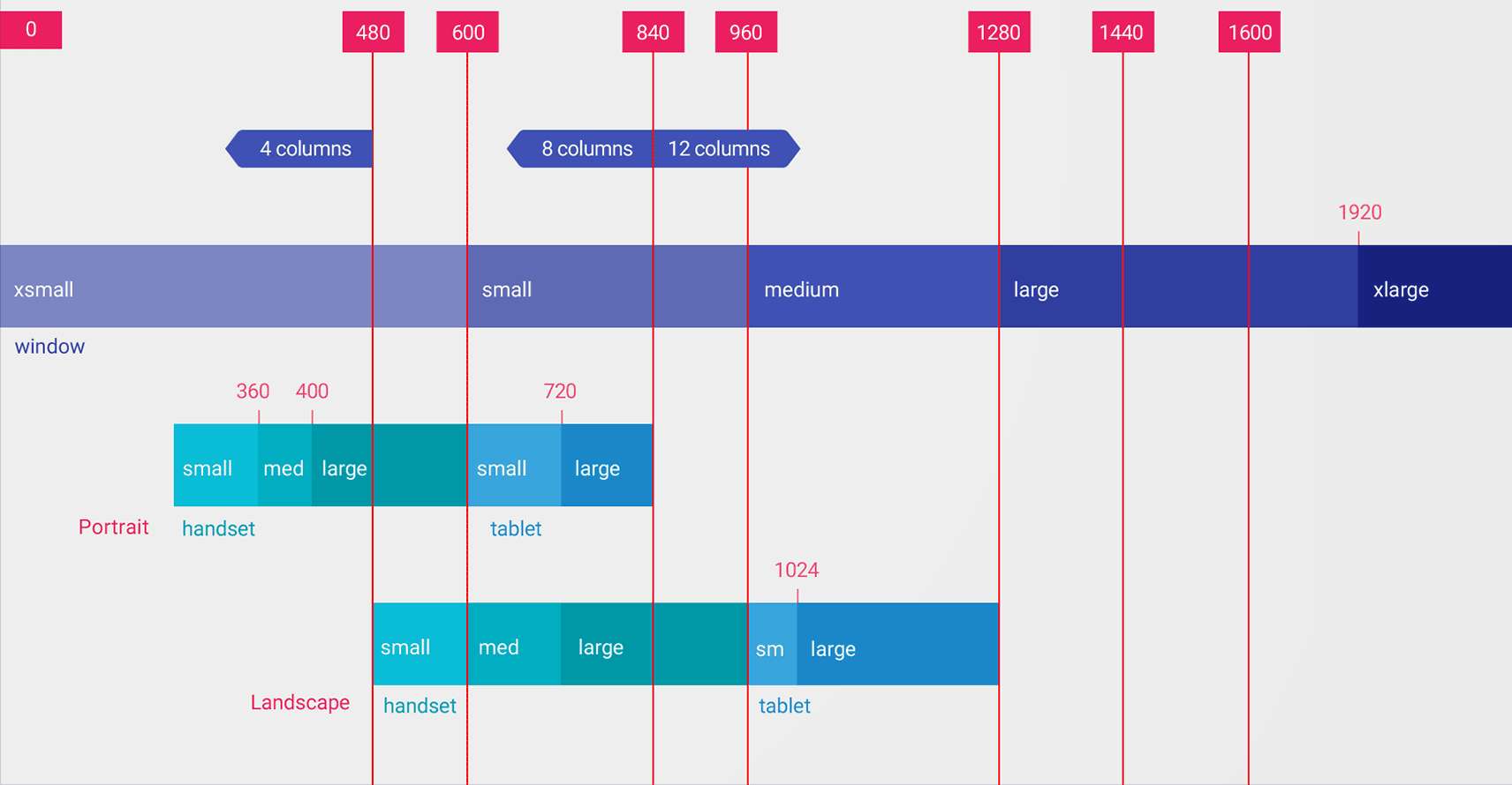
This figure provides a detailed view of how different screen dp widths generally correspond to different screen sizes and orientations. Image: Google
Your goal, as a designer, should be in ensuring that following objects look great on any screen size and screen density:
Get the best possible performance for your app. You can’t count that all your users will have top-end hardware such as Samsung Galaxy S9, so you should focus on making your app less demanding on hardware resources. Ideally, the app you design should work great on different hardware — from low-level $100 devices to top-end devices.
Tip: Use Google Play analytics to understand what are the most common devices which people use to work with your app. Optimize your app for this group of devices.
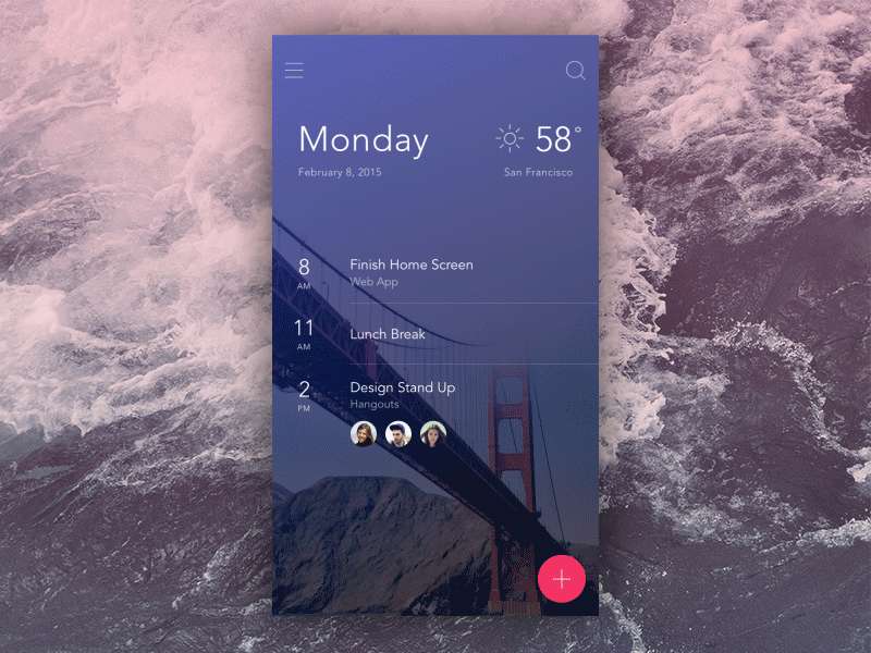
Modern mobile devices have a lot of hardware components that can be used to make users life easier. Camera, GPS location, Bluetooth, NFC, accelerometer, gyroscope and more — all these sensors can enrich user experience. Let me give you a simple example of how you can utilize GPS location for routine tasks. When it come to filling out the form, instead of asking the user about her/his current location, you can request access to the Location Service, and fill out the required details automatically. This will saves valuable time for your users.
Auto-detection of location can save users time. Image: Thinkwithgoogle
When it comes to designing an app, one your goal should be in conveying branding personality. You need to create a product that reflects your brand. Designers have a few powerful tools in their toolbox that can be used for that purpose:
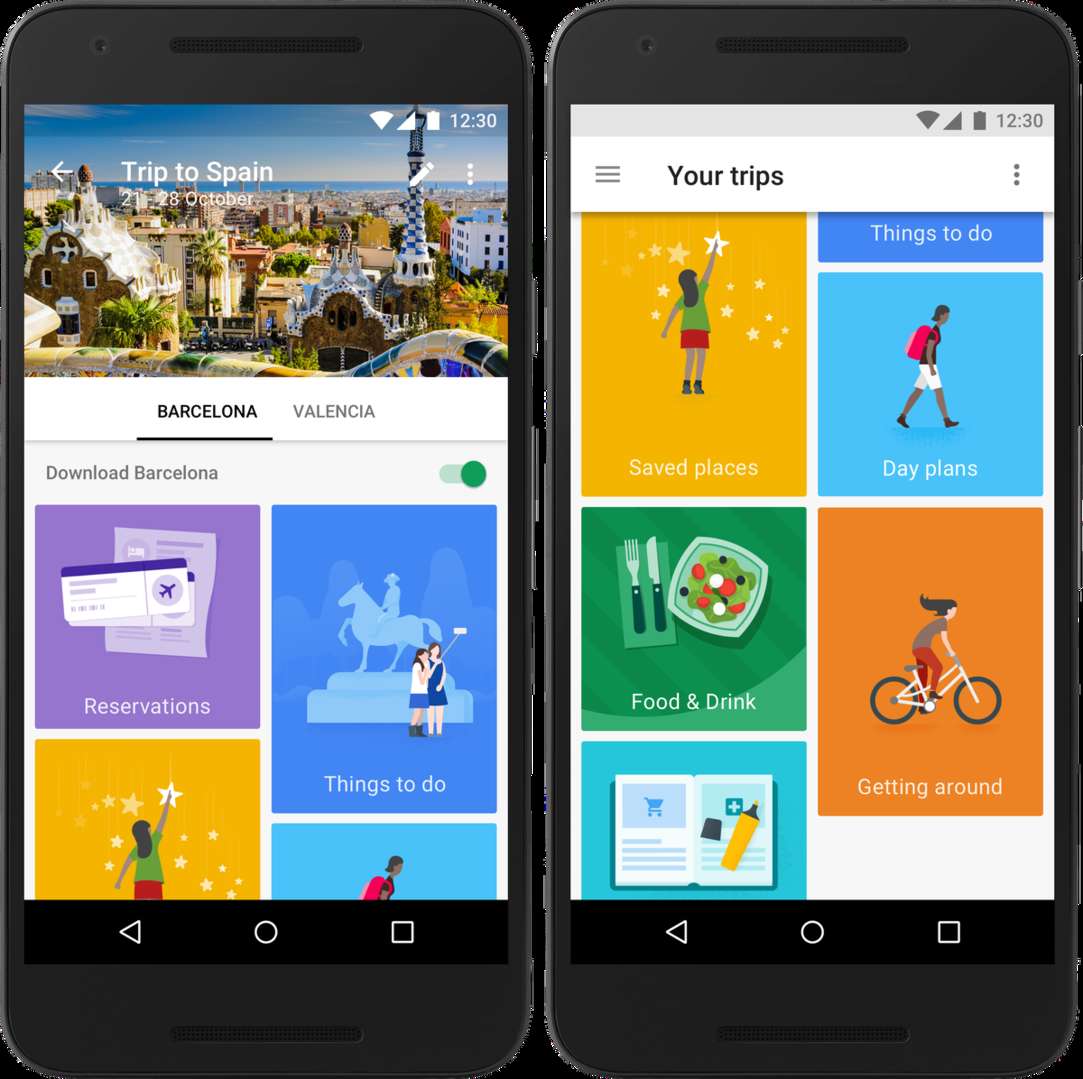
Google Trips uses nice illustrations that helps reflect the brand. Image: The Verge
When it comes to creating a mobile app, there no other choice than to prototype and test your design. Don’t attempt to create a perfect design right from the first attempt. In most cases, it’s simply impossible. Instead, be ready to iterate on your product.
Having a great Android prototyping tool such as Mockplus in your designer toolbox can make your life easier much easier. Mockplus not only helps you to create an interactive high-fidelity prototype in minutes; it also allows you to test the prototype with real users. So, the next time you’ll have some assumption on how a particular feature/screen/UI element of your product should look like or functioning— don’t guess it, test it!
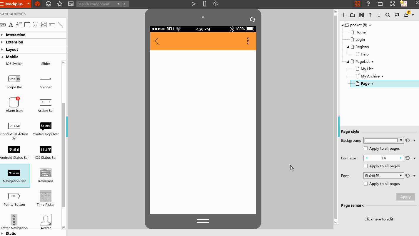
Mockplus is a powerful prototyping tool for Android app designers
When you keep track of your design work, this will help you to understand better how your design thinking evolved. It’s especially important to keep all negative iterations (failed attempts). The knowledge negative iterations deliver will prevent you from making the same mistakes again.
When it comes to creating a great mobile app, the most important thing that should be taken into account is that you design for your users, not yourself. As a designer, you should spend less time pushing pixels and more time working with your users. Experiment, try different approaches, choose the one that works best for your target audience and build upon the value you provide for your users. Good luck!
 Mockplus RP
A free prototyping tool to create wireframes or interactive prototypes in minutes.
 Mockplus DT
A free UI design tool to design, animate, collaborate and handoff right in the browser.


 Sign up with Google