Do you know that a 100ms increase in website loading time drops conversion rate by 1%, according to Amazon? And the
bounce rate increases by 123% if the page loading time exceeds 3 seconds. Heavy images, videos, and complex fonts could be reduced loading speed.
The Solution?
If you want the bounce rate to decrease and the conversions to increase, you must conduct frequent usability and technical tests to detect and fix slow pages and elements. Besides this, you should replace heavy images with more optimized options and swap video content with texts and pictures whenever possible.
It is also crucial to minify (shrink) HTML, CSS, and JavaScript files of the website, which can be done either manually or with an
online minifier.
Broken Links
Another example of a bad UX website design is broken links. When a user comes to your website, they want to get all the information for the purpose they have in mind. However, if they click on a link that gives a 404 error, they will probably leave the website right away and find that information from a competitor's website. But that's not the only issue! When web crawlers come across a broken link, they mark it as an empty page with no updated information. As a result, the website will appear lower on SERP.

The Solution?
The only solution to spot broken and poorly functioning links is regular monitoring and running usability audits. Once the broken links have been detected, you can quickly eliminate or fix them to increase the user experience of your website.
Unresponsive Website Layout
More than
80% of internet users own a smartphone, and
59% of shoppers feel that being able to shop on their mobiles is essential. This means that the number of people using their smartphones and tablets to access websites is increasing yearly!
An unresponsive website layout that won't adjust according to the screen size across devices means your website is only accessible via laptop or PC. A responsive website design helps increase your session duration, leading to a higher conversion rate.
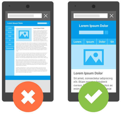
The Solution?
When developing a website, you should make a responsive layout, which adjusts according to the screen width and is appropriately displayed whether accessed via laptop, desktop, mobile, or tablet.
Non-clickable Buttons The buttons on a website play a crucial role in providing additional information to the user. However, if the buttons don't work, the user has no point in staying on your website. For example, suppose you have an e-commerce store and have displayed a product with different color options. In that case, you must have a color selection button so that the customers can browse the product in different colors. If your color selection button doesn't work, they would probably think the product isn't available in the required color and head to another website to order the same product in the desired color.
The Solution?
Running a simple usability test can identify these non-clickable buttons for you to fix.
Hamburger Menu
A hamburger menu is three horizontal lines that open up a side menu for easy navigation through a website. It's quite a helpful option for mobile users or people using narrow-screen devices. However, the same menu can be a hassle if added to the main website version. How? Because the main website version already has a linear menu, where all the navigation options are displayed on the page's top/side/bottom for easy access.
A user has to click on the section they wish to visit. If you remove the linear menu and place a hamburger on the main website version, it will affect usability, as the users will have to first click on the menu, then on the section, they want to go to. Although there's only one additional step, it can still be quite inconvenient for users browsing via a PC. In this example, you can see a website on a PC; however, at first glance, where there are no navigation options. Users can spot a small hamburger menu to access other website sections on the top left.
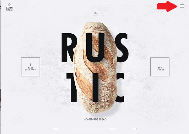
The Solution?
Keep hamburger menus for the mobile version of your website, and stick with the linear layout for the central performance.
Another common UX issue is non-highlighted links. To keep a user within your website, you must mention links with related information so they can click on them and be redirected to another page. However, if the links are not highlighted, the user won't know it's a link, won't click on it, and therefore spend lesser time on your website than they would have, had they noticed the link!
The Solution?
Make sure to highlight the links with a different color than the text to make them more noticeable.
One thing that annoys users is pop-up ads, especially obstructive ones where they have to complete a specific action, like sign up for newsletters, or follow a link. A pop-up that pops right as a user sets foot on the web page is a deal breaker. Users are looking for information and want to get to it ASAP. If a banner or pop-up comes the way, they would probably leave and search for that information elsewhere.
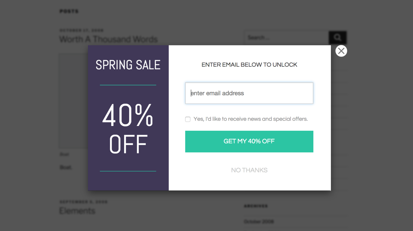
The Solution?
Make sure the pop-ups are displayed at the right time to get the user to perform the desired action. The ideal time for a pop-up to appear is when a user has browsed a portion of the webpage and is now interested in your content or product. That's when they would willingly provide their email or phone number for a subscription.
Registration Before Ordering
How many times have you browsed through the products on a website, added them to the cart, and a registration form appeared right before you're set to place the order? Many times! And it's pretty frustrating! A mandatory registration to be able to place an order is one of the significant root causes of the low conversion rate. A user wants to place an order, and that's about it. They will register if they feel like it, and forcing them to do so without letting them purchase your products will make them leave your webpage.
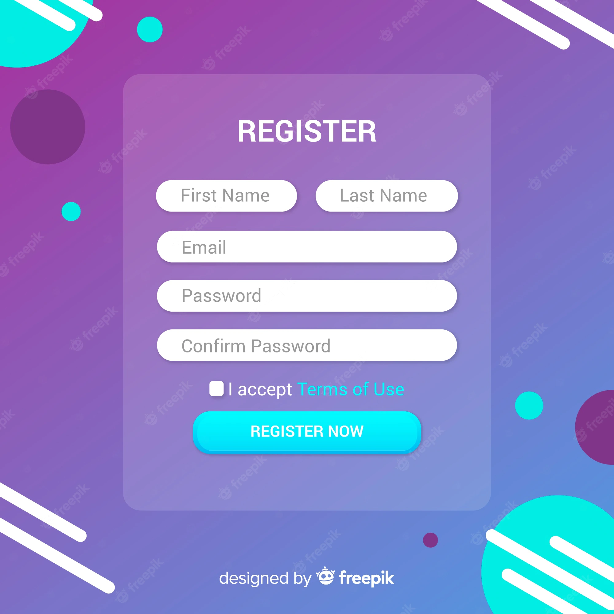
The Solution?
If you want to get customers to register for your newsletter, or promotional emails, place the registration form at the end of the purchase, and throw in a discount or bonus. This will prompt them to provide their information quickly.
Low-Quality Website Design
The best kind of website design is minimal website design. It should attract the users rather than push them away with too much clutter, banners, buttons, complex fonts, or images or videos that take forever to load. A well-structured page, with buttons placed correctly, everything displayed in an orderly manner, and ease of use is what attracts customers.
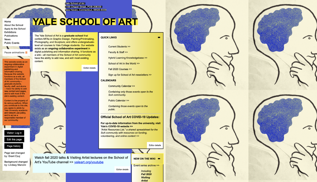
If you design a website that has too much information on one page with a jumbled-up layout, the users will get confused about where to click and where not to click. This will obviously make them leave without browsing. Following, you can see the website design of
Yale School of Art. It has random boxes with texts and no definite layout, making it look messy and confusing.
The Solution?
Aim for a minimalistic website design that's easy to use and offers a flawless customer experience.
When a user visits your website, the first thing they do before consuming the content is to scan the webpage. And during this process, the first thing that catches their eye are the visuals. However, if the visuals are inconsistent or disproportionate, it gives your website an instant messy appearance.
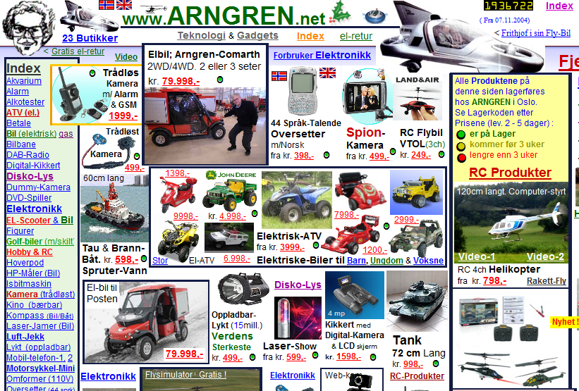
For instance, if you have displayed several products on your page, and some of them appear larger than the rest, they won't match the overall design or have a consistent style. This will make your page look unprofessional, untidy, and confusing. Have a look at this website, for instance. It has images placed randomly without proper proportion or design. Merely looking at it creates a sense of confusion and chaos!
The Solution?
Make sure all visuals displayed on your webpage are proportionate and placed correctly.
Mismatched Text and Background Combination
As we mentioned, a user scans a webpage before proceeding, and readability is another thing that instantly grabs attention. If you have used the wrong text and background combination, the users will have trouble reading the content. The result? A click on the cross button! The text and background color combination is one of the most important aspects of a
UX design; therefore, make sure it's right! The same can be said of text on images.
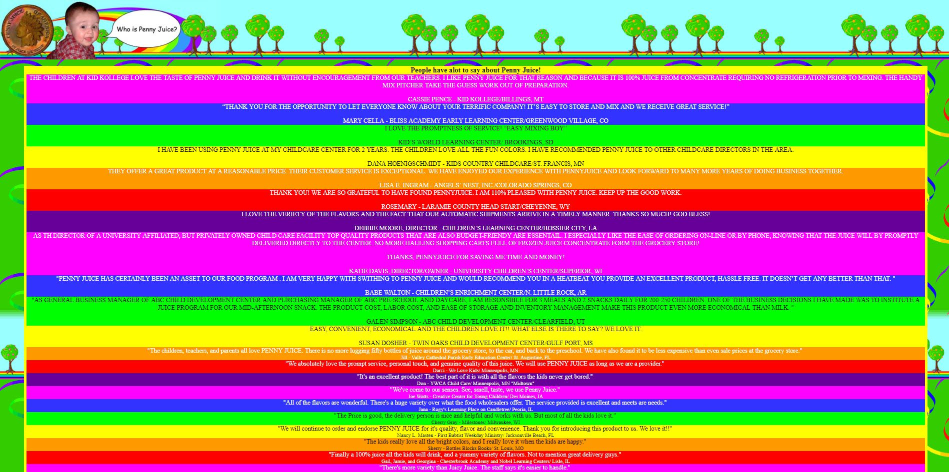
For instance, a white text would probably be illegible if there's an image of the light blue sky. Similarly, black text on a dark blue or purple background would also require the user to focus closely. If a user has to spend extra time figuring out what's written, they would probably give up a few seconds later and find a website with better readability. Look at this web design of a flavored milk company for kids. They have added too much color with texts of a similar shade, making it almost impossible to read.
The Solution?
Black text on a white background or white text on a black background is the perfect combo. However you can also go with other colors of your choice, but if the background is dark, use a lighter shade for the text and vice versa.
Another factor that imposes readability issues is unstructured text. A webpage with tons of sentences, all jumbled up without headings or paragraphs, is not only an eyesore but also gives the impression of too much information. Therefore, nobody would give their time of day to read that block of words!This Atari web page is an excellent example of unstructured text. There are no proper headings, formatting, or consistency, making it look cramped and untidy.

The Solution?
To improve readability, try to structure the text on your website in a proper way. Add a heading, use small sentences, insert paragraphs, and use bullets. If the content is long, we recommend structuring it using the F-pattern, so that people who skim through the text can easily find what they're looking for.
Every website has a color theme. For example,
Wikipedia is black, white, and grey with blue highlighted links,
Amazon has a black, white, and yellow theme, and
Apple has a simple, black-and-white theme. These themes are subtle and undistracting. However, if you choose a theme with a loud color combination, it can affect the mood and comfort of the users. The following web page design has too much color and no layout, making it difficult to focus on what's written.

The Solution?
Choose the right color scheme that is appealing and has a calming effect.
If your website has something to offer, a CTA seals the deal! However, if your call-to-actions are weak, they won't entice the user to take action. Similarly, responsive website versions face frequent CTA issues, as the CTA button disappears entirely, leaving no option for the users to go. This offer from Macy's shows what a weak CTA looks like. The user would have a hard time figuring out where to click!

The Solution?
Make sure your CTAs are persuasive with a solid offer on a banner image. Meanwhile, a broken CTA is a technical issue and can be detected and solved by frequent website usability analysis.
Low Image Quality
Low-quality images are the ultimate deal breakers, especially on product pages! A user skimming through a website might notice an image and stop to have a closer look, but what's this? The image is unclear, clicked in low quality with a distracting background. This little detail screams unprofessionalism! It gives a poor impression of your brand and product.
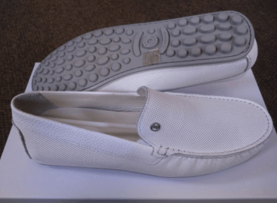
The Solution?
Use a good quality camera to click pictures of the products. If possible, use an editor to sharpen and polish the image to make it look crisp, vibrant, and professional. These were a few examples of a bad UX website design that wards off your website's potential customers and organic traffic. But, what is it that reels in the users? Let's have a look.
Good UX Design Examples
Just like physical stores keep sprucing up their interiors to enhance customer satisfaction and shopping experience, online stores also need to do some maintenance to keep those sales coming. And online store maintenance means a good UX website design that attracts the customers, keeps them browsing, and eventually converts into sales. Here are three examples of a good UX design to help you better understand the concept.
If you want users to stay on your website, you must keep it simple. This means easy navigation, a minimalistic design, neutral colors, and ease of use. Anything too complex or high-fi can cause confusion and reduce traffic. The UX website design of
Germaine Days is a good example.
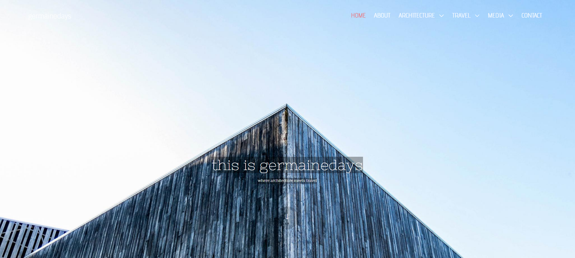
Why? Because:
It's simple.
It has different sections as you scroll, and each section has an extensive background image with minimal text and a clickable button that redirects you to the specific page.
It has a sticky header that appears on every page and helps you navigate with utmost ease.
The color theme is neutral and calm.
The placement of everything is proper, which makes it easy to browse.
The second most crucial aspect of a good UX design is usability. Usability means how easily a user interacts with the website, using an
UX design tool to check the layout and user flow first can avoid usability issues. It usually goes side by side with simplicity because the simpler the web design, the higher the usability. Here, we will take the example of
Amilia.
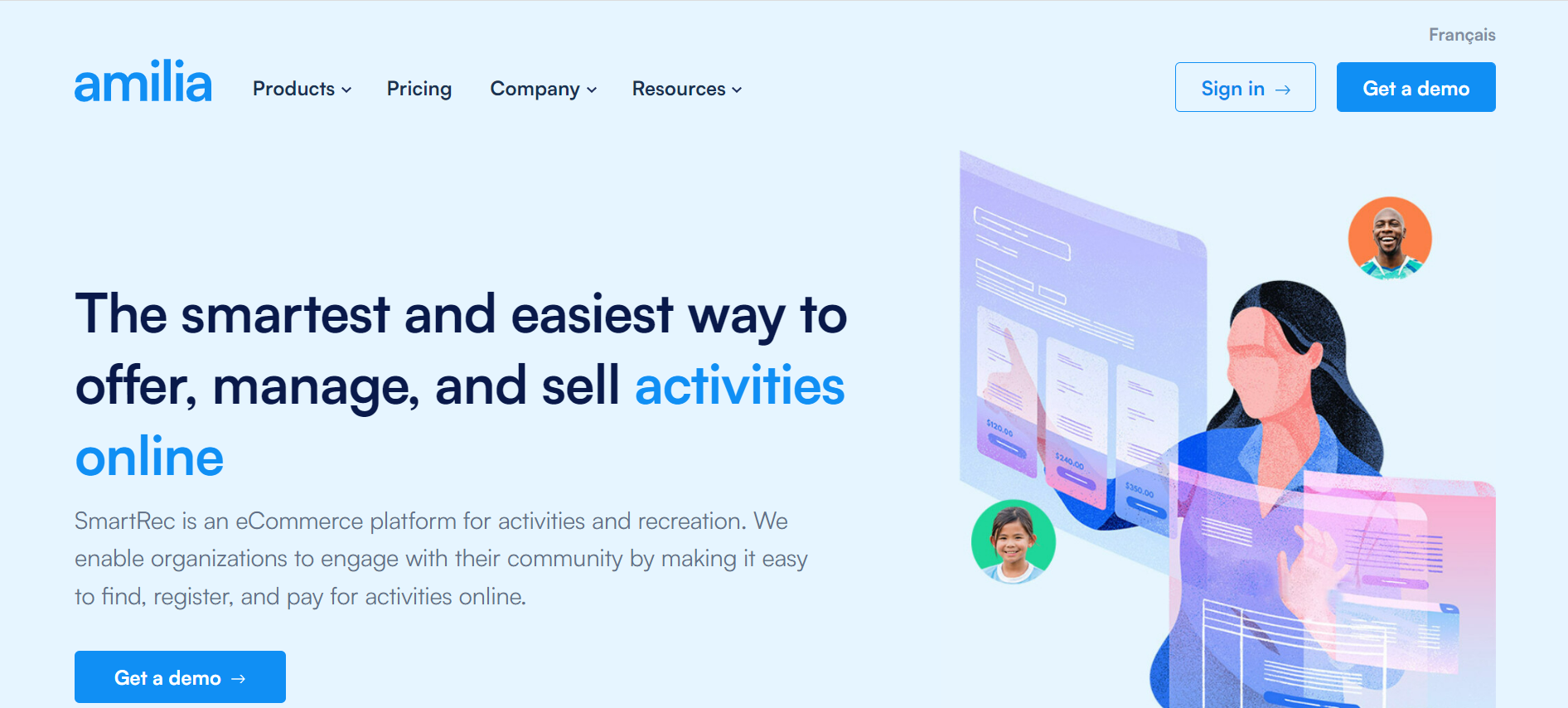
Why does Amilia have superb usability? Because:
It helps users find relevant content immediately.
Users can click on the menu to access a drop-down menu to choose which section they want to navigate.
The navigation menu contains a one-line description of what the page is about, for easy understanding.
A person visiting the website for the first time can also easily navigate the pages without losing track of anything.
Apart from simplicity and usability, the UX design should also be visually aesthetic. This means that designers should place the text and visuals correctly, the font should be appropriate, the color scheme should match, the readability should be high, and most importantly, the images should be clear, crisp, and high-quality. In short, the website should look pleasing to the eyes and have a professional and tidy appearance. Take
Pinch of Yum's web design, for instance.

We consider it visually pleasing because:
It is simple and straightforward, with all the menu options in the right places.
The fonts, colors, and background are perfect.
It uses professional-looking, high-quality images taken with great precision.
The web design, the color scheme, and everything, in general, give a happy vibe.
Conclusion
Everyone wants a great user experience. However, sometimes our web designs lack good UX/UI, making the users leave the website sooner than they should. We have put together various examples of bad UX website design, complete with how UX designers can improve them for a better user experience. We have also added a few examples of websites with a UX design looking good for you to look at and get inspired. We hope this informative article will help you create a UX design that works!
 Mockplus RP
 Mockplus DT


 Sign up with Google