The use of dark colors in website design is one of the hottest design trends in 2019 and the cause of much debate. Many web designers have adopted this style for big brand company sites, believing that it gives a unique impression of high quality. But others think dark colors can create a somber tone and be less easy to read by comparison with brighter colors.
Indeed, using dark colors in website design is not appropriate for every industry. But, if done well with the right color scheme, a dark website can stand out from the crowd and reach its audience effectively with good readability. Moreover, it can come across as creative, even beautiful.
This article explores some best practice and highlights some good examples of how best to use dark colors in website design.
Readability is the number one concern for people who don’t like dark colors on websites. So web designers need to pay particular attention to the text and how it appears.
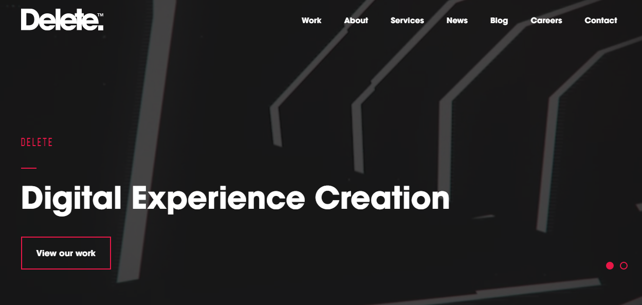
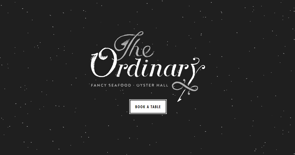
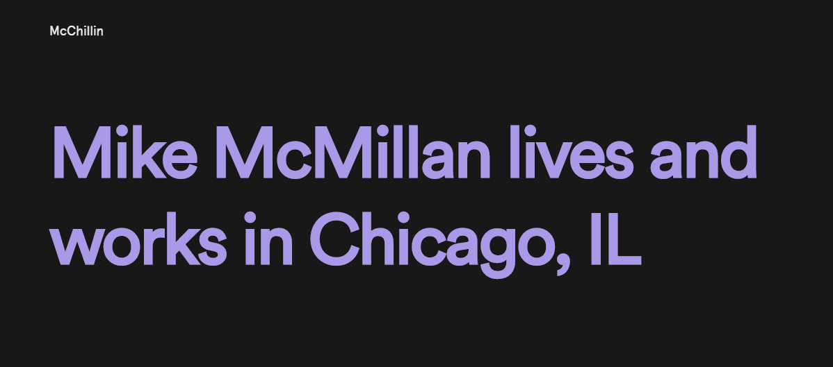
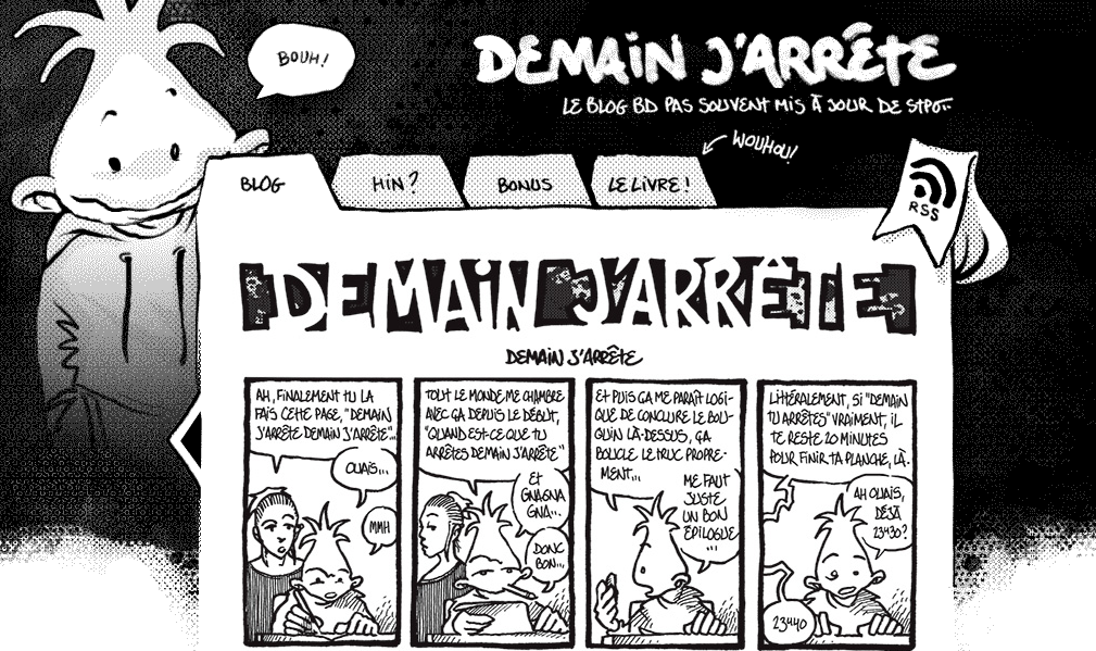
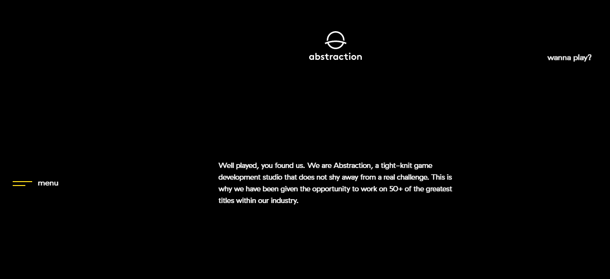
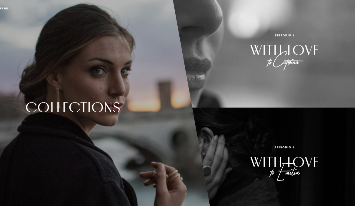
Using bold, clearly visible color fonts on headings, titles, and labels is an easy way to attract people’s attention and get them to focus on the sites’s content and branding. Against dark backgrounds, white is always the first choice for many designers here. But, for longer paragraphs or blocks of text, white on a dark background should be avoided as it can strain the eyes and thus affect readability. Gray fonts work much better.
Related article: 12 Cool Black and White Website Design Examples for Your Inspiration
The websites listed below are good examples of how to use bold white fonts for headings, titles, and labels. They are visible, elegant, and memorable.


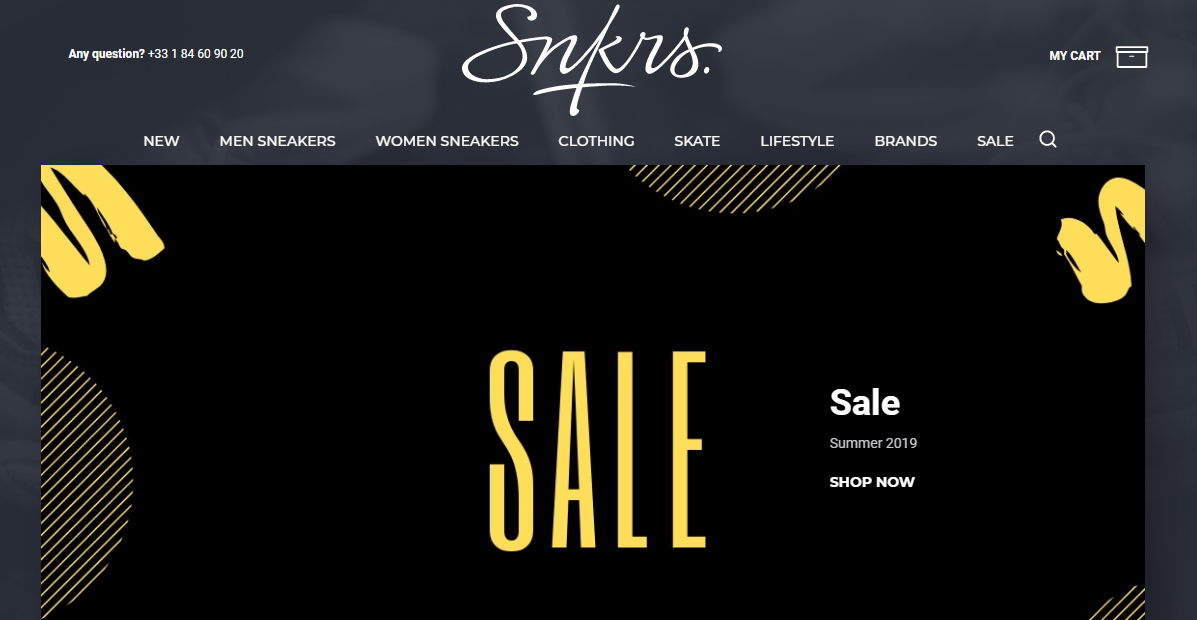
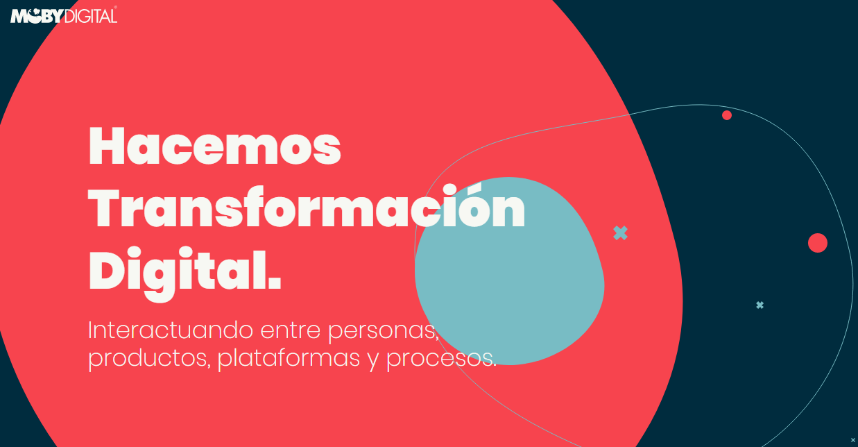
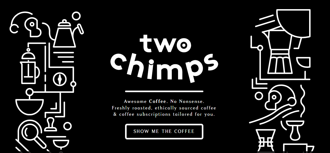
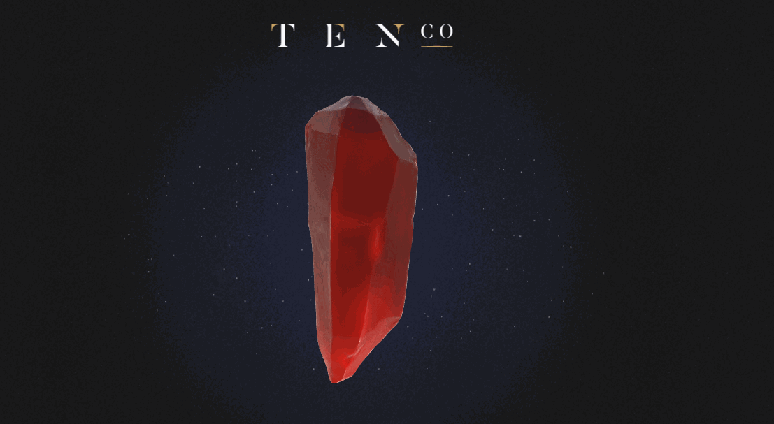
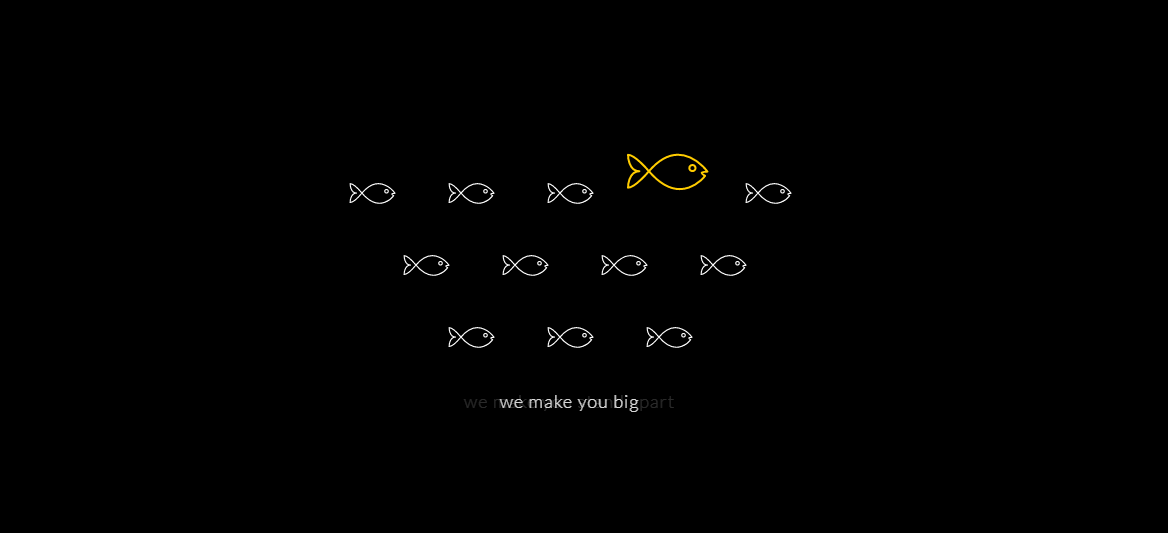
Bright colors can be fun and eye-catching. Using them against dark backgrounds on websites can make the sites more interesting and lively, creating a more striking visual effect for the user. But to maintain cleanliness and to keep the feeling uncluttered, designers should stick to more limited, even minimal, color schemes.
The following examples demonstrate good use of bright colors. Here designers have stuck with just one or two colors against the dark background. This is a good choice; the less color used, the more the page stands out.

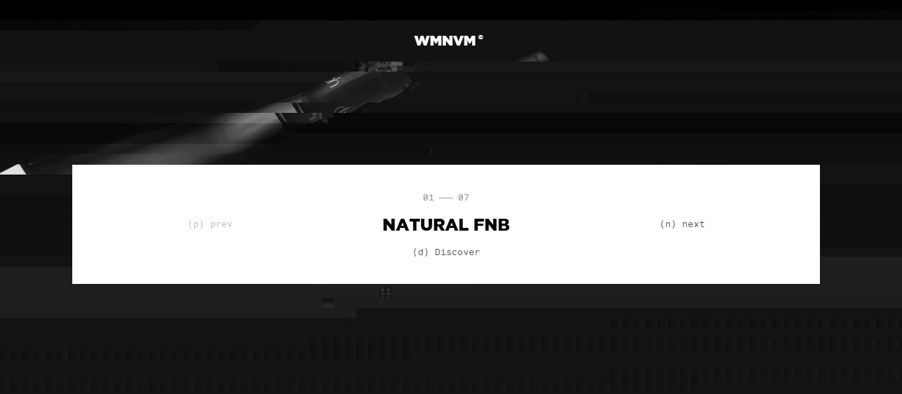
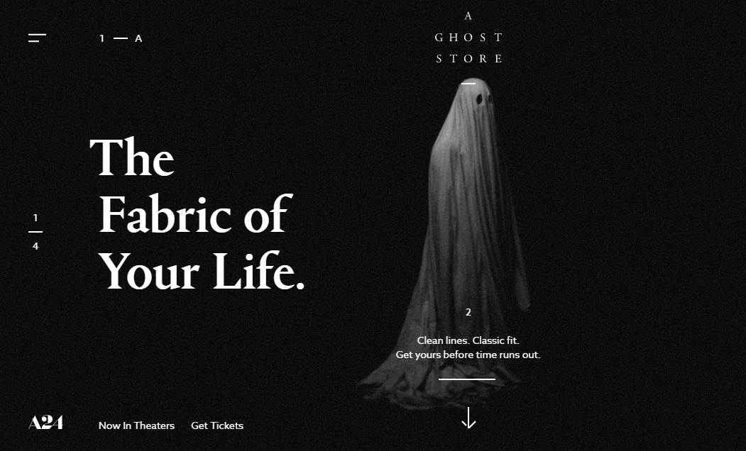
Dark color schemes can make websites appear “heavy” or “oppressive”. Careful use of white space can make each element on the page easier to understand.
White space is the most common element in web design, especially against dark backgrounds and its use is essential to help highlight the main content. The more white space you have, the more space you can spare for fonts and the main content, all of which can guide the user smoothly through the site. If there are too many elements, the user’s attention will be dispersed. White space allows users to find the information they need as quickly as possible. Overall, it can improve the user experience.

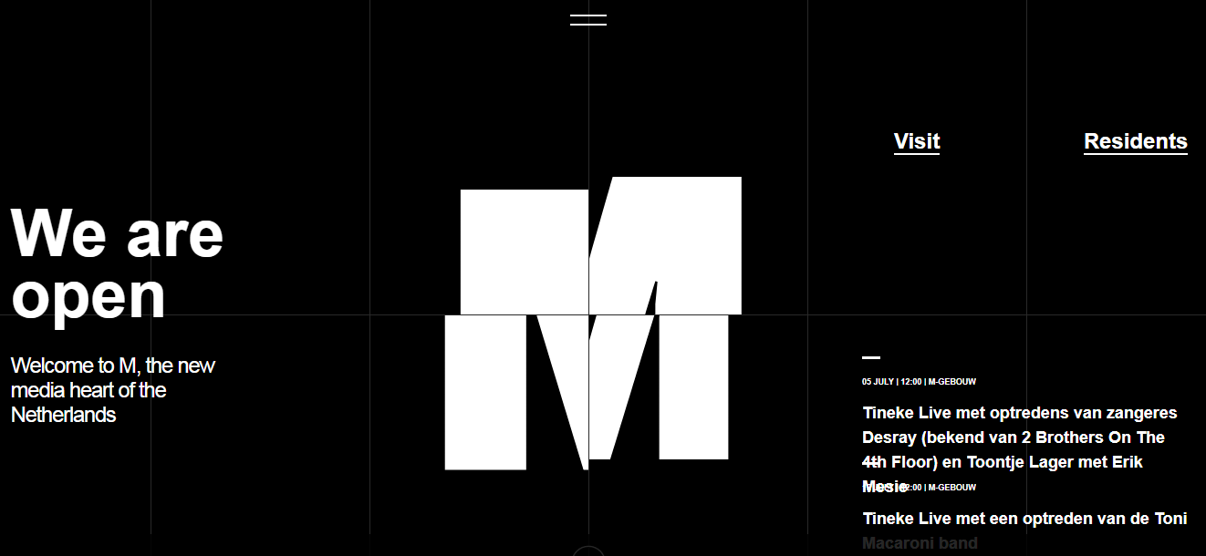
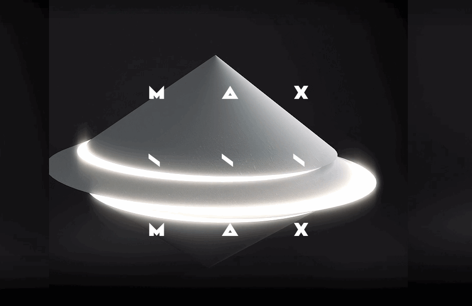
There is nothing like the pleasure of visiting a website with eye-catching animation.
In the following examples, we can see that many designers use animation to enhance the interactiveness of the page and to break any dull feeling created by the dark background. The visual experience created by simple animation effects is very appealing and can encourage users to explore the site further. Remember not to use effects that are too complicated. They may provide amazing visual impact but they can be very distracting for the user.

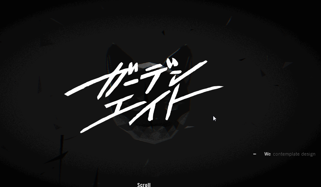

Here are some more examples of high-quality websites with dark color schemes:


There are similarities in how many users perceive the use of color on websites. If a site appears too cluttered, with many colors, the user will not enjoy the experience. So the choice between dark or light color schemes for the main color on your website needs to be judged very carefully.
The following two color-scheme guides will help you get it right.
Https://visme.co/blog/website-color-schemes/
Https://www.websitebuilderexpert.com/designing-web...
Getting a color scheme right is a basic skill for any web designer. Choosing the base color is not difficult, but the real challenge is to get the right set of color combinations. Many designers will, therefore, use color tools to arrive at the best color scheme.
There are many color schemes and tools out there. Some tools are designed to be used in specific ways, while others can only meet certain specific needs. This color tool collection from the creative blog has information for web designers in all design scenarios.
 Mockplus RP
A free prototyping tool to create wireframes or interactive prototypes in minutes.
 Mockplus DT
A free UI design tool to design, animate, collaborate and handoff right in the browser.


 Sign up with Google