Without any doubts, the checkout experience is the most crucial aspect of any online store. How well it’s designed is directly related to the conversion of e-commerce website — the faster and more convenient your checkout form, the higher conversion rate you’ll get.
As a UX designer, it’s your job to ensure the checkout experience is seamless and efficient. In this article, I’ll share ten highly practical tips that will help you achieve excellent checkout performance.
According to the Baymard Institute, a mandatory requirement for creating an account is one of the top reasons why people abandon the process of purchasing. Don’t make such mistake! Allow users to purchase without creating an account. It’s essential not only to provide guest checkout option but also make it clearly visible. Baymard Institute found that 88% of mobile checkouts forms fail to make the guest checkout option clearly visible, so users often overlook it.
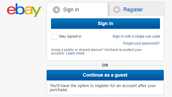
eBay provides easy distinguishable “Continue as a guest” option
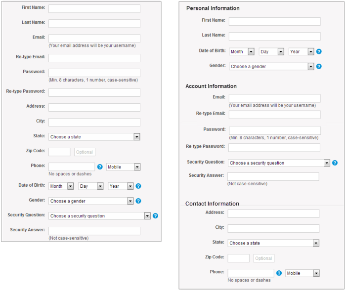
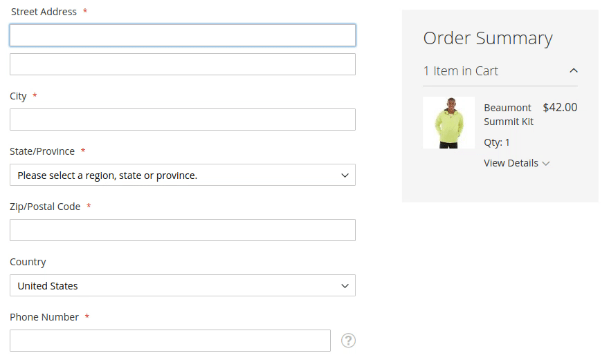
When it comes to collecting information, “less is more” is the most important principle to follow. A study by Baymard Institute found that almost 1/3 of US online shoppers abandon their cards because of “too long/complicated checkout process.” The same study found that it’s possible to reduce the average checkout length by 20-60%. Thus, as a designer, you should always ask for a least possible amount of information. For instance, if you don’t plan to call your customers there’s no need to ask for their phone numbers.
By reducing the total number of fields, you not only boost up the completion time, but you also make the process of competition much more comfortable. Less number of fields means less cognitive load on a user, and, as a result, less number of potential mistakes.
Tip: Clearly mark all optional fields. If you have optional fields they should be marked with word ‘optional’ or ‘*’ symbol. This will allow users who want to fill the form ASAP skip those fields.
The main rule with labels is not to hide them while users input the data (users shouldn't lose the context). Field labels should be visible all the time; ideally, they should be located at the top or at the left of the field. If you design for mobile and have limited screen space, you can utilise a technique called floating labels. When users activate a field, a placeholder text fades out, and a top aligned label animates in.
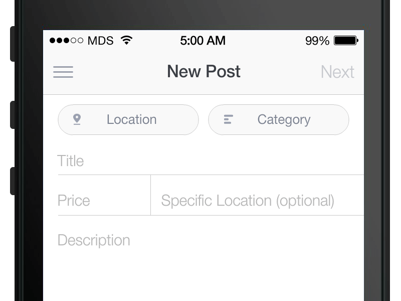
Labels should always be visible to users. Image credit: MDS
In multiple-column forms eyes follow zig-zag scanning and this makes it much harder for users to focus on certain elements (eyes won’t be fixated on certain elements). As a result, multi-column forms increase the completion time. When form consists of one-column, this makes it much easier for users to scan it — eyes follow a vertical scanning pattern.
When too much information is presented all-at-once, this may be overwhelming for your users. A technique of chunking can help you give the same amount of information without overloading them. There are two types of chunking:
Left: there are no visual separations between fields. Right: the same number of fields are visually divided into 3 logical parts. Image: NNGroup
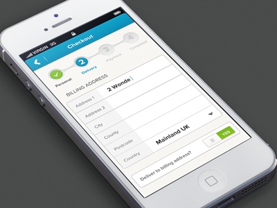
Multi-step checkout process: the form makes it clear at what stage a user currently is. Image: Murat Mutlu
Tip: For multistep checkout process it’s essential to ensure that back button behaviour aligns with user expectations. Users expect the back button to take them one step back (to what they perceive to be their previous page) not all way back to the product page. The second behaviour often accompanied with data-loss and, as a consequence might easily cause checkout abandonment.
Strive to minimise the need for typing. You can use a mechanism of auto-suggestions and auto-completion when users start typing an address. Services such asGoogle’s geolocation search allow you to fill the address based on a few typed in letters. At the same time, you should leave pre-filled fields editable so users can change information in them.
Address autocomplete function. Image credit: Eric Nguyen
Tip: The procedure of filling out the address might be even more straightforward on mobile. You can ask users for the permission to access their current location and feel the form for them.
Provide as many options for payment as you possibly can so that users can choose their favourite methods.
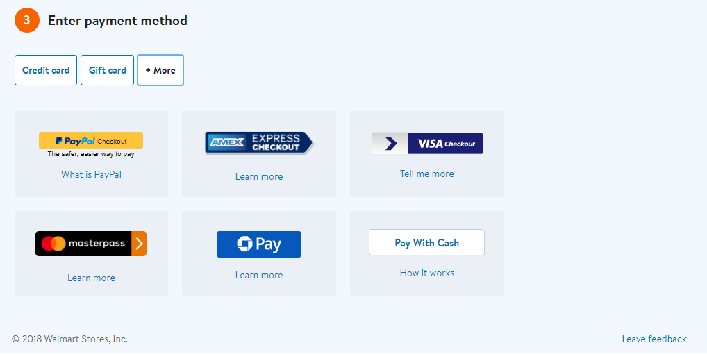
Walmart allows paying using a credit card, gift card, and many other popular options such as PayPal.
Among many payment options, credit card remains to be one of the most frequently used. It’s essential to make sure that checkout form is optimised for purchasing using a credit card. Here are a few things to remember:
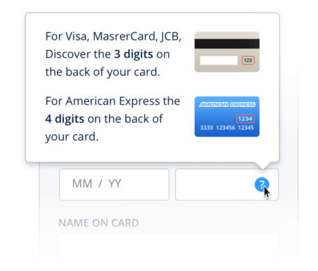
Security code for Visa/MasterCard, JCB vs American Express. Image: Dmitry Kovalenko
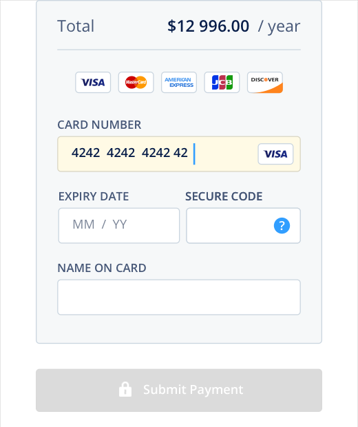
Bank card details form that satisfy all requirement mentioned above. Image: Fluix by Dmitry Kovalenko
It’s essential to provide order summary before a purchase. This feature allows users to review the order details and selected option for delivery, double check the billing and shipping information and make all required corrections if necessary.
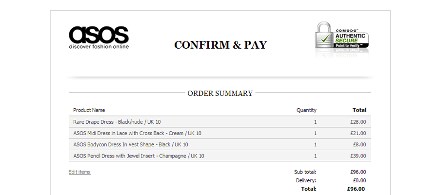
Asos includes provides order summary: users can review and correct their orders.
“Quick buy” is an excellent feature for returning customers. If your database has information about a customer, instead of asking them to proceed through all steps of the checkout process, this feature allows users to move straight to the purchase summary. All billing and shipping information will be used from a previous purchase.
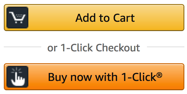
Amazon’s 1-Click purchase feature allows users to purchase the product almost immediately. Information about preferred shipping method, address, and payment details will be used from the customer’s data.
It’s pretty typical situation when users start browsing for a product on mobile but when it comes to filling out checkout form they switch to desktop. When users turn to the desktop, they should be able to continue from the place they were on mobile. Allow them to do that by providing an option “send your cart on email.”
When it comes to the checkout process, your ultimate goal is to increase the success rate (make users convert) and decrease completion time (allow to do it faster). The easier it is to buy stuff, the better chance there is people will do that.
 Mockplus RP
A free prototyping tool to create wireframes or interactive prototypes in minutes.
 Mockplus DT
A free UI design tool to design, animate, collaborate and handoff right in the browser.


 Sign up with Google