Design is not something that is set in stone. Design changes and evolves all the time, and when it comes to creating great products, most designers know that it's not enough to make a great design; it's also essential to ensure that it's easy for a product team to introduce changes in it. Product teams rely on design systems to minimize the time required to implement a design, and design tokens are fundamental aspects of modern design systems.
Design tokens provide designers and developers with a common language for expressing design decisions and help them achieve consistency across multiple platforms and devices. In this article, we will explore what design tokens are, why they are essential, and how they can be used to create a cohesive design system for your product.
Design tokens are pieces of information about design that define the properties of a product. Design tokens are often expressed as values for properties like color, typography, and spacing that can be used across designs, code, tools, and platforms. They're used in place of hard-coded constants, which helps introduce flexibility and unity across all product experiences.
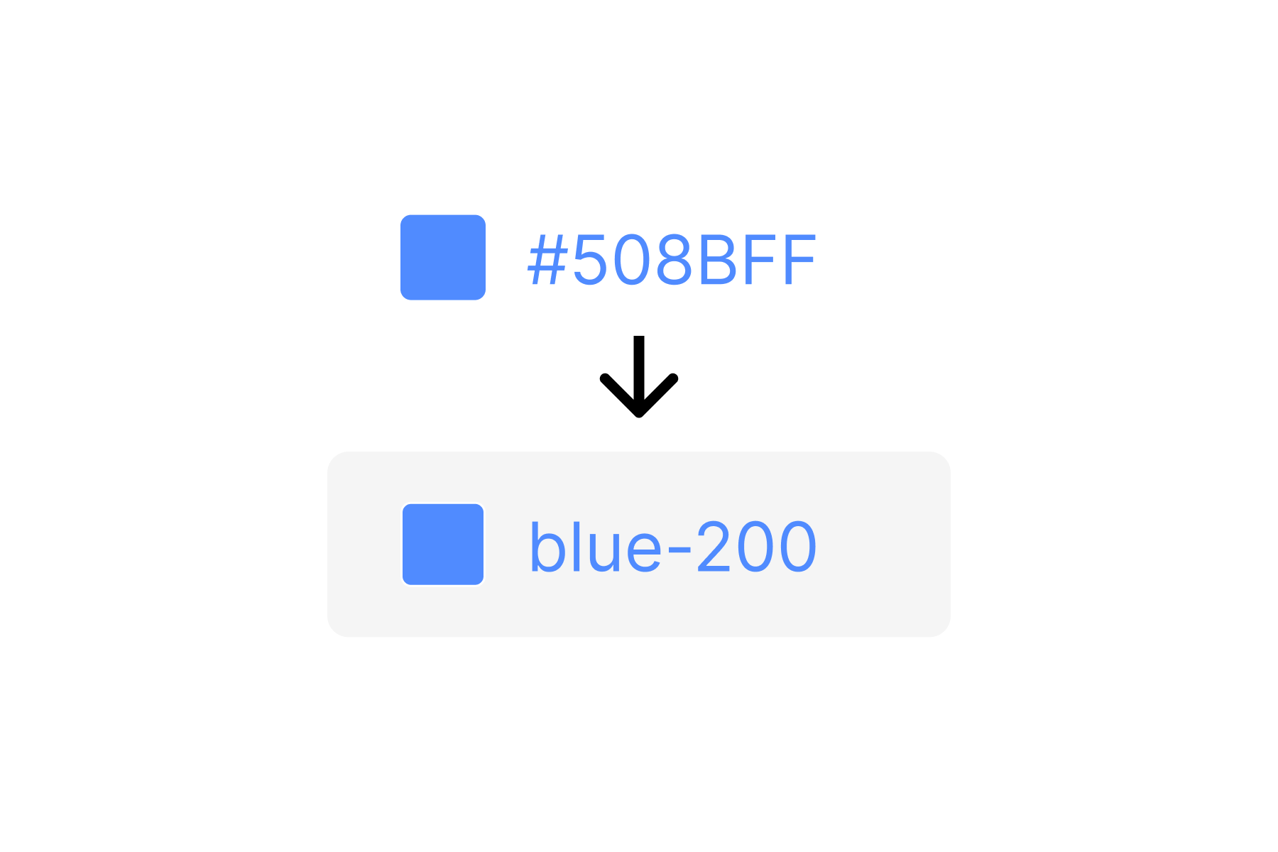
Let me give you an example. Suppose you use blue as a primary color in your application. The particular color you use has a hex code #508BFF. You can use the hex code in your design as a constant by hardcoding it into design elements. But it's not a very efficient way of organizing visual properties because every time you want to change the color, you need to go through all instances that use this color and adjust them manually.
It can be highly tedious, primarily when you work on a large-scale project. And it's relatively easy to introduce a visual inconsistency in design—for example, you might accidentally forget to change the color in some part of your product. When you use tokens, you create a variable with a name equal to the hex code #508BFF. This value is used both in design and code so that if you decide to change the color (suppose you choose a different hue of blue), you can change it in one place, and the change applies to all instances automatically.
Hard-coded constant vs. design token with a self-explanatory name. Image by Nick Babich.
Design tokens were first introduced by Salesforce as a part of their Lightning Design System. The idea behind design tokens was to provide a common language for designers and developers so that they can ensure consistency in the design of Salesforce's products. Since then, design tokens have become increasingly widespread, and many companies and organizations now use them to improve their design processes.
Design tokens are variables that define the design properties of a product. Design tokens are directly integrated into the component libraries of design systems, and they become an integral part of the design system used by product creators. The design tokens are used in design tools like Mockplus RP, and when designers create mockups and prototypes of the product using this tool, they use design tokens.
The fact that design tokens are integrated into the design system makes it much easier and faster for designers and developers to introduce changes in product design. When a design token is changed, the change is automatically applied to all instances of that token in the product. For example, suppose a designer's mockups and a developer's implementation both reference the same token called blue-200. In that case, design and development can be confident that the same color will be used in both places. This consistency remains in place even when the value assigned to a token gets updated (i.e., designers decide to change the value).
Design tokens are also used in code, typically using CSS or SASS. The design tokens are replaced in code with actual design values, such as a hex code of the color.
The token's value can be one of several things: a color, a typeface, a measurement, or another token. Design tokens can be grouped into several categories based on their use:
Color. Color tokens are used to define the color palette of a product, including the primary colors, secondary colors, and tertiary colors used in the design.
Typography: Typography tokens are used to define the typography of a product, including the font family, font weight, and font size.
Spacing: Spacking tokens are used to define the spacing between elements in a product, including margins and paddings.
Elevation: Elevation tokens are used to define Z-depth between elements in a product.
Motion: Motion tokens are used to define animation effects, including timing and easing curves.
Iconography: Iconography tokens are used to define the style and behavior of icons used in a product, including size, color, and shape.
Brand: Brand-related design tokens are used to define the visual elements of a brand, including the logo, typography, color palette, and other brand-related properties.
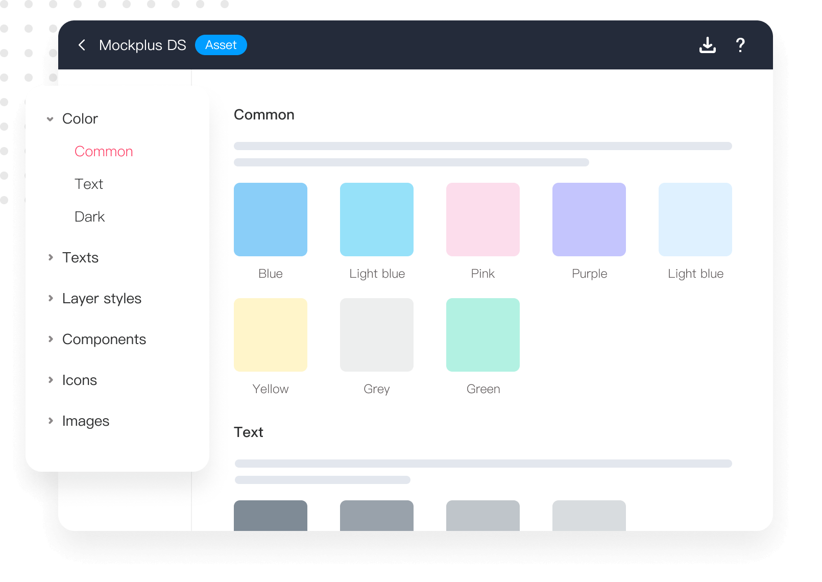
Design tokens in Mockplus DS. All design tokens in Mockplus DS are organized in a tree structure, making it easy to add or find any design assets. Image by Mockplus.
It's easy to think of design tokens as the building blocks of a consistent design system. They provide a way to standardize design elements and ensure that they are used consistently across all platforms and devices:
Consistency: Design tokens allow designers and developers to work together to create a cohesive design that is visually consistent.
Easy maintenance: Design tokens make it easier for team members to introduce design changes. When a design token is changed, the change is automatically applied to all instances of that token in the product.
Reusability: Design tokens are reusable and can be used in multiple instances throughout the product. This reduces duplication.
Shared language: Design tokens provide a common language for designers and developers, making it easier for them to work together and understand each other's decisions.
Improved accessibility: Design tokens can be used to ensure that the product is accessible to all categories of users, including those with disabilities. For example, design tokens can be used to define colors with sufficient contrast for users with visual impairments.
Tokens are most helpful and efficient in the following three situations:
You plan to build a new product or redesign your existing product.
Your product is available for more than just one platform.
Your design changes often, and you want an easy way to maintain the styles of your product.
Tokens may be less helpful if you use hard-coded constants in your design, and product design won't change much in the next few years.
Getting started with design tokens involves several steps:
When creating tokens, the first thing to do is to deconstruct pages/screens of your product down to their atomic elements, like buttons and input fields, and collect all visual styles they use. At the end of the interface inventory, you will have a comprehensive collection of styles that make up your interface. The great thing about content inventory is that it's possible to automate this process using tools. For example, if you conduct a content inventory of a web project, you can use a tool called CSS Stats that will analyze CSS files in your project and collect all unique styles from them.
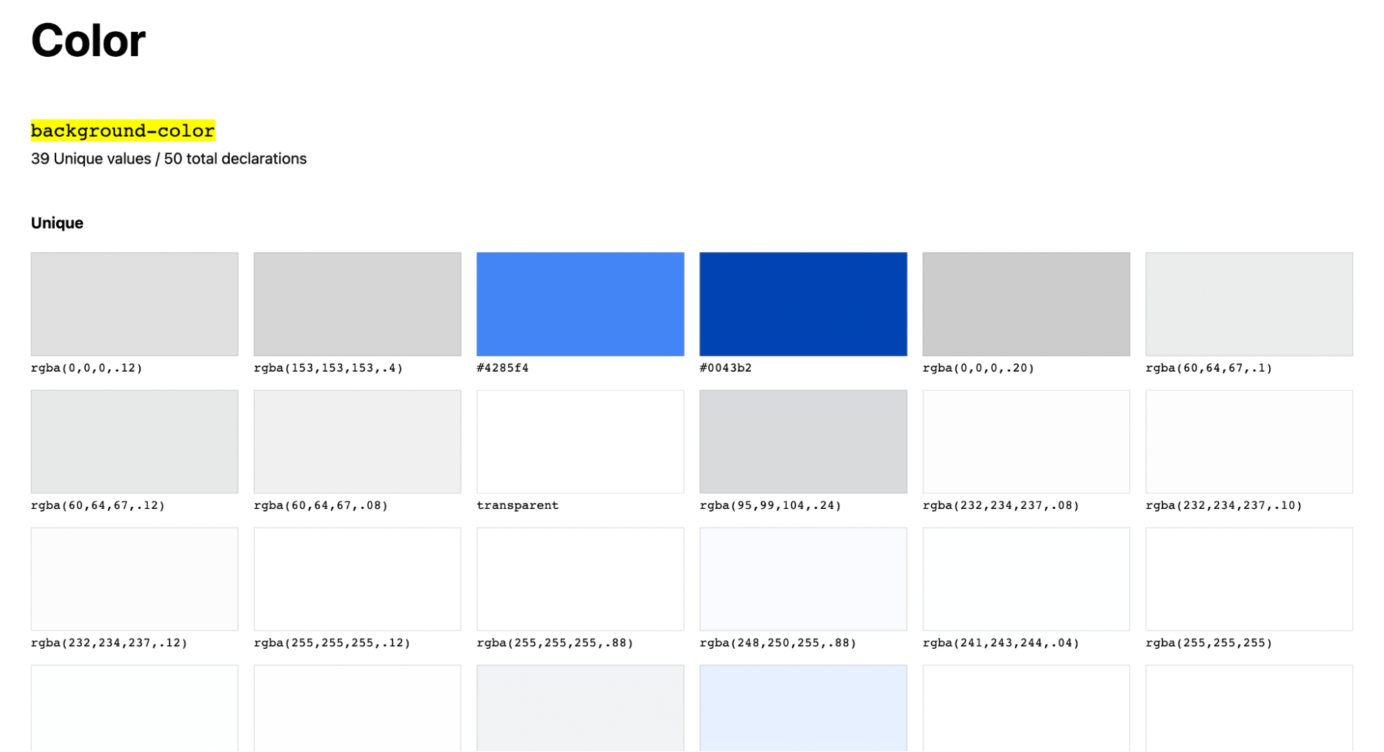
CSS Stats conducts a visual inventory of the Google.com website.
Design tokens are a part of the design system that a team uses. Once you finish content inventory, you're ready to define your product's components (functional elements you use to create your product like menus, call-to-action buttons, etc.) and specify their visual properties. It will include your color palette, typography, spacing, animation, and other design properties.
But don't just turn all colors, fonts, or spacings your design has into tokens. You need to specify clear criteria that will help you understand whether an individual property should be turned into a token or not. It doesn't make much sense to turn into a token a color or typeface that is used only once in your design. A rule of thumb is to use the criteria "used X times"—if a style is used X times, you should create a token.
You should also have a dedicated person called the gatekeeper responsible for reviewing changes to the design system. This person should care about the system's consistency and curate the requests to introduce new tokens from team members. It will prevent adding unnecessary or redundant tokens to the design system.
Once you know what visual properties you have and have clear criteria in place reading the adding new tokens, it's time to define variables for your design properties. It's a good idea to document your design tokens during this step so that everyone on your team understands how to use them. You should include information about the token name, value, use case for the token (describe each token's purpose and how it should be used), and relevant contextual information that your team members need to know about it.
Poor naming is one of the common mistakes that many designers make when they create tokens. The token's name should give people who will read it a hint of how the token is expected to be used. For example, if you name the color token for the call to action button "mysuperblueelement-400" it won't say much to people who read this name for the first time.
On the contrary, when you use the name "cta-primary-background-blue-400," it clarifies that this token is used for the primary call to action and serves as a background. A recommended approach for naming tokes is [Category]-[Type]-[Attributes], where Category is a category of an object (i.e., button, input field, etc.), Type is a type of a particular object (i.e., primary button, secondary button), and attributes are visual properties that this object has.
When creating tokens, you should also check them for accessibility. The design you make should be accessible to all groups of users, including people with disabilities. It's vital to validate the color contrast for colors, the size and weight of the text used for the headings and body copy, and even motion effects values (because poorly designed animated effects can cause motion sickness). That's why it's essential to consider W3C recommendations when building tokens.
Use your design tokens in your design files in Mockplus DS to create mockups and prototypes of your product. At this step, you should choose a format for the tokens. While you can use many different formats, relying on JSON is recommended because this format can store item-value pairs and be easily adjusted based on the developers' needs.
Once you polish your design files, it's time to implement tokens in code. Design tokens should be stored in a library that developers can import into their codebase. Once they do it, it's vital to replace hard-coded values with design tokens, and double-check the tokens to ensure that the code is using the correct design tokens for each individual design property.
It's also worth grouping related tokens together in the same file or in a subdirectory to make them easier to find and use. For example, group color tokens in a file called "colors.scss".
There shouldn't be a situation when one part of your product is tokenized and another is not because such conditions can easily lead to visual inconsistency in design. Always use your design tokens consistently throughout your product. It will make it easier to introduce design changes in the future.
Design tokens are design decisions that the team makes when building a product. Using design tokens instead of hardcoded values can streamline the product design process so that the product team can introduce changes much faster and reduce the risk of introducing inconsistency in design. Design tokens become a single source of truth for designers and developers, so both can rely on tokens to achieve consistency in UI design.
 Mockplus RP
A free prototyping tool to create wireframes or interactive prototypes in minutes.
 Mockplus DT
A free UI design tool to design, animate, collaborate and handoff right in the browser.


 Sign up with Google
 Join our Discord community
 support@mockplusapp.com