Having a well-designed website is essential for online sales when it comes to eCommerce. If your website looks outdated or unprofessional, customers will go elsewhere. Therefore, to make the most of your eCommerce business, you need to have a website that looks great and is easy to use.
The saying "You never get a second chance to make a first impression" applies to your eCommerce store. Customers will form an opinion of your store within the first few seconds of visiting, so it's essential to make a good impression. A study conducted at the Human-Oriented Technology Lab in Canada determined that web designers have 0.05 seconds to make an excellent first impression! That is not a lot of time. Thus, it is vital to make sure that the overall design of your website is professional and appealing.
You also have to make sure that the loading speed of your website is fast. A slow-loading website can be highly frustrating for customers and may cause them to leave your store without buying anything. Research by KissMetrics shows that the abandonment percentage increases drastically if a website takes more than 2 seconds to load when using a computer.
It is vital to have a well-designed and professional-looking website, but it is also crucial to make sure that your website is mobile-friendly. A study found that more than 50% of digital sales are m-commerce. In addition, 30% of people will leave a website if it takes more than six seconds to load on their mobile device. So just imagine what you can miss out on if your website isn't mobile-friendly.
It is clear that having superior goods or products is no longer enough to succeed. The presentation of your store matters, especially if you are in eCommerce. That is why more and more people are turning to creative agencies like Fourmeta to get help with their online stores. Hiring professionals or an eCommerce Website Development Company certainly eases your load in addition to bringing in more customers.
If you prefer a more hands-on approach, then this blog will provide you with tips and tricks on how to improve your:
Homepage
Categories page
Products page
cart and checkout page
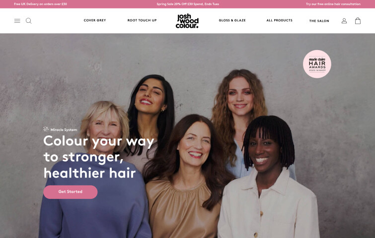
The first impression of your start obviously starts with your home page. As we stated above, you only have approximately 50 milliseconds to make a good first impression. So what are some of the "do's", the "don'ts", and necessary features of a moneymaking homepage.
You want your homepage to be simple and easy to navigate. Too much information or clutter will only confuse and frustrate your customers. Think of an actual store: your homepage is your storefront. You wouldn't display everything you offer but put out a few items to attract customers. It is the same with your homepage. You don't want to display everything that you sell. Think "broad": focus on categories, not on specific items.
Your homepage should be constantly updated with new information, products, and deals. This will keep customers coming back to your store and keep them interested in what you offer.
Your homepage's overall look and feel should be appealing and memorable to your target audience. It's essential to research and figure out what demographic you are trying to reach. Use this opportunity to tell your story: why you are different from hundreds of other sellers online. Be artistic and make sure to use high-quality photos. A Weebly survey found that great photos influenced 75% of surveyed shoppers.
Make sure to display a search box on your homepage prominently. According to Comprend, 59% of visitors use the search box if it is available. While it may seem unimportant, adding a search box leads to increased conversions and customer loyalty and strengthens SEO. Place your search box in a visible location. This tends to be either in the centre or in the top right section of the homepage. Add colour to it to make it stand out. Please take advantage of the JAVA script, which causes the text inside the search box to disappear once a customer clicks on it. Few things are as annoying as having to delete the text from inside that box.
Ensure you have a “Contact Us” link or button prominently displayed on your homepage. This will give your customers a way to contact you if they have any questions or problems quickly. This is an easy way to alleviate any doubts, especially if you respond quickly to customer questions.
Following these tips should help you grab the attention of your visitors and encourage them to go for a deeper dive. But, of course, once they do, you want to make sure that the quality of the rest of your pages matches your homepage. So, how do you design a categories page that drives sales?
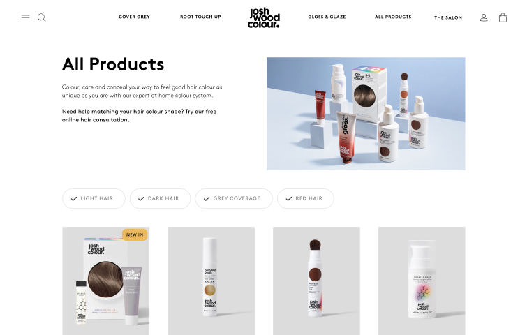
A categories page is where a shopper lands after clicking on a specific category from the homepage. This page should have all of the relevant information about that particular category. It should also be easy to navigate and include high-quality photos of the products in that category.
You want to keep a few things in mind when designing your categories page.
Make sure to display filters on your categories page prominently. Filters are essential because they help customers quickly find the products they are looking for. This page should include filters for brand, size, price, colour, and product type. You may also want to consider including a filter for the occasion (i.e. wedding, birthday party, etc.). Research shows that placing the filters on the left side with checkboxes works the best in terms of utilization.
Include brief but descriptive product titles and descriptions on your categories page. These descriptions should be enticing enough to make the customer want to browse the products. Keep these descriptions simple; they are designed for your customers. So avoid using jargon, supplier information, or anything else that will confuse a potential customer. You also want to make sure that the descriptions are accurate and up-to-date.
Make sure to include high-quality images of the products on your categories page. Hyundai reported that once they started using higher-quality images on their website, their test drive requests increased by more than 60%. Don't skimp on quality photos: hire a professional, if need be. It's money well spent.
Applying these suggestions and tips should increase the traffic to the individual products page. You want to make sure that your products page is helping you make a sale and not prevent you from making one. Here are some things to consider for your products page.
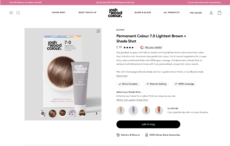
The products page is the most important page on your website. This is where customers go to learn more about a product and, hopefully, make a purchase. It should be easy for them to find the information they are looking for and include high-quality images of the product.
One way to make your products page more enticing is to add some fun elements. This could be in the form of a video, a quiz, or even a poll. Make it interactive: allow users to change sizes and colours and provide a 360-degree view. Avoid long, boring descriptions that most of your customers won't bother reading. This will help keep the customer engaged and encourage them to spend more time on your page.
Highlight the product's features without bombarding the customer with too much information. Use your imagination: create pop-ups with feature descriptions when you hover a mouse over a product. Or use a carousel to display multiple images of the product. This will help customers see all of the features that the product has to offer.
Including a video on your products page is a great way to show customers how the product works. It can also help them understand the features of the product.
Make sure that you include high-quality videos on your products page. Customers are more likely to watch a video if it is good quality.
Customer reviews are a great way to show potential customers that the product is worth purchasing. They can also help customers make a decision about which product to purchase.
Make sure to display customer reviews on your products page prominently. If possible, keep the reviews on the same page as the product itself. This allows customers to develop trust for the product and the seller, eliminating fears and doubts.
The call to action button is one of the most critical elements on your products page. This button encourages the customer to take the next step and make a purchase.
Make sure that your call to action button is easy to find and stands out from the rest of the content on the page. The natural flow of a webpage view is top to bottom, not left to right. Hence, you want to keep the CTA button in the centre close to your description, not on the side. Use strong language and ensure that the button is visually appealing.
Now that you understand the importance of a quality products page make sure to apply the tips and suggestions provided in this article. By doing so, you will hopefully make more sales. However, these suggestions are not the be-all and end-all of what you can do to improve your eCommerce store. So continue to research and find more ways to drive traffic to your store and increase sales.
Once your customer has selected a product, the final step is closing the sale. Setting up your cart and checkout page for a smooth purchase is essential. If you've ever gone fishing, nothing is worse than having a fish hooked but having it come off when reeling in. Losing customers because of a poor cart and checkout page is deadly to your eCommerce store.
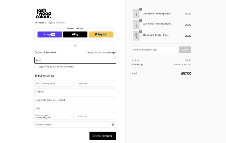
Your cart and checkout page must be user-friendly. This means that it needs to be easy for customers to add items to their cart and check out quickly and easily. You can do a few things to make this process easier for your customers.
Make sure that your customers can see the items they have added to their cart by using a pop-up cart. This will allow them to keep track of their purchase and ensure that they are not adding anything they don't want.
Show your customers the thumbnails of the products they have added to their cart. This will remind them of what else they are purchasing and help them decide which product to buy.
The leading cause of cart abandonment is unexpected charges! Make sure that your customers can see the total price of the products they are purchasing. In addition, your customers should be able to see how much tax and shipping will be added to their purchase. This will help them understand the final cost of the purchase.
If possible, allow your customers to checkout as a guest. This will make the process easier for them and encourage them to make a purchase. Typically, people don't want the hassle of creating an account and then remembering the login information.
Use a progress bar to show your customers how close they are to completing their purchase. This will help keep them calm and encourage them to finish the checkout process.
Keeping your checkout process to one page has substantial benefits. If customers can enter and edit all of their payment, shipping, and billing information all in one place without jumping back and forth, they are more likely to complete the purchase.
Making a purchase online can seem like a daunting task. This is because there are many different factors to consider, such as the product itself, the price, shipping, and taxes. As a bonus, we’ve compiled a few general tips you can implement.
Colours play a significant role in how customers feel about a product. Use colours that pop and make your product stand out. This will help customers focus on what they are buying. Red, for example, elicits feelings of excitement and passion. There is proof that making your Call To Action buttons red increases conversion rates.
Upselling and cross-selling are techniques used to increase the average order value. Upselling suggests a product of a higher value, and cross-selling suggests a product related to the one the customer has already chosen.
Building an email subscriber list is one of the best things you can do for your eCommerce store. It provides a way to stay in touch with your customers, but it also allows you to target them with special offers and discounts.
An easy way to do this is to include an offer to receive promotional emails. You can place this offer on your checkout page with the checkbox already accepted (meaning the customer would need to uncheck the box not to receive emails). If they sign up for these emails, you can even offer an incentive, such as a discount, on their first purchase.
Some customers are turned off by ads and will leave your website if they are bombarded with them. Therefore, try to keep the number of ads on your website to a minimum, or better yet, none at all. This will help keep customers on your page and increase their chances of making a purchase.
This means that you might lose out on some income. But with so many scams and viruses, people are afraid to click on something that pops ups or is a sidebar ad. Eliminating these will alleviate customer fear, provide peace of mind, and increase conversion.
Cart abandonment is a massive problem in the eCommerce world. In fact, it's estimated that almost 70% of carts are abandoned. This means that customers add products to their cart but leave the website without completing the purchase.
Obviously, they liked the product enough to put it in the cart. So send them an email with a friendly reminder. You can even offer a discount on the products in their cart to entice them to come back and make a purchase. That could be the final step to closing a sale.
Add a promotions tab. Customers love sales and promotions. They provide an opportunity to get a great deal on the products they want. Promotions also help to increase the average order value.
You can also use this as an opportunity to cross-sell related products. And you give your customer a reason to "window surf" your store. This way, they come back to check out the sales, even if they don't want to buy something specific.
eCommerce stores must consider the different stages of the buying process to create a successful sales funnel. By understanding and implementing the tips and suggestions provided in this article, you can increase traffic to your page and make more sales.
However, these are just a few of the things you can do to improve your store. Continue to do your research and find more ways to drive traffic and increase sales. By making your store easy to use and by providing quality products, you will be able to increase the number of sales you make. And, don't forget to test different methods and see what works best for your store. Your customers will thank you!
About the Author
Fourmeta is a full-cycle digital agency specializing in brand strategy, design and web development. We combine the human touch with the process of digitalization to achieve our goals. Our services include digital product design, digital marketing, digital product development, and Shopify eCommerce. We believe in the power of great design to build meaningful connections and create a lasting impact. Check us out, we are on Instagram, Behance, and Dribbble.
 Mockplus RP
A free prototyping tool to create wireframes or interactive prototypes in minutes.
 Mockplus DT
A free UI design tool to design, animate, collaborate and handoff right in the browser.


 Sign up with Google