As more and more people attach great importance to graphic design, no more emphasis can be placed on the flat design color combinations. Undoubtedly, the color combination decides how your design looks like and is an important factor for outputting an excellent design work. It’s not exaggerative to say that the color palette takes up 70% of a successful design, and the rests are the layout, text and graphics, etc.
For those who want to master the basic color theory but arenew to the design industry, there will be much practice works to deepen their understanding towards color and thus enable them to use a variety of colors skillfully. Right here, we will give a brief introduction on how to apply the color combinations in flat design so as to make them full of creativity and beauty.
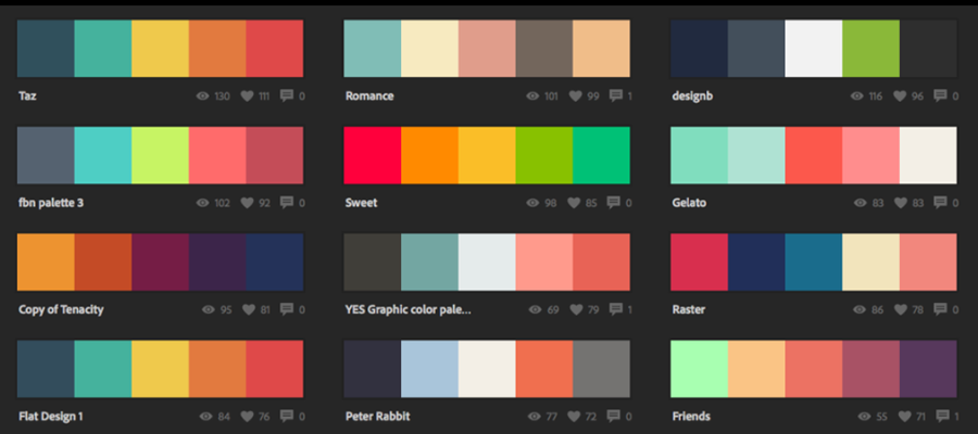
There must be contrast existing for a good flat design, from the overall composition, color match to elements’ arrangements. Only through the contrast can the focus be highlighted and the beauty be displayed. This goes the same way for the flat design color palette. In general, the contrast of color comes in various forms, such as the contrast of purity and brightness or the contrast of light and dark, etc. You might hear about the design tip of never use black, but we just hold the neutral attitude towards it.
The color contrast can simulate the visual impact, and also acts as a set-off to better express the theme of flat design. Often the case is that people need to use a number of related elements to set off the theme.
It’s easy to find that the best flat design color combinations follow the principle of comparison. But how does the contrast come from? Generally speaking, a qualified design requires 60% of the prime colorand 30% of the auxiliary color, plus 10% of the dotted color which is theso-called finishing touch. That is used to highlight the design and enhance the design level.
While seeing a design work, we will firstly feel its color combination, be in warm or cold color. This is what we’ve mentioned that 60% ofthe prime color is to render the whole atmosphere; the other 30% is for balance purpose and used to set off the main colors. As for the 10% as described above,it makes the design not rigid and alive. That’s the 6:3:1 golden rules for making agorgeous UI.
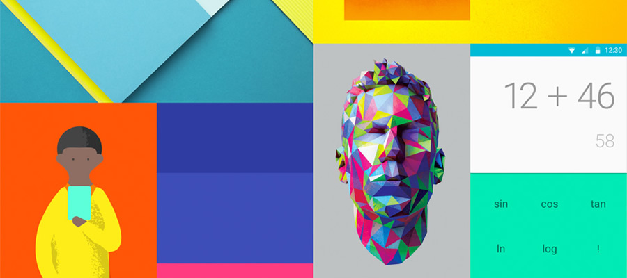
A majority of people have a sense of fear towards black as there is no hue in it. Also the color of black will make the design look rigid. However, the use of color can make the design look concise and even deliver delicate feeling sometimes. This can be a big difference between flat design and material design.
From the human nature, we always like seeing the scenery, the building and anything beautiful. To extract colors from nature can make your design more user-friendly, comfortable to users’ eyes and bring the power of beauty to users.
That explains why interior design services in Dubai often draw inspiration from both modern architecture and natural surroundings.
The different contrast of color can evoke a different emotional response. Why people always like wearing black suites, not the white skirt? Why the bedroom of warm colors always uses those colors which are similar in hue and light. The color contrast has a close relation to the psychology of color.
If your design wants to tell a very formal thing, then use the strong contrast as it can bring people’s concentration and tension; if your design wants to show relaxing and casual, then do not use strong contrast to comfort and please your audiences. This point has been proved especially in the interior design.
Above are the guidelines and tricks for flat design color combinations based on our hands-on experiences. Feel free to comment below if you want to share your thoughts with us.
 Mockplus RP
A free prototyping tool to create wireframes or interactive prototypes in minutes.
 Mockplus DT
A free UI design tool to design, animate, collaborate and handoff right in the browser.


 Sign up with Google