Products
Gradient refers to the mysterious and romantic color transition of an object from bright to dark, deep to shallow, or from one color to another. At the very beginning when theflat design has just risen, designers were keeping away the gradient in design. However, since Instagram changed the logo from classic Polaroid camera to a brightly colored flat icon, the gradient in app design is gradually making a comeback.

The reason for gradient’s rise is that flat design color combinations are extremely easy to cause homogeneity. If designers pursue a design language with rich visual, the gradient is the best choice. Let's take a look at the examples of gradient color used in mobile APP.
As a basic expression method in gradual design, the linear gradient is also one of the most common creative techniques. In general, there are 3 kinds of the gradient according to the direction: horizontal gradient, vertical gradient and diagonal gradient. Following are the examples.
Horizontal gradient:

This is a concept design of an eCommerce app, including settings, authorization, and coupons. The designer presents the user's coupon information by cards which use a uniform double-color horizontal gradient, highlighting the information on the card. Overall, the interface is minimalist and elegant.

How to make your weather APP stand out? Look at this one. The designer uses the vertical gradient very clever to create a sophisticated evening sky background with the APP's timeline. The interface and function complement each other.

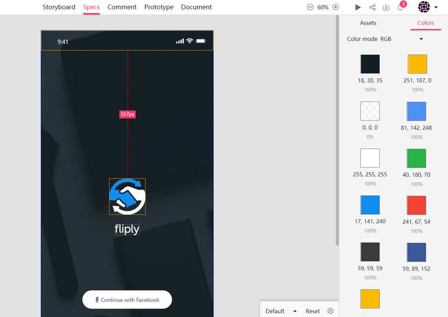
The landing page of this music app was created by the rapid prototyping tool Mockplus. When you open the APP, it will kindly ask your current state to automatically filter the music in line with the current mood.
The designer uses the diagonal gradient as a background, the warm gradual interface makes the interface more friendly and cordial. Besides, the diagonal gradient makes the interface more lively and rich, giving users a soft and humane AI product experience.

Adding gradient overlays on the background and head image can strengthen the sense of wholeness, making the user aware of other more important and crucial elements that enhance the page's readability. The effect of this design on the big image is especially noticeable. In addition, the overall image will be more mysterious, elegant and attractive.
You should also pay attention to the selection of the background image, picture content and tone. All the elements need to be consistent, the use of translucent could make the picture more delicate. Gradient needs to strengthen the readability of the page information and cannot be decorated for decoration.

As Instagram changed its icons and UI, Instagram lead designer Ian Spalter wrote a post about the icon change on Medium.
“If the lens is a bridge into the bolder, simpler glyph, the rainbow is a bridge into the colorful gradient. Color has always been a huge part of Instagram —you see it in the classic app icon, filters, and the community’s photos and videos.
When we started reimagining the rainbow, we looked at more minimal options, but ultimately we needed more warmth and energy to complement the glyph.”
Instagram captures the core elements of the original logo: the rainbow, the lens, and the viewfinder, which created a minimalistic and colorful rainbow of images with a multi-angle, multi-layered overlay on the background. Specifically, this icon mainly uses a set of the linear diagonal gradient, plus two sets of spherical radial gradient overlay, using color wisely in UI design.


Gradient is not only limited to be used as a single background decoration, it can also have some functionality. Designers will use the same color, similar color, approximate color, contrast color, the complementary color to separate each menu item clearly. So that the interface keeps the balance at the same frequency that makes the picture is colorful, more rhythmic and more comfortable.

This site has thoughtfully given every color a corresponding name. Click on the upper left corner to browse all colors, you can also select a color from the navigation bar above, presenting the color with all the corresponding gradient plan. After selecting the right one, you can copy the color values just by clicking the value shown above.
Link: https://uigradients.com/

CoolHue is a pretty useful gradient background website that offers about 30 different gradient backgrounds. The elements can be downloaded for free as a photo format or as CSS3 syntax. Just add it to the site style form, you can apply gradient color in any area.
Link: https://webkul.github.io/coolhue/
Mockplus iDoc is a powerful product design collaboration tool for designers and engineers. It goes beyond the design workflow and helps teams with the design hand-off.
It greatly facilitates the handoff by taking designs from Sketch, PS, Adobe XD and exporting them into a format thatcan easily generate code snippets, specs, assets, style guides, interactive prototypes, etc. After you upload your designs in Mockplus iDoc, it will automatically extracts colors from the design and organizes them into styleguide.
Under the rapid development of mobile APP, the gradient in app design is a result of the continuous improvement of people's aesthetic level. In the UI design, the gradient is often used with the shadow and external light to enhance its three-dimensional effect. Although the gradient is very hot in the current design trend, its unique style is still based on the needs of the APP itself. So it can not has a negative impact on function and readability.
 Mockplus RP
A free prototyping tool to create wireframes or interactive prototypes in minutes.
 Mockplus DT
A free UI design tool to design, animate, collaborate and handoff right in the browser.


 Sign up with Google