The iPhone X is finally here, and it will be on November 3rd. I think most of you have been aware of “the odd notch” of the iPhone X UI design. But what really bothers to the developer is that Apple made the announcements regarding the UI adaptation, it stressed that the developer can not hide the rounded corners of the device screen and also does not allow to design a black top status bar to hide the device sensor housing.
So this policy has brought big trouble to the developers. Luckily, the team of Safari web browser engine – WebKit will explain to us the details about how to optimize the UI design for iPhone X.
WebKit team takes the Safari as an example. In a nutshell, the page contents have been moved to the middle of the device screen to avoid the device sensor housing area, but the rounded corners can't be blank and the page’s content can’t be obscured by the device sensor housing area, like the pictures shown below.
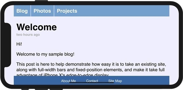
Using the viewport to adopt the safe area, and then you can use the iPhone X for web design in the safe area. Here, the page’s content will not be obscured by the device sensor housing or rounded corners.
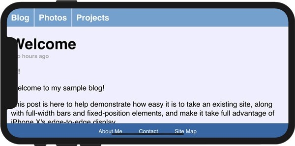
It’s required to fill in the matching color on both sides of the blank area after finishing the design in the safe area, will just be like the pictures shown below:
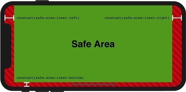
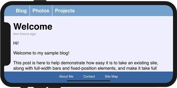
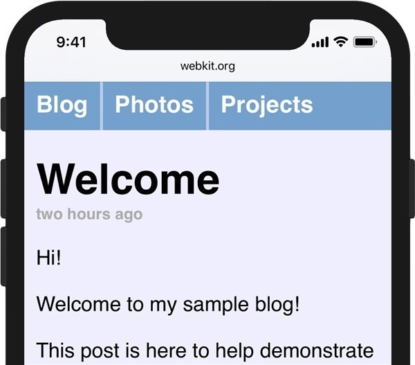
The final effect looks great after all, but this is the design instances of webpage. There are more APPs need to redesign, but we believe that many apps will be adapted when the iPhone X is officially on sale in November.
 Mockplus RP
A free prototyping tool to create wireframes or interactive prototypes in minutes.
 Mockplus DT
A free UI design tool to design, animate, collaborate and handoff right in the browser.
