As phone sizes get bigger and bigger, there now exists what is called a thumb zone for mobile screens: easy-to-reach, hard-to-reach, and in-between areas. According to this design discipline, UI/UX designers need to place the menu navigation at the bottom in most cases so as to decrease interaction cost. However, we still find other menu navigation designs such as the sidebar and the top menu bar.
In this article, we present a list of curated 20 mobile menu designs which cover hamburger, radial, top, bottom, and side navigation categories for your inspiration. Each has its pros and cons based on usability and user interface.
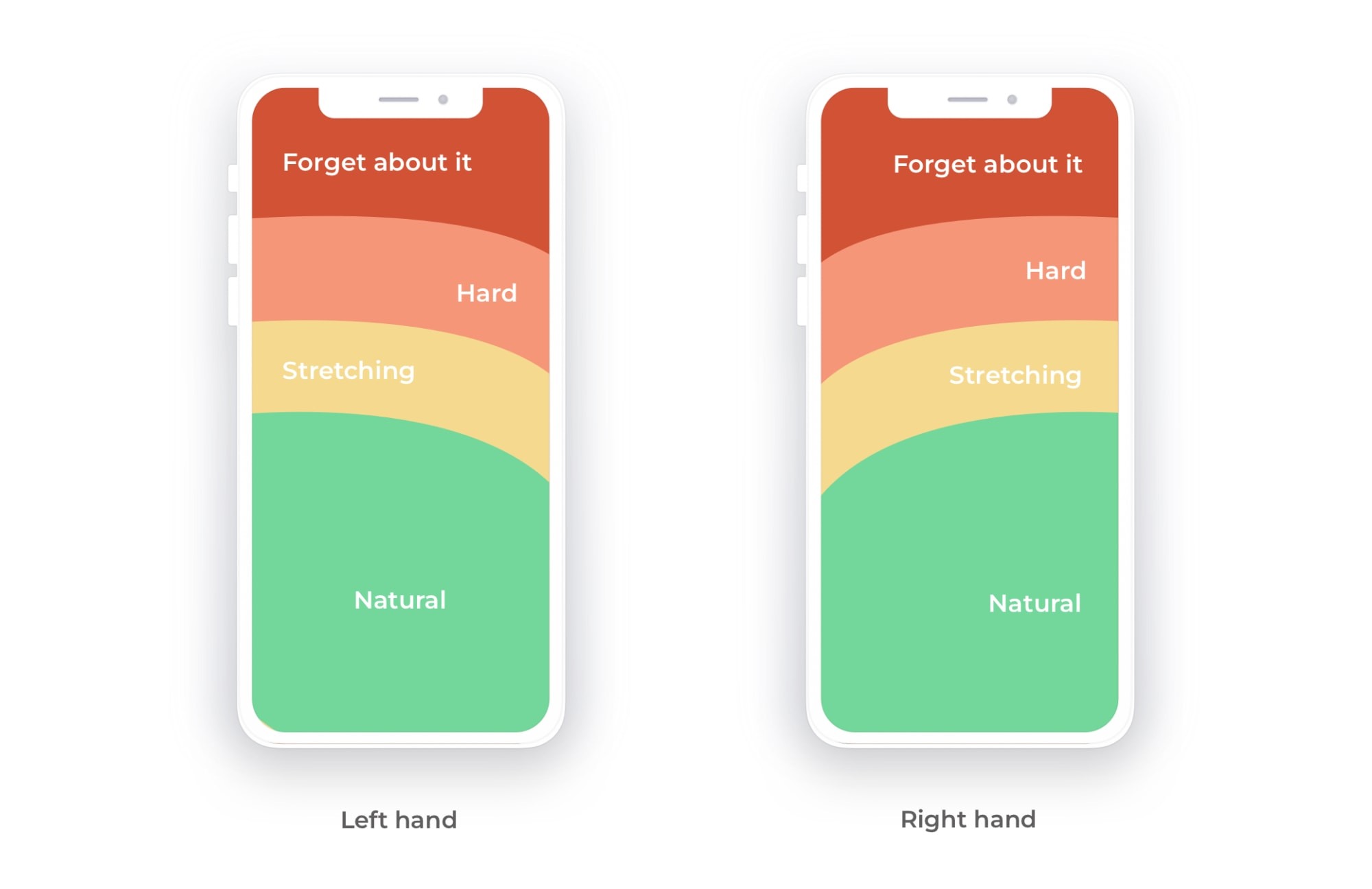
According to the thumb zone design, the hamburger button is more comfortable for the user compared to the top and side bar menu. A bonus point is that the hamburger menu is available for both left-handed and right-handed users.
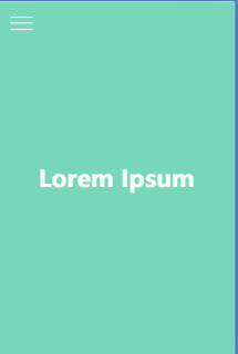
At the end of 2019, Neumorphism, a new quasi-physical design style became a thing. By playing with light and shadow to highlight a content area or module, the overall feeling becomes more immersive than a flat design. The hamburger menu below is designed by Alex Zubenko, who combines vertical icons layout and Neumorphism.
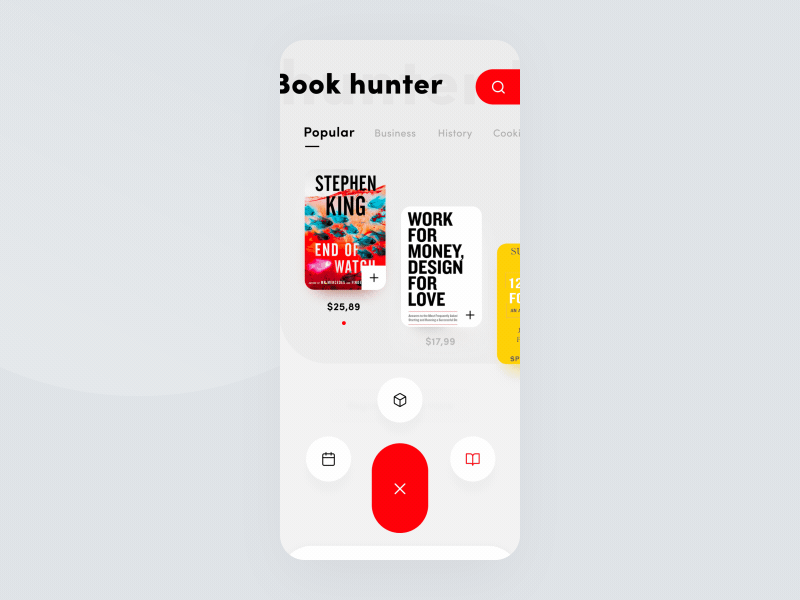
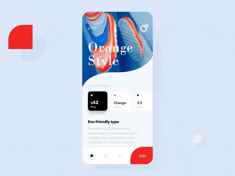
This design is a book store app using the outline of a white fox on a bright red background as a logo. Created by Taras Migulko, it uses both a bottom menu bar and a hamburger menu as a sub-navigation. The lively mood and the smoothness of the animations are great eye candy. This combination increases the usability and yet keeps the UI clean.
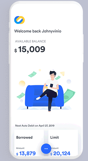
This financial app concept is designed by Johny Vino. With a hamburger icon menu and smooth animation of sub-navigation icons, it is a truly awesome concept applying minimalism and usability.
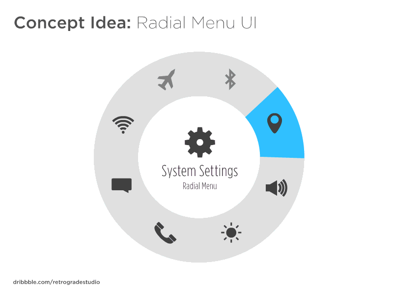
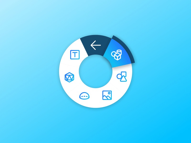
The radial menu or pie menu is a variation of the hamburger navigation. Usually, the sub-menu options pop out from the hamburger menu icon. However, this radial menu design is more suitable for touch screen devices and it seems a bit old-fashioned when applied to today’s mobile menu design.
Here's a concept of the radial menu idea by Howard Moen. Though this menu design is trying to simplify the scrolling process by putting all the menu categories in a circle, it actually has a higher interaction cost and users might get confused when using the menu.
Nico Salomone designed the radial menu for picking elements in a VR project. As I mentioned above, the radial menu is more suitable for a bigger screen as this work is mainly for a touch pad instead of mobile screen. Overall, considering the layout and the color scheme, this concept is a simple yet bright menu design.
Compared to bottom bar and hamburger navigations, a top menu navigation is usually in a hard-to-reach area and has a relatively high interaction cost.
This menu bar concept by Praveen Tewatia uses top navigation together with a side tab bar sub-menu, which increases usability. A bonus point which makes this design an unique one is the bouncing animation.
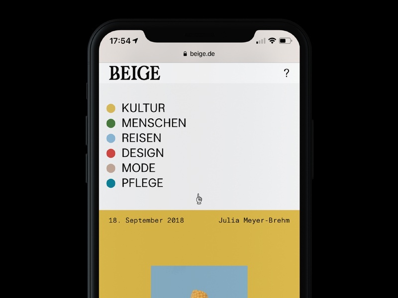
Another alternative for top navigation is using a drop-down sub-menu to complement the lack of usability. This concept by designer Nicholas Christowitz applies a bright color scheme and clean typography in the layout.
This mobile menu concept uses a hamburger icon at the top while a full-screen menu appears after an awesome animation. Although this design is just a rough concept, it shows great functionality with sub-navigation appearing in the middle area of the screen.
One way to increase the usability of top navigation is combining it with full-screen sub-navigation. In this concept, the creator uses a pull menu concept and plays with menu interactions. When scrolling down, the menu options bend and wiggle according to the direction you scroll.
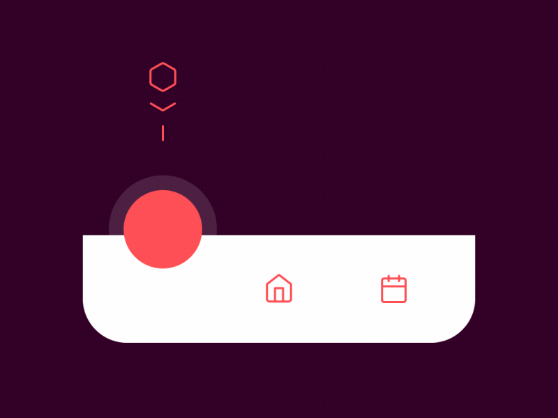
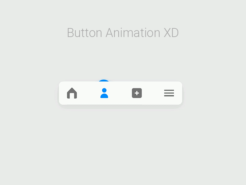
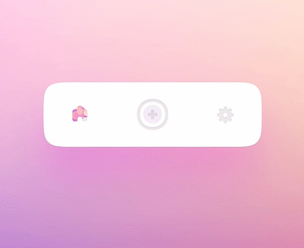
This type of mobile menu navigation is the most common one as it's in the easy-to-reach area. The new trend in menu design is adding micro-interactions to the menu icon or transition.
This idea of Designer Taras Migulko is simple navigation on a mobile device. It has an awesome bounce micro-interaction. The animated floating icons make the design even more special.
Another example of bottom menu bar micro-interaction by Alex Zubenko. This one has a simple yet smooth transition when changing the tab bar.
The shot below is a travel app concept by Alex Zubenko. The overall layout of the user interface is clean and with the special choice of typography, this concept adds a little cartoon-like effect. As for its menu bar navigation, the unique thing is that when the user holds the tab bar, a moving car animation appears.
Yet another simple design of bottom mobile menu navigation by Kaliraj. While simple, the micro-interaction and the transition animation are quite cool.
Created by Abdur Rahim, this bottom menu navigation example has a smooth transition and the pop-up animation offers a new idea for tab transitions. It uses component states while prototyping.
This blog app concept created by Kristian Paulsen has a hamburger icon at the bottom. When pressing it, instead of a full-screen sub-menu, the sub-navigation appears on the right side of the screen. However, this menu design might be difficult for left-handed users.
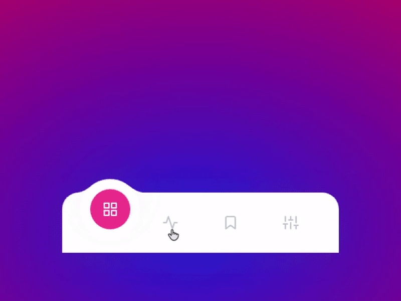
Designer Oleg Frolov uses a particle system to mark an active state of the menu tab bar. It has a clean minimalistic interface and the blush tones look amazing! The particle system, together with the gradient color, makes the interaction look cool.
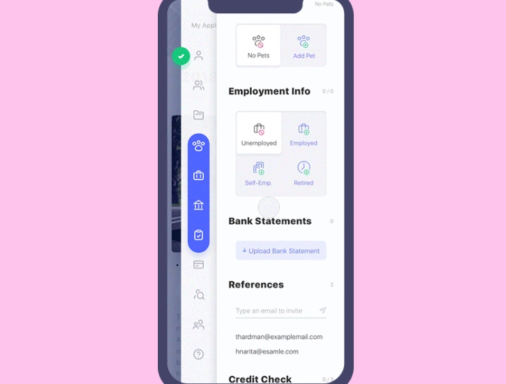
This type of navigation is not common, and usually UI/UX designers combine side navigation with a top hamburger menu to decrease interaction cost.
This shot by Yaroslav Zubko is for a vehicle lease app. The sidebar navigation has a clean and smooth interaction. I like how it appears formal and playful at the same time.
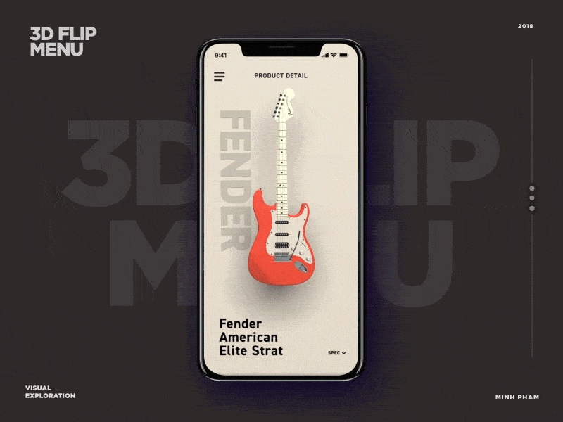
As software technology has improved at a fast speed, 3D illustrations have become a huge thing in recent years. The following shot by Minh Pham applies a 3D flip on the side navigation when pressing the hamburger icon. Overall, it gives us an interesting idea when it comes to 3D tech in mobile menu design.
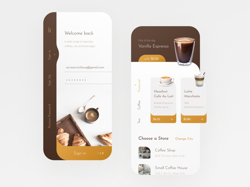
The side navigation of this coffee shop app by Anastasia Marinicheva is so elegant. The side panel coloring perfectly suits the coffee theme. The choice of typography is smart, too. The tab menu text might be a little hard to read for users, though.
This e-commerce app interaction design concept is made by Taras Migulko. It has smooth animations and the detailing makes this concept quite modern. As for the menu design, the creator combines a hamburger icon with a full-screen side navigation. When entering a specific item, the menu navigation is displayed in the easy-to-reach area.
Design trends change every year, and so does mobile menu design. There are several categories we covered in this article: hamburger, top, bottom, and side navigation. However, in real-life, designers usually combine these types of menu navigation in order to create a high-usability design. The new trend this year is using micro-interaction in the most widely used menu type - the bottom tab bar. However, the hamburger icon with side navigation is still loved by many designers due to its low interaction cost and smooth transition.
The first thing to keep in mind when designing your mobile menu concept is usability. Unique concepts sometimes do stand out but they won't last long due to lack of usability. When it comes to tools for mobile menu design, try prototyping tool Mockplus, which allows you to create an interactive mobile menu design with a simple drag-and-drop.
 Mockplus RP
A free prototyping tool to create wireframes or interactive prototypes in minutes.
 Mockplus DT
A free UI design tool to design, animate, collaborate and handoff right in the browser.


 Sign up with Google
 Join our Discord community
 support@mockplusapp.com