Ever wondered how Airbnb started with just air mattresses on a floor, or how Instagram began as a simple photo app? The secret sauce: MVPs—Minimum Viable Products that pack maximum punch with minimal features and efforts.
For UI/UX designers, an MVP isn’t just about speed; it’s about designing around the core problem, testing early, and learning fast. This guide, we will walk you through what an MVP is, why it matters, the design process, best practices, examples, and tools to help you launch smarter.
You will also need our free design tool to quickly visualize and test your MVP ideas.
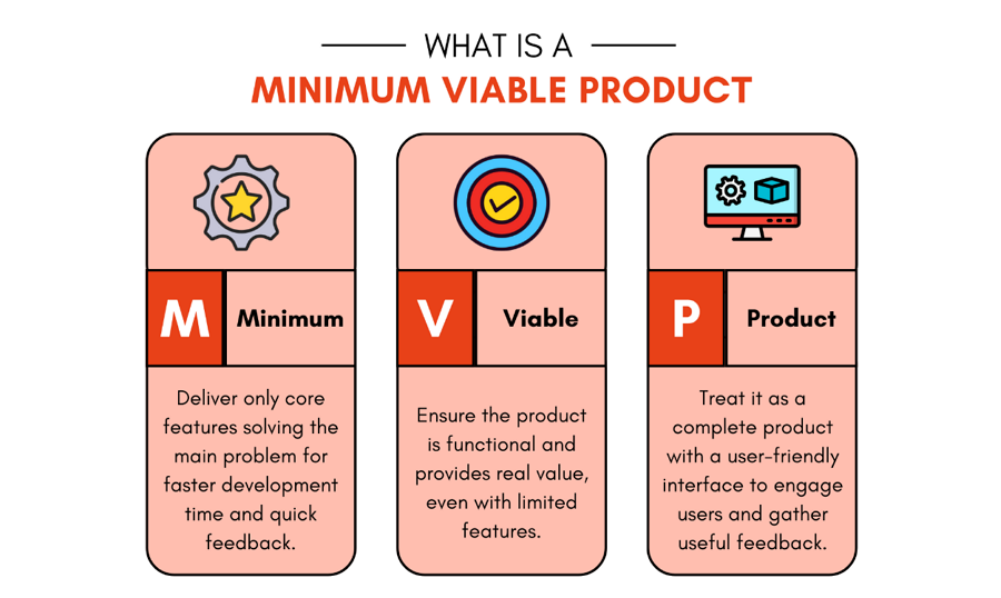
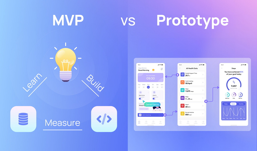
An MVP (Minimum Viable Product) is the simplest, usable version of a product that solves a core problem for users. It’s not about building a “rough draft,” but about delivering just enough functionality for people to try, use, and give feedback.
In UI/UX design, an MVP means identifying the most critical user flow — the one action or task that proves your idea has value — and designing around it.
Unlike wireframes or prototypes, which are often used to test ideas internally, an MVP is functional and released to real users. Its purpose is to validate assumptions, gather insights, and guide the next iteration without wasting effort on unnecessary features.
Designing an MVP isn’t about cutting corners — it’s about focus. These principles keep your design lean but effective:
Your MVP should feel like it was designed specifically for your target user, not like a generic solution hoping to please everyone. So, creating a user-centrial version is always the top princinples you should follow.
To create an actually user-centric design, you might do the following:
Fox example, Spotify's MVP focused solely on music streaming for desktop users, ignoring podcasts, social features, or mobile apps until they nailed the core listening experience.
If users need a manual to understand your MVP, you've overcomplicated it. Simplicity isn't just about fewer features—it's about intuitive design that feels effortless.
How to achieve simplicity:
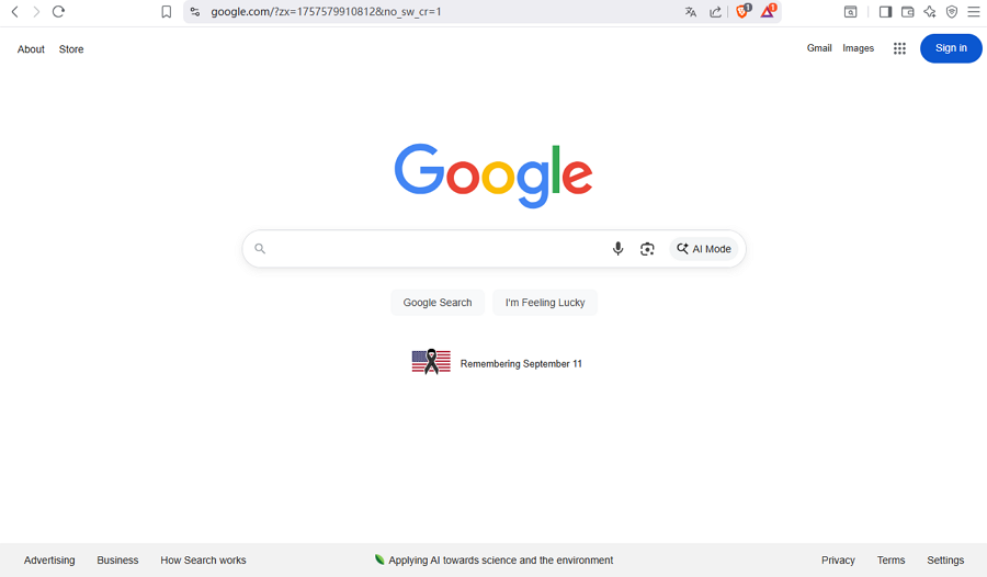
Google's Home page is designed to be quite simple
For example, Google's homepage famously contains just a search box and two buttons—nothing more, nothing less.
Every screen, button, and interaction should contribute to delivering your core value proposition. If it doesn't, it doesn't belong in your MVP.
How to design for value:
For instance, Uber's MVP focused entirely on "getting a ride quickly"—no food delivery, no multiple car types, just simple car-on-demand.
Your MVP is an experiment as much as a product. Design it to generate maximum learning about your users and market with minimum effort.
You and your team can do the below to learn about the target users:
And Dropbox's famous MVP was just a video demonstrating the concept—they learned about demand before building the full product.
Think beyond today. Your MVP should be built on a foundation that can grow, not one you'll need to completely rebuild later.
To minimize the cost, you can try the following to future-proof your MVP:
For example, Instagram, we've mentioned at the begining, started as a photo-only app but was architected to easily add features like Stories, Reels, and Shopping.
Even with minimal features, your MVP should create a positive emotional response. Users should feel something when they use your product.
To deliver a positive emotional collection, just try this:
And in this aspect, you mught check Mailchimp's playful illustrations and encouraging copy that made email marketing feel fun instead of intimidating.
Your MVP isn't your final product—it's your starting point. Design it to evolve quickly based on user feedback and data. So, embrace change and build flexibility into your design process.
To maintain a rapid iteration mindset, you might do the following:
For example, Twitter started as a simple status update tool and evolved into a news platform, communication tool, and social network through constant iteration.
Anyway, while working on a MVP, you tend to remember a golden rule: "Less is more" when it's done right!
After knowing the core principles, let's learn the MVP design process and see how to create a MVP for your digital product step by step:
Before you design a single screen, you must first answer two fundamental questions:
Once you have your problem and persona, it's time to validate your assumptions. This isn't just about reading existing data; it’s about talking to real people.
There are many ways that you can try to conduct user research:

This is the most critical step in MVP design. Your research will generate a long list of potential features, but you can’t build them all.
What you need to do:
It would be great if you can make a checklist for this MVP to ensure that all of the core features are not missed finally.
Now you can start designing the structure and layout of your MVP screens.
For example, you can:
With the wireframes validated, it's time to add the visual design.
Simply just do:
The final and most important step before launch is user testing.
The feedback you gather will either validate your design or reveal areas for improvement. This allows you to make necessary adjustments before building the final product, saving time and resources.
By following this process, you ensure that your MVP is not a random collection of features but a thoughtful, user-validated product with the highest chance of success.
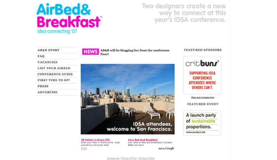
The very first MVP design of Airbnb website
Nearly 20 years ago, renting an apartment wasn’t as simple as browsing a website or opening an app. People didn’t have an easy way to view or compare available places to stay.
Brian Chesky and Joe Gebbia, two young designers living in San Francisco, saw this gap and came up with a scrappy solution. They created a simple website called “AirBed & Breakfast”, where they listed their own apartment with just a few photos, allowing conference attendees to book a stay.
This was the very first MVP of Airbnb: incredibly minimal, focusing solely on the booking process. It wasn’t polished or feature-rich, but it validated one crucial insight — people were willing to rent space in someone else’s home if the process was easy and trustworthy.
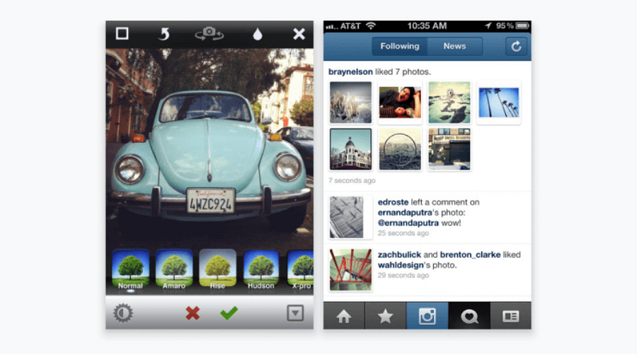
Instagram's story is actually about what they took away, not what they added. The founders originally built an app called Burbn that did everything—photo sharing, location check-ins, scheduling, you name it. But users only cared about one feature: sharing photos with filters.
So they stripped everything else away and launched Instagram as a photo-only app. The interface was dead simple—capture a photo, apply a filter, share it with your followers. The chronological feed was easy to scan, and the limited filter options meant users didn't get overwhelmed by choices.
This laser focus made the app instantly understandable and addictive. Sometimes the best design decision is figuring out what not to include.
Here's a brilliant twist on the MVP concept. Drew Houston didn't build Dropbox first—he made a 3-minute video showing how it would work, then put it on a simple landing page with an email signup form.
The video demonstrated the user experience perfectly: drag a file into a folder on one computer, and it magically appears on another. Simple concept, but the technical execution would have been incredibly complex to build upfront.
That video got 75,000 email signups overnight, proving there was massive demand for the solution before they wrote a single line of complex code. Sometimes you don't need a working product—you just need to show people what their experience would be like.
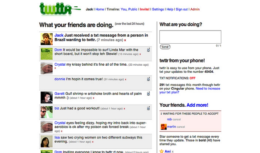
Twitter started as a simple status update tool with one key constraint: 140 characters maximum. This wasn't a design choice—it was a technical limitation based on SMS messaging.
But this constraint became Twitter's defining feature. The character limit forced people to be concise and creative. The simple reverse-chronological timeline made it easy to catch up on what friends were thinking. The @ mention system created natural conversations.
What seemed like a limitation actually made the platform more engaging and easier to use. Don't fight your constraints—embrace them and turn them into your competitive advantage.
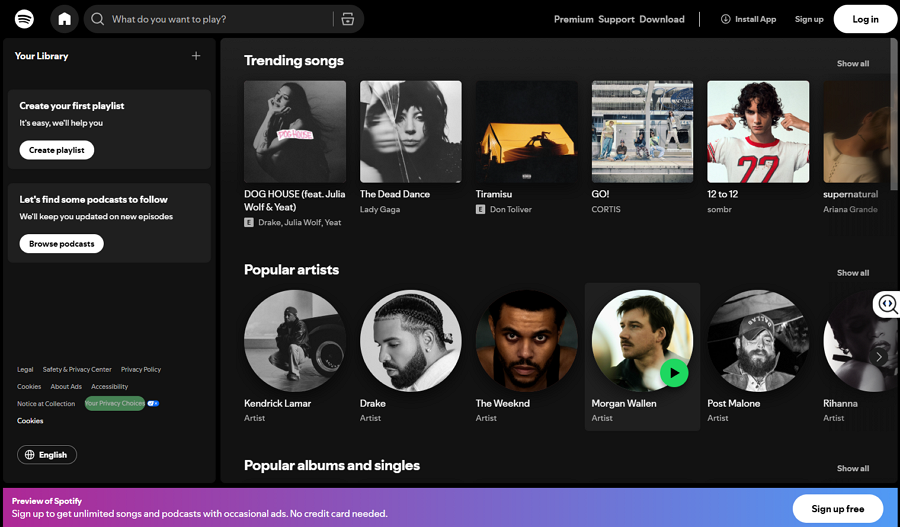
When Spotify launched their desktop app, they made a smart design choice: make it look and feel like iTunes, the music software everyone already knew how to use.
The interface felt familiar with its library organization, search functionality, and playlist creation. But underneath, it solved a huge problem—instant access to millions of songs without downloading or purchasing individual tracks.
By using familiar design patterns, they reduced the learning curve for users while delivering something revolutionary. You don't have to reinvent the wheel to create something amazing.
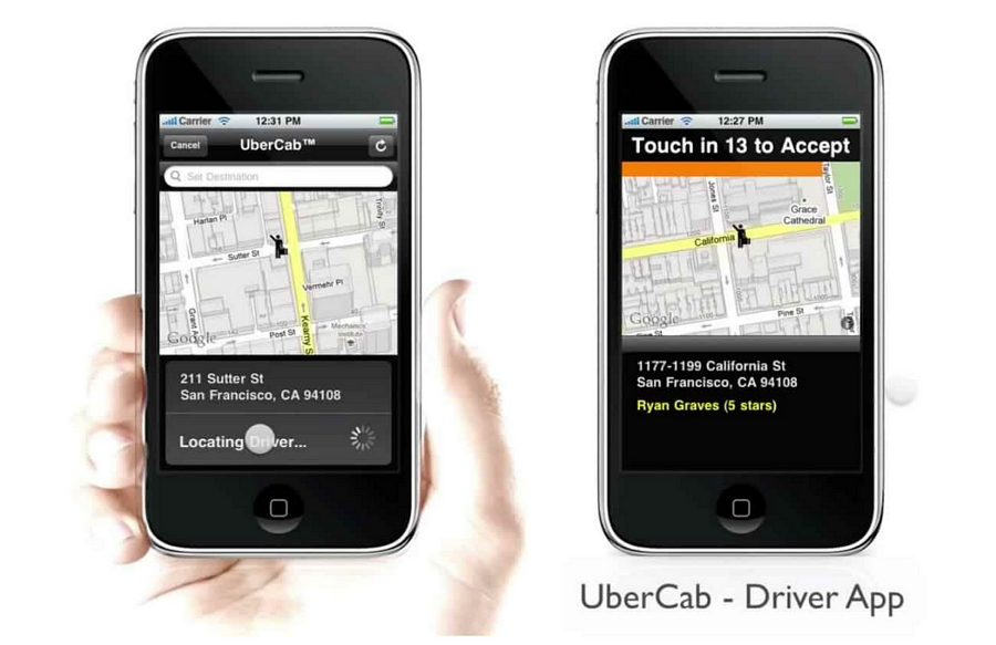
Uber's MVP was laser-focused on one thing: getting a ride quickly in San Francisco. No multiple car types, no surge pricing explanations, no food delivery—just black cars on demand.
But the genius was in how they addressed user anxiety. The map interface showed exactly where you were and where nearby cars were located. Real-time tracking let you see your driver approaching. The interface answered the questions users had before they could even ask them.
Good MVP design isn't just about functionality—it's about understanding user emotions and addressing them through thoughtful interface choices.
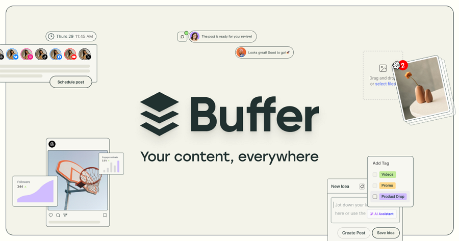
Buffer solved one specific problem: scheduling social media posts ahead of time. Their MVP had a clean, minimal dashboard that made the complex task of social media management feel manageable.
Instead of trying to build a comprehensive social media management suite, they focused on doing one thing exceptionally well. The interface was intuitive, the scheduling was straightforward, and the basic analytics gave users just enough insight without overwhelming them.
The lesson? It's better to solve one problem really well than to solve ten problems adequately.
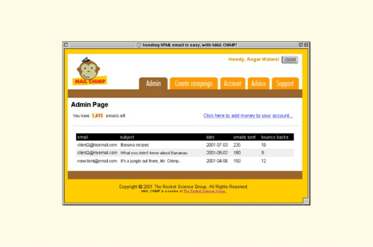
Mailchimp took the traditionally dry world of email marketing and made it fun. Their MVP was a basic email newsletter tool, but what set it apart was personality.
The friendly illustrations, playful copy, and encouraging tooltips throughout the interface made email marketing feel approachable instead of intimidating. They turned a business tool into something people actually enjoyed using.
This shows how UI copy, illustrations, and tone of voice can completely differentiate your MVP from boring competitors, even when the core functionality is similar.
Slack didn't invent team messaging—they just made it way better than existing solutions like IRC or endless email chains.
Their MVP used familiar concepts (channels for different topics, direct messages for private conversations) but wrapped them in a clean, professional interface that felt modern. The search functionality actually worked, file sharing was simple, and the overall experience felt polished.
Sometimes MVP success comes from taking something people already do and making it significantly better, rather than trying to change user behavior entirely.
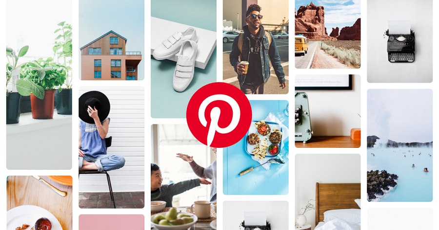
Pinterest did something different—they created an entirely new way for people to organize visual inspiration. Their grid-based layout was perfect for browsing and discovering new ideas.
The pinning mechanism was simple (especially with their browser bookmarklet), board organization felt natural, and the visual focus meant users could quickly scan and save things that caught their eye.
This MVP succeeded by tapping into a behavior people wanted to do but didn't have a good tool for. Sometimes innovation means creating new user behaviors, not just improving existing ones.
While a great design depends on strategy and creativity, having the right tools can make the entire MVP process more efficient, collaborative, and effective. So, for now, let's dive into the tools that you might need to hasten your MVP design process:
Before you even open a design program, you need to understand your users and validate your ideas. These tools are crucial for the early stages of the "build-measure-learn" loop.
This is the core of the design process, where you turn ideas into tangible, interactive models.
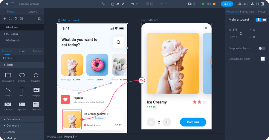
Create high-fidelity prototype with Mockplus RP
An MVP's success hinges on validated learning. These tools help you get a product in front of real users and gather actionable insights.
By leveraging the right mix of these tools, a UI/UX team can streamline the entire MVP design process, from initial concept to a data-driven, user-validated launch.
1.What does MVP stand for?
MVP stands for Minimum Viable Product. It’s the simplest version of your product that delivers the core value to users, allowing you to test assumptions, gather feedback, and validate demand before investing in full development.
2.What is the difference between an MVP and a prototype in UI/UX design?
3.How do I know which features to include in an MVP?
You should always focus only on features that directly deliver your core value proposition, such as:
If the answer is “no” to all three, it probably doesn’t belong in your MVP.
4.Can startups launch with only an MVP?
Yes. Actually, many successful startups (like Airbnb, Dropbox, Uber) did exactly that. An MVP helps you enter the market faster, validate demand, and refine based on real-world usage. The key is to treat it as a starting point, not a final product.
5.How much does it cost to design an MVP?
The cost can vary widely depending on complexity, tools, and whether you hire an agency, freelancers, or build in-house.
Remember, the goal isn’t to build the cheapest product, but the leanest version that still delivers value and provides learning.
Designing an MVP isn’t about building a perfect product — it’s about building the right product. By focusing on your core value, keeping things simple, and learning quickly from users, you set yourself up for long-term success.
The best MVPs don’t try to do everything at once. They solve one real problem exceptionally well, then evolve through iteration and feedback into something users truly love.
We hope this beginner’s guide has given you a clearer understanding of MVP design and helps you take the first step toward creating your own digital product.
 Mockplus RP
A free prototyping tool to create wireframes or interactive prototypes in minutes.
 Mockplus DT
A free UI design tool to design, animate, collaborate and handoff right in the browser.


 Sign up with Google