Recently, responsive web design and adaptive web design has set off a trend in the design industry. When you start to design a new site or redesign of the site, which design to select is quite a wrenching question. Facing with the picky boss and client, how to explain the definition is a test for the website designers. If they want the former design style, how do you explain to them the pros and cons of responsive web design?
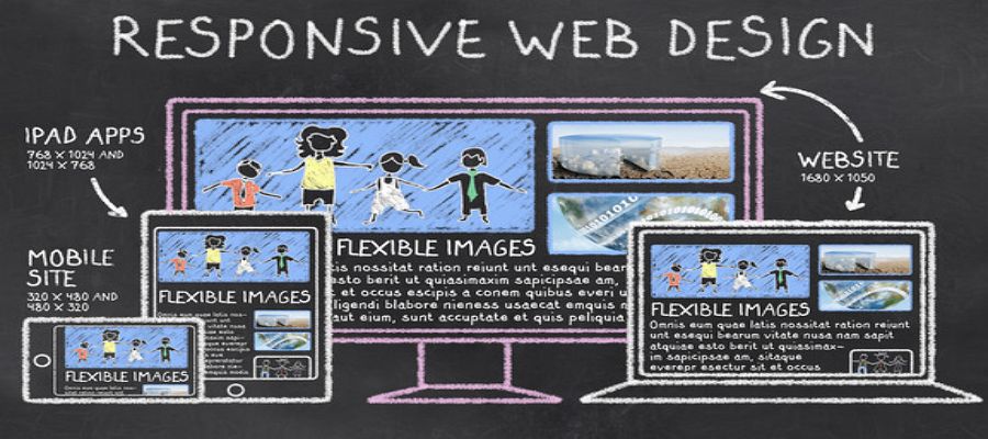
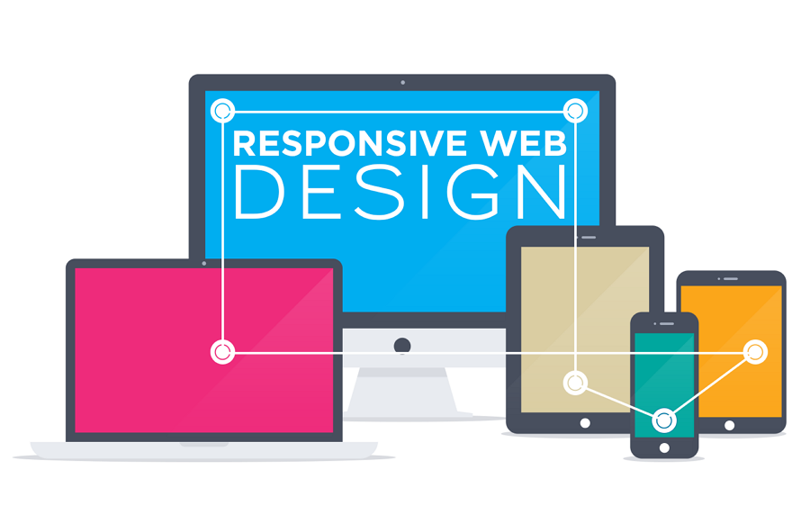
Responsive Web Design (RWD) is an approach to web design aimed at allowing desktop webpages to be viewed in response to the size of the screen or web browser one is viewing with. It means to offer the same support to a variety of devices for a single website.
Three steps you should take into consideration:
1. Media query. That is, specify a different CSS display style.
2. Fluid grid. Percentage% will be used in CSS rather than absolute values.
3. Fluid images / media. The same with point 2, it also uses percentages instead of absolute values to modify the display of images, videos, and fonts. So that to make adjustments based on different screens.
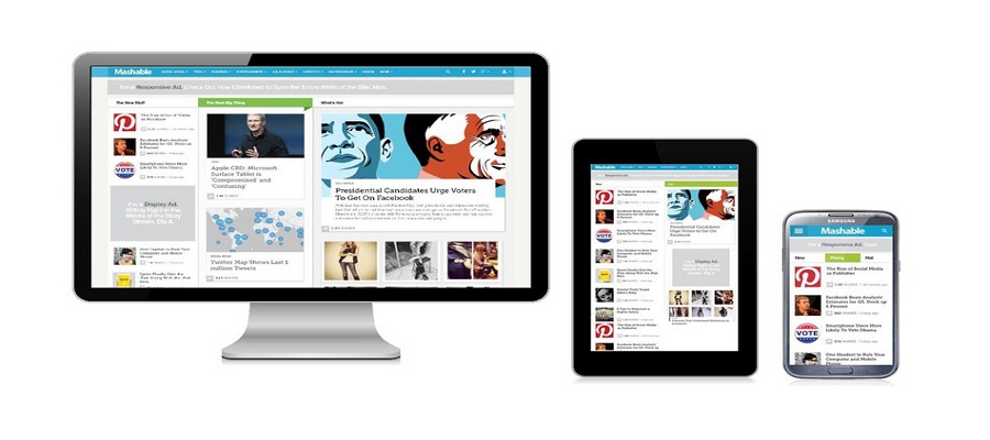
The responsive design can provide users with a friendly web interface, as it can adapt to almost all devices on the screen, including smartphones, tablets, TV, PC monitors, iPhone, and Android phones which contribute to the mobile friendly website design. Even though there is a saying that the responsive design is falling mobile UX.
Comparing with the development for websites on PC, iPad, and mobile phone, the responsive design is more conducive to saving design and development costs.
In terms of design, it only needs to design two sets of design renderings for the responsive web interface based on the PC, iPad, and mobile. From the perspective of the front-end development, itonly needs to develop 3 different sets of CSS styles. From the perspective of post-maintenance, there is no need to maintain PC interface, iPad interface, and mobile interface.
It allows you to collect all social sharing links through a single URL address (if you are the site owner). You can make a positive contribution to creating better and more friendly websites.
From another perspective, responsive web design is SEO friendly. Google also suggests giving priority to responsive design, because no matter what page version you choose, it’s easy for Google to deal with the same HTML and content.
If your site users are mostly using the old version of IE, it is not recommended to do responsive design. That’s a fatal problem for the older version of IE browser (IE6, IE7, IE8).
It will take longer to load for some responsive websites. It’s not a big deal because some unnecessary HTML/CSS will be loaded. For example, the images on a responsive site are just visually scaled down and not re-sized for fastest load times.
It’s a time-consuming task to a responsive website. If you intend to convert an existing site into a responsive website, it may take more time. If you want a new responsive website, it's better todesign from the very start. It means from creating the prototypes by prototyping tools like Mockplus to the HTML/CSS development.
The liquid layout of the responsive web design is hard for designers to control well about the design style. Designers are trying to display wireframe and design prototypes separately for mobile and desktop layouts. Only after these two layouts get improved, the responsive Web design strategy can be really achieved.
What the pros and cons of responsive web design listed above should be a clear distinguish for you to make a right choose. I hope so. Well, if the information is not helpful or you still in hesitation, you can ask the help from the professional responsive web design companies. The company below is my favor for settling your trouble.
For pursuing the high quality of the website design, another choice is seeking help from the professional design agencies. Here are 3 best firms.
It’s such a web design development organization ideal for business professionals just stepping into the online world.
Blue Fountain Media offers custom packages with affordable client-selected services.
The EIGHT25MEDIA professionals are pleased to provide clients with diverse online advertising services, including responsive web design services.
If you’re unsure whether a responsive website is right for your business, you can refer these great examples of the best responsive web design to get a clear comprehension about responsive web design as well as the pros and cons of it.
 Mockplus RP
A free prototyping tool to create wireframes or interactive prototypes in minutes.
 Mockplus DT
A free UI design tool to design, animate, collaborate and handoff right in the browser.


 Sign up with Google
 Join our Discord community
 support@mockplusapp.com