The ability to put yourself in a website user’s shoes is invaluable when it comes to UX (user experience) design. Empathy can help you design according to user behaviors. However, knowing how to predict user behavior can be far more effective. That is where psychology comes into play. Being able to understand people and why they do things is an essential resource for UX designers.
When you possess a comprehensive understanding of the human mind, you can design accordingly. Psychology theories and research pave the way for recognizing the way users behave with or react to products or services. Being able to understand why users click through or click away allows you to correct any design missteps. Also, knowing how to collect information from users to better understand them is another important pillar of psychology.
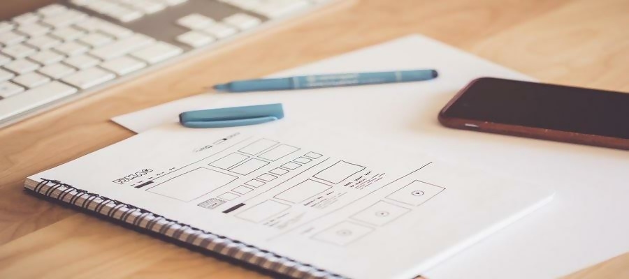
Regardless of whether you studied psychology or are wonderfully intuitive, comprehending specific psychology theories is vital. After all, having first-hand knowledge is always preferable to recycled and regurgitated tidbits you pick up along the way. User experience design can always benefit from a fresh perspective, in this process, you can always use a UX design tool to map out user flow and avoid the usability issues. That’s precisely why doing your psych research can improve your user experience finesse. Here you have a beginner’s guide to psychology principles for UX designers.
People have an affinity for the familiar. That’s why they tend to choose the things they know over things that they don’t. Think about going to the supermarket or to your favorite restaurant, you’re more likely to select something you’ve tried before. In terms of psychology, that is explained by the mere-exposure effect. Humans gravitate toward things that seem familiar, even when there may not be an apparent reason to trust them.
Our minds use our previous experience to protect us. The things we don’t have experience with are ‘the unknown,’ and they can be very unsettling. However, we develop familiarity with things a lot sooner than you might think. Regularly seeing or encountering something, without actually experiencing it, establishes familiarity in the mind. These are some ideas to remember when it comes to UX design.
“While too much familiarity can be tedious, a mix of familiarity and strange or new things can be exciting. Although, too many new things can be frightening as it activates our fear of the unknown. Designers should focus on striking the perfect balance. Using an unfamiliar or unique kind of design should always be balanced out with the familiar design. For example, using a new form of navigation becomes less scary when it's combined with a usual way to scroll.” — Pat Fredshaw, head of the marketing department at Essay Supply.
In other words, throwing users out into the deep end with wildly innovative design is an absolute no-no. Even the ubiquitous hamburger icon on mobile versions took some getting used to. Regardless, user experience design is continually evolving. Something that might seem to wild or unusual for users now might be the norm tomorrow.
Users have come to expect certain things when it comes to websites. For instance, they expect to be able to scroll down or click for more information. Horizontal presentation of information is comforting because information appears gradually which is calming to the mind. In this way, there are fewer distractions, and the user can easily focus on new information. When it comes to designing a pleasant user experience, maintaining consistency is crucial.
Our brains save power by speed reading and scanning for gist. By designing boxes that emerge from one side or another, you may overload the mind. Instead, try piquing user interest with stretches of color and text that flows from side to side. These horizontal formatting tricks help to create a sense of urgency. Users that experience this sense of urgency will want to acquire all the information they can from a given page.
The symbols that you use to display your content help give a pleasant feel to your design, too. Our brains pick up on shapes and patterns, so select appropriate ones to incorporate on your site. Squares and rectangles are used to demonstrate discipline, security, reliability, and strength. Triangles can illustrate excitement, balance, and stability. Whereas spirals can indicate growth, creativity, and intelligence.
Fonts also play a big part in the comfortable appeal of a page. Although, be sure to stick to a maximum of three fonts as to not distract the user. Shapes and words used to label items should always be placed close together. Information gets absorbed much better when there is a clear pattern for the user to identify. Clever use of white space can also help users interpret data better.
That old saying of “keep it short and sweet” is definitely true with user experience design. Too much text can be rather irksome when browsing a website. Displaying information succinctly and concisely gives users a better experience. In fact, the less time it takes for you to get your point across, the better. With that in mind, here are a few rules of thumb:
Veronica Wright, a CEO at Resumes Centre explains: “In terms of psychology, you have to make the most the user’s attention span. Perfectly short and sweet text can be the difference between a good landing page and a great one. Simply and directly conveying information on a page aids users in knowing what to do next. All information presented on a site should help answer not raise questions.”
Writing several drafts may be necessary. Utilizing A/B testing can also help you decipher whether your content is fully optimized and functional. Fortunately, there’s plenty of tools available for you to optimize your content. Google Optimize or Lucky Orange can all help you ensure your copywriting hits the spot. Although, learning how to craft your written content better from the onset will save you a lot of extra work.
Human beings are very visual. We simply love to observe the world around us. This why some psychologists theorize that social media is so popular. The flood of images and videos we get from social media is exceptionally pleasing to our voyeuristic minds. Not to mention, pictures and videos also communicate information much more quickly to our brains than words can.
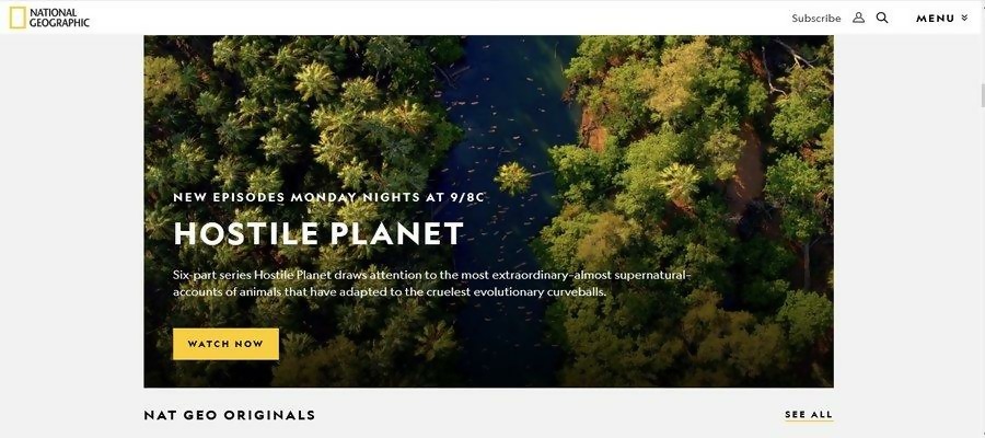
A picture is worth a thousand words, isn’t it? Incorporating more photos into your UX design can help get a message across faster. It can also make a site more visually satisfying. Using banners and hero images help unlock this pleasure-seeking part of the human psyche. Capturing users’ attention may only require one stunning image.
Maintain a sleek design with all images. Here are some tips on how to accomplish that:
The proof is in the pudding with this one. Users that get drawn in by visual stimuli will be on the hunt for more. Incorporating images that activate the hedonistic instincts in the mind is good user design. Of course, designers must deliver on that promise and give the people what they want. Do your best to strive for visual symmetry when designing.
So pictures are important, but what kind of pictures are best? The ideal images for optimal user experience are those which trigger a visceral response. If an image can capture users’ attention, that’s brilliant. However, going a step further and using an image to generate desire is exponentially more influential. Pictures are a direct way for people to relate to situations and feelings.
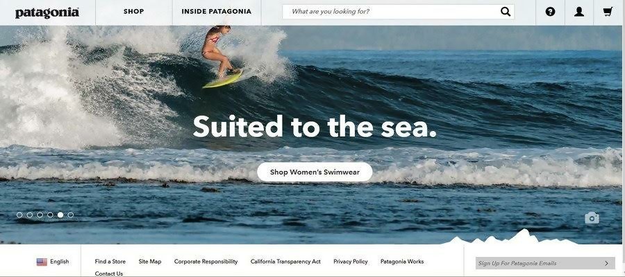
Brands that sell sportswear often include this technique in their UX design. Seeing someone who is geared up and breaking a sweat triggers an emotional response. Visitors who see that image can emotionally connect with it and crave a similar experience. Their intrigue may transform a connection into a conversation. After all, a powerful image receives a powerful response.
Indeed, images transcend words. Including a strikingly powerful image can be more effective than the catchiest of slogans. People have a tendency to remember how something made them feel. Specific details like words, on the other hand, can filter out of their memories. Therefore, using an image to start a conversation can have a longer lasting effect.
However, images that you include must be relevant to your message. Brainstorm precisely what you hope to convey to visitors before selecting an image. You want to compel not confuse your users. Furthermore, ensure that your pictures don’t disrupt other aspects of your design. While they can bring a lot of meaning to a page, buttons and hyperlinks are important for user actions, too.
Perhaps you’ve had a long conversation with someone before and felt like they weren’t always completely listening. That’s just human nature. Our attention spans can time out, and we may only remember the end of a conversation. The same goes for users browsing through a website. Especially when there’s lots of information to sift through.
In psychology, this appears as the recency effect. This effect means that the most recent information gets more attention. Our brains lock this information in our working memories and have easy access to it. When it comes to user experience design, that means that the information presented at the end will be best remembered.
Conversely, there is also the primacy effect. This is the complete opposite as it signifies that information presented first gets more attention. In this case, our brains are capable of storing initial items more effectively in our long term memory. Ergo, the information presented at the beginning also has a higher chance of being remembered.
When distributing information, you ought to keep both of these effects in mind. Vital information should appear at both the beginning and end. While the information in the middle is necessary, it is far less likely to remain in a user’s memory. Be sure to organize your content accordingly to ensure that all the critical info stays in users’ noggins.
Othering is something that all humans do instinctively. When we observe something or something as being different, we label them as so. That is to say, things that are different stick out like a sore thumb. Although othering can be detrimental in society, in user design, it is quite helpful.
Utilizing contrast to provoke the desired reaction is an example of visual othering. For example, imagine a webpage that is all black with a single yellow button in the middle. The human eye will naturally be drawn to that yellow button. First of all, because it is different. Secondly, because the color yellow provides a stark contrast to the black.
“Hedwig von Restorff theorized that items that stand out are more memorable. His theory, or the Von Restorff effect, is a common practice in modern design. Creating contrast draws attention and gives meaning. Implementing this theory in your UX design can be helpful with it comes to buttons or CTAs.” — John Overbach, the lead designer at FlashEssay.
Again, this technique should be used sparingly as not to diminish meaning. It’s recommendable to only incorporate this strategy where it will add to not detract from your design. Overuse of this technique can decrease its effectiveness.
Although you aren’t likely to experience any Freudian slips in UX design, understanding them can help you design better. Depending on the kind of site you’re designing, tapping into the unconscious mind can have its benefits. Whether you’re focusing on formatting, visuals or written content psychology helps give you a leg to stand on. Still, remember that the human mind is still very irrational.
Taking time to study and learn more about users can undoubtedly improve the user experience. A genuine interest in users allows you to more profoundly understand their behavior. So prepare your controls and variables and let the research begin.
Daniela McVicker is a blogger with rich experience in writing about UX design, content planning, and digital marketing. Currently, she is the chief contributor at Top Writers Review where she helps individuals and organizations improve their web content writing, design, and planning skills.
 Mockplus RP
A free prototyping tool to create wireframes or interactive prototypes in minutes.
 Mockplus DT
A free UI design tool to design, animate, collaborate and handoff right in the browser.


 Sign up with Google