In the kingdom of the app, content is the king. Readability is the guide to the king’s castle.
In this era of information explosion, there is countless information on apps every day. Users always open an app with their own specific goals, such as reading the feed, looking for a song, shopping, and checking new messages. But there is too much information on a tiny mobile screen (compare to other devices, it’s small) and it takes a lot of time for users to review them all.
If the readability of an app is dreadful, the users would be like the passengers getting lost in a strange and chaotic kingdom. They need a guide taking them to the place they want, otherwise, they may leave and never use the app anymore. Strong readability conforms to the logic of reading and conveys information effectively, enabling users to recognize and get the information efficiently, maximizing the effectiveness of content, improving user experience, and increasing the new user acquisition.
So, what determines readability? The core of readability is visual hierarchy, and the core of visual hierarchy is logicality. Thus it can be seen that logicality is a key concept affecting readability. Let’s know about logicality in UI design.
Logicality is consist of dependencies, similarities, and differences.
Dependencies mean the contents from lower levels belong to the contents from upper levels.
Similarities mean the contents on the same level.
Differences mean the contents of different levels or other contents which don’t belong to any levels.
Once you master the logical relationships, the direction of creating visual hierarchy would be very clear. Building contrasts and organizing the elements to provide decent visual hierarchy is a critical responsibility of UI designers. Here are 5 factors affecting visual hierarchy.
Size is one of the most effective factors to control visual hierarchy. The bigger the element, the higher the level, which works for text and images. Setting up different sizes for the elements on different levels is very helpful to build basic infrastructure of visual hierarchy.
Font weight is a factor to emphasize the text or reinforce the contrast after adjusting font size. The bolder the text, the higher the level.
Adding colors has the function of highlighting or classifying the information. The elements in different colors are more eye-catching, but remember to limit your colors and only add colors in the very necessary parts.
As we know, the colors we can use for the text are very limited. Displaying the text in different shades is a good way to build contrast by altering opacity.
When the elements are close to each other, they tend to be regarded as a group. Utilizing proximity legitimately can classify the elements into groups, improving the information recognition and enabling users to respond quickly.
The elements with the similar appearance are generally perceived as a group, which means they have the similar function or are on the same level.
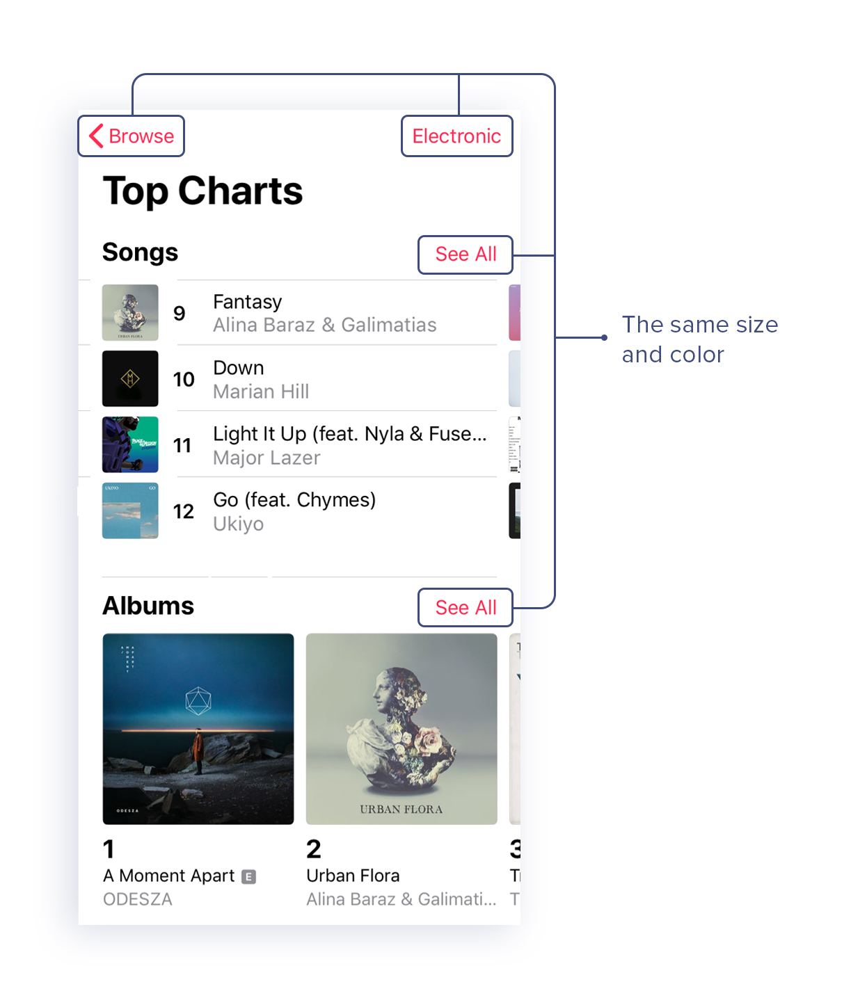
To build clear and organized visual hierarchy, these factors are commonly used in combination. Here’s a brilliant example, apple music app in iOS 11, for us to learn from. Let’s see how the readability is built into this app.
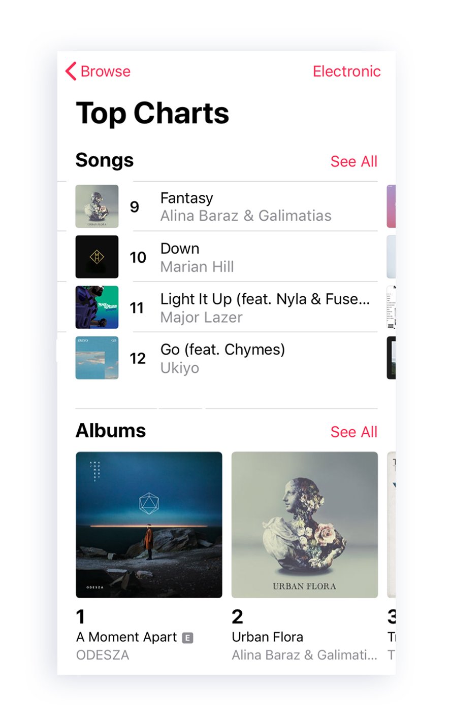
The visual hierarchy of this app is like below:
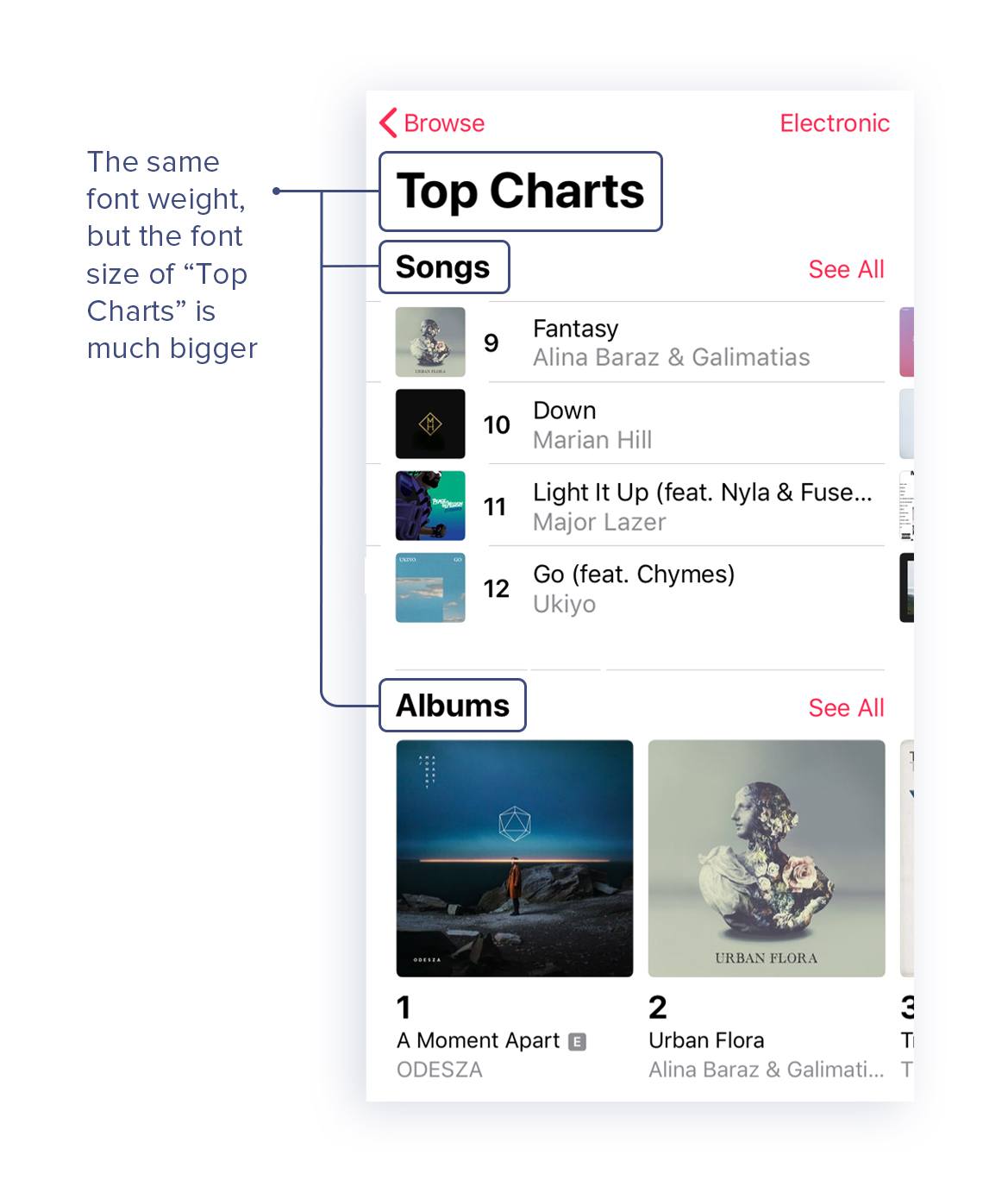
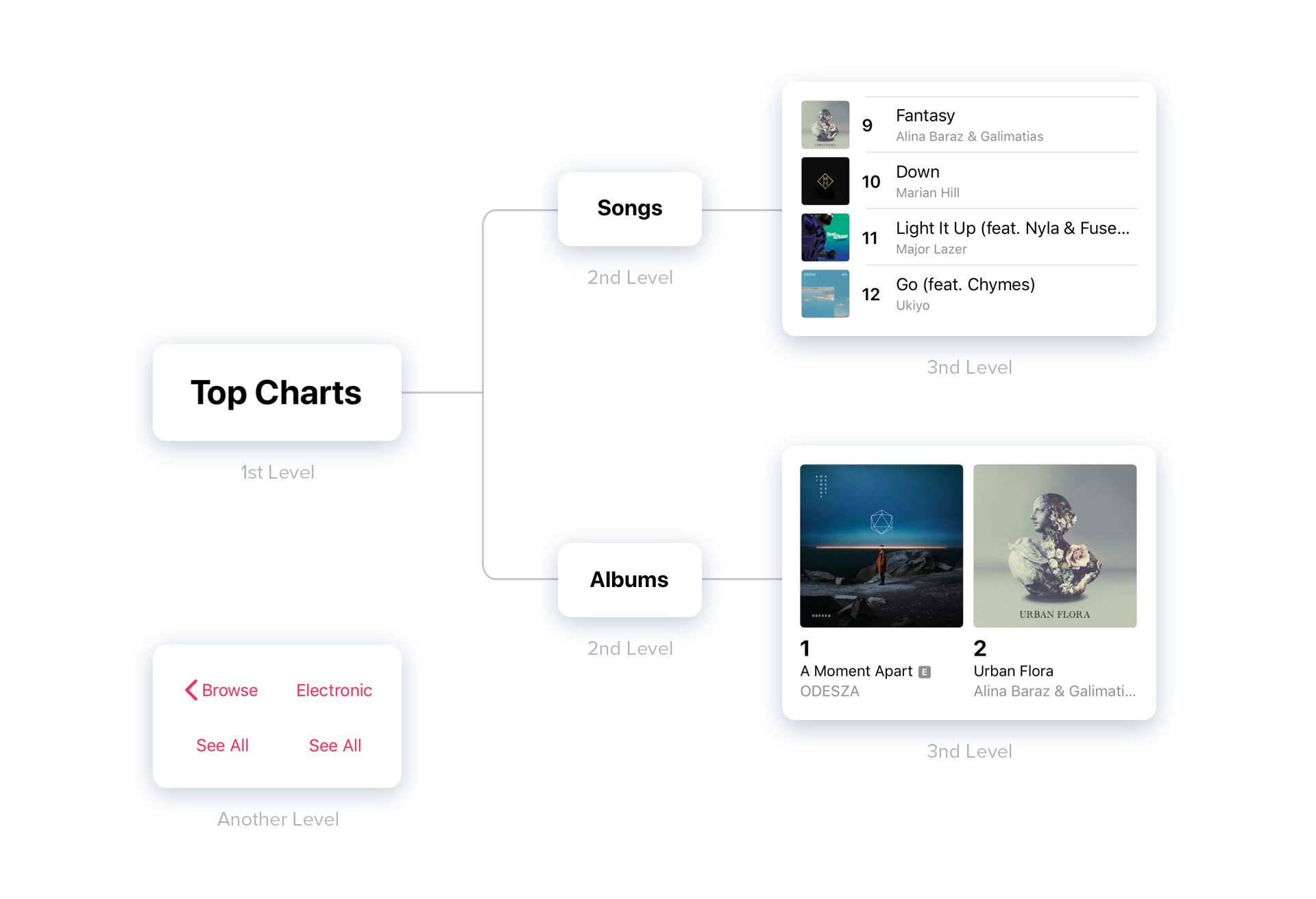 “Top Charts” is on the 1st level.
“Songs” and “Albums” are on the 2nd level and belong to “Top Charts”
The small images and the text beside them are on the 3rd level and belong to “Songs”.
The big images and the text below them are on the 3rd level and belong to “Albums”.
“Browse”, “Electronic”, and two “See All” are on another level.
As “Top Charts” is a category on the top level, indicating that categories like “Songs” and “Albums” belong to it. “Top Charts”, “Songs”, and “Albums” are the text with the same font weight, which shows their similarity. “Top Charts” is much bigger than “Songs” and “Albums”. This strong contrast makes their dependency clear, which means “Songs” and “Albums” are the subcategories belong to “Top Charts”.
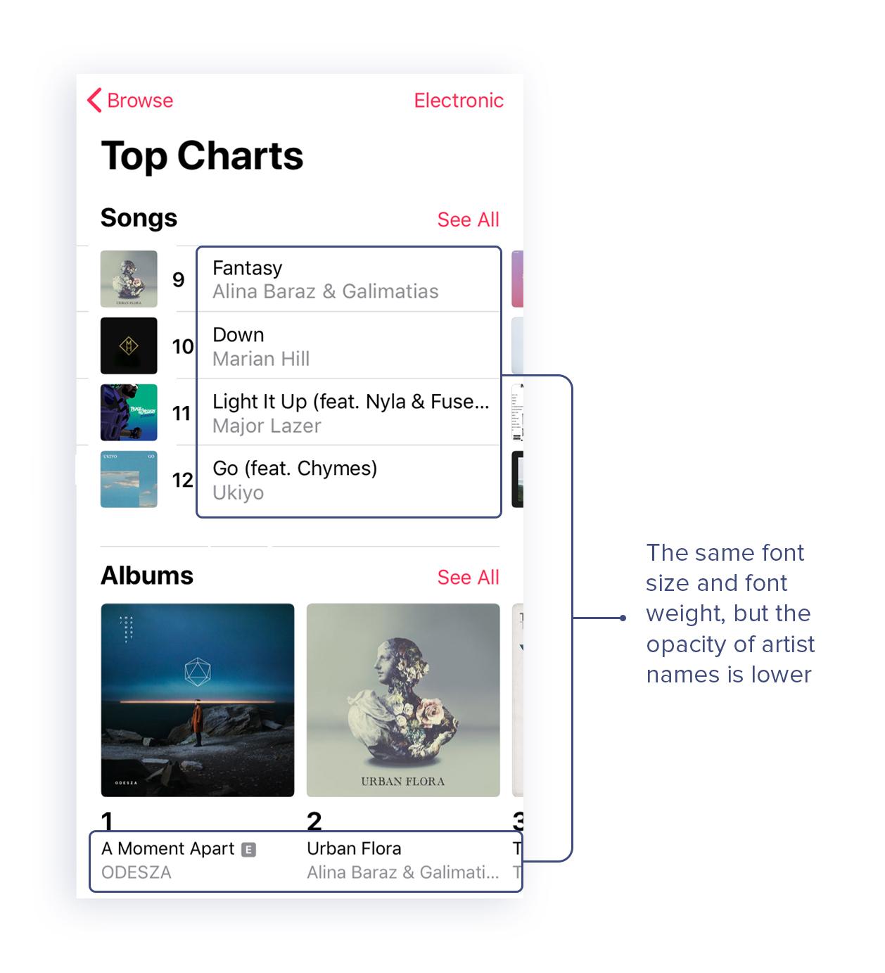
Song names, album names, and artist names are the text with the same font size and font weight. To clarify they are on the 3rd level, building contrast via making their font size smaller and font weight thinner. Relative to song names and album names, artist names are auxiliary content, so the opacity of artist names is lower. This contrast successfully avoids confusing the users with the song/album names and the artist names.
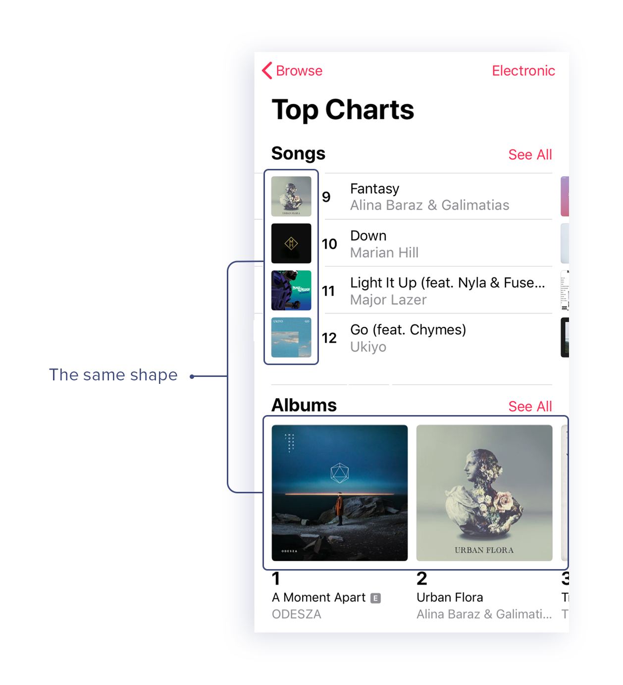
The images of songs and albums have the same shape, which indicates that they are all album covers.
You may notice that there are two album covers are the exact same. One is in the song section, the other one is in the album section. But their sizes are not the same.
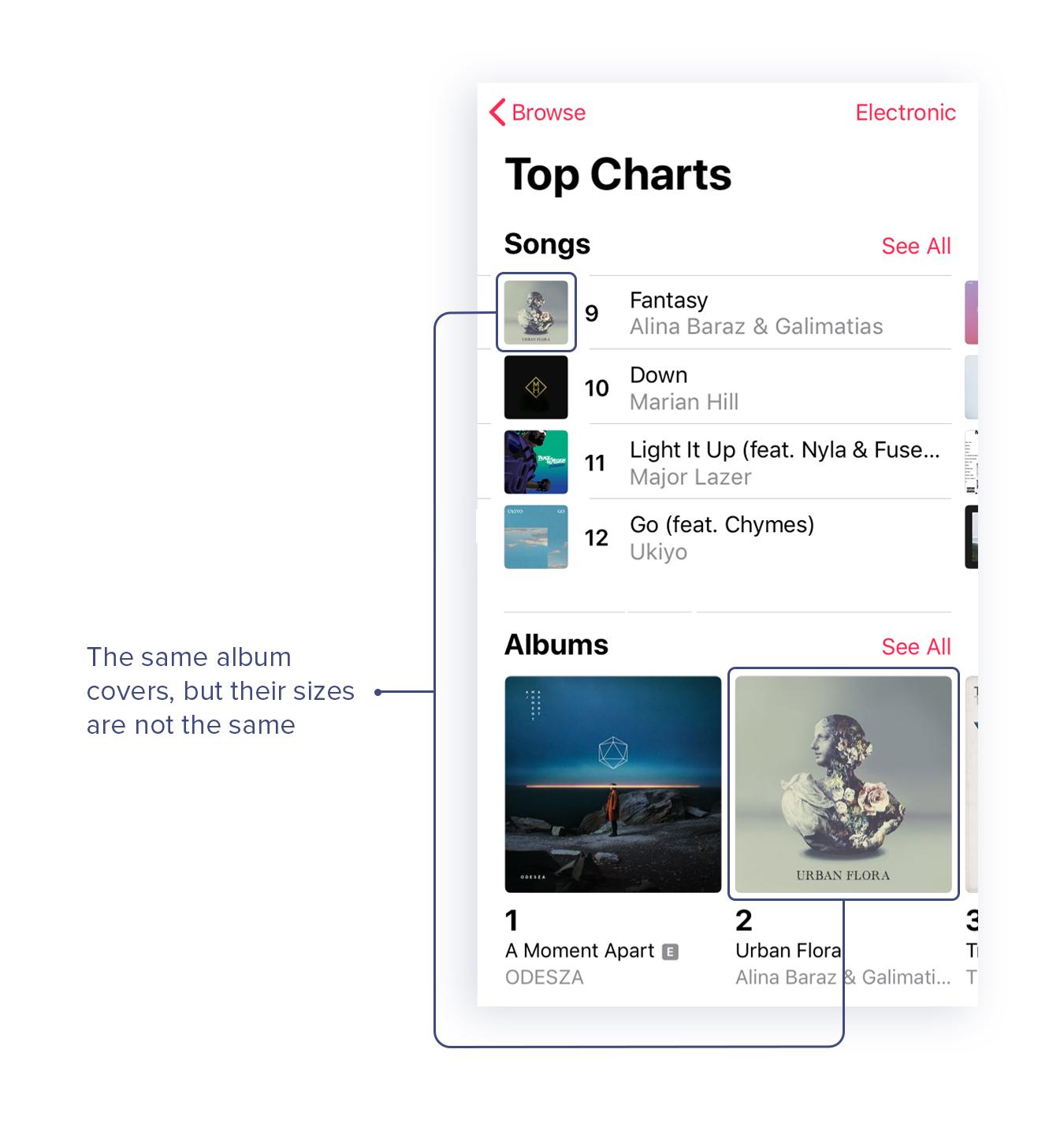
Why? Because it creates the difference and clarifies the logical relationship. The image in the song section displays which album this specific song comes from. The image in the album section means that it’s an album including 10 or more songs. So the image in the album section is much bigger, which is logical.
“Browse”, “Electronic”, and two “See All” are the text with the same size and color. Adding the color to these content effectively distinguish them from other content and shows their functionality according to user habit. Users can quickly get that these rose red texts are buttons and they can tap them to make their next move. Also, the designers chose to limit the colors extremely by only using their branding color, which works well with this app.
Great readability can make content shine. It makes the interaction between users and apps smooth. Figuring out the logical relationships between elements is the foundation of creating a clear visual hierarchy. Introducing multiple factors including size, font weight, color, opacity, proximity, and similarity can achieve this goal.
Hope it’s helpful. Feel free to share this article.
 Mockplus RP
A free prototyping tool to create wireframes or interactive prototypes in minutes.
 Mockplus DT
A free UI design tool to design, animate, collaborate and handoff right in the browser.


 Sign up with Google
 Join our Discord community
 support@mockplusapp.com