The popularity and success of your app rely on many factors, but the most important one is the user experience and usability. Having a quality UX is the make or break point for your app in the market. How good will an app be if its full of amazing functions but no one can use it effectively without tearing their hair apart in frustration?
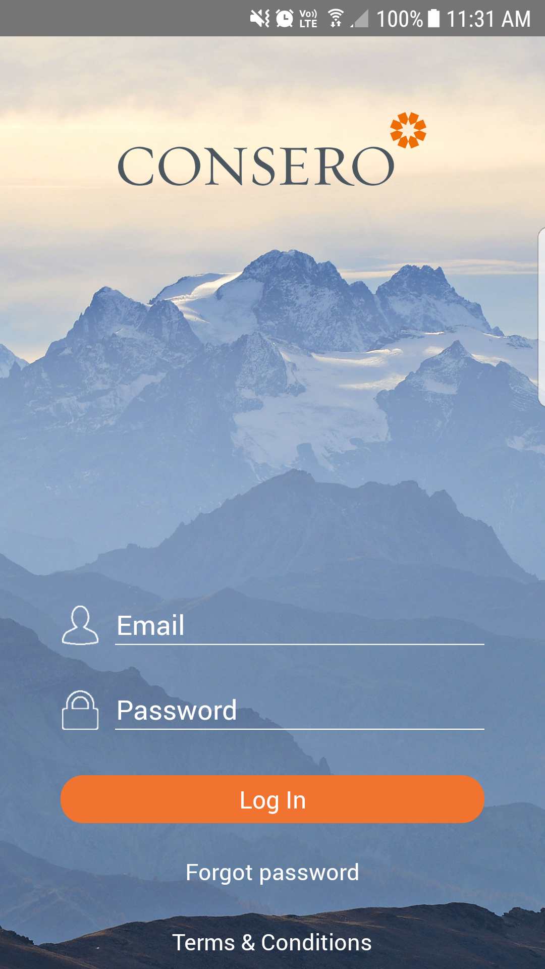
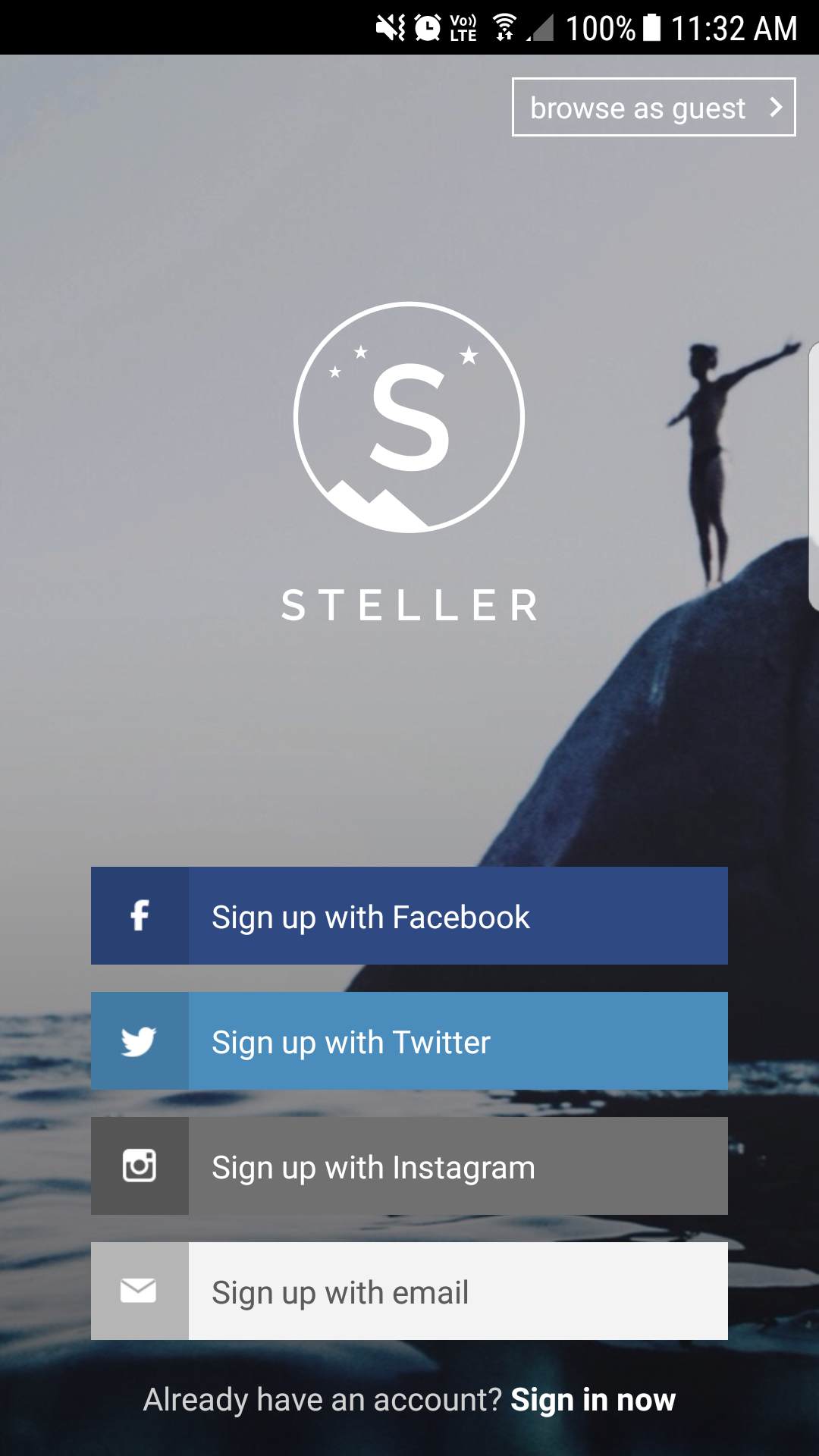
The design quality should begin with your app onboarding and especially in your signup/ login options. The sign-up screen of a mobile app is extremely important for conversion rates and its design is grueling. You need to consider efficiency and speed of the login process while maintaining simplicity, privacy, and data security. Keeping up with all these requirements on a simple screen is hard, but for those who manage to nail it, it gives better conversion rate and retention rates.
From the user perspective, filling out signup forms is painful enough in websites, and put it in mobile apps, it is even more so. While there isn’t a one size fit all solution when it comes to login design, there are some basic principles every designer need to keep in mind during the design process.
Check out this all-inclusive list of simplistic best practices you need focus on when you design your app’s signup page.
Let’s go back to the basics. A major consideration should be given to the number of registration/ sign up fields. Keep it to a minimum. The lower the better as it gets your user to the actual functionalities faster.
Remember, the signup is not the endpoint of your app but the gateway to the actual functions. Think of it as a doorway, keep it streamlined and make the process as speedier as possible. The quicker you get the user to the other side, the higher your chances of retaining them.
Due to the smaller screens and unease of typing passwords and other information on mobiles, the inputs you need your user to fill up should always be kept minimal, unless you want them to drop off.
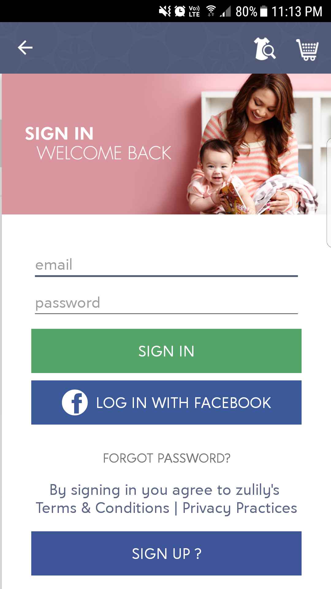
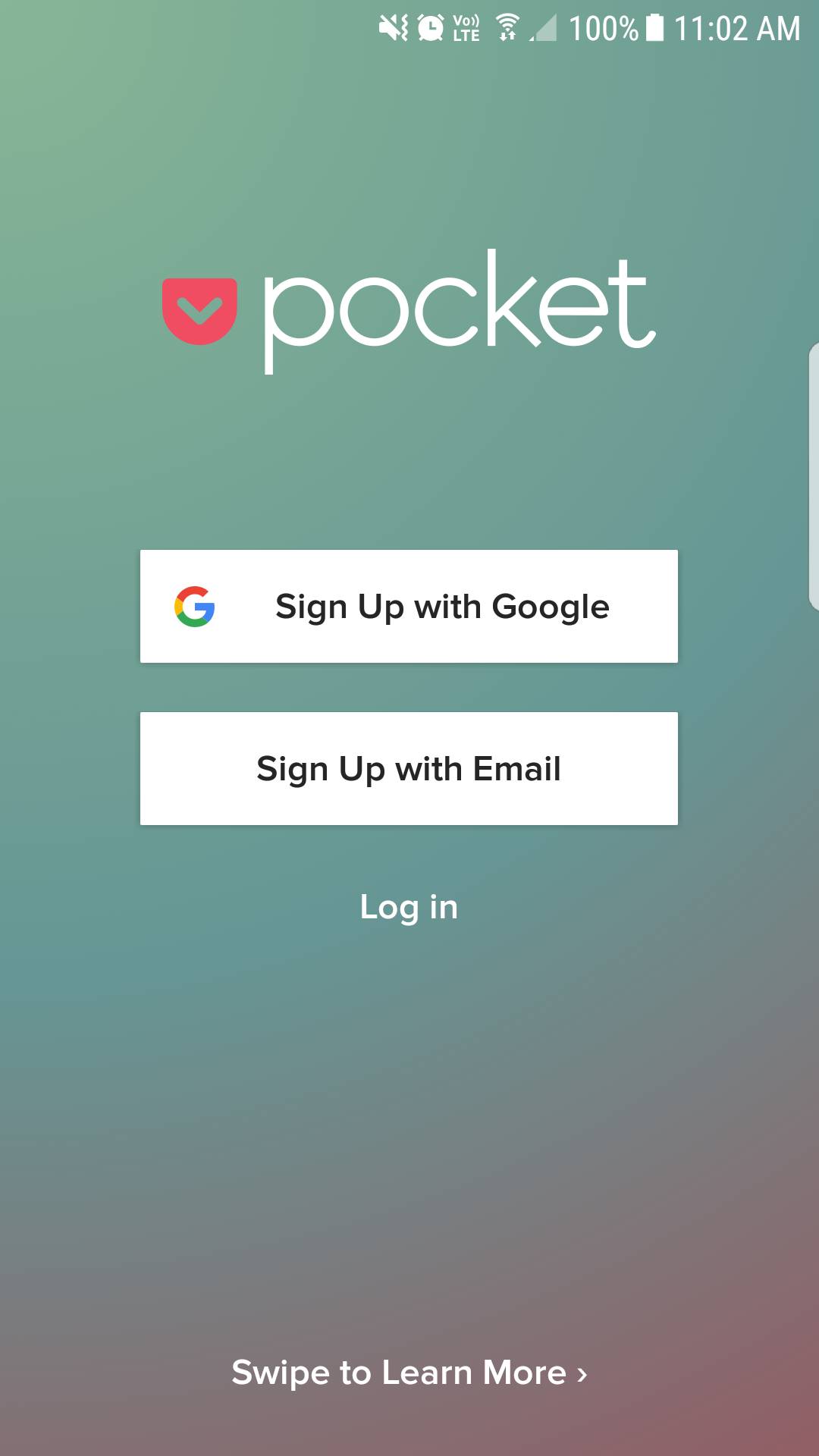
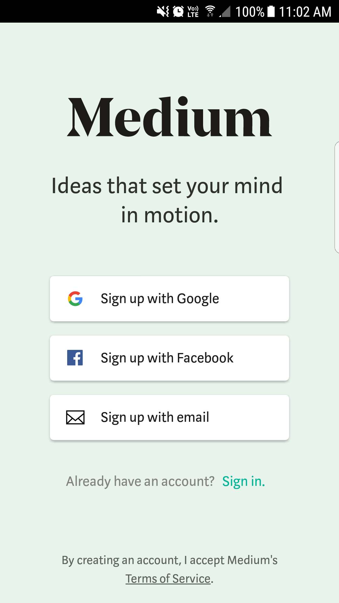
Request only the details you absolutely require. Incorporate prediction and autocomplete features and remember to keep your user logged in for ease of use. Go for emails rather than usernames and passwords and fingerprints and mobile number if its required for verification purposes.
Nothing else is required in the signup stage. If you need more personal details, ask them to fill up a profile at some later stage.
The email vs username dilemma is a no-brainer when you think about it. Who remembers all those unique usernames you are supposed to come up with? And when I type in a brilliant username idea, chances are you will say, “it’s already taken”. So, save the trouble guys, and go for the email. You will ask that anyway for verification and other contact purposes, so it’s already a required item.
Don't force your customer to search for options. Make it clear, make it pop and the call to action should be clearly identifiable in any orientation. Help your users find exactly what they need without exerting too much effort with simple layouts. The forgot password is a major culprit that always break this. Don't make your users hate your design by making their life a pain.
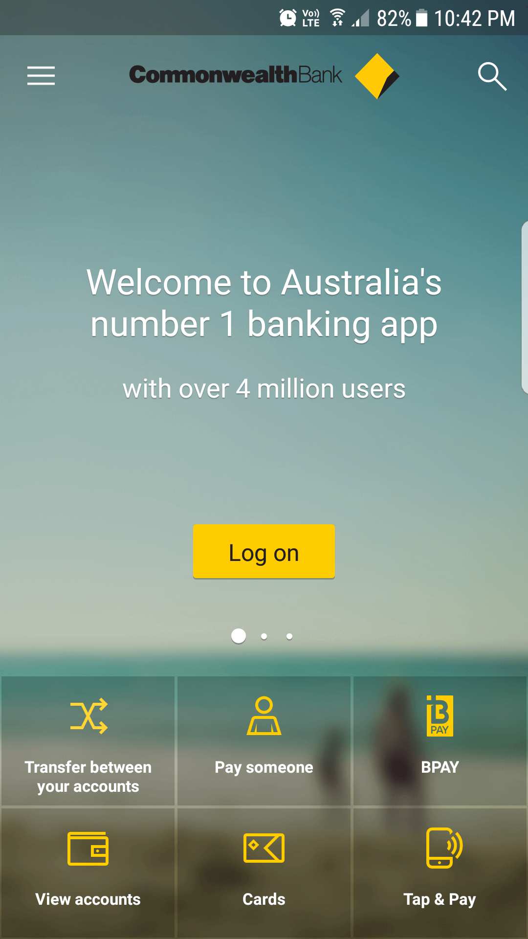
If it’s your user’s first visit, a quick onboarding may discard their doubts and you will see high conversion rates. For a popular application that's known to the wider market, putting a login/signup option on the first screen wouldn't hurt.
The signup page needs to show a compelling and succinct statement of what your app offers and the customer benefit.
Have the login/signup at the appropriate places. If your user wants to sign up at the end of the session, let them do it. Catering to the user is our priority after all.
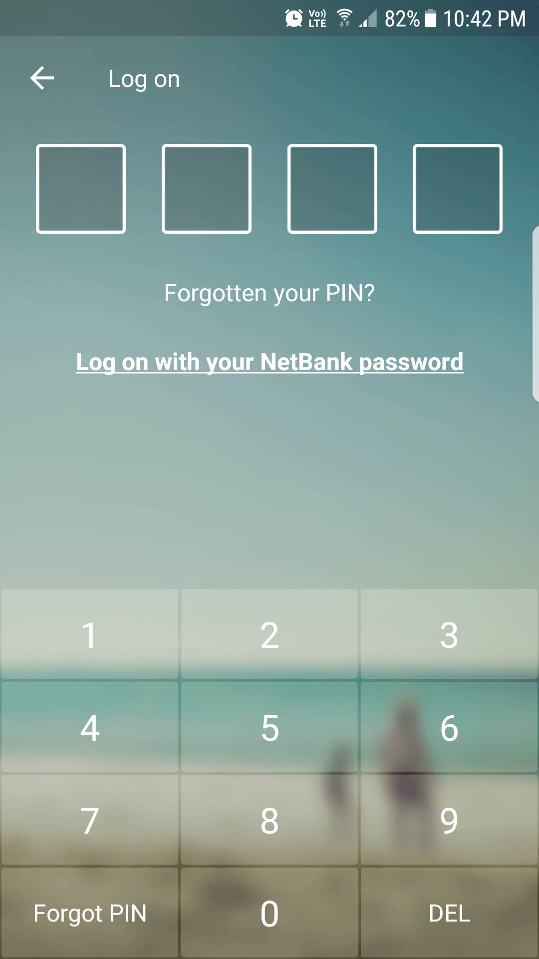
The best choice will be to use an app until you require user information like e-commerce app while a banking app may need to authorize the user before providing information. It depends on your user, the application type, and the data security requirements.
Only ask your user to login if it’s necessary to do so. For e-commerce apps, it is when the user pays for the products - after they browsed the product range and added items to their carts. Even then it may not be necessary to log in. Having a guest checkout helps in these cases. But for banking apps, it will be in the initial stages as they need to verify the user’s authenticity before divulging financial data.
An important feature you need to consider is the captcha feature that many uses to weed out spam. Let’s think this realistically. Every app in the market has hundreds of competitors in App store and play store. What happens when someone downloads your app and get stuck in this captcha phase. They may try once, twice or thrice if they really like your onboarding and if it’s still hard to login or signup, they will abandon you for your competitors. This potential user loss is easily avoidable if you are willing to perfect your UX.
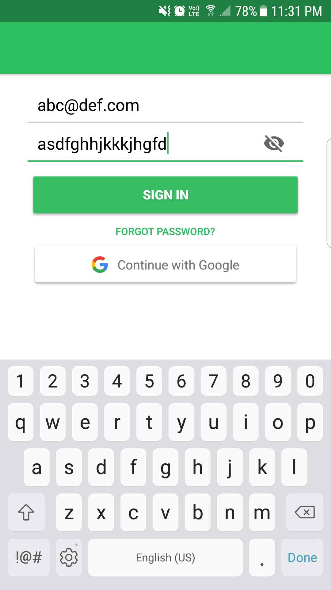
This UXcomes into play with the passwords too. Don’t ask a user to validate a password by entering it twice. Typing in passwords is an absolute pain in mobile phones and asking me to do it twice will make me mad. Since most applications enforce certain rules for passwords, it’s important to make this as smooth as possible.
Users make errors when they can’t see what they’re typing. So, let them be in control and give them access to a show password option so that they can ensure what they are typing in is the correct password.
It’s not convenient to remember all the passwords and usernames we come up with when we see a signup form. It would much easier for me as a user to sign up with my email as I will remember it, but not if it’s going to be visible to every other user on that platform. It raises security and privacy concerns. So, if you ensure my email safety and not make it visible to everyone the retention rates will go up.
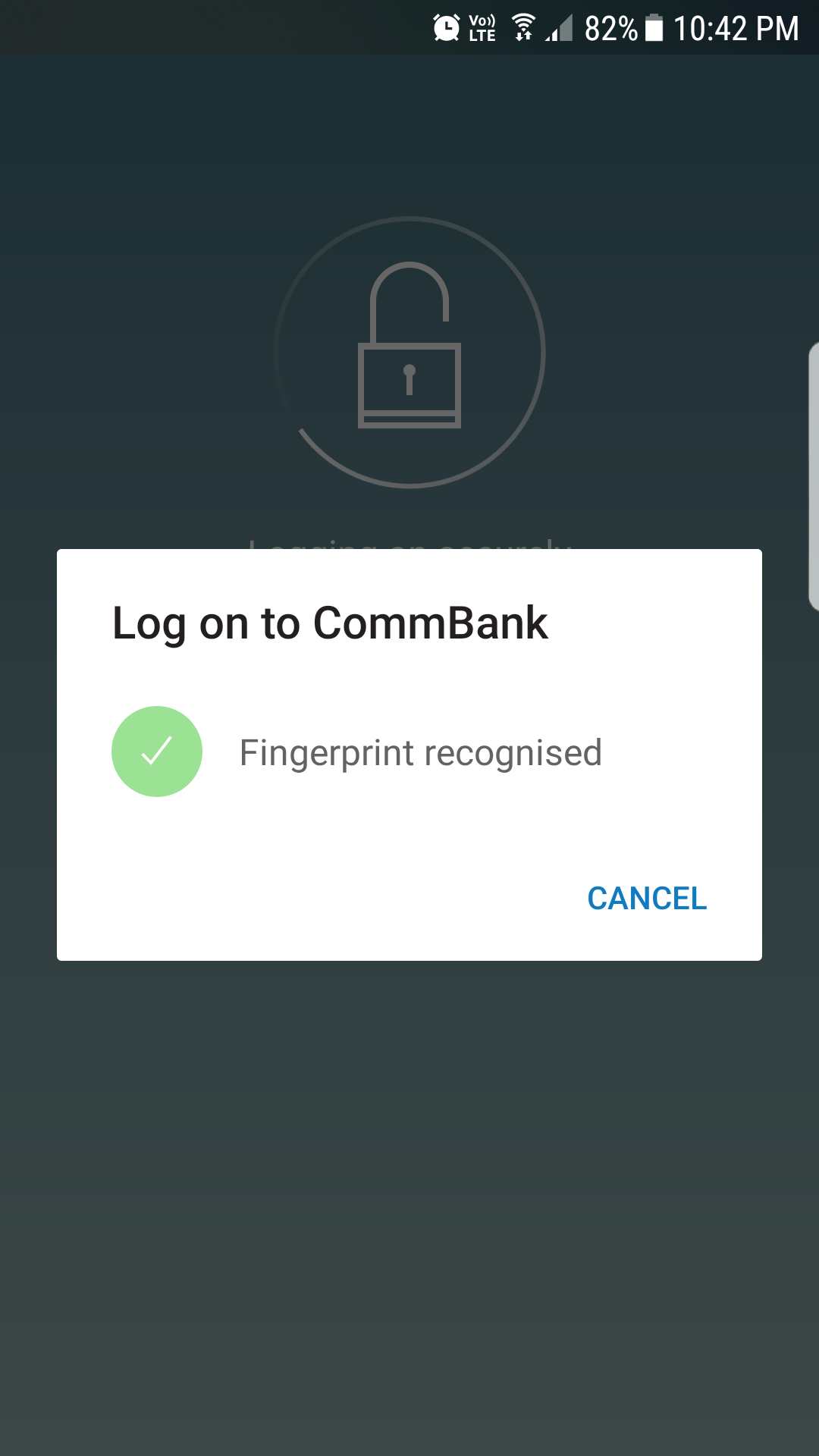
If I am using an app on the go, it is much preferable to have an ‘always logged in’ feature. Most users are security conscious and their mobiles are already crammed with patterns, and fingerprint recognition etc.
Mobile users are mostly in a hurry and don’t have the time to focus on typing their login credentials all the time so it is usually helpful to not log me off every time I turn off the app.
Keep me logged in or give an option to choose ‘Remember Me’ unless I do the logoff. it saves time and allows returning users to feel welcomed. If security is the issue, add some feature like facial or fingerprint recognition to your app.
Literally, no one remembers all the passwords we have typed over the years. Keeping up with the password constraints means we create random passphrases no one could decipher and recalling it is tough.
The most painful part of this is the resetting. Make this password reset phase as smooth as possible. Ask the necessary questions and only the most necessary ones. Unless you keep in extremely sensitive data, don’t ask me the whole slew of security questions and enough with the captcha.
If you have the mobile number on record, why not send me an SMS or call, instead of that rest password email you prefer. It is easier for me as a user and usually faster. Keep this ‘forgot password’ or ‘reset password’ features clearly visible and in a logical position.
Studies show that 45% all customers in major e-commerce sites have multiple user registrations and around 75% of people who requested their passwords abandon it for other sites. Therefore, having an effective system for resetting passwords is essential and if not properly implemented, will be detrimental to your retention rates.
The security aspect depends on the type of application and sensitivity of the data stored. We don’t want the same security procedures for a banking application and a game.
It depends on the app usage. If you are like Facebook and is using the app as an extension of your web application, it’s better to go with Log in as prominent. Consider whether your user already has an account or do they need a new one.
If you are mobile only and expect most of your users to meet you through your app for the first time, go with Sign Up.
Keep the sign-up process as painless, simple and easy as possible. Social media logins can help with this. Identify the most preferred social media applications of your market audience and try to tailor the sign-up experience.
The social media buttons only work depending on your app’s purpose. Not everyone wants their dating app to have access to their social profile with the option of posting on their wall. If your app functionality includes social sharing as a focal point, then it’s obvious to keep the social media logins.
If you do provide social logins, make sure that you also provide them with an alternate login option with email as not everyone prefers social login. If you use social logins, do communicate the posting and sharing capabilities and ask for permission before sharing anything, every-single-time.
Make it clear what you want your user to do. Clarity should be a focus. Deliver your value proposition in a clear and concise manner. Make it easy for the user to disengage and re-engage with ease.
Make your messaging as unambiguous as possible. Keep the conventions and don’t reinvent the wheel when it comes to sign up and log in. The users are used to these and would easily understand what it means rather than “Continue on” or “Let’s fly through”.
Make it obvious what you need from the user. Your users shouldn’t have to pause and think what option to choose.
If it’s an email address, say so. Whatever it is - their user id or an account number - state it directly. Never, ever make the user guess what they need to input
Outdated design trends out you as a poor developer/designer. Flat designs are the rage right now and incorporate it with a streamlined look for easy navigation. Clutter-free with the right balance of imagery with text is the way to go.
Focus on having white space. Make use of it. Clean interface wins every time against a clunky interface. It’s essential for readability and visual experience.
Don’t ask for too much data at a stretch. Prompt the user to provide details only when necessary and at a time where they can understand the relevance of providing the data. This will ensure that your signup forms are clutter free and in line with user expectations.
Ask for customer data only when it is essential. By reducing customer efforts, you can improve customer conversion rates. Lowering the barriers to entry will ensure higher retention rates and in the longer term loyal users.
Instead of asking a whole bunch of data at a time, stretch the data collection over a period. This ensures more robust collection of data points instead of the random bunch of nonsense incensed users provide if they are prompted to add these details at sign up.
Think of it as getting to know a person. Would you rather get to know a person little by little so that you get a whole picture or would you rather collect whole statistical information about them without giving anything in return?
How would such a person be viewed in real life? I bet it’s something along the likes of obnoxious and rude and annoying. Since that’s not the emotion you want to evoke in your customers, let’s go with the natural order of getting to know progressively.
Before asking your customer to give up their personal details, ensure to provide them with the “why”. Why they need to sign up and what they get in return?
Identify what your user wants, communicate clearly the value you provide and how it aligns with what your customer is looking for. Be clear and concise in your messaging and let them know the value of signing up and how it helps them.
Your user may be looking for personalized data, or to be in the loop always, or to get mobile-only discounts for a purchase. Whatever it is, make it clear, make it pop out so that your customer understands the value exchange properly and not feel short-changed.
Stop covering up half of your screen with keyboards. Mobiles have limited real estate, so covering up input fields due to keyboards is an unattractive design pattern and should be removed. Ensure that your design responds to the keyboard placement and try to keep the input fields visible to your user.
Switch the keyboard on the device according to what you need. If it’s a numeric pin, change it to a numeric keyboard. Help your customer to easily provide you the data.
Don’t tell me that my credentials are wrong. Tell me which one is wrong. Did I enter a wrong username? Is it not the email I logged in with before? Is it the password that’s mismatching?
Remind your users when they are typing in an old password. Let them know they have changed it. Instead of telling them “wrong password” tell them “you have changed the password on ….” so that they can remember it. It should only appear if the user is typing in an old one and should default to “wrong password” if it is mistyped.
Conclusion
Well, make no mistake. This is the age of mobile technologies. Keep up or Get Out that’s the only options you got as a mobile app developer.
There is no magic solution for your login page design woes. Though there exists many components and features that are standardized, it’s still best to keep in mind that your customers and app functionalities are unique and tailor an experience that mesh with the rest of the app functionalities.
Keep usability in the forefront of your design, and there is no reason for your design to fail. Streamlining your administration stuff to provide your users with a smoother onboarding process will give you credits and this optimization will result in higher retention rates.
Throw away the clunky and cluttered interface, ask only what’s essential and allow them to try on the functionalities faster, and your customers will love you and will keep coming back. After all user experience is the name of the game.
 Mockplus RP
A free prototyping tool to create wireframes or interactive prototypes in minutes.
 Mockplus DT
A free UI design tool to design, animate, collaborate and handoff right in the browser.


 Sign up with Google