Using the golden ratio is one of the key rules that designers follow to create a naturally balanced and eye-pleasing design work.
However, as a designer, how much do you know about the golden ratio? How can you use it to improve your design project? What practice tips or principles should you follow to simplify your design process?
Worry not! We've compiled this ultimate guide for you to learn everything you want to know about the golden ratio. Some typical examples and design tips are also included for your inspiration and study.While learning these basics and tips, also quickly visualize your UI design to timely test out your design ideas.
What is the golden ratio in design?
The golden ratio in web or app design refers to a special design mean that allows designers to create a balanced and aesthetically eye-pleasing composition by presenting layouts, spacing, texts, images, and other visual elements of a project at the proportion of 1 to 1.618. This special design means or composition proportion is widely found in nature, art, and architecture, and has been used for thousands of years since it was first applied by the Ancient Greeks.
As a composition form that can make interfaces close to perfect, there are several patterns that the golden ratio is applied when placing or layout the UI elements of a project, such as:
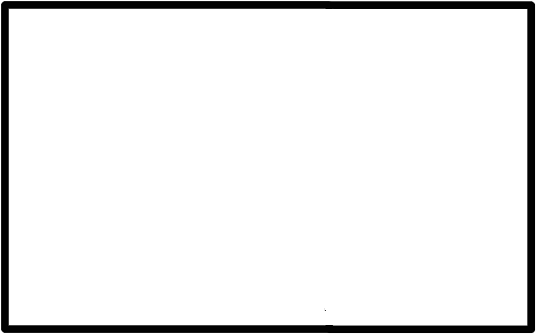
1. Golden rectangle
A golden rectangle is a perfect rectangle whose length is 1.618 times its width:
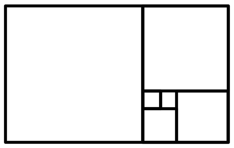
As we keep cutting out the perfect rectangle at the ratio of 1 to 1.618, we also get more golden rectangle patterns, like:
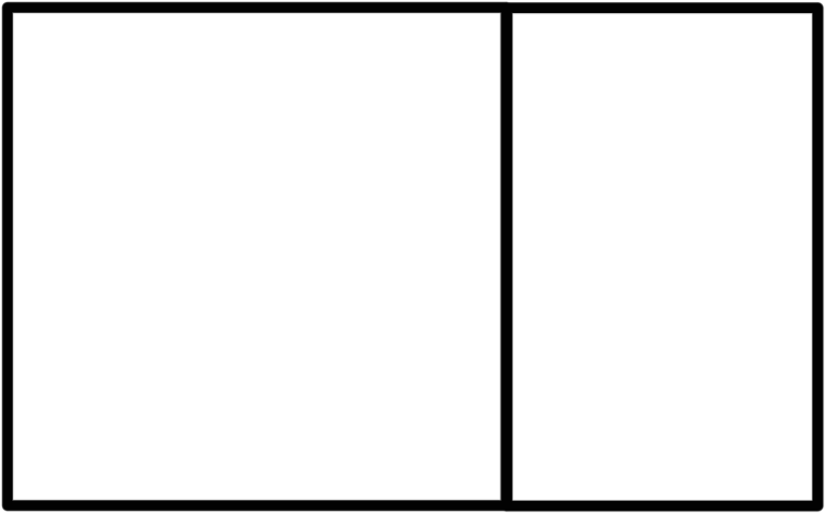
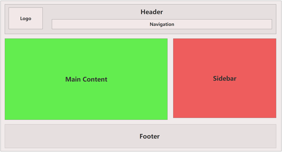
The most widely-used two-column golden rectangle pattern
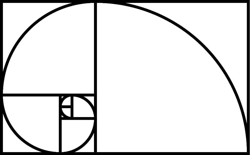
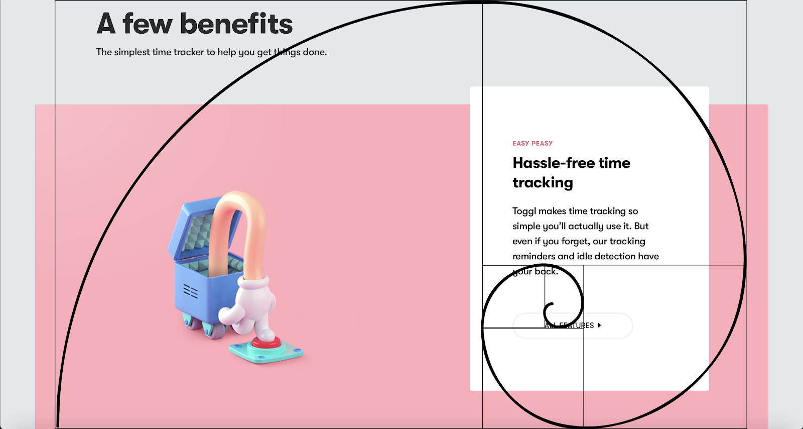
2. Golden spiral
A golden spiral is another commonly-used golden pattern that is based on the golden rectangle and connects the opposite corners of each of the perfect rectangles, generating a shape that looks exactly like a spiral:
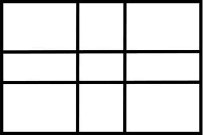
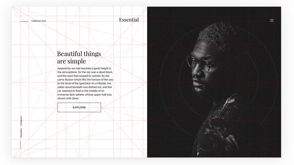
3. Golden grid
The golden grid, also known as "the phi grid", is a grid system that starts with a rectangle or image frame, and then divides one side of the rectangle into two parts, with the longer part being approximately 1.618 times the length of the shorter part.
And then, you draw a vertical line from the shorter part's endpoint to create a square. Next, from there, you repeat the process within the remaining rectangle, creating a series of squares and rectangles based on the golden ratio. And, you will get a new golden compositional pattern as below:
Why does the golden ratio matter in design?
Here are the several benefits that the golden ratio can bring to your web or app design:
Perfect visual appeal and balance The golden ratio is often associated with visual harmony and balance. It is widely found in nature, like trees, flowers, and animals, and has a mysterious attraction to the human eye. As a result, designs that incorporate the golden ratio effortlessly capture people's attention, surpassing other design proportions.
Consistent visual patterns and hierarchies As we've explained in the above section, the golden ratio can be applied to your interface design in different compositional patterns, allowing you to easily follow the same visual pattern and hierarchy to present texts, images, and layouts for design consistency.
Natural visual flows and UI focus The golden ratio guides the placement and arrangement of key design elements, leading to a natural flow of attention and focus for the user. It helps to direct the user's gaze towards important features and content, enhancing usability and engagement.
In one sentence, by harnessing the power of the golden ratio, you can unlock the potential to create visually captivating and user-friendly designs that leave a lasting impact on your target audience.
How to use the golden ratio in design?
Now that you have a better understanding of the golden ratio, it's time to learn how you can use the ratio to create a much better UI/UX design project. Here are some practical principles and tips that you can follow to incorporate the golden ratio into your design:
1. Define the size and hierarchy of text copies using the golden ratio
To increase the readability of a website or mobile app, designers need to design text copies of the interface in different sizes. To ensure text on the interface is visually appealing to users, you can use the golden ratio to define the size of all text copies there, such as the body text, header, footer, sidebar, and so on.
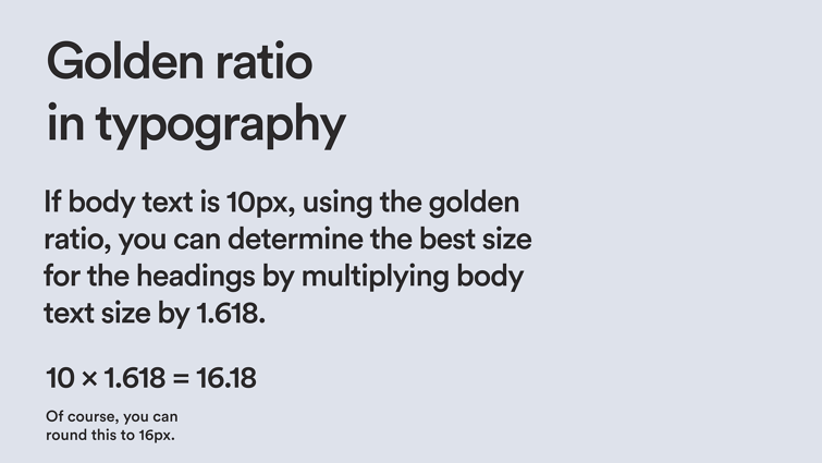
SourceFor example, let's consider that the main body text is set to a size of 10 pt. To determine the ideal size for the header, you can apply the golden ratio. Simply multiply the body text size by 1.618, which results in 16.18. Consequently, the perfect size for the header would be 16 pt.
2. Design images based on the golden ratios
While designing an image, you may adopt the golden spiral as a guideline to compose the elements of the image. A crucial aspect to bear in mind is placing the main focal point of your image at the center of the golden spiral, which will help create a natural view flow and draw attention to key areas of your image.
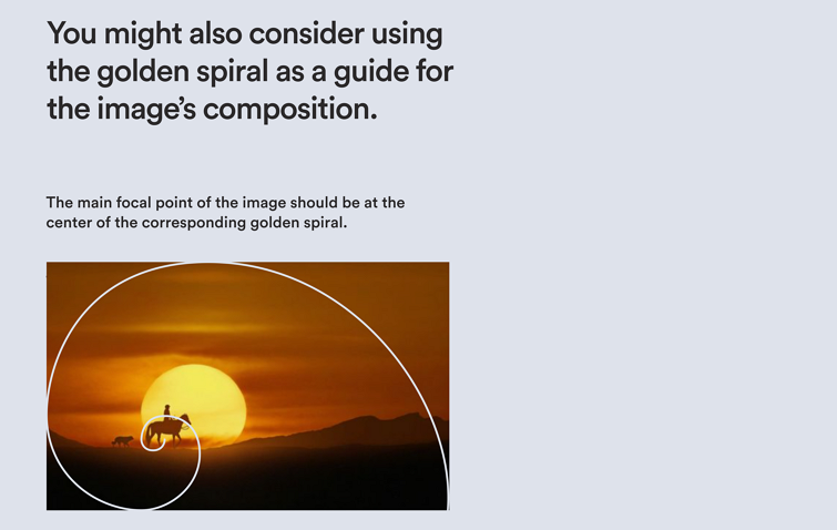
By adhering to this practice, you can create a visually engaging and captivating image composition.
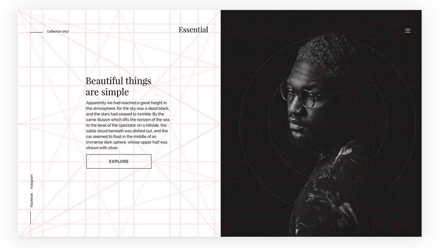
3. Layout your interfaces with golden ratio compositions
While designing the layout of your interfaces, you can even try nearly all possible golden ratio patterns to create a more eye-pleasing interface, for example:
As the above image shows, this two-column ratio composition pattern is ideal for websites with a main content area and sidebar.

Source
While the golden spiral pattern, remember to put important elements, images, or focal points along the lines or intersections of the golden ratio spiral to easily stand them out.
Source
As the above example shows, the golden grid pattern helps to better arrange the elements of the web interface, allowing to present everything in a more clear and eye-pleasing way. 4. Create responsive designs using the golden ratios
If you are working on a responsive design, to ensure the content of the web interface can be perfectly fit into a mobile screen, you can integrate the golden ratio to determine the size of the main content, sidebar content, and so on.
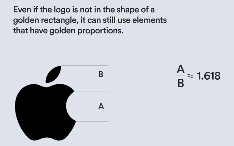
Source5. Create brand logos based on the golden ratios
Logos play a crucial role in website and app design. While designing a logo for their project, designers adopt the golden ratio to sketch out the proportions and shapes for generating a visually appealing and balanced composition. Many well-known brand logos follow this rule, like Apple, Twitter, Google, Adobe, and more.
Source10 examples of the golden ratio in design
We also have picked 10 examples of web designs that adopt the golden ratio for your inspiration:
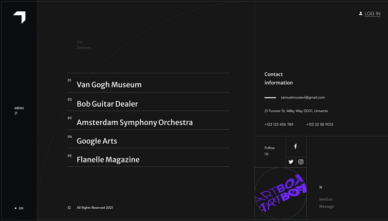
1. Neutrality
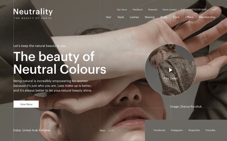
Neutrality is a good golden ratio exploration. It adopts the mathematical proportion of 1 to 1.618 to define the sizes of body texts and headings, and also plays with the golden ratio grids to place all visual elements in a more balanced and harmonious way.
2. Demure
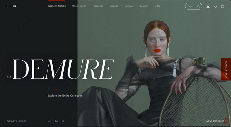
Demure is a dedicated website concept that explores how one can use the golden ratio to create an interface. The designer attaches a short slide to show the process of how the golden spiral is used as a base layout to place each element of the interface, aiming to create a better visual composition. It is surely a good example for beginners.
3. BOX
BOX extensively utilizes the golden grid system and golden rectangles to lay out all of its landing pages. This showcases another successful application of the golden ratio design. If you are considering incorporating both the golden grid system and golden rectangle in your own designs, BOX serves as an excellent example to explore. By examining their approach, you can gain valuable insights and inspiration for achieving visually appealing and harmonious compositions.
4. Golden Canon Grid
Golden Canon Grid is a web example shared by Adrián Somoza, a web designer from Argentina. The designer even shares a video to show how one can go from the blank canvas to the final product using the golden ratio grids in just simple four steps. Some tips about composition and layouts are also explained in that video as a bonus. Don't miss out on this!
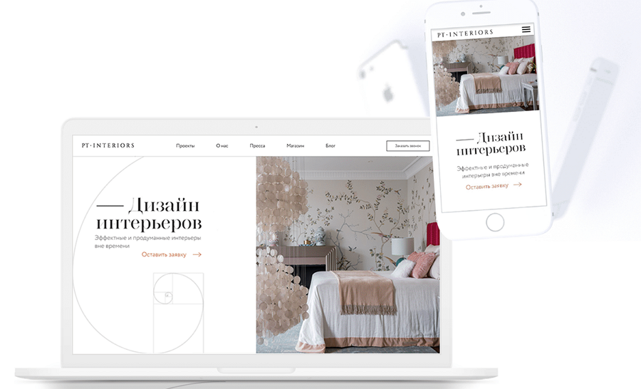
5. ClothWe
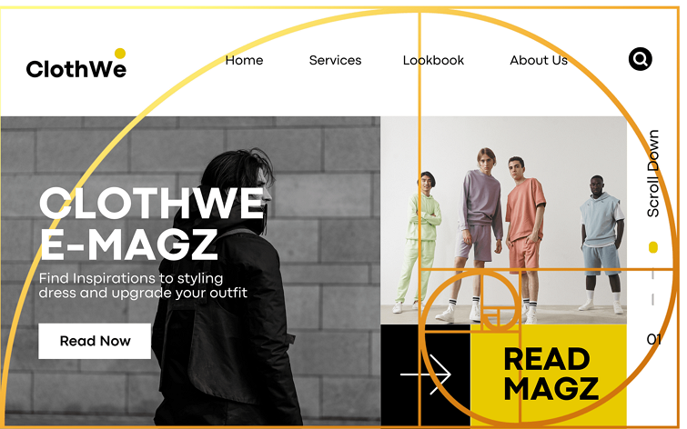
ClothWe is a web mockup that exemplifies the use of the golden ratio in web UI design. The page is divided into sections, with elements like headers, images, text blocks, and buttons positioned and sized to maintain a sense of proportion and balance. The title and main content area are carefully aligned to create a visually appealing ratio, ensuring that the focal points of the page are strategically positioned.
6. Forbes
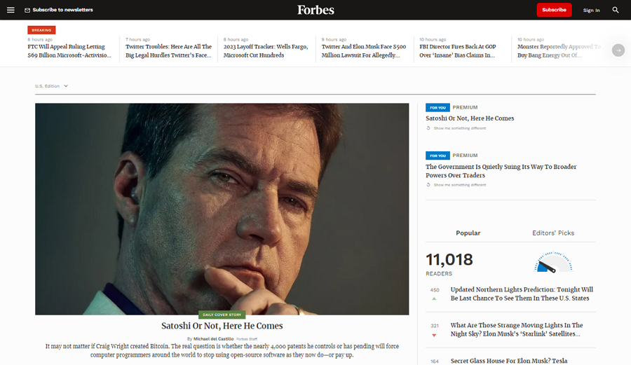
Forbes, a renowned business and finance news website, adopts an aesthetically pleasing two-column golden rectangle layout pattern to present its interface content. By leveraging this design approach, Forbes effectively captures users' attention with a strategically placed column that showcases vital business and finance content.
Simultaneously, the website employs the second column to accommodate a right sidebar, which seamlessly incorporates supplementary content, advertisements, and social media links. It provides a good example of how we can use the two-column golden rectangle layout to enhance the overall user experience and ensures a harmonious balance between essential information and additional resources.
7. Design Inspiration
Design Inspiration is an online website platform for creative inspiration, and it implements the golden ratio grid systems to curate and presents various design projects and visual inspiration. The grid system helps maintain a sense of proportion and harmony throughout the website.
8. Golden Number
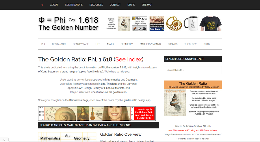
Golden Number itself focuses on providing information and resources about the golden ratio. Unsurprisingly, it incorporates the golden ratio grid to present its content, demonstrating how the principle can be applied in design, nature, and other disciplines. So, in other words, whether you are seeking design inspiration or detailed information about the golden ratio, this website is a must-visit.
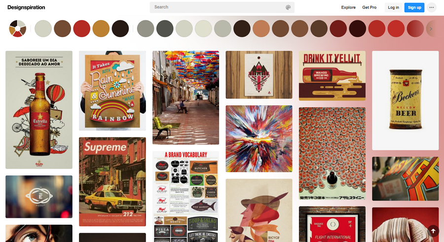
9. Pinterest
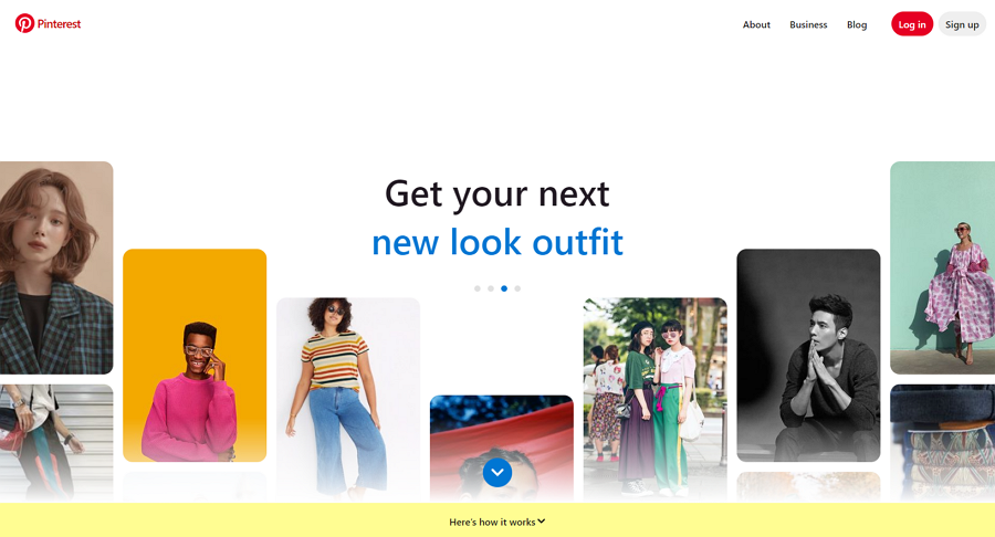
Pinterest, a visual discovery platform, also adopts the golden spiral to help design its layout. The arrangement of pins and the visual hierarchy of content aligns with the proportions of the spiral, generating an organized and visually pleasing interface.
10. Mockplus Blog
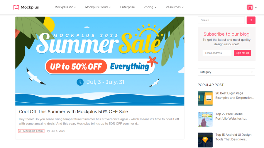
Mockplus is an online platform that caters to designers and design teams, offering them a fast prototyping tool and a one-stop design collaboration and handoff tool. They also host
a highly-regarded blog that shares top-notch UI/UX design guides, resources, and the latest news.
The blog's design follows the two-column golden ratio pattern, providing readers with an enhanced visual experience. The main column showcases vital design news, articles, and resources, while the right column presents additional high-ranking posts that readers might find interesting.
What tool is used to measure the golden ratio?
Golden Ratio Calculator: a direct calculator that helps you calculate the longer size, shorter size, and the whole size of your design or section at the golden ratio. What you should do is enter a desired length number and customize the unit as you need.
Golden Ratio UI Design Tool: a UI design tool that helps you design all UIs at a golden ratio simply by choosing a golden ratio pattern overlay. There are three golden ratio pattern options, including Golden spiral, Golden rectangle, and Golden grid, for you to place or arrange your elements with just drag-and-drop.
Golden Ratio Typography Calculator: an online calculator that helps to calculate the size of texts and fonts used in your web or mobile app. You can easily enter the font size and content width to get your typography at the golden ratio.
Conclusion
The golden ratio compositions bring balance, harmony, and appeal to your UI/UX design, making it a popular choice for a wide range of web and app design projects. This article aims to provide you with a comprehensive guide to the golden ratio and introduces how it works to improve your design. We hope it is helpful to you anyway.
 Mockplus RP
 Mockplus DT


 Sign up with Google