A mobile device, with sufficient battery and powerful wifi, that’s enough to bring us a wonderful world of unlimited information and pleasure. We are all living in the mobile world. How to beautify this world toward optimized user experience? How to present clear UI and UX on a limited screen without overload? Many elements should concern, and I bet mobile typography is an important one.
Mobile design requires highly details and elaboration. Every elements chose on this one small screen should be of both aesthetics and functionality. It’s quite challenging to make mobile typography work for your users just right. But there is actually a practical way to follow, this article describes essential practices of typography in mobile design.
As a designer or even a developer, some may have never been usually trained or learnt about typography. This is not a good thing. You don’t have to but you really should.
“Typography is the art and technique of arranging type to make written language legible, readable, and appealing when displayed. The arrangement of type involves selecting typefaces, point sizes, line lengths, line-spacing (leading), and letter-spacing (tracking), and adjusting the space between pairs of letters (kerning[1]). The term typography is also applied to the style, arrangement, and appearance of the letters, numbers, and symbols created by the process.”
--- Wikipedia
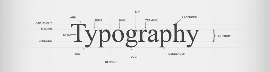
In short, typography involves everything related to the written language on a screen, and requires both the art and technique skills of designer.
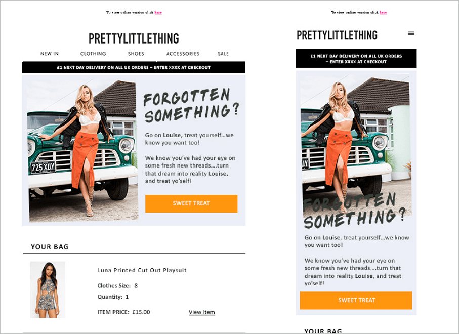
Not a single screen can get rid of copy completely. Likewise, by displaying copy elements on an interface disorderly can not reach effective UI and positive UX. Although images and video are dynamic and colorful, users still need to gain information through text. It’s more than a habit, also text can convey things other elements can’t do. A good designer should do good mobile typography design to ease user’s eye and make the interaction more productive.
Normally, mobile typography consists but not limited of the following elements. A note first: mobile design is changing, similarly, mobile typography can’t be unalterable. We pay respect to the existing rules, still, be creative.
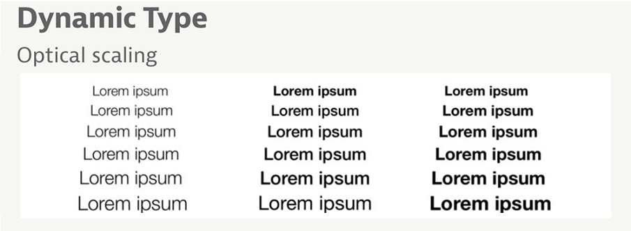
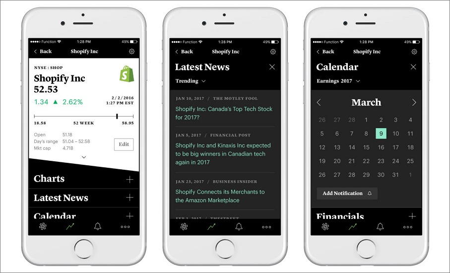
Take an example of iPhone. The typography is keeping improving and changing. In the latest iOS 11, the typographic changes including:
1) Increased text sizes and weights: help with readability throughout the system.
2) Offers a range of larger type sizes—in addition to standard dynamic type sizes—for users with accessibility needs.
So, what elements worth paying attention?
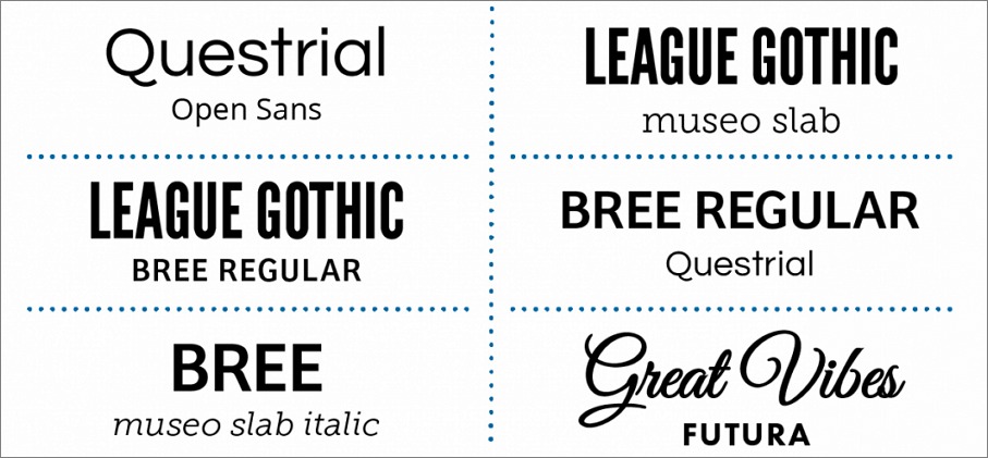
Fonts selection is not treated right, either been neglected, or simply adopted from the library. Actually, different type of content requires different font, because font can express feelings. Image use thick fonts with hard edges for feminine copy, quite weird, right? Instead, you should choose curvier and thinner fonts.
On the other hand, over-decorative fonts may look illegible on small screen. Maintain a simple and clean UI and use fonts of that style is the key. You may choose a secondary font to make contrast with the primary one. In that case, 2 or 3 fonts is quite enough.
You may need the details. Here is a collection of amazing fonts and typesetting rules.
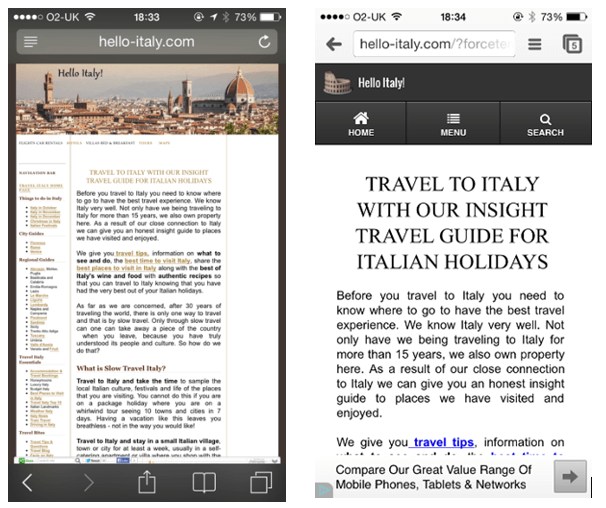
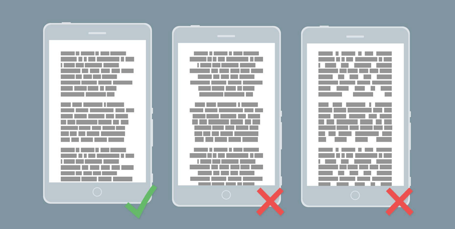
Mobile screen is limited, so the font size matters a lot. If you simply use tiny font on a mobile screen, that’s funny. Although users can pinch or room to see the text, it’s not an excuse. Smaller text may hurt user’s eye and takes more time to read, while bigger text may use up the screen quickly and break in the reading coherence.
Then which one is appropriate? For iOS, use text size that’s at least 11 points, while for Android, choose 14 sp for main text. Do notice this is mostly used criterion in main copy, not changeless one. Moreover, you may think to use type that is slightly bigger than usually on a desktop screen.
Use a single typeface and a few font variants and sizes. Mixing several different typefaces can make your app seem fragmented and sloppy. highly legible at both small and large sizes. A brand or an app, usually have it’s own default font. Apple uses San Francisco, Nokia use Nokia Pure and Google Android uses Roboto.
Apple choose font according to the product feature. For example, use Myriad(Pro) Light for iOS 7, SF-UI in iOS 9. In iOS 10, the San Francisco variants were SF UI Text and SF UI Display.
For more, check the iPhone X UI deisgn.
Use built-in font styles whenever possible. The built-in text styles let you express content in ways that are visually distinct, while retaining optimal legibility. These styles are based on the system fonts and allow you to take advantage of key typographic features, such as Dynamic Type, which automatically adjusts tracking and leading for every font size.
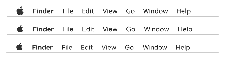
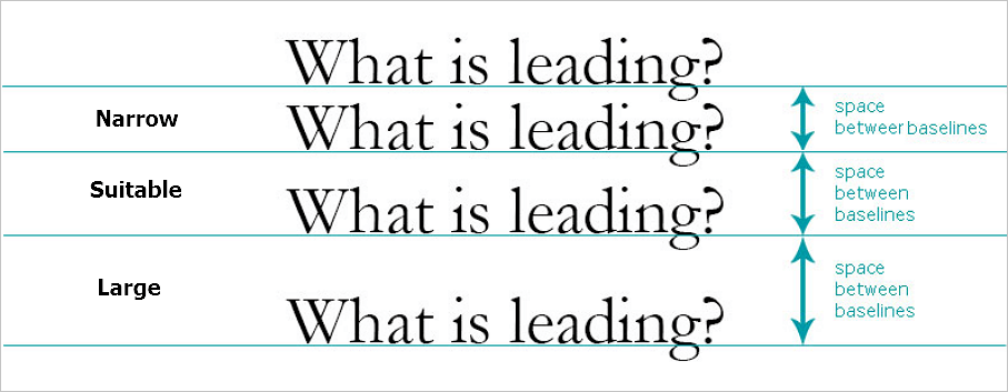
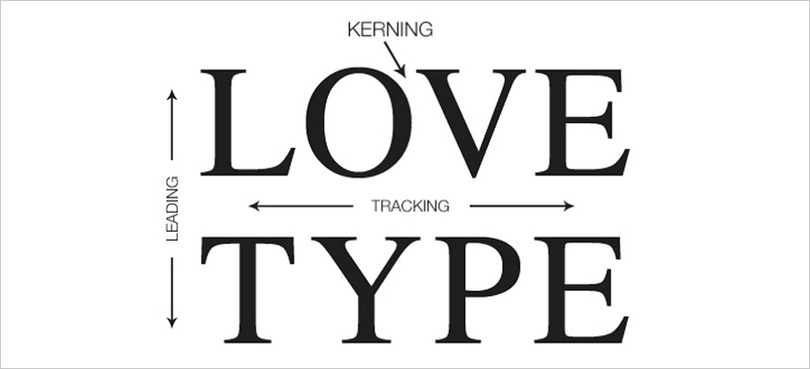
Leading is the space between lines. Mobile screen is smaller, so leading is usually smaller than a desktop version. When set leading, tighten it for mobile screens than on desktop. Wider or shorter leading are both ruins the mobile UI. Many believe 1.4em is the standard leading, but still, it’s a little bit shorter, users may have a feeling that the text is tighten up. In design, the standard leading should be 120% the point size of the font. Another common used tip: short line length requires less leading.
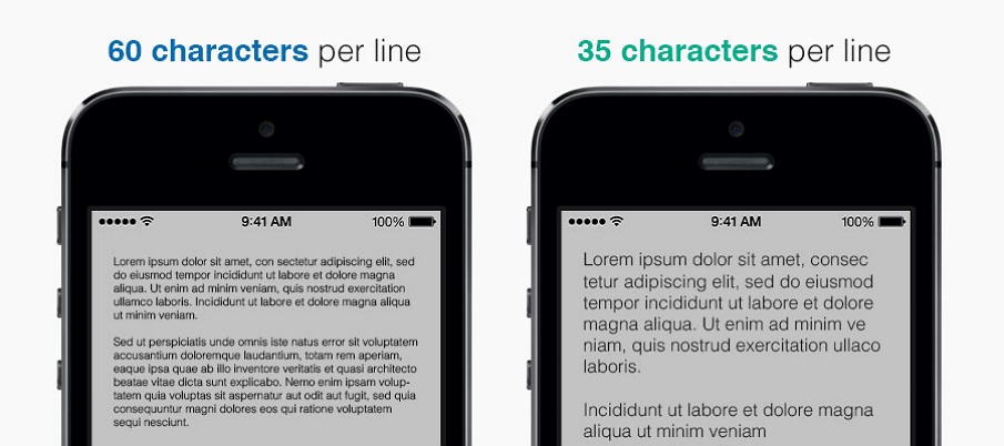
Line length is also the measure in mobile typography. The length of a text line can impact the whole typography. Line length of a desktop screen will go beyond the mobile screen borders. In mobile typography, the amount of characters on each line, font size and line length are closely connected. They work for each other harmoniously is the key to readability. Keep the number of character per line within 30-40 is a good choice.
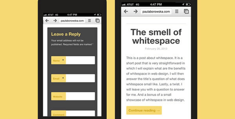
Space is like in everywhere in design. Space can bring the feeling of freedom and relaxing. Space in mobile typography mainly contains: space between lines, space in the margins, paragraph space. Proper space in mobile typography can help user better interact with the text. Designers can consider to start in the 10 to 20 percent range. Do not make the area of space too much for the mobile screen is not large, or you are waste the room.
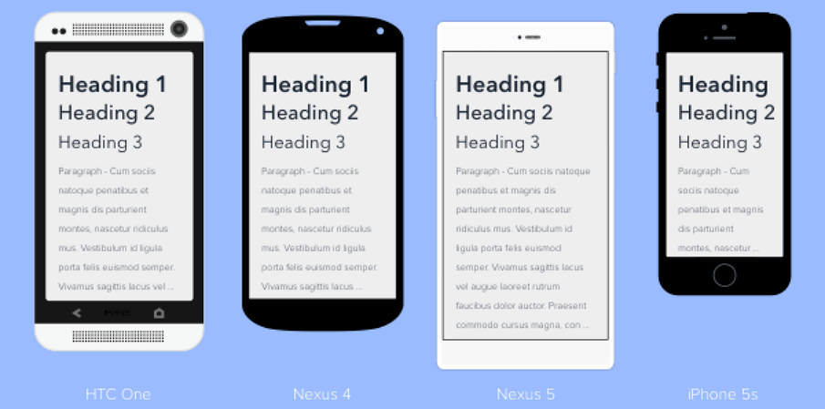
Hierarchy is to emphasize the key cope elements from the whole text and also create contrast. But hierarchy in mobile typography is thinner than a web interface, which normally owns 3 levels. Mobile screens have a more limited space, so many designers apply only 2 levels. A headline and a body is enough, headlines is to grab the reader instantly and the body toward readability. This is also a tendency of mobile design. This can make the mobile UI clean and still maintain contrast and hierarchy.
On mobile screen, the copy is less than web face, as a result, the contrast becomes exaggerated. The biggest rule is to weaken the contrast. If you use ambient light, and short fonts on small screen, you are not helping but bring a headache to your user. Color choose can make powerful contrast, what’s worse, red text with green background. On the other hand, using right color can make your UI interface looks perfect. Moreover, font size is another big consideration of contrast. Just do not go too far when set hierarchy, the font size of headline can not be too big than the body. The proportion of the space and the body can also cause tiny contrast.
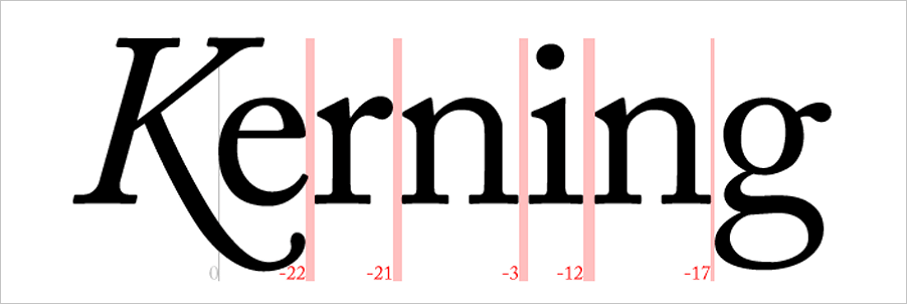
Kerning is the spacing of two letter. It is a quite tiny factor in mobile typography but worth attention. Yes, in a large copy block, kerning may not seem as a problem. If you’ve been very careful, you may notice that sometimes the kerning between a capital letter may resulting in inconsistent letter spacing compared to the spacing between lowercase letter. Pay attention to this problem and keep the space visually consistent.
Since I mentioned kerning, it’s necessary to involving in tracking. The two term may cause confuse to designers, similar but different indeed. Tracking is the letter spacing of all characters.
Effective tracking makes text more readable. Usually, font usage can adjust tracking appropriately, so you don’t need to adjust tracking often. And Larger copy block requires less tracking, and smaller one requires more tracking.
Normally, text can be placed 4 ways: left, right, center or justified. Which one is better in mobile typography?
The key is to keep a comfortable and clear rag. The former 3 ways can all leave a rag, while the justified have no rag on either side. Moreover, Justified text results in inconsistent whitespace, and in the worst cases leads to a couple of words on a line. So justified text can first be removed from mobile typography.
Left side alignment is the best choice of the rest 3. It can resulting in a ragged right edge, which allows user’s eyes jump from one end of a line to the next consistently. However, some claim that a mixing alignment can work better. The copy is a large block, use left side alignment; while for the title or short lines, centered looks good.
Keep a balanced UI is not enough, the functionality is equal important. Make it actually work can do better UX. On a mobile, we usually have some actions like purchasing products, make a order or book a ticket. Make sure users know what it will do next and they can easily do the actions. Functional typography should be highlighted among the other and clickable elements should be big enough to tap on them. Keep the usability first.
Mobile device have various size. Responsive design also have already applied to mobile design. Responsive typography becomes a great factor in this trend. It’s just not something simply about breakpoint. Any wrong usage of the whole above elements can ruin the overall mobile UI design. It’s requirement for designers to consider how mobile typography will look on different devices.
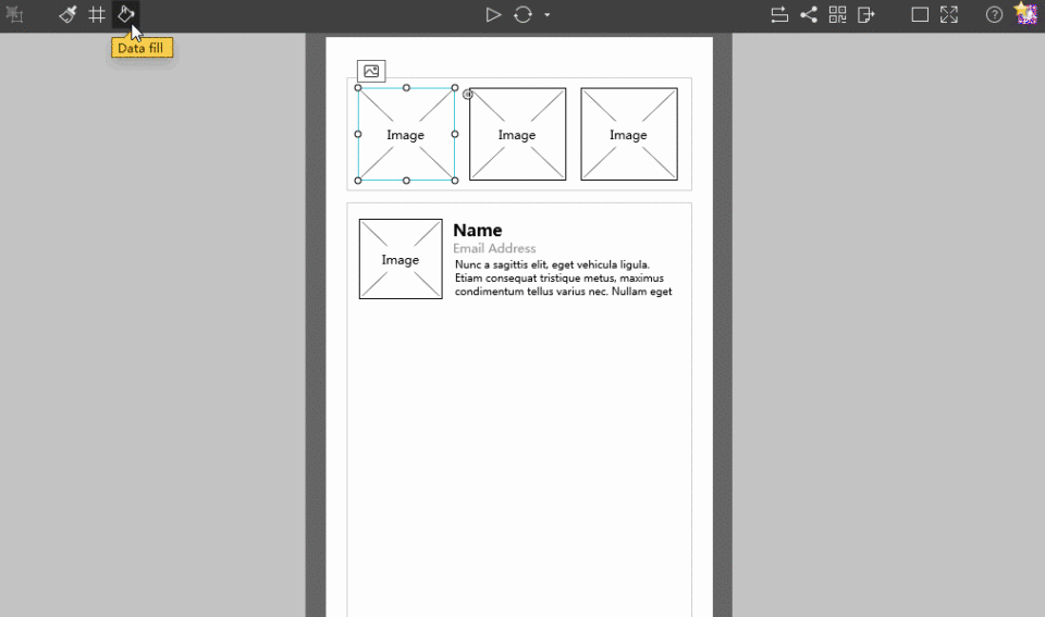
Typography is important in all kinds of designs, so as in prototype design. Excellent mobile typography can work together with all other UI elements towards a clean and productive mobile UI. but in mobile prototype design, text don't need to be meaningful. For example, in Mockplus, one of the professional prototyping tool, you can use text component to design with simple drag-and-drop.Mockplus contains single single-line text and multi-line text component. You can freely to define the properties of the text, like color, font, font size, alignment, etc. Beside, the auto data fill function of text can save you much time. What's best is you can test the design on a real mobile to check if it's of great readability.
The above are mainly covering all elements concerning mobile typography skills. Keep in mind the rules and guides are a good help, but do not forget to pay attention to the new trend. Typography will definitely gain more weight in 2018, Stephen Perry once claimed 2017 would filled with bold typography, and that’s true. In 2018, you may prepare to embrace minimalistic. Let’s see.
Third, useful tools and sources about mobile typography:
The 5 Best Mobile Typography Apps To Create Vivid Typography
Mobile typography source on Pinterest
Best Free App Fonts for Mobile Designs
 Mockplus RP
A free prototyping tool to create wireframes or interactive prototypes in minutes.
 Mockplus DT
A free UI design tool to design, animate, collaborate and handoff right in the browser.


 Sign up with Google
 Join our Discord community
 support@mockplusapp.com