Quick summary:
UX design patterns help designers devise workable solutions to common interface problems. UX patterns incorporate design best practices for every single piece of functionality, whether it’s a sign-in form or a site's navigation. In this article, we'll go through the main categories of design patterns such as:
* Data input
* Content structuring
* Navigation
* Hierarchy
How to indicate that a particular element is interactive? How to make the users know that more information is available on the scroll? The answer for both questions lies in UX design patterns. From this article, you’ll know what UX design patterns are, why they are important and how designers can use them in product design.
Patterns are reusable solutions to common usability problems. When designers solve problems, they come up with solutions. Some solutions worked so well that designers start to use them repeatedly. When users see the same solution implemented in different products such solutions became not just familiar to them, they become expected.
Humans are hardwired to look for patterns. When we start interacting with a new product, our brains do a lot of work to figure out what they are dealing with. Our mind makes all those decisions based on the learned behavior. The great thing about pattern recognition is that this process is largely unconscious.
There’s an apparent reason why experienced designers often argue against reinventing the wheel. If a design deviates too far from expected conventions, users will have to spend extra time figuring out how to use a product. Taking the fact that modern users are willing to spend less than 10 seconds to understand whether or not they want to stay on the site when site’s design forces them to learn how to use it, it increases a chance the users will leave the site.
No. Even when designers incorporate a particular pattern, they have enough freedom for creativity. Let’s take a simple concept of web links as an example. Initially, all links on the web were blue underlined text that changed their color from blue to purple after the visit. But today web developers use different colors to indicate interactivity, and this approach works equally well for users. It happens because users remember pattern behavior more than pattern visual design specifics. And they can quickly match the new look to the behavior they know learn before.
Patterns, first and foremost, are solutions to problems that happen during human-computer interaction. You can follow a simple three-step process to find the pattern for your particular problem:
The main reason for using pattern is obvious — pattern communicates function. Each time when users visit a new website or launch a newly-installed app, they scan the screen to understand how to interact with a product. They search for the elements that will help them accomplish their goal. Patterns simplify this task — when users see common objects, they immediately understand how to deal with a product.
Let’s see how patterns work for everyday tasks:
Data input patterns are used to handle data input and provide feedback for users.
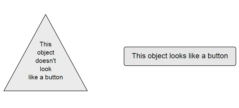
Let’s see how data input patterns work in the concept of a button. As users, we usually identify whether a particular object is interactive or not just by looking on it. Element’s shape plays a vital role in the process of identification. That’s why the basic rule of button design says ‘make a button look like a button.’ It doesn't matter how much effort you invest in making a button looks beautiful if you end up with a design that your users won’t be able to identify as a button.
Crafting an easy-to-identify button is only a half of the battle - you need to provide appropriate feedback on user input. It’s possible to achieve this goal by using animation. Below you can see an example of animated feedback that the user sees when they submit the data.
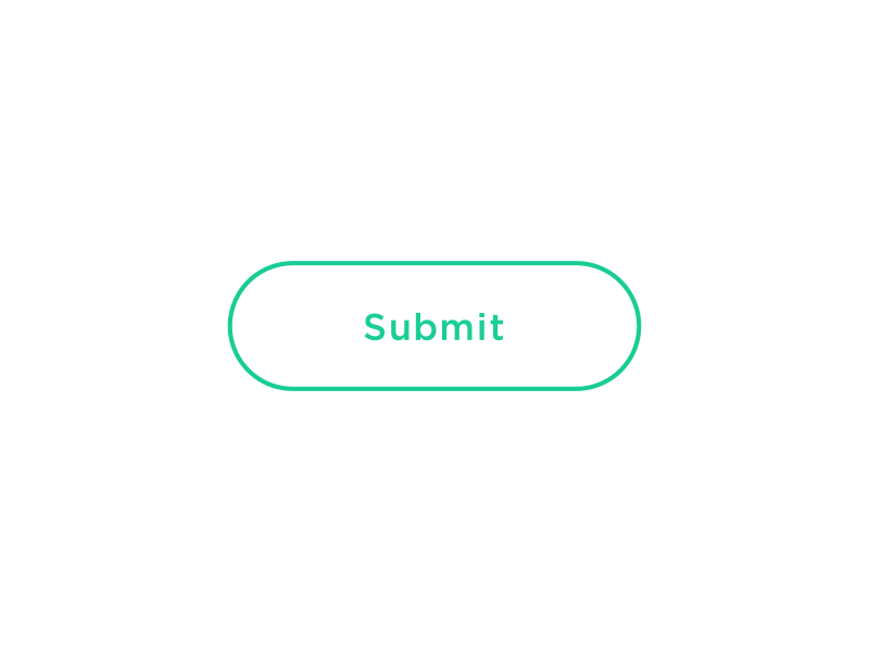
Image: Dribbble
These patterns help you create an excellent visual hierarchy so your users can quickly scan pages and find all required information or actions.
When it comes to creating visual hierarchy, designers should strive to fight visual clutter (remove all unnecessary elements) and group related elements together. The principle of proximity says that people perceive closely-placed elements as related. As designers, we have a powerful tool in our toolbox called negative space that allows us to apply the principle of proximity in designs we create. By using a different amount of space, we can to push certain elements apart or make them a part of the same unit. The great thing about negative space is that we don’t need lines or any other visible indicators to make it clear for users that objects are grouped together.
It’s easy to use negative space for creating a visual hierarchy. For example, it’s possible to use negative space to separate different text sections as we can see in the example below.
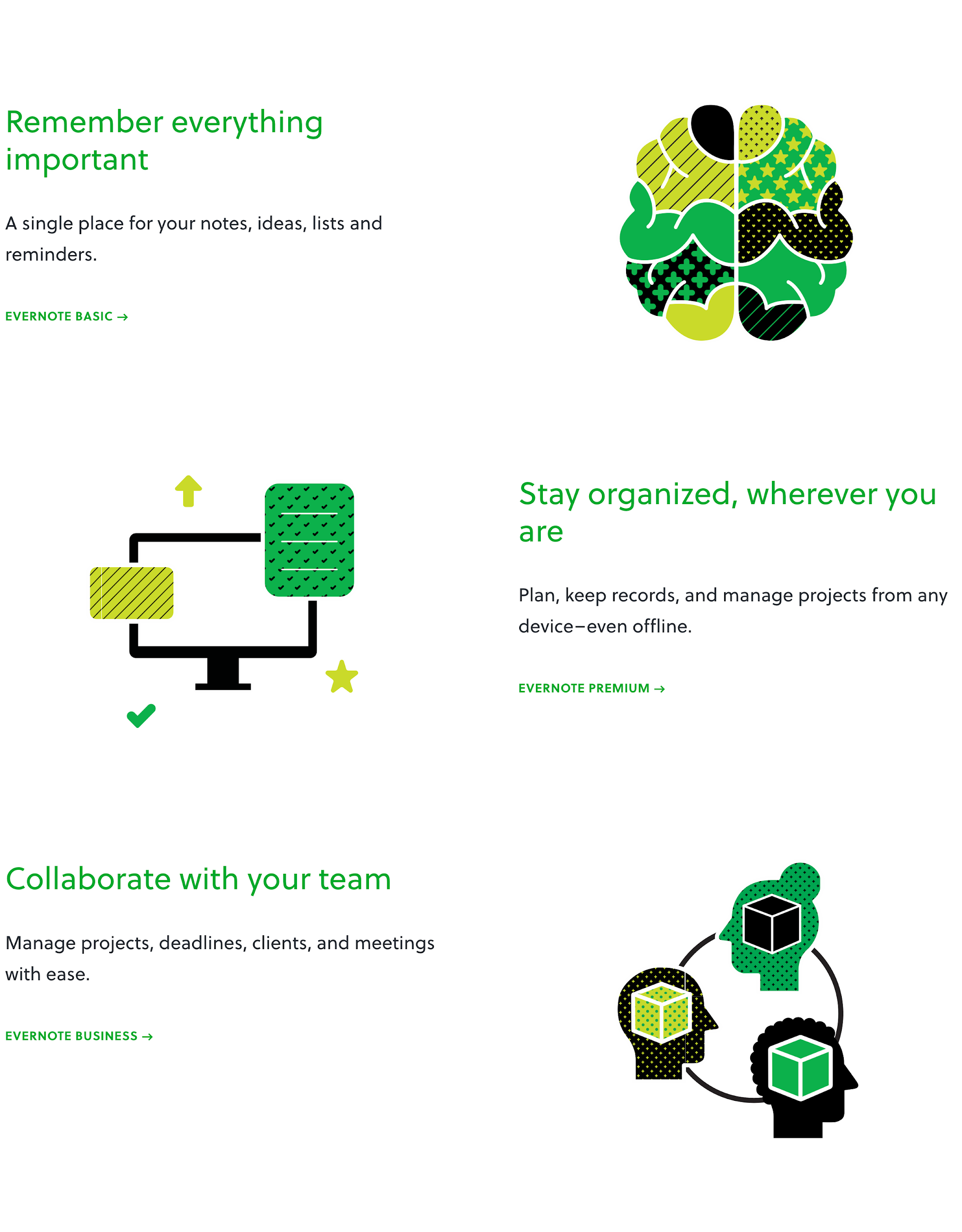
Evernote uses negative space to present different features. Image: Evernote
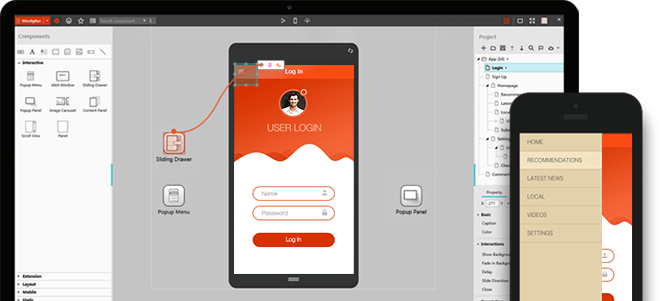
Mockplus allows designers to play with negative space and arrange elements exactly the way they want. It’s possible to create a prototype and test how real users perceive a design.
Navigation is a cornerstone of user experience. It answers the following key questions:
Let’s take a concept of the main menu on a website as an example. There are a few common places where users expect to find primary navigation — most websites place it at the top of a page, or behind the hamburger menu. When users unable to find the navigation in those places this might cause confusion and frustration.
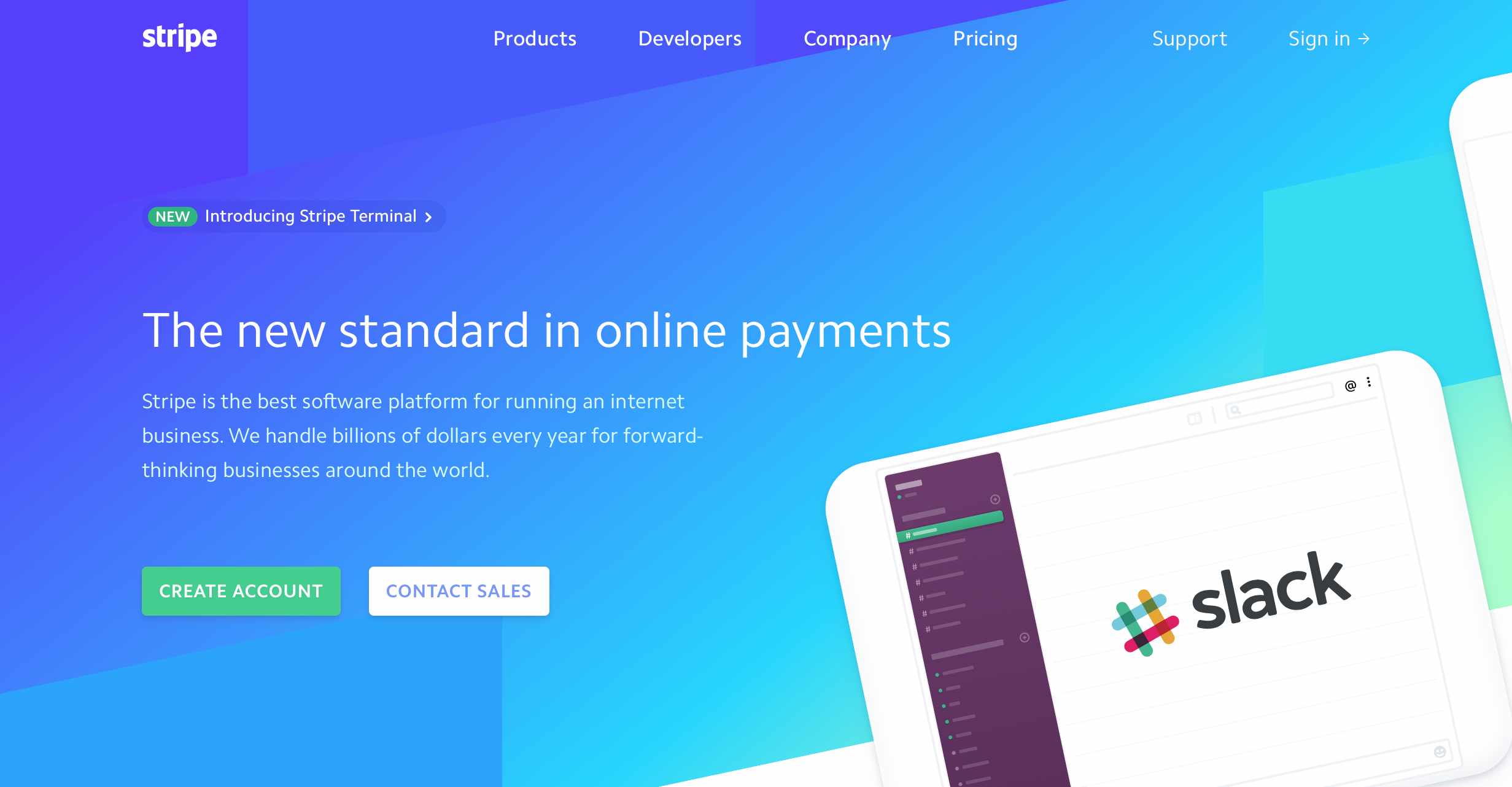
The main menu on the Stripe website is located at the top of the page.
While the primary menu will work fine for small and mid-size websites, websites that have a lot of levels of depth will need additional navigation that will support users in the journey. That’s a perfect case for breadcrumbs. Breadcrumb is a pattern that shows a user’s path from the home page to the current page.
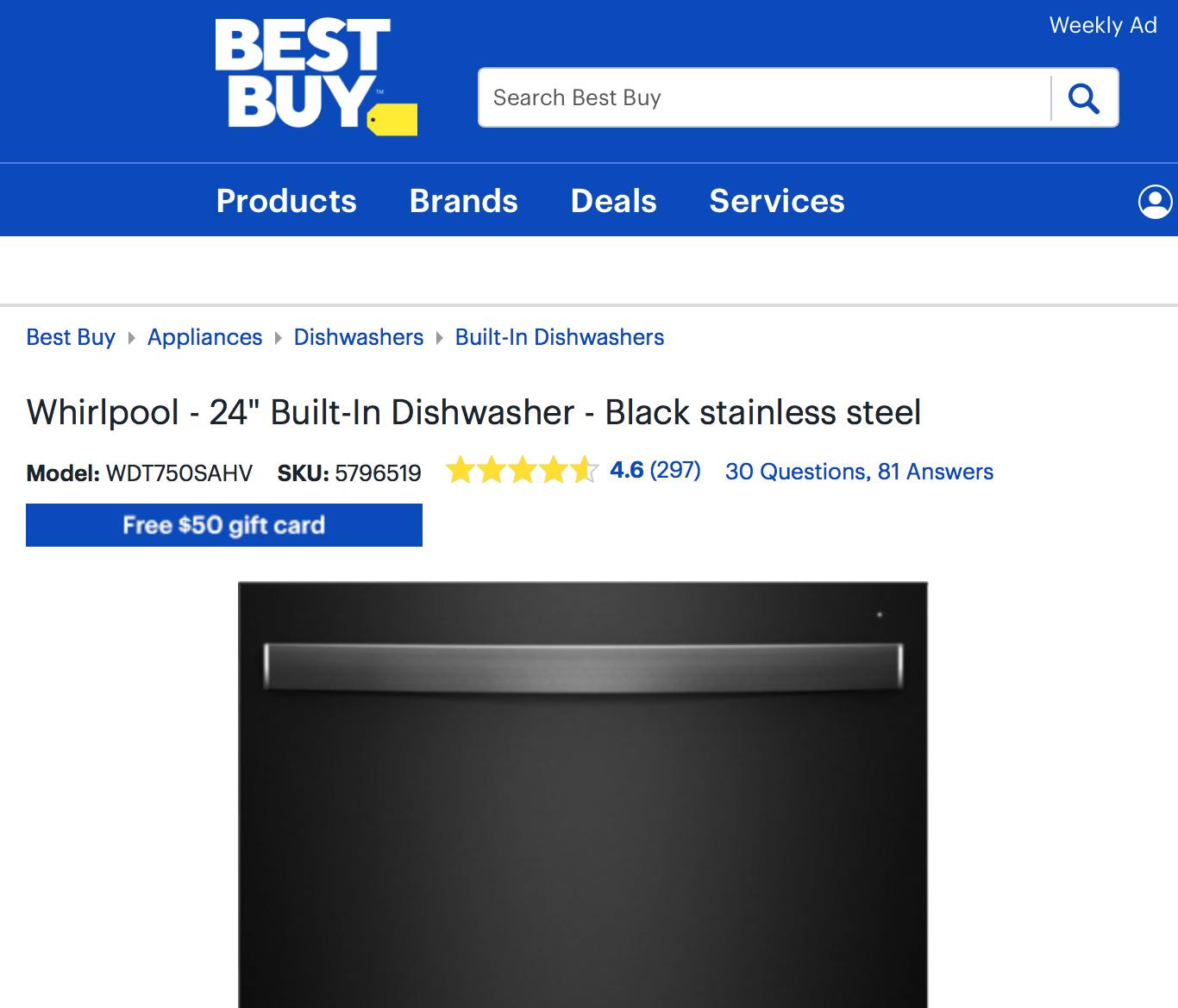
BestBuy uses breadcrumbs to simplify the navigation for their users.
UX patterns are tried-and-tested solutions for a particular kind of problem. Thinking about how to incorporate UX patterns in design makes the designer focus on the core objective of design - creating the best possible experience for their users. Introducing patterns in product design helps to reduce a user’s cognitive load and ultimately makes the user experience better.
 Mockplus RP
A free prototyping tool to create wireframes or interactive prototypes in minutes.
 Mockplus DT
A free UI design tool to design, animate, collaborate and handoff right in the browser.


 Sign up with Google