A good homepage tells your visitors who you are and what you do, and also guides them to explore more on your website.
However, the situation can be really ironic sometimes: websites designers wonder why visitors leave your homepage so ruthlessly, while users feel disappointed even at the first glance on your homepage.
Actually, the bridge between designers and users seems destroyed. So my intention in this article is to rebuild the bridge by providing useful materials - 35 of the Best Website Homepage Design Examples. I hope you can use this content as a big inspiration.
Table content:
35 Best Website Homepage Design Examples
10 Websites Homepage Design templates
5 Homepage Design Tools
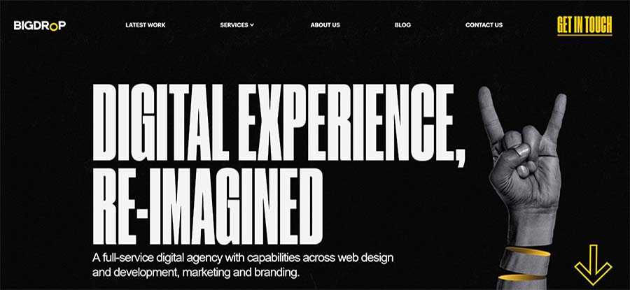
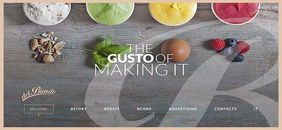
The typography on this website is very practical and frequently-used. It is simple, yet powerful. The bold typography is the best-suited homepage style for a simple, clean and creative website layout.
Yellow is one of the most vibrant color that draws the eye, but it can be tricky to use in web design. While Bigdropinc is a big success because it worked out with this uncommon color.
The brightness of yellow is so strong to capture attention, distinguish Bigdropinc from competitors, and achieve a great balance with its black and white background.
But what I love most is the unique animations. The neatly animated elements make this website stand out from the crowded. Just scroll down, you’ll see more and fell in love with them too. The parallax effects and micro-interactions are also super amazing.
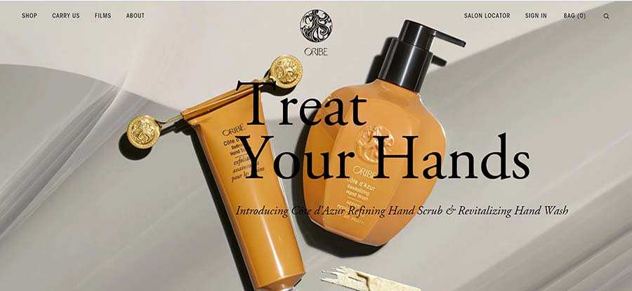
Oribe not only owns the best-selling and award-winning brand but also has a website that sparks deep connections with its consumers.
As the website says itself, it is for “those were the classifications found in all beauty categories except hair care”.
But how do you explore all the beauty categories?
You will figure out once you see the nicely designed homepage of Oribe. The automatically displayed background images or videos will show you their main products of various beauty categories, one-by-one and each with specific cope that keeps the focus on their product.
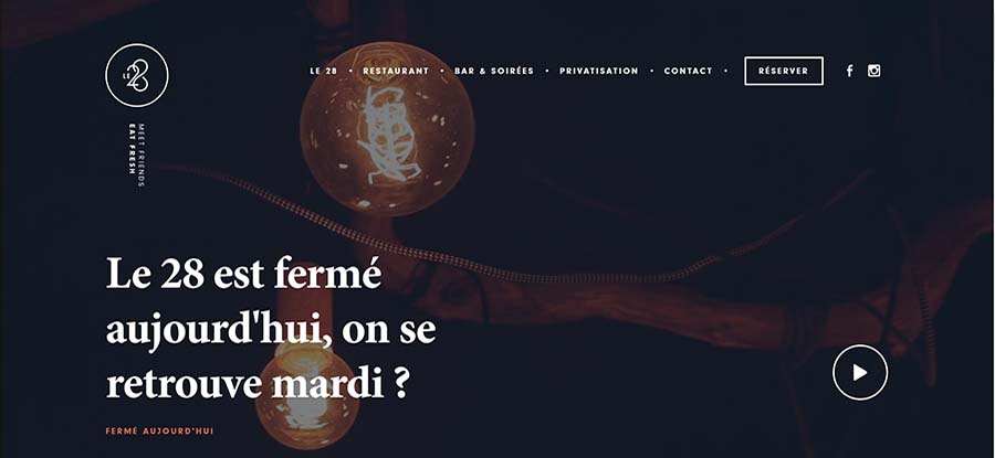
LE28 LILLE has a compelling, memorable and well-designed logo. It goes with the most popular way to be in the top-left corner of the screen. With only 3 minimal elements, the logo conveys the brand identity strongly and clearly.
I also like the responsive and animated navigation bar very much. With its stylish logo, useful CTAs, and necessary social links, it creates a more friendly user interface and shows more information.
The white main text and other copies contrast with the black background. The call-to-action button also features a hover effect. It changes the color and that looks very attractive and vivid.
In addition, you can watch the background video if hit the play button.
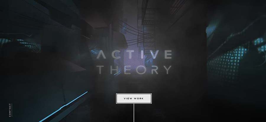
Activetheory is a studio building creative digital experiences. This one-page website is very unique and uncommon. It has a cool, creative countdown timer loading animation. This can totally delight me while I was waiting.
The centered text is very short and bold. It expands the character spacing and line spacing and makes only the core information stand out.
Activetheory is also a highly creative website with its amazing liquid mouse hover effect and button hover effect. Also, it adopts a cinematic way to shows the UI. You will feel like you are walking slowly through a narrow, deep, and mysterious old street.
If you want to get in touch, do not forget the hidden contact button on the left-bottom corner. It will pop up when you hover.
For more inspiration, check our 10 Best One Page Design Templates: Creating a Perfect Single Page Web.
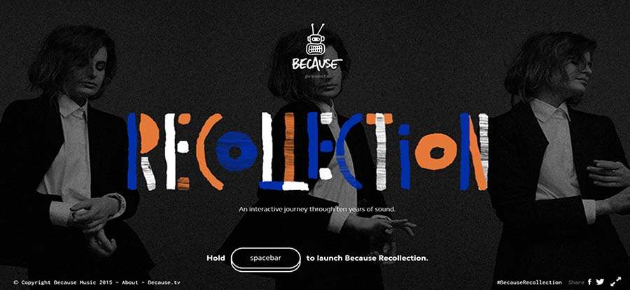
This website is super cool! Because of its 10th birthday, it presents a music interactive experience, which you’ll be informed on the loading page. So just put on your headphone and enjoy! The music is awesome.
Besides, I love these simple, interactive, flat-style illustration icons. They are so cute.
The whole website is highly interactive with cool animations. With the deep, sophisticated black background, all the colorful interactive elements became more vivid and vibrant.
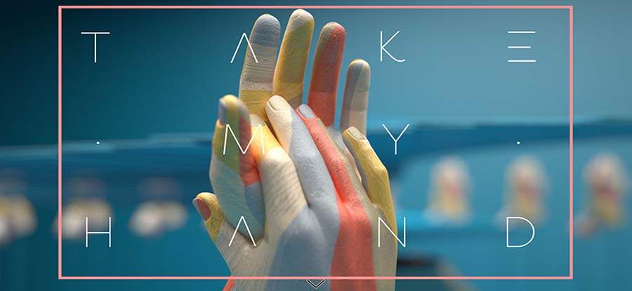
Sehsucht is very interesting. It features a beautiful, simple first screen, but when you scroll, all the content became highly interactive with amazing parallax effects.
The centered text “take my hand” has a unique, light, and beautiful typography. The letters work perfect with the other elements and create a nice UI.
I can not take my eyes off the high-quality big photo when I first land the website. It shows two hands with colorful paint touching to each other, and also has a warm background shadow effect.
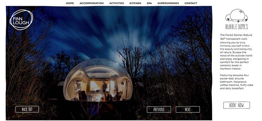
Finnlough uses the 2-column layout to display its content. On the left is a set of nice picture carousel as the hero images. Each keeps the focus on the theme of the website and creates an emotional connection with visitors. On the right column is a brief introduction of what this website does. It uses nice typography and an engaging CTA to lead users to BOOK.
Also, there are 3 equal CTAs on the hero images section, one for back out, one for previous, and one for next — that use handwriting typography and hover effect to draw the eye.
If you want to know more about website layout, I believe the 9 Best Website Layout Examples and Ideas for Web Design can be a great inspiration.
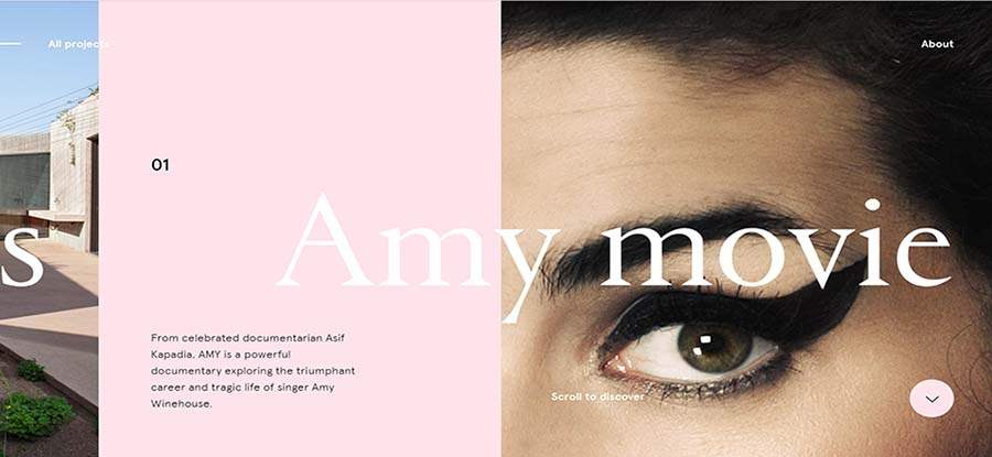
Oursroux is a personal website designed by a French designer who specialized in Webdesign, identity and interfaces design.
This website also has a nice picture carousel as the hero images. Each featured image is the presentation of his design project. You can click to check the details.
In addition, the multi-column layout features more asymmetrical beauty. To avoid the interface being over scattering, it has bold typography to link the 3 columns together.
And I also love the color scheme of this website. It is amazing, bright and powerful that will attract your eyes immediately. The horizontal parallax effects add more highlights to this website.
This website features a nice loading effect and nice food photography carousel. These high-quality and beautiful images will definitely return your appetite when you looking at them. The use of visuals is very effective and impressive.
It also offers a modern navigation menu, which is not on the top, but on the bottom of the first screen, as well as in line with the logo.
The centered text is a beautifully mixed typography with bold fonts and light fonts, which helps to make the key information stand out.
The best? When you scroll to the next screen, you will experience a fullscreen overlay navigation menu when click. Each has a link hover effect to guide you view more detailed pages.
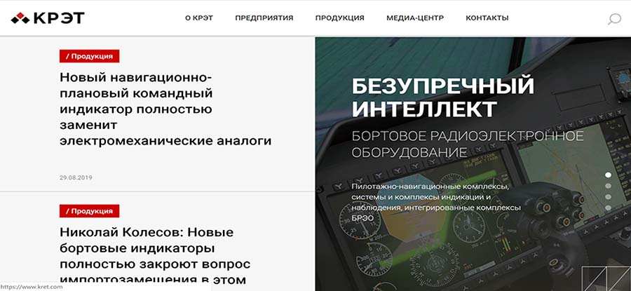
Kret is a very basic website design example. It features a sticky header for the navigation menu. When you scroll down the navigation always shows on the top of the page. And it also has a nice animated text underline effect.
The main screen has a split layout, which offers two main sections of equal importance simultaneously. The contrast is obvious, not only to the visual side - that one uses white space while the other has phototypography transparent background behind the text but also to the interaction - that one has the dot navigation while the other has overlay hover effect.
In addition, the navigation bar holds a search icon, allowing users to search the overall website.
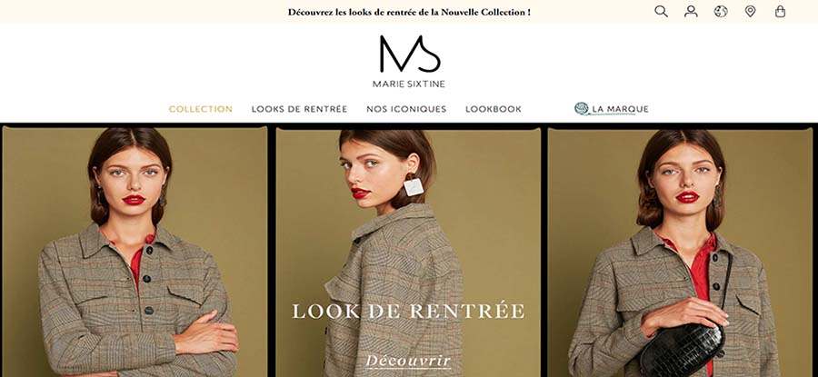
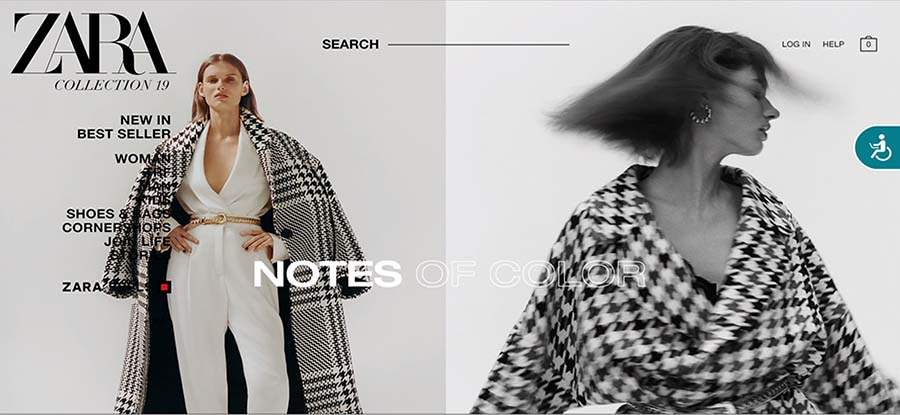
One of the most elegant websites I’ve ever seen! Just love the designs and the beautiful models!
Leave aside it's aesthetic appealing, this website is also extremely user-friendly. The universal navigation bar is highly responsive and animated. And it also contains a drop-down panel with nice images to display the detailed items.
There are 3 minimal, flat-style illustration icons to show you more options. You can search openly all the items on the website, check items off your chart and etc.
Also, the centered logo “M”, which represents Marie Sixtine, is well-designed, simple, sophisticated and powerful. Marie knows its target audios are female consumers, so it uses a light font that conveys a more feminine vibe.
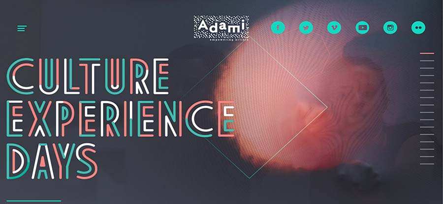
This website highlights its social icons with a nice hover effect and micro-interactions. Adami, the owner of this website, wishes visitors to share his works. Put social links in the header navigation is wise if you have a social-oriented brand.
Here is a hidden menu on the left-top corner. It has a hover effect and will show you information when you click.
Speaking to the vertical dot navigation, Adami uses short lines to replace dots, which works more perfectly with the text and other UI elements. The color scheme is also brilliant - the combination of origin, green and white adds more personalized identity to this website.
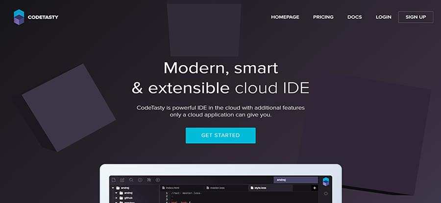
Codetasty is modern, smart and trendy. The interactive transparent background works perfectly with the copy, CTAs, and all the other UI elements.
The text and sub-text are simple, straightforward, and powerful. It’s an appeal to the visitors' emotional side.
The CTA button with the blue background and white text also has strong overlay hover effect. It tells visitors clearly what they should do next. In addition, The animation is amazing, when you scroll to explore more, the featured image “PC” will close itself.
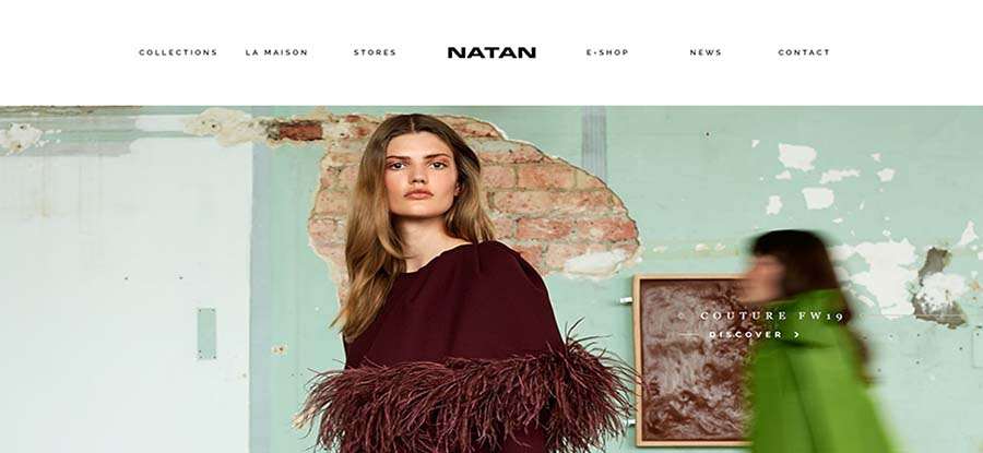
Natan's homepage features super simplicity and minimalism. All you can see is clean navigation with animate text underline effect and one full-screen photo.
With large, high-quality photographs with light overlay effect, Natan keeps the focus only on their product.
And there’s one thing interesting, that when you scroll back, the navigation bar will be stuck to the top at the screen. Usually, we use the top navigation sticky bar when scrolling down, Natan goes the other way.
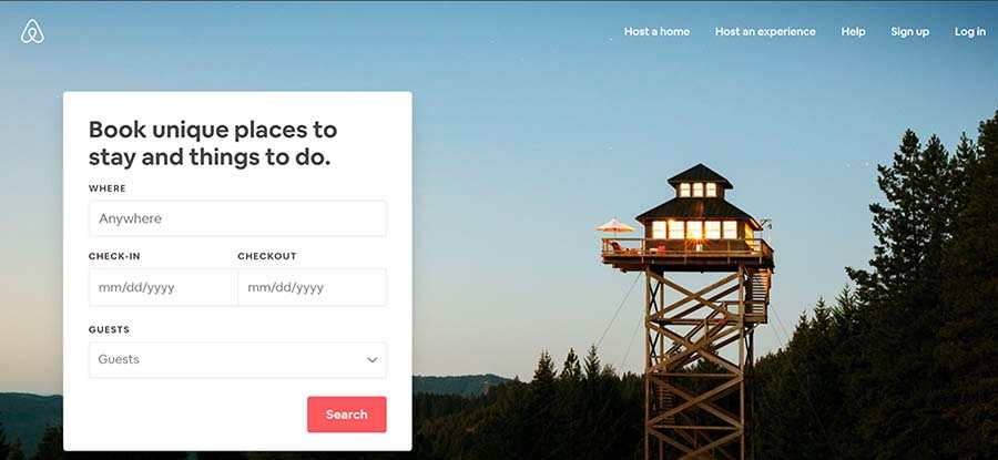
Book unique places to stay and things to do? Go to Airbnb.
Airbnb has a simple yet powerful homepage. It has one big hero image to display the brand identity and create an emotional connection with visitors, one simple navigation to offer options, and one simple form that you can input the destination and date.
The primary call-to-action with the red background and white text contrasts with the background and stands out.
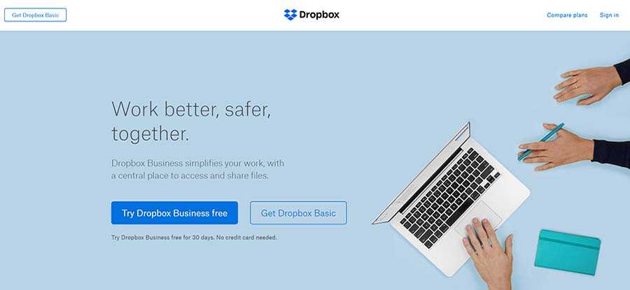
Dropbox has a website that can serve as the ultimate example of simplicity to business website design. The featured image with fixed text and sub-text is powerful to display the brand identity.
There are 2 call-to-action buttons with hover effect, each of them has supporting cope to tell you what you can do next.
Dropbox also has a sticky navigation bar and a “Compare plans” for the target users to choose.
The footers of Dropbox offers lots of useful links to its main pages, as well as a“Try free for 30 days” button above it. All these designs will generate a better user experience.
Are you still confused by the question that how do you make a business homage? Then maybe the best advice I could offer is to learn from Dropbox!
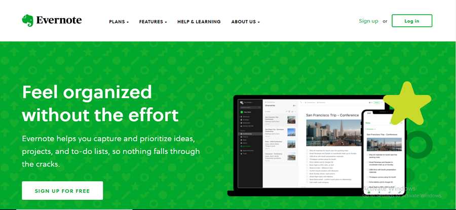
Evernote features a super simple and clean website. It has limited use of copy, visuals and other UI elements, and contains whitespace to an extremely large scale.
The first screen was slipped into 2 parts, on the left is the text that shows directly what Evernote is, and the right is the Signup form.
Evernote also offers a one-click signup process through Google. This is very friendly t Google users and will help them save time.
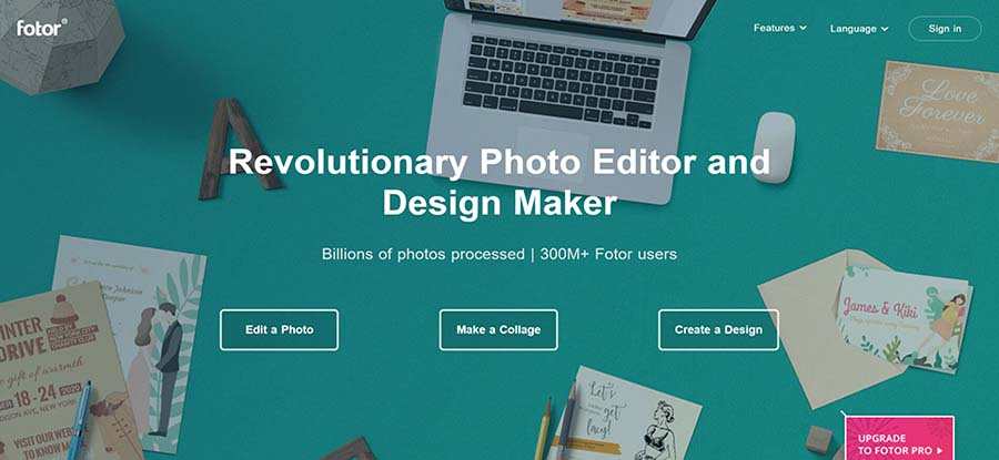
Fotor is revolutionary photo editor and design maker. Fotor says it itself by displaying high-quality and matched images with the supporting copy on the homepage.
Unlike the other photo editing website, Fotor has 3 compelling CTAs with giving equal weight, you can freely choose what to do next.
In addition, it has a sticky top navigation bar features a drop-down menu.
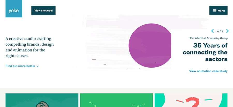
Yoke is a creative studio compelling brands, design and animation for the right causes. This website is clean and simple. Not like the others, it doesn’t hold a navigation bar, instead, it has a fullscreen overlay navigation menu.
I love all the illustrations o this website, either they are interactive, or they have strong overlay hover effect. You can click to check detailed information.
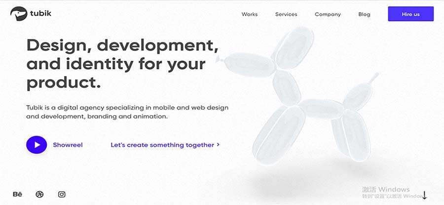
Tubik is a full-stack digital agency with all the specialists required for the efficient creative process from scratch.
It is a simple and clean website. The cope in bold typography says strongly what this website does - Design, development, and identity for your product.
I love the floating cartoon background. It seems like this cute cartoon animal is greeting with you.
In addition, you can display the video if hit the play button. Also, there are social links to get in touch.
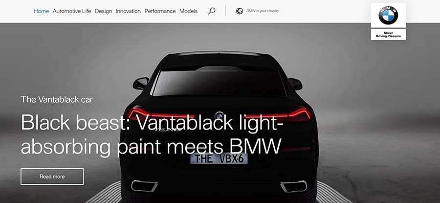
BMW is a famous car brand. Its homepage presents high-quality typography to draw the user’s eye and convey its brand.
There is a search button on the navigation bar. You can quickly find any of your desired cars. BMW is a world-known brand, so it provides an option to help you find BMW in your country. This is very user-friendly for BMW-lovers from all over the world.
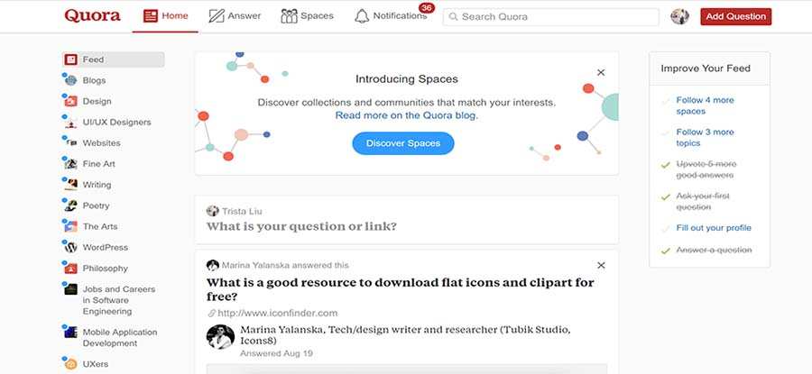
Quora is a place to gain and share knowledge. It enables you to ask questions and connect with people who contribute unique insights and quality answers. Therefore, you must need an easier way to search answers, ask questions and post your thoughts.
Well, on the stick navigation bar, there is a big search box for you, as well as a fixed, compelling CTA - using a contrasting color for you to add a question.
Quora’s homepage has a 3-column layout - only the centered column is scrollable while the left and the right part remains static. And the notification shows you how many informations you haven’t read.
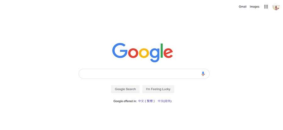
Google is the world most powerful search engine. I Google everything. With the logo and a big search button, Google gives me everything I was looking for.
Google’s homepage adopts a very simple design. It limits its use of copy and leaves a lot of whitespaces. And there is an icon to remind you to search by voice. In addition, it shows your language options due to your locations.

The University of Oxford is one of the leading universities in the world. Its homepage uses a high-quality photography to showcase its distinctive collegiate structure.
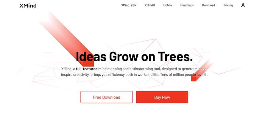
XMind is a full-featured mind mapping and brainstorming tool. I love Xmind not only because it helps me to brainstorm, but also for the beautiful homepage design.
There are lots of beautiful illustrations to show the main features of Xmind is a vivid and persuasive way. This also makes this website has more digital and technological sense. This website also has 2 main CTAs to lead visitors where they should take the next step.
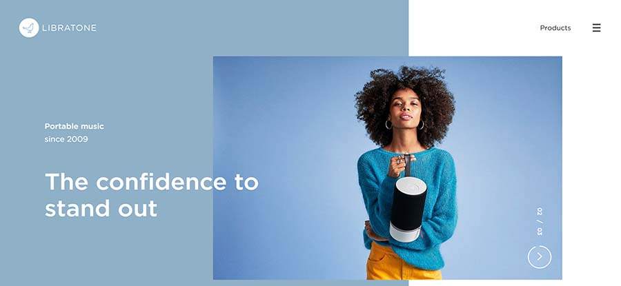
Libratone is the powerful speakers & headphones brand through cutting-edge technology. Its homepage uses an asymmetrical layout. There are 3 different types of image carousel, each with a harmony color scheme.
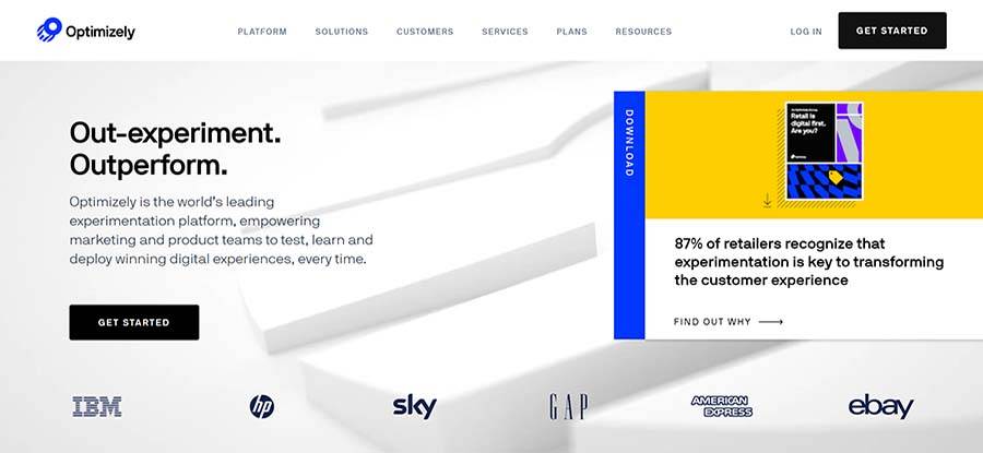
Optimizely has a universal sticky navigation bar, hovering on each will pop-up more related options.
The animations with parallax effect are amazing. When you scroll down, the main image on the first screen will be hidden and became a vertical navigation bar. It also has a fixed CTA to lead the user.
In addition, Optimizely shows how they can help you to do marketing and growth by showing a mindmap. This makes this site more trustworthy.
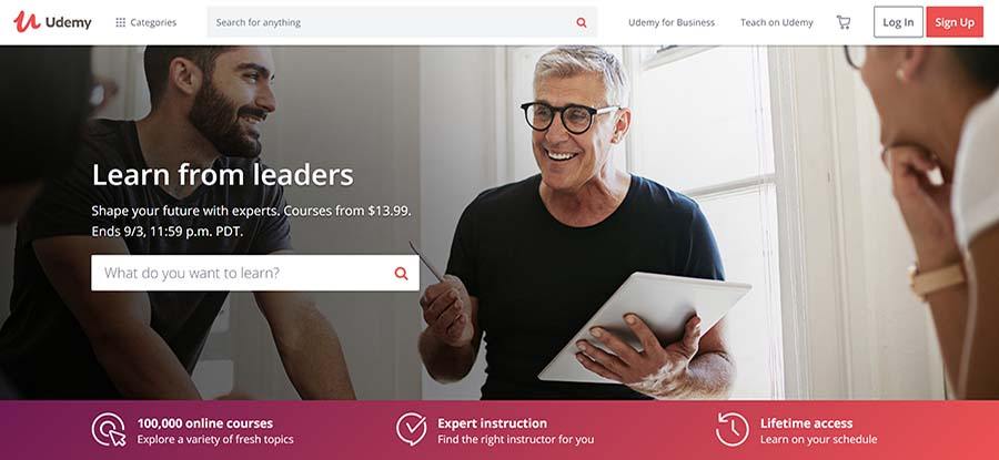
Udemy put emphasis on the search box.one is on the navigation bar, while the other is on the first screen, they really want to make sure that you can search any courses you need.
There is a powerful Hamberger categories icon on the left-top corner, which contains all kinds of courses you may need.
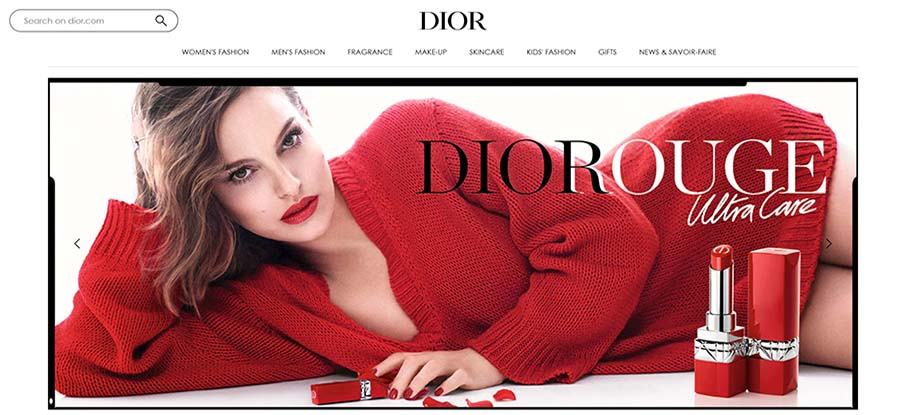
DIOR’s official website is elegant and appealing. Ther e is one big photo to display the brand identity and attract the user to explore more of their products.
The universal navigation bar has pop-panel to display the details of items. It also features a big search box. What’s special is that the footer has vertical navigation.
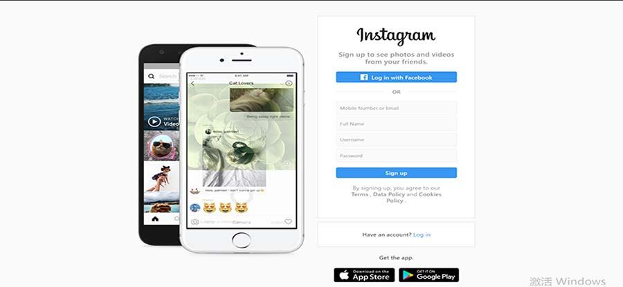
Instagram is a photo and video-sharing social networking service owned by Facebook. Its homepage is super simple. There are only one photography and a signup form on the official website. You can signup via facebook and download the Instagram app by hitting the download options.
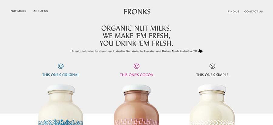
The typography on this website is very practical, bold and attractive. This minimal and simple one-page website uses a layout of large header-width box with a few smaller boxes to present the products. The 3 main items also feature micro-interaction when hovering.
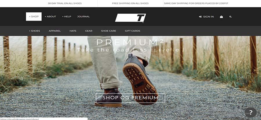
Truelinkswear has a motivation that started us in 2009 is the same today - helping you to enjoy the walk.
This website has one big photo with clear CTA to keeps you attracted to their product and then take the next step t purchase. The navigation bar is highly responsive and powerful with hover effects. And it will become more visible with a color-changing animation.
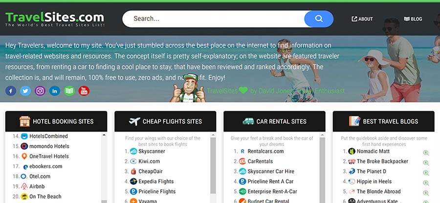
Travelsites is a navigation site for those who love to travel. This site features a big search button and. You can definitely everything you need about traveling, hotel booking sites, cheap flighting sites, car rental sites, etc. Also, there are lots of social share links, you can share anything you find useful to your friends.
This website has fixed vertical navigation and a big search box with an overlay effect. You are able to find anything you want effortlessly. Besides, with the large scale images, minimal style, and high-quality photography carousel, you are able to see all the newest and hottest items.
The most special part is that it has an Accessibility Options Menu, you can open it and makes the site compatible for screen reader users.
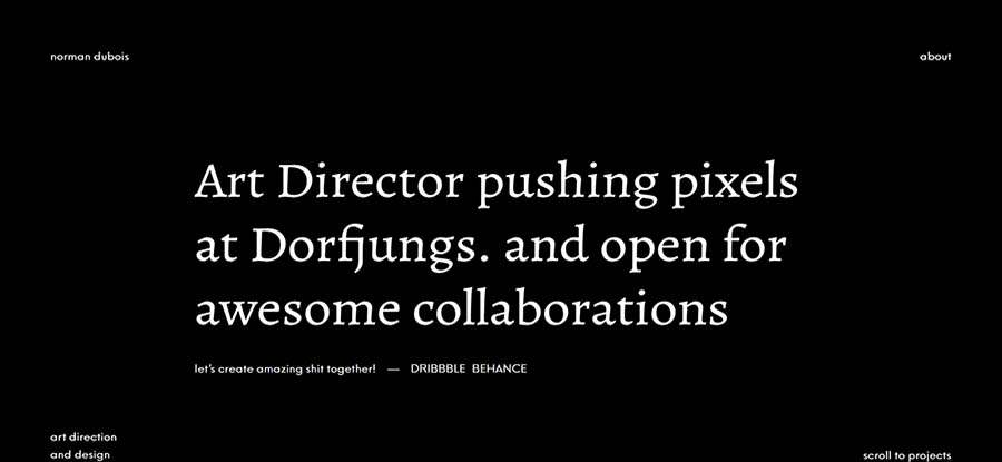
“Yo, nice to meet you!”These are the nice greeting words you’ll see when the website is loading. Normandubois is a personal website owned by an Art Director from Germany, who is pushing pixels at Dorfjungs. His site is very sophisticated. Everything is in black and white.
Well, to help you fasten your homepage design speed, we also offer you 10 websites homepage design templates.
Format: PSD
Innota Agency is a business homepage template. If you have a multipurpose agency, this template is perfect for you. It combines minimal and perfect grid design with functionality and usability. There are 32 PSD files included in total, all of which are fully layered and customizable.
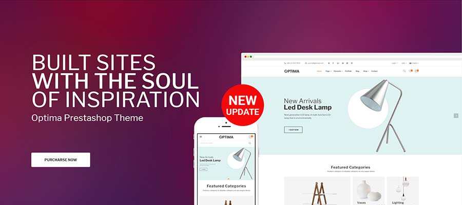
Format: PSD
Optima is a multipurpose responsive Prestashop 1.7 theme. It is compatible with Bootstrap 4.x and Bootstrap 3.x. Optima has 43 well-designed, colorful, and amazing templates, including digital, furniture, fashion, kids, tools, organic template. You can design any types of the homepage with this strong and powerful theme.
Format: Layered PSD, CSS files, JS files
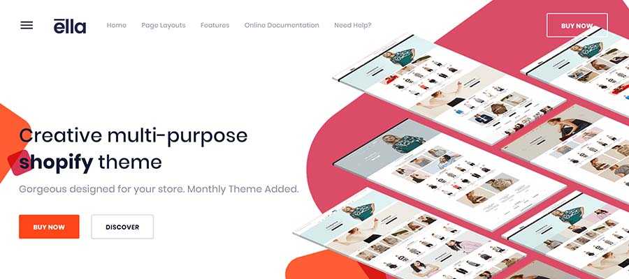
Ella is a responsive Shopify template, and it is sectioned ready. It features responsive layouts, modern design styles, well documented and incredible mobile optimized. In addition, it has 15+ homepage layouts, 07+ stunning Shopping pages, and 09+ product pages.
Format: PSD
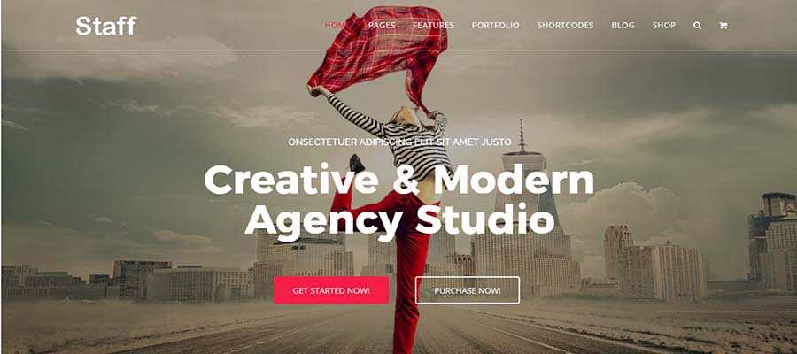
Staff is a responsive, simple, clean and professional Joomla template. It comes with 10+ homepages, a lot of inner pages, awesome slideshows and color variations. Staff also features easy-to-customize layouts and designs. This template is specially created for business.
Format: HTML files, CSS files, JS files
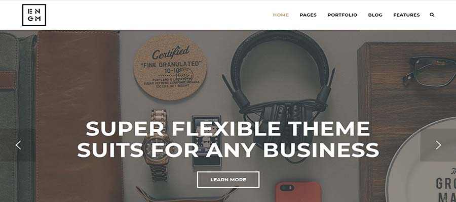
Enigma is a creative responsive HTML template with simple and minimal style. It features amazing flexibility and responsiveness, as well as compatible with Bootstrap 3.x and all mobile devices. This template is perfect suits for companies, creative agencies, freelancers, photographers, personal portfolio, creative minds, blogging and for landing pages as well.
Format: CSS files
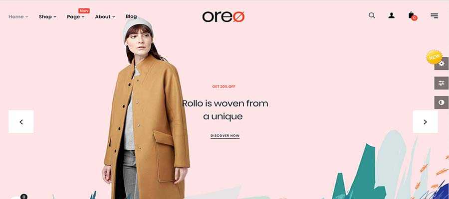
Oreo is a responsive fashion store and decor Prestashop template. It has both a bright background and clean layout to highlight your products, and the animation effect is flexible. It also features SVG icons, a social block, SEO optimization, multiple language support and compatible with Prestashop 1.7.x.
Format: Layered PSD, PHP files, CSS files, JS files, PSD
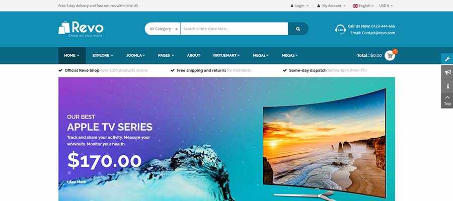
Revo is a multipurpose website homepage template. The homepage is elegant, beautiful, and can perfectly fit for any eCommerce website. You can easily build and customize your online shop with lots of awesome features built-in. Also, it is fully responsive and looks delightful across different devices and screen layouts as well.
Format: PHP files, HTML files, CSS files, JS files
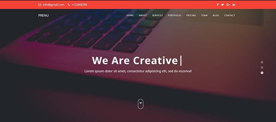
Prenu is a one-page business HTML homepage design template suitable for any creative. It features a simple, clean and minimal user interface, fully responsive and customizable. The unique and modern designs, animations and responsive dot navigation bar will definitely help you to drive success in your business.
Format: PHP files, HTML files, CSS files, JS files
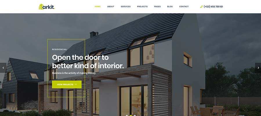
Arkit is the perfect HTML homepage template for architecture and interior website designs. Based on Bootstrap 4, this template is fully responsive and is easy to customize. It also features a clean and ultra-modern design.
Format: layered PSD, PHP files, HTML files, CSS files, JS files, PSD
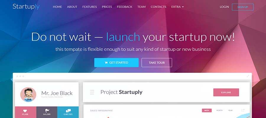
Startuply is a responsive one-page homepage template. It is built with Bootstrap 3.1.1 and fully responsive to any devices. The most appealing part is the smooth HTML5 and CSS3 transitions and animations. It is perfectly designed for all kind of startup or company.
With the useful design tools, you can work like charming.
Mockplus is a wireframing and prototyping tool with multiple functions. With simple drag-and-drop, you can create rapid low-fidelity wireframes. You can design your unique webpage by the rich components and interactions. You can start with an empty iPhone app or responsive website template, where you design everything in the app. Or, if you have a design you want to prototype and add interactivity, there are tools to import a project from or Sketch.
Sketch has gained a massive following since it launched in 2009. It is a professional vector graphics tool, which has bitmaps and a good page setup. It'll definitely do help to your web design.
Webflowis a web-based app. You can design a homepage without coding. It has a simple UI and an option to view the design at popular breakpoints, and a preview mode, which gives you full control over the viewport size. There are some familiar tools that allow you to design elements, but it's all drag-and-drop (there’s no drawing tool) so you are limited with what you can create.
Macaw was built with designers in mind, and without touching any code you can create responsive designs that look and work great across all devices.
A good product design collaboration tool is useful when you handoff your designs and collaborate with your team during homepage design. Mockplus Cloud is a powerful product design collaboration tool for designers and engineers. It facilitates handoff by taking designs from Sketch, Adobe XD, PS and exporting into a format that can generate code snippets, specs, and assets.
Conclusion
The great homepage design not only pleasures the users but also improve the site user experience and attract more users. Above are some of the best website design examples selected by the Mockplus team. Hope that can provide you inspirations and help you achieve a better design.
 Mockplus RP
A free prototyping tool to create wireframes or interactive prototypes in minutes.
 Mockplus DT
A free UI design tool to design, animate, collaborate and handoff right in the browser.


 Sign up with Google