The first impression counts. As Will Rogers said, “You never get a second chance to make a first impression.” Studies have also shown that it only takes seven seconds to two minutes at most for a person to form their first impression. When it comes to the field of website design, this recognition process is even shorter. So, how can you grab visitors' attention at first sight? Well, you can always try to improve the layout of your website. To help you do that and provide you with fresh inspiration, I've listed 32 of the best website layout examples and popular design ideas. Let's check them out!
Website layout idea: a clear focal point
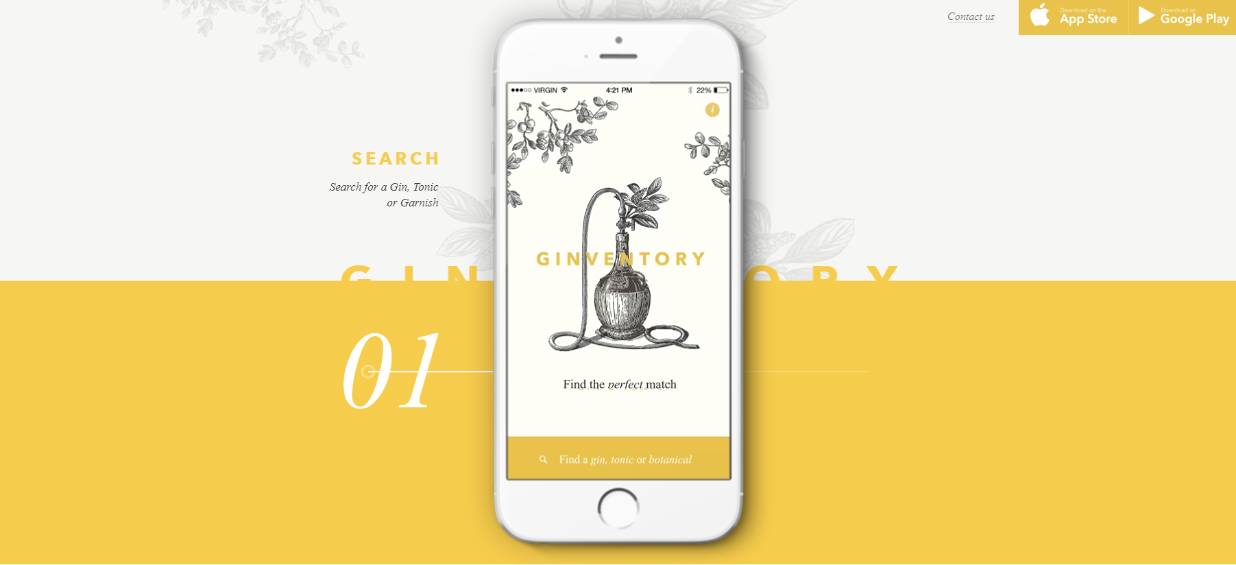
Ginventory is the most-downloaded gin and tonic guide in the world. When there is a clear focal point on your site, it will direct the attention of visitors to that point. You can put important information on those areas to highlight them. It's quite beneficial for designers to establish a clear focal point. You can use images, typography, bright colors, or other things to create a focal point. However, it might be hard to use focal points when websites are content-heavy. To showcase a service or product, it's always a good choice to make it the center of attention.
Website layout idea: Featured image to display the brand identity
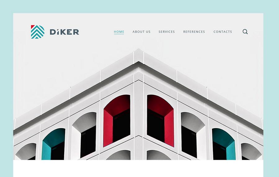
Diker is a Group of Construction and Architecture+Planning companies based in Berlin, Germany. The designer outlined the major characteristics and attributes of the brand identity. These were used as the basis for the overall website structure and architecture. Modern coding and testing techniques were used to ensure the usability of the website.
The design is not littered with excess elements, thus directing the user’s attention entirely toward the product.
Images provide an opportunity to create an emotional connection with visitors — a big, bold photograph or illustration of an object makes a strong statement and creates a stunning first impression. This layout is great when you need to demonstrate only one product/service and focus a user’s attention on it. If you want to design a site that can sell a product fast, then use this type of layout.
Website layout idea: design elements that match the brand and products
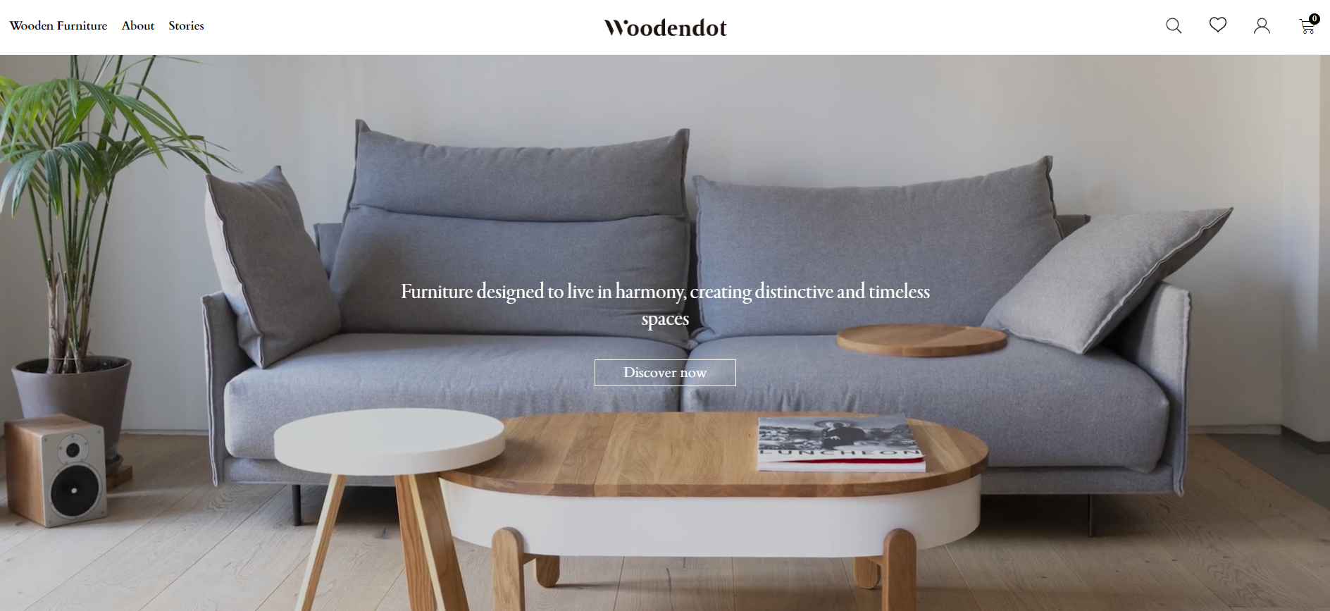
Wooden Dot is a design and manufacturing firm where you can find wooden furniture and lighting products. When you open this web page, the screen will turn from dark to bright. This design idea echoes the theme of its lighting products. The use of quality and full-width images also fulfil the purpose of promoting their wooden furniture. There are not too many words on this site. You can just find a few taglines on the images. It's the quality of photography that makes the layout work. Together with skilful echoing, this site provides a fresh and elegant feel.
Website layout idea: split-screen layout
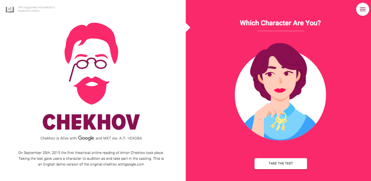
Chekhov uses a split-screen layout, giving two equal pieces of content the same importance. By putting two items side by side, the designer creates contrast, which acts as a great attraction grabber. The combination of bright colors and animations creates and provides users with a rich and dynamic experience. If your site needs to offer two drastically different variations of the user journey, then you might try to use the split-screen layout. But do avoid using too much content in split sections. Split-screen designs do not expand as well as content grows. Therefore, it’s better not to use this type of layout if you need to provide a lot of textual or visual information in split sections.
Website layout idea: text-based design
Impossible Bureau is created by a team of multi-skilled and curious digital specialists. Some designers are prone to using text-based designs because this method will make the layout clean and simple. This kind of design is primarily light on images with a solid-colored background. This type of layout can bring a clean and minimalist feeling. The layout of this website features large text on a black background. When you hover over any column, it will light up and change to a vibrant gradient. You can scroll up and down to show or hide a window.
Website layout idea: highly-immersive design elements
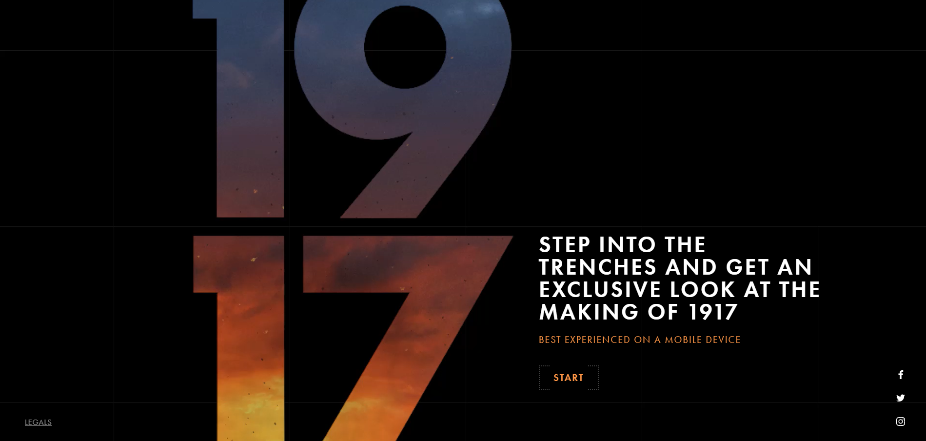
1917 is an award-winning website created to promote the film 1917. The layout has totally upended traditional design ideas, giving visitors an immersive experience. You can actually walk around the trenches and try to complete the same mission that the heroes did in the film. The highly interactive elements also allow you to check their maps and use other tools. It's a great example from which you can get some new ideas for your next project. Still, there is one thing you have to consider. This kind of layout will necessarily involve heavy design elements, which might be a double-edged sword.
Website layout idea: Parallax scrolling effect
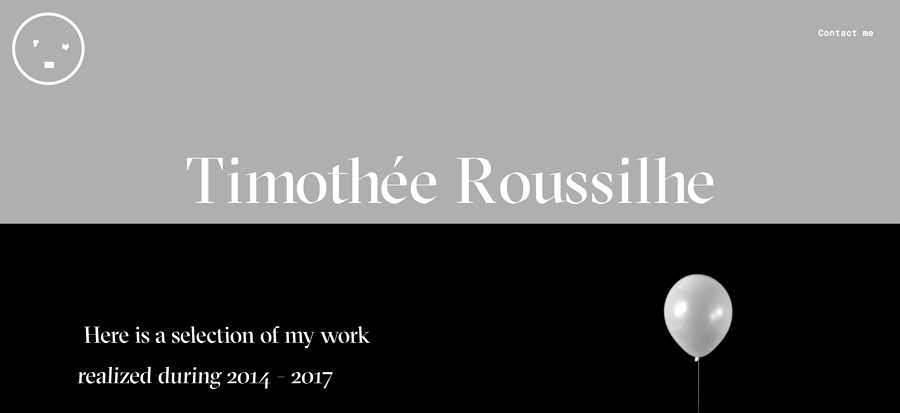
Time thee Roussilhe is the resume website of designer Timothee Roussilhe. It's simple yet creative. He adds a parallax effect to provide an impressive experience. As you scroll down, there are boxes moving in and out. What’s amazing is how all the boxes take advantage of the parallax effect; you feel like you are watching a movie while browsing the site.
If you want to design a website with cool factors, then use the parallax effect. But remember to keep the layout simple and use a clean color scheme to avoid a messy design.
Website layout idea: Fixed sidebar navigation
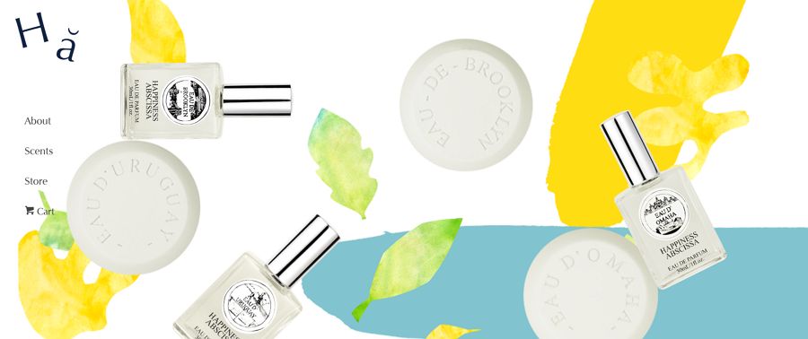
Happiness Abscissa uses fixed sidebar navigation to display the whole layout. The main menu is a critical element in user navigation. It tells the user where they are and where they want to go.
Usually, we see top-side horizontal navigation, but here, we see a vertical column on the left part as the sidebar. The key is to keep the bar visible and accessible while the rest of the page changes as users scroll up and down.
This site also uses a parallax effect. As you scroll down, the layout changes and just displays text accompanied by a single decoration.
If you are building a website that contains only a few navigation options, you might want to consider this layout. It can ensure all the options are in-sight as users go through your page. Also, you can add social media links, contact details, or any other information you want visitors to find easily on the sidebar.
Website layout idea: two vertical columns
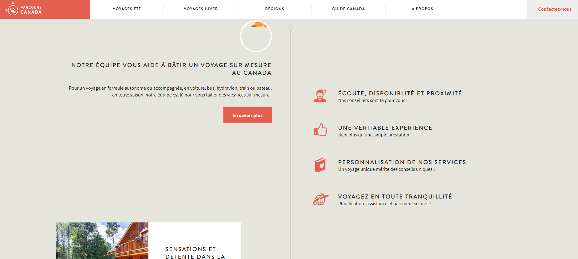
Parcours Canada is a specialized website for individuals and families to book trips. The website has the typical vertical scrolling design and arranges content into two columns. This helps users flexibly check information both on the vertical and horizontal directions in a more organized manner. Besides, when you hover over a travel package, the image will change and switch to another one. You can immediately check the travel routes on the map.
Website layout idea: balanced layout with refreshing gradients
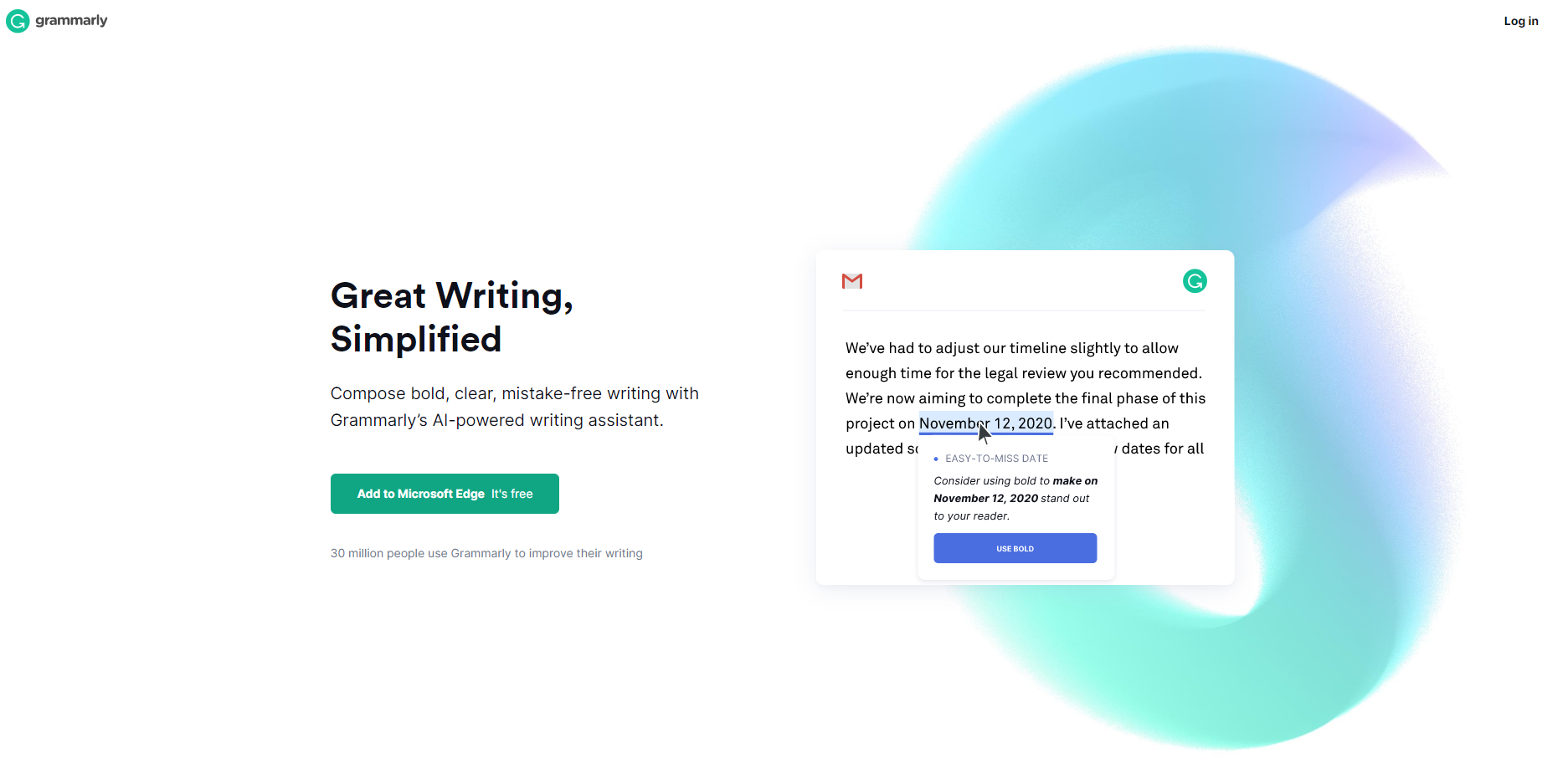
Grammarly is a useful digital writing assistant. The website has arranged everything properly. There is a sense of minimalist and symmetrical beauty in the layout. As visitors scroll down the home page, they get to know how this tool works and the reasons why they need the service. The use of gradients gives the layout a rather relaxing look. The gradient is consistent with the color of their logo. While the layout is relatively simple, the clean and minimalist layout still shows great power to capture the users' attention.
Website layout idea: modular layout
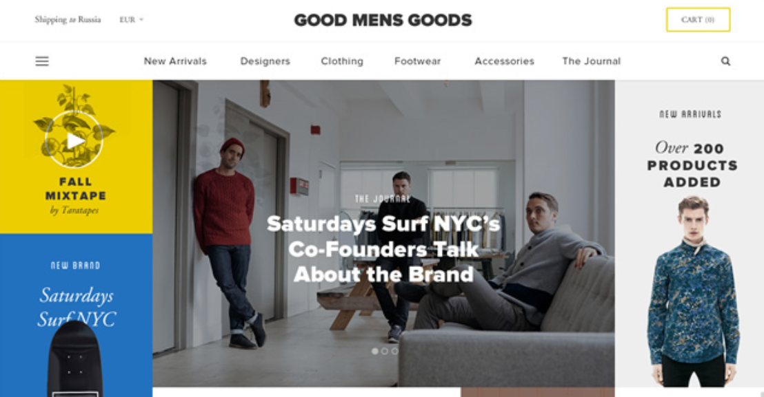
Good Mens Goods is from the designer Great Simple. The design takes advantage of a modular layout. This layout is also adopted by Google’s material design principles. Modular layouts, also known as card or block layouts are becoming increasingly popular. The kind of layout is completely different from a typical grid where each area of the site is put in a module or container. Compared to other layouts, this technique will create a streamlined look as the format could change to fit different display methods.
Website layout idea: stunning video and colorful elements
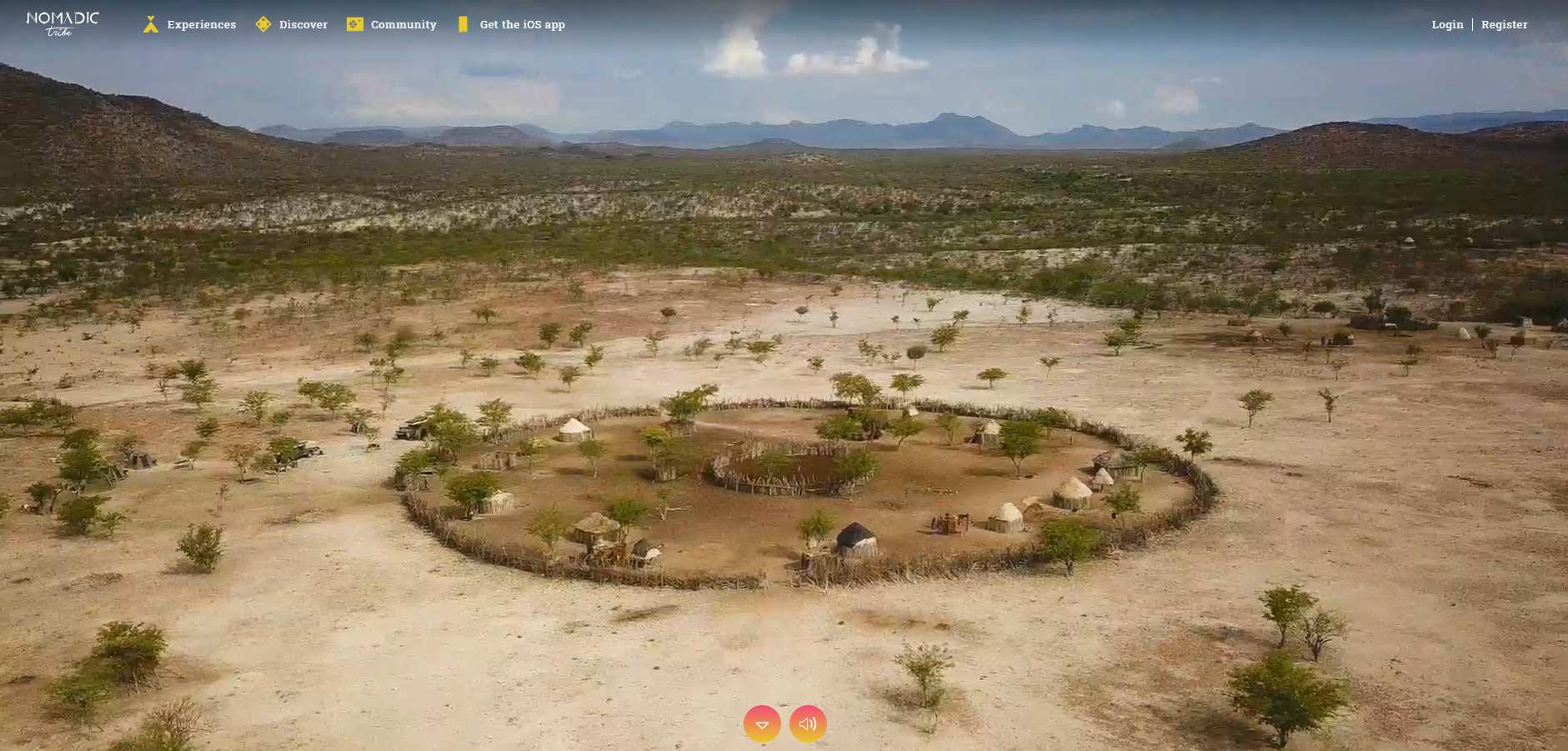
Nomadic Tribe is one of the most engaging websites I've ever seen. When you come to this page, you're embarking on an exciting journey with tribes and indigenous peoples and like-minded travelers. Apart from the stunning video, the fonts on this site are also dynamic and playful. Besides, the combination of different shades of pink, orange, and yellow made a huge difference. As you scroll down, there are several featured stories for you to check. The layout is well-arranged with clear logic and quality images.
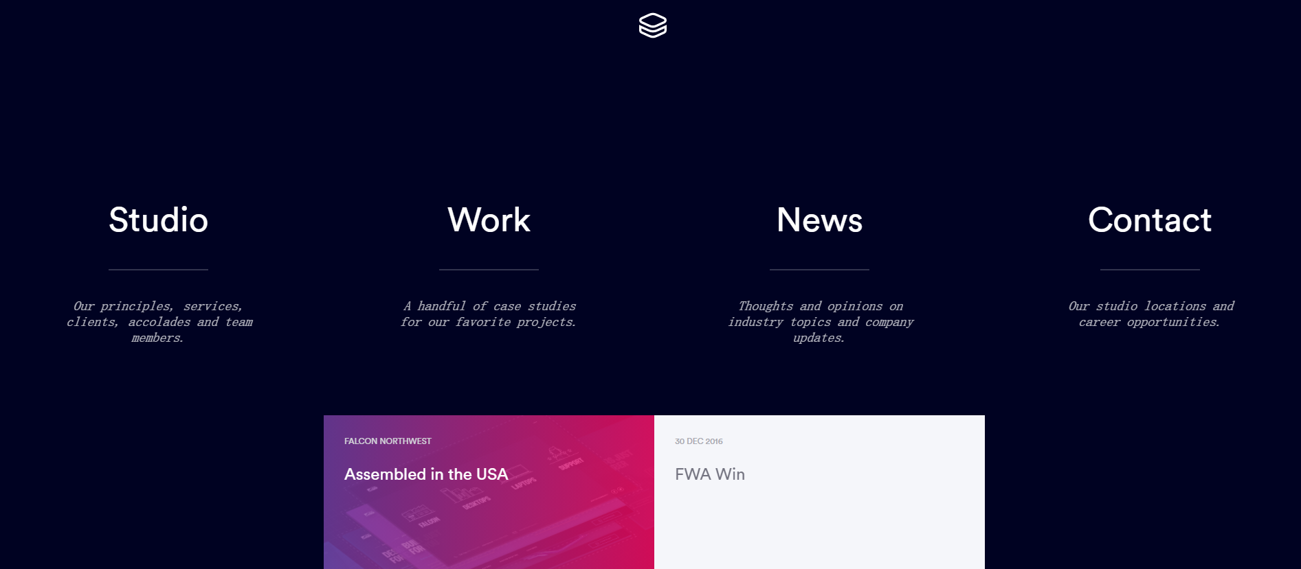
Website layout idea: A grid of cards
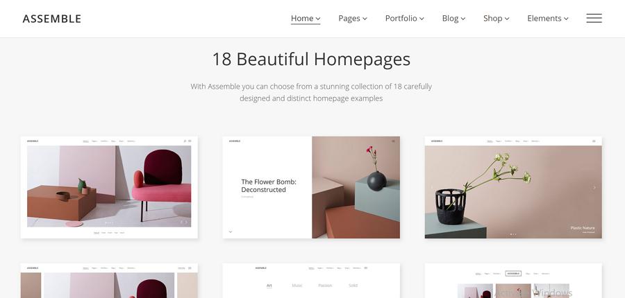
Assemble offers wonderful portfolio projects by using cards in a grid structure. Cards allow you to serve up a heavy dose of clickable information in a digestible manner. It helps visitors find the content they like and provide a way to dive into details by simply clicking or tapping the card.
This layout is also popular in responsive layout design. Grids of cards work excellently with various elements such as size, spacing, number of columns, and screens - with the ability to display a lot of items with equal hierarchy. So, if you have a content-heavy site, a grid of cards is a perfect choice.
Website layout idea: pixel-perfect images and terse description
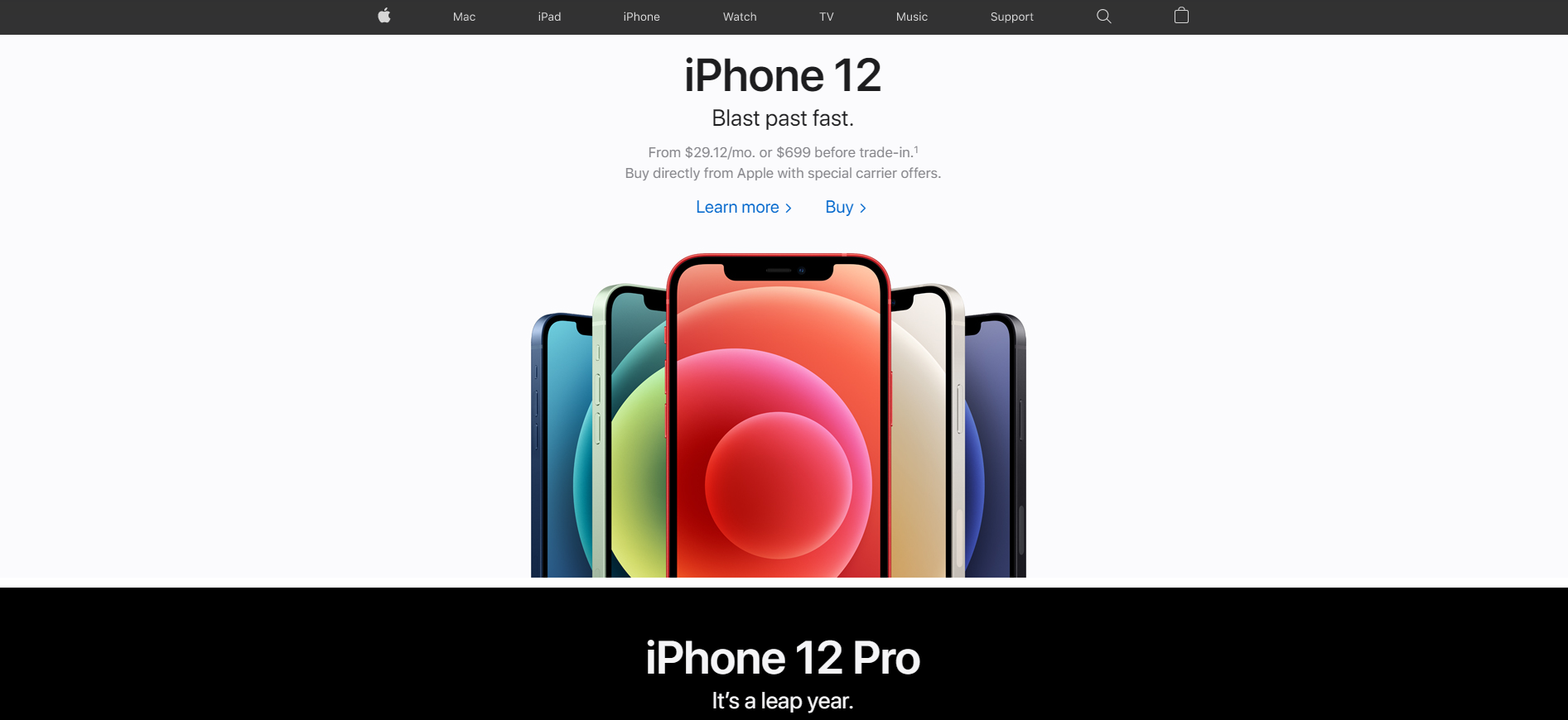
Apple is one of the best websites that have leading layouts. The combination of pixel-perfect images and terse descriptions brings out the best in each other. When visitors come to the home page of Apple, they are enticed to explore further on other sub-pages. On the top of the home page, there is a fixed navigation bar. This static menu makes it easy for visitors to delve into the interior of the website without an excessive amount of clicking and scrolling.
Website layout idea: simple links and clear headings
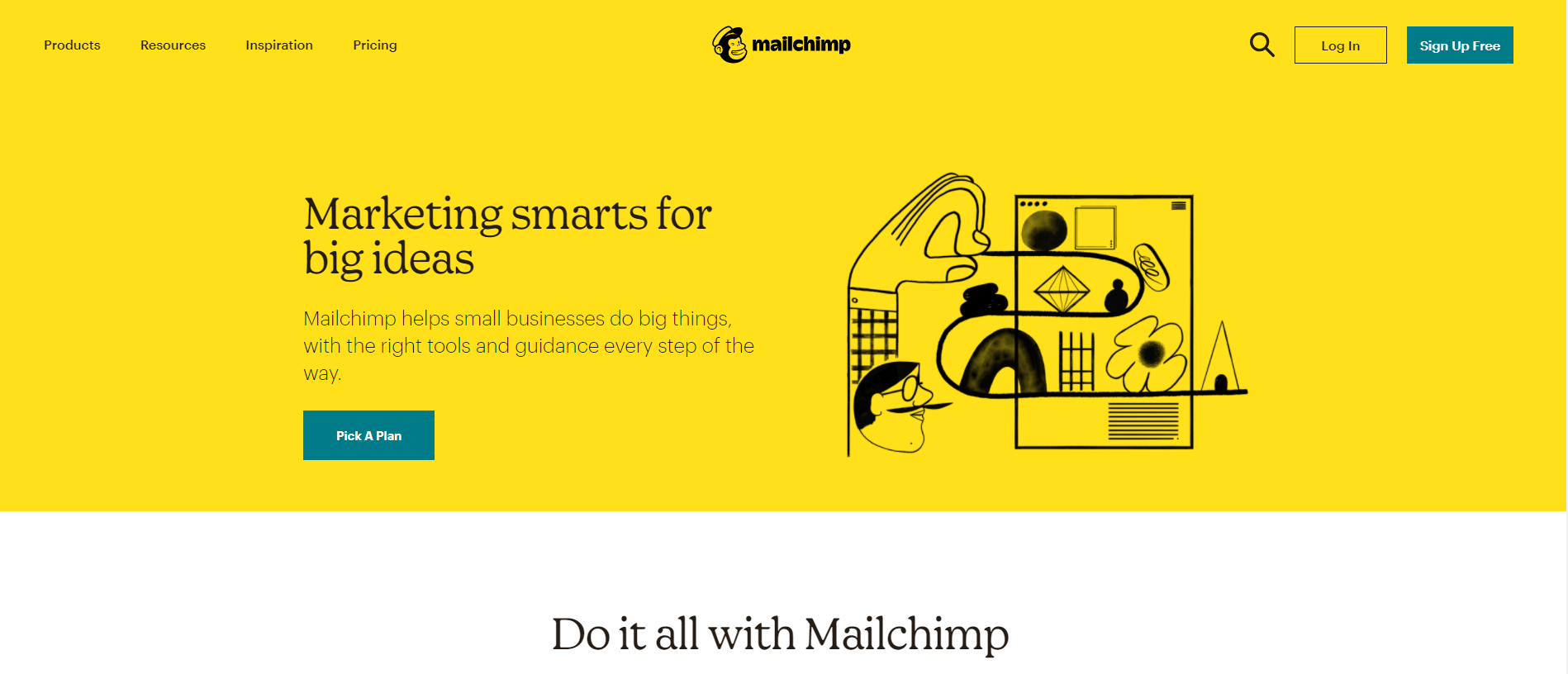
Mailchimp is one of the most famous email marketing services. The layout combines simple links with clearly-marked headings so as to make it easy for visitors to learn more. The colors are easy on the eyes. The white space between each element is also wide enough. The overall layout is easy to navigate. You can scroll down to find the information that you need smoothly. The images that this site uses are hand-picked. While there are many links, they are all properly arranged in different sections of the page.
Website layout idea: symmetrical layout
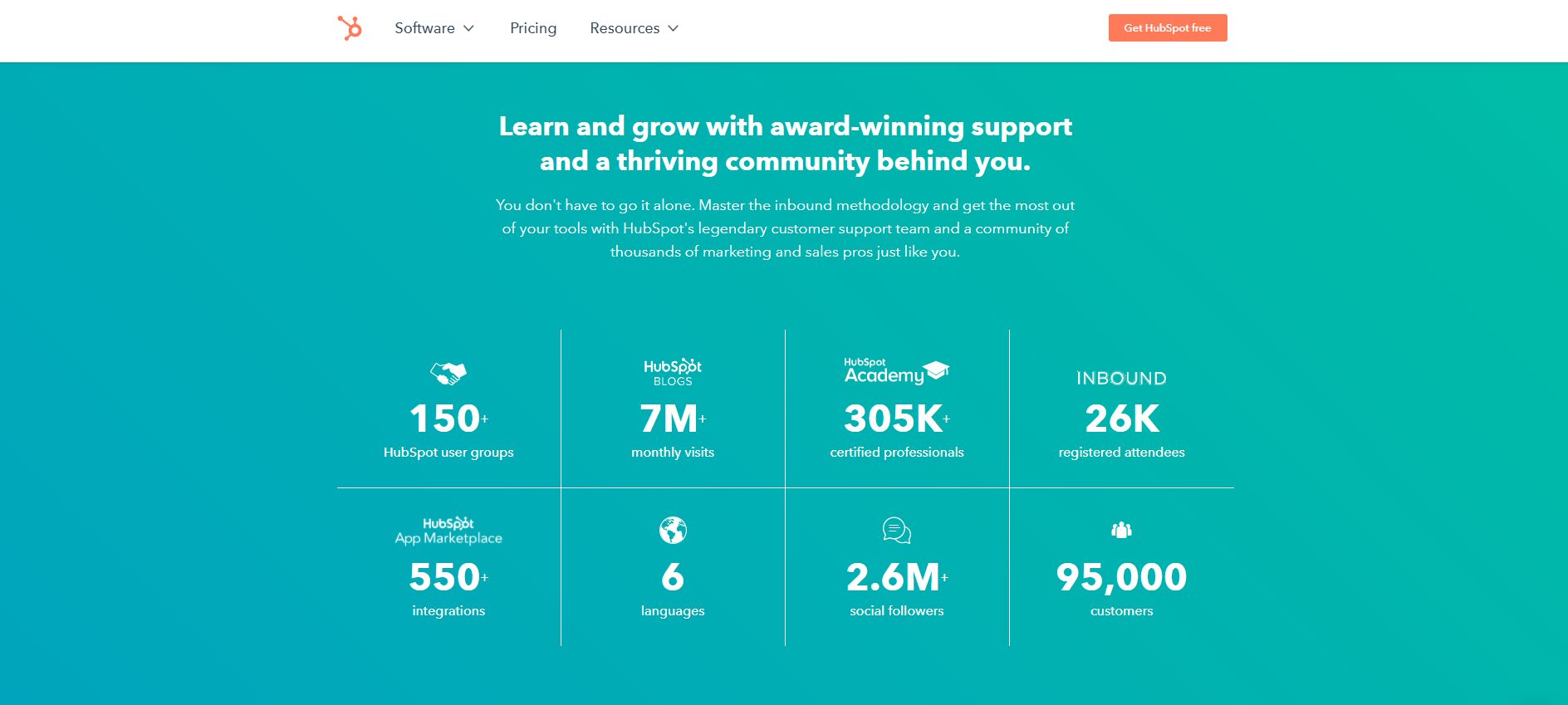
HubSpot is a platform for sales, marketing, customer service, and more. The website has a special focus on a symmetrical layout. When you scroll down the page, the delicate and well-arranged layout will make you want to stick around and explore more. The use of a background color is good for your eyes and looks relaxing. Besides, the grid has no external lines, giving a spacious feeling. The information they provide is right to the point. There are no chunks of words or images. What's provided is only the essential information that you need.
Website layout idea: Multi-column layout
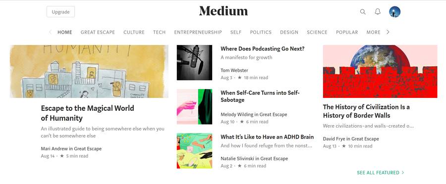
Medium is a popular blogging website that presents huge amounts of information to the reader in an easy-to-follow manner. It uses a multi-column grid to create a complex hierarchy and integrates text and illustrations, making it easier for visitors to scan, read, and understand a page quickly. There is a visual rhythm to allow the eye to travel naturally from one block to another.
This layout is similar to a magazine layout, a good choice for publications that have a complex hierarchy with large amounts of content on a page.
There is one thing that makes the design stand out: when you dive into a deeper page, you will see the article page is in the single-column layout. This makes for an effortless read, even for long articles that require you to scroll down.
Website layout idea: Boxes - large header-width box and a few smaller boxes

Beverages have a layout with a large header-width box; and a few smaller boxes that each take up a portion of the larger box’s screen real estate. The number of smaller boxes can range from two to five. Each of the boxes can be a link that leads to a larger and more complex page.
This is a versatile layout that can be used for both individual portfolio-like sites and for corporate/e-commerce websites. You can connect boxes to tell a story. The large box can be used to showcase products while the smaller boxes can offer further information on the product.
Website layout idea: interactive and asymmetric elements

Dropbox is a cloud storage service and is sometimes referred to as an online backup service that is frequently used as a file-sharing service. The layout is dynamic and interactive. When visitors come to this website, they can learn, sign up, or scroll down to learn more. There’s a pared-down menu that makes finding what you need simple and intuitive. The use of bold fonts highlights the essential information that this site wants to deliver. The colors are consistent and match well with each other. This makes the layout look neat, clean, and organized. The interactive elements encourage visitors to explore the page by scrolling up and down.
Website layout idea: flat design illustrations
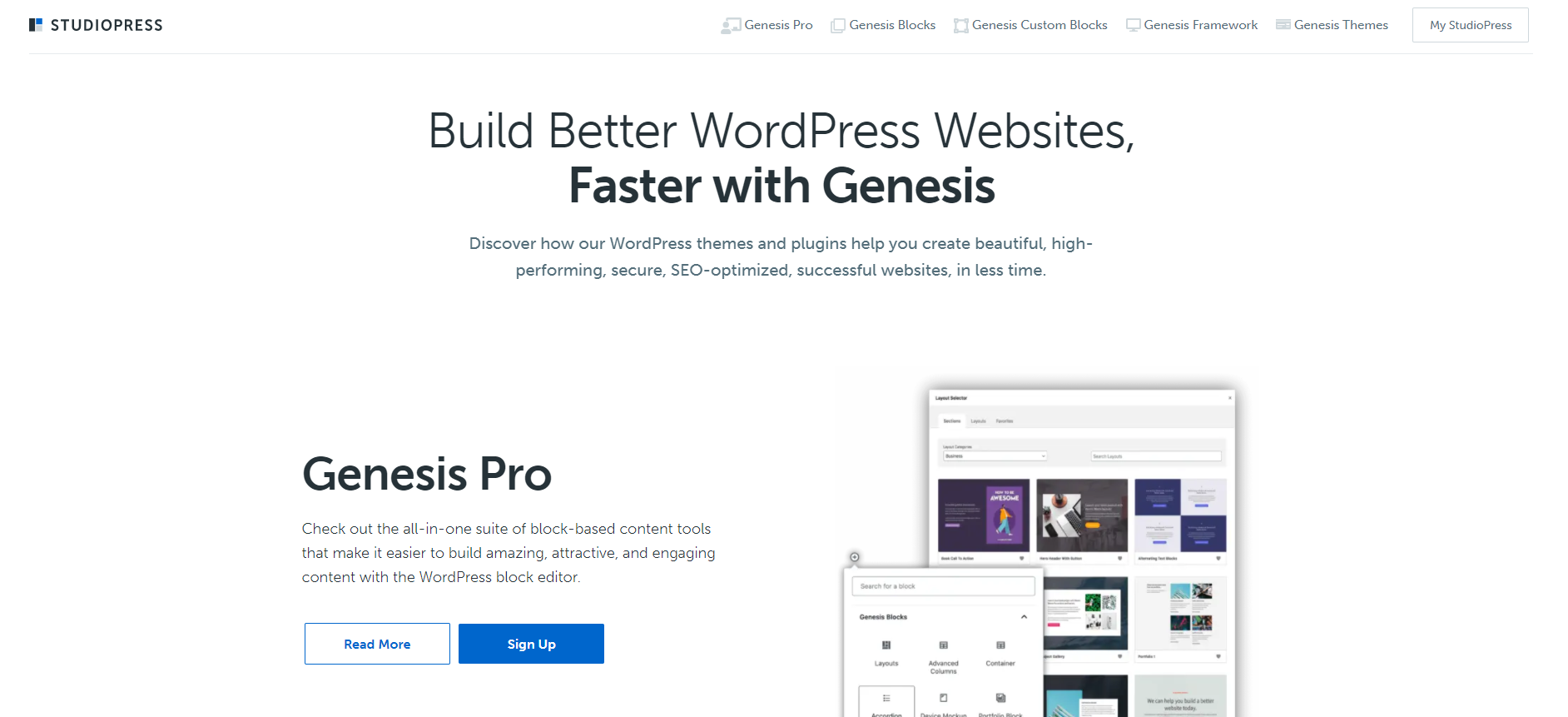
StudioPress is a well-known theme framework for WordPress. The layout has muted colors and minimal elements. Together with flat design illustrations, they produce this clean, neat and clear home page. The headlines are big and bold enough to let anyone know what this site can do for you at first sight. As you scroll down, you will get to know the different features that they offer. All of them are well arranged and illustrated.
Website layout idea: fixed sidebar
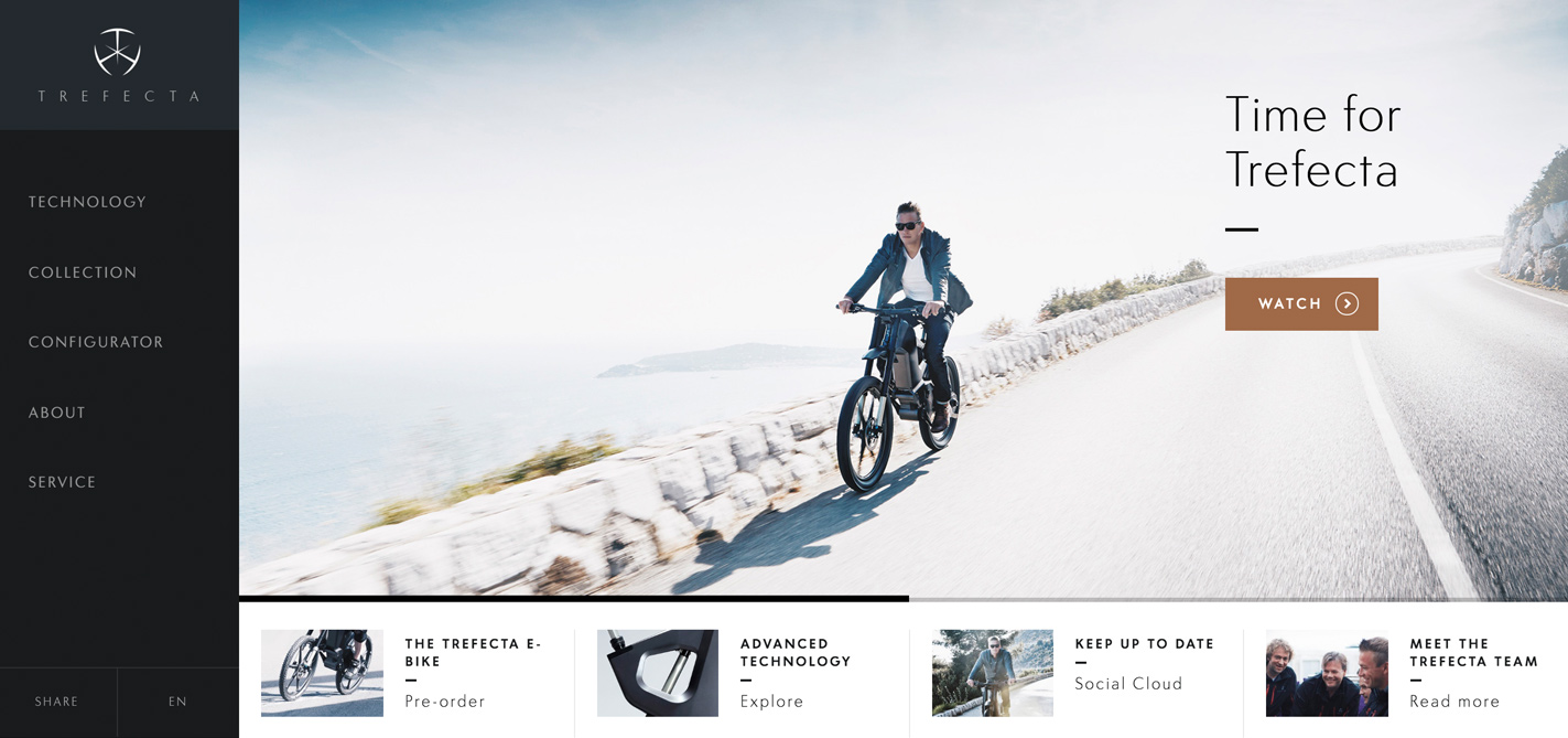
Trefecta is an e-bike selling website that has a classic sidebar. The bar is fixed to the left side of the screen with a simple menu and the company's logo. Navigation bars are essential and are considered as an important tool to help users locate certain parts of the page. It will be easier for visitors to check different parts of the page or even other pages when a navigation bar is fixed on a certain area of the page.
Website layout idea: Asymmetrical layout
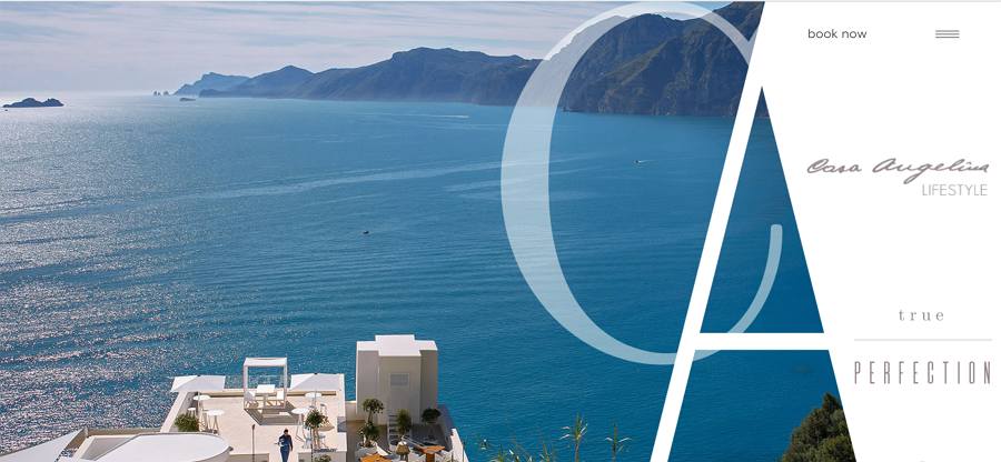
Hotel Casangelina, one of the top ten cliff hotels in the world, is located on the cliffs of the Amalfi Coast. This website uses an asymmetrical layout, which a lack of equality between the two parts of the page. Asymmetry is a long-time favorite technique in the art world; and has recently become popular among web designers.
Take note that asymmetry is different from imbalance. The goal of asymmetry is to create a balance when it’s either impossible or undesirable to use equal weight for two sections. Using asymmetry makes it possible to create tension and dynamism. Asymmetry facilitates better scanning behavior by focusing on a user’s attention on individual objects (focal points). By changing the width, scale, and color of each asymmetrical piece of content, the designer encourages the visitor to stay visually engaged.
This type of layout can be used when designers want to create interesting and unexpected layouts, while still providing directional emphasis. Appropriately applied, asymmetry can create active space that guides the eye from one element to another, even across the emptiness. Consider how Dropbox clearly shows points of focus in the example below.
Make sure your content can be presented in an asymmetrical layout. An asymmetrical layout is not practical for every site. It works best for minimalist layouts.
Add a focus on color. Asymmetry is rooted in the idea that an object with more visual weight will draw attention first. You can use elements with high color contrast to add visual weight to specific parts of the design.
Website layout idea: clear CTA and featured stories
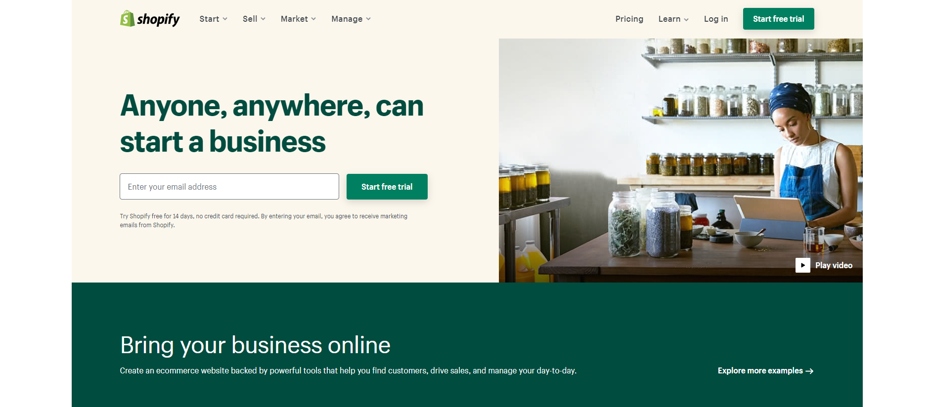
Shopify is an e-commerce website that allows anyone to set up an online store and sell their products. The bold and clear tagline mentions that anyone, anywhere, can start a business. The CTA is well-designed and arranged. The use of blue background makes the white letters stand out. As you scroll down, you can see both symmetric and asymmetric elements presented in an organized way. There are videos and stories that you can check. By the way, there is a globe that you can spin at the end of the page.
Website layout idea: deadline and image gallery
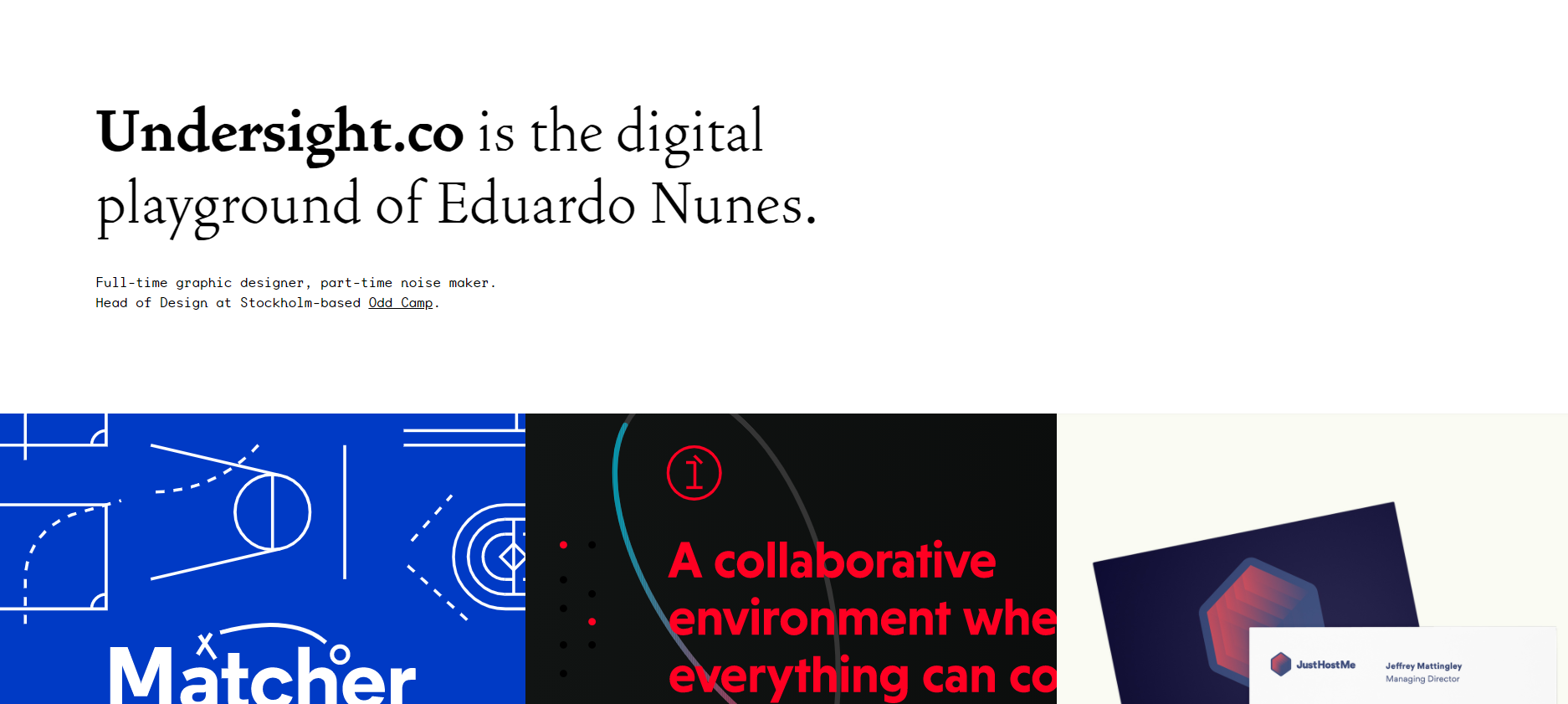
Undersight.co is a portfolio website for the designer Eduardo Nunes. The layout is an organized combination of a basic grid and a text-based design. This design trend is quite popular among e-commerce portfolio designs. Usually, they feature some large headlines at the top and related commercial descriptions. In the body of the webpage, there are a collection of different images, such as product photos. Undersight.co is a typical example. The page is made up of headlines in bold typography and blocks of images to showcase projects.
Website layout idea: One big photo with clear CTA
The core element of this layout is one big photo that is used as a background for the page. It’s used to introduce visitors to the site content. This layout has an opportunity to create a strong first impression and encourages user interaction
This layout is great when you want to say less and show more. Since the layout - and the message - revolves around a single image, it is critical that you use the perfect one. Choose your image carefully to avoid sending the wrong message or confusing visitors.
Use videos instead of images to engage visitors. It might be worth using video instead of a photo, especially when you need to demonstrate something in action.
Website layout idea: single page with minimal description
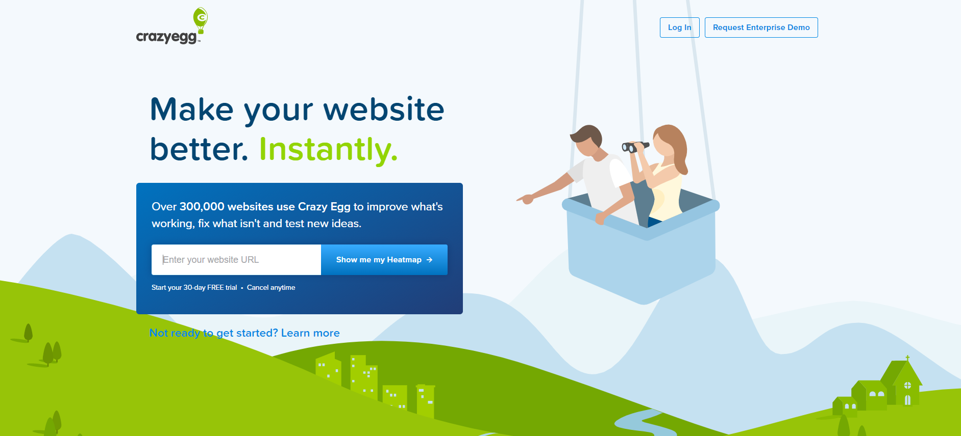
Crazy Egg is a website that aims to help visitors improve their own pages. The layout is extremely simple. There is only a headline, mentioning what this site is for. Then, there is a window where you can enter a web link to check what will happen. This kind of single page layout with minimal description is really powerful. It is focused uniquely on encouraging visitors to plug in their URL to view a heatmap. Then, you will get to know there is a free trial and get hooked up instantly.
Website layout idea: quality images and illustration
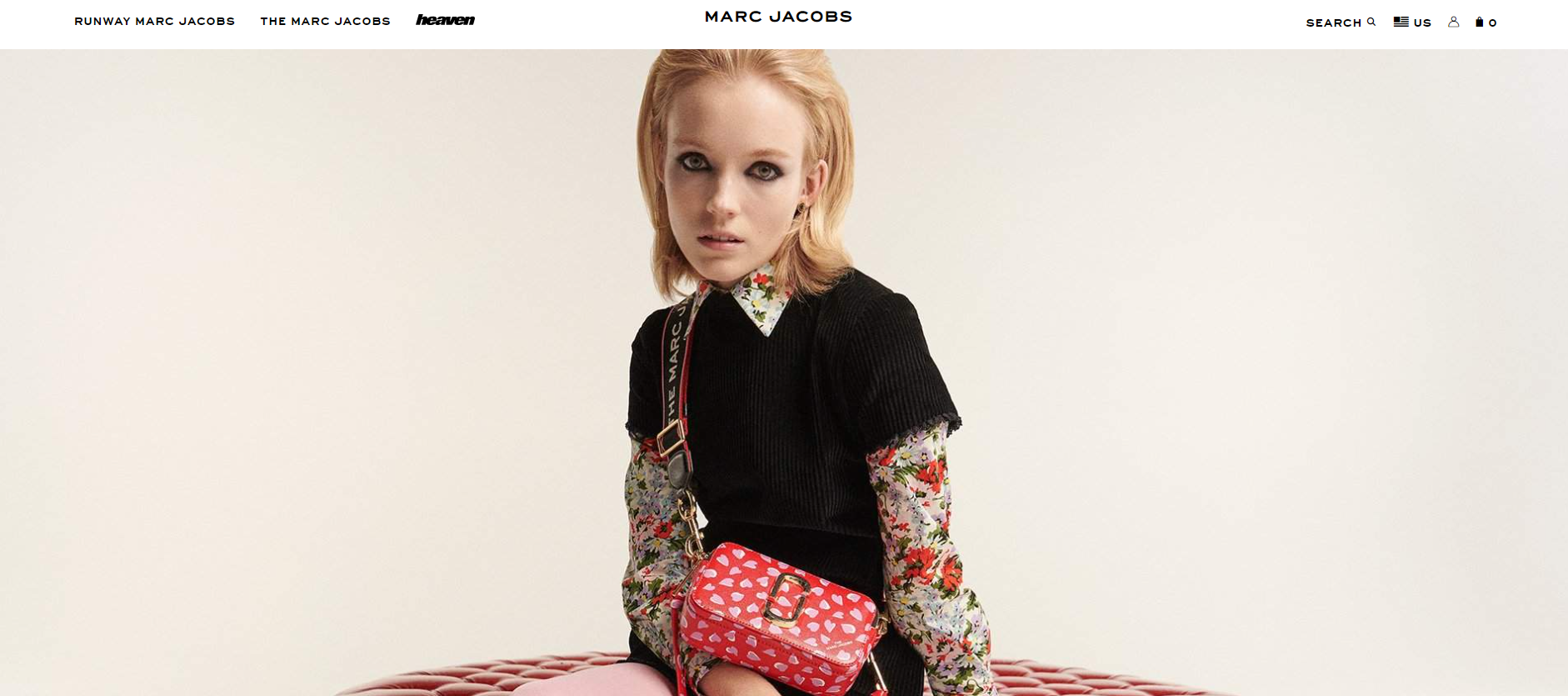
Marc Jacobs is an American fashion expert and this website sells his products. The layout has made use of quality images and illustrations. The website has a minimalist yet sophisticated look. What captures the attention of visitors the most is the creative copywriting. The dynamic images change from time to time. You will be able to scroll down and get the best option for yourself. It does not have too much description. All the information is presented with quality images and clear illustrations.
Website layout idea: unique illustrations
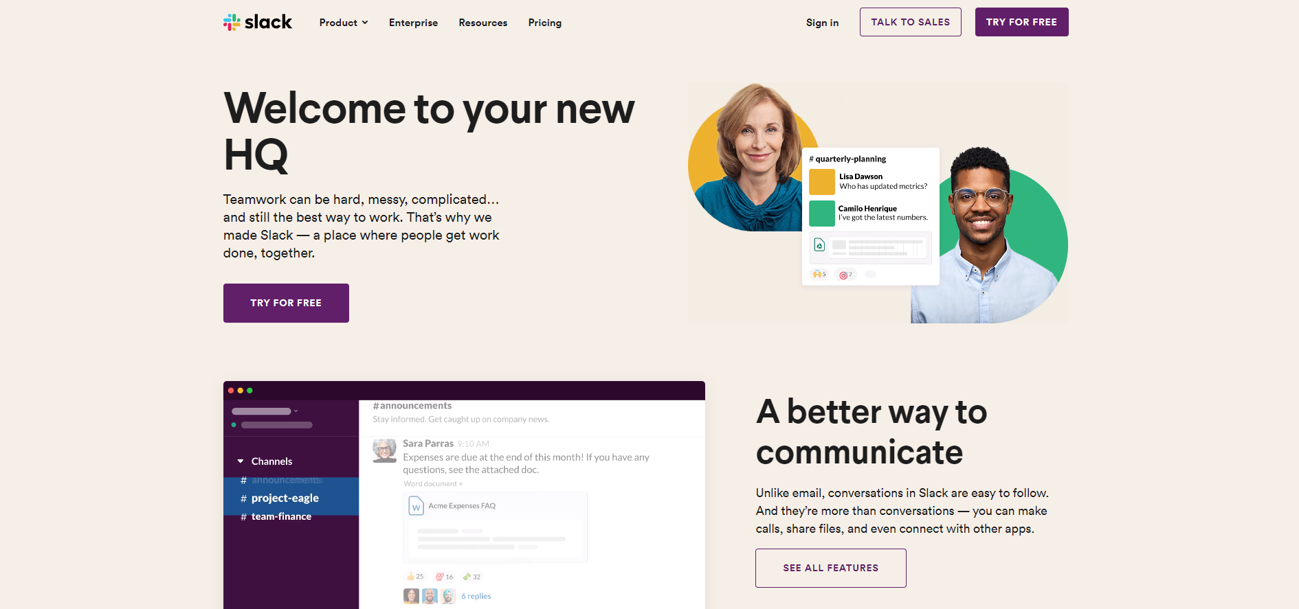
Slack is a channel-based messaging platform where different people can work together. The website has a soft light-colored background, which is easy on the eyes compared with white background. This is something to consider when designing web pages. Besides, there are a couple of unique illustrations to show the interface and usage of their products. As you scroll down, a floating menu will come out at the top of the page. This gives users easy access to explore more about this website. You can try for free, talk to sales, and check their product list.
Website layout idea: creative layout with a split screen
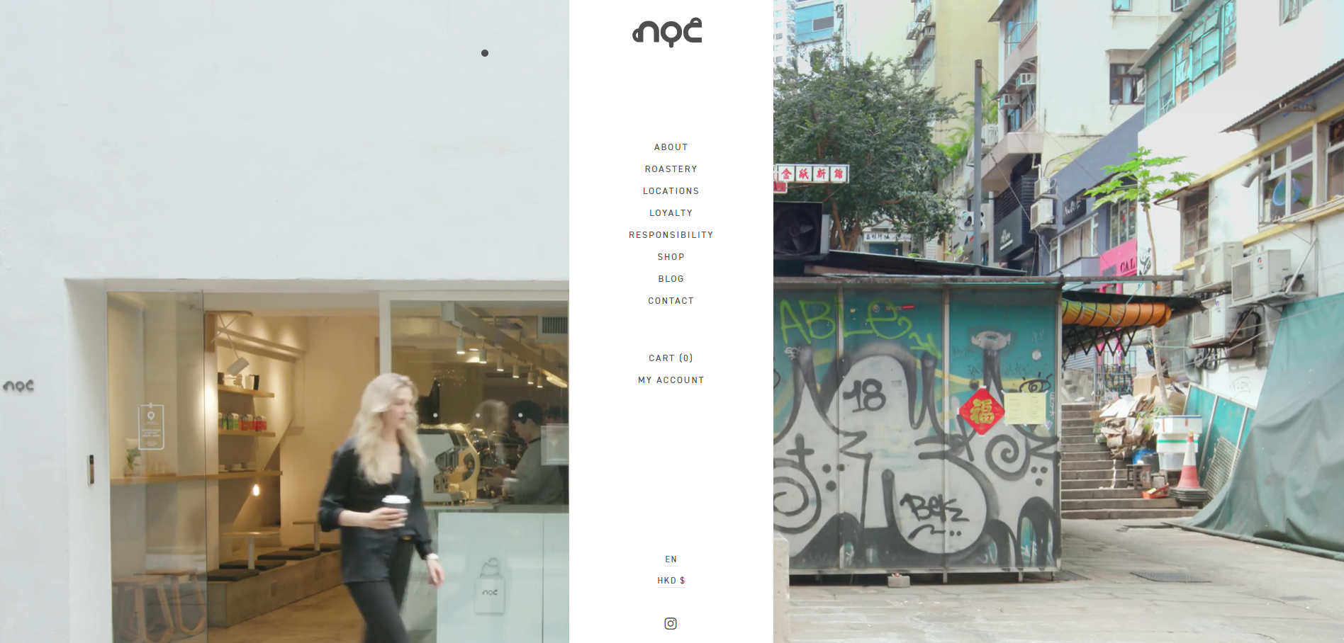
NOC Coffee is a site where coffee meets creative design. This site has a split screen with an unusual placement of the navigational menu. Normally, navigation menus will not be placed in the middle of the screen. However, this creative layout does that and it blends well into the background. When you hover over it, the images and description for each category will come out. Besides, the two halves of the screen match well with each other.
Website layout idea: contrasting colors with split pages
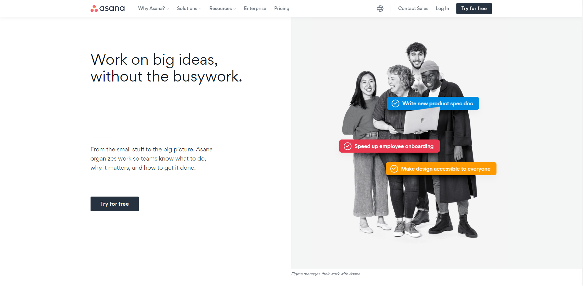
Asana is a task management tool that helps teams organize, track, and manage their work. Its website design has clear and simple navigation. The layout is basically black and white. Still, it has created an awesome information hierarchy. When the background is black, the essential information is in white and vice versa. Besides, you can easily find what you need when you come to this site. There is no need to scroll down or jump to other pages unless you want to get more details about specific features.
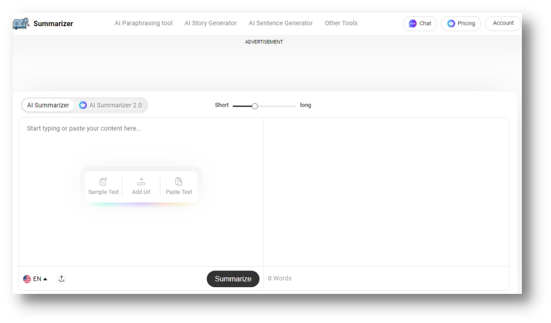
AI Summarizer is a text summarizing tool that is powered using diverse AI algorithms. To ensure an intuitive experience for all, special care was taken in interface design to accommodate the average skills and preferences of the audience. On the homepage, users will see two boxes, one is for input text, and the other one is for output. The white and black color scheme is used to ensure user’s eyes don’t get affected. After scrolling downwards, visitors will find information about how the tool works i.e., technologies, and what features it comes with. Overall, it has a user-friendly layout with everything aligned properly from buttons to links, etc.
There you have 32 of the best website layout examples. We hope you’ll pick something from these examples and apply them to your next projects. One last thing that you should not forget is to give Mockplus a go while building your next website layout. With its wide array of components and icons available, you can easily drag and drop elements to finish your page layout. Good luck and happy creating!
 Mockplus RP
A free prototyping tool to create wireframes or interactive prototypes in minutes.
 Mockplus DT
A free UI design tool to design, animate, collaborate and handoff right in the browser.


 Sign up with Google