Before we start, I have this one question; what is your priority when designing a website? Is it an attractive appearance? Or the cool effects?
As for me, I like to prioritize the site functionality and user experience. The interface is important, but the functionality of your website should carry more weight. You should deliver your ideas or your product to the user in a clean and logical way. Especially when you are building a brand, you need to make your site look trustworthy.
But how do you build a trustworthy website?
The key point falls on the design. Even though you are a small, bootstrapped startup, there better be a web designer to help you with your website design. Of course, it will be best if the web designers can collaborate with developers from the very beginning with a good online design collaboration tool.
It’s not easy to design a good website that is both beautiful and functional. Experienced UX consultants could help you analyze your target user's behavior, create and implement effective UI – with the ultimate goal to take your product’s user experience to the next level. This is what makes you achieve solid business results.
And, it is also important to know common mistakes in web design and how you can avoid them effectively. If you are feeling confused, I will show you what a good website should look like by presenting the top 10 bad web design examples.
Web design trends are changing all the time, so design principles on the web are really hard to define, however, there are still golden rules that stand the test of time. I’ve checked hundreds of sites and discovered several design principles. These include:
The above principles are just a few rules of web design, but they all clearly indicate that good web design should be aesthetically pleasing, easy to understand and easy to use. That is, a good website should provide an excellent user experience.
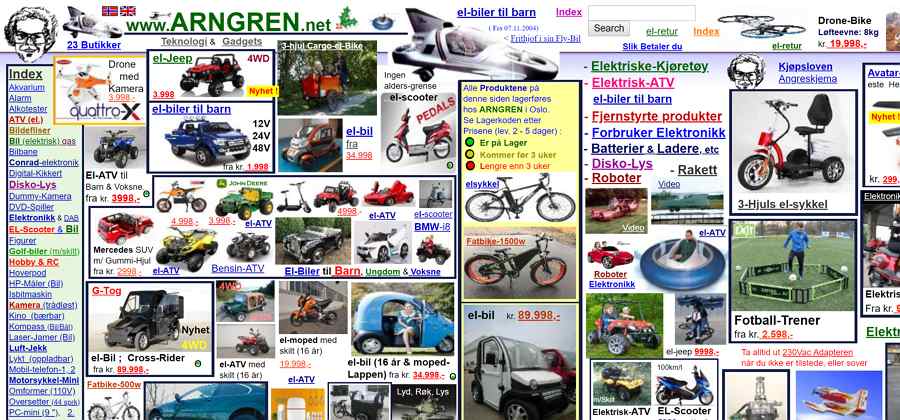
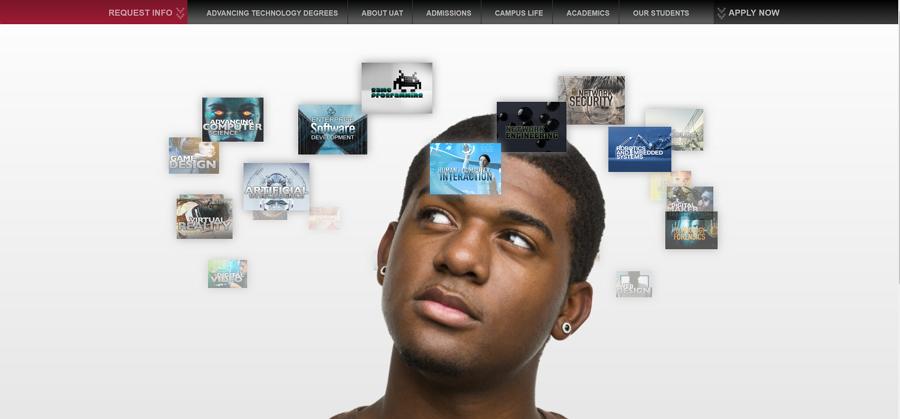
I don’t want to be mean but it really hurts my eyes every time I see it. The site literally places the graphics, content, and links anywhere. All the elements together make the site an incomprehensible mess.
Why is Arngren a poorly designed website?
1) The biggest problem is that the site doesn't use a grid.
2) Unbelievable navigational structure.
3) Poor typography makes it unreadable.
4) Random use of colors.
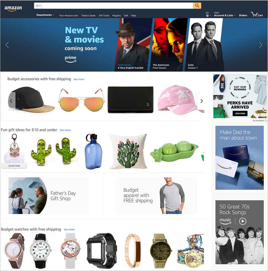
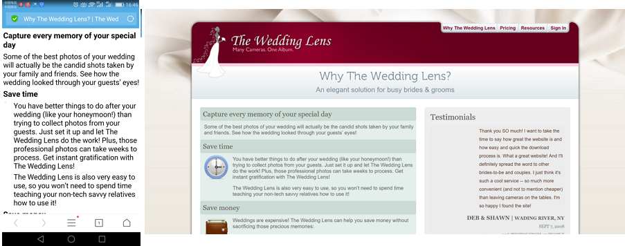
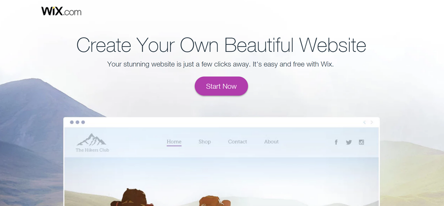
A grid can make everything clean and organized on your website. It keeps all your elements in their proper places and helps you to determine their size, the size, and space of the text, etc. With a grid, you can create a consistent, well-designed interface.
A good web design example of using the grid in web design - everything is organized.
Clear and powerful contrast between the elements can help users to know what is the core info of the page. It helps the user to better read and understand the info. On this site, the background color and text color are pretty much similar, leaving a very weak contrast. The poor contrast makes the text become blurry to the eye. Besides, the small font size makes the readability of the text extremely poor.
A good web design should make sure that the text and pictures are highly readable. Actually, it’s not hard to improve the readability, just make use of everything - the color, space, and size to make them have high contrast. For example, good use of typography makes highlights the important information by different font sizes, and the contrast between the colors strengthens the visual effects.
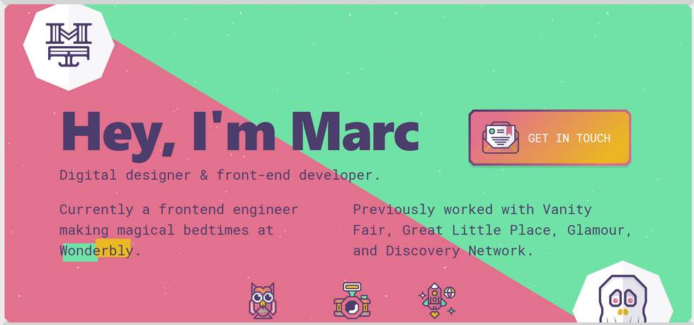
Good web design with proper contrast should look like this:
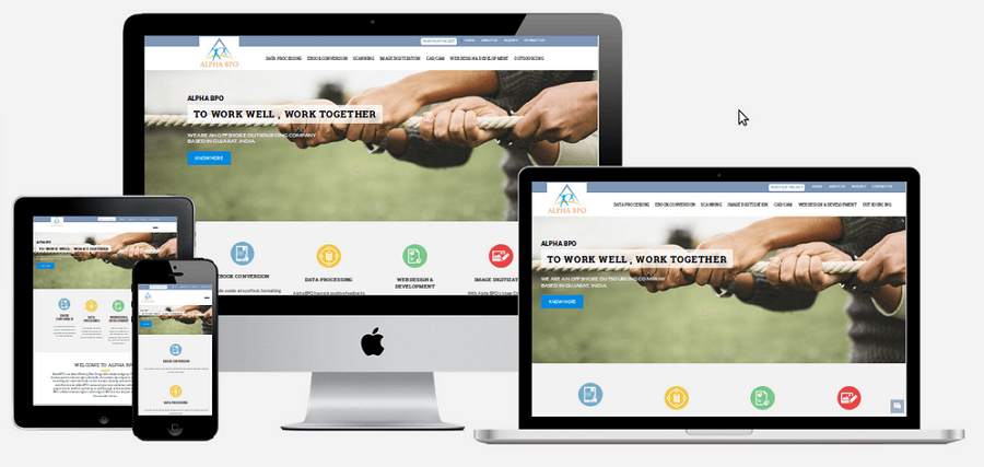
You should always use a responsive design framework, or adopt other better solutions. Your web page needs to run on mobile smoothly as it does on the website. On this site, when loading on the mobile phone, it still shows an entire page with such a poor interface of plaintexts. It does not have a mobile version to view, so it’s unable to use on the phone. I will just give up on a website like this.
The good web design - responsive design.
This web design is like a mixed color palette, which contains plenty of conflicting colors and text colors, and also mixed with the background color. All those make it difficult for users to read at all. Also, the navigation is quite complicated.
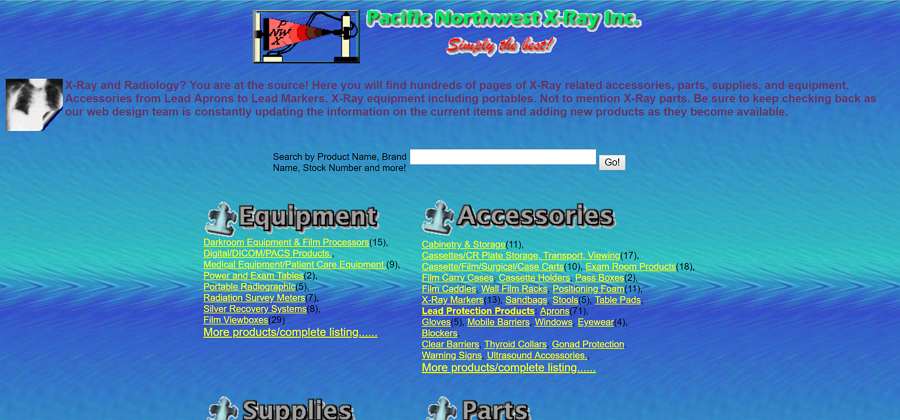
A good web design should use color properly to create a beautiful and concise interface and atmosphere. It should ease the user’s eye and make the user operate with no effort, like this one:

More info about the color scheme: How To Use Color In UI Design Wisely to Create A Perfect UI Interface?
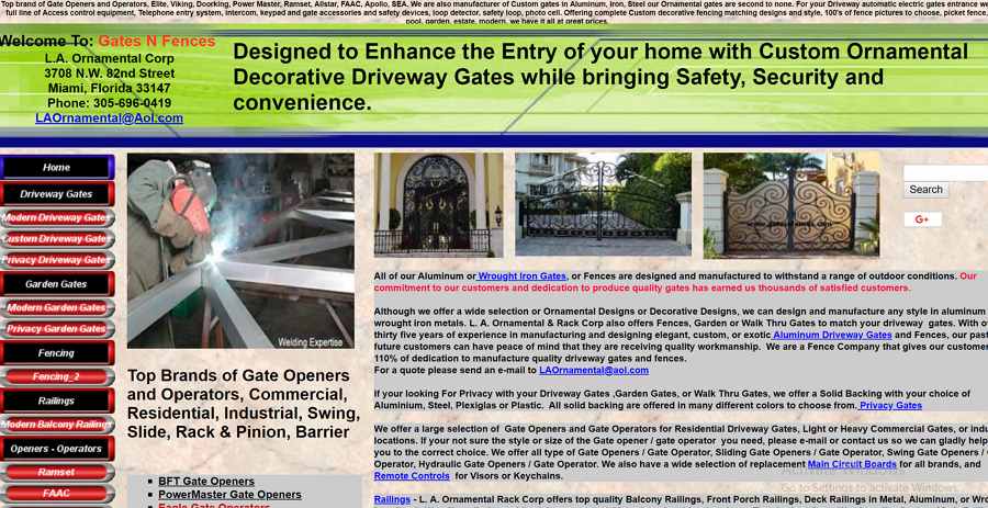
The biggest feature of navigation for a website is self-evident. When a user logs onto your website, he/she should understand what they can do next and what actions to take to reach their destination. The navigation must be eye-catching and should often be at the top of the page. Do not try to design navigation like this site. It only makes the user more confused.
In addition, the navigation content and the interactions also need to be clear, so do not use the horizontal scroll bar or other unusual animation design. If you do, you should at least give the user some hints to let them know how your site works.
Good navigation of web design should look like this:

A mess of links and dead links are both major errors of the website. You should check your links manually or use tools such as the Website Link Checker often.
Also, you need to make sure of the functionality of the links. Especially links in the text, you should make them obvious enough and easy to click. For example, do not add a lot of text links within your text. When browsing the text on a small mobile screen, it will be difficult for users to tap on the correct link.
On this site, each moving small picture is actually a link. Leave alone it’s moving all the time, the text itself is very vague, so the user does not know what information is displayed.
The CTA settings must be clear too. Do not give users too many CTA choices at the same level because it will cost the user more time to figure which one they prefer to choose. Have a look at the example:

Too many CTAs of the same level will make the user more confused. Also, you should retain only one CTA to highlight the key point. The following is a well-designed CTA.
The picture you use on the web page can be the front door of your website. A good-looking picture makes your site more beautiful and comfortable. Some designer even uses the entire picture as a background image.
On this site, the design is very good actually, but when looking closely you will find out the text and background images are too overwhelmed. The website's background image is covered by other elements, so the whole interface is actually broken.

Using transparent buttons would be a better choice here. That is, when designing buttons on the web page, you should abandon complex colors, styles, and textures. Instead, just outline the wireframe and use text only indicating the function. Here is a better one.

If you want to keep the page smooth and concise, then do not use too many elements of different styles. On this site, the text area uses contrasting colors and different font sizes to highlight the info. But the text on the second level also uses a highlight blue color, which in fact breaks the unity and balanced hierarchical interface.

Unity is crucial to the overall beauty and fluency of the web interface, see it below:

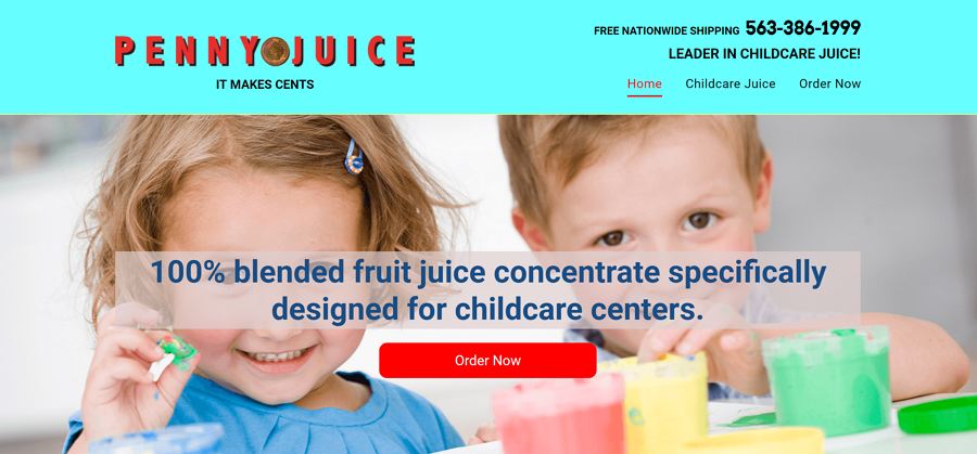
The whole website looks colorful, contrasting and prominent, and also it appropriate to the topic of children's juice drink. But a lot of too bright colors are too mixed and there is no space at all. It looks more like a colorful painting than an online business website. Besides, the combination of exaggerated colors makes the readability of the texts became very poor. Moreover, the site did not have any navigation, leaving you to scroll to the bottom to find relevant information.
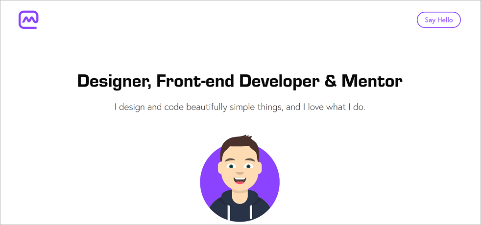
Good web design with white space is simple and clean:
Above are some lists of bad websites. But other web design mistakes also exist:
1. Automatically playing music (without notifying the user).
2. Long page load times. The more time it takes to load, the more likely the user will leave your site.
3. The web page is too long. How many users do you think are interested in going all the way down to the bottom of your page? Do not try to test the patience of the user.
3. Expired information. Information that is not updated will mislead the user and make your site look unprofessional.
5. Isolated page. The user does not know how to return to the homepage. This offers a bad experience.
6. Missing interactive content. If you are unable to provide a way for users to express emotions and ideas, your website may become a slowly die.
It’s okay if you’re guilty of some of the mistakes mentioned above. Practice makes perfect, you just need more practice. My suggestion is to start with the prototype design.
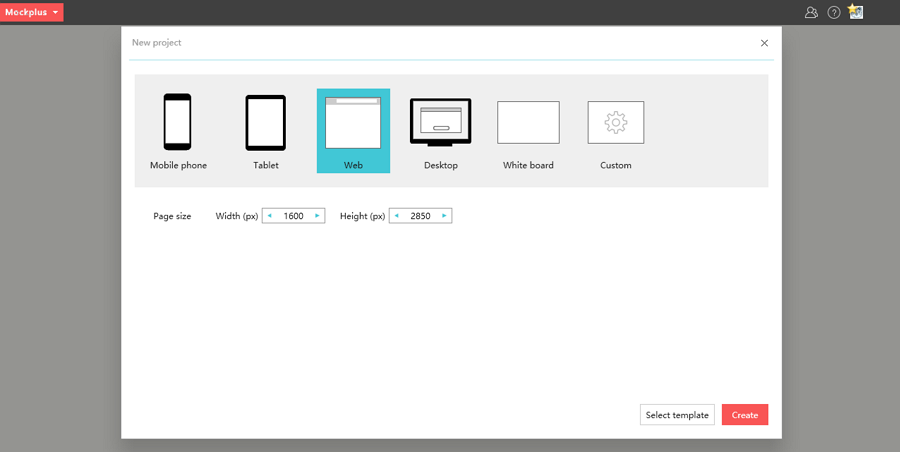
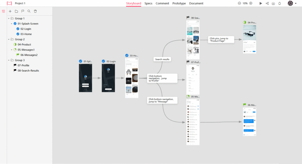
You can use the faster and easier web prototype tool- Mockplus, to start your web design. Mockplus supports web projects. Now I will show you how to design web pages in Mockplus.
On the start page, you can select individual projects or team projects. After selecting, choose the web project in the pop-up window. Here, you are also free to set the website page size.
Mockplus has more than 200 highly-designed components and more than 3,000 vector icons that can help you design quickly. Here are a few tips for you:
1) Text hierarchy: The text in the navigation bar, main title, subtitles, and body should be different. You can use Text area components and set the text size in Mockplus to highlight the text hierarchy.
2) Quick design: You can use the format painter and Auto Data Fill to quickly finish your design. The format painter can make the whole texts presented in the same format, and the Auto Data Fill can automatically fill text data and image data.
3) Property settings: You can set the color, transparency of the components.
4) Image import: A dedicated image component can import pictures you want as a web page background image, and you can also freely design it.
To avoid bad web designs and common errors mentioned above, it is necessary for designers to let developers, product managers, and other product team members participate in website design from the very beginning and collect suggestions and feedback from them timely.
About this, a handy online design collaboration tool, such as Mockplus Cloud, can be a good start for you.
As website designers, you can simply import website designs with asset details and from Photoshop/Adobe XD/Sketch(by using Mockplus Cloud plugins) with one click, collect feedback and suggestions from other team members timely, and create interactive prototypes to share with others.
As website front-end developers, you can simply view all website designs and leave comments freely, search duplicate elements and colors easily, and check and download design assets quickly.
As product managers, you can simply check the design process easier, upload and preview documents freely to manage website design projects more smoothly.
Overall, Mockplus Cloud can effectively connect your entire product design workflow from the very beginning and help you avoid many website design errors.
A site's design needs to serve the functionality of the website itself. It also needs to take into account beauty and other requirements. I hope the above 9 bad web design examples would be useful to you and help you understand what is a bad web design, and how to avoid them in the future.
 Mockplus RP
A free prototyping tool to create wireframes or interactive prototypes in minutes.
 Mockplus DT
A free UI design tool to design, animate, collaborate and handoff right in the browser.


 Sign up with Google