How can you design a good landing page to attract users and funnel them to use your products and services? What elements should you include in your web design?
In this article, we will show 20 of the best landing page examples for your inspiration and see how it work excellently in these website.
A landing page is created specifically for attracting users for a marketing or advertising campaign (for example, a Google text ad or display ad). Generally, it's not only a page where the visitor first “lands”, but it is also a page which has content that will attract and keep users on the site, making it essential to the success of the campaign.
A landing page is a great method to gain traffic and impress your audience with your brand. Data shows that almost 68% of business websites use landing pages to attract users and get clicks. The landing page clearly guides users to learn about or use a product or service. Combined with a proper CTA button, the landing page encourages users to take action, which can translate into profits for your business.
Excellent landing page design helps attract users, retain users, and improve conversion rates. The success of many websites is a testament to how critical a landing page is.
Here are some factors in designing a good landing page.
The UI design of your landing page plays an important role in attracting users and improving conversion. Every element of the web page, including the images, buttons, texts and icons, should be clean, simple, and organized to give users a good experience.
Since the landing page is meant to encourage purchase and is always connected with CTA buttons, the design and appearance of the CTA should be clear and not confusing. More importantly, it should exude a sense of trustworthiness.
Just as with logos and icons, visually attractive images in landing page design are essential in impressing users and enticing them to become more involved in your products and/or services.
A landing page should not be a kitchen sink. It should not contain everything. Instead, a good landing page has a clear, specific goal and target distinct users. For example, a landing page for a beauty website that needs to improve sales will be designed for women aged 20-30 and incorporate a link (or CTA button) that brings the user to the purchase page.
Most websites contain different levels of text content to highlight importance and function. For example, big titles are for catching the attention of users while the body text gives further information, which users read carefully.
Title: Use refined and engaging text for attracting users' attention.
Body: The main information; concise, direct, and clear
Call-to-Action Text: Provide clear, actionable guidance for users by combining buttons and links. Guide users step by step and lead them to the completion of the task.
Footer: Provide links and information, such as brands, contacts, and social media links to build trust and provide context.
It doesn’t matter if it’s the landing page or homepage of a website - good design should have a tight & clear connection with the brand. This makes the users remember the brand and hopefully make them come back.
With nearly 30% of all web activity coming from mobile devices, responsive design is a must these days. So, a good landing page should also have a mobile-friendly version that is easy to navigate, fast-loading, and ultra-clickable.
At the core, a landing page and a website page are the same. They do have specific differences, however
Landing page: Simple structure and no distractions
Website page: A standard website page contains multiple modules and functions, such as navigation links, side bar, About, Company Information, Services, and Blog.
Landing page: It has a very specific purpose, such as for users to sign-up, to gather information, to sell a product, or a clickable advertising or marketing campaign.
Website page: It is designed to describe and explain your product or service with ample text and images.
Landing page: Limited access available, such as only a clickable CTA
Website page: All pages are accessible for clicking and jumping with reversible interactions.
Taking the points above into consideration, I have picked 20 of the best landing page design examples I found online. I hope you find some inspiration from them as we say goodbye to 2019.
Highlights:
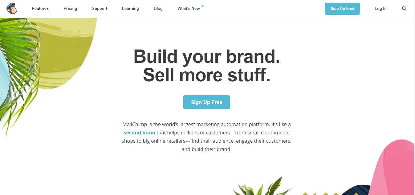
The slogan’s bold black font on a white background is a huge attention-grabber, immediately positioning the site as an email marketing service.
The gorilla image on the corner clearly shows that this landing page is created by MailChimp. The color contrast of the blue registration button and white login button stimulates users to create an account. And, since free is always welcome, this option is a great addition to the landing page.
Highlights:
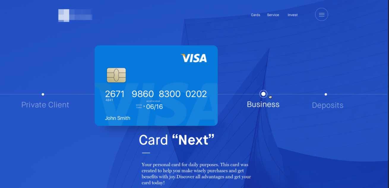
This is a landing page designed by Ramotion on Dribbble. A prominent bank card shows the site's main product and services in a blue background. Smooth business processes clearly show users how to apply for a bank card step by step.. The clickable point allows users to click and jump to specific information on the same page.
The clickable process node and jump flow introduction enrich the presentation of the product, sharing as many details as possible for users on one page. This smart design reduces the bounce rate of the landing page.
Highlights:
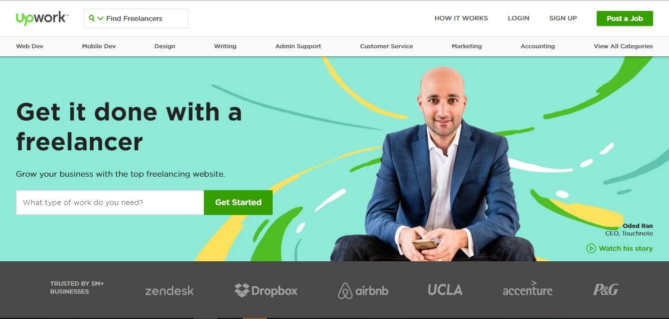
The best way to design a landing page is to highlight the main CTA button. Upwork makes good use of this. From their CTA design, it is easy to see that their goal is to attract businesses and freelancers to register.
From the user experience point of view, the green "Post a Job" button targets businesses, while the question written in small characters - "What type of work you need?" - is for freelancers.
Their copywriting is also very directional. Instead of using a rigid CTA like "Employer: register here," they use creative language ("Let freelancers do more work"), and then an action-oriented CTA urges potential users to "post your work" here.
Highlights:
Clean and concise flat design helps to show the smooth animation on the landing page. The creative combination of the CTA button and animation makes the user experience natural and vivid. Lively animation is also a good complement to the site’s responsive theme.
Highlights:
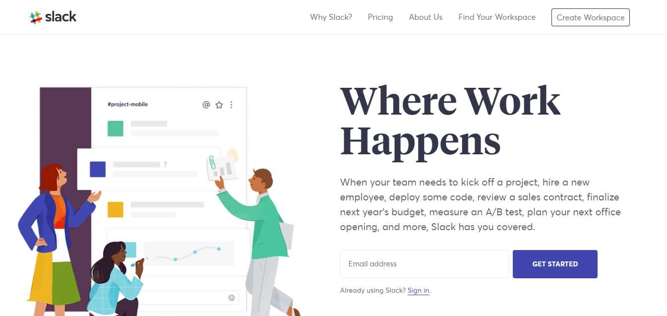
The fixed header displays all the necessary information while the page is scrolling, allowing visitors to receive information without having to move the page up or down.
Slack's most important collaborative capabilities are presented to clients as a personified image. Diversified collaborative document presentations enhance Slack’s brand image.
The landing page design makes use of colors to boost the brand’s impact.
The CTA button on the page uses a short, straightforward "Get Started" as the customer's activity guide.
Highlights:
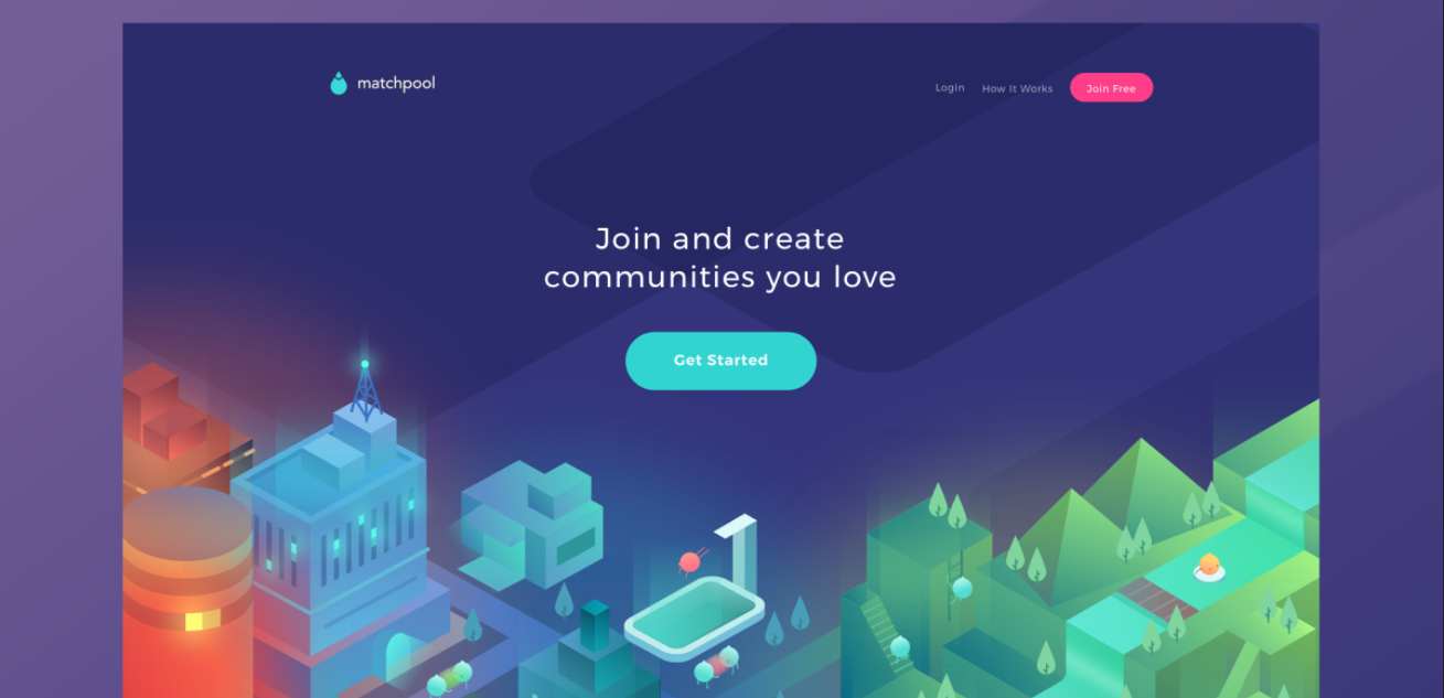
Matchpool follows flat design principles and uses a fresh, lively color theme. The concept of community is reflected in the movement of elves. The short copy also tells users that they are free to create their own community.
The sharp color contrast of the CTA button makes it very eye-catching. As for the copy, like I mentioned above, "Free" is always attractive for users.
Highlights:
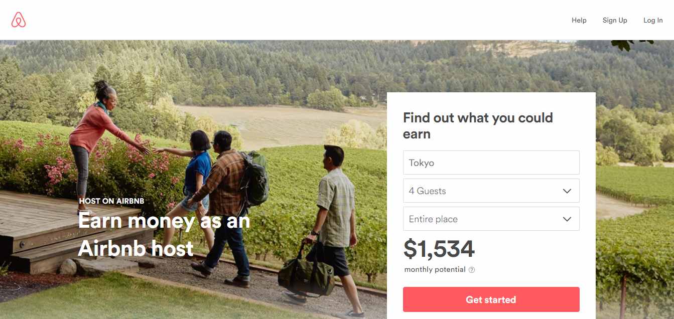
To help turn visitors into landlords, Airbnb offers some engaging personalization features such as estimated weekly average revenue based on your location. You can enter additional information about your potential accommodation in the field for more personalized estimates.
How to become a landlord for income? How to ensure security? A step-by-step guide is provided to give the user a clear direction. Trust is enhanced by the word-of-mouth marketing shared on the landing page.
Highlights:
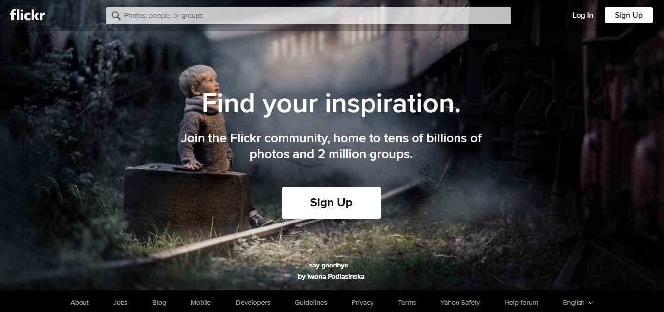
As we all know, Flickr is a photo sharing and storage platform. Both amateur and professional photographers can join and be inspired. Its landing page design takes on the form of a picture carousel to showcase the user's photography. The author is also highlighted by the artwork signature and author name, encouraging users to find out more about the author and his work.
The large, visible CTA button design draws users to the Flickr community.
Highlights:
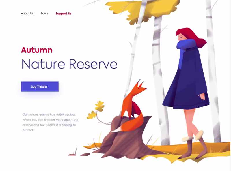
The connection between humankind and nature is undeniable and these days, awareness of the need for conservation is at its peak. This landing page is designed to appeal to that connection and awareness - and further spread it. The user’s attention is directed to a love for nature and wildlife, encouraging one to get involved.
The whole website design is clean and made interactive by the illustration of a little fox and girl. The CTA button on the simple left side is as eye-catching as the girl in blue.
Highlights:
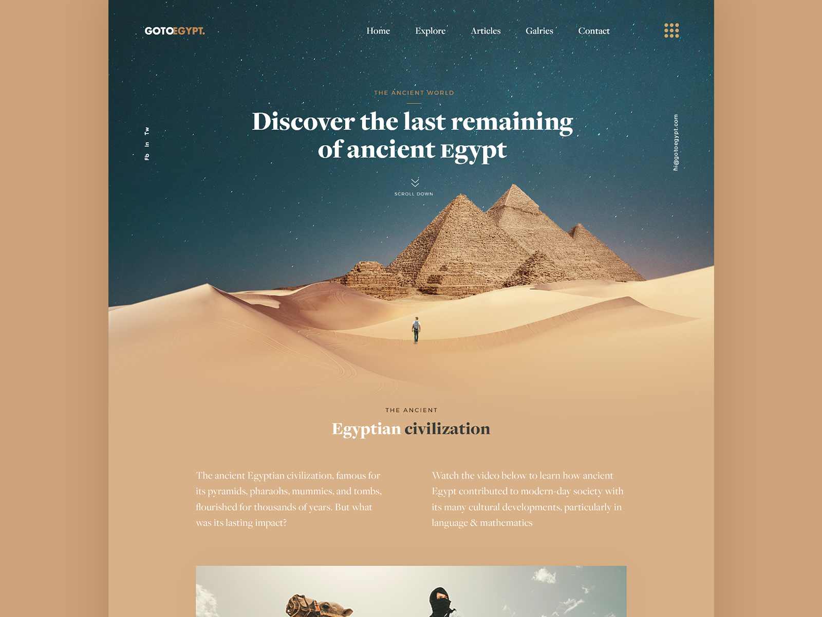
As a travel landing page, this website capitalizes on a point of advertising and website theme construction by utilizing breathtaking scenery.The image used is a real scenic spot, making it a perfect creative background.
The natural matching of colors makes visitors feel comfortable and achieves the goal of eliciting a desire to travel and explore.
Highlights:
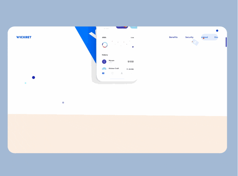
This landing page is designed for a bank app. I really love its design and interaction! What makes the interaction special is that the designer gave every element on the website a different weight. So, when you move your mouse, you can really feel each element's "strength". It's creative and interesting!
Highlights:
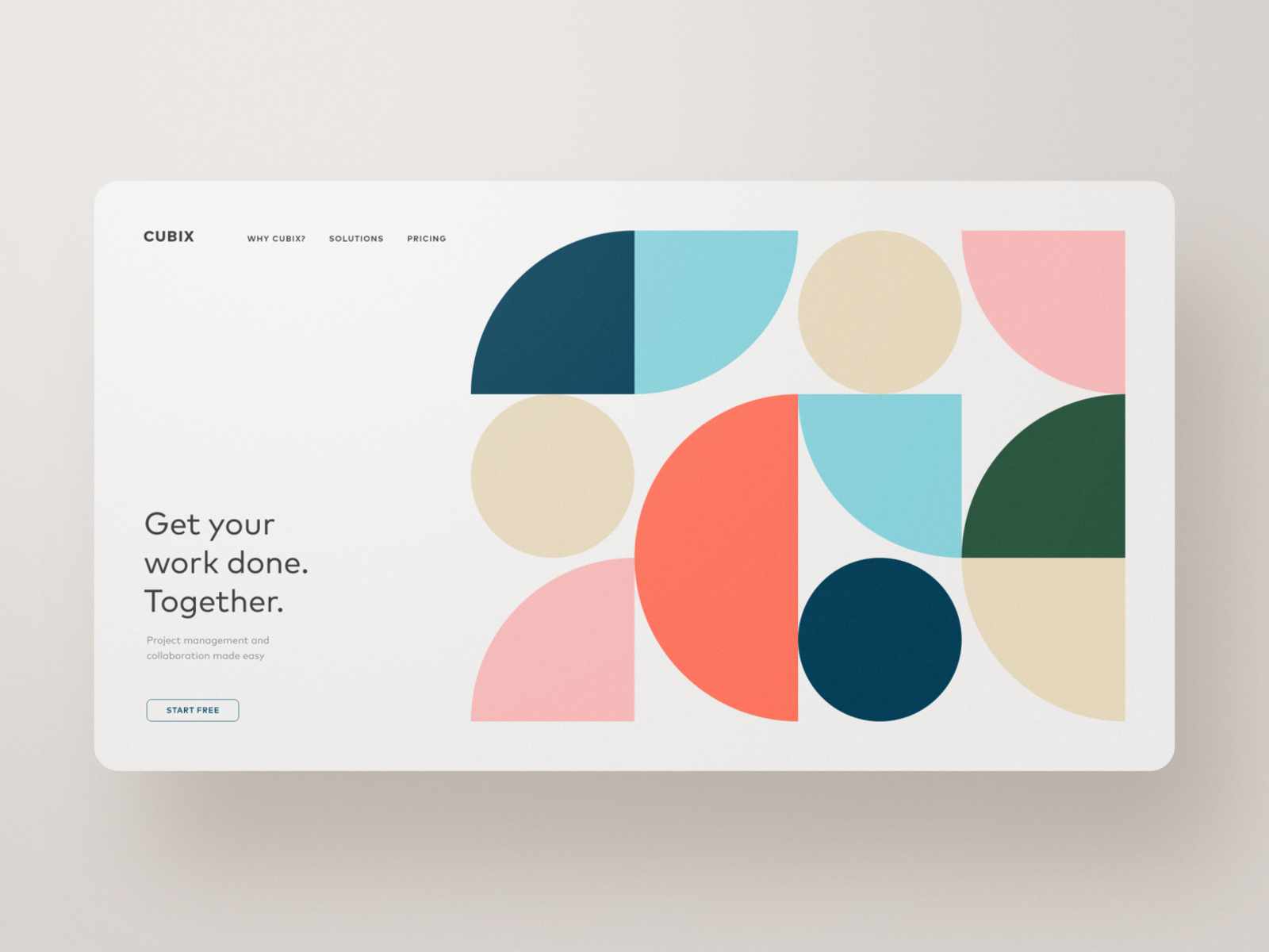
Compared with the landing page designed for the bank app above, CUBIX specializes in its "quietness". It has no ornate interaction, but wins in clear navigation and goal-oriented CTA text and button design.
Highlights:
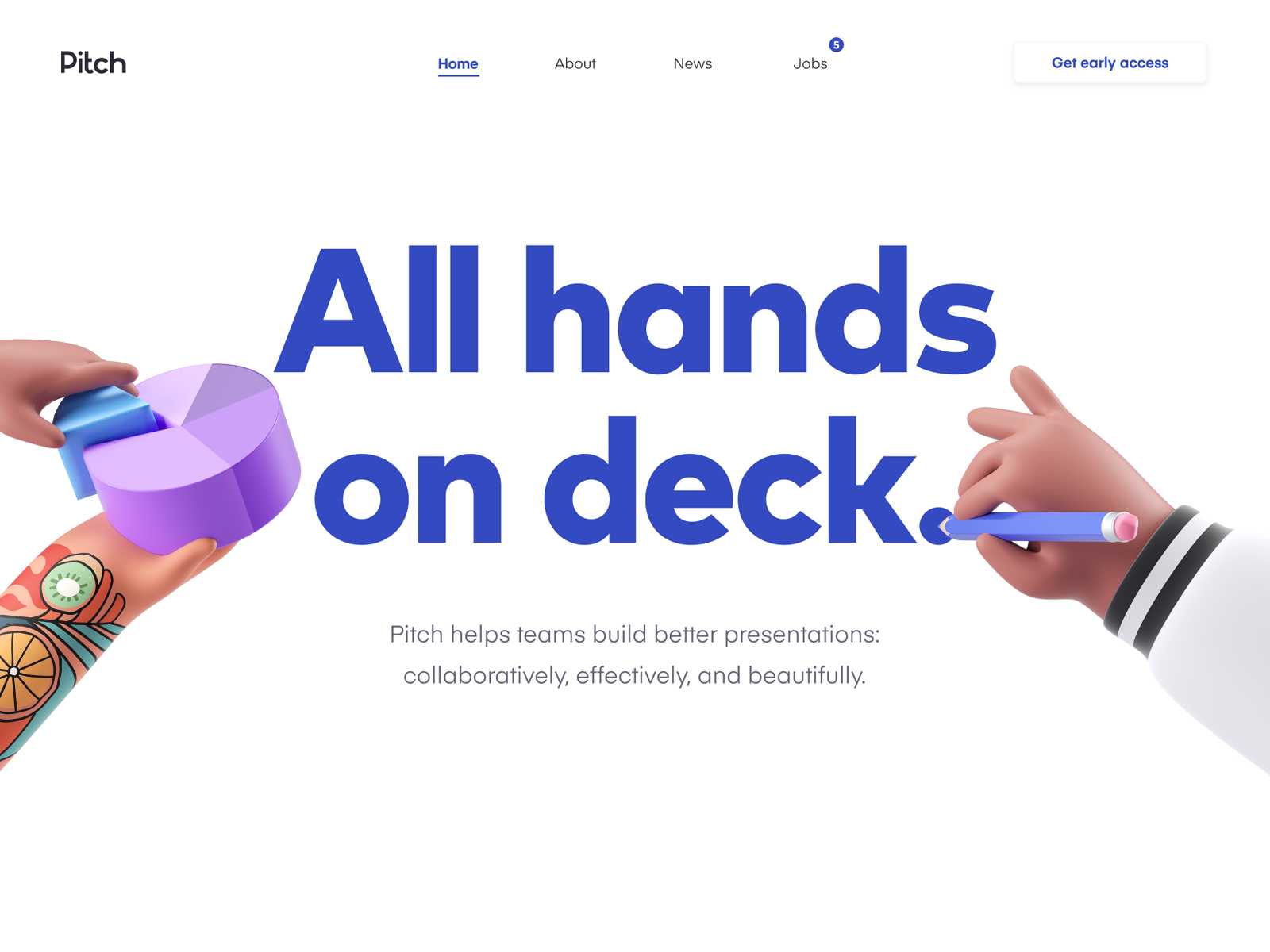
Pitch is a website designed to help teams build better presentations - collaboratively, effectively, and beautifully.
The 3D illustrations found on the landing page are pretty amazing. They add an X-factor to the site, and I wouldn’t be surprised if a new style for website design stems from this.
Highlights:
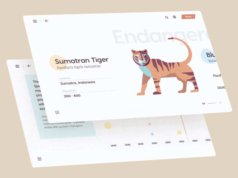
This is a website designed to tell people about climate change and its effect on animals More and more species are facing the danger of extinction, and this site hopes to bring a sense of urgency to its visitors.
The alternating background design is quite impressive. Through the comparison, you'll get a more intuitive experience of how urgent it is for human beings to protect endangered animals.
Highlights:
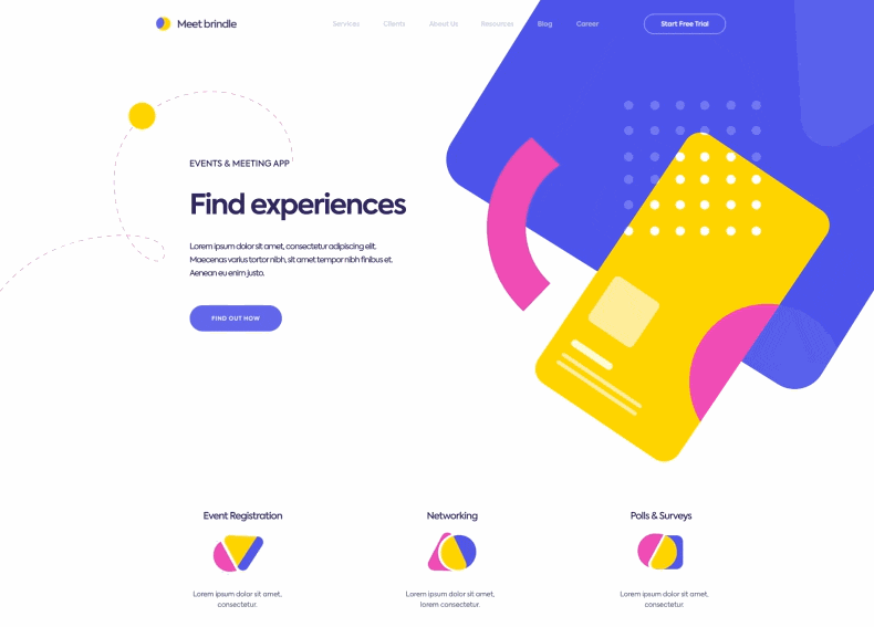
This landing page is designed for a mobile application that helps to track events taking place in your city. You can book meetings with your business partners and friends, as well as save personal notes.
Its landing page design presents the service to customers clearly. Playful colors and forms unequivocally target its market - the young and ambitious.
Highlights:
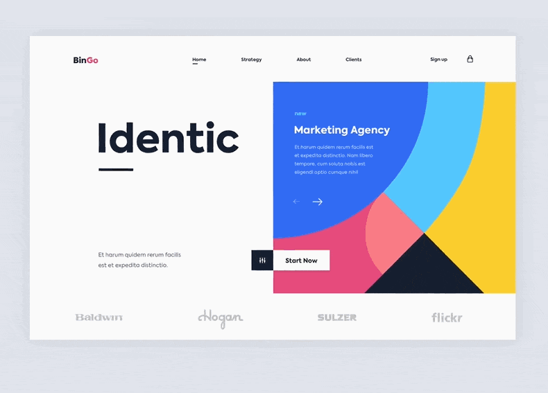
The landing page of this website uses four parts to show its services. All of them are connected by excellent transitions.
Even though it makes use of a split screen design, the whole site stays flat and minimalistic. This balances the visual contrast brought by colorful images and bold text.
Highlights:
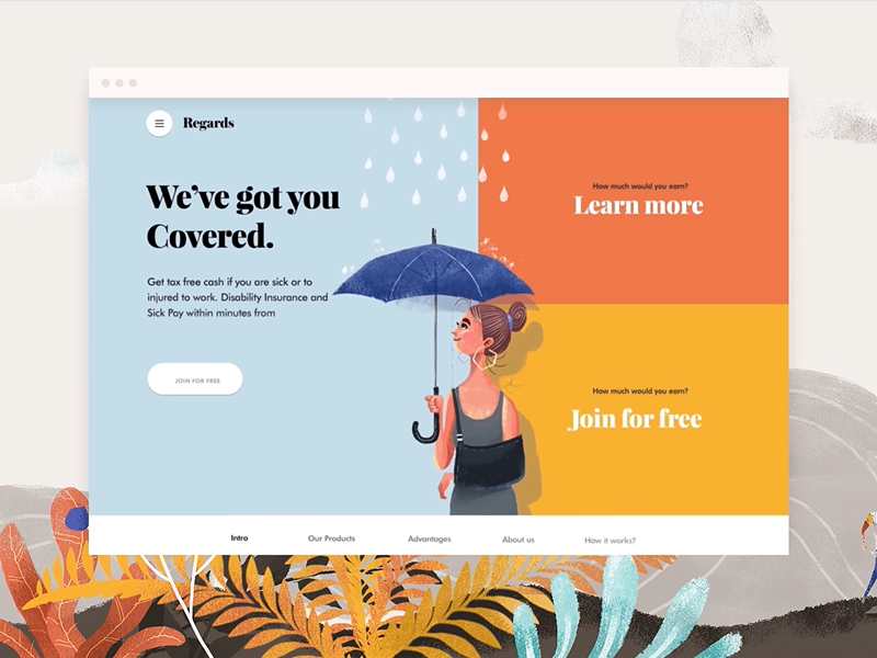
Regards is a healthcare website designed to cater to people who may be ill or injured.
Before the landing page is displayed, a loading image of a girl with an umbrella is shown. Text on the left is highly associated with the image. This is what we call "brand design". On the right side, two big clickable color blocks urge you to "Learn more" and "Join for free". All elements are combined naturally and logically.
Highlights:
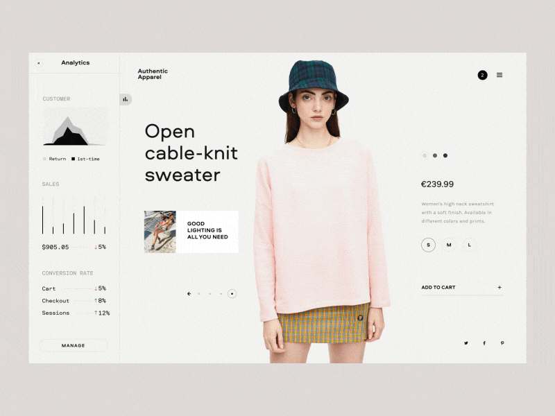
E-commerce Analytics is a website designed for online clothes shopping with data analytics. Armed with logical data, customers can make the best choices when shopping.
This landing page makes shopping more interactive and gives it a sense of moderness and technology.
Highlights:
The design of the landing page is aimed to promote culinary courses to those who are eager to become Michelin star chefs.
The minimalist layout is enhanced by the use of juicy colors, and the visual appeal is boosted by the smooth animations.
Highlights:
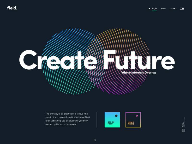
On this landing page, each visual element is brightened by its dark background, such as the gradient buttons, overlapping bold brand text, and small and white navigation.
Clean and minimal design gives users more space to concentrate on the white text. This “forces” them to learn about the service provided by the site - a brilliant combination of design skills and psychology.
Is it a new visitor who knows nothing about your product? Or, is it a user who already knows something about the product? You need to know which user you are targeting as the landing page for each would be quite different.
Ask yourself, what do you want the visitors to do? To subscribe, download apps, buy items, register as members, or read more articles?
Keep the information for different sources and landing pages clear. Otherwise, your bounce rate will soar. The reason users arrive on the landing page is to find the correct answer! What they want to see is something useful and helpful.
Responsive design is the best way to address the issue of user friendliness of landing pages on different devices like cell phones, tablets, and computers.
No page is 100% perfect. There is no single standard for success.To make a good landing page, remember that data speaks louder than stories. So, the best thing to do is to optimize gathered data - visitor's stay time, bounce rate, conversion rate, what they read, what they click on, etc. Study the colors. Compare the performance of a red button as opposed to a green button. Which converts more - copy A or B? Let A/B testing speak.
In addition to the convenience of usinga prototyping tool to design an ideal landing page even before the project begins, templates can also be applied directly. For example, Unbounce and Leadpages have provided a number of very good landing page design templates.
Unbounce - The best-known landing page design tool
There are many great landing page templates on Unbounce. Most of the templates focus on guiding users to switch. Unbounce also has a first-rate WYSIWYG page building tool to help users create their own landing page web pages.
Leadpages - Multi-purpose landing page design tools
LeadPages offers many features such as web page layout, A/B testing, and SEO optimization. Its biggest advantage is integration with other tools. For example, LeadDigits encourages users to subscribe by entering their email address using SMS.
I hope the best landing page design examples I listed above will serve as inspiration for your own landing page design in 2020. Bear in mind, there are many small details you need to pay attention to, such as how to create the CTA layout, how to use color in web page design, and the location of the company logo to enhance the page. Also remember that elements such as title copywriting and support improvements can enhance your conversion rate significantly.
.
 Mockplus RP
A free prototyping tool to create wireframes or interactive prototypes in minutes.
 Mockplus DT
A free UI design tool to design, animate, collaborate and handoff right in the browser.


 Sign up with Google