Whether you're a UI designer or just starting out, you've probably heard the phrase "color theory" thrown around quite a bit.
But what exactly is it, and why is it so important in UI design? And, more importantly, how can we utilize it to create exceptional products and experiences that are user-friendly?
That’s what we’re going to talk about today! In case you’re short on time, here are the topics we’ll cover in this article:
What is color theory?
What are all the color theories?
What are the 3 parts of color theory?
What are the rules for color theory?
Tips for using color in UI design
So, buckle up, grab your favorite crayons (or your favorite UI design tool), and let's dive into the world of UI color theory!
Color theory is the study of how colors interact with each other, and a set of guidelines on how they can be used in art, design, and other similar fields.
This includes understanding how colors can be mixed together to create new hues, as well as how different colors can be used in combination to create harmonious color schemes.
Color theory was inspired by Sir Isaac Newton’s very smart invention, The color wheel.
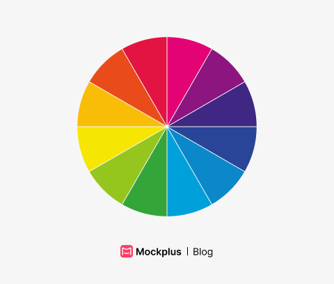
A color wheel is a visual representation of the spectrum of colors, arranged in a circle. It typically includes:
Primary colors - red, yellow, and blue.
Secondary colors - green, orange, and purple (which are created by mixing the primary colors).
Tertiary colors - for ex. yellow-green, blue-green and etc. (which are created by mixing primary and secondary colors).
Mixing yellow and blue would create a secondary color green. Mixing green with another secondary color would create tertiary color - and that’s how it works in a nutshell.
UI designers can use a color wheel to understand the relationships between different colors and how they can be used together in their UI designs. It’s pretty awesome stuff!
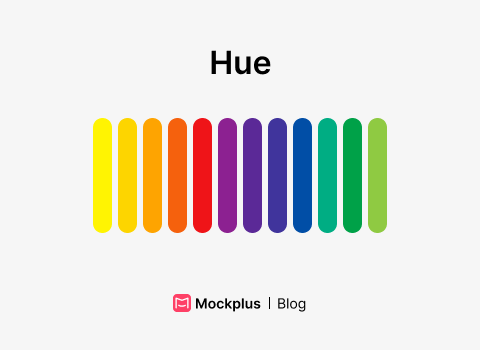
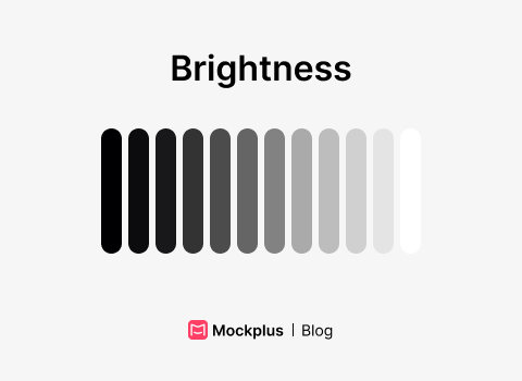
Building on the color wheel, each color has 3 main properties:
Hue - this refers to the actual wavelength of light that is perceived as a specific color. It is often used to describe the dominant color in a composition.
Saturation - also known as “chroma” or intensity, refers to the purity or vividness of a color. A color that is highly saturated is considered to be pure and vibrant, while a color that is less saturated is considered to be more muted or grayed.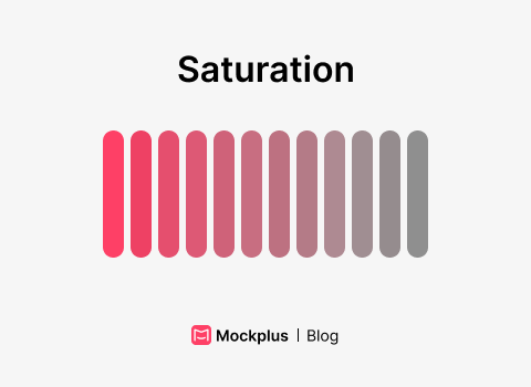
Brightness - which is also referred to as value or luminance, refers to the relative lightness or darkness of a color. A color that is considered to be bright is one that appears to emit a lot of light, while a color that is considered to be dark is one that appears to absorb light.
The color wheel also helps us to understand how colors can affect the mood and message of the design.
Think about it: Knowing the correct colors and when to use them is a pretty important skill to master if you are a UI designer, don't you think? It’ll improve the accessibility of the product you’re working on significantly.
Really, It’s about the psychology behind colors and making sure they are appropriate for the specific context and purpose of the design.
A color scheme is a set of colors that are used together in a composition.
There are various types of color schemes, each with its own specific characteristics.
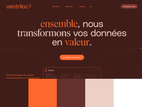
Monochromatic color scheme use variations of one single color. This can include tints (adding white to a color), shades (adding black to a color), and tones (adding gray to a color).
This specific scheme could be utilized to achieve a cohesive and harmonious look. Monochromatic color schemes can be used to create a soothing and calming effect, or to create a sense of formality or elegance.
Additionally, they can be used to create a sense of unity in design, because all the colors used will be closely related and will work well together.
Just look at the example of the website below:
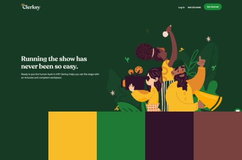
An analogous color scheme uses colors that are next to each other on the color wheel.
For example, a scheme might use the colors red, orange, and yellow.
Analogous color schemes are often found in nature and can create a harmonious and pleasing look. They are also easy to create because the colors naturally go well together.
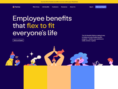
A complementary color scheme uses colors that are opposite each other on the color wheel —so this one is super easy to remember!
But why are they called complementary? Well, because when used together, they can create a strong contrast and enhance each other.
If you’re going for a dynamic and vibrant look, this will be your go-to color scheme. But use it with care, as the high contrast can also be striking and overwhelming if not balanced properly.
A great example of a complementary color scheme can be seen below:

A split-complementary color scheme is literally the older sister of complementary one.
But, in this instance, instead of choosing the color that's directly across from your main color (which would be the "complementary" color) you choose the two colors just to the left and right of the complementary color.
With this one, you’ll achieve less contrasting and a more cohesive look, while still providing the benefits of a complementary color scheme.
A triadic color scheme uses three colors that are evenly spaced around the color wheel. It looks like a triangle when you connect the lines.
Thanks to the consistent distance in the color wheel, they are always related to each other but still provide enough contrast to create interest.
A triadic color scheme is often used to create a sense of variety and interest in a design, while still maintaining a cohesive and harmonious look.

A tetradic color scheme, also known as a “double complementary color scheme”, uses four colors arranged into two complementary pairs.
This creates a rich and complex color palette, as the colors used in a tetradic color scheme are related to each other but still provide enough contrast to create interest.
It can be a bit tricky to use all four colors together, but, when you do, it creates a super cool and sophisticated look!
Some other color schemes are:
Square
Rectangle
So, let’s wrap this section up with a few thoughts.
Each color scheme uses different colors and arrangements to create a specific, visual impact and convey a certain mood or message.
As a UI designer, however, you’ll usually have restrictions on the decisions you can make. Every good product nowadays has an extensive design system, brand guidelines, etc. —so your choices will be limited. But still, it’s super important to know about these color schemes when working on your UI screens.
To fully understand the use of color theory in the UI, you need to know that color theory has three important parts.
Put simply, color harmony refers to the use of colors in a way that creates a visually pleasing and balanced composition. It is the use of color relationships on the color wheel to create aesthetically pleasing designs.
As mentioned above, there are a few color schemes, such as monochromatic, analogous, complementary, etc. (Refer back and read again about different types of color schemes if necessary.)
Color value refers to the relative lightness or darkness of a color.
The value of a color can be thought of as its "brightness" or "grayness" on a scale from black to white. It can also be affected by factors such as its saturation and hue.
In UI design, color value is an important part of color theory. The most experienced UI designers usually use color value to create balance and make some elements stand out. And you know what’s the best part? They usually don’t even think about it: It all comes with practice.
But you’re lucky because you got to learn it by reading from this article!
In color theory, color temperature is used to describe how cool or warm the color is.
Warm colors (such as red, orange and yellow) are associated with feelings of warmth, energy, and excitement.
On the other hand, cool colors (such as blue, green, and purple) are associated with feelings of calmness, serenity, and composure.
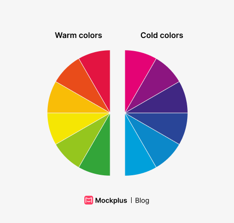 Once again, we see a great application of the color wheel - where the colors on the left side are warm and those on the right side are cool.
So, if you see a painting with a lot of warm colors, it's like standing in front of a fireplace on a cold winter day. On the other hand, a painting with a lot of cool colors would feel like taking an ice bath in the middle of the lake (like Wim Hof!).
To put it simply, in UI color theory is like a secret sauce. It helps turn boring designs into a colorful feast for the eyes.
Being able to pair the right colors is crucial if you want to deliver a good experience for the user.
Just look at the following UI design.
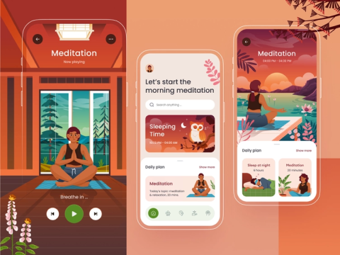
These warm colors make you instantly feel calm and at ease. I’d say those are the perfect colors for a meditation app (credit for image to designer on Dribbble)
And you have such examples everywhere.
Just think about using the wrong colors in a checkout process, such as using too much red. That could potentially create confusion and discomfort for the user.
Using bad colors is like adding spicey sauce to a pizza for a person that hates spice.
Interesting fact: According to study published by The University of Chicago Press, using red color on eBay auctions improves CTR. The reason?It makes users feel as if they are competing with other bidders, which actually results in higher willingness to pay & bid more.
You see? Good knowledge of color theory can either break or make your UI.
But what about color theory in the UI? Aren’t there any rules on how to apply it?
Of course there are!!
You see, the overall goal of using color theory in UI design is to create an interface that is visually pleasing and easy to use. This means making sure the interface is consistent with the brand's identity and also accessible to all users.
How do we achieve that?
By following a few simple rules. I guarantee to you that once you learn them, your UI designs will improve!
Let’s dive right in!
As a UI designer, you always have to consider the demographic you are designing for.
For example, older people will have trouble reading text that is small and grey —so make sure to use the right contrast colors.
There is a great tool called Color contrast analyzer by Adobe. It basically helps you to determine whether your colors will be easy to read.
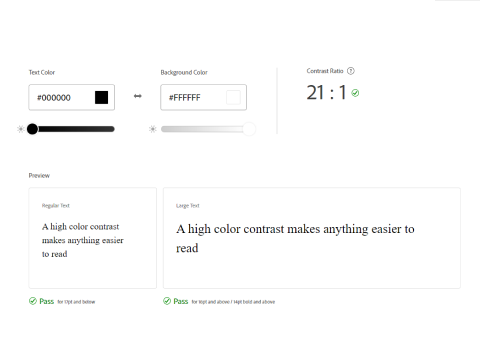
It’s a “UI sin” to have a very small contrast ratio so make sure to always check it out. As an experienced UI designer you’ll be able to tell.
Also, this is something you can test as a UX designer when conducting usability tests. If a user is working really hard to read some text (e.g, getting closer to the screen) , this might indicate that the contrast is poor (or the font too small).
We already touched on this, but it’s important.
You see, using the wrong colors in wrong situations can be detrimental to the success of the product you’re working on. For example, look at this two meditation apps and tell me which one do you think is more likely to evoke calmness:
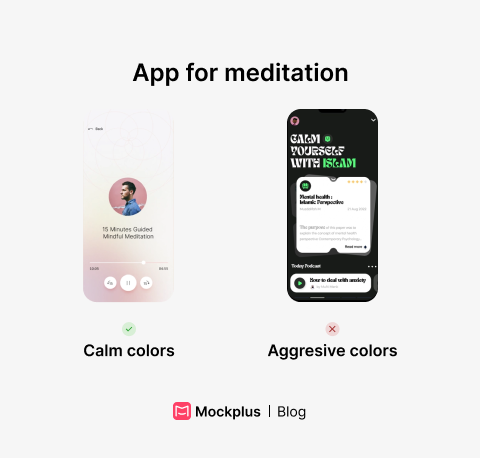
I think the answer is pretty much clear.
Using wrong colors in a bad context can cause confusion and discourage users from taking action.
So, the context in which you use the colors is very important.
This is something you can start to apply immediately in your UI workflow. For example, help users quickly understand if they have successfully completed a task by using a green colored icon or similar visual cue.
Contrary, you can use red color to indicate that user is about to do some irreversible change such as deleting something:
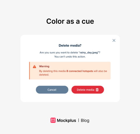
It’s a small thing, but it can have a big impact on the user’s interaction with your product.
Whether you are starting your new UI project, or you‘re picking up where somebody else left off, at some point you’ll want to have a design system.
“Ugh.. what is a design system?”
A design system is a collection of guidelines, components and tools that help teams design and build consistent, cohesive user interfaces.
Design systems can be as big as a full documentation that has over 200 pages of information - to short ones that are just enough for a small startups.

In a design system you’ll usually want to include typography, spacings, components and colors.
All big companies have design system. Just have a look at Apple, Samsung, IBM or even Microsoft - but you might find that their design systems are also aimed towards developers.
Now let’s move on the last part of this article.
We’re going to show you a few actionable tips so you can improve your work and create jaw-dropping design interfaces!
The 60-30-10 rule is a set of guidelines in color theory that suggests any color scheme should include the following:
60% of the space should be dominated by the main color
30% by secondary color
10% by accent color
Of course, there are exceptions, but this rule has become well-known in the art industry.
The main color is usually a neutral color, such as white, beige, or gray, and is used to create a sense of continuity and balance. The secondary color is used to create contrast and interest, and the accent color is used to add visual interest and draw attention to specific elements.
Please keep in mind that this is more like a guide to create balance and harmony, rather than a set of rules.
Can’t decide what color to use in the CTA section? Don’t know what colors would be better for checkout process?
Make a proposal to the team to run A/B test and find out! Researching, iterating and validating ideas is an essential part of the UX — so, if you want to improve UX of your work, test and validate!
Having trouble deciding on the best color for your call-to-action (CTA) section or the checkout process? One way to solve this problem is by proposing an A/B test to your team.
You see, conducting research, iterating, and validating ideas is a crucial part of user experience (UX) design. So, if you want to improve the UX of your work, test and validate!
Conclusion
To put it simply, color theory plays a crucial role in UI design.
By understanding the psychology behind different colors and their effects on human emotions and behavior. Designers can create interfaces that are not only aesthetically pleasing but also effective in achieving their intended goals (which is also part of the UX).
In my opinion, it is more important than ever for designers to start focusing on color theory in their projects. By doing so, they can enhance the user experience, improve usability, and ultimately create interfaces that are more engaging and impactful
 Mockplus RP
A free prototyping tool to create wireframes or interactive prototypes in minutes.
 Mockplus DT
A free UI design tool to design, animate, collaborate and handoff right in the browser.


 Sign up with Google
 Join our Discord community
 support@mockplusapp.com