Colors have a profound influence on the visual appeal and initial impression of a website. But it's the clever use of complementary colors that truly makes important content stand out visually. As a designer, understanding the basics of complementary colors and how they work together becomes indispensable for creating exceptional websites or design projects.
To help you unlock the magic of complementary colors, we've curated this guide that covers everything you want to know about complementary colors, including their definition, significance, inspiring examples, and practical tips for integrating them seamlessly into your UI/UX design. Let's dive into the captivating world of complementary colors together now.
What are complementary colors?
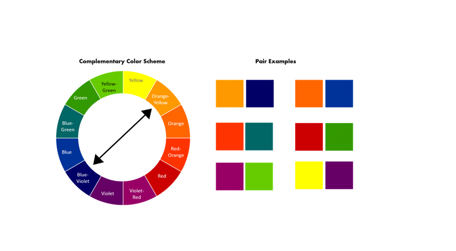
Complementary colors refer to the two colors that are positioned opposite each other on the
color wheel. One of the main charms of these colors lies in their ability to make each other stand out and create a strong visual contrast when used together. While the specific complementary color pairs may vary depending on the color wheel or model being used, let's illustrate with the example of the classic or the most widely-used color wheel devised by Sir Isaac Newton. The primary complementary colors on this wheel are:
Red and green
Blue and orange
Yellow and purple
And since complementary colors possess the power to make interface elements stand out and effortlessly capture the attention of web visitors or audiences, UI/UX designers frequently employ complementary color schemes to infuse visual interest, ensure balance, and highlight important content in their design projects.
What makes up complementary colors?
Basically, a set of complementary colors typically consists of a warm color and a cool color. Warm colors encompass shades like orange, red, and yellow, while cool colors include blue, green, and purple. When a warm color is paired with a cool color, it produces a pronounced visual contrast.
For example:
Red and green: Red is a warm color, while green is a cool color. This pairing creates a bold and energetic contrast.
Blue and orange: Blue is a cool color, while orange is a warm color. This combination offers a striking and vibrant contrast.
Yellow and purple: Yellow is a warm color, while purple is a cool color. This pairing creates a lively and eye-catching contrast.
By combining warm and cool colors, designers can achieve a captivating interplay that captures attention and adds visual intrigue to their designs. The contrast between these complementary colors serves as a powerful tool for emphasizing and highlighting important elements.
Why are complementary colors important?
Complementary colors hold significant importance in the world of design for the following reasons:

This website design uses orange and blue to create a very clear visual contrast. - Ensure visual balance: Using warm or cool colors only on a website may result in a limited and unbalanced visual experience for web users. However, using them together can reduce the bad effect and enhance the overall visual appeal of a web design, creating a harmonious aesthetic.
Show visual hierarchy: When utilizing complementary colors with shading or gradients, they also assist in illustrating the visual hierarchical relationships of design elements, effectively generating depth and dimension within the design.
Show off design creativity: By understanding and effectively utilizing complementary color combinations, designers can explore endless possibilities for creating unique and captivating designs.

Antoniouve's website wisely utilizes complementary colors, such as red and green, purple and orange, to create a striking website, providing a unique user experience.In one sentence, understanding the power of complementary colors empowers designers to make good color decisions and create visually striking and impactful designs. So, as a UI or UX designer, you should never ignore or underestimate their significance.
How to use complementary colors?
Using complementary colors is the art of using opposite colors to create contrast. Incorrectly using them can fail to make your content stand out and even disrupt the overall aesthetic of your website. To fully unleash the potential of complementary colors, consider following these practical tips:
1. Choose the right color wheels and tools
When considering complementary colors, it's important to note that the specific color wheel and model you use can result in different combinations. To ensure the best outcome for your design, it is essential to select the appropriate color wheel. Fortunately, there are many complementary color pickers and tools available in the market, such as
Color Wheel or
Color Picker, which can save you not just hours.
2. Consider the emotional impact of your color pairs
Colors possess the remarkable ability to evoke diverse emotions and psychological responses. When using complementary colors, you may also consider whether the emotional effect of the colors you've selected aligns with your products or brand.
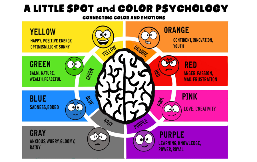
Colors can evoke various emotions, and the same holds true for complementary color pairs.
As mentioned earlier, the color combination of "red and green" generates a vibrant and energetic contrast. However, it is important to note that this particular pairing may not be suitable for some websites or themes that want web visitors or audiences to keep calm and serious all the time.
3. Be careful of using complementary colors equally
Believe me, using complementary colors equally on your web interface sometimes can be super ugly, because they can result in visual imbalance and potential strain on the eyes.
To make them work perfectly with each other, you are supposed to choose one color as the dominant color, which can help to set the overall tone and mood, and let the other color support it. Only in this way, you can just ensure a perfect harmony between the colors.
4. Render complementary colors with shades and gradients
Using complementary colors directly side by side can occasionally result in a less desirable outcome, as it may appear too direct or visually unpleasing. To fix this, you may try to blend two complementary colors with shades and gradients for a smoother transition between these colors.
5. Timely test and iterate
Design is an iterative process, so experiment, gather feedback, and refine your color choices as you progress. When working on a web or mobile app project,
a handy prototyping tool like Mockplus RP would be a good tool for you and your team to quickly prototype, test, and iterate your interface and color ideas in the easiest way. Simply sharing a link is all you need to collect feedback and refine your designs according to their feedback.
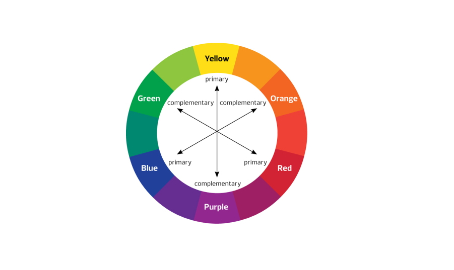
Complementary colors and examples
Based on Sir Isaac Newton's red, yellow, and blue color wheel, the classic examples of complementary color combinations are often:
Red and green
Orange and blue
Yellow and purple
If you include the variants of these primary colors red, green, and blue, you may get another three complementary color examples, such as:
Blue-purple and yellow-orange
Red-purple and yellow-green
Red-orange and blue-green
You may have far more complementary color options when you involve more color variants. And these combinations offer a wide range of possibilities, enabling you to create stunning website designs. To spark your creativity, we have curated a collection of 10 exceptional website designs that showcase the effective use of complementary colors for your inspiration.
1. Petitsmo

Petitsmo features a captivating game-style interface that combines two harmonious complementary color combinations: red and green, and blue and orange. The designers cleverly used green as the dominant color, applying it to buttons, images, logos, icons, and more, and creating a refreshing and vibrant look. They also added touches of red to enhance the overall aesthetic design. Additionally, the clever use of blue and orange colors further enhances the visual appeal of the website.
2. Buuuk

Buuuk is an outstanding website that successfully integrates the red and green color pairing. Unlike Petitsmo, this website places red as the prominent color while using green sparingly for specific buttons and decorations.
The use of green buttons against the red background creates a striking visual contrast that instantly captures attention. This intentional contrast draws users' eyes to the buttons, visually encouraging them to take action, such as placing an order or reaching out for further information.
Buuuk's skillful execution of the red and green pairing creates an engaging and user-friendly interface, where the complementary colors work together to guide and entice users to interact with the website effectively.
3. Dental Health Website

The
Dental Health Website exemplifies a remarkable use of another complementary color combination: blue and orange. With astute design choices, the website predominantly employs blue, creating a captivating visual foundation. In a strategic move, orange is tastefully utilized as a decorative element, infusing vibrancy into the website and drawing attention to significant numbers and key information.
4. Skateboard Web

Skateboard Web is an outstanding demonstration of leveraging complementary colors to create striking visual contrast.The designers skillfully highlight the skateboards by juxtaposing a vibrant blue skateboard against an energetic orange backdrop, a captivating pink skateboard against a deep blue background, and a vivid yellow skateboard against a refreshing light blue canvas.
This meticulous choice of colors produces a captivating and dynamic contrast, resulting in an exceptionally vibrant and visually stimulating experience.Moreover, the innovative two-column layout, embellished with distinct colors and content, elevates Skateboard Web to new heights of creativity.
5. Kenn & Kitt
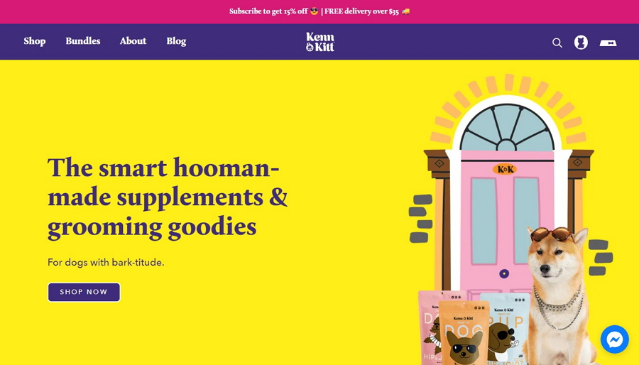
Alt: Kenn & KittIf you are wondering how you can perfectly incorporate purple and yellow?
Kenn & Kitt can be a good example. The bright color combination not only makes the site more colorful and lively, and also helps to stand out the important elements.
6. Zendesk

Utilizing a complementary color pair such as yellow and purple does not necessarily have to rely solely on pure tones. Variations of these colors can be equally effective in creating a visually striking contrast.
Zendesk exemplifies this approach by employing a distinctive visual statement through a pairing of dark purple and mustard yellow.
Within Zendesk's design, mustard yellow is skillfully utilized as a background to provide a cohesive foundation for all interface elements. Moreover, dark purple is selectively employed to accentuate specific buttons, decorations, and interactive elements, ensuring they all grab users' attention easily.By incorporating these variations of yellow and purple, Zendesk achieves a harmonious balance between visual contrast and cohesive design elements, resulting in a unique and engaging user experience.
7. BigScoop

BigScoop, a web design concept, effectively employs the complementary colors of dark purple and mustard yellow. However, it distinguishes itself from Zendesk by utilizing these colors in a distinct manner. BigScoop strategically leverages these two hues to visually divide various functional areas within the web interface.In the case of BigScoop, mustard yellow takes center stage, serving as a vibrant highlight for the initial screen of the page.
On the other hand, dark purple gracefully transitions to the subsequent screen, where it takes the stage to showcase locations or other relevant information. This deliberate use of the color pair creates a clear and visually appealing division, ensuring seamless navigation and engagement.
Through its thoughtful implementation of dark purple and mustard yellow, BigScoop demonstrates an innovative approach in utilizing complementary colors to enhance both the aesthetic appeal and functionality of its web interface.
8. Hootsuite

Hootsuite, the renowned website for social media management, effectively utilizes a complementary color scheme featuring dark blue and vibrant green. This combination is skillfully employed to create a visually engaging and cohesive user experience. Within Hootsuite's design, the vibrant green takes center stage, as it permeates the backgrounds, buttons, headings, and even images.
This lively hue contributes to an energetic and dynamic atmosphere throughout the interface. In contrast, the dark blue color is thoughtfully incorporated for specific elements such as icons, images, and subtle details. By leveraging the dark blue in these areas, Hootsuite achieves a sense of depth and adds visual interest to the overall composition.
9. Little Big Band

Little Big Band's website features a captivating combination of blue and orange. The background uses a gradient of blues, ranging from dark navy to lighter shades. The text is in white or light gray, ensuring readability against the blue backdrop. Vibrant orange is used for videos, images, buttons, links, and icons, creating attention-grabbing accents. The complementary colors of blue and orange work together to create an engaging and visually appealing design.
10. Tracko Lap

Trackolap gives another good example of how you can use complementary colors such as blue and orange to create an appealing website. The blue tones are elegantly used throughout the site, providing a calming and trustworthy backdrop.To create an eye-catching contrast, vibrant orange accents are strategically placed. These pops of orange draw attention to specific elements, such as buttons, icons, and important highlights, adding a touch of energy and creating visual interest.
The overall design is well-balanced, ensuring a delightful user experience.
One more thing that is worth mentioning is, in real-life scenarios, achieving a user-friendly experience may require more than just using complementary colors in your website design. It is essential to remember to incorporate other colors with less contrast to create a softer and more visually pleasing experience for your users.
FAQs:
1. How do you know if colors are complementary?
The best way to see whether colors are complementary is to use a color wheel. Locate one specific color on the color wheel, and its complementary color lies just on the opposite of that wheel. You will then know whether they are complementary or not.
2. Do complementary colors go together?
Yes. Complementary colors can go together harmoniously. If you're looking to achieve the perfect balance between them, you can go back to the "How to use complementary colors?" part of this article, which introduces valuable insights on how to effectively combine these colors to meet your specific needs.
3. What are complementary and contrasting colors?
They two are completely two different color concepts in
color theory:
Complementary colors are pairs of colors that are located directly opposite each other on the color wheel, such as red and green, blue and orange, and yellow and purple. When placed side by side, they create a strong contrast and enhance each other's vibrancy.
Contrasting colors are two colors that differ significantly from one another in terms of hue, value, or saturation. These colors create a noticeable visual distinction when placed together.
Most importantly, while all complementary colors are contrasting, not all contrasting colors are complementary. They are kind of different.
Wrap Up
Complementary colors play a vital role in design by creating strong visual contrast and allowing important elements to stand out. This comprehensive beginner's guide aims to provide a better understanding of complementary colors and lets you learn how to use them effectively. We hope the information and examples shared here are helpful and inspiring enough to you.
 Mockplus RP
 Mockplus DT


 Sign up with Google