Web Developers used to spend a lot of time creating beautiful CSS. Thanks to the CSS frameworks, we now have a better, faster, and more effective way to build responsive websites and web applications.
Are you still looking for the best CSS framework? Do you want to know which framework you should try? In this article, we have 15 best CSS frameworks in 2022 for your inspiration.
CSS framework gives web developers a basic structure, which includes grid, interactive UI patterns, web typography, tooltips, buttons, form elements, icons. This structure helps web developers to start quickly and efficiently when they are designing a website or web applications.
That means developers can free themselves from starting everything from scratch. CSS framework will create a solid foundation for them. Besides, developers can also reuse code in all projects they work on.
CSS frameworks have their downsides. So you need to understand whether you need one or not. Here are a few strong arguments for using the frameworks:
You can save time by having a solid foundation that you can rely on. CSS frameworks give web developers something that they can use and customize (if required).
And for those who have limited coding skills, using a CSS framework is the only way to create a solid product.
You can build a solution and test it with your users. It is much faster and easier to create a prototype or wireframe with a framework rather than do it from scratch.
PS:Designers can also create prototypes/wireframes using a rapid prototyping tool.
There are a lot of great frameworks you can choose from. Sometimes people give up using a CSS framework because they couldn't find a suitable option. If you struggle to find a framework for your specific needs, then you should check our list of 15 CSS frameworks.
Here we have put together 15 best CSS frameworks. We hope you like them, and most importantly, find the best one for your needs.
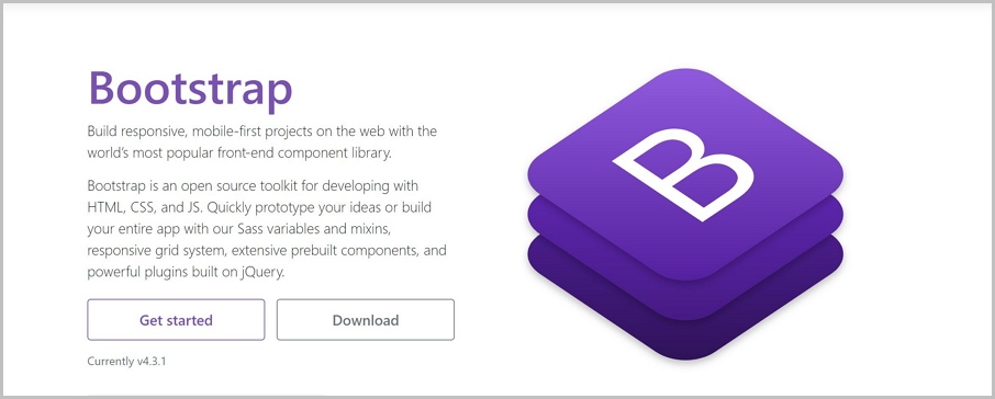
Bootstrap is one of the most popular CSS Frameworks. The current version of this framework is Bootstrap 4, which was released in 2018. Many significant features were introduced in this release, such as new color schemes, new modifiers, new utility classes, etc.
In addition, version 4 of Bootstrap is built with SASS, and that means Bootstrap is now supported both LESS and SASS.
1) Powerful responsive design
Bootstrap powers responsive design using its grid system. It’s easy to use, and you can quickly create a responsive grid that will work well in all browsers. Your design will look great on all screens and resolutions.
2) Built-in libraries of resources
Bootstrap provides large libraries for front-end developers, for example, website layouts, website templates, Bootstrap themes, admin panels, and a massive collection of UI components.
The components include buttons, forms, cards, progress bars, alerts. Those are pre-build components that can save product design teams a lot of time.
3) Low learning curve
Bootstrap framework is good for web beginners. Using this tool, you can join the front-end development field. There are lots of helpful documentation and tutorials that you can rely on whenever you have questions.
4) Quickly build prototypes
Using ready-to-use components is one of the fastest ways to mock or prototype a solution. With the variables and mixins, responsive grid system, rich components, and many other powerful tools, you can prototype with ease.
More features of Bootstrap:
Foundation and Bootstrap are both the widely used CSS frameworks. But Foundation is a way more sophisticated framework. It is very flexible and easily customizable.
It is a useful tool to create responsive websites and web apps, especially for the enterprise. Facebook, eBay, Mozilla, Adobe, HP, Cisco, and Disney use Foundation in their products.
1) Create responsive design
Similar to Bootstrap, Foundation is also a very flexible front-end framework that helps web developers create responsive websites, apps, and emails that look great on any device.
2) Powerful Email framework
Besides website and applications, Foundation can also be used to create great-looking responsive HTML emails. You can build HTML emails using Foundation for emails. No need to use the complex table markup or other stuff. It is a great help for Email marketing companies.
3) Online webinar training support
Foundation can be a great help if you know how to use it, but it can be hard to achieve an advanced level in it. That’s why Zurb (The company who developed Foundation) opened an online webinar training and professional consulting to teach you and your team the valuable skills. But the training isn’t free.
4) Easy to customize
Foundation is much more flexible than Bootstrap. The front-end developer has full control over the UIs. However, due to that, newcomers may find Foundation is hard to start with.
More features of Foundation:
Pure is a lightweight and responsive CSS framework created by Yahoo in 2014. It is built using Normalize.css and help you create responsive layouts using its Grids and Menus. Pure is responsive by default, and unlike Bootstrap, it doesn’t allow creating fixed layouts.
More features of Skeleton:
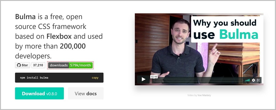
Bulma is a free and open-source CSS framework based on the Flexbox layout model. It is lightweight, responsive, pure-CSS, and mobile-first.
All these features made Bulma one of the most popular CSS frameworks along with Bootstrap and Foundation. Bulma has more than 150 000 users, more than the Foundation.
1) Readable and memorial class names
Bulma provides the developers with readable CSS class names and ready-to-use components to build mobile-friendly interfaces. It is incredibly easy to recognize and remember the CSS class names because all of them are named logically.
2) Pure CSS, no JavaScript
Bulma created in pure CSS. Whenever you use the framework, all you need is one .css file, and no .js is required. Besides, developers can easily add custom look on all the components via modifier classes and variables.
3)Community
Bulma has a large community. Their fans can communicate with each other, ask questions, and get answers.
4)Easy to learn
The low learning curve is another benefit of Bulma. It is an excellent framework for newbies.
More features of Bulma:
Flexbox based
Built with Sass
Easy to learn, easy to use
Semantic UI is a responsive front-end framework that uses human-friendly HTML. You can build beautiful, responsive layouts with its 3000+ Theming Variables and 50+ UI Components.
It also integrated with a lot of third-party libraries, including React, Angular, Meteor, Ember, and many other frameworks. All this helps you organize your UI layer alongside your application logic.
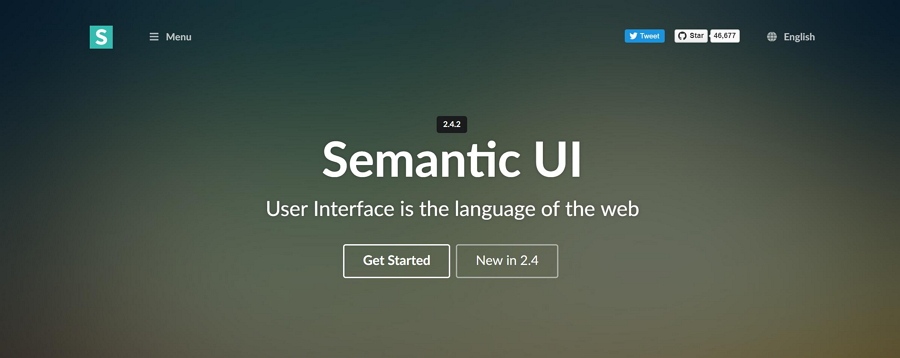
1)Friendly Class names
The most significant benefit of Semantic UI is it’s "human-friendly HTML." It means that you can code using a natural language. Although it has some learning curve, the class names are very readable and friendly.
2)Nice-looking layouts
Semantic UI has 3000+ Theming Variables, and all of them are as responsive. Compared to Bootstrap 4, all layouts created in Semantic are more beautiful by default.
More features of Semantic UI:
Concise HTML
Intuitive Javascript
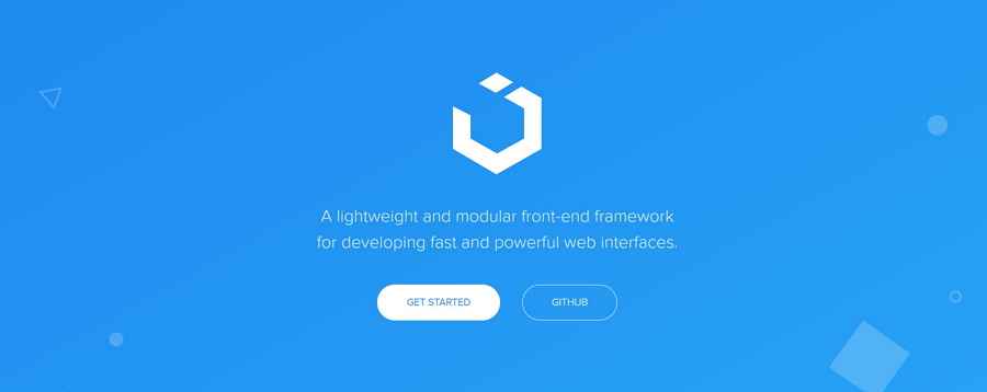
UI Kit is a lightweight CSS and web UI design framework, which offers almost all the features of other frameworks.
You can create simple, clean, and modular web interfaces with its SVG icons set, many components, responsiveness, unified styles, and customization options. Besides, you can also design complex flexbox-based layouts with UI Kit using plain HTML.
What makes UI kits stand out from other CSS frameworks?
1) Minimalism
UI kits can help web developers create clean and modern interfaces. It offers powerful features, but when it comes to design, it becomes super clean.
2) Useful UI components
UI kits has pre-built components such as Accordion, Alert, Drop, Iconnav, animations, Padding, etc. Each component shows the usage pattern, component options and methods.
Other features of UI kits:
Compatible with Less and Sass.
Includes JavaScript
Works in pretty much any modern browser.
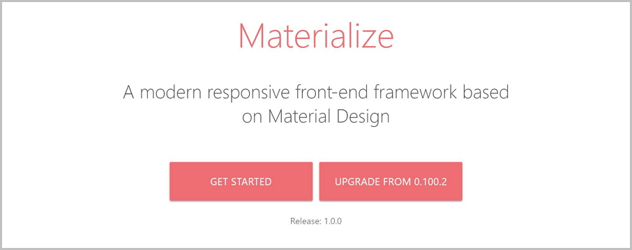
Materialize CSS is a responsive front-end framework created by Google in 2014. It’s the right solution for anyone who wants to design websites or Android web apps because it comes with ready-to-use classes and components. You can quickly get started using its starter templates.
There are two reasons you might want to use Materialize as one of your design languages.
1)You love Material Design
We all know that Material Design is an essential ingredient of Google products. That is the reason why Materialize CSS became one of the most popular design languages.
So whether you are a starter or interested in Material design, Materialize CSS is the one you shouldn’t miss out.
2)You know how Bootstrap works
Materialize CSS uses Bootstrap’s 12-column grid format so you can quickly create responsive page layouts. You will get started even faster with the basic knowledge of a Bootstrap project.
More features of Materialize CSS:
Mobile menus
Compatible with Sass
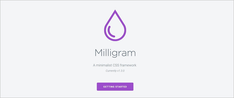
Milligram is one of the lightest CSS frameworks that can help you design fast and clean websites. The solution’s weight is 2KB (gzipped).
But despite its small size, Milligram comes with a complete set of web development tools. Developers can also use all the features offered by CSS3 specification with Milligram. These can add much power to Milligram and made it one of the top three lightweight frameworks available.
More features of Milligram:
Based on Flexbox grid
Super design themes
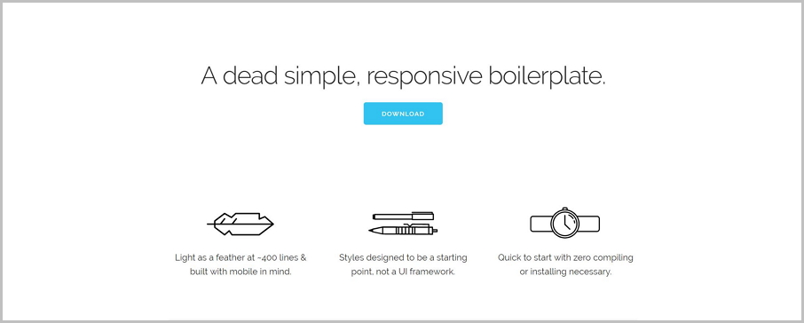
Skeleton is a minimal responsive CSS framework which contains only 400 lines of source code. Despite its relatively small size, it offers a lot of options (grids, typography, buttons, forms, lists, tables, code, etc.) that allow you to create complex websites.
When is the best time to use a Skeleton framework?
If you're doing a smaller project or have no necessary to use all the utility of larger frameworks, then Skeleton is your best choice. Skeleton only features a limited number of standard HTML elements, but that’s enough to get started.
More features of Skeleton:
Built with mobile in mind
Easy to learn
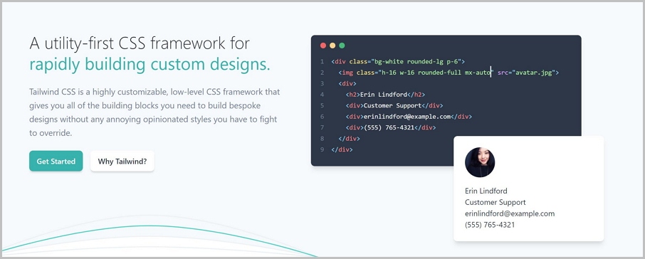
Tailwind CSS is a highly customizable and low-level CSS framework. Unlike Bootstrap that creates a generic-looking UIs, Tailwind allows you to customize your designs and create a unique look and feel.
1) Easy to customize
Tailwind is written in PostCSS and configured in JavaScript. You will have full control of a real programming language that can customize your UI looks - play with colors, border sizes, font weights, spacing utilities, breakpoints, shadows, and other elements and properties.
For example, if you want to create buttons using Tailwind, here is how they will look:
Pill:

Outline:

3D:

2) Utility classes
Instead of pre-styled UI components, Tailwind focuses on utility classes, which lets you build a true sense of custom websites. Such websites convey your unique look and feel.
But Thildwindis will be hard to use if you don’t have any experience with utility classes and know nothing about Atomic CSS.
More features of Thildwind:
Spectre.css is a great framework that can help you do faster and extensible development with the elegantly designed elements, beautiful typography, and pre-built components.
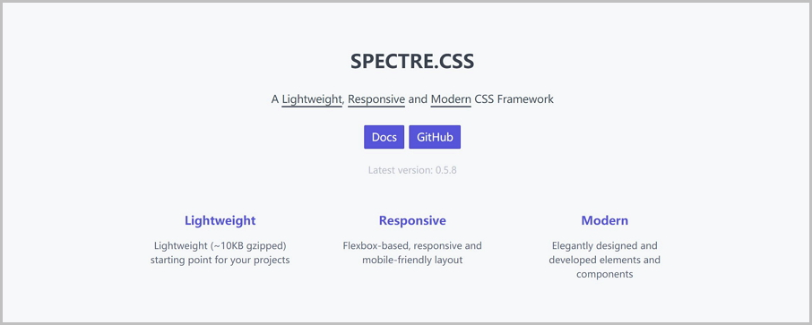
Also, the components are pure CSS, so you don’t need any JavaScript language to use them.
More features of Spectre:
Base is a responsive CSS framework that has a lightweight and minimal code. It is simple, clean, minimal yet powerful. Web developers and designers can create responsive websites and web applications with its solid foundation.
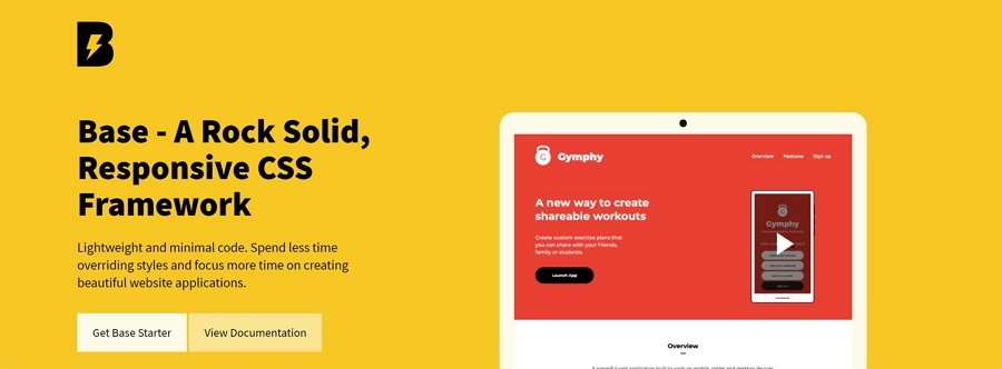
Besides, it is mobile-first and works excellent in all modern browsers, including IE 10+.
More features on Base:
Picnic is another lightweight CSS library with a size of less than 10kb (when gzipped). It provides you pure-CSS and interactive components, including grid, forms, tabs, tooltips, and alerts. The library helps you create a responsive website and beautiful web applications.
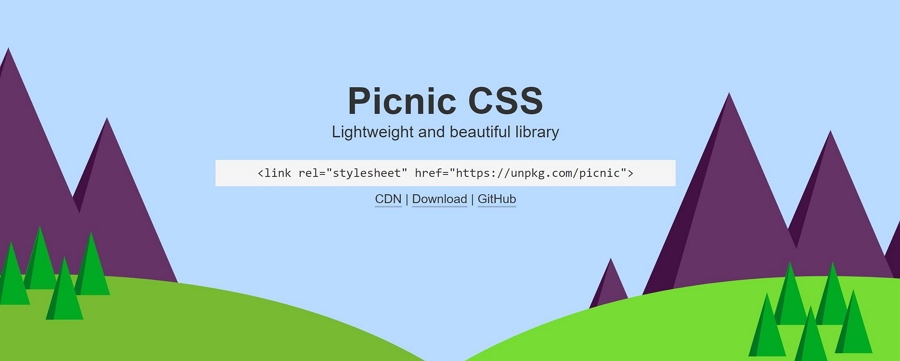
More features of Panic CSS:
Looking for a CSS framework for starters? Try Mustard UI. It is an open-source, lightweight CSS framework specially designed for newcomers. You can start with the essential building blocks because it has split into modules.
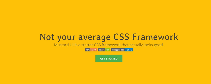
It also provides components for you to create a front-end design. These components are flexbox-based grids, buttons, tables, forms, and cards.
More features of Mustard UI:
Dead Simple Grid is a useful tool with only 250 bytes of CSS code and only two classes. It may not be considered as a complete CSS framework, but it’s handy when web developers want to use a grid system.
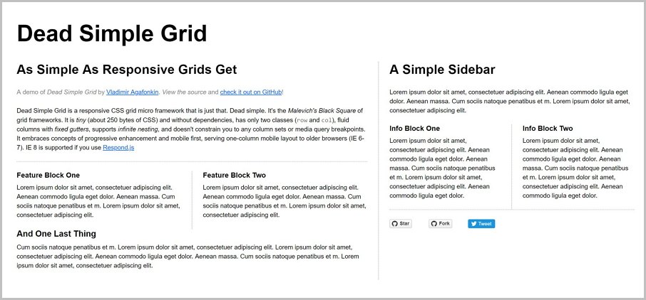
It also supports all major browsers starting from IE 8, serving a one-column mobile layout to older browsers.
More features od Dead Simple Grid:
Susy is a lightweight grid-layout engine. It is designed to simplify and clarify responsive grid layouts. You can use Susy with floats, flexbox, tables, or any other CSS technique.
Animate.css is a great framework that lets you add CSS animations. These include bounce, flash, pulse, rubberBand, shake, swing, tada, wobble, jello, heartBeat, bounceIn, etc. You can check the 30 Cool CSS Animation Examples for some inspiration.
Paper CSS is a LESS- formal CSS framework. It was built with LESS and deployed on a single index.html page before being open-sourced.
NES.css is a NES-style (8bit-like) CSS Framework. It only provides components, so you will need to define your own layout.
Tent CSS is a simple and robust CSS framework. It is designed to be used as a foundation for building websites. It is pure CSS so that you can create websites with zero Javascript dependencies.
Simple Grid is a 12-column, lightweight CSS grid to help you quickly build responsive websites.
Of course, it is. Bootstrap is widely-used CSS Frameworks. If you are interested in Bootstrap, try Bootstrap 4. It can help you create websites and web applications even better and faster than Bootstrap 3.
Pure CSS and Bootstrap have their pros and cons. The majority of web developers are using both. According to the answers of learing Bootstrap and use CSS, Here is a typical way that developers follow:
Flexbox is a layout mode, not a framework. We have talked about CSS3 Flexible Box or flexbox in this article.
HTML (Hypertext Markup Language) is the standard markup language for documents designed to be displayed in a web browser. It is not a framework.
We hope that you want to try some frameworks that we’ve shared with you today. Did we miss any framework? Feel free to let us know!
 Mockplus RP
A free prototyping tool to create wireframes or interactive prototypes in minutes.
 Mockplus DT
A free UI design tool to design, animate, collaborate and handoff right in the browser.
