Dark Mode has become quite trendy in recent years. But does that mean Dark Mode is much better than Light Mode? Or should we be using both modes together? As both options have gained popularity in modern web and app design, knowing when and why to choose one over the other is crucial for creating a great user experience (UX).
In this article, we’ll walk you through everything you need to know about Dark Mode and Light Mode. We'll explore what they are, the pros and cons of each, and help you understand when and how to use them for optimal UX. We’ll also share real-world design examples and highlight how both modes can be effectively combined to enhance user engagement and accessibility.
Whether you choose to use the dark mode, light mode or use them together, you can try our free design and prototyping tool to fully explore and test your ideas for better decision making.
Dark Mode is exactly what it sounds like—an interface where the background is dark, and the text and other elements are light. This simple switch helps reduce the brightness of the screen, which can make it much more comfortable for users, especially when they’re using apps or websites in low-light settings.
But Dark Mode isn’t just a style choice. It serves a practical purpose. By reducing the brightness of the screen, it minimizes eye strain and can even save battery life, particularly on OLED and AMOLED displays. Over time, it has evolved from being a niche feature favored by developers to a mainstream design trend embraced by both users and companies.
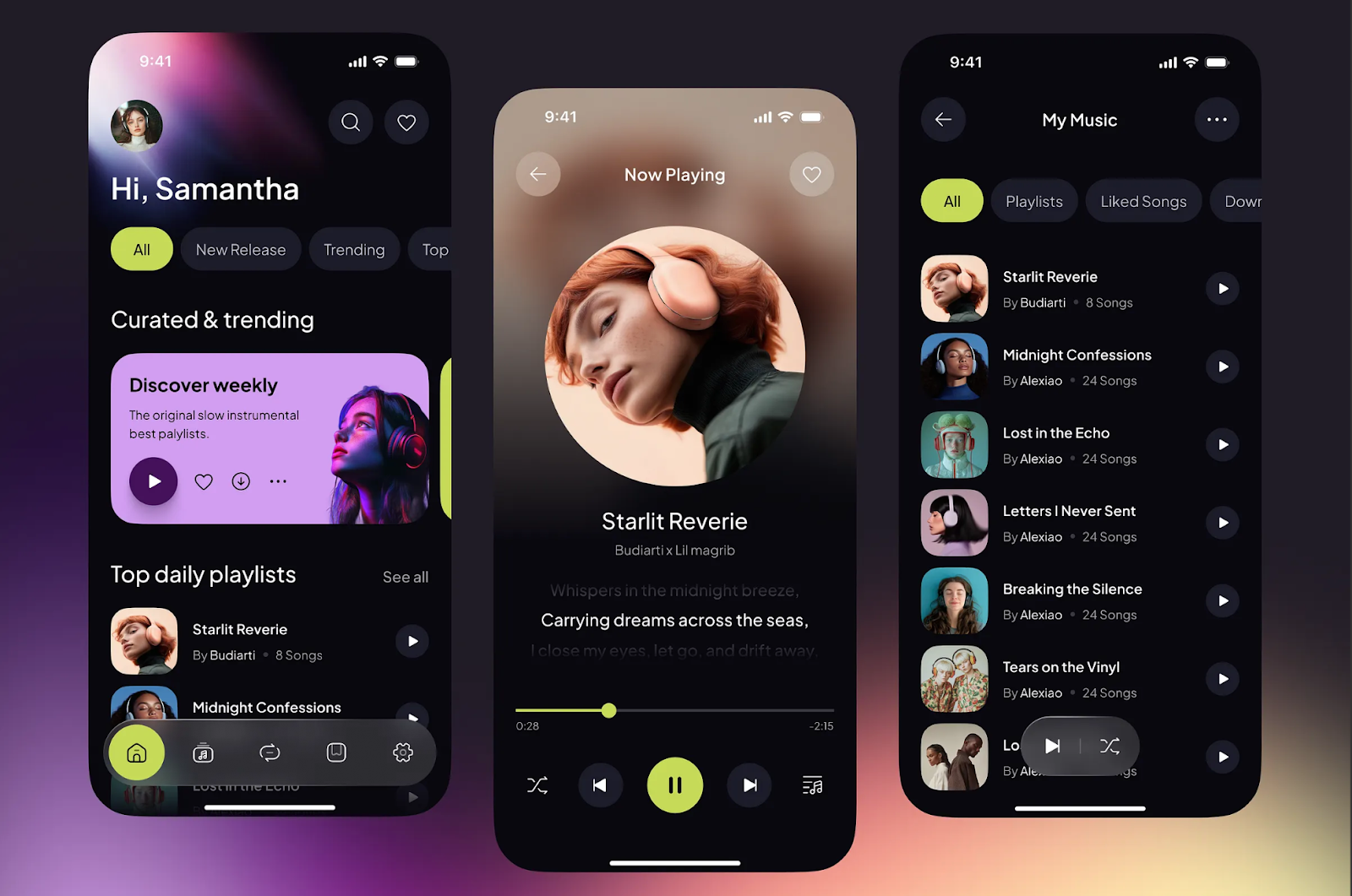
This music player UI demonstrates how a black background in dark mode effectively highlights colorful content while enhancing readability for users.
Dark Mode gives a sleek, modern vibe, and it’s also easier on the eyes, making it perfect for long reading sessions in dimly lit environments.
Trendy dark mode design also has its pros and cons:
Less Eye Strain in Low-Light Settings: Ever noticed how your eyes start to hurt when you’re reading on your phone at night? Dark Mode can help with that. By reducing the glare from the screen, it’s much easier on your eyes, especially if you’re using your device in a dark room or late at night.
Saves Battery: If you’re using an OLED or AMOLED screen, Dark Mode can actually help conserve battery life. These types of displays only light up the pixels that need it, so black pixels don’t consume power.
Focus and Clarity: Because the background is darker, the content tends to pop, making it easier to focus on important elements. Designers often choose Dark Mode for creative workspaces or coding environments where focus and minimal distractions are key.
Sleek and Modern Look: Let’s face it—Dark Mode just looks cool. It gives apps and websites a more polished, futuristic feel, which is why so many tech companies and apps have adopted it.
Harder to Read: Despite its appeal, Dark Mode isn’t always the easiest on the eyes. Especially when it comes to reading long text, high contrast can make it a little tricky. If you’re not careful with the design, text can get hard to read or cause visual fatigue over time.
Accessibility Issues: Dark Mode can be a challenge for some people with visual impairments, like those with astigmatism or color blindness. If the contrast isn’t set just right, it can make reading even more difficult.
Fatigue After Extended Use: Some studies suggest that while Dark Mode might reduce glare, it can also cause a different kind of fatigue, particularly when it comes to distinguishing fine details.
So, to gain the optimal UX, you should always take practical measures to max the pros and minimize the cons.
So, when should you actually use Dark Mode in your designs? While Dark Mode has become popular for its sleek look, it's important to use it strategically based on your users' needs and the context in which they’re engaging with your app or website. Here are a few scenarios where Dark Mode truly shines:
Dim or Low-Light Environments: Dark Mode is ideal for users who are in dark rooms or using your app at night. A bright white screen in low-light conditions can cause eye strain and discomfort, while Dark Mode reduces glare and makes the screen easier on the eyes. For example, platforms like YouTube and Twitter offer Dark Mode to enhance usability when users are browsing at night. This not only provides a more comfortable viewing experience but also makes content stand out against a darker background.
For Creative or Technical Work: Dark Mode is often preferred by designers, developers, and video editors. In these fields, focus and attention to detail are key, and Dark Mode helps eliminate distractions caused by a bright screen. For example, Visual Studio Code, a popular code editor, offers a Dark Mode theme to reduce visual noise and allow developers to concentrate on their code. Similarly, video editing platforms like Adobe Premiere Pro use Dark Mode for a more immersive workspace, helping users focus on their creative process without being overwhelmed by a bright interface.
Battery-Saving Scenarios: If you’re building an app or website for users who care about battery life, especially on mobile devices, Dark Mode can be a smart choice. OLED screens, commonly found on modern smartphones, save power when displaying darker colors because pixels don’t have to be fully lit. Apps like Instagram and Google Maps take advantage of this by offering Dark Mode as a way to help users save battery, especially when they are on the go. This energy-saving feature is a key advantage for users who rely on their devices throughout the day.
When done right, Dark Mode can transform the user experience.
Here are a few examples of popular platforms that have nailed Dark Mode:
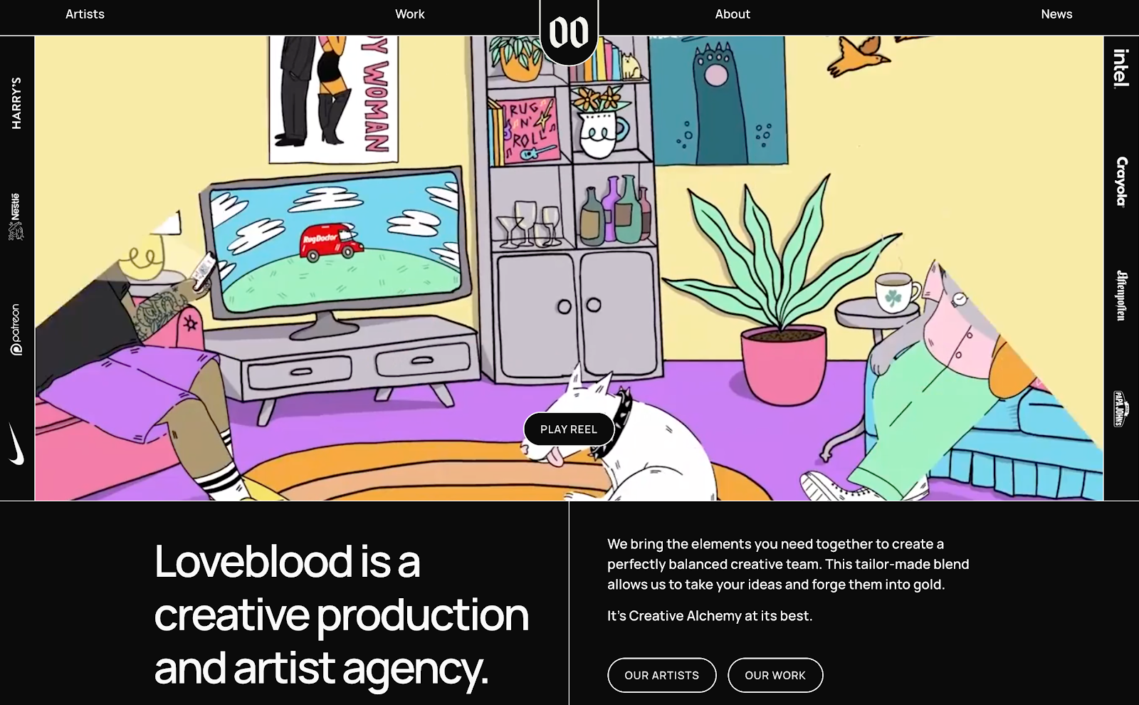
Love Creative Blood is a striking online presence for an art agency, distinguished by its bold use of dark mode. Crisp white text, vibrant imagery, and structured line-style grids contrast beautifully against the black background, enhancing content clarity and visual impact. It's a standout example worth exploring for anyone looking to elevate their dark mode design.
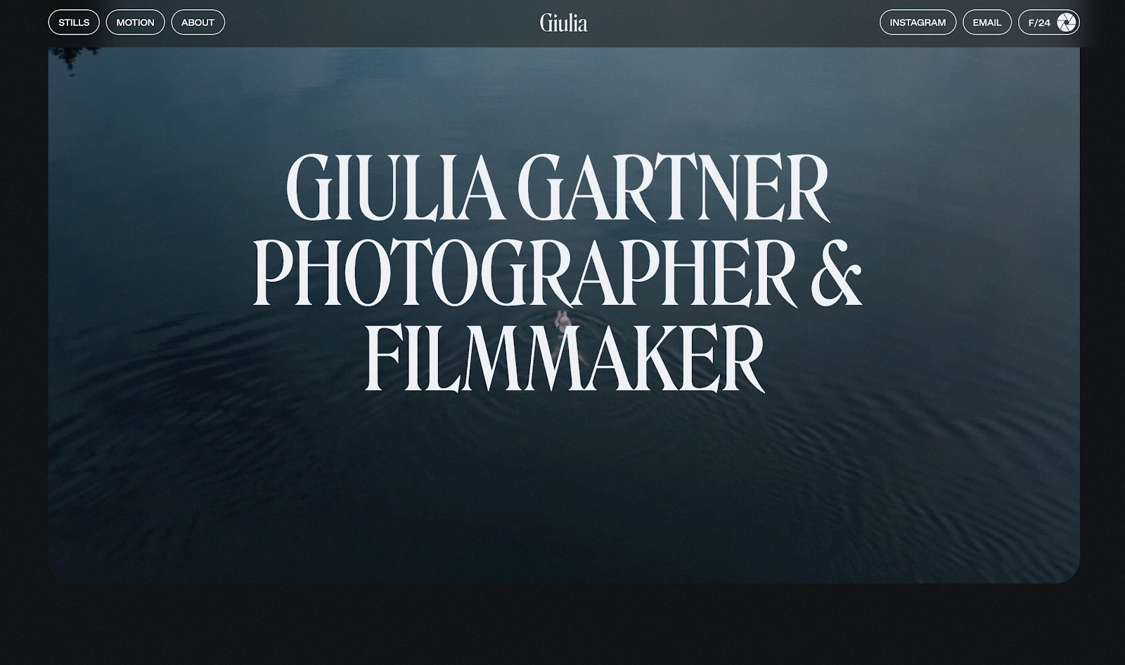
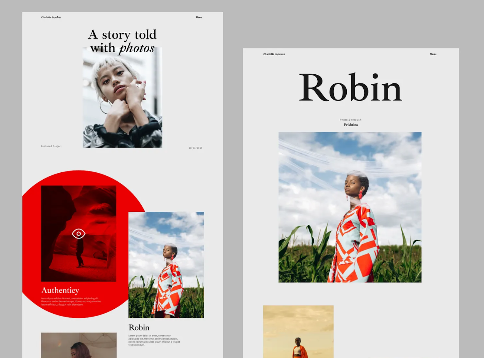
Giulia Gartner’s portfolio is a minimal, interactive website that fully embraces dark mode. From the moment users land on the homepage, they’re met with captivating film videos that immediately draw attention—enhanced by a black background that amplifies their visual impact. The experience is further elevated by dynamic scroll animations and engaging interactive elements, creating an immersive journey through the artist’s work.
3.Ilja Van Eck
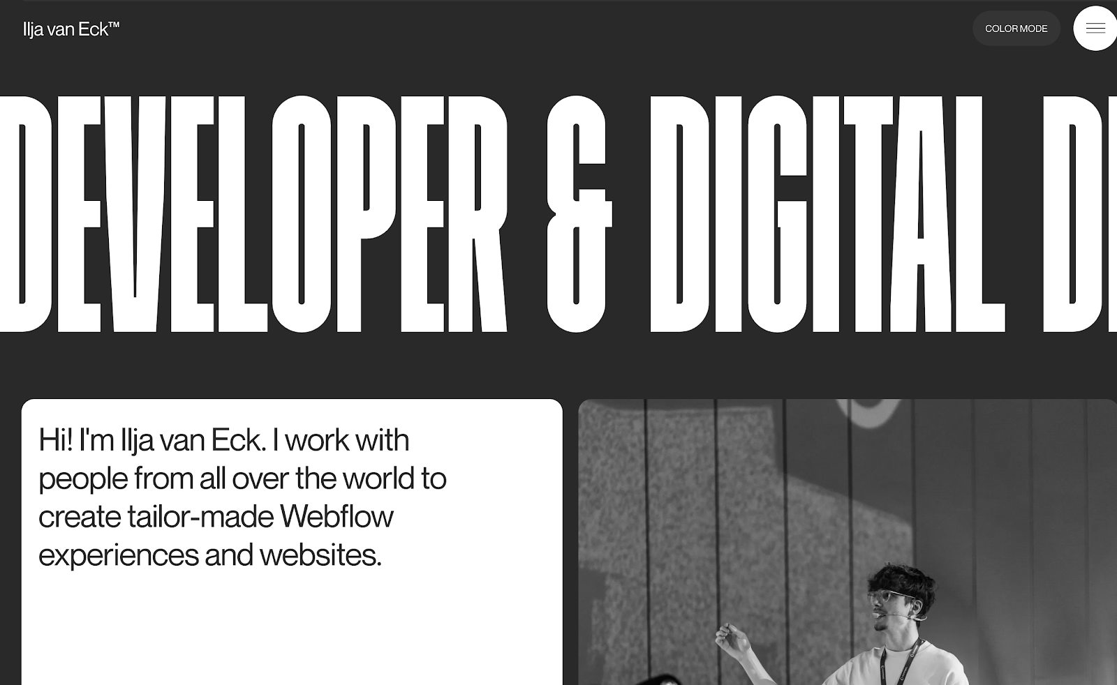
Thinking of designing a brutalist, dark-themed website? This example serves as an excellent reference. With bold, unconventional fonts, high-contrast black-and-white imagery, and striking text blocks, it showcases a powerful use of dark mode. The dramatic contrast against the black background amplifies its visual identity—offering plenty of inspiration for designers looking to push creative boundaries.
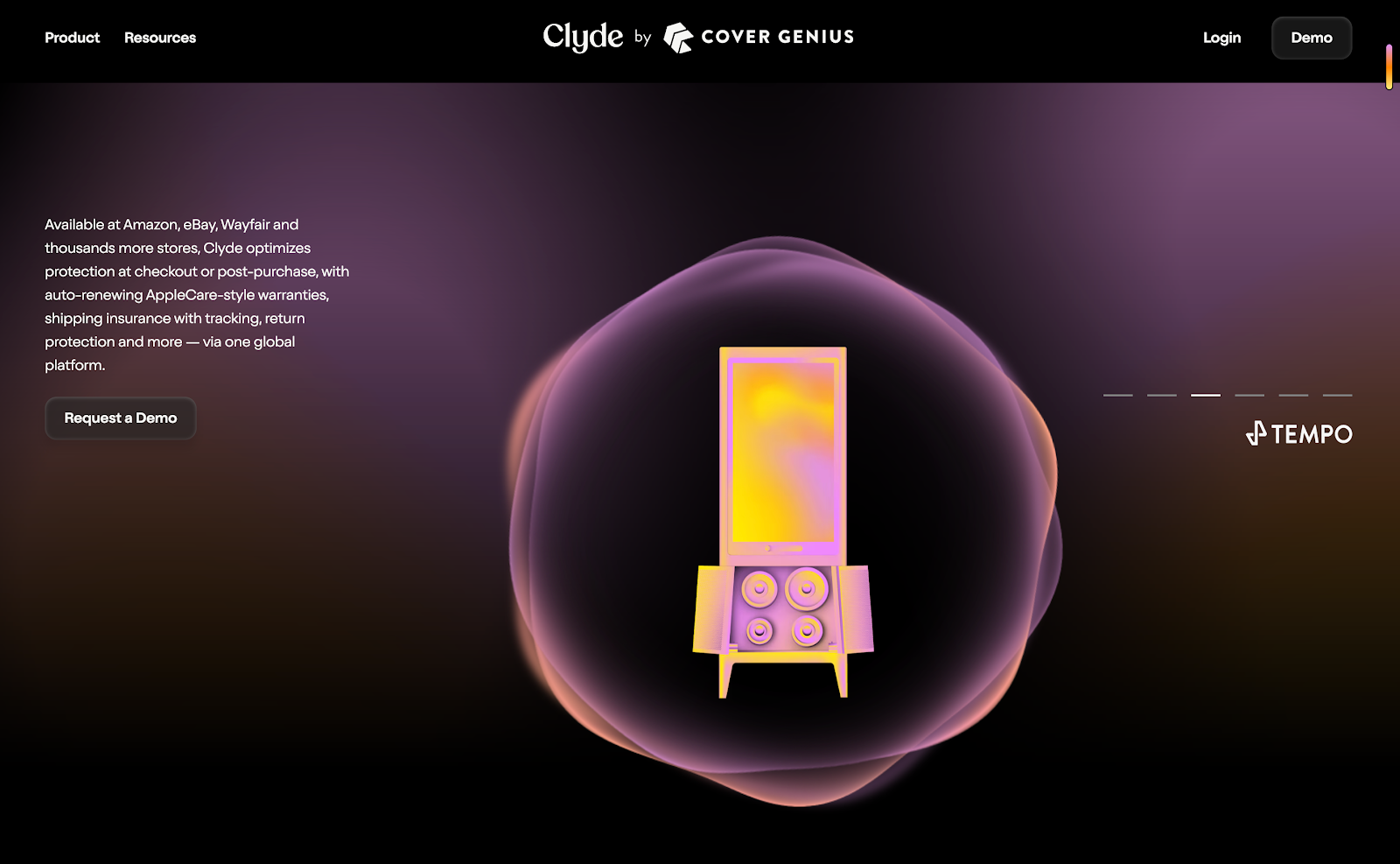
Dark mode doesn’t have to mean using only a black background. Any deep, muted tones that evoke a dark aesthetic can work effectively. The Joinclyde website is a great example—utilizing dark purple as the base, complemented by white and varying shades of purple to create visual hierarchy and highlight key content. It’s a thoughtful approach to dark mode that balances style with usability.

Dark mode is widely embraced in mobile app design, where vibrant elements like candy colors, gradients, and modern illustrations are often used to make key content stand out. This online course app exemplifies that approach—combining sleek dark backgrounds with soft yellow and green accents, along with contemporary illustrations, to create a visually engaging and user-friendly experience.
Light Mode is the traditional UI design with a light background (usually white or light gray) and dark text. It’s the default for many apps, websites, and operating systems and is widely familiar to most users.
While Dark Mode has gained traction, Light Mode remains the go-to choice for tasks that require high visibility and readability, especially in bright environments. It's ideal for activities like reading articles or browsing the web during the day. For instance, Google Search and Facebook use Light Mode to ensure clear text and easy navigation.
Light Mode also tends to be better for accessibility, providing higher contrast that can benefit users with visual impairments, making it a popular choice for news sites and e-commerce platforms.
Easy to Read: Light Mode provides a high contrast between text and background, which makes it great for reading long-form content. If you're designing a website or app with lots of text, Light Mode tends to be more readable.
Perfect for Bright Environments: If you’re using your device in a bright room or outside, Light Mode ensures that the content stands out against the bright surroundings, preventing glare and making things easier to see.
Universal Accessibility: Light Mode is often considered better for accessibility. Users with conditions like astigmatism or low vision find it easier to read text in high contrast, making Light Mode more inclusive.
Eye Strain in Darker Settings: The main drawback of Light Mode is that it can cause discomfort in low-light settings. The bright screen contrasts sharply with the dark surroundings, leading to glare and visual fatigue.
Battery Drain: On OLED and AMOLED screens, Light Mode uses more battery because all the pixels are lit up. This can quickly drain your battery, especially if you're using the device for long periods.
Can Feel Harsh: Some users find Light Mode to be too bright, especially if they’re using their devices in the evening or at night. For those who prefer a more subdued, mellow experience, Light Mode can feel a bit jarring.
Light Mode works best in the following situations:
Well-Lit Environments: If your users are typically in bright settings, such as outdoors or in coffee shops, Light Mode ensures that text remains easy to read without competing with the surrounding light. For example, Google Search and Instagram use Light Mode to provide a clean, easy-to-read interface when users are browsing in natural daylight, making it easier to view search results or scroll through content on a sunny day.
Content-Heavy Applications: For apps and websites that rely heavily on text, such as news sites, blogs, or educational platforms, Light Mode is ideal. Platforms like Medium and The New York Times use Light Mode to ensure that long-form articles are easy to read for extended periods. The high contrast of dark text on a light background is proven to reduce eye strain, making Light Mode the go-to choice for content-heavy environments.
Traditional User Preference: Some users are simply accustomed to Light Mode because it’s the default on most operating systems and applications. For example, many Windows and macOS users start with Light Mode, as it is the standard setting. Similarly, Facebook and LinkedIn keep Light Mode as their default for users who expect a familiar interface and easy navigation. When your target audience is accustomed to this mode, sticking with it can help maintain a seamless experience.
We've also picked 5 creative light mode design examples for your inspiration:
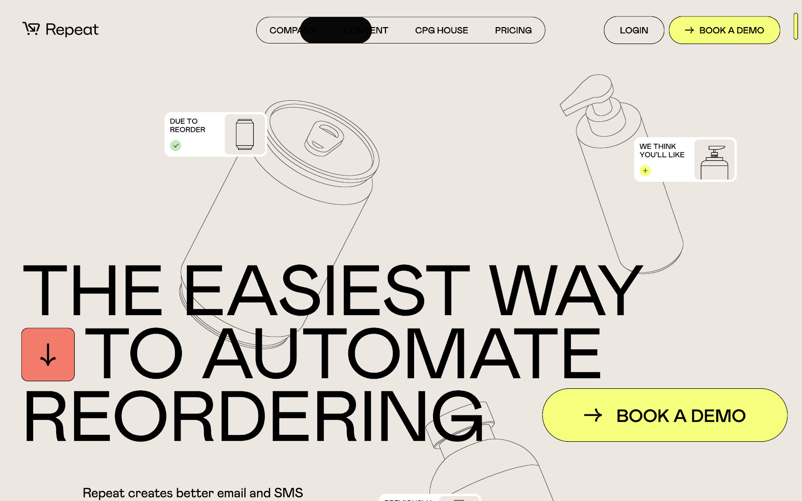
The Repeat website by Studio Freight showcases how light mode can be impactful through contrast and clarity. With a clean, near-white background, bold black typography, and minimal yet vivid accent colors, it maintains strong visual hierarchy.
Subtle animations and generous spacing further enhance readability and user flow—demonstrating that light mode can be both modern and immersive when paired with sharp design choices.
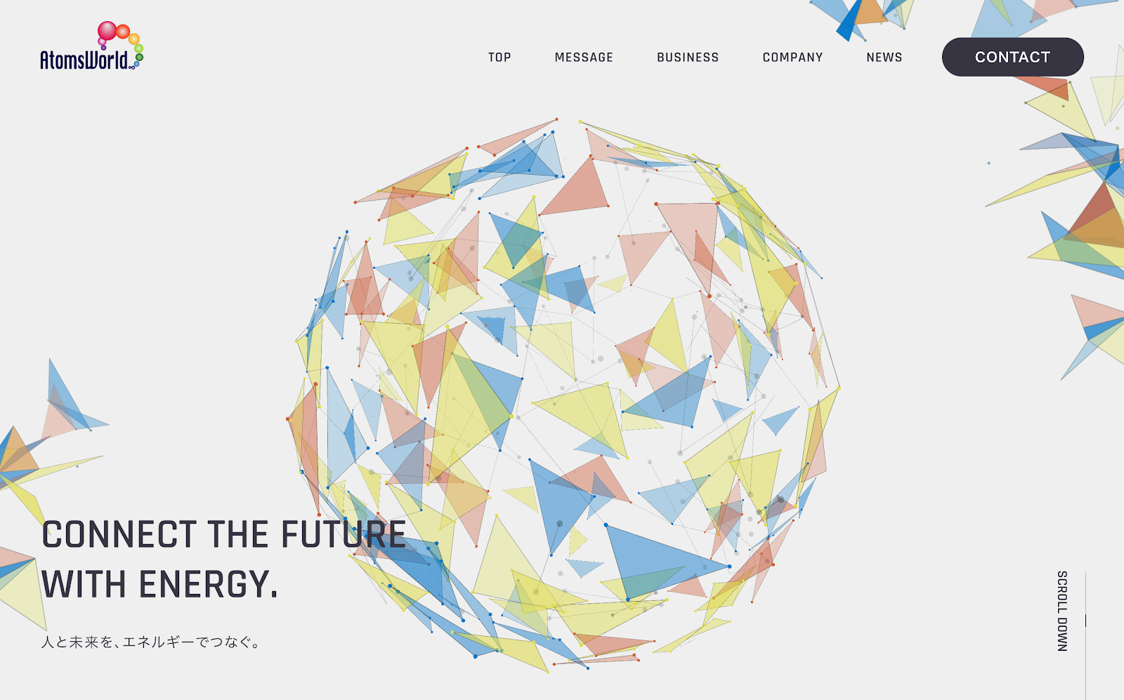
AtomsWorld’s light-mode site strikes a refined balance between simplicity and interactivity—utilizing soft visuals, delicate animations, and thoughtful spacing to deliver a modern, engaging, and easy-to-navigate experience.
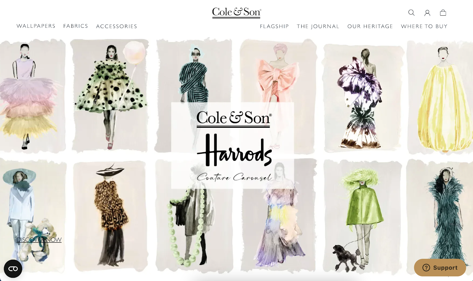
Cole & Son’s light-mode design masterfully celebrates its rich visual content—using a calm backdrop, refined typography, and minimal UI accents—all while integrating practical ecommerce features seamlessly.

Embacy’s light-mode site delivers a refined, professional feel—anchored by strategic whitespace, strong visual hierarchy, clean typography, clear navigation, and a cohesive tone. It's a highly effective showcase for their branding and digital design expertise.
Aerials projects' layout perfectly blends gallery-style elegance with functional clarity. The alternating tones, neat typography, and thoughtful use of imagery create a polished, engaging portfolio template that’s both professional and inviting.
When it comes to Dark Mode vs Light Mode, both have distinct advantages and disadvantages, making it essential to choose the right mode based on the user's environment and the type of content being consumed.
Dark Mode shines in low-light environments, like at night or in dimly lit rooms. It reduces screen glare, minimizes eye strain, and helps users focus by removing bright distractions. However, it can be harder to read for extended periods, especially with text-heavy content. Apps like YouTube and Twitter offer Dark Mode to provide a comfortable viewing experience in dark settings, but it’s not always the best choice for reading lengthy articles or documents.
Light Mode, in contrast, is best for bright environments, such as outdoors or in well-lit rooms. It enhances readability by providing high contrast between text and background, which is especially beneficial for long reading sessions. Platforms like Google Search and Facebook default to Light Mode to ensure users can easily read and navigate in natural or artificial light. However, in dark rooms or at night, Light Mode can cause eye strain, making it harder to engage with content for long periods.
Ultimately, the choice between Dark and Light Mode depends on your users' environment, the tasks they’re performing, and their personal preferences. For example, if your users are consuming content in a dark room, Dark Mode might be the better option. But for reading long articles or browsing in a bright environment, Light Mode would likely provide a more comfortable experience.
Offering both Dark Mode and Light Mode has quickly become a best practice for many apps and websites. Allowing users to toggle between the two modes based on their environment or personal preference has several benefits:
Increased User Satisfaction: By giving users the flexibility to choose their preferred mode, you’re improving their overall experience. This feature is especially popular among apps like Instagram, WhatsApp, and Reddit, which let users switch modes easily, ensuring comfort and reducing eye strain.
Personalized Experience: Giving users control over their interface creates a sense of personalization. It allows them to choose the mode that suits their current setting—whether they’re in a dark room or a bright environment. This level of customization not only enhances user satisfaction but also promotes longer engagement with your app or website.
Higher Engagement: Allowing users to pick their preferred mode helps them feel more in control of their digital experience. This sense of empowerment can lead to increased interaction, making users more likely to return to your platform. Additionally, MacOS, Windows, and many mobile devices now feature system-wide settings that automatically switch between modes based on time of day or ambient light, further enhancing the user experience.
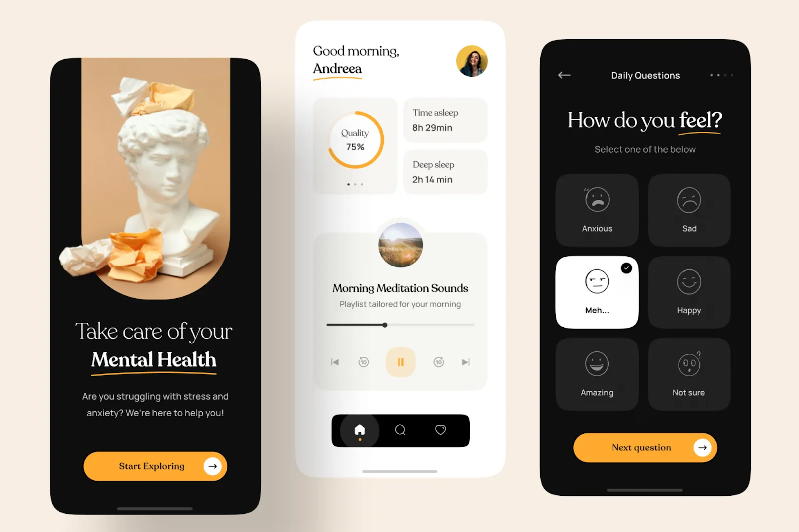
This Mental Health Meditation App seamlessly integrates both light and dark modes, offering users a more personalized and comfortable experience across different environments.
So, if your team or company tend to provide the best UX for a better converting and sale, using them together would be a good solution, so users can feel free to choose the most preferable one based on their needs and scenarios.
Choosing between Dark Mode and Light Mode isn’t about picking a winner—it’s about knowing when to use each one. Both modes offer unique benefits that can enhance your users’ experience depending on the situation. Whether you prioritize readability, aesthetics, or battery conservation, understanding the strengths of each mode will help you create more user-friendly, engaging interfaces. And, by offering both options, you’ll ensure that your design caters to a wider range of user preferences.
 Mockplus RP
A free prototyping tool to create wireframes or interactive prototypes in minutes.
 Mockplus DT
A free UI design tool to design, animate, collaborate and handoff right in the browser.


 Sign up with Google
 Join our Discord community
 support@mockplusapp.com