According to a recent survey, over 81.9% of Android users choose to use dark mode on their mobile phones, inside their apps or elsewhere when it's available. Dark mode seems to be used everywhere, including in website and app designs.
For UI/UX designers, designing a good dark mode is not just changing the color scheme, it is a complex process and there are many things that should be considered.
So, we've compiled this ultimate guide to help you learn everything about dark mode in website or mobile app design. We'll start with the definition, pros and cons, and best practices. At the end, we also cover some dark mode UI design examples and templates for your inspiration.
Table of Contents
What is UI dark mode
Pros and cons of dark mode
Dark mode vs light mode, which is better
When to choose a dark mode
When to avoid a dark mode
Dark mode design best practices
Dark mode design best examples and templates
In simple terms, the dark mode, also referred to as a night mode or a dark theme, is a kind of website or mobile app UI display mode when the lights of your website browser, apps or mobile apps have been turned off.
Its background quickly changes from light or bright colors into either complete black or a shade of grey. The relevant color scheme, visual contrast, and other design aspects should be adjusted or completely changed to make its texts, images and other content readable. It is a complete reversal of the default light mode that designers often used in the past decades.
Many renowned brands, including WhatsApp, Instagram, Google, Facebook and Apple, offer users a great dark mode experience. If you are considering a dark mode for your projects, here are the pros and cons that can help you evaluate it carefully in advance:
A good dark mode can bring many benefits to your projects:
Easy on the eyes
As we all know, looking at a computer or phone screen for a long period can strain your eyes and cause both short term and long term damage such as eye discomfort, dry eyes, headaches, blurred vision, double vision, migraines and more.
Compared with light mode, dark mode lets the eyes relax because there is less glare and bright lights coming from the screen.
Save device energy
Dark mode uses predominantly black and grey colors, and on OLED screens this significantly reduces the required energy on text, images and interactions.
Let users focus on the important things
When designing a normal “light mode”, designers tend to use rich colors, cool animations and interactions, and other appealing visual elements. However, the more visual elements you added, the higher chances you have of distracting users.
Whereas with dark mode, there are less colors due to less contrast on a black background, this reduces extra distractions. As such, users can focus more on the information that matters. When used in the right way, dark mode can boost your app or website's popularity due to it being more focused than other light mode alternatives.
Give a high-end and luxury feel
Black always gives users a classic, elegant or luxurious feel. If you are working on a project to evoke similar feelings of users, dark mode is ideal for you.
Like a sword with two edges, dark mode also has its weak points:
Weaken emotional connection
While designing a website or mobile app, different colors often help designers estimate different user emotions. More colors often means to create more and stronger emotions. However, with less colors, like white, black and grey, the motions that dark mode can create are also limited.
Weaken readability and accessibility
You can’t simply revert the color scheme and expect your designs to be correct, it takes time and effort to design the dark mode version of your app or website, otherwise both readability and accessibility will be incredibly difficult.
Light mode with more visual elements is the most widely used version to help users create a visually appealing website or mobile app. However, the dark mode with limited colors and visual elements removes unnecessary visual distractions and lets users focus on interface content, while potentially increasing product or service sales effectively by being a more focused app or website.
They do have their own pros and cons. Just try to list out all your needs and carefully evaluate which one is better for you.
Furthermore, if you cannot make a decision, why not try to use both of them on your project? Allowing users to choose the light or dark mode according to their preferences is a good way of improving UX.
Dark mode is very popular at the moment. But, it does not mean you can use it everywhere. You can try to use dark mode:
when it matches your brand;
when it matches with your app emotions;
when you're designing a minimal project;
when you want core content to stand out;
when you want to create a healthier user experience;
Dark mode stands out the core content of your interface and boosts your sales easily.
Here are also some common scenarios where you're recommended to avoid using dark mode:
when there is a lot of texts;
when there are lots of visual elements;
when there are lots of bright colors;
Too many texts clutter your interface and make it hard for users to read.
Here are some best practices that you can use to design a dark mode for your projects:
Pure white texts on pure black background creates high visual contrasts, sometimes making it hard for users to read. So, when designing dark mode, you are recommended to use dark grey or shades of grey instead. Dark blue is another good option.
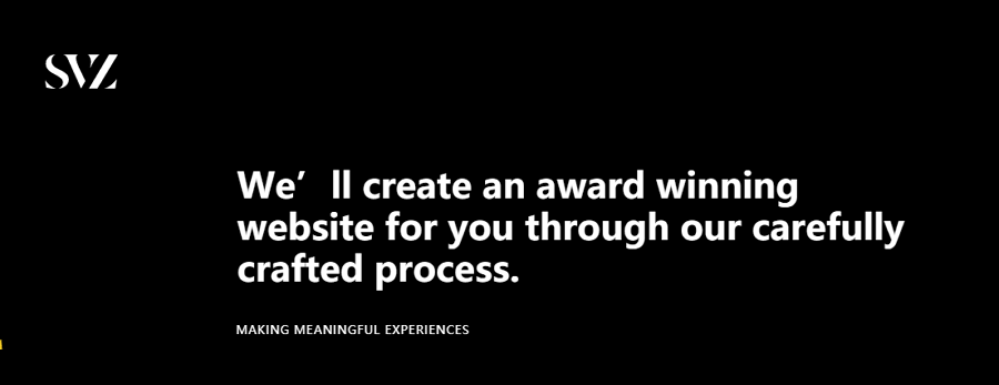
Let's check a website landing page with a black background:
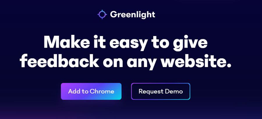
and then, the website landing page with a dark blue background:
Which one do you think is easier on the eyes? If you were the designer, which would you choose for your project?
Fully saturated colors are harder for users to concentrate on in dark mode and cause eye strains for users. When designing a dark theme, remember to use more muted colors, like white, grey, pink and so on.
Fonts are one of the most important visual elements in a design and you should always pay attention when designing a website or mobile app. Working with a dark-themed website or mobile app, you should also never ignore its role. Bolder fonts always seem to create a stronger contrast and make it hard to read the interface content.
For better readability, try to choose a lighter font, not a bold one.
This font with round strokes seems to make the landing page a little bit cluttered, not so good for users to read. The bold words also are hard for users to catch what the designer wants to emphasize, making the page a little bit visually noisy.
If the visual contrast is too strong, you might strain your users eyes when they try to use your website or app. Ensure you design a more gentle visual contrast that doesn’t negatively affect the readability of your app - focus on the contrast of the main colors, the text size and the images.
Dark and light modes are not the either-or concepts. You and your team can decide to choose one or both depending on your needs.
If you've decided to use both of them on your website or mobile app, here are several tips that you should follow:
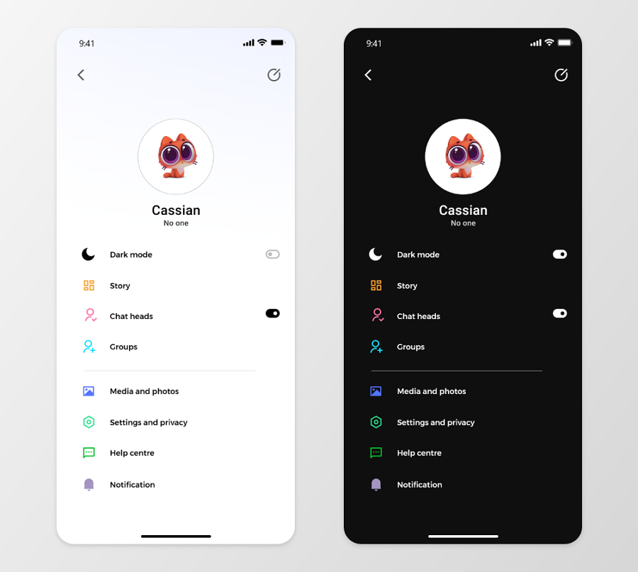
While people feel comfortable using dark mode, some may prefer to use light mode. So, when working on a project, it is better for you to let the user pick which mode to use and give the user the option to switch between these two modes whenever they like.
Allowing users to quickly switch between the light and dark modes is a good way to enhance the UX of your project. To make sure these modes improve the UX of your project, make sure to put the toggle or switch in the right place.
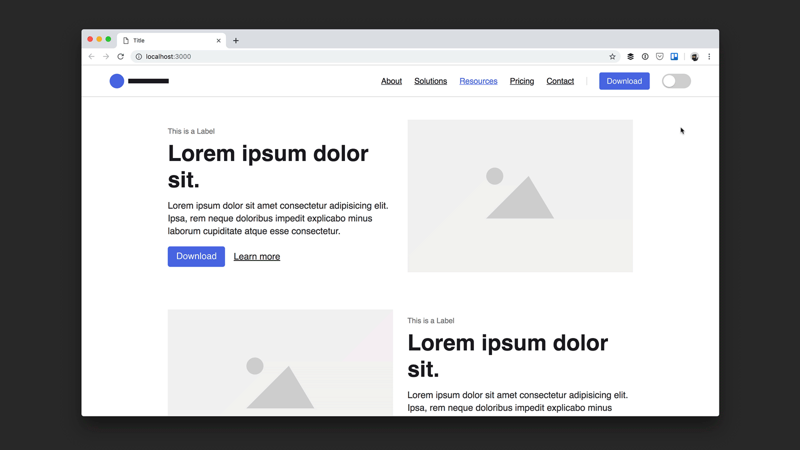
As you can see, the top navigation bar is a good place to put the switcher, making it easy for users to catch.
Set one mode as the default
To offer a more pleasant experience, try to set one mode as default and also allow users to change the default settings.
Remember users' preferences
Once users have selected one mode, remember their selection automatically and try to switch to their desired mode automatically next time.
To put it simply, try to do whatever you can to simplify the user experience there.
Too much text or content creates cluttered UIs and makes it hard for users to scan and read quickly. So, when designing a dark theme UI, remember to add as little content as possible to keep the user focused. If you do need a lot of content to introduce your product or service, try to add more whitespace (or blackspace, in dark mode) to create more readable layouts. Avoiding using long paragraphs is also a good measure to keep the page neat and tidy.
To increase the readability of your UI, you should also try to create a clear visual hierarchy, by using headings in different levels, color blocks and color gradients.

Use gray gradient colors to lay out your interface for a clear visual hierarchy.
Whether you decide to use one or both of these two modes, you are supposed to fully test all possibilities and iterate them according to user feedback. No matter what problems you've encountered, try to fix them all quickly in advance.
To allow users to join the testing process and give their feedback as soon as possible, you may need a design tool like Mockplus to prototype all details of your light or dark mode, and let users freely interact with your app to improve their own experience, simply by sharing a single link.
Furthermore, when using this tool to design and collaborate on this prototype, you can also switch between the light and dark mode for optimal viewing there.
Mockplus, the online web or mobile app design tool, helps you create lifelike designs from scratch and allows your entire team to review, test and iterate your designs together in one shareable Cloud platform, from anywhere.
Your dark or light mode, and even your entire project can be visualized and fully tested there with simple clicks or drag-and-drop.
We've also picked a collection of the best examples and templates with dark themes or modes to inspire you:
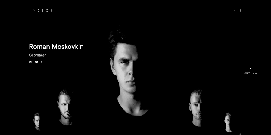
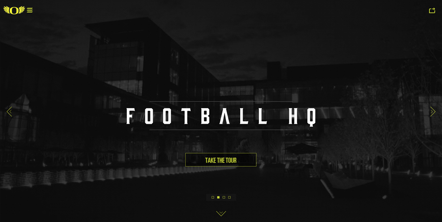
Inside Studio's portfolio website uses dark mode. Once opened, this website has full screen background videos with a dark theme that catches your eyes quickly, making you click to look around a bit more before you realize it.
The black-themed images, minimal design styles with brilliant animations creates a mysterious feel. This is a great dark-themed website for you to explore and get inspiration from.
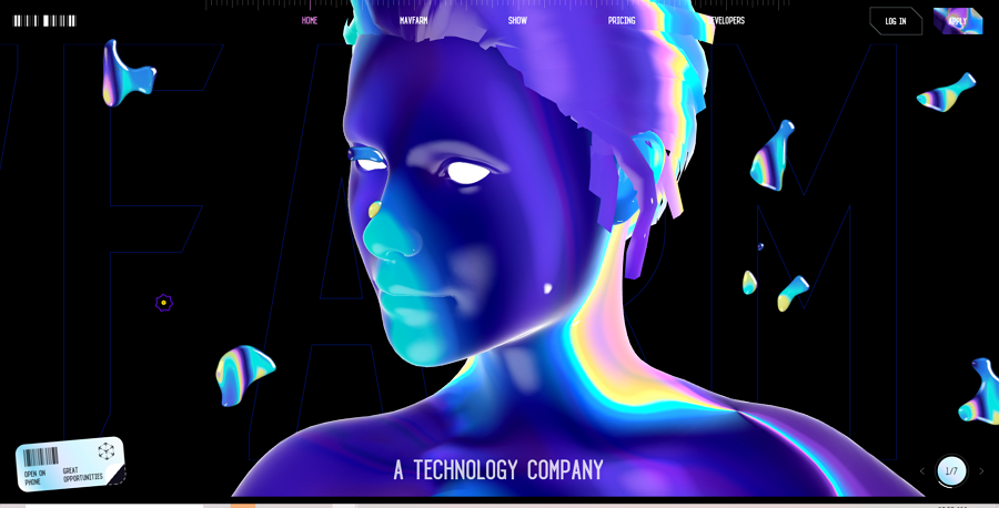
Mav Farm is a technology company that offers tools to help clients start and run an online business in a breeze. Its website has a dark theme and impresses everyone with crystal 3D effects. The crystal objects or figures are on the black background, there are cool transitions and animations with easy-to-read text, smooth scrolling and more designs details create a sci-fi wonderland for users.
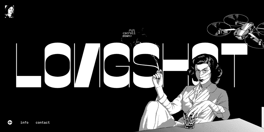
Long Shot is an artistic enterprise that provides clients with a range of services, including hosting live events, making maps, writing about movies and more innovative works. Its online website showcases a visual index of their works. It uses a fantastic illustration style to give users a unique and immersive experience along with the original background music. The website's dark mode is unique in its aesthetic and keeps the user focused on the content.
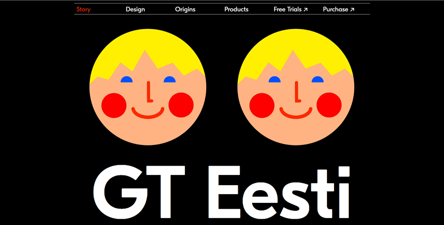
GT Easti is an online website telling the story of the typeface - GT Easti. Apart from the simple black and white color scheme, the most attractive part of this website is the illustration emojis on its landing page. They will automatically change to other emojis with different emotions when you are lingering there for a while.
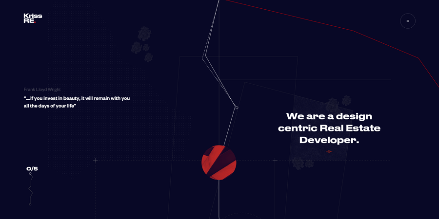
While designing a dark-themed website, some designers will use a dark blue background instead of the pure black background to soften the visual contrast and reduce users' eye strain. This Kriss Real Estate website also selects a dark blue background that’s easy on the eyes and uses a storytelling style to guide website visitors to navigate around.
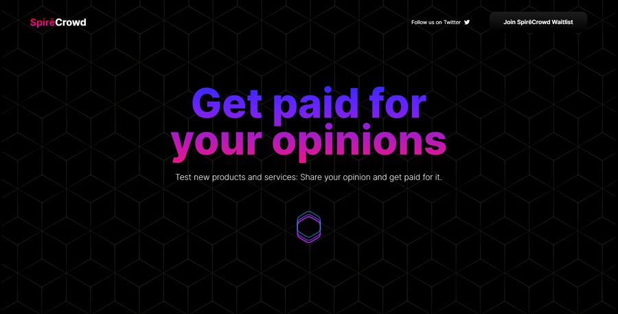
Alt: Crowd Spire
Crowd Spire website is designed to inspire visitors to become a paid product tester. To improve the visual experience there, the designer added a geometric texture onto the black background. The texts have gradient colors, interesting pseudo 3D illustrations and parallax scrolling, all helping to enhance the user experience effectively.
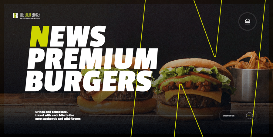
In some cases, adding some bright colors such as yellow, red or green can help you emphasise your brand and give a strong impression on users or customers quickly. When carefully chosen a strong color palette can be a great asset to your website and The Good Burger uses a bright green color to give their website more personality and really shows off what you can do with dark mode when you design correctly.
A black and white color scheme makes it easy for designers to create a more classic looking website. The Oregon Gridiron website features pixel textures to go with the black and white, making the styling more retro and attracts attention from visitors right away.
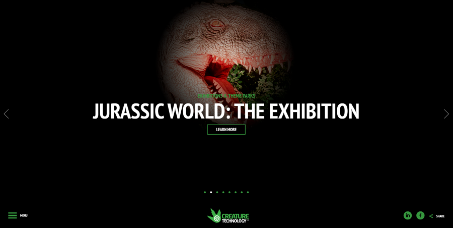
Creature Technology is a company that produces lifelike animatronics for theme parks, exhibitions, stage shows and events all over the world. It’s online website features a stunning dark mode.
On the landing page, there is a cool spotlight cursor effect, where the cursos illuminates the image on the page. If your mouse isn’t near an object, the object isn’t visible. It is a cool expression of how you can merge a dark theme together with more interactive websites.
Airbnb Design is a modern website with a dark theme and is all about Airbnb’s design philosophies. Its home page uses trendy geometric shapes to layout page content, creating a fresh user experience. It is minimalistic and mirrors Aribnb’s style on their website, helping users feel at home, while in a more dark setting.
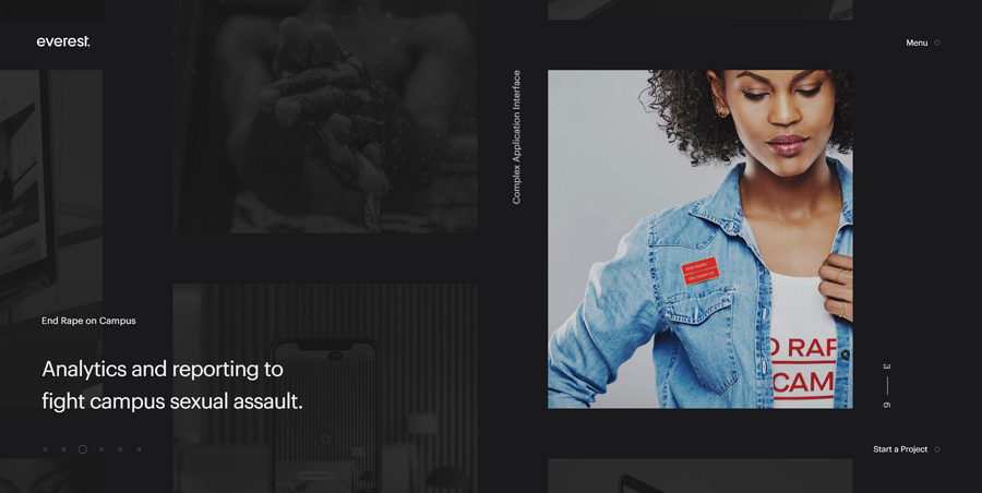
Everest Agency is a UX design studio that helps companies design and create digital products. The website features a minimal dark theme with a unique scrolling mechanism showing off their portfolio.
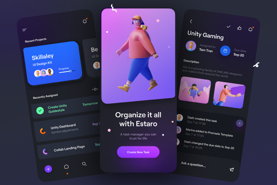
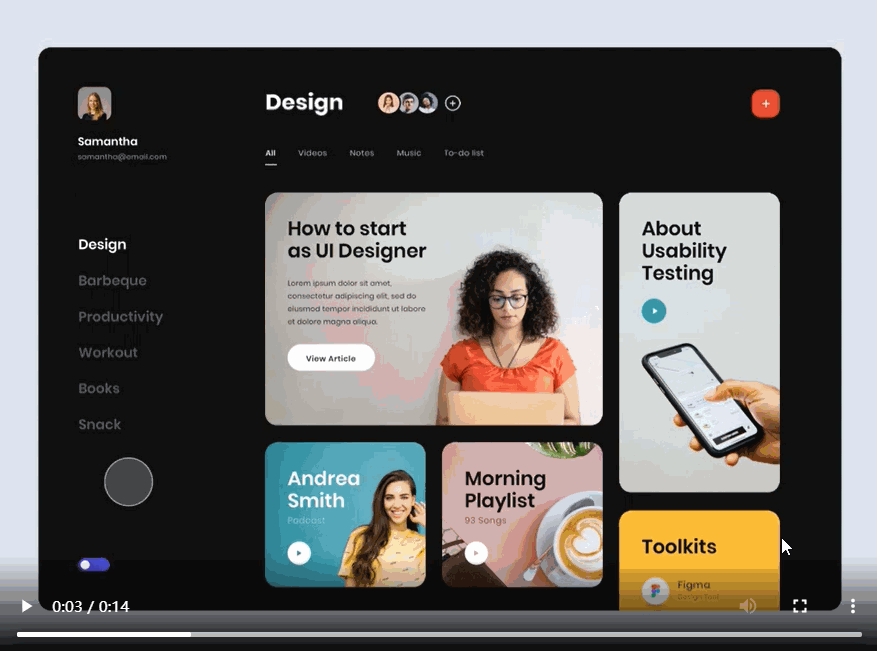
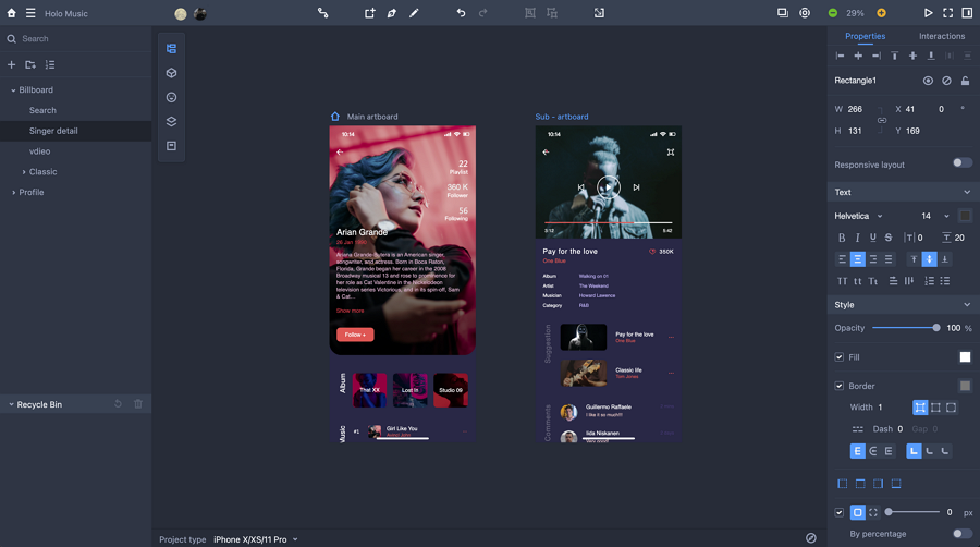
Estaro is a task management app concept for mobile devices. This template shares the PNG images of its dark mode for you to edit and try out your own version in similar fashion
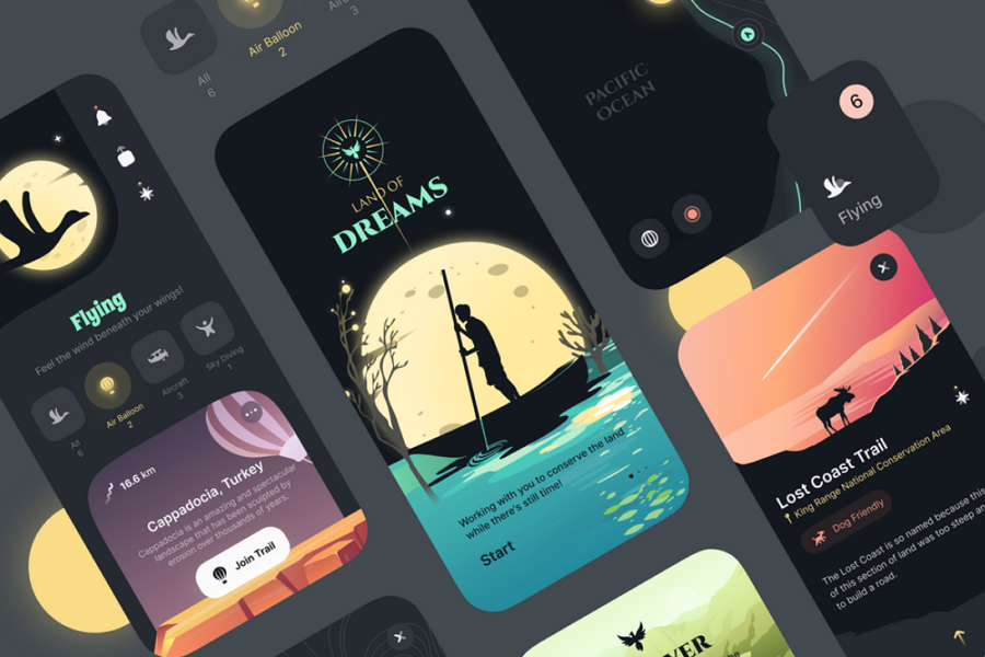
Land of Dreams is a mobile app concept with a dark mode. The rich and warm color creates really fantastic scenes, and with this template you can recreate the app or website from your dreams.
Price: $21
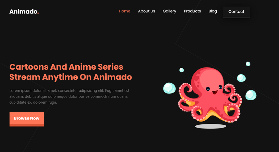
Animado Cartoon Studio is an HTML ecommerce website template with light and dark mode options. Included are: responsive layouts, fully customizable layers, 2 modern slide shows and many more, all making it easy for you to create your own website with similar design details
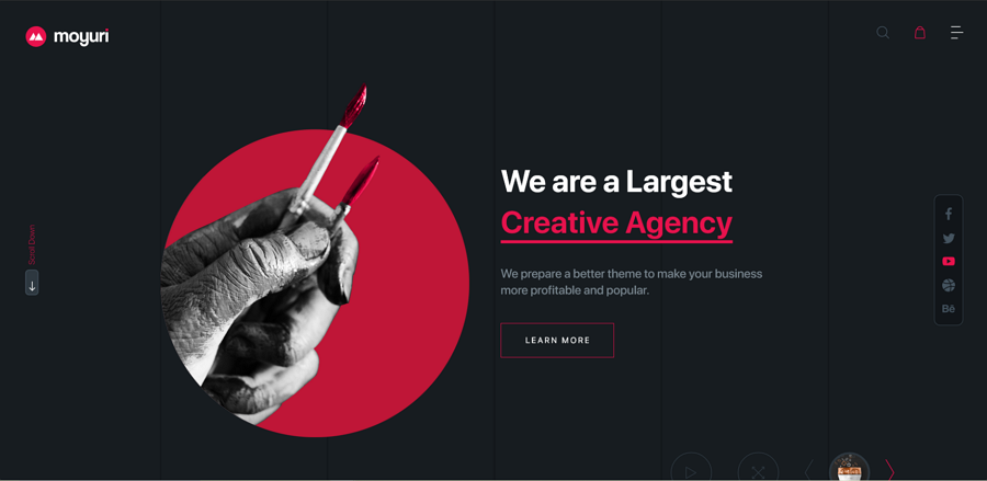
Alt: Moyuri Adobe XD Template
Price: $14
Moyuri is a modern and attractive portfolio website for design freelancers or agencies. Its premium template package gives you eye-catching web pages filled with red, black and white to create a fresh look. It packs 10 complete artboards in Adobe XD format to match your designs.
 Mockplus RP
A free prototyping tool to create wireframes or interactive prototypes in minutes.
 Mockplus DT
A free UI design tool to design, animate, collaborate and handoff right in the browser.


 Sign up with Google