Design specs convey user interface details like colors, styles, measurements, and assets, and allow designers and developers to communicate and handoff designs without much effort. A good design spec can even speed up the entire design-to-development workflow and help product teams create better products.
However, do you really know what good design specs should include? How do they work to speed up your design-to-development workflow?
This article will walk you through all basics of design specs for a website or mobile project and answer what design specs are, why and when you should use them, and how to create design specs.
Table of Contents:
What are the website or mobile app design specs?
Why do you need design specs?
When to use design specs
How to create design specs
Do's and Don'ts when creating design specs
When it comes to website or mobile app product design, design specs (also known as design specifications) provide all possible design details regarding the website or mobile projects.
These spec documents work just like design blueprints that allow developers to pull all necessary values, components, colors, measurements out and get desired design assets and user experience flows.
In most organizations, design specs are created by designers and handed over to developers along with prototypes and other design resources.
Let's first check an example of design specs:
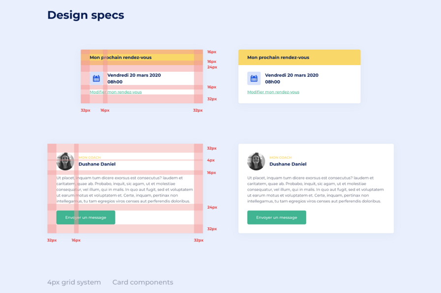
An effective design specification document often comes with the following information:
User interface details. Before starting coding the user interface, developers always need to know every detail of the interface, such as colors, fonts, measurements, etc. The design spec document covers all such details.
Design assets. Apart from the interface details, product developers also need design assets that cannot be coded, including the interface images, icons, and other resources. To simplify the developing process, the design specs should include all the design assets as well.
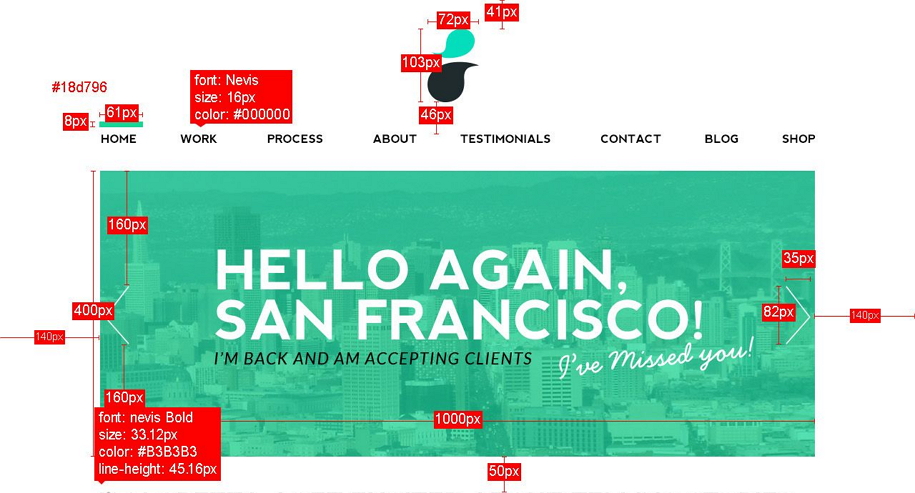
User experience flows. An effective design spec document should also provide design information like user experience flows, user behaviors, and interface features. Developers can better understand the inner logic, and create really impressive products with excellent UX.
Other design resources. You can add any other design resources that can help developers understand the product better and avoid back and forth communications with designers. For example, try to add a link to prototype previews, user flowchart or any other helpful resource.
A well-crafted and effective design spec document should be:
Clear and complete. Website or mobile app design contains hundreds of values, measurements and other design resources, such as the theme color values, spacing values, opacity values, corner radio values, grids, icons. A design spec document should allow developers to find all their desired data and detail as fast as possible. Every super tiny detail should be included in the spec.
Easy to read and scan. To save time and effort, designers sometimes directly add markups to interfaces to specify different raw values. However, this approach can be a disaster for developers because all these values and information are often scattered or crowded in a mess, making it hard for them to read, scan and find required attributes. So, when writing a design spec document, you should pay attention to readability and accessibility.
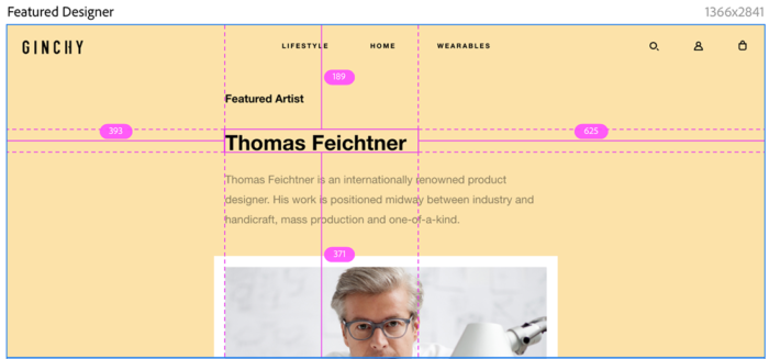
Easy to share. As one of the important handoff files, a good design spec document should be easy to share and read. A Word, PDF or TXT format file is ideal for sharing all design spec details across your teams or organization.
Consistent. Ensure that all design spec documents are written in the same visual language (such as the same color palette, fonts, text styles) and remove all possible discrepancies in advance.
Keep it up to date. A good design spec document should also be easy for designers to update at any time.
Create a live version of the specification. Live design spec is an excellent format for design specs. Nowadays, there are many powerful design tools, like Mockplus, which allow users to create an online design spec document, and share it with the entire team using a simple link.
It can take hours, days, or even weeks to prepare the design spec document manually. However, once it has been created, it becomes much easier for designers to share all possible design values, elements, and other details with developers across teams. There is no need to conduct a meeting with developers every time you want to share a new design.
The design spec document with all possible design details and data keeps both designers and developers on the same page, allowing them to discuss every tiny detail, idea or feedback, and better understand each other. No more misunderstandings and miscommunications.

When it comes to the design handoff process, with a detailed design spec document, designers can easily pack all related handoff files (such as design specs, assets, user flows and prototypes) in a zip file and hand it over to developers via Slack or any other communication channel. No need to conduct a formal meeting to discuss the details.
Without countless sync meetings, both designers and developers can spare more time to do more important things—actual design and development. Good design specs help you save much time and improve your team's work efficiency. The total cost of product design and development can also be extremely reduced.
Generally, the product building process consists of the following phases:
User research
Brainstorming
Map out and iterate design drafts
Create product prototypes
Coding
Testing
Product releasing
The design specs are created right after you've completed the design prototyping phase. In many cases, designers start to prepare design specs after they've got the final version of the design drafts because this approach helps them avoid any waste.
In general, there are two ways for designers to prepare design specs:
If designers do not have access to automated design tools, they can manually create design specs, and combine all design values, measurements, and other information into a document. A Doc, Docx, PNG or PDF file would be a perfect solution to present all design details.
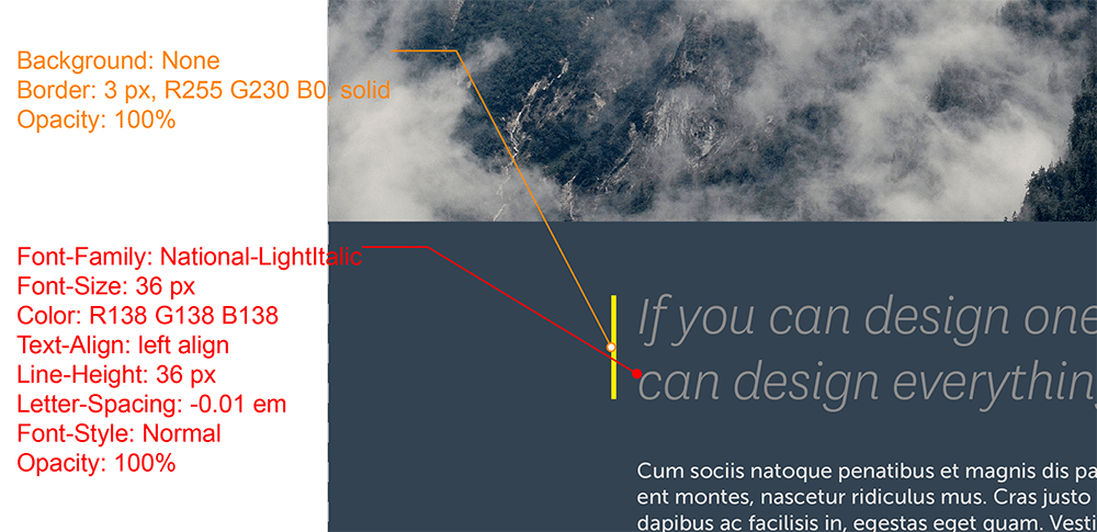
Time and effort are the major downsides of manual design specs. Manual specs are time-consuming and require designers to revise and update the document frequently whenever a new design version is created.
To avoid extra work, product teams can use some handy design tools like Mockplus, which can help product teams create live design specs automatically.
In fact, as a one-stop online product design platform, Mockplus connects your entire design workflow and allows you to prototype ideas, comment and collaborate designs, create and share the same design system, and hand over all design resources to developers. All in one place. It also helps product teams improve the design handoff process with auto and manual specs.
Both designers and developers can benefit from using Mockplus.
Create and share auto-generated design specs online
In Mockplus, interface design specs are auto-generated once designers have imported designs from Sketch, Adobe XD and Photoshop. After sharing the design specs to developers with a simple URL, developers can instantly view all design values in a few clicks.
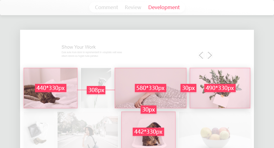
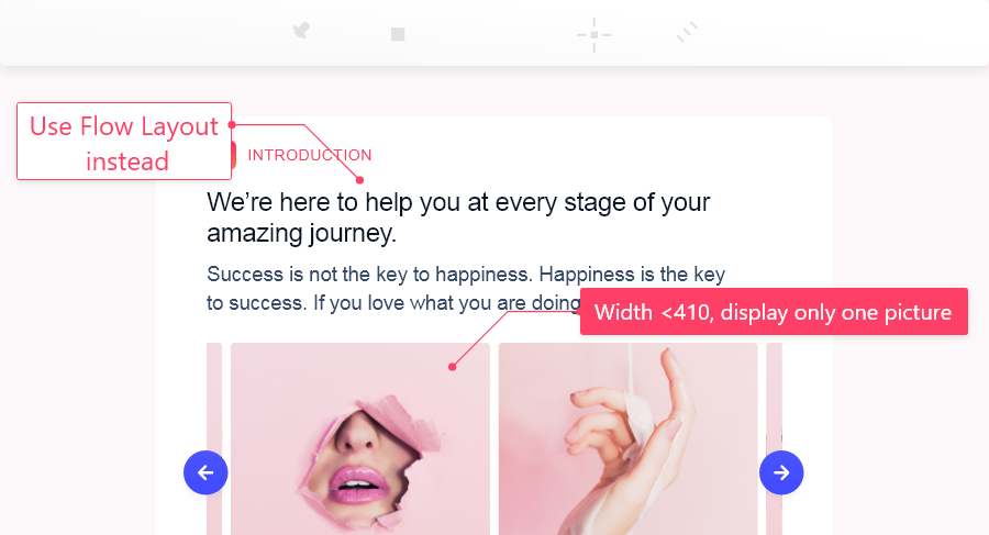
Add manual design specs for further explanation
If designers need to further explain an idea or design detail, they can also directly add manual specs to the design screen and enrich their design specs. A hyperlink can also be added to make everything clear.
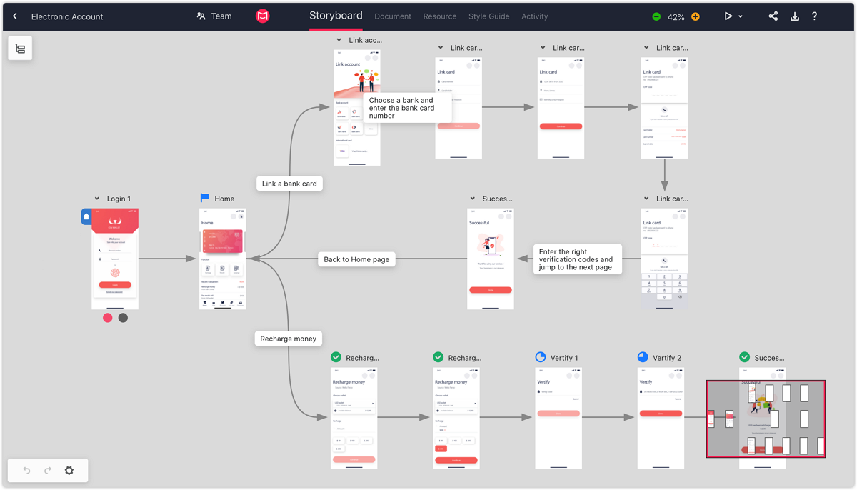
Create user flowchart with drag-and-drop
With Mockplus, user flowchart diagramming becomes a breeze. After importing all design pages, designers can easily drag and drop the logical lines to connect different pages. The page jumping relations are clear enough.
Share and handoff up-to-date design specs with a simple link
Mockplus also speeds up the design handoff process by making it easy for designers to send the design specs to developers with a simple link. Once the design versions are changed, the associated design specs will also be synced simultaneously.
Designers can also assign different roles and permissions before sharing the link to secure data.
Inspect super tiny design detail in simple clicks
Developers can easily join the design workflow with a simple link and click on any interface position to inspect the related layer, style and asset data. Clicking or hovering over an element also allows them to view the spacing between different elements.
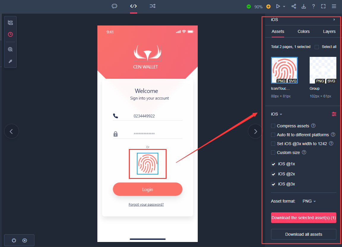
View and download assets
Assets are automatically imported along with the designs. Developers can easily click an asset layout and view the data on the right panel. A simple click is all they need to download any desired assets.
If they are working on a responsive website or mobile project, they can download assets tailored for all devices and platforms, such as Website, iOS and Android devices.
Preview prototypes to understand products better
Developers can click a simple preview link to preview and test out product prototypes, making it much easier to understand how the product works. No need to ask questions about the details
Export style codes for faster development
When coding the product, developers can also easily copy and paste any desired style codes of different elements into their coding programs. It streamlines the developing process.
Mockplus makes everything online and says goodbye to the manual design spec era.
To help designers and developers collaborate better, here are the do's and don'ts that you should keep in mind when creating design specs:
Before designers start to prepare the design specs, they should also take developers on the same page and discuss some design ideas together. By doing that designers ensure that all design ideas are executable for developers.
Designers and developers should host internal meetings to discuss the language they use to convey different design details, ideas and feedback. It will help to establish a shared understanding.
The design specs should be updated once the design version has been changed.
Good design specs tend to present the actual value of the width, height, color and other elements. A value range is not recommended.
Design specs provide the specific values and information of an interface design. To help developers get their design data as soon as possible, it's recommended to connect the design specs with actual designs.
For example, in Mockplus, all design specs are directly displayed on the interface screen and allow developers to view any details on click or hover. This approach simplifies the process of developing a product.
Wrap Up
Good design specs make designers' and developers' lives easier and allow them to collaborate smoothly for creating better products.
We hope this guide can help you better understand the concept of design specs and will help you to create design specs for your new project.
 Mockplus RP
A free prototyping tool to create wireframes or interactive prototypes in minutes.
 Mockplus DT
A free UI design tool to design, animate, collaborate and handoff right in the browser.
