On the Mobile World Congress in 2010, Eric Schmidt, the CEO of Google put forward that designers should follow the “mobile first” rule in product design. What does “mobile first design” mean? Why is it important? How to make it? I’ll answer these 3 questions in the following part.
To understand the concept of mobile first design better, you should know the two phrases below first.
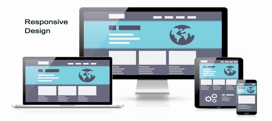
1. Responsive Web Design (RWD)
Responsive web design is a web design method that enable web to fit to the screens of different devices automatically, displaying the content in a way that people feel comfortable. This greatly reduces users’ operations like panning, zooming and scrolling when browsing the web.
Know more about responsive design
2 “Progressive Advancement” & “Graceful Degradation”
These two concepts were put forward before responsive web design. In order to make web or application interface display reasonably on different devices, designers provide customized versions of product for different ends.
Progressive Advancement means that when we design a product, first we build a version for relatively lower browser (like that on a mobile phone). This version includes the most basic functions & features. After that we tend to the advanced version for a tablet or PC, which is created by adding interactions, more complicated effects, etc. on the basic version for a better user experience.
“Graceful Degradation”, on the contrary, starts the product design from an advanced end like desktop and builds a version with well-rounded features at the beginning. Then designers make the product compatible to mobile ends by cutting some functions or contents.
Progressive Advancement has won the game for now as far as I can see. If UI/UX designers start a product design with its desktop version, they will inevitably want to make use of most of the advantages of the advanced end. For example, the hover effect which is supported by a cursor mouse; HD images & complex charts which can display normally only when there is a recent bandwidth. In this way the designers will make efforts to complete an amazing desktop version and only to find it can hardly be adopted on a mobile end unless they give up a lot of beautiful ideas. If so, the mobile end version will be more like an afterthought, an incomplete product which’s been watered down.
But if we take the mobile end product design as a starting point, under the restrictions like bandwidth, screen size and so on, designers will naturally seize the key points of a product, head for a lean & neat product with prioritized features. When the platform is expanded to a tablet or PC, designers are able to take advantages of the unique features of these advanced ends to strengthen the product step by step. This might be the main reason that progressive advancement strategy is widely used.
You may ask, why do you spend so much time on explaining the two concepts? The answer is that “mobile first” is exactly a rule of “progressive advancement”.
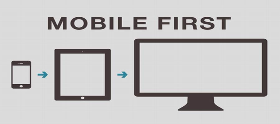
"Mobile first", as the name suggests, means that we start the product design from the mobile end which has more restrictions, then expand its features to create a tablet or desktop version.
Except for the victory of progressive advancement against graceful degradation as mentioned above, we have more tangible reasons to believe that mobile first principle is important in product design. That is, the exploding of mobile use.
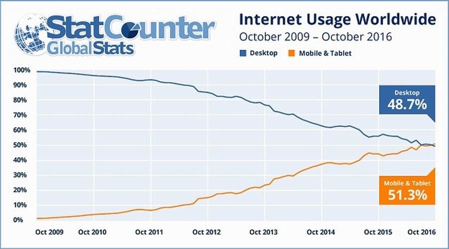
1. Mobile internet usage has surpassed desktop usage in 2016.
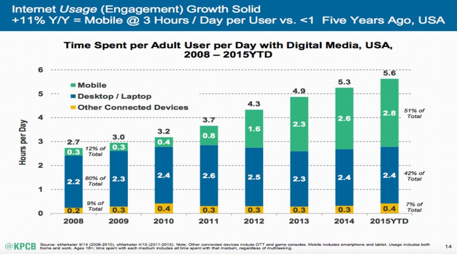
2. People have spent more and more time on internet from mobile ends.
3. Early in 2012, smart phone sales have overtaken PC sales.
The exploding of mobile ends urges designers to pay attention to the mobile end and follow the “mobile first” rule in product design.
The key to mobile first principle is, in fact, a content-centered mind.
The following part will explain the advancement of a product from a mobile phone end to a PC end.
(The design tool used in the example below is Mockplus, an easy-to-use PC/mobile application for fast wireframe & prototype building.)
Let’s make an application about hotel booking. We first sort the content of the site by importance:
* Website name
* Hotel (Domestic Hotel, Foreign Hotel, Hour Room, Special Hotel)
* Time selector (check-in time, departure time)
* My Order
* Customer service
* Promotion & Advertising
Then we get a mobile end version like this:
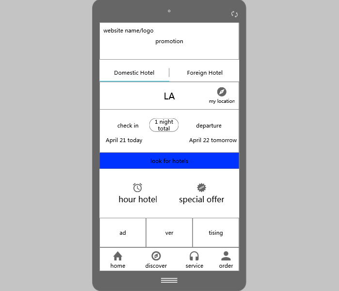
Hotel Booking App - Created with Mockplus
Domestic, foreign hotels and time selectors are the most important content. They are located on the most prominent part of the interface.
By adding more features on the mobile version and enlarging the promotion & advertising displaying area we get a desktop version like this:
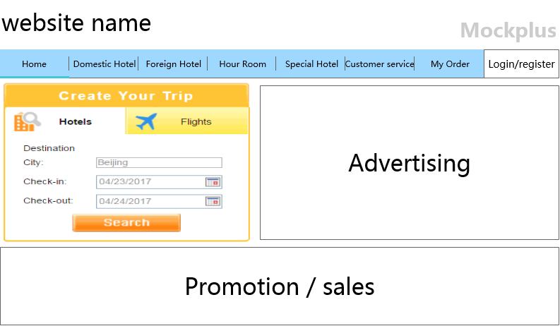
In this way, designers are able to creating a product for multiple ends in a smooth and efficient way instead of ruthlessly removing those good features to get an afterthought.
In short, the "mobile first" principle has an important role in product design. On the one hand, it helps to save product design time and improve designers’ productivity. On the other hand, it forces designers to pay more attention on the content of a product, which helps them to created neat and practical designs. However, as smartphones become more and more powerful, the mobile end might no longer be considered as “lower ends" in the near future, so the "move first" may not be an everlasting topic. But for now, its place in product design cannot be ignored.
 Mockplus RP
A free prototyping tool to create wireframes or interactive prototypes in minutes.
 Mockplus DT
A free UI design tool to design, animate, collaborate and handoff right in the browser.


 Sign up with Google
 Join our Discord community
 support@mockplusapp.com